Olympus White
A cool light gray with a real blue undertone, reviewed honestly: the light that keeps it gray, the light that turns it plainly blue, and the exterior it washes out on.

Jessica has spec'd whites and neutrals for more than 300 rooms and keeps a sample wall of painted drawdowns in her studio. Every color review is checked against real reader rooms in the comments and re-tested when a formula changes. About the testing process →
- 1Stardew43
- 2Sea Salt63
- 3Olympus White68
- 4Spring Thaw83
The Fast Verdict
Olympus White is Sherwin-Williams' answer to a request nobody says out loud: a light gray that is actually gray, not beige wearing a gray name. At LRV 68 it sits close to white on the chip, and in strong daylight it can pass for one — clean, misty, barely there.
But the blue undertone is real, not a marketing footnote, and in a dim or north-facing room it shows up plainly, no squinting required. Buy it because you want cool, not because you assume every light gray behaves the same.
Bright south- or east-facing rooms · kitchens with white stone, stainless, or dark cabinets · small bathrooms that need lifting · anyone who actually wants gray, not greige
Your room is north-facing or gets little direct light · you're set on painting a whole sunny exterior with it · your floors and trim lean honey-warm · you want the safety of a proven warm neutral
- A light gray that is actually gray, not a greige with a gray name
- Reads clean and modern against white stone, stainless, and dark cabinets
- High LRV (68) brightens small, dim bathrooms without going stark white
- Doesn't drift purple, green, or muddy — the undertone stays honestly blue
- Pairs cleanly with a crisp cool white trim for a coordinated cool palette
- In north or low light it reads as distinctly light blue, not gray
- Washes out and looks flat in full exterior sun without dark trim for contrast
- Fights honey oak floors and warm creamy trim whites
- Too cold for a room that wants to feel cozy under lamp light alone
What Color Is Olympus White, Really?
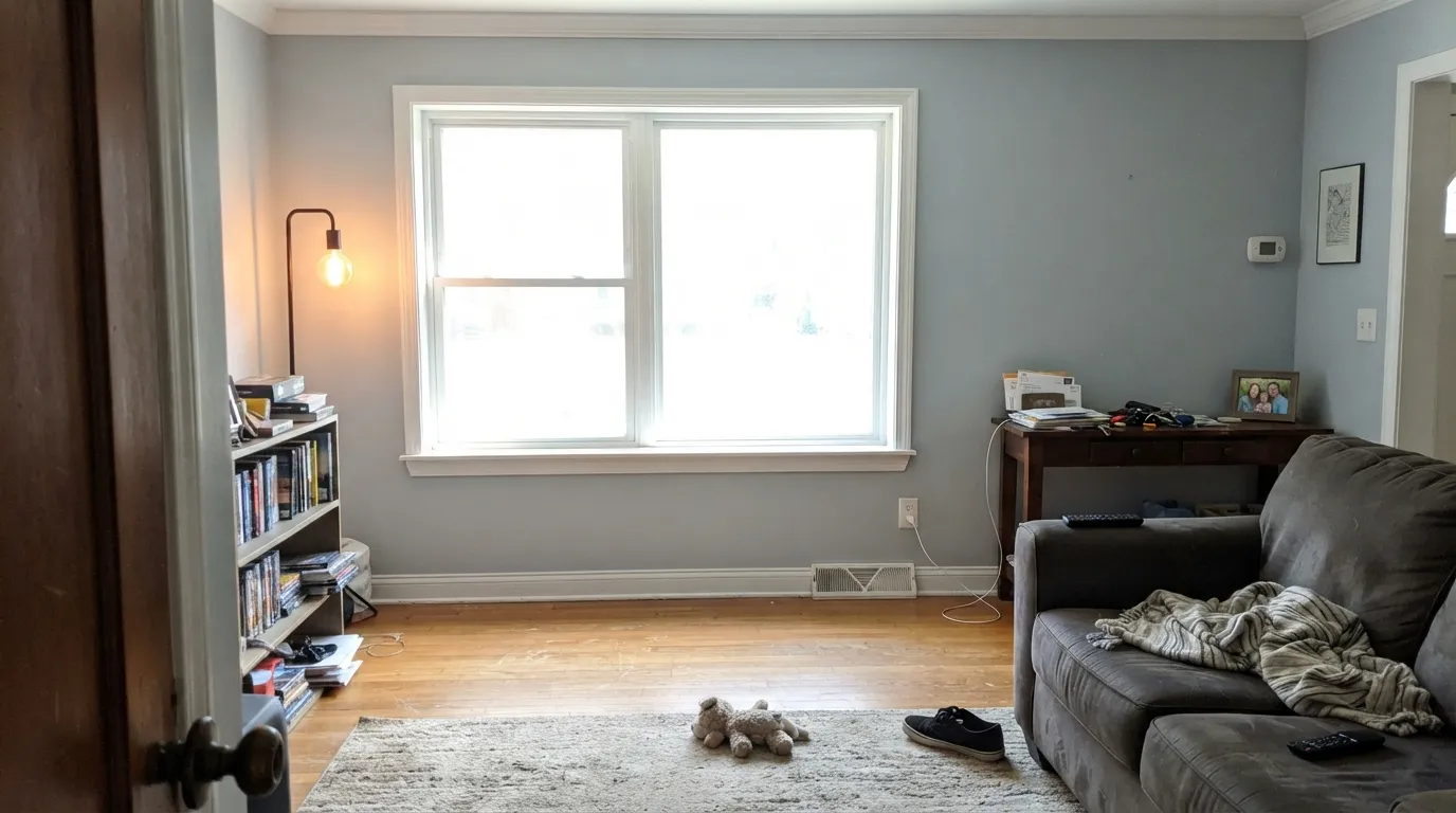
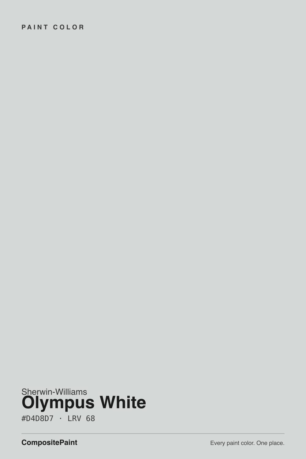
A pale cool gray with a genuine blue undertone — not a greige in disguise, not a soft white with a gray rumor attached. RGB 212/216/215, hex #D4D8D7: the numbers alone show the green channel edging out red just slightly, the blue-gray signature. Sherwin-Williams files it under white paint colors on its own site, but on the wall it reads as a light gray more often than a white — the SKU sits two doors down from Ice Cube (SW 6252), a nearly identical near-white with the same undecided lean, which says this whole corner of the SW deck is built around one quiet, cool idea.
At LRV 68 it reflects a lot of light without disappearing into it — put it next to a true white like Pure White (LRV 84) and Olympus White clearly shows body and color, the way a light gray should. That gap is the point: with real daylight on it, it reads soft, clean, and unmistakably gray rather than the visual nothing a near-white can become. It is not, despite the name and the SW category, a color to buy expecting a white.
Undertone in one line: cool, blue-leaning gray — real, not subtle. Homeowners who describe it as looking 'light blue instead of light gray' are not imagining it; that is the honest character of the color under enough daylight or the wrong bulb. If your sample looks warm or beige, check your lighting — 2700K lamps and afternoon sun both push it toward neutral, masking the blue that shows up plainly at noon.
Where It Shines
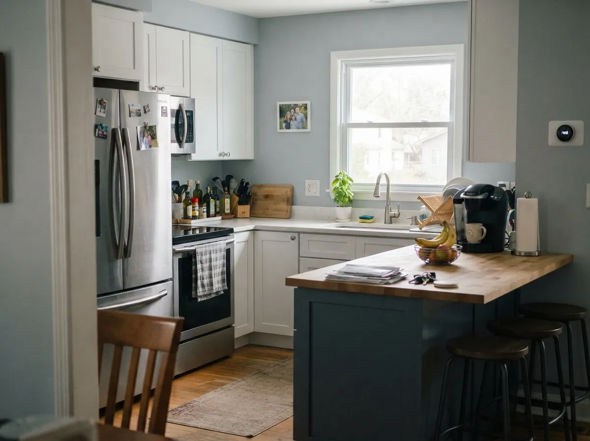
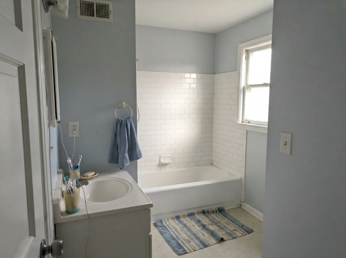
Give it strong daylight and it does exactly what a cool light gray should: quiet, clean, and genuinely gray rather than white-adjacent or greige-adjacent. Kitchens are its strongest room — with white quartz or marble, stainless appliances, and either black or navy cabinetry, the cool cast reads deliberate and modern instead of cold. Small bathrooms brighten under it without the flat, characterless feeling a true white can leave behind, and against crisp white trim the whole room reads finished rather than half-decided.
Where It Fails
The complaints about Olympus White cluster into three predictable stories, and every one of them was visible before the first coat went on. None of them are the paint failing — they're a light gray with a real undertone meeting a situation that undertone doesn't survive.
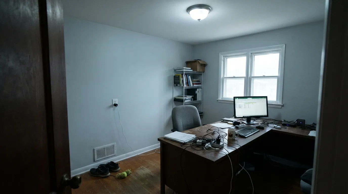
Cool light and a blue undertone are a bad combination: north daylight strips out the little warmth the color has, and the blue reads plainly, not subtly. This is the exact complaint behind 'I painted my walls light blue instead of light gray.' The color didn't change — the light just stopped hiding what was already there. Test a large sample on the actual wall, at the actual time of day, before committing.
Full sun does not flatter Olympus White the way it flatters a warm white — it tends to wash the color out, reading flat and almost featureless from the street rather than crisp. It can still work on siding paired with genuinely dark trim (charcoal, black, navy) for contrast, but painted alone on a sunny elevation it often looks like plain builder white with none of the personality that made you pick it indoors.
Pair a cool blue-gray wall with warm-orange oak floors or a creamy warm trim white like Alabaster or White Dove, and the two fight instead of finishing each other — the wall looks slightly institutional, the wood looks slightly orange. Match temperature instead: a crisp cool white like Extra White or Pure White on the trim, white oak or gray-washed floors underneath.
Room by Room
White quartz or marble, stainless steel, matte black or navy cabinetry: Olympus White backs all of it up without competing. The blue keeps the room from reading beige-kitchen-generic, and it holds its own next to stainless in a way a warmer white can't.
Small, light-starved bathrooms take well to it: the LRV is high enough to lift the room, and the cool cast reads clean and spa-like against white or light-gray tile. Skip it if the room stays dim all day — see the fails section.
In a south- or east-facing living room with white trim and darker, deliberate furniture it reads calm and modern. In a dim or heavily shaded room it drifts flat and cold instead — this is not a moody-cozy color, it needs light to do its job.
Works in a bright bedroom that wants calm rather than cream, but skip it for a north-facing bedroom that only sees lamp light at night — the blue reads cold exactly when you want the room to feel warm before sleep.
Olympus White itself on trim is fine in a bright room but loses definition next to its own walls. Pair Olympus White walls with a genuinely brighter, cooler trim white (Extra White, Pure White) rather than using it on both surfaces.
Works on siding when paired with dark, deliberate trim — charcoal, black, or navy shutters and doors give it the contrast it washes out without. Painted alone in full sun on a plain elevation, it tends to read flat and characterless. Details in the exterior section below.
Your Light Is the Risk
Strong, direct daylight is the color at its most honest and most flattering: clean, misty, unmistakably a light gray rather than a washed-out near-white.
Cool, indirect light strips out what little warmth the color has and the blue undertone shows up plainly — the light-gray-becomes-light-blue complaint happens here.
East rooms read a fairly neutral gray in the morning and shift cooler and bluer as the light moves later in the day; sample it at both ends before deciding.
Warm 2700K bulbs settle it into a soft, neutral gray with the blue mostly tamed; cool white LEDs bring the blue-gray forward again, sometimes starkly. Bulb choice matters more here than on most colors.
Most complaints about Olympus White are a light mismatch. Upload a photo of your actual room and see it on your walls — then ask for the same wall in north light or evening lamps before you buy a single sample.
Need It From Another Brand?
Any paint counter can custom-tint Sherwin-Williams SW 6253 directly. If you would rather stay in one brand's own deck, these are the closest stock matches, measured as ΔE2000. Under 2 is a difference you will not see on the wall.
| Brand | Closest color | ΔE | LRV | |
|---|---|---|---|---|
| Behr | Solemn SilencePPU26-12 · Behr | 0.6 | 68 | Color page → |
| Benjamin Moore | Blue Lace1625 · Benjamin Moore | 1.9 | 66 | Color page → |
| Valspar | Aerodynamic8006-10A · Valspar | 0.5 | 68 | Color page → |
| PPG / Glidden | PeregrinePPG0993-1 · PPG / Glidden | 1.3 | 68 | Color page → |
| Glidden | PeregrinePPG0993-1 · Glidden | 1.3 | 68 | Color page → |
| Dutch Boy | Frosted Silver435-1DB · Dutch Boy | 1.6 | 69 | Color page → |
Similar Sherwin-Williams Colors
The nearest shades to Olympus White within Sherwin-Williams's own range, ranked by perceptual color distance — useful when you want the same look a touch lighter, darker, or warmer.
WCAG 2.1: AA is 4.5 : 1 for normal text, 3 : 1 for large text, AAA is 7 : 1.
Olympus White vs the Colors You're Also Considering
Every Olympus White sample board has the same rivals on it. The numbers show the real lightness gap — then it comes down to which risk you would rather live with.
Pick this when you want visible gray on the wall, not an almost-white that only flashes color in the right light.
Sherwin-Williams SW 6252 · LRV 77Ice CubePick this if you want the same undecided cool lean, just lighter and closer to true white.
Pick this for a genuinely cool gray with no beige creeping in, even under warm light.
Sherwin-Williams SW 7015 · LRV 58Repose GrayPick this if the blue feels like too much risk — Repose Gray is the warmer, safer greige with far less cold-light drama.
Pick this for a cooler kitchen palette next to white stone and stainless — Alabaster's warmth works against that look.
Sherwin-Williams SW 7008 · LRV 82AlabasterPick this for cabinets or trim that should read soft and warm instead of crisp and cool.
Pick this when you specifically want the blue, not a gray that could land almost anywhere depending on the room.
Benjamin Moore OC-52 · LRV 65Gray OwlPick this if your painter works in Benjamin Moore — a similarly pale chameleon gray that wanders less decisively toward blue.
Windchill SW 9636 at LRV 68 is nearly the same color, close enough that most rooms would not show a difference. Reflection SW 7661 at LRV 66 is two points deeper and slightly greener. First Star SW 7646 at LRV 69 is a touch lighter and warmer, which is the one to choose if Olympus White feels cool in your room. Serenely SW 9632 at LRV 66 leans clearly green, while Starry Night SW 6540 at LRV 69 and Hinting Blue SW 6519 at LRV 68 both add visible blue at the same lightness.
Across brands, Valspar Aerodynamic 8006-10A at deltaE 0.48 and Behr Solemn Silence PPU26-12 at deltaE 0.62 land on the same value. Glidden Peregrine PPG0993-1 at deltaE 1.31 and Benjamin Moore Blue Lace 1625 at LRV 66 and deltaE 1.86 are visually identical in normal room light. Farrow & Ball Borrowed Light No. 235 at LRV 69 and deltaE 2.23 is very close, so sample first.
Olympus White Coordinating Colors
The rule for coordinating with Olympus White is temperature match: stay cool or go genuinely dark, and keep warm creams and honey wood at a distance. It pairs cleanly with crisp cool whites, its own deeper blue-gray cousins, and true near-blacks — these are the partners that keep it looking deliberate instead of accidental:
Olympus White on Exteriors
Outside, the same undertone that reads as a clean cool gray indoors behaves less predictably. Full, direct sun tends to bleach the color toward a flat, almost featureless white — the personality that makes it interesting on an interior wall with controlled light can disappear on a sunny facade. It is not a color that carries a house on its own the way a warm off-white does.
The fix is contrast: genuinely dark trim — charcoal, black, or a navy like Hale Navy on the door — gives the pale blue-gray something to read against, and the combination lands as crisp and modern rather than washed out. Avoid pairing it with warm trim colors outdoors for the same reason you'd avoid it indoors, and check a large sample on the actual elevation, in both sun and shade, since a shaded north wall will read noticeably bluer than a sun-baked south wall.
Olympus White With Wood Tones and Floors
This decision happens at the floor, not the paint can. White oak, gray-washed wood, and black-stained floors all sit comfortably with Olympus White because they share its cool-to-neutral temperature — none of them are fighting the blue undertone. Black-stained or ebonized floors in particular make the pale blue-gray read sharp and intentional rather than accidental.
Honey oak and other warm-orange floors are the one real clash: the wood pushes toward orange next to the cool wall, and the wall pushes toward a colder, slightly institutional blue next to the wood — both sides lose. If a warm honey floor is staying put, a genuinely warm gray or greige like Repose Gray will get along with it far better than Olympus White will.
Three Ready Palettes Built on Olympus White
A color is never alone on the wall. These are complete combinations in the 60-30-10 pattern, with the reason each one holds together. Every one opens in the visualizer.
Extra White keeps the trim genuinely cooler and brighter than the wall so nothing looks dingy by contrast, and Storm Cloud on the island doubles down on the same blue-gray family instead of fighting it — the whole room stays one temperature.
Try this palette in your roomPure White keeps the ceiling and trim reading crisp rather than warm, so the small room stays bright; Wolf Gray on the vanity grounds it with a deeper cousin of the same blue-gray instead of introducing a clashing warm wood tone.
Try this palette in your roomFirst Star sits almost exactly at the same LRV and shares the same quietly undecided cool cast, so the handoff between rooms is seamless; Peppercorn on the door supplies the one dark, near-neutral anchor the palette needs without adding warmth that would fight the gray.
Try this palette in your roomOlympus White FAQ
Is Olympus White gray or blue?
Both, honestly — it's a cool gray with a real blue undertone, not a subtle one. In strong daylight it leans toward gray; in north light or under cool LEDs, the blue comes forward enough that some owners describe it as painting their walls light blue by accident. If you want a gray that never flashes blue, this isn't it.
Is it too cold for a whole house?
Not if the house gets real light. It reads clean and deliberate in bright rooms, but a dim, north-facing room will make it feel genuinely cold rather than calm. Reserve it for the rooms with the best daylight and use a warmer neutral like Repose Gray in the dim ones.
What trim white goes with Olympus White walls?
A crisp, cool white — Pure White or Extra White — keeps the temperature matched so the trim reads brighter without looking like a different, warmer paint job. A creamy warm white like Alabaster or White Dove will make the wall look slightly dingy by comparison.
Does it work on kitchen cabinets or islands?
Yes, especially with white quartz or marble and stainless appliances — the cool cast reads modern rather than sterile. It's a stronger fit for cabinets in a kitchen with plenty of light than for a dim galley kitchen.
Can I use it on an exterior?
Carefully. Full sun tends to wash it out toward a flat, characterless white unless it's paired with genuinely dark trim — charcoal, black, or navy shutters and doors — for contrast. Painted alone on a sunny, plain elevation it often loses the personality that made it appealing indoors.
How does it compare to Repose Gray or Agreeable Gray?
Both of those are warm-leaning greiges with far less cold-light risk — safer defaults for most houses. Olympus White is the pick when you specifically want a cool, blue-leaning gray and have the daylight to support it; it is not a drop-in substitute for either.
Have you painted with Olympus White?
Rate it — one tap helps the next reader decide.
Ask a Question