Wolf Gray
A deep blue-gray reviewed honestly: the light that makes it read slate, the light that flattens it to mud, and where it actually belongs in a house.

Jessica has spec'd whites and neutrals for more than 300 rooms and keeps a sample wall of painted drawdowns in her studio. Every color review is checked against real reader rooms in the comments and re-tested when a formula changes. About the testing process →
- 1Hale Navy8
- 2Waterloo13
- 3Wolf Gray21
- 4Resolute Blue40
- 5Lost in the 80s51
The Fast Verdict
Wolf Gray is not a greige wearing a gray name — it is a real blue-gray, and at LRV 21 it has enough depth to prove it on every wall. Think slate, not stone: cooler and more assertive than Chelsea Gray, deeper and more committed than Boothbay Gray. It rewards a house with real light and punishes one without it. Buy it because you want blue in your gray, not because a paint chip looked safe.
Kitchen islands and front doors · exterior siding, shutters, and trim · home offices and libraries with walnut or black built-ins · anyone who wants a gray that admits it's blue
You actually want a warm, neutral gray · your room is small, dim, and lamp-only · your floors are honey oak with no rug between them · you're painting all four walls sight-unseen
- A real blue-gray, not a greige pretending to be one — the undertone is honest and consistent
- Deep enough (LRV 21) to read as a deliberate color, not an accident
- Kitchen islands, front doors, and exteriors: its natural jobs, and it's excellent at all three
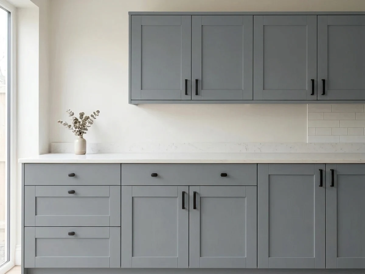
- Pairs cleanly with black hardware, brass, walnut, and warm white trim
- Doesn't drift toward purple or pink the way some blue-grays do
- Not a neutral — buyers hoping for "just gray" get real blue on four walls
- Goes flat and heavy in small, dim, lamp-only rooms
- Clashes with honey oak and other yellow-orange wood tones without a buffer
- Needs real daylight to earn its keep — a north room with a small window is a gamble
What Color Is Wolf Gray, Really?
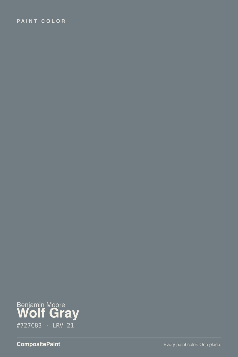
A deep slate blue-gray — and unlike most colors marketed as "gray," this one earns the blue honestly. Pull the RGB apart and blue sits highest, red lowest, by a real margin; our own color library files Wolf Gray under Blue, not Gray, and the numbers back that up. It reads less like a neutral wall color and more like a graphite-blue chosen on purpose, which is exactly why it shows up on kitchen islands and front doors more often than living-room walls — rooms where a little personality is the point, not a risk.
At LRV 21 it sits in the same depth range as Chelsea Gray (LRV 22) and well below Boothbay Gray (LRV 36) — deep enough to read as a real color statement in daylight, dark enough that a dim room can swallow it whole. That depth is also what concentrates the blue: the more paint on the wall, the more the undertone commits. A chip strip can look like a soft, ambiguous gray; four walls of Wolf Gray never gets mistaken for one.
Undertone in one line: blue-gray with a faint green undercurrent, no violet, no true black. In warm 2700K light it settles into a soft, almost-charcoal gray. In cool daylight or cool LEDs, the blue comes forward and it can read close to slate or gunmetal. Neither read is wrong — they're both this paint being honest about the light it's in.
Where It Shines
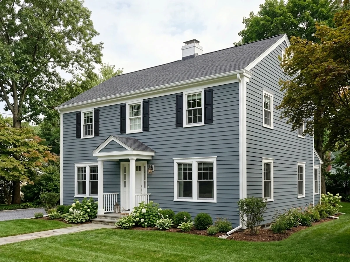
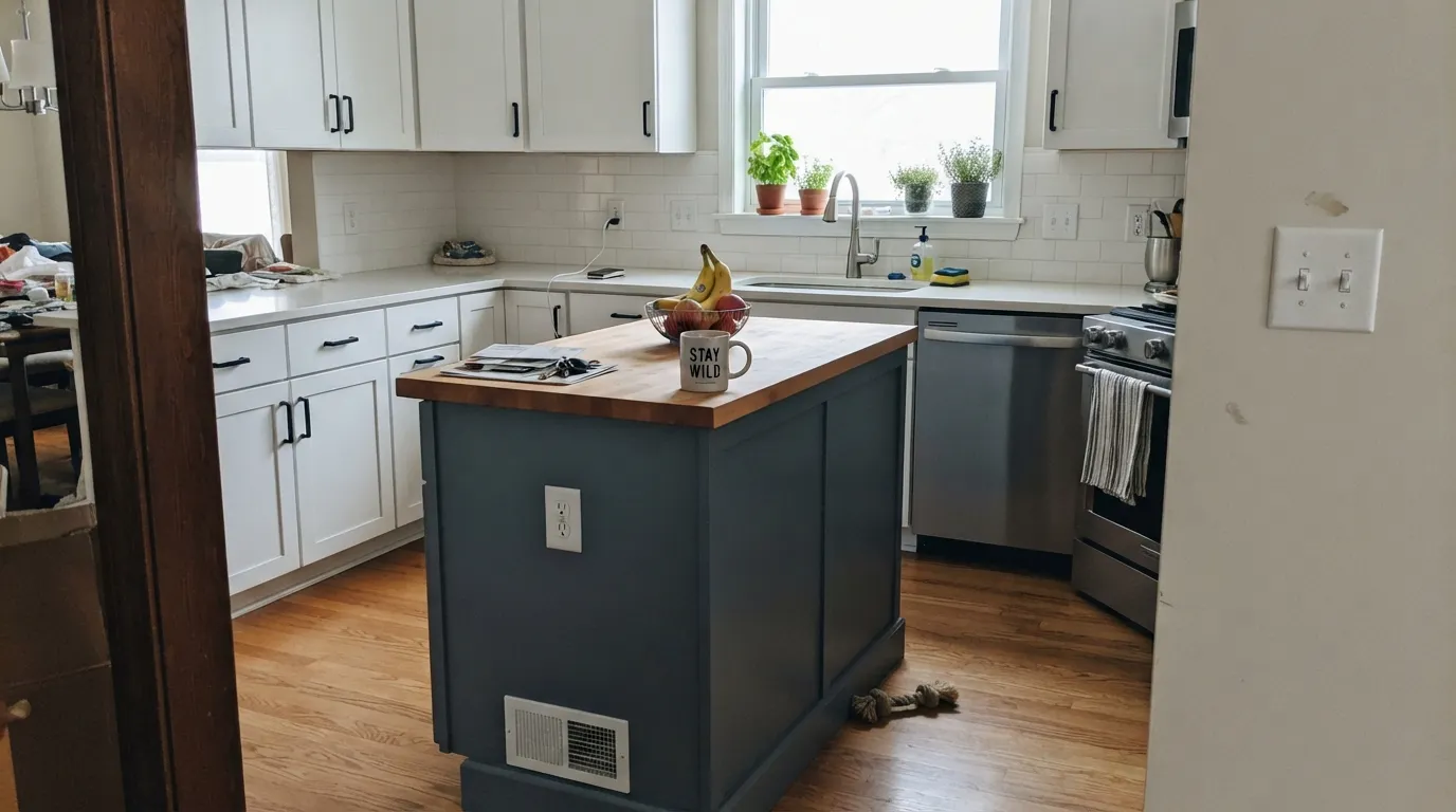
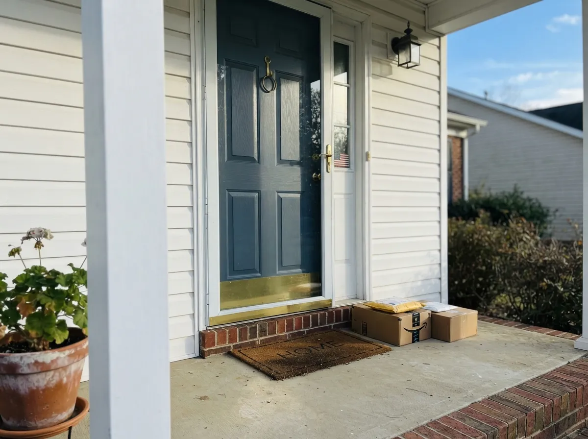
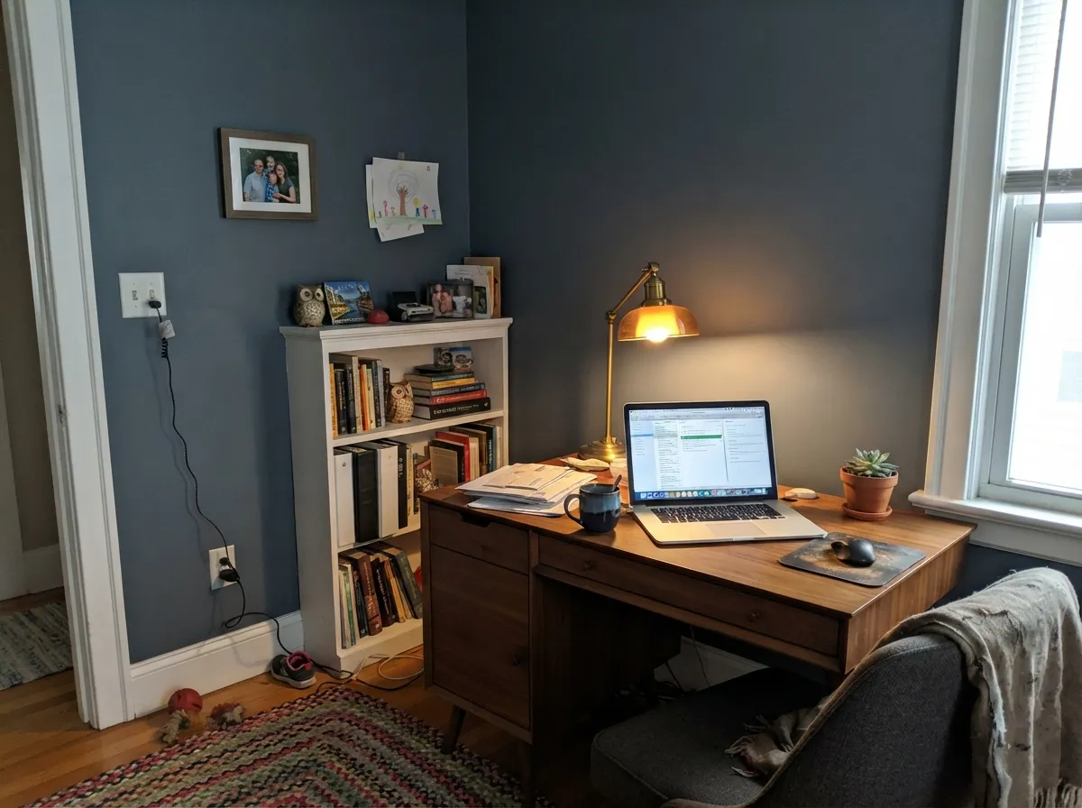
Give it a surface with real daylight and a job with some drama attached — a kitchen island, a front door, an exterior — and Wolf Gray does exactly what a blue-gray should: reads as a deliberate, confident color choice instead of an accident. It's especially good next to black hardware and warm wood, where the blue settles down and the color reads sophisticated rather than cold. On an exterior, paired with white or cream trim, it's one of the more convincing "not black, not navy, not gray" siding colors in the BM deck.
Where It Fails
Almost every disappointed review of Wolf Gray comes from one of three mismatches, and all three are avoidable before the first coat. None of them are a paint defect — they're expectation problems, and a large sample board fixes every one of them before you commit a whole room.
Wolf Gray is not a diplomatic greige — the blue is real, and depth concentrates it. On a chip it can look like an ambiguous, moody gray; on four walls, especially in daylight, nobody calls it neutral. If you actually want gray at this depth, look at Chelsea Gray instead — same weight, no blue.
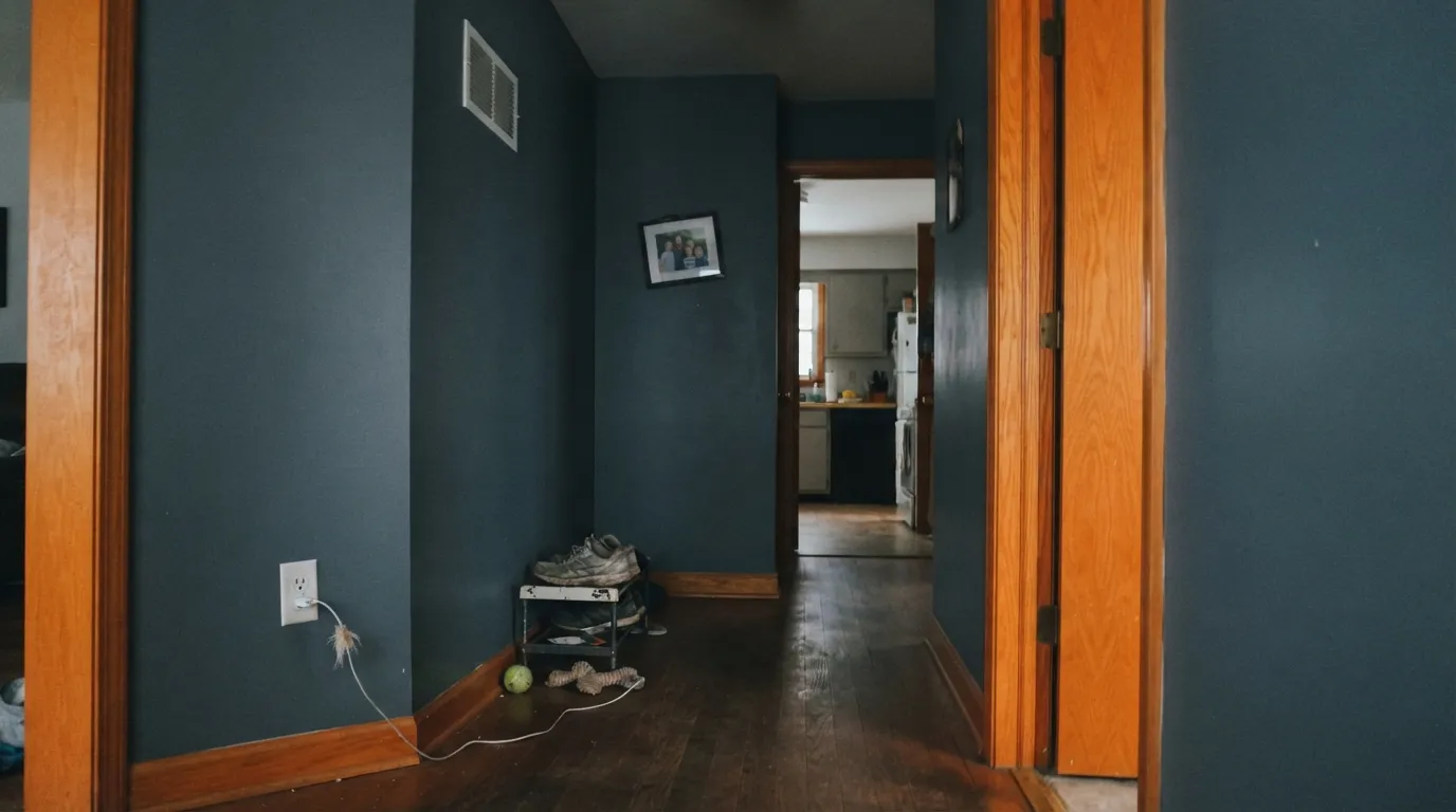
At LRV 21 it needs daylight or strong overhead light to read as slate blue instead of flat, heavy mud. A windowless powder room or a hallway lit by a single bulb is where readers report it going "battleship" or "cave-like." Reserve it for rooms with a window, or add real light before you paint.
Blue and orange sit opposite each other on the color wheel, and honey-toned oak floors run into the same clash every blue-gray does: the wall reads more blue, the floor reads more orange, and neither side wins. A large rug or a walnut/espresso floor keeps the peace; if the honey oak is staying and can't be covered, pick a warmer neutral instead.
Room by Room
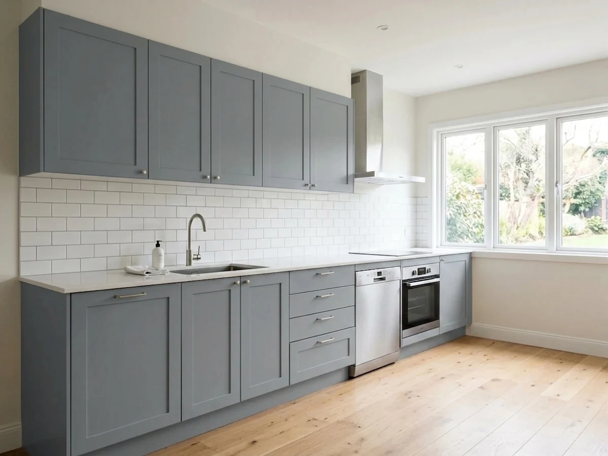
Painted on cabinetry against white or cream perimeter cabinets and a warm wood or butcher-block counter, the blue-gray reads custom and expensive rather than moody. Black hardware sharpens it; brass warms it. Satin or semi-gloss cabinet enamel, always.
Against white, cream, or brick, Wolf Gray is a confident, weathered-slate front door that doesn't read as loud as navy or as flat as true black. Full sun brings the blue forward; a shaded, north-facing entry keeps it closer to charcoal. Either way it's a deliberate choice, not a safe one — which is the point of a front door.
On siding it settles into a modern, slate-blue neutral that pairs cleanly with white trim and black windows. Full sun reads it lighter and more blue than the chip suggests; deep shade under trees pulls it closer to charcoal. Walk the house at different times of day with a large sample before committing to gallons.
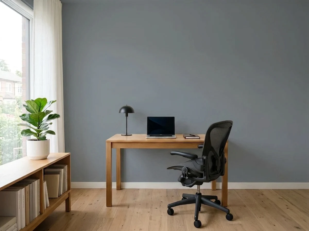
Against walnut shelving, leather, and brass reading-lamp light, Wolf Gray walls read like a study in an old hotel — moody without going black. Eggshell holds up to books sliding in and out; keep the trim a warm white so the contrast does the work.
One wall of Wolf Gray behind the headboard, a warm white on the rest, and 2700K bedside lamps: it reads calm and slate-dark at night, not cold. A full four-wall bedroom is a bigger commitment and needs real daylight to avoid feeling like a cave.
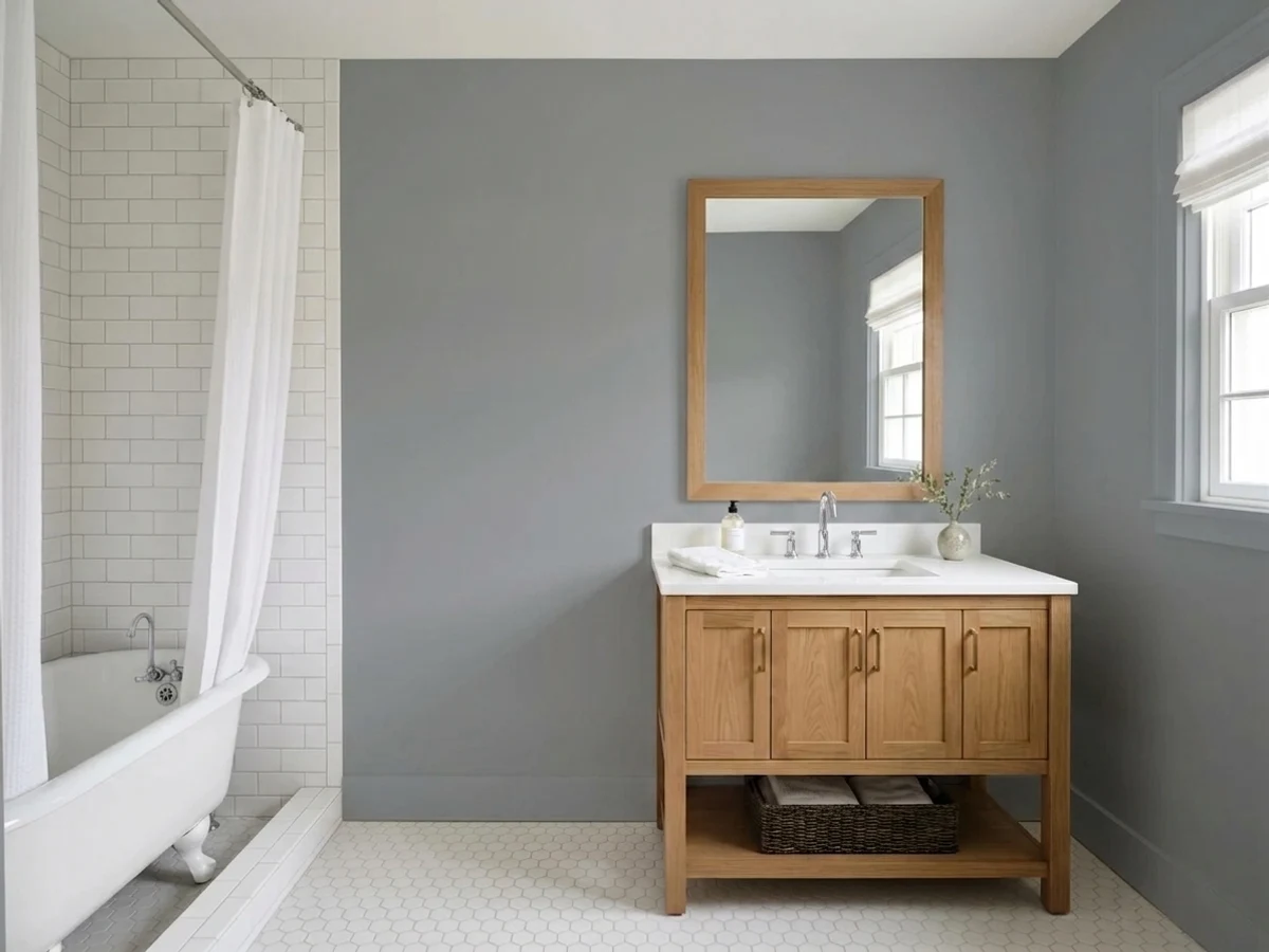
With warm marble, brass fixtures, and a wood vanity it's a genuinely striking small-room color. With cool blue-grey tile it pushes the whole room colder than most people want — sample it against your actual tile before painting.
Your Light Is the Risk
A covered porch, a north room with a big window, an overcast-but-bright day — the blue reads clean and true without going flat or washing out. This is the light Wolf Gray was made to be seen in.
Without real daylight the blue drains out and it reads heavy, flat, almost battleship gray. Small windowless rooms are the classic disappointment.
Morning and evening low sun pull it warmer and softer; midday sun reads it more blue and more saturated. Expect two sides of the same house to look like different colors at different hours — normal, not a defect.
2700K bulbs settle it into a soft, almost-charcoal gray with the blue muted. Cool LEDs sharpen the blue back up — closer to slate or gunmetal at night.
Most complaints about Wolf Gray are a light mismatch. Upload a photo of your actual room and see it on your walls — then ask for the same wall in north light or evening lamps before you buy a single sample.
Need It From Another Brand?
Any paint counter can custom-tint Benjamin Moore 2127-40 directly. If you would rather stay in one brand's own deck, these are the closest stock matches, measured as ΔE2000. Under 2 is a difference you will not see on the wall.
| Brand | Closest color | ΔE | LRV | |
|---|---|---|---|---|
| Sherwin-Williams | Foggy DaySW 6235 · Sherwin-Williams | 2.2 | 20 | Color page → |
| Behr | Deep ShalePPF-38 · Behr | 0.8 | 20 | Color page → |
| Valspar | Elephant Gray4006-2A · Valspar | 1.1 | 18.9 | Color page → |
| PPG / Glidden | PhantomPPG1036-6 · PPG / Glidden | 4.0 | 19 | Color page → |
| Glidden | French Grey70BG 19/071 · Glidden | 1.9 | 19 | Color page → |
| Dutch Boy | Industrialized434-5DB · Dutch Boy | 1.6 | 21 | Color page → |
Similar Benjamin Moore Colors
The nearest shades to Wolf Gray within Benjamin Moore's own range, ranked by perceptual color distance — useful when you want the same look a touch lighter, darker, or warmer.
WCAG 2.1: AA is 4.5 : 1 for normal text, 3 : 1 for large text, AAA is 7 : 1.
Wolf Gray vs the Colors You're Also Considering
Every Wolf Gray sample board has the same rivals on it. The numbers show the real lightness gap — then it comes down to which risk you would rather live with.
Pick this when you want the depth and the blue to actually show, not just flash in certain light.
Benjamin Moore HC-165 · LRV 36Boothbay GrayPick this for the same blue-gray family at half the depth — light enough that most buyers call it "just gray."
Pick this when the blue is the whole reason you're here, not an accident you're trying to avoid.
Benjamin Moore HC-168 · LRV 22Chelsea GrayPick this if you want the exact same depth without the blue — a warmer charcoal-greige for the same islands and exteriors.
Smoke Gray 2120-40 at #757B82 and LRV 21 and Silver Streak 2119-40 at #757B83 and LRV 21 are both a shade more neutral than Wolf Gray, with slightly less blue. Black Pepper 2130-40 at #717C86 and LRV 21 goes the other way, holding more blue, so it edges toward slate. Normandy 2129-40 at #6D7E89 and LRV 22 is the bluest of the group and reads closest to a soft denim. Eclipse 2132-40 at #717980 and LRV 20 is the darkest and flattest, and Montpelier AF-555 at #718087 and LRV 21 pulls green.
Across brands, Behr Deep Shale PPF-38 at deltaE 0.85 is effectively the same color, and Valspar Elephant Gray 4006-2A at 1.09, Dutch Boy Industrialized 434-5DB at 1.62, and Glidden French Grey 70BG 19/071 at 1.91 are all visually identical in normal room light. Sherwin-Williams Foggy Day SW 6235 at 2.24 is very close but sample it first, since it holds less blue. Farrow & Ball Barrow Blue No. G8 at 3.57 and PPG Phantom PPG1036-6 at 3.95 are close but visibly different side by side, both greener.
Wolf Gray Coordinating Colors
The rule for coordinating with Wolf Gray is simple: keep the whites warm and let the wood do the warming. It sits cleanly next to warm off-whites, tonal charcoal-greiges, and true near-blacks — and it argues with anything yellow-orange unless there's a buffer between them. These are the partners that keep showing up in rooms that work:
Wolf Gray's Reputation: A Workhorse, Not a Headline
Wolf Gray hasn't had a Color of the Year moment, and it doesn't need one. It's the kind of color that shows up on paint-store recommendation lists and "best blue-gray" round-ups year after year without ever being the headline — a dependable pick for kitchen islands, front doors, and exteriors when a client wants more personality than a greige but isn't ready to commit to true navy or black. That's a good place for a color to live: it means the reputation is built on people actually using it and coming back, not on one viral photo.
If your painter suggests it for an island or a door, that's the track record talking — it's a genuinely well-behaved blue-gray, not an unproven trend color.
Wolf Gray With Wood Tones and Metals
Walnut, espresso, and weathered gray wood are the easy partners — the cool blue-gray and the cool-to-neutral wood tone don't fight, and the combination reads intentional on cabinetry, built-ins, and exterior doors alike. Pale white oak works too, as a lighter, calmer contrast.
Honey oak and other yellow-orange woods are the one real problem: complementary colors amplify each other, so the floor reads more orange and the wall reads more blue the longer you look. A rug or a change of wood tone solves it; painting around it usually doesn't.
Metals are forgiving. Black hardware sharpens the color and reads modern; brass and unlacquered bronze warm it up and read more traditional. Chrome and polished nickel are the only finishes that can tip the whole pairing cold.
Three Ready Palettes Built on Wolf Gray
A color is never alone on the wall. These are complete combinations in the 60-30-10 pattern, with the reason each one holds together. Every one opens in the visualizer.
Simply White keeps the perimeter bright enough to carry the island's depth; Kendall Charcoal on the windows ties the darker note together without adding a second color story. Black or brass hardware finishes it — black sharpens the blue, brass warms it.
Try this palette in your roomWhite Dove siding keeps the house warm enough that the blue door reads deliberate, not cold; Wrought Iron on the garage door sits close enough in value to Wolf Gray that the two dark notes read as one considered palette instead of two competing ones.
Try this palette in your roomChelsea Gray on the built-ins sits at nearly the same depth as the walls but reads warmer, so the room gets two distinct notes instead of a flat monochrome. White Dove trim keeps the edges from disappearing into all that blue-gray.
Try this palette in your roomWolf Gray FAQ
Is Wolf Gray more blue or more gray?
More blue than most buyers expect. It chips and photographs as an ambiguous, moody gray, but on four walls in real light the blue is unmistakable — our own color library files it under Blue, not Gray, for exactly that reason. If you want a genuinely neutral gray at the same depth, Chelsea Gray is the better pick.
Is it good for kitchen cabinets or an island?
Yes — it's one of Wolf Gray's best jobs. Against white or cream perimeter cabinets and a warm wood counter, it reads sophisticated rather than moody. Use a satin or semi-gloss cabinet enamel; both black and brass hardware work.
What trim white goes with Wolf Gray?
A warm white — White Dove or Simply White — keeps the pairing from reading cold. A stark, blue-leaning white doubles down on the cool side and can make the whole space feel chilly.
Does it work as an exterior color?
Yes, and it's one of its stronger jobs: paired with white trim and black windows it reads as a modern slate-blue that doesn't go full navy or full black. Expect it to look noticeably lighter and bluer in full sun than in the can or on the chip.
Will it clash with my wood floors?
Only if they're honey oak or another yellow-orange wood with no buffer — blue and orange are complements and amplify each other. Walnut, espresso, and pale white oak all sit comfortably with it.
How dark does it read in a small room?
Darker than the LRV 21 number suggests if the room is short on daylight. In a windowless bath or a dim hallway it can read close to charcoal. In a room with a real window it reads as a clear, considered blue-gray, not a cave.
Have you painted with Wolf Gray?
Rate it — one tap helps the next reader decide.
Ask a Question