Chelsea Gray
The designer charcoal-greige on every island and every farmhouse exterior, reviewed honestly: the undertone that flashes green in the afternoon and purple next to the wrong neutral.

Jessica has spec'd whites and neutrals for more than 300 rooms and keeps a sample wall of painted drawdowns in her studio. Every color review is checked against real reader rooms in the comments and re-tested when a formula changes. About the testing process →
- 1Black Fox7
- 2Pewter Green12
- 3Chelsea Gray23
- 4Stardew43
- 5Quietude48
The Fast Verdict
Chelsea Gray is the color designers reach for the moment a client says "I want gray, but with some soul." It is warm, velvety, and sits right at the edge of charcoal without tipping all the way into black — which is exactly why it works on kitchen islands, whole exteriors, and single accent walls instead of just trim.
The catch is the undertone: it is not a flat gray. It carries brown, a real streak of green, and in the wrong light a flash of violet, and that three-way mix is the whole story of both its best rooms and its worst reviews.
Kitchen islands and cabinets · whole-house exteriors and front doors · a single moody accent wall · powder rooms and vanities · anyone who wants "gray" with visible depth, not a flat neutral
You want a true, undertone-free gray with zero personality · your home is a cool-light, north-facing box with no warm materials · you are painting a whole interior's base wall color, not an accent · your countertops or siding are already cool blue-gray
- One of BM's most-used charcoal-greiges for islands, exteriors, and accent walls — proven, not trendy
- Reads noticeably brighter and warmer in real sun than the chip suggests
- Warm enough to pair with red brick, stone, and wood without a fight
- Deep enough (LRV 23) to read as a deliberate color, not indecisive gray
- Historical Collection pedigree — decades of use, not a two-year trend color
- Genuinely three-way undertone (brown/green/violet) — surprises buyers expecting flat gray
- Strong afternoon sun can push it visibly green for an hour or two
- Next to cool grays or blue-whites, the violet undertone shows
- Too dark and too characterful to work as a whole-house interior neutral
What Color Is Chelsea Gray, Really?
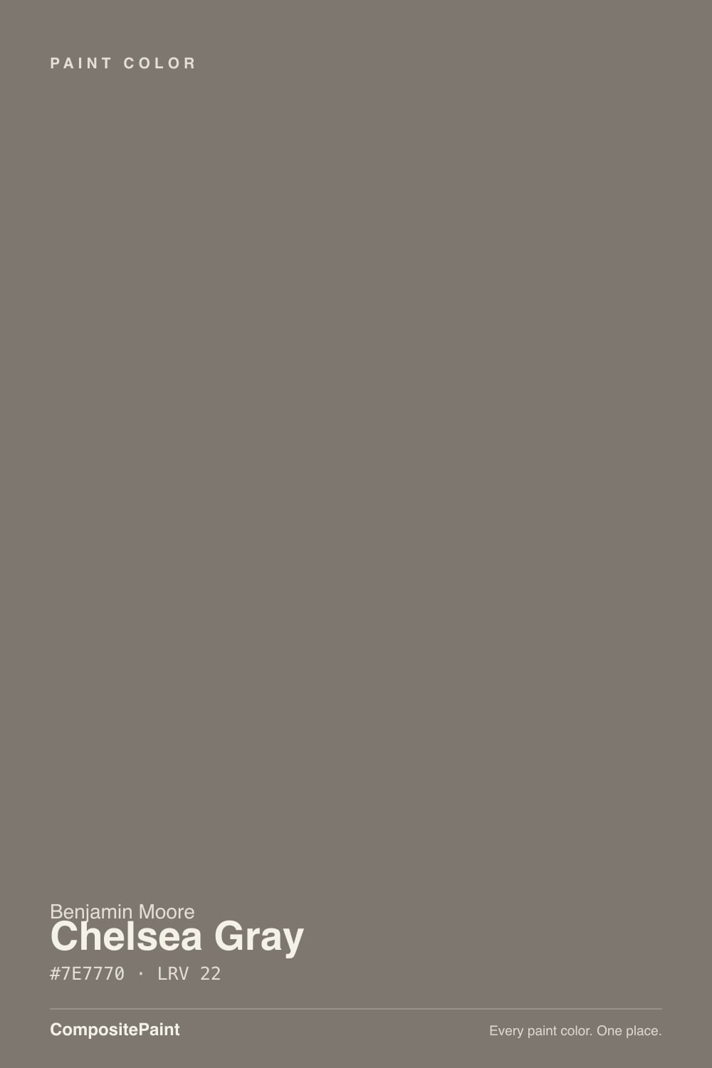
Chelsea Gray is Benjamin Moore's Historical Collection entry HC-168, and the collection tag matters: this is not a trend color invented for a Pinterest moment, it is a decades-old warm charcoal-gray that the current farmhouse-exterior and moody-kitchen-island trends simply rediscovered. Where a lot of "greige" paints split cleanly into either warm-beige or cool-gray, Chelsea Gray's undertone is genuinely layered — a brown base carries the weight, a real green surfaces in strong daylight, and in cooler or artificial light a violet flash can show through. Reviewers who chart its undertone in detail (Kylie M Interiors, Brick & Batten, and others who've painted it in multiple homes) consistently land on this same three-way mix rather than a single clean answer, which is unusual even among BM's more complicated grays.
At LRV 23 it sits in real charcoal-greige territory: noticeably lighter and less committed than Kendall Charcoal (LRV 13), but far too deep to function as a whole-house interior neutral the way a beige or a light gray would. That depth is the point on an island, a front door, or one accent wall — it reads as a deliberate color choice, not "we couldn't decide." Multiple reviewers note it looks noticeably brighter and warmer in direct exterior sunlight than the chip or a north-facing interior sample suggests, which is why so many owners test it indoors, think it looks almost black-brown, then paint the exterior and get a color that reads a full step lighter and warmer once the sun hits it.
Undertone in one line: brown first, green when the light is strong and warm, violet when the light is cool or the neighbors are cool-toned. All three are real — which one you see depends on your light and what is sitting next to it on the wall.
Where It Shines
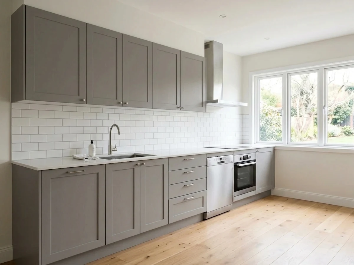
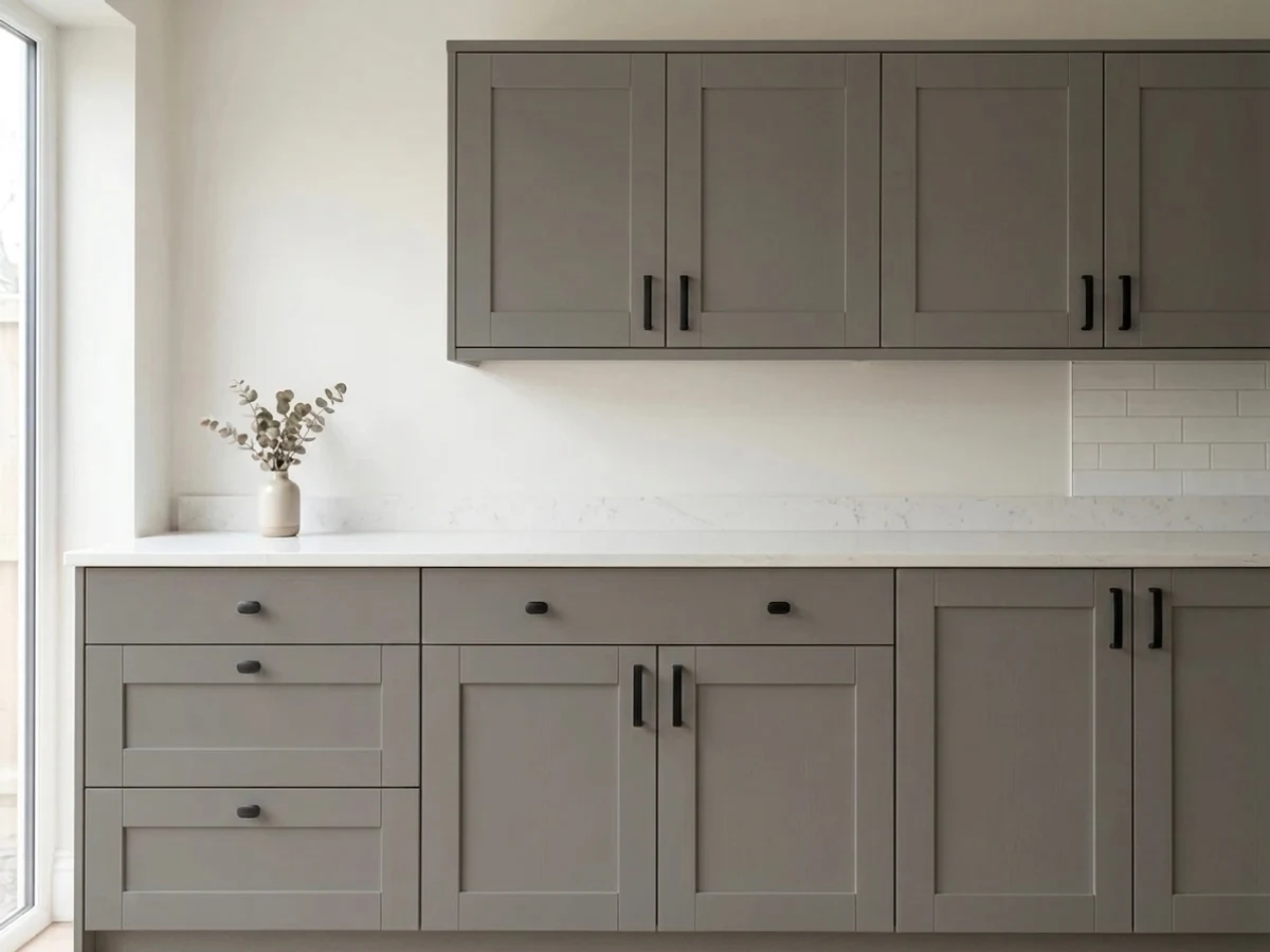
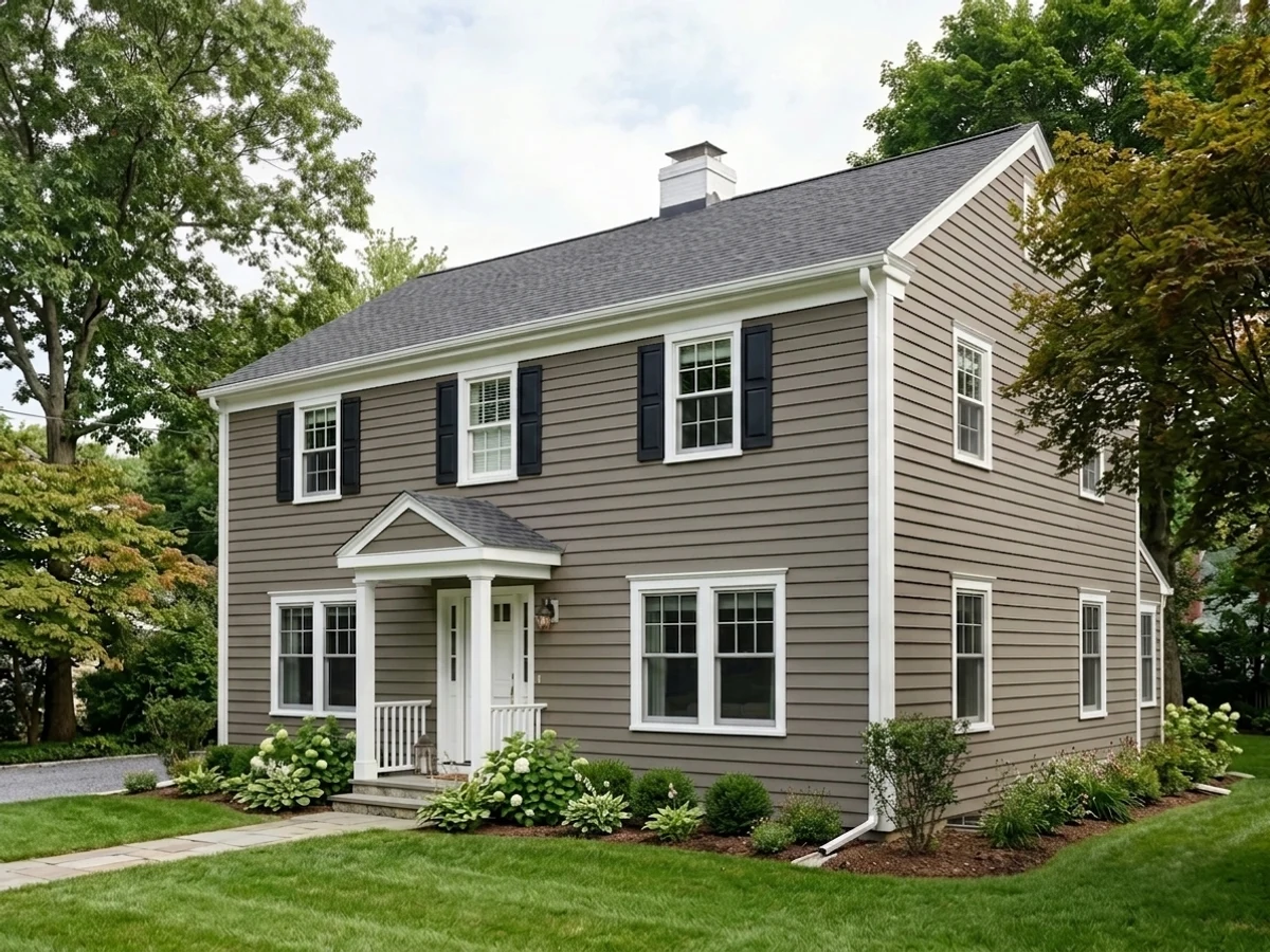
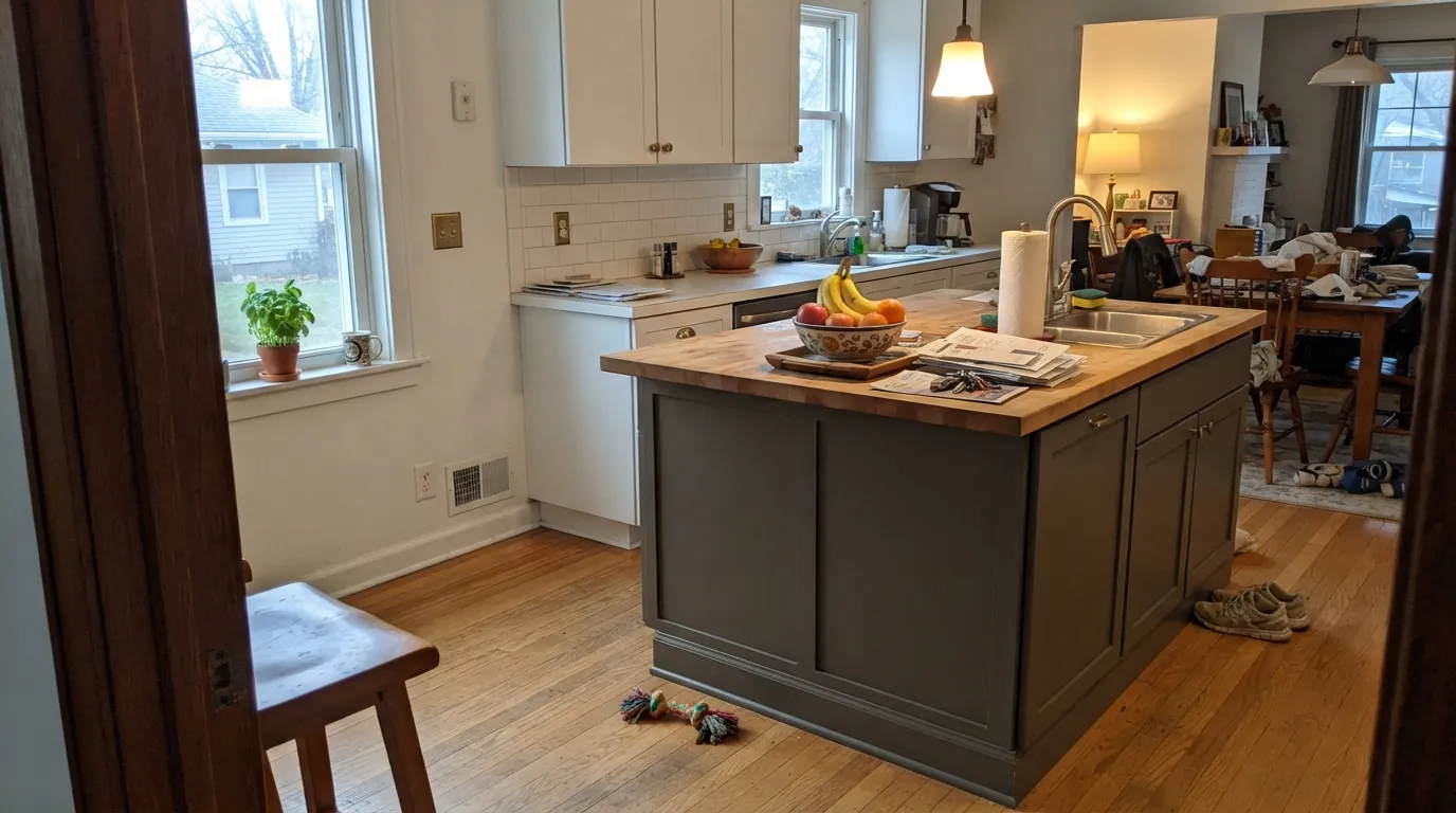
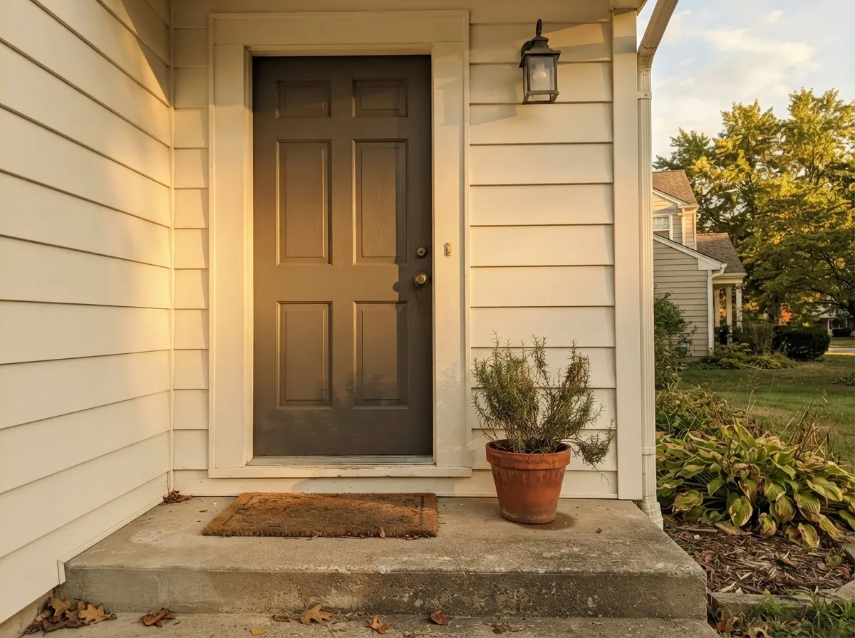
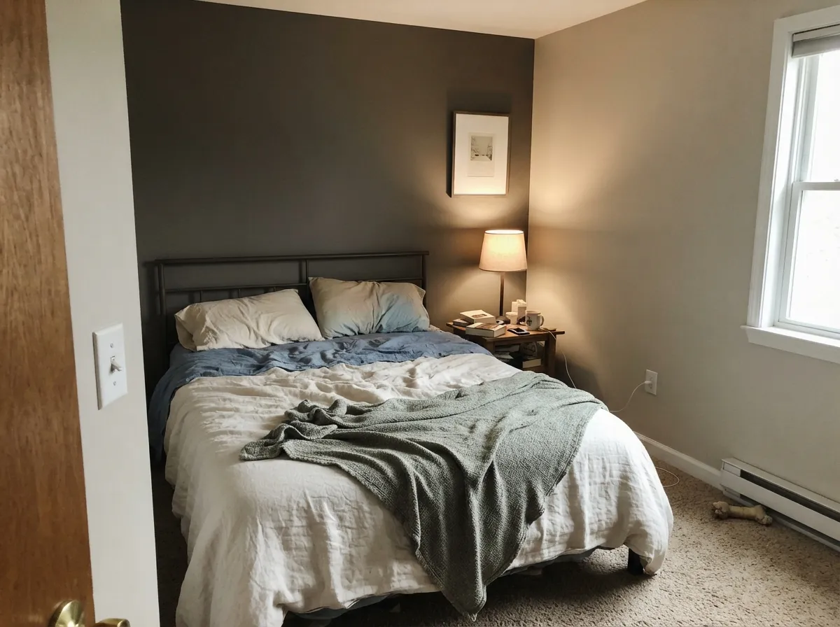
This is a color built for a supporting role, not a background one. On a kitchen island against white or off-white perimeter cabinets it is the single most-repeated use case in every review of this color — the depth reads expensive next to brass or unlacquered hardware, and it does not fight butcher block or white quartz the way a true black would. Its other home is the whole exterior: with warm trim white and black windows it is a modern-farmhouse staple, and unlike most dark exteriors it does not go flat or muddy in full sun — it warms up and gets more interesting. As a single accent wall in a bedroom or den, one wall of Chelsea Gray against a lighter warm neutral gives a room real depth without the commitment of four dark walls.
Where It Fails
Almost every disappointed review of Chelsea Gray traces back to one of three predictable mismatches, and none of them are really the paint's fault — they are the three-way undertone meeting the wrong light or the wrong neighbor color.
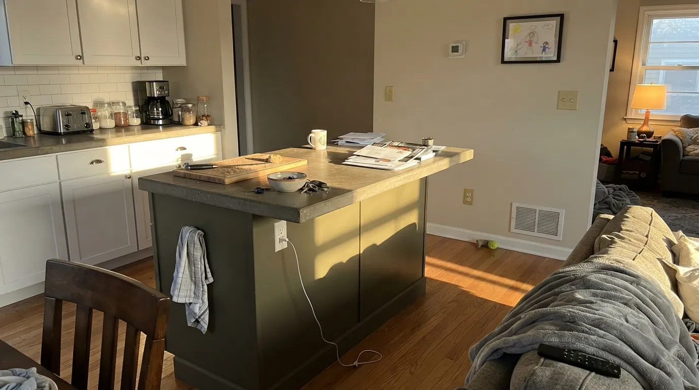
West-facing exteriors and kitchens that get hard late-day light are where the green in the undertone comes forward hardest — owners who picked it expecting "charcoal gray" report the island or the siding reading distinctly olive-green for an hour or two each afternoon. It is real, it is the paint being honest about its undertone, and it is worse the stronger and lower the sun angle is.
Put Chelsea Gray next to a true cool gray or a blue-leaning white and the violet in its undertone becomes the dominant story — the two colors argue instead of coordinating. The fix is to keep its neighbors warm: warm whites like White Dove or Swiss Coffee, not a cool builder white or a blue-gray.
At LRV 23 it is simply too dark and too much of a statement to be a background neutral for every room. Owners who paint it wall-to-wall through a whole interior report the house feeling heavy and dim rather than "moody-chic." It wants to be the one deep note in a room built around lighter neutrals — an island, an accent wall, a door — not the whole palette.
Room by Room
Against White Dove or another warm white perimeter, Chelsea Gray on the island is the most-repeated success story for this color. Satin or semi-gloss cabinet enamel, brass or unlacquered hardware, and it never fights butcher block or white quartz.
Full sun reads it brighter and warmer than any interior sample suggests. With warm white trim and black windows it is a modern-farmhouse classic; with red brick or warm stone it settles in rather than clashing. Satin exterior finish.
Deep enough to read as a real color decision without going full black. Semi-gloss for durability and to catch the light that keeps the green-brown warmth visible.
One wall, matte or eggshell, against a lighter warm neutral like Edgecomb Gray or Pale Oak. Gives a bedroom or den real depth without the whole-room commitment that trips people up.
Small rooms take deep color well, and Chelsea Gray on cabinetry or all four walls of a powder room reads custom rather than dark-for-the-sake-of-it. Satin on the vanity.
Too dark and too much personality to carry an entire home as the base neutral — this is the mismatch behind most of its negative reviews. Use it as the accent, not the background.
Your Light Is the Risk
Warms up and brightens a full step from how it reads indoors — the brown-green comes forward and it looks richer, not muddier. This is the light it was made for.
The same warmth that flatters it outdoors can tip visibly green for an hour or two on west-facing walls and islands. Sample at 4-6pm before committing to that wall.
Cools down and can read flatter, with the violet undertone more visible than the green. Fine if you like it moodier; test first if you expected pure charcoal.
Warm 2700K lamps deepen it toward a cozy brown-charcoal. Cool white LEDs pull the violet forward and flatten it — swap the bulbs before you blame the paint.
Most complaints about Chelsea Gray are a light mismatch. Upload a photo of your actual room and see it on your walls — then ask for the same wall in north light or evening lamps before you buy a single sample.
Need It From Another Brand?
Any paint counter can custom-tint Benjamin Moore HC-168 directly. If you would rather stay in one brand's own deck, these are the closest stock matches, measured as ΔE2000. Under 2 is a difference you will not see on the wall.
| Brand | Closest color | ΔE | LRV | |
|---|---|---|---|---|
| Sherwin-Williams | Mountain RoadSW 7743 · Sherwin-Williams | 2.6 | 23 | Color page → |
| Behr | Barnwood GrayPPU24-07 · Behr | 0.7 | 23 | Color page → |
| Valspar | Dorian GrayT511 · Valspar | 2.9 | 22.2 | Color page → |
| PPG / Glidden | Sweater WeatherPPG0999-5 · PPG / Glidden | 2.5 | 23 | Color page → |
| Glidden | So SublimePPG1006-5 · Glidden | 2.8 | 23 | Color page → |
| Dutch Boy | Promising Gray439-4DB · Dutch Boy | 2.1 | 24 | Color page → |
Similar Benjamin Moore Colors
The nearest shades to Chelsea Gray within Benjamin Moore's own range, ranked by perceptual color distance — useful when you want the same look a touch lighter, darker, or warmer.
WCAG 2.1: AA is 4.5 : 1 for normal text, 3 : 1 for large text, AAA is 7 : 1.
Chelsea Gray vs the Colors You're Also Considering
Every Chelsea Gray sample board has the same rivals on it. The numbers show the real lightness gap — then it comes down to which risk you would rather live with.
Pick this if you want the lighter, more livable middleweight that still reads clearly as a color, not a near-black.
Benjamin Moore HC-166 · LRV 13Kendall CharcoalPick this if you want true deep charcoal — it commits to green and skips most of the violet flash, at nearly half the LRV.
Side-by-side comparison →Pick this when you want the accent-wall or island depth that a light greige simply cannot give a room.
Benjamin Moore HC-170 · LRV 59Stonington GrayPick this for a whole-house interior neutral with almost none of the undertone drama — the safe choice Chelsea Gray is too dark to be.
Pick this for the specifically gray-charcoal read, with more green-brown range than Urbane Bronze's straight bronze-brown.
Sherwin-Williams SW 7048 · LRV 8Urbane BronzePick this if your painter works in Sherwin-Williams and you want a deeper, browner dark neutral with a steadier undertone.
Kendall Charcoal HC-166 is the next step down in the same family. At LRV 13 it is clearly darker and slightly cooler, so it reads closer to true charcoal. Choose Kendall Charcoal when you want near-black drama on an exterior or accent wall; choose Chelsea Gray when you want the same character but need the room to stay visibly gray rather than shadowed.
Amherst Gray HC-167, at LRV 19, sits just below Chelsea Gray and carries a subtle green cast in many lights. Side by side, Chelsea Gray looks warmer and browner, Amherst Gray a bit mossier. If your room has lots of greenery or cooler finishes, Amherst Gray can integrate better; with warm woods, Chelsea Gray usually wins.
From Sherwin-Williams, Dovetail SW 7018 at LRV 26 is the closest popular rival. It is a step lighter and slightly softer, so it forgives dim rooms more. In a bright space the two are hard to tell apart on the wall.
Chelsea Gray Coordinating Colors
The rule for coordinating with Chelsea Gray: keep its neighbors warm and let it be the one deep note in the room. It pairs beautifully with warm whites, soft warm greiges, and one true near-black for contrast — and it argues with cool, blue-leaning neutrals that pull its violet undertone forward. These are the partners that keep showing up in rooms and exteriors that work:
Why a Historical Collection Color Became a Modern Farmhouse Staple
Chelsea Gray has been in Benjamin Moore's Historical Collection for decades, which is worth knowing because it explains why the color survives design cycles that killed off flashier grays. It was never built for a single trend — it was built to look like it belonged in an older house, which is exactly the quality the 2010s-2020s modern-farmhouse exterior wave went looking for when black and near-black houses started to feel overdone.
The island and the exterior both work for the same underlying reason: Chelsea Gray reads as "a real color with depth," not "we couldn't decide between gray and brown." Designers use it precisely because the three-way undertone that trips up some homeowners is what keeps a large surface — a whole facade, a big island — from looking flat under changing daylight. A perfectly neutral gray would look identical at 9am and 5pm; Chelsea Gray visibly lives through the day, and most owners who understand that going in end up loving it for exactly that reason.
Chelsea Gray With Wood Tones, Brick, and Stone
This is where the warm undertone earns its keep. Red brick, warm stone, cedar, and butcher block all sit comfortably against Chelsea Gray because the brown in its undertone meets them halfway — it is one of the few dark grays that genuinely settles in next to a red-brick exterior instead of fighting it, which is part of why it shows up so often on brick-and-siding combination houses.
Indoors, oak and walnut both work well as flooring under a Chelsea Gray island or accent wall, though very orange, glossy honey-oak floors can push the green in the paint forward the same way strong afternoon sun does — sample the paint above the actual floor before committing to a full island repaint.
The one combination to test carefully is cool gray stone or quartz with strong blue veining: it is the countertop equivalent of a cool neighbor color, and it can pull the violet undertone forward the same way a blue-white trim does. Warm-veined quartz or a honed, warm-toned stone is the safer match.
Three Ready Palettes Built on Chelsea Gray
A color is never alone on the wall. These are complete combinations in the 60-30-10 pattern, with the reason each one holds together. Every one opens in the visualizer.
The most-repeated success story for this color: White Dove keeps the perimeter light and warm, Pale Oak's soft greige walls give the room a quiet backdrop, and the island carries all the depth by itself. Brass or unlacquered hardware finishes it.
Try this palette in your roomCrisp white trim keeps Chelsea Gray from reading muddy against the house's warm daytime light, and Wrought Iron adds the single near-black note that makes the whole scheme look intentional rather than just "dark house." Works especially well with red brick or warm stone accents.
Try this palette in your roomEdgecomb Gray shares Chelsea Gray's warm-brown lean, so the accent wall reads like a deeper version of the same room instead of a clashing statement. White Dove trim keeps the edges soft and stops the dark wall from feeling like a hole in the room.
Try this palette in your roomChelsea Gray FAQ
Is Chelsea Gray warm or cool, gray or green?
Warm, and genuinely a three-way undertone: brown carries the weight, green surfaces in strong daylight, and violet can flash through in cooler or artificial light. It is not a flat, undertone-free gray — if that is what you want, this is the wrong color.
Chelsea Gray or Kendall Charcoal — which one?
Kendall Charcoal (LRV 13) is nearly half the lightness and commits harder to green, with almost no violet flash. Chelsea Gray (LRV 23) is the more livable middleweight — clearly a color, not a near-black, and easier to live with on a whole exterior or a large island.
Is it good for a kitchen island?
It is arguably the color's best-known use. Against a white or off-white perimeter, satin or semi-gloss Chelsea Gray on the island reads deep and expensive without fighting butcher block, white quartz, or brass hardware.
Does it work as a whole-house interior wall color?
Not well. At LRV 23 it is too dark and too much of a statement to carry every room as a background neutral — owners who try it wall-to-wall report the house feeling heavy rather than intentional. Use it as one accent wall, an island, or a door instead.
What trim color goes with a Chelsea Gray exterior?
White Dove for a soft, warm trim, or Chantilly Lace when you want maximum crisp contrast — both are proven with it. What to avoid is a blue-leaning gray-white: it pushes Chelsea Gray’s violet undertone forward and the two colors start to argue.
How many coats does it take, and does it need primer?
Two coats over a similar mid-tone; three over a light color or bare drywall, since it is a saturated dark hue. A gray-tinted primer first saves a coat of finish paint and gives the truest color match, especially on exteriors going over an old light-colored siding.
Have you painted with Chelsea Gray?
Rate it — one tap helps the next reader decide.
Ask a Question