Mountain Road
A green-gray Sherwin-Williams workhorse reviewed honestly: the light where the olive shows, the light where it goes muddy, and what to pick instead.

Jessica has spec'd whites and neutrals for more than 300 rooms and keeps a sample wall of painted drawdowns in her studio. Every color review is checked against real reader rooms in the comments and re-tested when a formula changes. About the testing process →
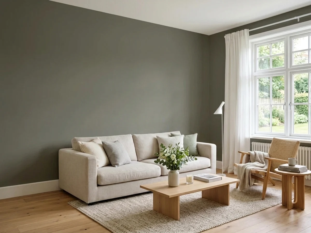
- 1Nocturne8
- 2Mocha Latte17
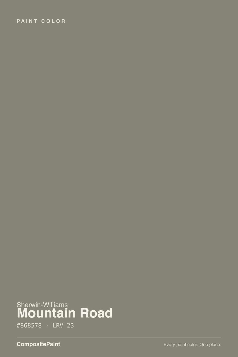
- 3Mountain Road23
- 4Mindful Gray48
- 5Light French Gray53
The Fast Verdict
Mountain Road is Sherwin-Williams' quiet answer to a question nobody asks out loud: can a gray have a pulse without turning into a full sage? It sits at a genuine mid-depth — LRV 23 — with a whisper of olive-khaki hiding just under a gray surface, so it reads as three slightly different colors depending on the room and how much sun it gets. It has no Color of the Year plaque and no viral kitchen behind it. This is a workhorse a colorist reaches for quietly, not a color anyone name-drops at a dinner party — and that is a compliment, not a knock.
Home offices and studies wanting depth without charcoal · kitchen islands and lower cabinets · exterior siding paired with black windows · anyone circling the sage/olive trend who still wants the room to read gray first
Your room runs on cold LEDs with little natural light · you want a definitively clean gray with zero green · your floors are bright honey oak with nothing to contrast against · you need a color everyone in the room will instantly recognize
- Genuinely reads gray, green, and khaki depending on the room — never flatly one thing
- Deep enough (LRV 23) to ground a space without going full charcoal
- Near-identical Benjamin Moore twin exists if your painter only stocks that line
- Earns its keep on cabinetry, islands, and exterior siding, not just walls
- Pairs cleanly with warm whites, matte black metal, and weathered wood
- Cool light — north rooms, fluorescent, cold LEDs — drains it to a flat, muddy gray
- A real mid-depth color needs an actual light plan, not just an overhead fixture
- Buyers hunting for a clean, true gray get visible olive instead
- Loses definition against same-tone honey oak floors with nothing to contrast it
What Color Is Mountain Road, Really?
Sherwin-Williams files Mountain Road under its Neutral family, but color databases and paint-matching sites more often call it a deep, earthy green with brown and yellow undertones — the gray is real, but so is the green, and which one you notice first depends on the light. It is close enough to Benjamin Moore's Gunsmith Gray that cross-brand color-matching tools list it as the nearest equivalent, which is usually a sign a color is a genuine load-bearing neutral rather than one brand's invention — more than one deck-maker landed on a similar formula because the market wanted a deep, green-leaning gray for offices, cabinetry, and exteriors.
At LRV 23 it is a real mid-depth color, not a light-gray-adjacent white. It reads closer to a warm charcoal than to a pale greige, which is exactly why it works as the deeper half of a two-tone kitchen or a study wall that needs weight without going full black. A color this deep needs real ambient light to look intentional rather than like a shadow — plan actual lamps or daylight, not just an overhead fixture, before you commit a whole room to it.
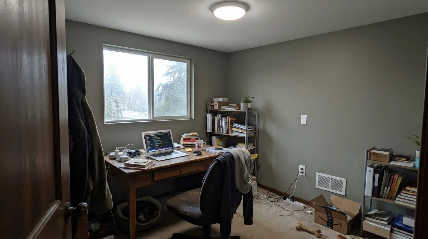
Undertone in one line: green-gray with a khaki whisper, never blue, never purple. Warm daylight pulls the olive forward; cool light — north-facing rooms, fluorescent tubes, cold LEDs — flattens it toward a plain, slightly muddy stone gray. Both reads are the same paint being honest about the light it's in.
Where It Shines
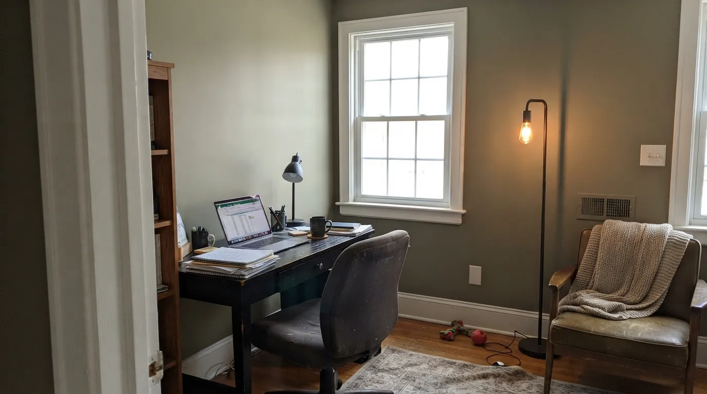
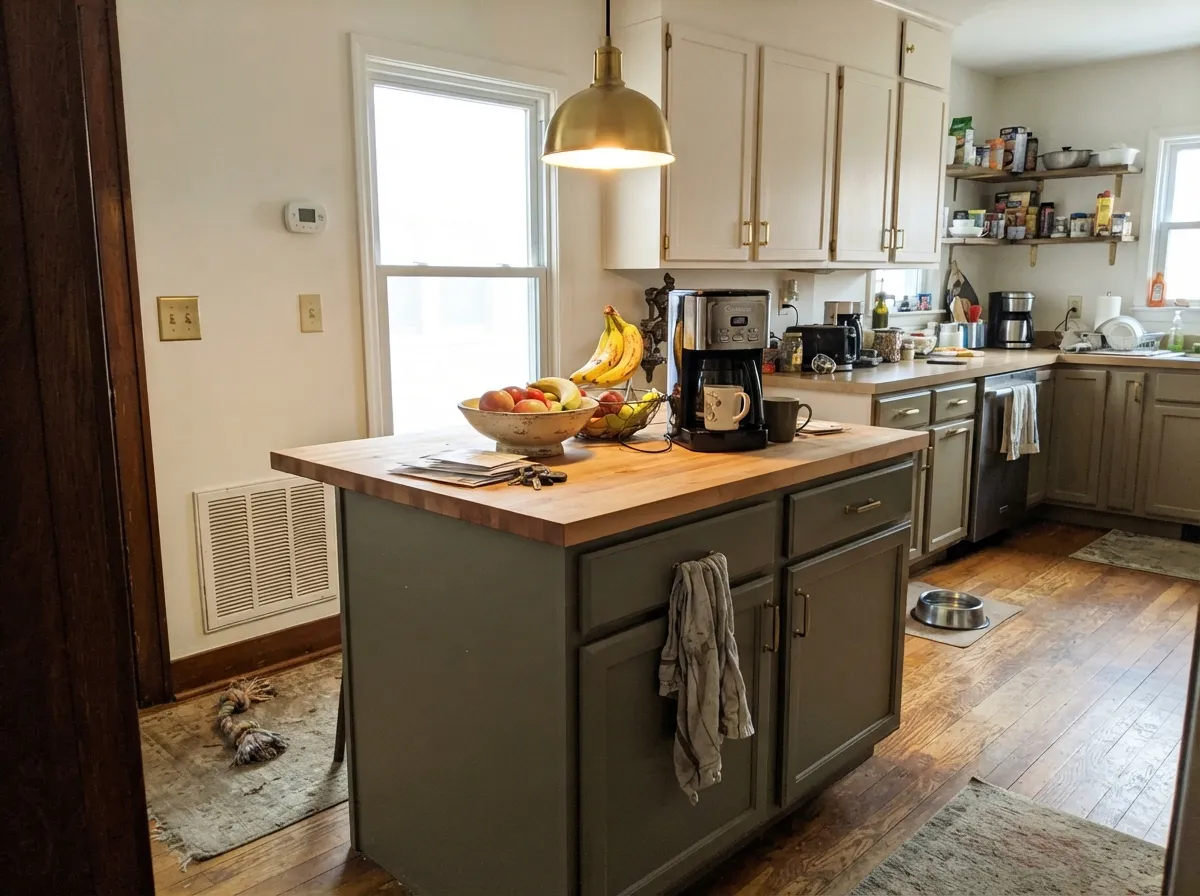
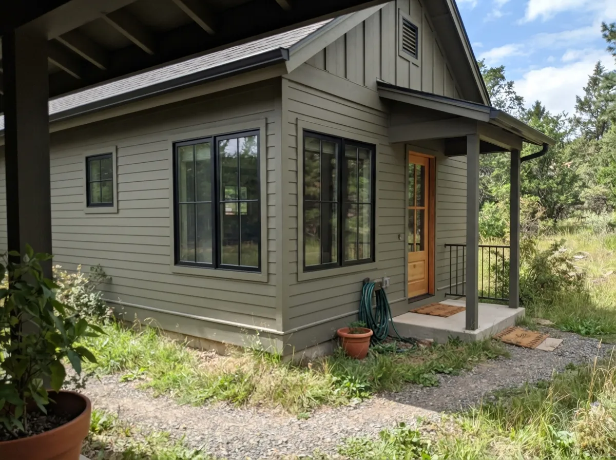
This color is built for the room that wants depth without the drama of a true dark. Give it a real window and it becomes the deep, grounded neutral a study or den has been missing — enough color to feel deliberate, not enough to demand a whole design scheme around it. Its second home is the small commitment: an island against pale upper cabinets, a run of exterior siding under black window frames, a powder-room vanity. Pair it with creamy off-whites, matte black hardware, and weathered or dark wood, and it looks like a color someone chose on purpose rather than defaulted into.
Where It Fails
Almost every disappointing story with Mountain Road traces back to one of three predictable situations. None of them are the paint failing — they're the paint being asked to do a job its light or its neighbors won't let it do.
North-facing daylight, fluorescent tubes, and cold LEDs all do the same thing to Mountain Road: they strip the olive out and leave a flat, slightly muddy stone gray that reads dingy rather than intentional. The paint didn't fail — the light did. Add warm 2700K lamps or move it to a room with real sun.
This is a green-gray, not a neutral gray, and depth makes undertones louder, not quieter — the olive that looks like a rumor on the chip is unmistakable on four walls. If "gray with zero green" is the actual goal, this is the wrong color; look at a true gray instead and let Mountain Road stay in the cabinetry aisle.
Both the floor and the wall are warm, mid-depth, and yellow-leaning, so instead of clashing they merge into a beige-green blur with no defined edge — the opposite of a fight, but just as disappointing in photos. Give the eye a line to land on: white baseboard, black hardware, or a pale rug between the two.
Room by Room
Deep enough to feel serious, warm enough to still feel calm — this is the classic use case for a mid-depth earthy neutral. Eggshell walls, warm task lighting, and dark wood furniture let the olive come forward without a fight.
Works as an accent wall or a full room in daylight-rich spaces; in a dim living room it needs lamps doing real work, not just an overhead can light.
The classic two-tone move: pale, warm-white uppers with Mountain Road grounding the island or lower run. Satin cabinet enamel wipes clean and the depth hides everyday scuffs better than a true gray would.
Cozy and grounded under warm evening lamps; in a north-facing bedroom with no lamp plan it can go flat and cave-like. Matte or eggshell either way.
One of its more reliable jobs. Full daylight reads it as a stony, grounded neutral, and it pairs cleanly with black window frames and a warm wood door for a modern-cabin look without going full charcoal.
A vanity or a powder room in warm light is a genuinely good use. A full bath wrapped in cool tile and cold LED strip lighting is the one place this color reliably disappoints.
Your Light Is the Risk
The olive-khaki comes forward and the color reads its truest, richest self — grounded, not gray. This is the light to sample it in.
Cool, flat light drains the warmth and leaves a plain, slightly muddy stone gray with none of the personality. Test with lamps on before you commit.
Golden hour pulls the khaki forward; midday sun reads more stone-gray. The swing is gentle, not a color change — most people like it.
2700K bulbs deepen it toward a rich cabin brown-green. Cool LEDs flatten it toward plain battleship gray — swap the bulbs, not the paint.
Most complaints about Mountain Road are a light mismatch. Upload a photo of your actual room and see it on your walls — then ask for the same wall in north light or evening lamps before you buy a single sample.
Need It From Another Brand?
Any paint counter can custom-tint Sherwin-Williams SW 7743 directly. If you would rather stay in one brand's own deck, these are the closest stock matches, measured as ΔE2000. Under 2 is a difference you will not see on the wall.
| Brand | Closest color | ΔE | LRV | |
|---|---|---|---|---|
| Behr | CompassT12-11 · Behr | 1.6 | 24 | Color page → |
| Benjamin Moore | Gunsmith GrayCW-65 · Benjamin Moore | 1.2 | 22 | Color page → |
| Valspar | Artichoke6003-2A · Valspar | 3.4 | 24.1 | Color page → |
| PPG / Glidden | Sweater WeatherPPG0999-5 · PPG / Glidden | 2.9 | 23 | Color page → |
| Glidden | Sweater WeatherPPG0999-5 · Glidden | 2.9 | 23 | Color page → |
| Dutch Boy | Niagara Valley422-5DB · Dutch Boy | 2.0 | 22 | Color page → |
Similar Sherwin-Williams Colors
The nearest shades to Mountain Road within Sherwin-Williams's own range, ranked by perceptual color distance — useful when you want the same look a touch lighter, darker, or warmer.
WCAG 2.1: AA is 4.5 : 1 for normal text, 3 : 1 for large text, AAA is 7 : 1.
Mountain Road vs the Colors You're Also Considering
Every Mountain Road sample board has the same rivals on it. The numbers show the real lightness gap — then it comes down to which risk you would rather live with.
Pick this if your painter already stocks Sherwin-Williams, or you want to keep the greener, more khaki cast.
Benjamin Moore HC-168 · LRV 22Chelsea GrayPick this if your painter works in Benjamin Moore — a close, slightly cooler charcoal-greige cousin at nearly the same depth.
Pick this for the warmer, more khaki-leaning version of the same mid-depth idea.
Sherwin-Williams SW 6207 · LRV 21RetreatPick this for a cooler, more clearly green cabinet color at almost the same depth.
Within Sherwin-Williams the neighbors split by how much warmth they carry. Willowleaf SW 9649, hex #85877B at LRV 24, is slightly lighter and leans green. Connected Gray SW 6165 at #898473 and Hardware SW 6172 at #8B8372, both LRV 23, are warmer and read closer to a true beige. Terrain SW 9613 at #8C8475 and Zinc Luster SW 9514 at #8C8373 are a touch lighter in body color, and Lauriston Stone SW 9593, hex #868172 at LRV 22, is the deepest and most brown of the group.
Across brands, Benjamin Moore Gunsmith Gray CW-65 at deltaE 1.17 and Magnolia Home Boutique Gray JG-125 at 1.55 are visually identical in normal room light. Dutch Boy Niagara Valley 422-5DB at 2.03, Dunn-Edwards Gunsmoke DET510 at 2.08, C2 Olive Branch C2-938 at 2.19, and Behr Woodcraft N200-5 at 2.66 are very close, so sample first. Valspar Artichoke 6003-2A at 3.4, Rodda Slate CA090 at 3.81, and Farrow and Ball Mole's Breath No. 276 at 4.38 are close but visibly different side by side.
Mountain Road Coordinating Colors
The rule with Mountain Road: keep whites warm, keep metal matte, and decide up front how much green you're willing to admit to. It flatters creamy trim, black hardware, and weathered wood, and it has a near-identical cross-brand twin if your painter only stocks one line. These are the partners that keep showing up in rooms that work:
Mountain Road's Real Story: A Workhorse, Not a Headline
Mountain Road has never been a Color of the Year and it doesn't show up in viral kitchen photos — this is an honest review of a color that earns its keep quietly instead. Sherwin-Williams files it in its Neutral family, but ask a color database and you'll just as often hear it called an earthy green. Both are right at different times of day — that duality, not a marketing push, is the whole story here.
Its closest cross-brand sibling is Benjamin Moore's Gunsmith Gray — near enough in hue and value that color-matching tools list it as the nearest equivalent, though not a perfect twin. That kind of overlap usually means a color is a genuine, load-bearing neutral rather than one brand's invention: more than one paint maker landed on a similar formula because designers kept asking for a deep, green-leaning gray for offices, cabinetry, and exteriors. Mountain Road is Sherwin-Williams' answer to that ask, and Sherwin-Williams' own pairing guidance — White Dove, Oyster White, Accessible Beige, Edgecomb Gray — leans the same warm-neutral direction this review does.
Mountain Road With Wood Tones and Floors
Weathered, whitewashed, and gray-washed wood are the easiest pairing — the tones sit close enough in temperature that nothing fights. Walnut and dark espresso work well too; the near-black depth gives Mountain Road something to contrast against instead of blend into.
Bright, golden honey oak is the pairing to sample first. Both the floor and the wall are warm, mid-depth, and yellow-leaning, so instead of clashing they can simply merge into a beige-green blur with no defined edge — a quieter problem than a true clash, but just as disappointing once the room is finished. A pale rug, black hardware, or a crisp white baseboard gives the eye a line to land on.
Three Ready Palettes Built on Mountain Road
A color is never alone on the wall. These are complete combinations in the 60-30-10 pattern, with the reason each one holds together. Every one opens in the visualizer.
A warm white trim keeps the khaki-gray from reading murky, and one near-black surface — a door or a wall of built-ins — gives the room the single anchor point a quiet green-gray needs to feel deliberate instead of accidental.
Try this palette in your roomWarm white uppers keep the kitchen bright while Mountain Road grounds the island without going cold; the near-black hood ties the metal hardware together and gives the eye a third depth to land on.
Try this palette in your roomTwo olive-leaning neutrals a shade apart read as a deliberate tonal exterior instead of a mismatch, and the warm white trim keeps the roofline crisp against a tree line instead of disappearing into it.
Try this palette in your roomMountain Road FAQ
Is Mountain Road gray or green?
Green-gray, with low yellow strength and a khaki whisper underneath. Sherwin-Williams files it as a Neutral, and in cool light it can pass for a plain gray — but with real daylight, on four walls, the olive is unmistakable. If you want zero green, this is not your gray.
What is the LRV, and will the room feel dark?
LRV 23 — a genuine mid-depth color, not a pale gray. It reads closer to a warm charcoal than to a light greige, so plan real ambient light (lamps, not just an overhead fixture) if the room doesn't get much daylight.
What white trim goes with Mountain Road?
A warm white — Alabaster or Greek Villa — keeps the pairing soft. A stark, cool white trim will make the walls look muddier by contrast; if you want brighter contrast, go darker instead, not brighter.
Is it good for a kitchen island or cabinets?
Yes — it's one of its best jobs. Under pale, warm-white upper cabinets it reads as a deliberate grounding color rather than just "the dark cabinet." Use a satin, urethane-fortified cabinet enamel.
Does Mountain Road work as an exterior siding color?
Yes, and reliably so — full daylight reads it as a stony, grounded neutral, and it pairs cleanly with black window frames and a warm wood door for a modern-cabin look. It reads warmer outside than the chip suggests.
Does it work with oak floors?
Depends on the oak. Weathered, whitewashed, or dark walnut floors give it something to contrast against and it looks intentional. Bright honey oak is the one real risk: both floor and wall are warm and mid-depth, so they can blur together into a beige-green haze rather than clash — a rug or white baseboard fixes it.
Have you painted with Mountain Road?
Rate it — one tap helps the next reader decide.
Ask a Question