Tate Olive
A muted khaki-olive from Benjamin Moore's Historical Colors line, reviewed honestly: where it earns its keep on shutters and islands, the light that turns it drab, and what to pick instead.

Jessica has spec'd whites and neutrals for more than 300 rooms and keeps a sample wall of painted drawdowns in her studio. Every color review is checked against real reader rooms in the comments and re-tested when a formula changes. About the testing process →
- 1Essex Green6
- 2Vintage Vogue12
- 3Tate Olive22
- 4Evergreen Fog30
- 5Clary Sage41
The Fast Verdict
Tate Olive is what a shutter color looks like when it grows up into a wall color. Filed in Benjamin Moore's Historical Colors collection — the deck built for Colonial and Federal-era houses — it reads more khaki than garden green: warm, grayed, brown-leaning, and dark enough at LRV 22 to hold its color instead of washing out. It has none of the trend heat of a Color of the Year and no famous room attached to it. What it has is decades of quiet, correct service on front doors and shutters, and a new second life on kitchen islands now that muted greens are back.
Exterior shutters, doors and trim on a light-colored house · kitchen islands and cabinetry · dens, libraries and home offices with warm lamp light · anyone who wants olive without it reading as "a green wall"
You want a true, saturated green, not a khaki · your room runs on cool LEDs with little daylight · you're chasing a trend color, not a quiet historical one · your floors and trim are already a warm honey-brown
- Genuine historical pedigree — built for shutters and doors, not invented for a trend cycle
- Warm khaki-olive that reads grounded, not "decorated" or loud
- LRV 22 holds its color in daylight without going flat
- Flatters brass, walnut and white or cream trim
- Quiet enough to pair with almost any warm neutral next door
- Reads more brown-khaki than true green — a letdown if you wanted a leafy color
- Goes drab, muddy olive-gray under cool overcast light with no lamps
- Too much surrounding honey-oak or terracotta turns the whole room muddy
- Not a well-known color — harder to find real owner photos than a bestseller
What Color Is Tate Olive, Really?
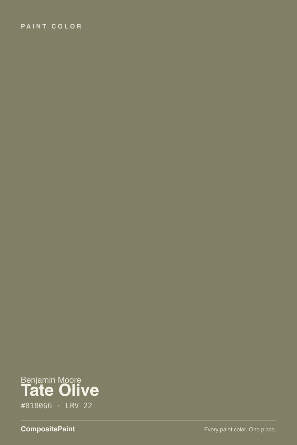
Benjamin Moore files Tate Olive as HC-112 in the Historical Colors collection — the same line that supplies the shutter and door greens on colonial-revival houses across New England. That pedigree explains the personality: this is khaki first, green a distant second. Break the hex apart and red and green sit almost dead even (129 and 128), with blue pulled well down (102). That near-equal red-green balance with no blue is what makes a color read olive-khaki instead of leafy — it is grayed and warmed at the same time, closer to faded canvas or old brass than to a plant.
At LRV 22 it is a genuine mid-depth color, sitting right alongside Benjamin Moore's own Chelsea Gray. That depth is the reason it works as a shutter or island color and not just a trim accent: it holds its khaki-olive read in full daylight, then sinks toward a near-black brown-green after dark, which is exactly what you want from exterior trim and cabinetry — enough presence to read as a deliberate color choice, not enough to fight the house around it.
Undertone in one line: warm olive-khaki with a brown lean, no blue anywhere in it. If your sample reads gray, that is cool daylight stripping the warmth out; if it reads muddy brown rather than green, that is dim light or a warm floor pulling it further from green — both are the same paint being honest about the room, not a bad batch.
Where It Shines
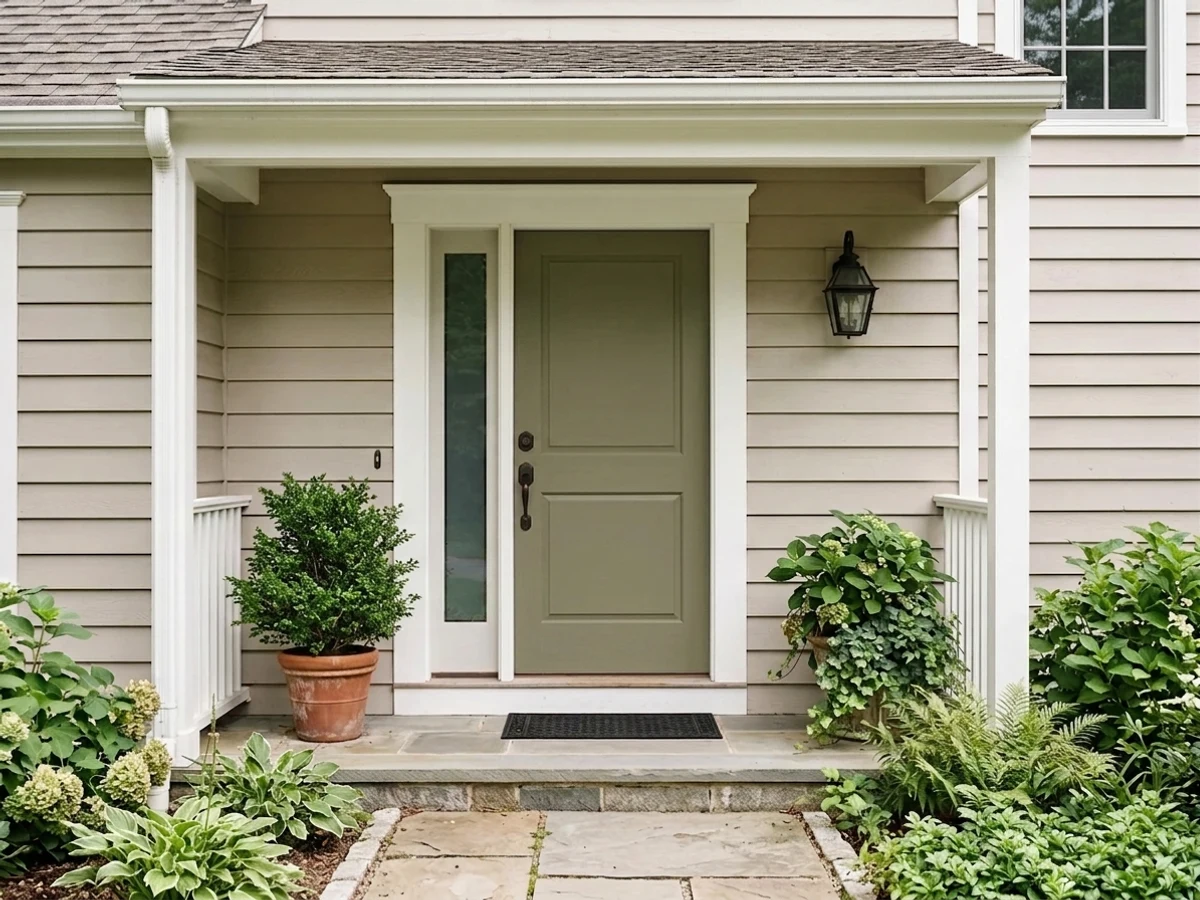
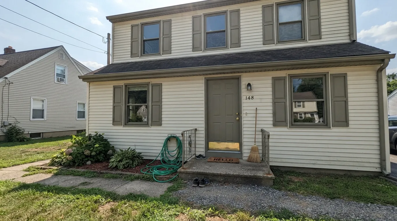
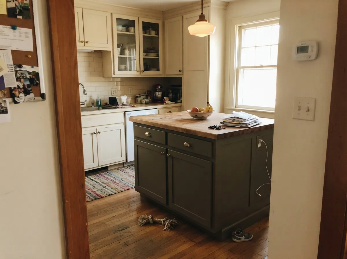
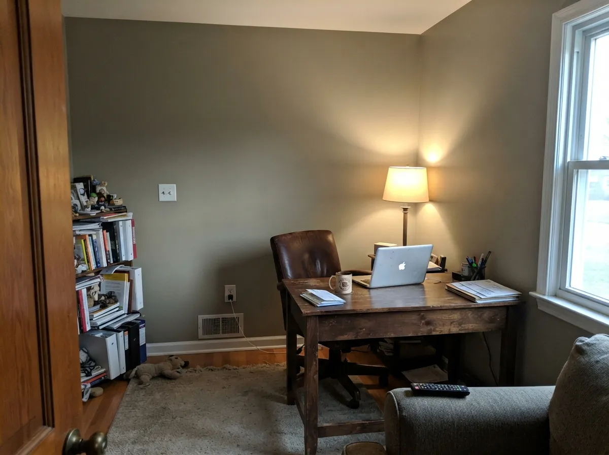
This is a color built for the job it was designed for: exterior shutters, doors and trim on a white, cream or gray-sided house, where full daylight brings out the khaki without letting it go flat. Its second life is newer — as the olive-green trend has circled back around, designers have started reaching for Tate Olive on kitchen islands and built-ins because it reads more grounded and less "decorated" than the punchier greens of the moment. Give it brass hardware, walnut open shelving, and a warm lamp in a den or home office, and it disappears into the room the way good historical colors do — you notice the room is calm before you notice the wall is green.
Where It Fails
Almost every disappointed story about Tate Olive comes from one of three situations, and all three are predictable before the first coat goes on. None of them are the paint's fault — but if your room or your expectations match one of these, this is not your color.
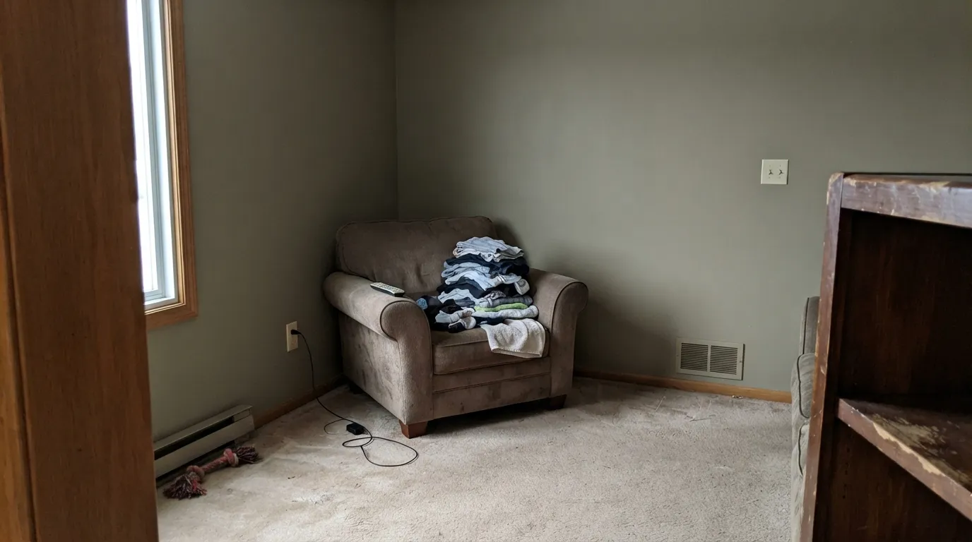
Cool, flat daylight strips the warmth out of the khaki and leaves a dull, slightly muddy olive-gray — readers describe it as "drab" or "army surplus." The color did not fail; the light did. If your room is genuinely dim and north-facing most of the day, this is a color to sample in that exact light before committing, not just on a sunny afternoon at the paint store.
Tate Olive is already leaning brown. Surround it with golden honey-oak floors, orange-toned trim, or terracotta tile and the whole room turns muddy brown-on-brown — the green gets swallowed and nothing reads intentional. It wants a break: white oak, walnut, painted trim, or a rug between it and a golden floor.
Because it's grayed this far toward khaki, Tate Olive will never read as a bright, leafy or emerald green — on some walls it reads closer to brown-gray than green at all. If the goal was a color guests immediately call "green," look at a color with more chroma left in it, like SW Rosemary, and let Tate Olive stay the quiet historical option it actually is.
Room by Room
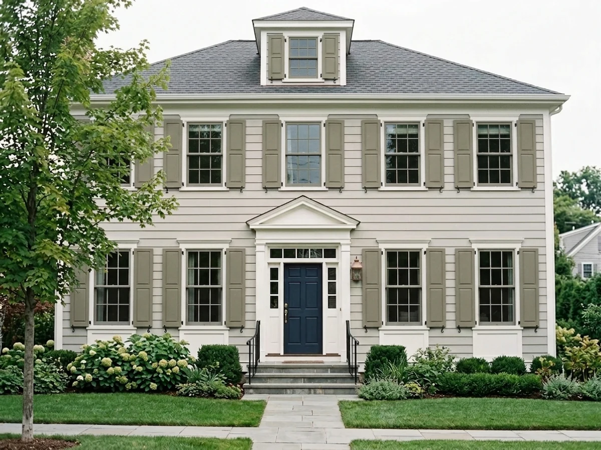
This is what the color was built for. On white, cream or light-gray siding it reads as a correct, historical khaki-olive; satin or semi-gloss on the trim work, flat or low-sheen on a full body coat if you're painting shutters alone.
Under cream perimeter cabinets with brass pulls and a butcher-block or light stone counter, Tate Olive on an island reads grounded and a little vintage without going full farmhouse. Satin cabinet-grade enamel; skip it for the whole kitchen unless you genuinely want an all-olive room.
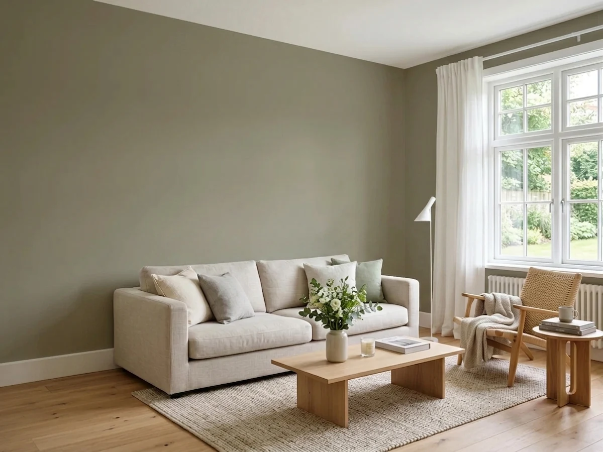
Low, warm lamp light is this color's best friend. With walnut shelving, leather and brass it reads deliberate and grounded, the way a good tweed reads deliberate. Eggshell for durability where a desk chair scuffs the wall.
Handsome in a closed room with warm daylight and wood furniture. Riskier in an open floor plan, where it has to negotiate with kitchen tones and whatever the next room over is wearing — keep the trim white consistent through both spaces.
Works as a single accent wall behind a walnut headboard with warm bedside lamps; painting all four walls this deep and this brown-warm can read heavy in a room meant to feel light. Test at night under your actual bulbs first.
A Tate Olive vanity under a light stone top and brass fixtures is a weekend project that reads custom. A full bathroom of it, especially one with little daylight, tips toward the drab side fast.
Your Light Is the Risk
South or west sun on an exterior wall, or a bright warm room indoors: the khaki reads clean and deliberate, not muddy. This is the light the Historical Colors line was tested in.
Cool flat daylight with no lamps drains the warmth and leaves a dull olive-gray. Test on a gray day, not just a sunny one, if your room is north-facing.
Warmer and more khaki through the sun hours, quieter and grayer once direct light leaves. On an exterior, walk around the whole house before committing — the shaded side will read a step cooler.
2700K lamps push it further into warm khaki-brown, almost bronze. Cool LEDs flatten it toward gray-green — swap the bulbs before you consider repainting.
Most complaints about Tate Olive are a light mismatch. Upload a photo of your actual room and see it on your walls — then ask for the same wall in north light or evening lamps before you buy a single sample.
Need It From Another Brand?
Any paint counter can custom-tint Benjamin Moore HC-112 directly. If you would rather stay in one brand's own deck, these are the closest stock matches, measured as ΔE2000. Under 2 is a difference you will not see on the wall.
| Brand | Closest color | ΔE | LRV | |
|---|---|---|---|---|
| Sherwin-Williams | ArtichokeSW 6179 · Sherwin-Williams | 2.0 | 21 | Color page → |
| Behr | Restful BrownBNC-36 · Behr | 1.9 | 21 | Color page → |
| Valspar | Native Henna6001-4B · Valspar | 1.2 | 21 | Color page → |
| PPG / Glidden | Autumn GrayPPG1028-5 · PPG / Glidden | 3.0 | 21 | Color page → |
| Glidden | Autumn GrayPPG1028-5 · Glidden | 3.5 | 21 | Color page → |
| Dutch Boy | Balsam Sprig325-4DB · Dutch Boy | 3.4 | 22 | Color page → |
Similar Benjamin Moore Colors
The nearest shades to Tate Olive within Benjamin Moore's own range, ranked by perceptual color distance — useful when you want the same look a touch lighter, darker, or warmer.
WCAG 2.1: AA is 4.5 : 1 for normal text, 3 : 1 for large text, AAA is 7 : 1.
Tate Olive vs the Colors You're Also Considering
Every Tate Olive sample board has the same rivals on it. The numbers show the real lightness gap — then it comes down to which risk you would rather live with.
Pick this if you're already committed to the Benjamin Moore deck; cross-brand color matching rarely tints identically.
Sherwin-Williams SW 6186 · LRV 21Dried ThymePick this if your painter already stocks Sherwin-Williams — nearly the same depth and warmth, just order it as SW 6186.
Pick this for the more historical, more khaki-leaning version of the same idea.
Sherwin-Williams SW 6207 · LRV 21RetreatPick this for cabinet-grade olive at the same depth — Retreat reads a touch more green where Tate Olive reads a touch more brown.
Pick this when you want that same LRV 22 depth with a whisper of green left in it instead of none at all.
Benjamin Moore HC-168 · LRV 22Chelsea GrayPick this if the green in Tate Olive worries you — same weight and depth, with the color dialed almost all the way back to charcoal-greige.
Pick this for a real exterior or island color; October Mist is too pale to read as anything but a soft accent in either job.
Benjamin Moore 1495 · LRV 39October MistPick this for a lighter, safer sage that still reads calm in a dim room — the most forgiving green in the BM deck.
Within the brand the differences are small. Springfield Sage 510 and Tapenade CC-694 at LRV 23 are one point lighter than Tate Olive's 22 and read slightly greener. Crownsville Gray HC-106 at the same LRV 22 pulls grayer, so choose it when the yellow in Tate Olive feels too warm. Galápagos Green 475, Mossy Oak CC-600, and Sussex Green HC-109 at LRV 21 all sit a shade deeper and cooler.
Across brands, Dunn-Edwards Ivy Garden DE6258 at LRV 20 is a true match at a deltaE of 0.71, and Valspar Native Henna 6001-4B at LRV 21 is 1.17, visually identical in normal room light. Sherwin-Williams Artichoke SW 6179 at LRV 21 is 2.04, Behr Mocha Accent 720D-5 at LRV 21 is 2.09, and C2 Paint Pondstone C2-935 at LRV 20 is 2.11, all very close but worth sampling first. PPG and Glidden Autumn Gray PPG1028-5 at LRV 21 is 3.0 and Backdrop Old Soul BD-OS at LRV 18 is 2.59, close but visibly different side by side.
Tate Olive Coordinating Colors
The rule for coordinating with Tate Olive: warm whites, near-blacks, and neutrals at the same depth that don't fight its brown lean. It pairs easily with cream trim, brass, walnut, and soft charcoal — and struggles next to anything cool-blue or bright white. These are the partners that keep it looking deliberate:
Tate Olive's Quiet History
Tate Olive comes out of Benjamin Moore's Historical Colors collection — the palette built from research into Colonial and Federal-era American paint, the same line that supplies the deep reds, mustards and shutter greens seen on restored New England houses. Unlike a Color of the Year, it was never launched with a marketing push; it has simply sat in the deck doing the unglamorous work of shutters, front doors and exterior trim for decades, largely unnoticed outside restoration and historical-renovation circles.
It's worth mentioning honestly: this is not a famous color, and there's no viral room or celebrity kitchen behind it. What has changed is the market around it. As muted, grayed-down greens like October Mist, Dried Thyme and Evergreen Fog have pulled interest away from bright, saturated greens, colors like Tate Olive are getting a second look — not because it's trending, but because it was already doing the thing the trend is now asking for.
Tate Olive With Wood Tones and Floors
Because Tate Olive already leans brown, the floor underneath it matters more than usual. Walnut, espresso and other dark, cool-leaning woods are its best partners — the contrast keeps the olive reading like a color choice rather than an extension of the floor. Pale or whitewashed white oak also works well, giving the room a clean break between wall and floor.
The one combination to test carefully is wall-to-wall honey oak or a golden-toned floor. Both colors are warm and brown-leaning, and stacked together they can read as one muddy brown instead of two distinct materials. A large area rug, or painted white trim as a visual break, usually solves it — a full room of Tate Olive over honey oak with nothing between them is the one pairing worth sampling before committing.
Three Ready Palettes Built on Tate Olive
A color is never alone on the wall. These are complete combinations in the 60-30-10 pattern, with the reason each one holds together. Every one opens in the visualizer.
This is close to the original job Tate Olive was built for: a warm white body, olive shutters and door for the color, and a soft near-black on ironwork so the palette has one dark anchor without going stark.
Try this palette in your roomCream perimeter cabinets keep the room light while the island carries all the color; Kendall Charcoal on one accent piece adds a dark note without competing with the olive. Brass hardware ties the whole thing together.
Try this palette in your roomTwo neutrals at the same depth — one with a whisper of green, one without — let the room read layered instead of matched. White Dove trim keeps either from disappearing into the other.
Try this palette in your roomTate Olive FAQ
Is Tate Olive green or gray?
Neither in the pure sense — it's a khaki-olive, grayed and warmed enough that the red and green in its makeup are nearly equal and there's no blue at all. On the wall it reads as a muted, warm olive, closer to canvas or old brass than to a leafy green, and grayer than a garden green but never a true gray.
What is Tate Olive's undertone?
Warm, brown-leaning khaki with no blue anywhere in it. In cool daylight it reads more gray; under warm lamps or in dim light it reads more brown. It never goes cool or minty — that's the one thing it will not do.
Does Tate Olive work on a house exterior?
Yes — this is its most natural home. It comes from Benjamin Moore's Historical Colors collection, built for exactly this job. It pairs well with white, cream or light-gray siding and reads correct next to black or dark bronze roofing and hardware.
Is Tate Olive good for a kitchen island or cabinets?
Yes, especially as an island or a single run of cabinetry under lighter perimeter cabinets. It's less common as an all-cabinet color simply because there are more saturated greens getting the attention right now — but the muted khaki holds up well against brass and wood.
What trim white goes with Tate Olive?
A warm white — White Dove or Swiss Coffee are the safe defaults. A stark, cool white fights the brown-warm khaki and can make the olive look dingy by comparison; keep the trim on the warm side.
Is Tate Olive a popular color?
Honestly, no — it's not a Color of the Year and it doesn't have a famous room attached to it. It's a quiet Historical Colors chip that has done steady, unglamorous work on shutters and doors for decades. The current wave of muted-green interest (October Mist, Dried Thyme, Evergreen Fog) has people rediscovering colors like it, but it remains one of the deck's honestly obscure options rather than a bestseller.
Have you painted with Tate Olive?
Rate it — one tap helps the next reader decide.
Ask a Question