Vintage Vogue
Benjamin Moore's most-loved dark green, reviewed honestly: the rooms where it glows, the rooms where it turns to gray sludge, and what to paint instead.

Jessica has spec'd whites and neutrals for more than 300 rooms and keeps a sample wall of painted drawdowns in her studio. Every color review is checked against real reader rooms in the comments and re-tested when a formula changes. About the testing process →

- 1Black Emerald1
- 2Essex Green6
- 3Vintage Vogue12
- 4Sage Green22
- 5Evergreen Fog30
The Fast Verdict
Vintage Vogue is the dark green people fall in love with on a chip and then meet again on a wall, twice as dark. In real daylight it is a deep, dusty olive that makes wood, brass and old brick look expensive. At LRV 12 it gives almost nothing back, so it lives or dies on how much light your room already has. Give it daylight or four warm lamps and it is one of the best colors Benjamin Moore sells; give it one north window and a ceiling fixture and it turns into flat charcoal.
Dining rooms and studies used at night · kitchen islands and lower cabinets · powder rooms you want to feel like a jewel box · front doors and shutters on a light house
Your room faces north with one small window · you want the soft sage you saw on the chip · you only have a single ceiling light · your floors and counters are cool gray
- Reads as real color, not black, wherever it gets light
- Makes oak, walnut, brass, and leather look expensive
- Muted enough that it never looks like a crayon green
- Outstanding on islands, built-ins, and front doors
- Hides scuffs and shoe marks far better than mid-tone paints
- At LRV 12 it goes flat charcoal in dim north rooms
- Much darker on a wall than the chip suggests
- Roller laps and touch-ups show — dark colors always tell on you
- Turns drab next to cool gray floors and white marble
What Color Is Vintage Vogue, Really?
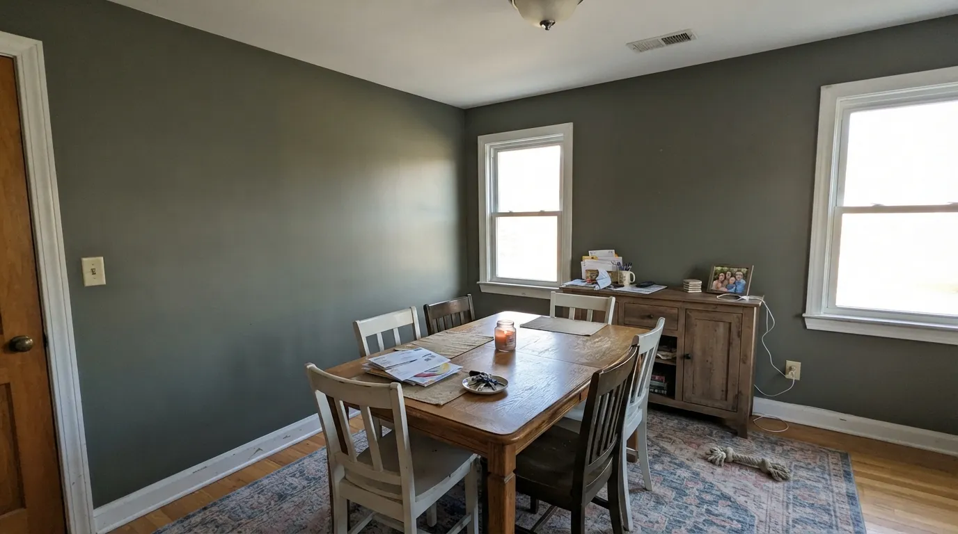
A dark, dusty olive that most people first mistake for a warm gray. That confusion is the whole story of this color: on a two-inch chip the green is so muted it reads gray-green, and on a full wall the olive builds up and becomes obvious. It is not a forest green, not an emerald, and not a blue-leaning sage. Think of the green on an old army canvas bag or a well-worn Barbour jacket — color that has been dusted over with gray rather than mixed with black.
The number that decides everything is the LRV of 12. Plain English: the wall keeps most of the light that lands on it and hands back almost none. That puts Vintage Vogue much closer to a navy like Hale Navy HC-154 (LRV 8) than to any mid-tone sage, and in the same depth band as Sherwin-Williams Pewter Green SW 6208. People do not expect that. The single most common story about this color is someone choosing it as "a nice muted green" and opening the door to a room that reads near-black at dusk.
Undertone in one line: gray-dusted olive with a trace of yellow warmth — never blue, never minty. If your sample looks like plain dark gray, the room does not have enough light for the green to show; if it looks khaki, that is warm bulbs or a wood floor bouncing into it.
Where It Shines
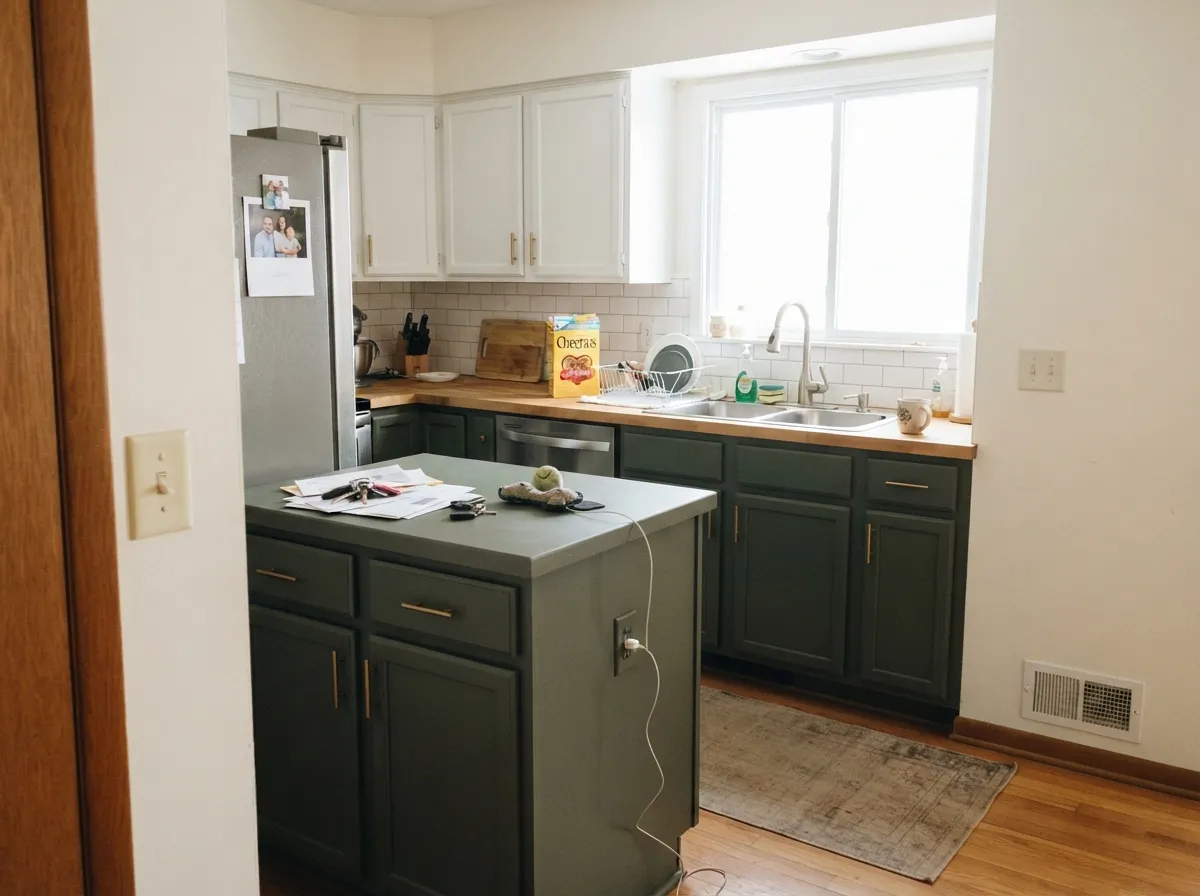
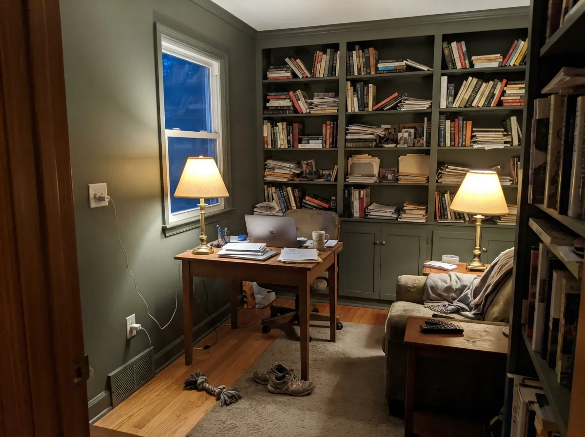
It does its best work in rooms you use after dark and in rooms where you want furniture and brass to be the stars. Dining rooms, studies, powder rooms, and kitchen islands are where readers keep landing, and it is no accident — all four are places where a low LRV stops being a problem and becomes the point.
Where It Fails
Nearly every unhappy Vintage Vogue story comes down to three situations, and all three are predictable before you open the can. If your room matches one, no second coat and no different sheen will save it.
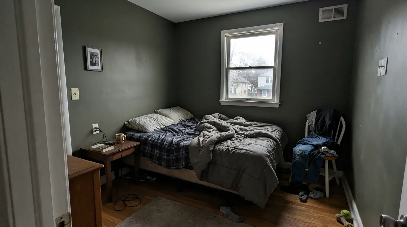
North light is cool and weak, and at LRV 12 there is nothing left to reflect it. The olive drains out and the walls read as flat, muddy charcoal all day — people describe it as looking dirty rather than moody. If you want green to survive that light, go lighter and greener with Cushing Green HC-125.
The chip reads like a soft sage-gray; a whole wall reads like dark olive, and at night like near-black. This is the number one regret with this color, and it is a scale problem, not a paint problem. If the chip is the color you actually wanted, paint Saybrook Sage HC-114 instead and you will get that softer green at full size.
Everything cool around it pulls the yellow out of the olive and leaves it looking drab and slightly dirty, especially against blue-gray LVP and Carrara-style stone. In a cool room, a green with more gray and less yellow behaves better — Sherwin-Williams Pewter Green SW 6208 sits at nearly the same depth without the khaki cast.
Room by Room
Rooms used mostly at night are where LRV 12 stops costing you anything. Eggshell on walls, White Dove OC-17 trim and ceiling for a clean edge, or the same green on the trim if you want the walls to disappear. Add candles, brass, and at least one lamp that is not the chandelier.
It quiets a room down and makes bookshelves and wood desks read rich instead of brown. Paint built-ins the same green in satin so the shelves melt into the wall. Two table lamps at 2700K beat one bright overhead every time.
This is the second-most common real-world use and it works. Satin on the island, White Dove OC-17 or Pale Oak OC-20 above, unlacquered brass or oil-rubbed bronze pulls, a wood or warm stone counter. Skip it on uppers in a small kitchen — the room closes in fast.
Small and windowless is exactly where a dark color is safe, because you were never going to feel airy in there anyway. Walls, trim, and ceiling all Vintage Vogue turns the room into a jewel box. Use eggshell for walls and semi-gloss on the door and casing.
Lovely and cave-like in a room with two windows and bedside lamps; grim in a north bedroom with one. Keep the ceiling in Simply White 2143-70 unless you want the ceiling to press down. Warm bedding and oak furniture pull the olive forward.
Against a cream or greige body it is the most forgiving dark green you can put on a door, because it never flashes bright. Semi-gloss or a high-gloss exterior door enamel, and expect the sun-facing side of the house to read a shade lighter and greener. Full details in the exterior section below.
Your Light Is the Risk
Long warm sun brings the olive fully forward — dusty green, still deep, never black.
Cool weak light drains the green. Expect muddy charcoal unless you add lamps.
Greener at that room's sun hours, grayer the rest of the day. Sample both times.
2700K lamps keep the olive alive; 4000K LEDs strip it to cold slate. Spread the lamps around.
Most complaints about Vintage Vogue are a light mismatch. Upload a photo of your actual room and see it on your walls — then ask for the same wall in north light or evening lamps before you buy a single sample.
Need It From Another Brand?
Any paint counter can custom-tint Benjamin Moore 462 directly. If you would rather stay in one brand's own deck, these are the closest stock matches, measured as ΔE2000. Under 2 is a difference you will not see on the wall.
| Brand | Closest color | ΔE | LRV | |
|---|---|---|---|---|
| Sherwin-Williams | Rookwood Dark GreenSW 2816 · Sherwin-Williams | 1.8 | 10 | Color page → |
| Behr | PastoralPPU10-20 · Behr | 1.4 | 11 | Color page → |
| Valspar | CapersT608 · Valspar | 1.6 | 9.6 | Color page → |
| PPG / Glidden | OsirisPPG1031-7 · PPG / Glidden | 3.7 | 10 | Color page → |
| Glidden | Shaded Fern30GY 10/048 · Glidden | 3.4 | 10 | Color page → |
| Dutch Boy | Espalier423-6DB · Dutch Boy | 4.1 | 11 | Color page → |
Similar Benjamin Moore Colors
The nearest shades to Vintage Vogue within Benjamin Moore's own range, ranked by perceptual color distance — useful when you want the same look a touch lighter, darker, or warmer.
WCAG 2.1: AA is 4.5 : 1 for normal text, 3 : 1 for large text, AAA is 7 : 1.
Vintage Vogue vs the Colors You're Also Considering
Every Vintage Vogue sample board has the same rivals on it. The numbers show the real lightness gap — then it comes down to which risk you would rather live with.
Pick this for the grayer, dustier, more sophisticated version of the same depth.
Benjamin Moore 469 · LRV 35BackwoodsPick this if you want the green to be clearly green, not a maybe-gray.
Pick this when the room has real daylight and you want drama after dark.
Benjamin Moore HC-125 · LRV 18Cushing GreenPick this for dim or north rooms — it keeps its green where Vintage Vogue quits.
Inside Benjamin Moore the closest neighbor is Dakota Shadow 448, hex #515D51 at LRV 12. It is a shade greener and less yellow, so it reads slightly cleaner and less olive. Boreal Forest AF-480 at LRV 11 is darker and greener again. Cabbage Patch 2141-20 at hex #5C5A47 is the one that swings clearly brown, and Mohegan Sage 2138-30 at LRV 11 lands between olive and gray.
Across brands, Behr Pastoral PPU10-20 at LRV 11 and Valspar Capers T608 at LRV 9.6 are close enough, at deltaE 1.38 and 1.56, to look visually identical in normal room light. Sherwin-Williams Rookwood Dark Green SW 2816 at LRV 10 and deltaE 1.8 belongs in that same group. Dunn-Edwards Midnight Spruce DE6294 at deltaE 2.99 is very close but worth sampling first, and Dutch Boy Espalier 423-6DB at deltaE 4.12 is close but visibly different side by side.
Vintage Vogue Coordinating Colors
The rule with Vintage Vogue is to keep its partners warm and quiet. Because the green is dusted with gray and carries a trace of yellow, it flatters creamy whites, warm greiges, and browns, and it argues with anything blue-based or icy. A bright blue-white trim next to it creates a hard edge and makes the wall look drabber than it is; a creamy white makes the same wall look intentional.
These are the partners that keep showing up in real rooms — a trim white, a couple of walls-partner neutrals for adjoining spaces, and one lighter green if you want the color to run through the house at different strengths.
Vintage Vogue on Cabinets and Islands
Cabinets are where this color earns its reputation, and the reason is the same LRV that causes trouble on walls. A kitchen island wants visual weight, and at 12 Vintage Vogue delivers it while keeping enough color to avoid the flat, hard look of black cabinetry. Lower cabinets under a lighter upper run, a mudroom locker wall, a laundry base, and bathroom vanities all read expensive in this green.
Practical notes from real projects: use a urethane-fortified cabinet enamel in satin, spray it if you can, and dust the shop or room first — dark green shows every hair and speck of dust in the finish in a way white never does. Hardware decides how the color reads. Unlacquered brass and oil-rubbed bronze push the olive warm and traditional; matte black keeps it modern; polished chrome makes it look drab and should be avoided.
The one warning is coverage on doors and drawer fronts. Deep bases cover thin, so plan on two full coats over tinted primer with real dry time between, and do not judge the color until the second coat has cured. A single coat on cabinet fronts always looks patchy and slightly gray.
Vintage Vogue Outside: Doors, Shutters, and Whole Houses
Outdoors the color behaves better than it does in a dim interior, because full sun is exactly the light it needs. On a front door against a cream or greige body it is the safest dark green in the deck — it never flashes bright, it never looks minty, and it works on colonial, craftsman, and modern-farmhouse fronts alike. Shutters are the same story.
As a full body color it is a real option for a house set among trees, with one caveat worth walking around the house for: the sunny south side will read a full step greener and lighter than the shaded north side, and in overcast weather the whole house reads charcoal. Cream trim rather than a bright white keeps the facade from looking cold, and a near-black door gives the one crisp note. Test a large board on two different sides of the house before you commit to the whole thing.
Three Ready Palettes Built on Vintage Vogue
A color is never alone on the wall. These are complete combinations in the 60-30-10 pattern, with the reason each one holds together. Every one opens in the visualizer.
The dark green takes the 60 percent, a warm white takes the trim and ceiling at 30, and the hallway greige is the 10 that keeps the transition from feeling like a light switch. White Dove is creamy enough that the edge against the olive stays soft instead of cutting.
Try this palette in your roomWeight on the bottom and light on top is what stops a dark green kitchen from feeling like a basement, and Pale Oak keeps the walls quiet so the island is the only strong note. All three share warm bases, so brass hardware and a wood counter tie the room together instead of fighting it.
Try this palette in your roomA creamy trim reads warm against the olive and stops the house from disappearing into the landscape, which is the usual failure of dark green siding. The near-black door supplies the one crisp note the facade needs without adding a second color story.
Try this palette in your roomVintage Vogue FAQ
Will Vintage Vogue look black at night?
Close to it, and that surprises people. Under warm 2700K lamps you will still read olive within a few feet of a lamp, but the corners of the room go to near-black. If you want to see the green after dark, use three or four light sources at different heights rather than one ceiling fixture.
Is Vintage Vogue too dark for a small room?
For a small room you want to feel bigger, yes. For a small room you are willing to make cozy — a powder room, a study, a dining room — it is one of the best colors you can pick. Paint the trim and ceiling the same green in that case; the seams disappear and the room reads as one dark box instead of a small room with dark walls.
Vintage Vogue or Backwoods?
Backwoods 469 is the clearly greener one and Vintage Vogue is the dustier, grayer one at almost the same depth. If people looking at your walls should say "that is green," pick Backwoods. If you want them to say "what color is that," pick Vintage Vogue.
How many coats does it take and does it touch up well?
Two coats over a tinted deep-base primer, and three if you go straight over white without priming — dark bases cover thin and the first coat always looks blotchy. Touch-ups are the real weakness: on a dark color a dabbed spot dries a slightly different sheen and you will see the halo. Keep a small roller from the original job and touch up by rolling a full section, corner to corner.
What sheen should I use on the walls?
Eggshell. Flat and matte look beautiful on dark green for about a month, then every scuff and every touch-up shows, and a flat dark wall picks up roller lap marks in raking light. Eggshell is easier to clean and forgiving enough to fix later. Save semi-gloss for trim, doors, and cabinets.
Does Vintage Vogue work with oak floors?
Yes, and this is one of its strongest pairings. Honey and red-oak floors sit under it comfortably because both carry yellow, and the muted olive keeps the orange in the wood from looking loud. Gray-washed or cool LVP floors are the ones to sample first — they pull the warmth out and the walls go drab.
Is Vintage Vogue still in style?
It is one of the greens that keeps outliving trends because it is barely a color — it is a gray with green inside it. Bright sages and clean forest greens date faster. If you want to hedge, use it on cabinets, an island, or a front door, where repainting later is a weekend, not a project.
Have you painted with Vintage Vogue?
Rate it — one tap helps the next reader decide.
Ask a Question