Salamander
Benjamin Moore's near-black green-blue chameleon, reviewed honestly: the light that finally lets it read green, and the light that just makes it black.

Jessica has spec'd whites and neutrals for more than 300 rooms and keeps a sample wall of painted drawdowns in her studio. Every color review is checked against real reader rooms in the comments and re-tested when a formula changes. About the testing process →
- 1Salamander6
- 2Hidden Gem14
- 3Van Courtland Blue31
The Fast Verdict
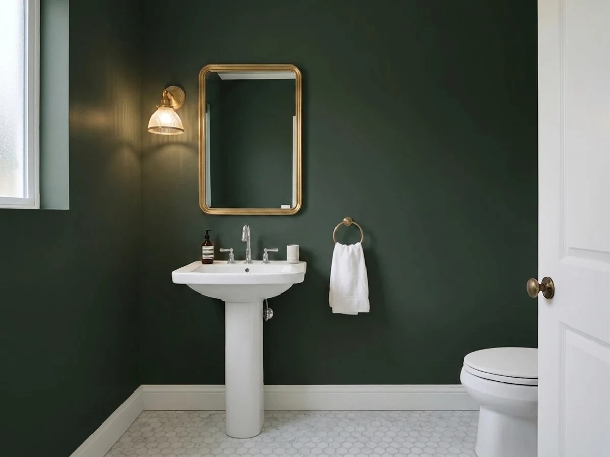
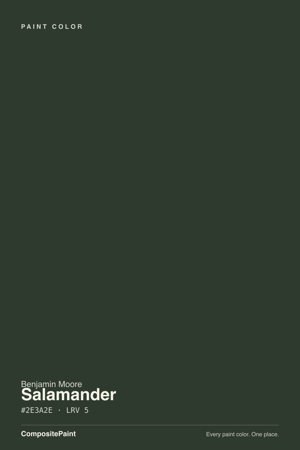
Salamander is Benjamin Moore's own description made literal: "a deep, dark mix of black, blue, and green." At LRV 6 it sits right at the edge of black, and most of the time it reads as exactly that — black. Give it strong, direct light and the mix separates: a cold blue edge, a mossy green core, a color instead of a void. It is one of the rare BM colors sold both as a cabinet enamel and as an exterior wood stain, which tells you what it is for — doses, not whole rooms.
Kitchen islands and cabinets riding the deep-green trend · a front door or exterior accent (it doubles as a Woodluxe wood stain) · a small, bright dining or powder room with real daylight · anyone who wants more depth than a flat black gives them
Your room has no direct daylight · you want the green to read clearly day and night, not just in good light · you're painting four full walls off a 2-by-3-inch chip · you actually want a neutral black with zero color story
- More depth and complexity than a flat black — genuinely shifts blue and green in strong light
- One of the few BM colors sold as both a cabinet enamel and an exterior wood stain
- Rides the deep-green cabinet and island trend without looking like a fad color
- Small doses — a door, a vanity, a hutch — read custom and expensive
- Loves brass and gold-toned metal, indoors and out
- LRV 6 means it reads flat black in anything less than strong, direct light
- Needs a deep-base tinted primer or expect three-plus coats for even coverage
- Chameleon undertone can look different wall to wall in a room with mixed light
- Too heavy for a room without real daylight, no matter the sheen
What Color Is Salamander, Really?
Benjamin Moore files Salamander in its Green family, but the brand's own copy calls it "an intriguing chameleon" — a mix of black, blue, and green rather than a straightforward hunter or forest shade. That three-way mix is the whole personality: it was built to sit at the edge of black and only give up its color when the light works for it, not a green that happens to be dark.
At LRV 6 it is genuinely near-black — deeper than Wrought Iron (LRV 6) and close to Essex Green (LRV 4), the classic BM near-black green most often compared to it. The difference readers notice is the blue lean: Essex Green stays a fairly pure black-green, while Salamander shows a colder, almost slate-blue edge alongside the green once the light is strong enough to separate the mix. In anything less than strong daylight, expect black first and color second.
Undertone in one line: black base, green core, blue edge — and which one you see depends entirely on the light, not the wall. If your sample reads flat black in the store or on a shaded wall, that is not a defect; that is LRV 6 doing what LRV 6 does. Test it under the strongest light your room actually gets before deciding it "isn't green enough."
Where It Shines
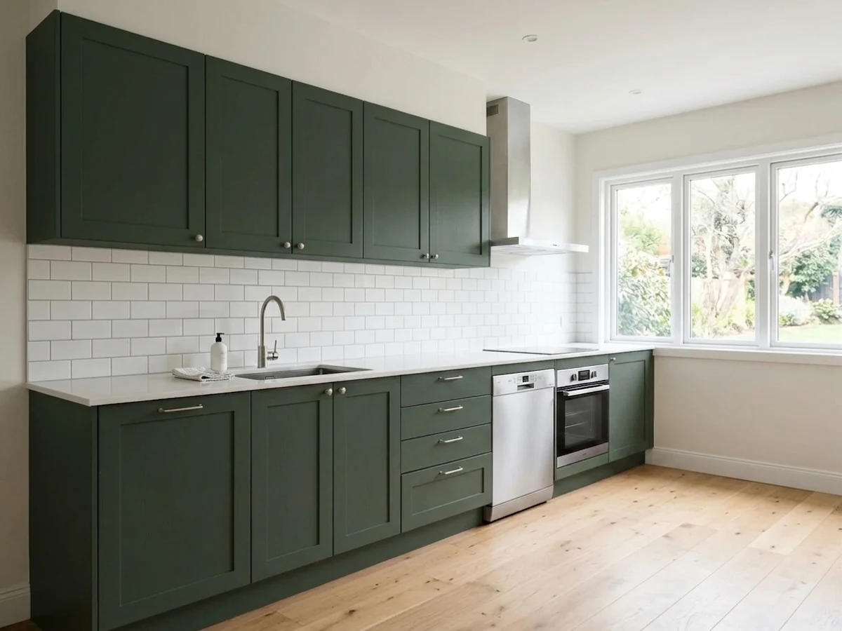
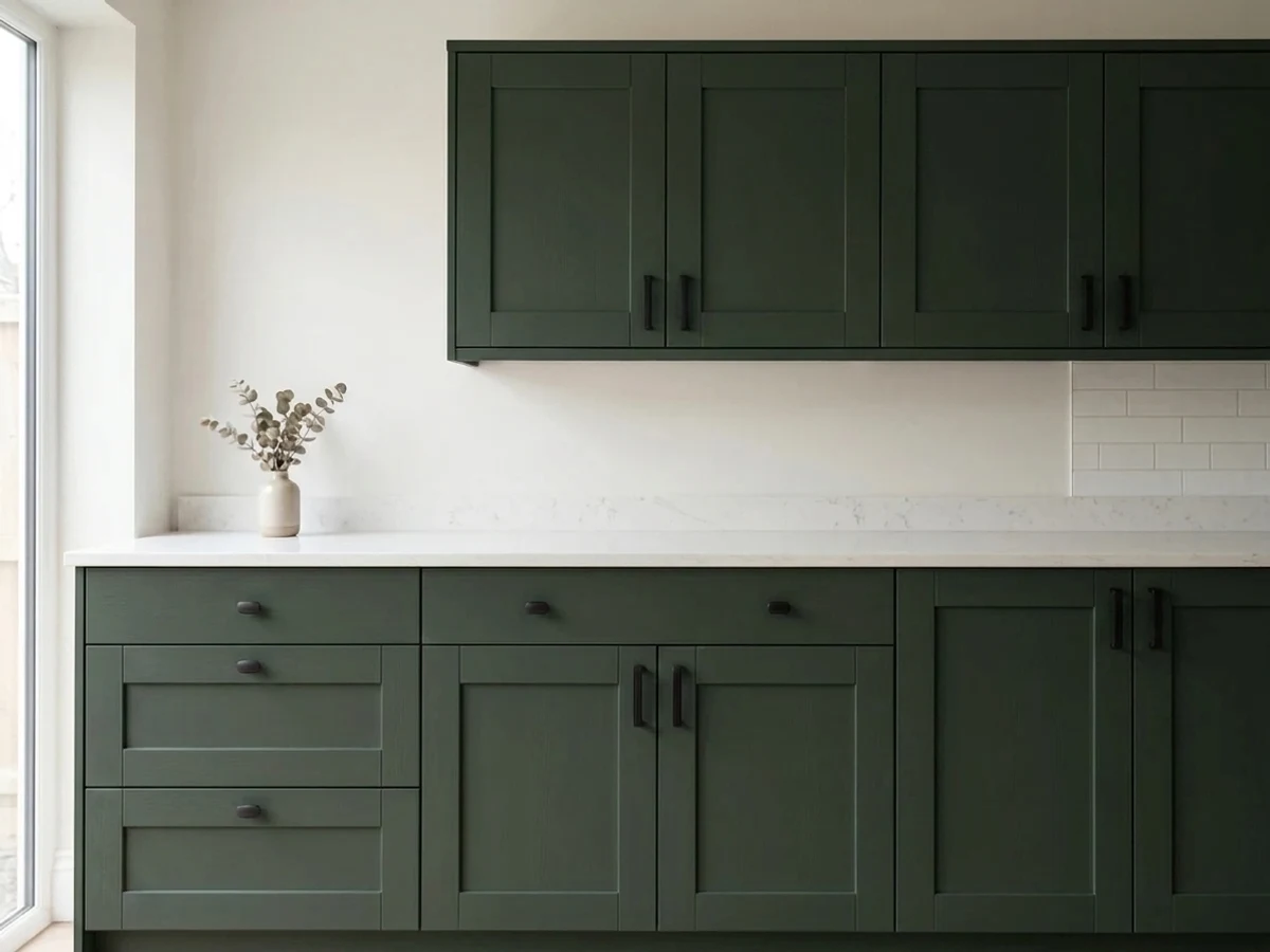
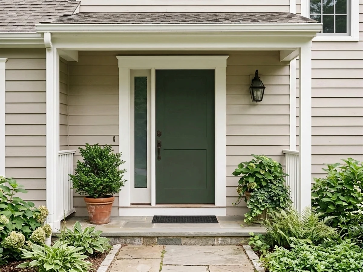
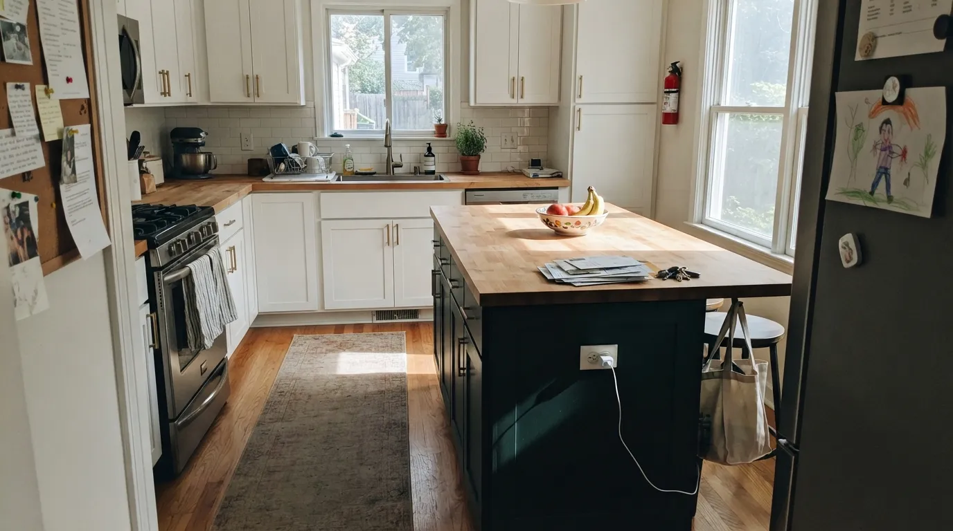
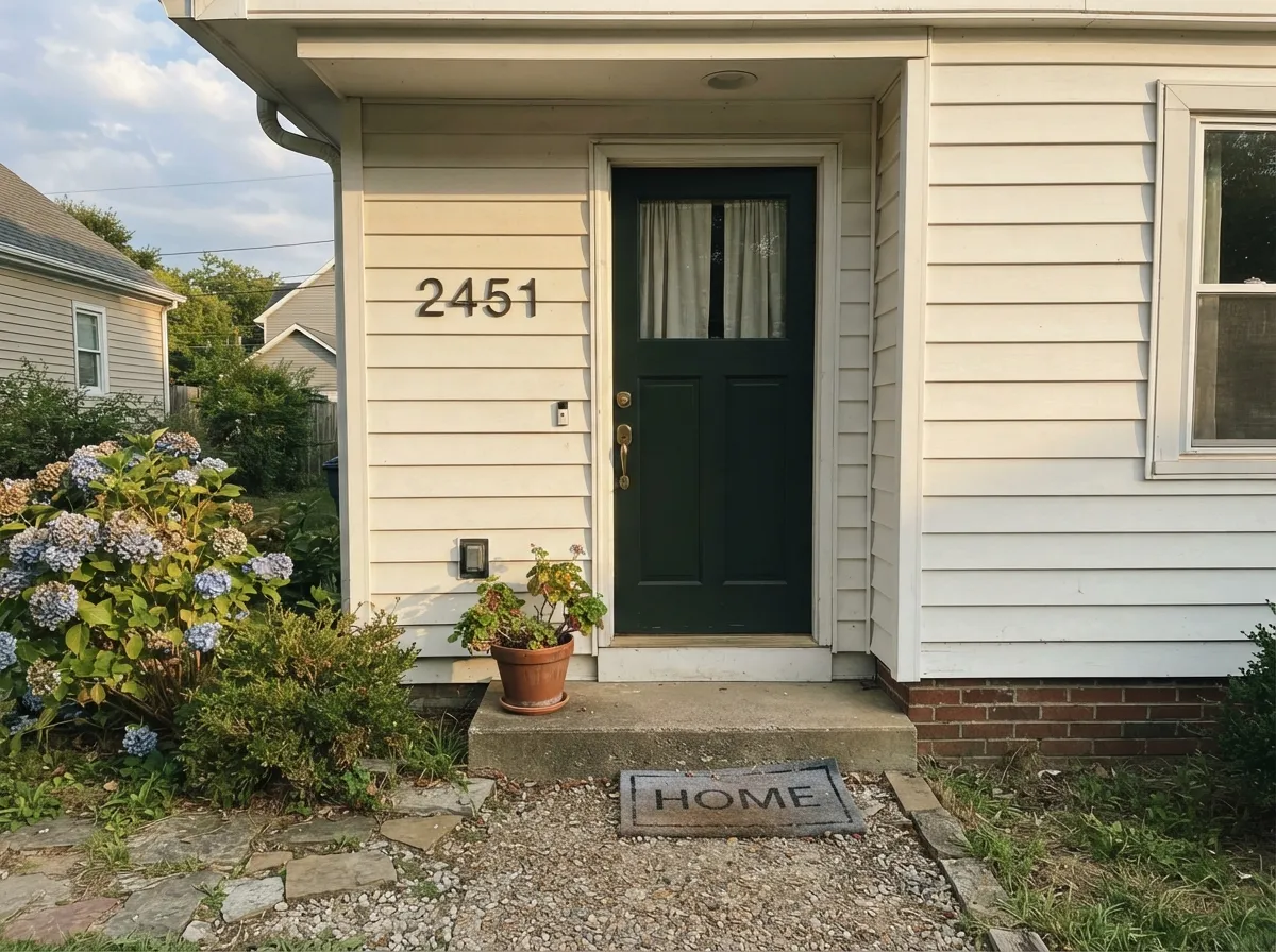
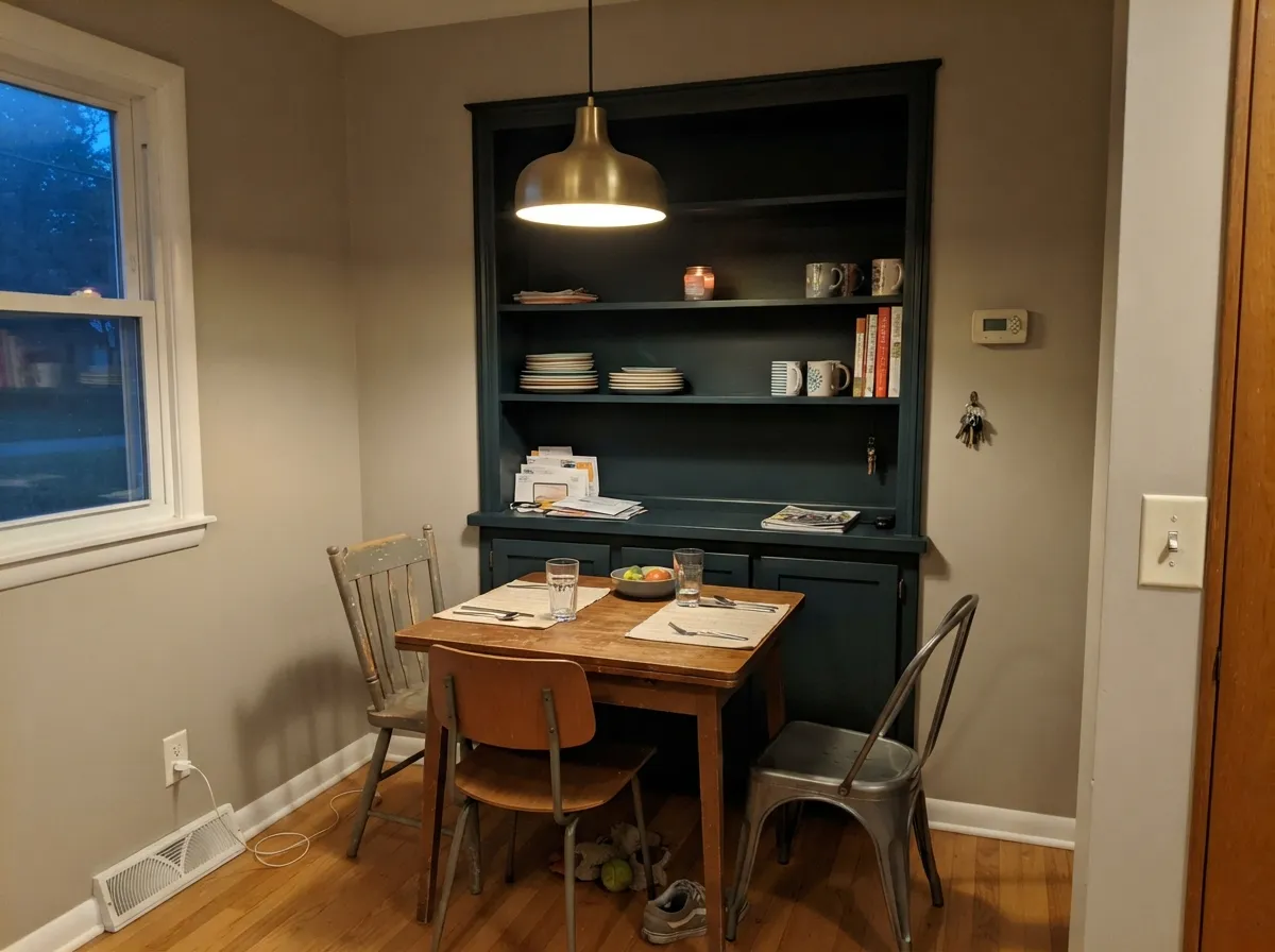
This is a doses color, not a walls-and-ceiling color, and it is at its best in the two jobs Benjamin Moore actually built it for. On a kitchen island or a run of lower cabinets, under real daylight, it reads as one of the more interesting dark greens in the deck — deeper and moodier than a straight hunter green, with brass or gold hardware pulling the blue-green forward instead of letting it go flat. Its other home is outside: Salamander is sold through BM's Woodluxe line as an exterior wood stain for siding, decks, fences, and furniture, so a front door, a shed, or a fence gate in the same color as your cabinets is a genuinely easy match, not a stretch.
Where It Fails
Almost every disappointed story about Salamander comes down to one of three predictable mismatches, and none of them are the paint failing — they're LRV 6 meeting the wrong expectation.
Without strong, direct light hitting the surface, the black in the mix wins and the green and blue never separate out. You paid for a color and got a shadow. If the room is dim, this isn't the color — pick something with real daylight, or a lighter green like Sherwin-Williams Rosemary that still needs light but starts from a higher LRV.
Because the color is built to shift with light, a tiny sample tells you almost nothing about how it will read on a full wall in mixed daylight. Get a large sample board, move it around the room at different hours, and expect the wall to look noticeably blacker than the chip most of the day — that's normal for this color, not a bad batch.
Near-black colors at LRV 6 need a deep-base gray or black-tinted primer, not a standard white one. Go straight over white drywall or old cabinets without it and expect three or four coats to get even coverage — the tinted deep base cuts that to two.
Room by Room
Deep green cabinetry is a real, ongoing trend, and Salamander's near-black base keeps it from looking dated the way a brighter green can. Satin or high-gloss (BM Advance) with brass or unlacquered gold hardware; keep the perimeter cabinets lighter so the island reads as a statement, not a cave.
Outdoor light is stronger and more direct than almost any interior, which is exactly where this color separates into blue and green instead of staying flat black. Available through BM's Woodluxe stain line for siding, decks, fences, and furniture, or Advance exterior enamel for a door — a genuinely easy way to match a door to a fence gate or shed in one color.
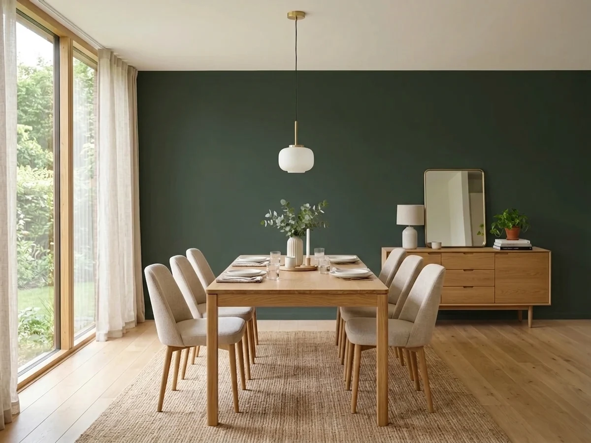
An accent wall or a painted hutch under a brass or gold-toned fixture is the look designer blogs reach for with this color, and it earns it: warm metal light is exactly the kind of strong, direct light Salamander needs to read as green rather than black.
Small rooms with a strong overhead or sconce light take this depth well without the room going cave-like. A vanity in Salamander under a bright fixture, with a marble or white-oak top, is a weekend project with a big visual return.
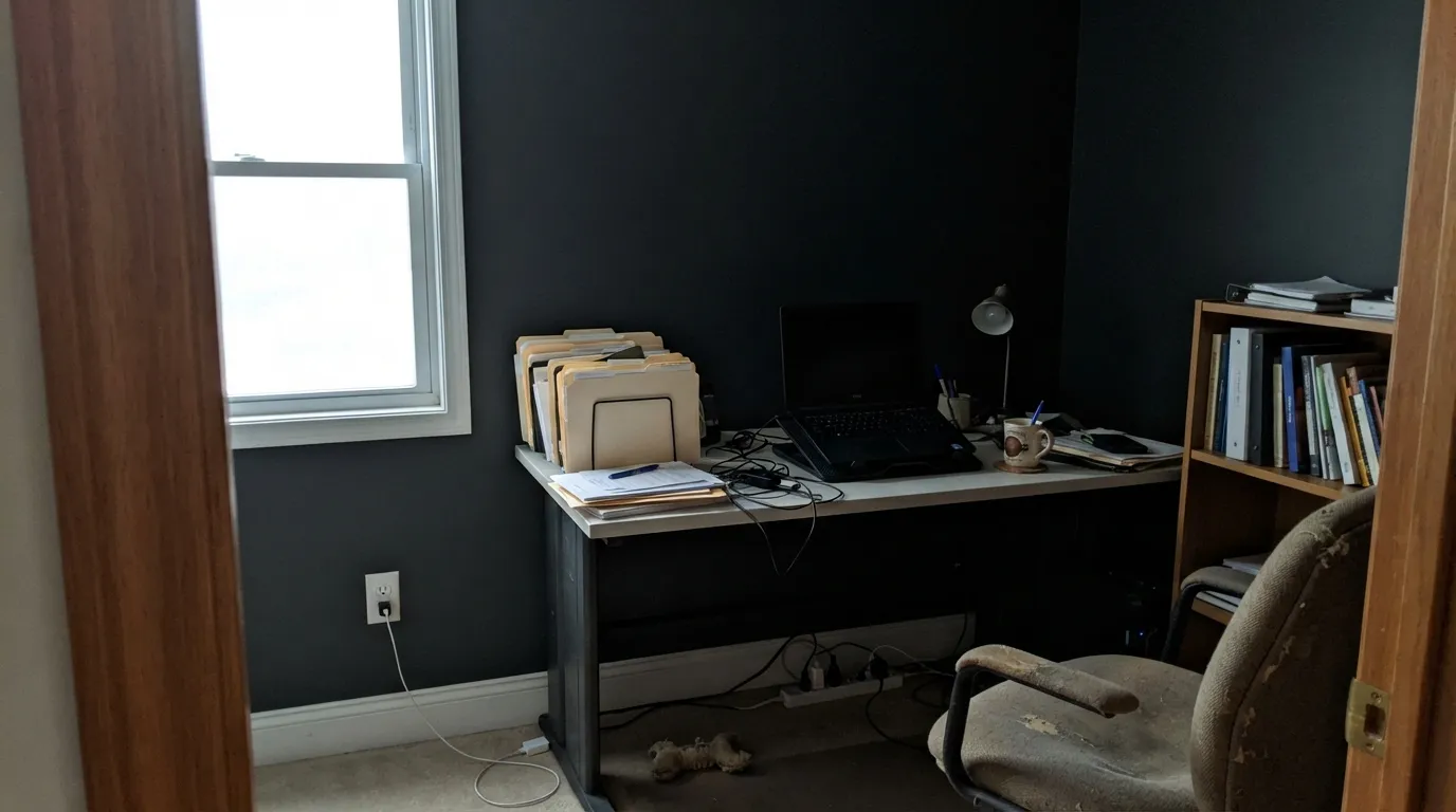
Living rooms rarely deliver the strong, consistent direct light this color needs across four walls; expect it to read as a plain dark neutral most of the day rather than the green-blue chameleon it's sold as. An accent wall opposite a large window is the safer bet than the whole room.
At night, under lamps, this is simply a dark wall — the color story disappears entirely, which some readers want and others find flat. If the room gets strong morning or afternoon sun, one accent wall can work; in a north-facing or dim bedroom, pick a color that doesn't depend on daylight to earn its price.
Your Light Is the Risk
This is the light where the black base finally gives up its blue and green — full sun on an exterior wall or a sunlit kitchen at midday. Test here first.
Without strong light hitting it, Salamander is simply black. If your room never gets direct sun, you are buying a black wall, not a green one.
The same wall can lean colder and blue-black in flat morning light, then warmer and green-black once direct afternoon sun crosses it. Expect real movement, not a static color.
Warm 2700K bulbs pull it toward a soft black with a whisper of green; cool white LEDs flatten it into plain black-gray with no color left at all.
Most complaints about Salamander are a light mismatch. Upload a photo of your actual room and see it on your walls — then ask for the same wall in north light or evening lamps before you buy a single sample.
Need It From Another Brand?
Any paint counter can custom-tint Benjamin Moore 2050-10 directly. If you would rather stay in one brand's own deck, these are the closest stock matches, measured as ΔE2000. Under 2 is a difference you will not see on the wall.
| Brand | Closest color | ΔE | LRV | |
|---|---|---|---|---|
| Sherwin-Williams | Rookwood Shutter GreenSW 2809 · Sherwin-Williams | 2.0 | 4 | Color page → |
| Behr | Black Sable730F-7 · Behr | 2.5 | 5 | Color page → |
| Valspar | Deep River Green5010-3 · Valspar | 1.8 | 4.4 | Color page → |
| Dutch Boy | Shaded Aspen331-7DB · Dutch Boy | 2.9 | 4 | Color page → |
| HGTV Home by Sherwin-Williams | JasperHGSW 3291 · HGTV Home by Sherwin-Williams | 4.3 | 4 | Color page → |
| Hirshfield's | Atlantic Waves0473 · Hirshfield's | 4.3 | 7 | Color page → |
Similar Benjamin Moore Colors
The nearest shades to Salamander within Benjamin Moore's own range, ranked by perceptual color distance — useful when you want the same look a touch lighter, darker, or warmer.
WCAG 2.1: AA is 4.5 : 1 for normal text, 3 : 1 for large text, AAA is 7 : 1.
Salamander vs the Colors You're Also Considering
Every Salamander sample board has the same rivals on it. The numbers show the real lightness gap — then it comes down to which risk you would rather live with.
Pick this when you want that same near-black depth to work equally well on kitchen cabinets, with a visible blue lean Essex Green doesn't carry.
Benjamin Moore PM-22 · LRV 4Essex GreenPick this if you want the near-black green built specifically for exteriors — shutters, doors, siding — where it also reads black indoors.
Pick this when flat black feels boring and you want the color to visibly shift once the light is good.
Benjamin Moore 2124-10 · LRV 6Wrought IronPick this if you want the near-black to stay flatly soft and neutral in every light — Wrought Iron never separates into green or blue.
Pick this for the moodier, closer-to-black version, when you want the color to read as "dark" most of the day and "green" only in strong light.
Benjamin Moore 2044-10 · LRV 9GreenPick this for cabinets that read unmistakably green even in ordinary daylight — four extra points of LRV makes that much difference.
Salamander's closest relative is Essex Green (HC-188, LRV 6). Essex Green is a touch more clearly green and slightly lighter, so it reads more like a classic dark forest green, especially on shutters. Salamander is quieter and blacker, which suits people who want the green to be a secret rather than the headline.
Black Knight (2136-10, LRV 5) sits at the same darkness but leans cool gray-black instead of green. If you compare them side by side, Salamander looks warmer and more organic; Black Knight looks more like a straight near-black. Choose Black Knight when you want black with no color story.
Wrought Iron (2124-10, LRV 6) is the color Salamander is often spec'd against. Wrought Iron is a very dark warm-leaning charcoal, while Salamander adds that green cast, making it feel a little richer and more sophisticated in the same near-black range.
Salamander Coordinating Colors
The rule with Salamander is simple: pair it with something that bounces real light back at it, because that's how it earns its color. Warm whites and warm greiges do the job best; other near-blacks make good trim or door partners without competing for attention. These are the partners that keep showing up in rooms and exteriors that work:
Salamander's Two Jobs: Cabinet Color and Wood Stain
Most Benjamin Moore colors live on one side of the house or the other. Salamander is deliberately built for both: it's available through the Advance line as a satin or high-gloss cabinet and furniture enamel, and through the Woodluxe line as an exterior wood stain — semi-transparent, semi-solid, solid, or ultra-flat solid — for siding, decks, porches, fences, and outdoor furniture. That crossover is unusual, and it's the honest reason to reach for this color specifically: a kitchen island, a front door, and a fence gate can all match without substituting a "close enough" color for one of them.
It's also honestly a workhorse rather than a headline color. Design blogs reach for it as an alternative to Essex Green when a client wants the same near-black-green mood with a colder blue edge, and it has shown up as a monthly retailer pick at a regional paint dealer — modest, real-world use, not a Color of the Year run. That's a fair way to read it: a genuinely useful deep color BM built to do two jobs well, not a color chasing a trend.
Salamander With Wood Tones and Metals
Metal is where this color gets its best reviews: unlacquered brass and warm gold-toned fixtures are the pairing designer blogs keep reaching for, especially in dining rooms and on cabinet hardware, because the warm reflected light is exactly the kind of strong light that pulls the blue-green forward. Matte black hardware works too, but it lowers the contrast and can make the whole cabinet run read as one dark block rather than a considered color choice.
Wood needs more care. Dark walnut, espresso, or black-stained floors sit close enough to Salamander's own LRV that the two can visually merge into one dark mass — fine if that's the intentional, moody look, a problem if you wanted the cabinets to stand out. Pale oak, white oak, or a painted white perimeter gives the color room to read as its own thing. Honey oak is a milder version of the same clash every deep near-black runs into: it's not wrong, it's just a stronger, busier contrast than a paler or cooler floor gives you.
Three Ready Palettes Built on Salamander
A color is never alone on the wall. These are complete combinations in the 60-30-10 pattern, with the reason each one holds together. Every one opens in the visualizer.
White Dove and Pale Oak share the same soft warm base, so the island reads as a deliberate statement against a calm, light kitchen rather than fighting the whole room for attention; brass hardware pulls the blue-green forward under normal kitchen light.
Try this palette in your roomOutdoor light is the strongest light Salamander ever sees, so this is where it actually shows its blue-green side. A warm white body keeps the door from vanishing into the facade at dusk, and Kendall Charcoal shutters echo the depth without matching it black-for-black.
Try this palette in your roomEdgecomb Gray's warm greige bounces exactly the kind of light Salamander needs to read green instead of black; White Dove trim keeps the room from feeling closed in, and the whole scheme was made for a brass or gold-toned light fixture overhead.
Try this palette in your roomSalamander FAQ
Is Salamander green, blue, or black?
Technically all three — Benjamin Moore's own description calls it "a deep, dark mix of black, blue, and green." In weak or indirect light the black wins and it simply reads as a near-black. In strong, direct light the mix separates: a mossy green core with a colder blue edge. It is built to change, not to hold one fixed color.
Will Salamander cabinets look too dark?
Depends entirely on your kitchen's light. Under real daylight, especially with brass or gold hardware, it reads as a deep, complex green — one of the more interesting cabinet darks in the BM deck. In a kitchen with weak or mostly artificial light, expect it to read close to black. Sample it on the actual cabinet run before committing.
Can Salamander be used outdoors?
Yes, and it's genuinely built for it: Benjamin Moore sells this exact color through its Woodluxe line as an exterior wood stain for siding, decks, fences, and furniture, in addition to the standard paint. A front door, a fence gate, and interior cabinets can all match without hunting for a substitute.
Does Salamander need a special primer?
Yes. At LRV 6 it's a near-black, and going over plain white drywall or old cabinets without a deep-base gray or black-tinted primer usually means three or four coats to get solid coverage. Ask for the deep base at the paint counter and you can get away with two finish coats.
How is Salamander different from Essex Green?
They sit close together — Essex Green is BM's classic near-black exterior green at LRV 4, Salamander is one point brighter at LRV 6 — but Salamander carries a visible blue lean that Essex Green doesn't, and it's marketed as a cabinet color as much as an exterior one. Essex Green stays a fairly pure black-green in almost any light.
What sheen should I use for Salamander?
Satin or high-gloss through BM's Advance line for cabinets and furniture, semi-gloss for trim and doors, eggshell or matte for the rare full wall, and a solid exterior stain finish for siding, decks, or fences through the Woodluxe line.
Have you painted with Salamander?
Rate it — one tap helps the next reader decide.
Ask a Question