Green
Benjamin Moore's purest jewel green, reviewed honestly: stunning on cabinets, black on a dim wall, and unforgiving to touch up.

Jessica has spec'd whites and neutrals for more than 300 rooms and keeps a sample wall of painted drawdowns in her studio. Every color review is checked against real reader rooms in the comments and re-tested when a formula changes. About the testing process →
- 1Rookwood Shutter Green4
- 2Green9
- 3Sage Green22
- 4Evergreen Fog30
The Fast Verdict
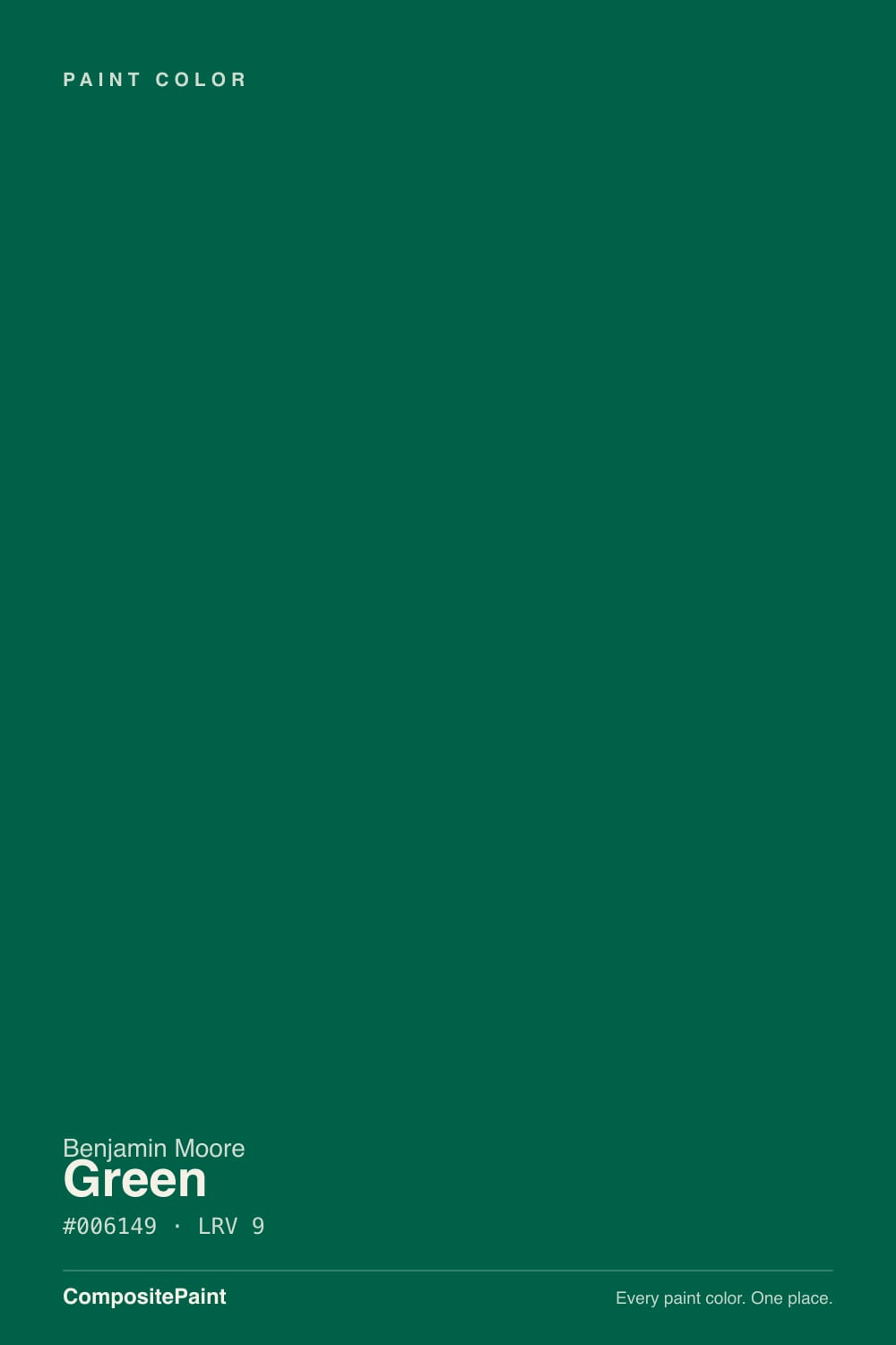
Green 2044-10 is the emerald end of the Benjamin Moore deck — pure pigment, no gray, and only LRV 9. On cabinets, a front door, or a paneled dining room with real lamps, it looks expensive in a way few paint colors manage. On four drywall walls in a dim room it stops being green and becomes a black box. Buy it for the surfaces light actually hits, and budget for a tinted primer and three coats.
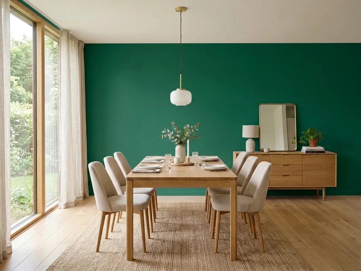
Kitchen cabinets and islands · a paneled dining room you want to feel like a jewel box · a front door on a light house · powder rooms with good lamps
Your only window faces north · you pictured a warm forest green · your floors and counters are cool gray · you need touch-ups to disappear
- Clean jewel green with no gray muddiness — genuinely rich, not murky
- Best-in-class on cabinets and islands next to brass and white oak
- Reads as a real color where black or navy would just read dark
- Excellent front door and shutter color against light siding
- Warm woods, cane, terracotta and bronze all sit comfortably against it
- At LRV 9 it reads plain black in dim or north-facing rooms
- Leans teal under cool LEDs and beside gray floors or white marble
- Deep base: expect a tinted primer and three coats, and touch-ups that flash
- Shows roller marks, dents and dust lines more than any mid-tone color
What Color Is Green, Really?
This is emerald, not forest. Most people who type "Benjamin Moore green" have a hunter or pine color in their head — deep, slightly yellowed, tweed-jacket green. That is not this. Green 2044-10 sits on the blue side of the family, so what you get is jewel green: the color of a bottle held up to a window. There is no gray in it to calm it down, which is exactly why it looks costly on a satin cabinet door and exactly why it can feel cold on a wall.
At LRV 9 it gives back almost nothing. Plain terms: stand it next to Hale Navy HC-154 (LRV 8) across a room and most people cannot tell which wall is darker — they only see two dark walls. That is the honest weight class you are buying into. If you want the same idea with the lights on, Sherwin-Williams Pewter Green SW 6208 (LRV 12) is the muted version people usually end up happier with in a whole room.
Undertone in one line: cool blue-green, clean and unmuddied — never olive, never yellow. If your sample looks teal, that is the blue lean doing its job under cool bulbs, not a mistint.
Where It Shines
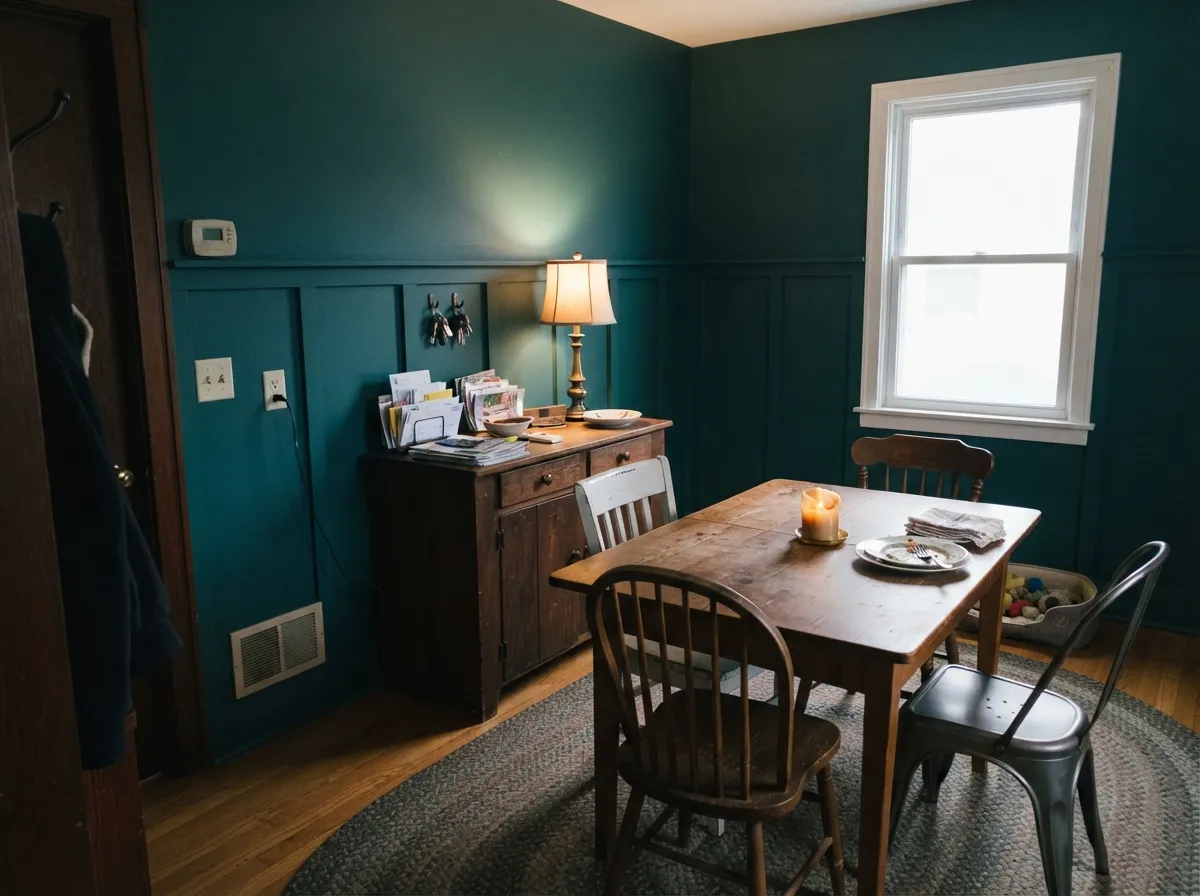
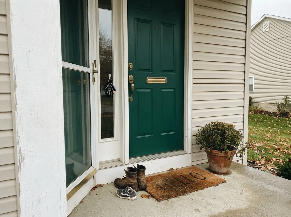
It earns its price on the surfaces that catch light and get looked at up close — cabinet doors, an island, a paneled dining wall, a front door under a porch light. The gloss is doing half the work: every reflection is where the emerald actually shows.
Where It Fails
The bad stories about this color are all the same three stories, and every one of them is predictable from the numbers. If your room matches one, no number of coats will save it.
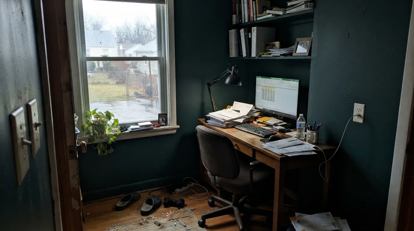
North light is cool and weak, and at LRV 9 there is nothing left to bounce back. By mid-afternoon the walls are simply black and the room feels smaller than it is. If you want a green that still reads green in that light, step up to Tarrytown Green HC-134 — a full step lighter and far more forgiving.
The blue lean is not subtle once it is on 300 square feet. Under 4000K LED bulbs, or beside gray floors and white marble, it tips toward teal and people say the room feels like an aquarium. If a warmer, more traditional deep green is what you pictured, use Deep Green 2039-10 instead — same depth, yellower lean.
Deep saturated colors are mixed in a soft deep base with very little white pigment, so a flat finish burnishes shiny wherever anyone brushes it and every touch-up flashes a different shade. Use eggshell at minimum, and if the wall takes real traffic pick a paler green like Buffett Green CW-535 that hides marks.
Room by Room
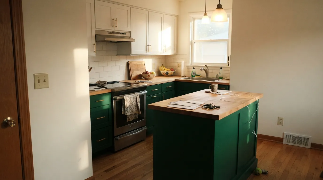
Satin, sprayed if you can afford it. The reflection off a door panel is where the emerald appears, and it flatters unlacquered brass and white oak the way almost nothing else does. Keep uppers in White Dove OC-17 so the room does not close in.
Wainscot or board-and-batten breaks the surface into planes that catch light differently, which is what stops an LRV 9 wall from going dead. Trim and ceiling in Chantilly Lace 2121-70. Put in a lamp or picture lights, not just an overhead fixture.
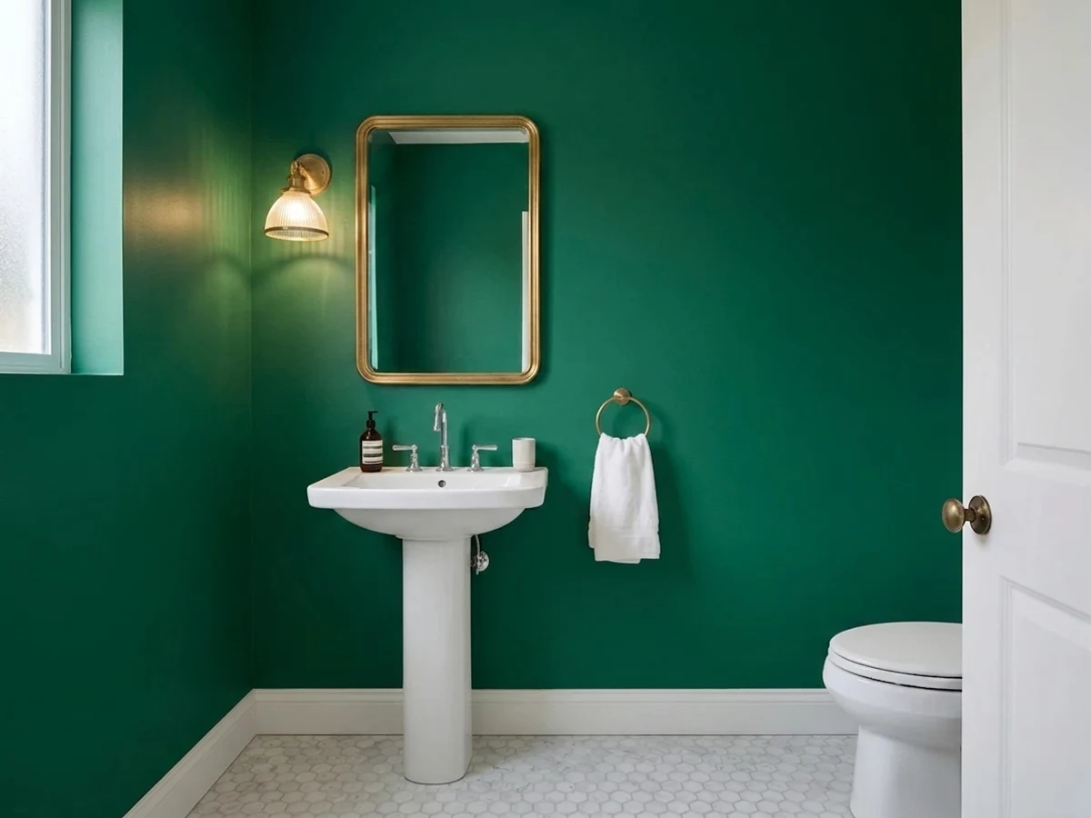
Walls and ceiling in satin, no window needed. A tiny room is where dark actually helps, because there is no expectation of airiness to disappoint. Simply White 2143-70 on the trim and vanity keeps it from becoming a cave.
Built-in shelving in the same green as the walls reads deliberate and expensive. Books and wood supply all the contrast you need. Add a picture light or two; one ceiling fixture will not carry this color after dark.
In a south or west bedroom it is genuinely restful. In a north-facing one it is a black room that photographs badly and feels heavy on gray mornings. Warm 2700K bulbs soften the blue considerably.
Against light siding it reads formal rather than trendy, and satin exterior enamel keeps the green visible. Expect some fade on a south-facing door over several years, as with any deep saturated color.
Your Light Is the Risk
Direct sun on the wall is when the emerald shows and the room gains depth.
Cool weak light plus LRV 9 equals a black wall by afternoon. Test first.
Clearly green during its sun hours, near-black the rest of the day.
2700K lamps deepen it and calm the blue. 4000K LEDs push it teal.
Most complaints about Green are a light mismatch. Upload a photo of your actual room and see it on your walls — then ask for the same wall in north light or evening lamps before you buy a single sample.
Need It From Another Brand?
Any paint counter can custom-tint Benjamin Moore 2044-10 directly. If you would rather stay in one brand's own deck, these are the closest stock matches, measured as ΔE2000. Under 2 is a difference you will not see on the wall.
| Brand | Closest color | ΔE | LRV | |
|---|---|---|---|---|
| Sherwin-Williams | GreensSW 6748 · Sherwin-Williams | 4.3 | 10 | Color page → |
| Behr | RealmS-H-500 · Behr | 2.7 | 10 | Color page → |
| Valspar | Rainforest RetreatP026 · Valspar | 3.4 | 7.9 | Color page → |
| PPG / Glidden | Deep VeridianPPG1141-7 · PPG / Glidden | 4.2 | 10 | Color page → |
| Glidden | Deep VeridianPPG1141-7 · Glidden | 4.5 | 10 | Color page → |
| Dutch Boy | Clover Green229-7DB · Dutch Boy | 4.5 | 9 | Color page → |
Similar Benjamin Moore Colors
The nearest shades to Green within Benjamin Moore's own range, ranked by perceptual color distance — useful when you want the same look a touch lighter, darker, or warmer.
WCAG 2.1: AA is 4.5 : 1 for normal text, 3 : 1 for large text, AAA is 7 : 1.
Green vs the Colors You're Also Considering
Every Green sample board has the same rivals on it. The numbers show the real lightness gap — then it comes down to which risk you would rather live with.
Pick this if you want the clean jewel-green look, not a traditional one.
Benjamin Moore 2039-10 · LRV 9Deep GreenPick this for a warmer, yellower deep green that reads classic forest.
Pick this when the room has real daylight and you want maximum richness.
Benjamin Moore HC-134 · LRV 10Tarrytown GreenPick this for dim rooms — it still reads green where 2044-10 goes black.
True Green 2042-10, hex #006047 at LRV 9, is nearly the same depth with a fractionally warmer, less blue lean. Deep Green 2039-10, hex #006242 and also LRV 9, moves further toward yellow-green, so it reads a little more like a classic forest color. Calypso Green 2046-10, hex #005A48 at LRV 8, is darker again and the most likely of the group to read plainly black indoors.
Buffett Green CW-535 at LRV 11 is the outlier worth knowing. Its hex of #265D41 carries visible gray, so it looks softer and more historical where 2044-10 looks like a jewel.
Across brands, Behr Realm S-H-500 at LRV 10 has a deltaE of 2.66, which is very close but worth sampling before you commit. Sherwin-Williams Greens SW 6748 at a deltaE of 4.25 and PPG Deep Veridian PPG1141-7 at 4.17 are close but visibly different side by side, with the PPG color leaning more teal. Benjamin Moore is sold through independent dealers, so take the 2044-10 code if you are comparing.
Green 2044-10 Coordinating Colors
The rule with a color this saturated is that everything around it should be quiet. It needs one clean white for contrast, one warm neutral to cancel its blue lean, and nothing else with an opinion. These are the partners that keep coming back:
Green 2044-10 on Cabinets, Doors, and Built-Ins
This is where the color stops being risky and starts being worth the money. A cabinet door is a small, hard, light-catching plane, so the emerald shows on every panel edge and every reflection instead of drowning the way it does on flat drywall. Satin is the sweet spot: gloss enough to reveal the green, matte enough to hide the fingerprints that a full semi-gloss broadcasts around handles.
Application is where people get burned. Deep base enamel is soft while it cures, so brush marks stay visible on a dark surface and hardware installed too early leaves dents. Spray if you can; if you brush, use a fine synthetic brush, thin coats, and leave the doors flat for at least a week before hanging them. On a front door, the same logic applies outdoors — satin exterior enamel, and accept that a south-facing door will lose some intensity over several years.
For pairings, keep the surrounding surfaces light and warm. Green lowers with White Dove OC-17 uppers is the classic split; walls in Edgecomb Gray HC-173 or Manchester Tan HC-81 keep the room from reading cold. Brass, unlacquered bronze, and white oak all warm the blue lean. Polished chrome and cool gray stone do the opposite.
Coverage, Touch-Ups, and Sheen With a Deep Base
Everything hard about this color comes from one fact: to reach a hue this pure, the paint is mixed into a base with almost no white pigment in it. That base hides poorly, dries soft, and behaves differently from the paint you are used to. Two coats over white drywall will look finished while wet and patchy the next morning, especially across the middle of a wall where the roller overlapped. A gray-tinted primer first and three finish coats is the honest plan, and it is cheaper than repainting.
Sheen is a maintenance decision, not a style one. Flat and matte burnish — rub a scuff and you get a shiny mark that will not go away — and at LRV 9 that shiny mark is obvious from across the room. Eggshell is the minimum for walls, satin for anything people touch. On woodwork and cabinets, satin or semi-gloss.
Assume touch-ups will not blend. Even the same can, brushed on months later, dries to a slightly different sheen and reads as a patch under side light. The workable habit is to keep a full quart of the original batch and repaint corner to corner when a wall needs help, rather than dabbing. It sounds like a lot of trouble, and it is — this color asks more of you than any mid-tone neutral, and pays it back only on the surfaces where light actually lands.
Three Ready Palettes Built on Green
A color is never alone on the wall. These are complete combinations in the 60-30-10 pattern, with the reason each one holds together. Every one opens in the visualizer.
The green takes 60 percent of the room and the crisp white trim is the 30 that keeps it readable as a color rather than as darkness. Shaker Beige in the hall is the 10 that warms the doorway, so the dining room reads as a deliberate dark box instead of a dead end.
Try this palette in your roomGreen on the base cabinets is the dominant painted surface, White Dove on the uppers keeps the eye level light, and Edgecomb Gray on the walls bridges the two without adding a third opinion. The warm gray also cancels the green's blue lean, which is what keeps the room from feeling cold.
Try this palette in your roomWrapping walls and ceiling in one dark color removes the edges, and satin lets the vanity light bounce so the green stays visible in a room with no window. Simply White on trim and vanity is the hard bright line that keeps the space from reading as a black closet.
Try this palette in your roomGreen FAQ
Is Benjamin Moore Green 2044-10 too dark for a whole room?
For most rooms, yes — unless the room gets direct south or west sun for part of the day. At LRV 9 it returns almost no light, so the walls read black wherever the sun does not land. In a dim room, put it on cabinets, built-ins, or one paneled wall instead of all four.
Will it just look black?
In shadow and after dark with one ceiling fixture, yes. In direct light, or on a satin or gloss surface catching a reflection, the emerald is unmistakable. The fix is sheen and lamps: satin instead of matte, and table lamps, sconces or picture lights rather than a single overhead.
Green 2044-10 or Deep Green 2039-10?
Both sit at LRV 9, so the choice is temperature, not depth. Green 2044-10 leans blue and reads as emerald or jewel green; Deep Green 2039-10 leans yellow and reads closer to a classic forest. Pick 2044-10 with brass and white oak, and 2039-10 with older woodwork and traditional furniture.
What white trim goes with Green 2044-10?
Chantilly Lace 2121-70 for maximum contrast and a modern look, or White Dove OC-17 if you want the edge softer and warmer. Avoid an off-white that is only a step or two lighter — at LRV 9 the trim needs to be obviously brighter or it disappears into the wall. Semi-gloss on the trim, always.
How many coats does it take?
Plan on a gray-tinted primer plus three finish coats over anything light. Deep saturated colors are mixed into a base with almost no white pigment, so two coats usually leave patchy, streaky spots that only show up once the wall dries. Rolling in one direction and keeping a wet edge matters more here than with any pale color.
Is it good for kitchen cabinets?
It is one of the best uses for this color. Use a satin urethane-fortified cabinet enamel, sprayed if the budget allows, because brush marks read clearly on a dark gloss surface. It pairs naturally with unlacquered brass, white oak, and warm stone; cool gray quartz will push it toward teal.
Do touch-ups blend?
Usually not. A dab of the same paint on a dark saturated wall dries to a slightly different sheen and shows as a patch under raking light. Keep the leftover paint, and when you need a repair, roll the full wall corner to corner rather than spot-touching it.
Have you painted with Green?
Rate it — one tap helps the next reader decide.
Ask a Question