Ballet White
The off-white designers call a "dirty cream," reviewed honestly: the rooms where it glows, the north-facing rooms where it turns faintly green, and what to buy instead.

Jessica has spec'd whites and neutrals for more than 300 rooms and keeps a sample wall of painted drawdowns in her studio. Every color review is checked against real reader rooms in the comments and re-tested when a formula changes. About the testing process →
- 1Agreeable Gray60
- 2Balboa Mist66
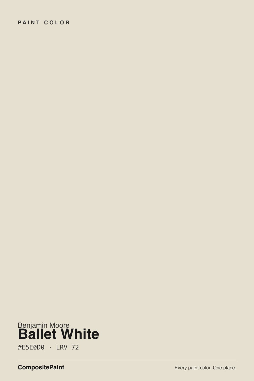
- 3Ballet White72
- 4Pearly White77
- 5Dover White83
The Fast Verdict
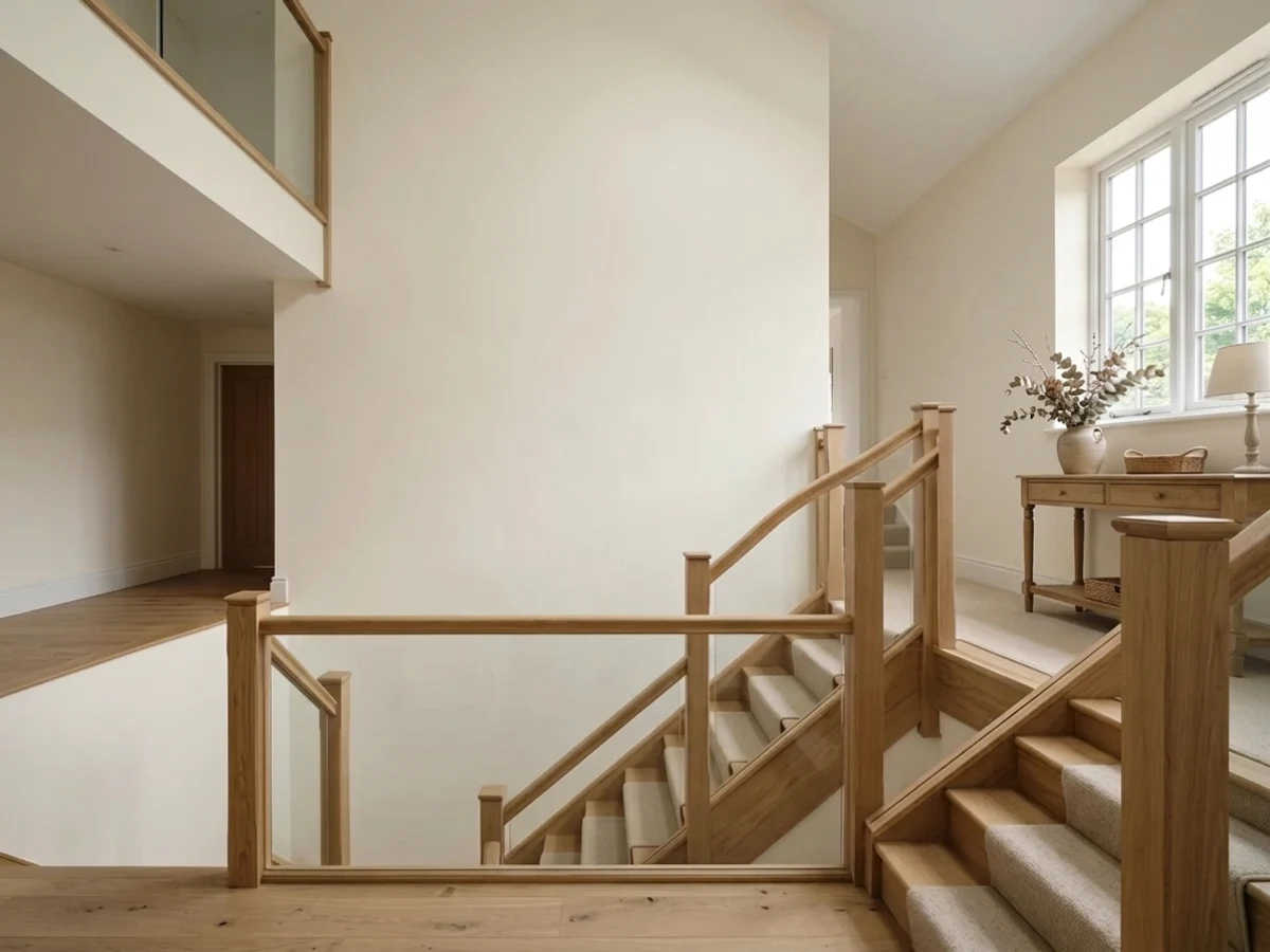
Ballet White is what people actually mean when they say "white, but not cold." It is a cream that has had gray stirred into it, so it stays soft instead of buttery, and at LRV 72 it holds enough body to look like a real color rather than a blank wall. That same gray is the catch: in dim north light the warmth drains out and a faint olive-green can surface. Sample it on the wall you are worried about, not on the sunny one.
Whole-house walls in warm or south light · kitchen cabinets that should look custom, not builder · rooms with oak, walnut, brass or stone · anyone who finds true white too sharp
Your room is north-facing and dim · your trim is already a bright builder white · you want the wall to read as white · your floors are cool gray LVP
- Warm without ever going butter-yellow — the gray does real work
- LRV 72 lifts dark halls and small rooms while still holding color
- Reads custom on cabinets and hides handprints better than bright whites
- Flatters oak, walnut, brass, linen and natural stone almost automatically
- Carries a whole open floor plan without clashing with the next room
- Turns flat and faintly olive-green in dim north light
- Looks dirty beside a bright builder-white trim or ceiling
- Goes clearly golden in late west sun, especially over orange oak floors
- The name promises white and the wall delivers a light warm beige
What Color Is Ballet White, Really?
It is a cream that somebody deliberately dirtied. Straight cream paints are built on a yellow oxide base and go butter-yellow the second real sun hits them. Ballet White starts in the same cream family, then a measurable amount of gray gets pulled through it, which mutes the yellow into something closer to a warm putty. Designers call the result a "dirty cream," and they mean it as a compliment: on the wall it stops looking like a color and starts looking like warm light. Take the gray back out and you would be left with an ordinary yellow-cream nobody would put on a whole house.
At LRV 72 it reflects a lot of light without ever passing for white. Put it beside Chantilly Lace 2121-70 at LRV 91 and the gap is nineteen points — Ballet White suddenly looks like a light beige and the trim looks like the real white. Beside White Dove OC-17 at LRV 85 the gap is thirteen points, which is the sweet spot: enough separation to make woodwork read crisp, not enough to make the walls look grubby. That difference is not a detail. It is the single decision that makes or breaks this color.
Undertone in one line: warm grayed yellow, with a green shadow that only shows up in cool light. If your sample looks olive on the wall, that is the gray base meeting north daylight — not a bad can of paint.
Where It Shines
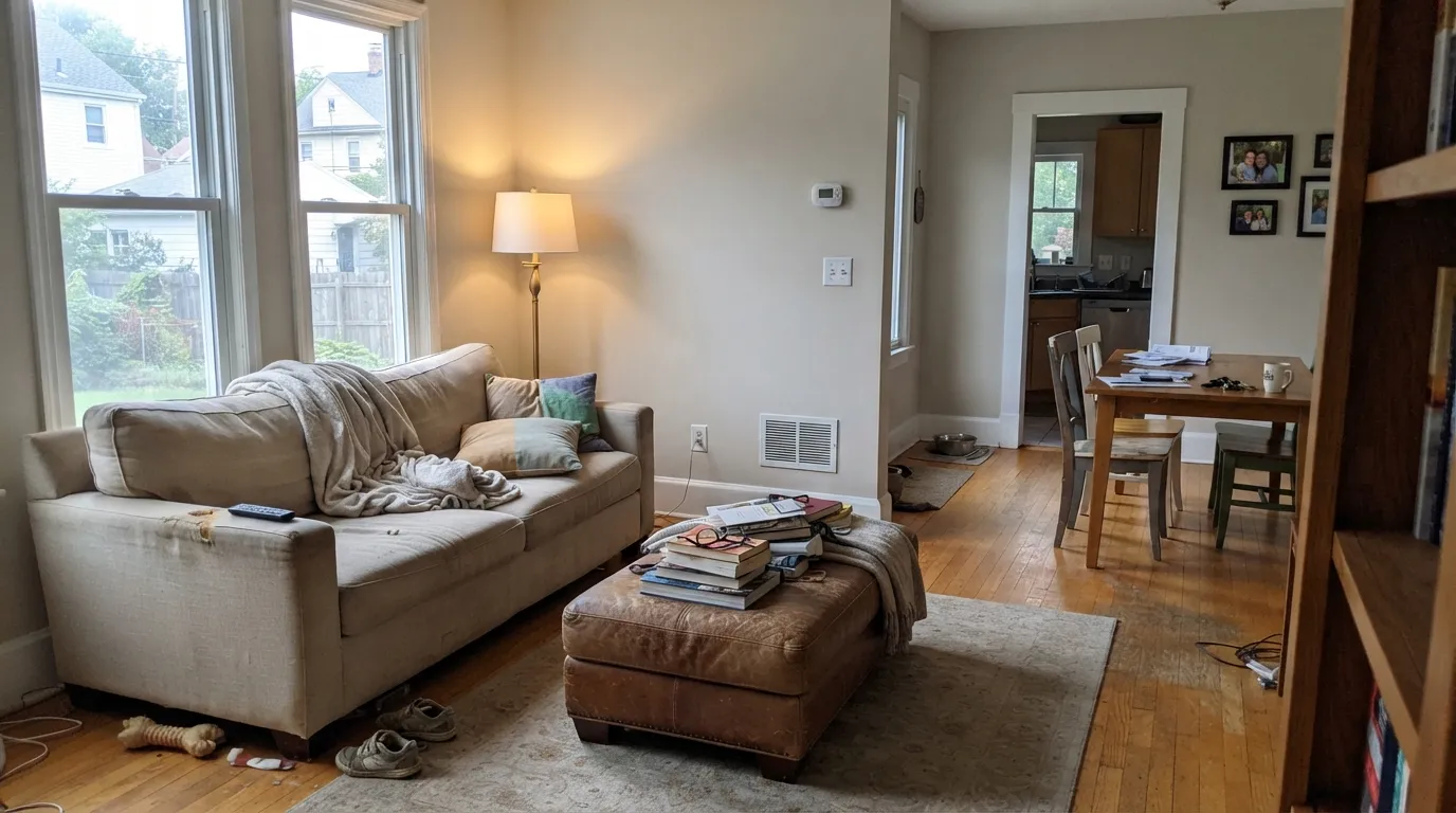
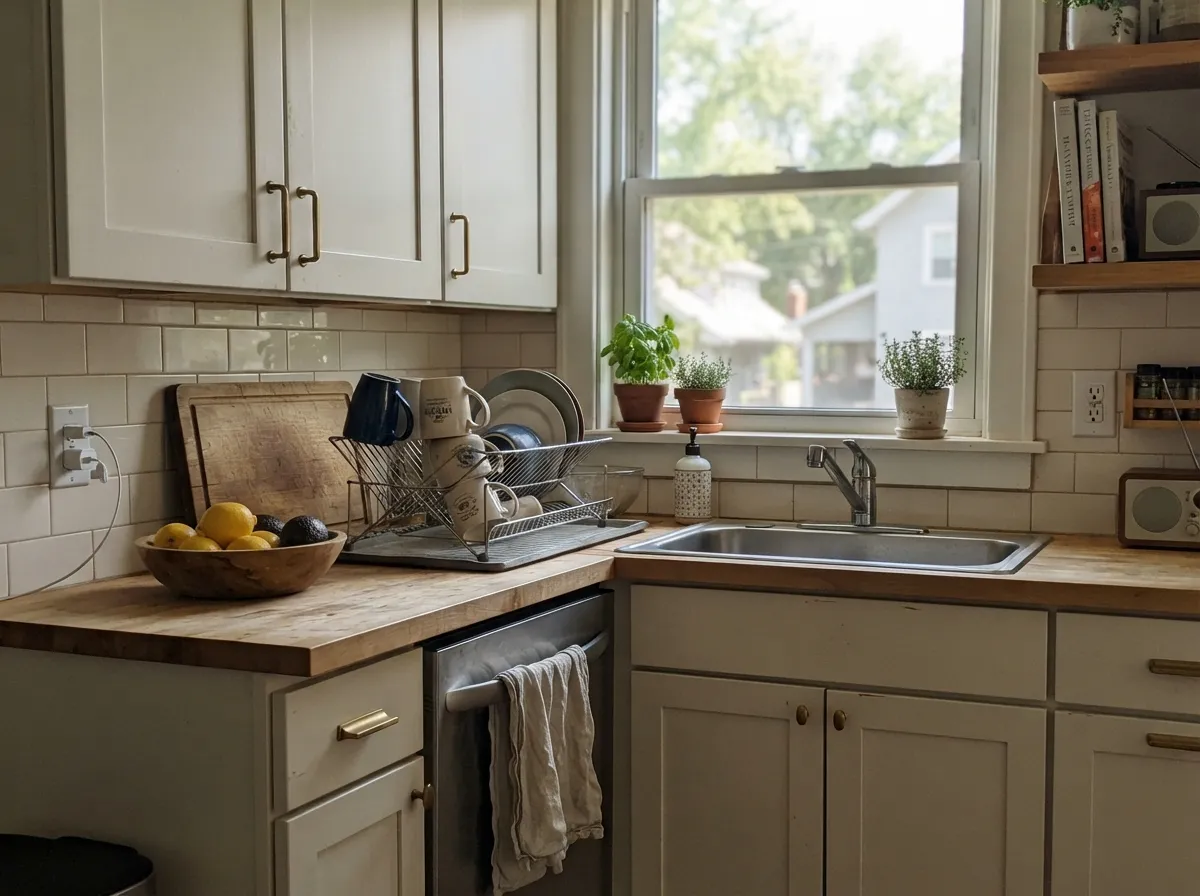
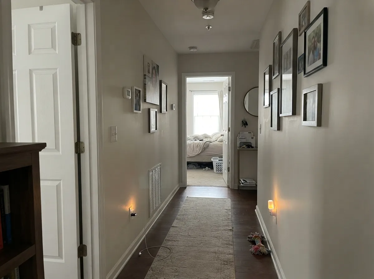
Give it warm daylight and a wood floor and it does the thing people are paying for: the room reads finished and old-money-quiet instead of freshly painted. Kitchens are where it earns the most, because on cabinet doors the soft cream reads custom rather than builder-grade, and at LRV 72 it forgives the fingerprints around every handle that a bright white would broadcast.
Where It Fails
The bad stories about Ballet White are remarkably consistent, and every one of them is predictable before you open a can. If your room matches one of these three, more coats will not save it.
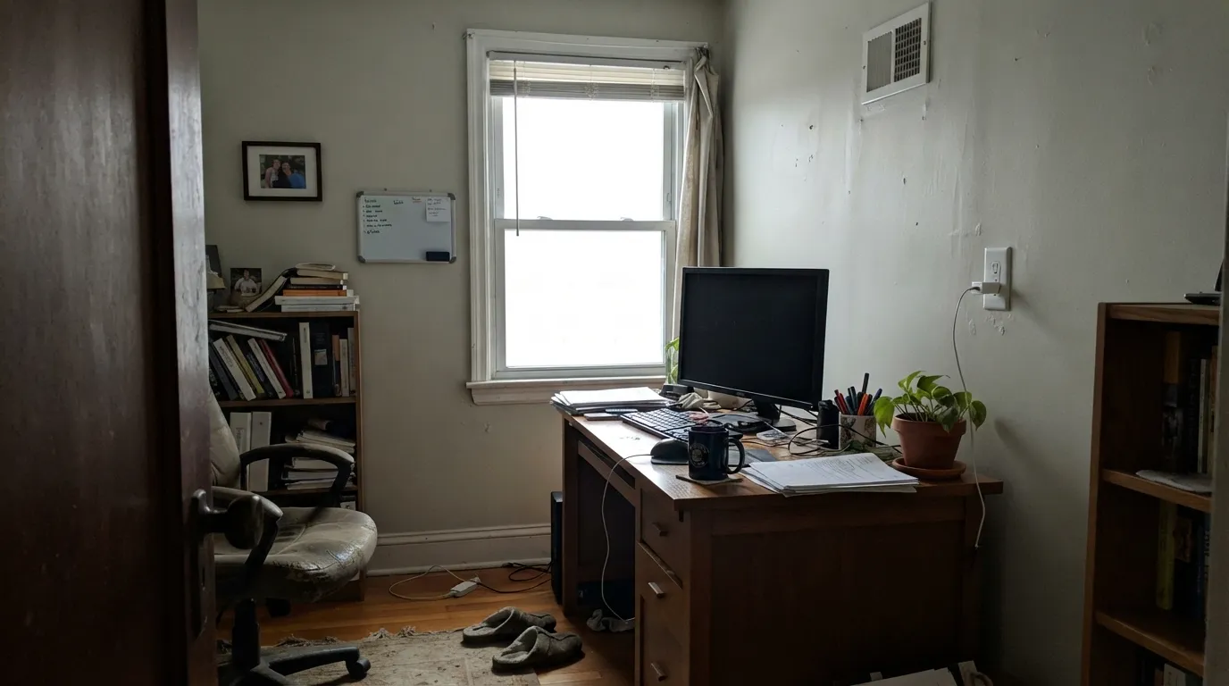
North light is cool and even, so it strips the yellow out and leaves the gray base standing alone. In a room with one small window and no lamps on, that combination reads faintly olive — people describe it as "dirty" or "a bit green." Go warmer and lighter with Swiss Coffee OC-45 at LRV 82, or commit to 2700K lamps you actually switch on during the day.
This is the most common complaint and it is a pairing mistake, not a paint problem. Against Chantilly Lace 2121-70 or a contractor-grade white ceiling, the nineteen-point LRV gap makes Ballet White walls look grubby and yellowed. Repaint the trim in White Dove OC-17 — the softer thirteen-point step reads clean instead of accusing.
Warm floors bounce warm light up the wall. In a west-facing room from about four o'clock, orange-leaning oak plus low sun pushes Ballet White past cream into a peachy gold that nobody sampled for. If your floors are that orange, step to the grayer Pale Oak OC-20 at LRV 70 or the greiger Edgecomb Gray HC-173.
Room by Room
With any real daylight it is the quiet backdrop that makes wood furniture and art look intentional. Eggshell on walls, White Dove OC-17 semi-gloss on the trim. Skip it if the room is north-facing and you rarely turn on lamps.
On doors and drawer fronts the cream reads custom, and the LRV keeps it gentle in a kitchen full of hard bright surfaces. Satin in a urethane-fortified cabinet paint. Pair with unlacquered brass and butcher block; be careful against a cool white quartz, which will pull the yellow forward.
Under 2700K bulbs it turns genuinely cozy after dark. In a dim north bedroom it goes flat and slightly green instead — use Swiss Coffee OC-45 there. Eggshell, and keep the ceiling one step brighter.
This is where LRV 72 pays off. It lifts a windowless hall without the cold blankness of a stark white, and it carries room to room in an open plan without ever fighting the next color. Eggshell so scuffs wipe off.
With warm marble, travertine, wood vanities and brass it is lovely. With cool gray porcelain or blue-gray subway tile it argues and reads yellow — use Pale Oak OC-20 instead. Satin, and check it under the vanity bulbs before you commit.
Full sun washes it brighter and crisper than it ever looks indoors, which is exactly why it works on a facade. Pair with Kendall Charcoal HC-166 or Wrought Iron 2124-10 shutters. Details in the exterior section below.
Your Light Is the Risk
The cream comes forward all day and stays soft. This is the exposure it was made for.
Cool daylight kills the yellow and exposes the gray base — a faint olive cast. Sample here first.
From about four o'clock it warms up hard and can read golden. Most people like it; some do not.
2700K lamps deepen the cream and it gets cozy. 4000K LEDs flatten it toward gray-white.
Most complaints about Ballet White are a light mismatch. Upload a photo of your actual room and see it on your walls — then ask for the same wall in north light or evening lamps before you buy a single sample.
Need It From Another Brand?
Any paint counter can custom-tint Benjamin Moore OC-9 directly. If you would rather stay in one brand's own deck, these are the closest stock matches, measured as ΔE2000. Under 2 is a difference you will not see on the wall.
| Brand | Closest color | ΔE | LRV | |
|---|---|---|---|---|
| Sherwin-Williams | White DuckSW 7010 · Sherwin-Williams | 1.5 | 74 | Color page → |
| Behr | Hazelnut Cream750C-2 · Behr | 1.0 | 74 | Color page → |
| Valspar | Totten's Inlet7006-9 · Valspar | 2.4 | 75.2 | Color page → |
| PPG / Glidden | FocusPPG1008-1 · PPG / Glidden | 0.5 | 74 | Color page → |
| Glidden | Antarctic Ice70YY 73/083 · Glidden | 0.4 | 73 | Color page → |
| Dutch Boy | Worn Pages016W · Dutch Boy | 1.5 | 74 | Color page → |
Similar Benjamin Moore Colors
The nearest shades to Ballet White within Benjamin Moore's own range, ranked by perceptual color distance — useful when you want the same look a touch lighter, darker, or warmer.
WCAG 2.1: AA is 4.5 : 1 for normal text, 3 : 1 for large text, AAA is 7 : 1.
Ballet White vs the Colors You're Also Considering
Every Ballet White sample board has the same rivals on it. The numbers show the real lightness gap — then it comes down to which risk you would rather live with.
Pick this when you want a soft neutral with body, not a white.
Benjamin Moore OC-17 · LRV 85White DovePick this when you want the wall to actually read white — thirteen points brighter.
Side-by-side comparison →Pick this in good daylight, where Swiss Coffee's extra cream reads too sweet.
Benjamin Moore OC-45 · LRV 84Swiss CoffeePick this for dim north rooms — it keeps glowing where Ballet White goes olive.
The comparison people ask about most is White Dove OC-17. At LRV 85 and hex #F0EFE2, White Dove is 13 points brighter and much closer to reading as an actual white. Ballet White at LRV 72 is the warmer, deeper, creamier of the two. Use White Dove when you want white, and Ballet White when you want a soft neutral that white sits on top of.
Inside the same deck, Muskoka Trail 974 shares the hex and the LRV exactly, while Plaster of Paris CSP-185 at LRV 73 and Feather Down OC-6 at LRV 73 are a hair lighter. Old Prairie OC-42 at LRV 74 is the least yellow of the group.
Across brands, Antarctic Ice 70YY 73/083 by Glidden at deltaE 0.41 and Focus PPG1008-1 at 0.54 are effectively the same color. White Duck SW 7010 at LRV 74 and Slipper Satin No. 2004 by Farrow and Ball at LRV 75 sit at 1.5 and 1.1, visually identical in normal room light. Cookies and Cream by Backdrop, at 3.16, is very close but worth sampling first.
Ballet White Coordinating Colors
The rule with Ballet White is to stay warm and to respect the LRV gap. It flatters warm greiges, muted greens, deep navies and every warm wood; it fights icy blues, cool gray stone and any white bright enough to make it look dingy. These are the partners that come up again and again:
Ballet White on Cabinets and Millwork
This is the use that makes people love the color rather than merely accept it. A stark white cabinet door shows every dust mote, every knuckle mark and every wave in the door panel. Ballet White at LRV 72 absorbs enough of that to look settled, and the cream in it reads as a decision somebody made instead of whatever the builder had on the truck. Use a urethane-fortified cabinet enamel in satin; a semi-gloss will make the warmth glare under undercabinet lighting.
Two cautions. First, do not put Ballet White doors against existing cream trim without sampling — two different creams in one room is the worst-looking mistake in this whole category, far worse than an obvious contrast. Second, watch your counter. Warm quartz, butcher block and travertine sit beautifully with it; a cool white quartz with gray veining will make the doors look yellow, and that is a job you cannot undo cheaply.
Ballet White on Exteriors
Outdoors this color changes character. Open sky light is far brighter and far cooler than anything indoors, so Ballet White loses most of its cream and reads as a warm, slightly aged white — the look people are usually chasing when they say "not a builder white." It sits comfortably against red brick, fieldstone, cedar shakes and copper, because it never competes with them for warmth.
The trim decides everything. Kendall Charcoal HC-166 or Wrought Iron 2124-10 on shutters and window frames gives you the modern-farmhouse contrast and makes the body color look crisp. A softer, more traditional result comes from a warm greige trim. What to avoid outside is the same thing to avoid inside: a bright blue-based white next to it, which turns the body of the house yellow by comparison. And walk the whole house with your sample — the shaded north elevation will always read a step creamier and grayer than the sunny south wall.
Three Ready Palettes Built on Ballet White
A color is never alone on the wall. These are complete combinations in the 60-30-10 pattern, with the reason each one holds together. Every one opens in the visualizer.
Thirteen LRV points between wall and trim is enough to make woodwork read crisp without making the walls look dirty, which is the whole game with this color. The navy door supplies the one dark note a house of soft neutrals needs.
Try this palette in your roomRunning the lighter white on the walls and the creamier one on the doors makes the cabinetry look built rather than bought, and it keeps Ballet White away from the bright-white-trim trap. Saybrook Sage picks up the green already hiding in Ballet White and turns a liability into the plan.
Try this palette in your roomCharcoal shelving gives the eye somewhere to land so the cream never reads as an unfinished room. Keeping the trim in White Dove rather than a bright white means the contrast all comes from the built-ins, which is where you actually want it.
Try this palette in your roomBallet White FAQ
Does Ballet White look green?
Sometimes, and only in cool light. The gray mixed into the cream carries a slight green bias, and north-facing daylight or 4000K LEDs can bring it forward as a faint olive cast. In south or west light you will never see it. Tape a large sample on the coolest wall in the room and look at it on an overcast morning before you decide.
Ballet White or White Dove for walls?
White Dove if you want the room to read white, Ballet White if you want warmth with some body to it. At LRV 72 versus 85, Ballet White will always look like a soft color and White Dove will look like a pale white. Many houses use both: Ballet White on the walls, White Dove on the trim and ceiling.
Will it look dirty next to my existing white trim?
It depends how bright that trim is. Against a builder white or Chantilly Lace 2121-70 the gap is too wide and the walls will look yellowed and grubby. Against White Dove OC-17 or Cloud White OC-130 it looks intentional. Hold a trim offcut against the sample before you buy a gallon.
Can I paint the ceiling Ballet White too?
You can, in flat, and it gives a soft enveloping look in bedrooms and small studies. But at LRV 72 the ceiling will feel lower and warmer than a standard ceiling white. In rooms with eight-foot ceilings, White Dove overhead is the safer move.
Does it work with orange oak floors?
In north or east rooms, yes — the cool light balances the floor and the two settle together nicely. In a west-facing room it is a real risk, because late sun bouncing off orange oak can push the wall to a peachy gold. Sample it on the wall farthest from the window and again at five in the afternoon.
Is Ballet White good on an exterior?
Yes, and it behaves better outside than its soft reputation suggests. Full sun washes it brighter and crisper, so it reads as a proper warm white on a facade rather than a beige. It sits naturally against brick, stone and cedar, and needs a dark trim or shutter to give the elevation structure.
How many coats do I need?
Two over any existing light color. Over a saturated or dark wall, prime first with a gray-tinted primer, because a low-hiding warm off-white over red, navy or deep green can otherwise take three or four finish coats to stop shadowing.
Have you painted with Ballet White?
Rate it — one tap helps the next reader decide.
Ask a Question