Pearly White
America's quiet builder white, reviewed honestly: the rooms where it glows, the one pairing that ruins it, and what to use instead.

Jessica has spec'd whites and neutrals for more than 300 rooms and keeps a sample wall of painted drawdowns in her studio. Every color review is checked against real reader rooms in the comments and re-tested when a formula changes. About the testing process →
- 1Agreeable Gray60
- 2Pale Oak69
- 3Pearly White77
- 4Dover White83
- 5Moonlit Beach88
The Fast Verdict
Pearly White is a cream that stopped short of being a cream. It has real yellow in it and no gray to hold that yellow down, so it flatters oak, brass and warm stone beautifully and turns dingy the moment a brighter white shows up on the ceiling. Used as the only white in the room — walls, trim and ceiling, sheen doing the separating — it is one of the most comfortable whites Sherwin-Williams makes. Used as wall color under builder-white trim, it is one of the most regretted.
Whole rooms in one color — walls, trim and ceiling · houses full of oak, travertine and brass · dim or north-facing rooms that need warmth · shaker cabinets in an older kitchen
Your ceiling or trim stays a bright builder white · your floors and counters are cool gray · you want a crisp modern gallery look · your room takes hard west afternoon sun
- Warm and comfortable without tipping into 1990s cream
- One-color rooms — walls, trim and ceiling — look genuinely finished
- Flatters oak, walnut, travertine, brass and aged bronze
- At LRV 77 it lifts dim and north-facing rooms with no glare
- Hides scuffs, patches and wavy drywall better than a bright white
- Reads dingy under a brighter white ceiling or trim
- Goes visibly yellow against gray floors and cool quartz
- Flashes a faint green-yellow in hard west sun
- Too soft for a crisp, modern, high-contrast kitchen
What Color Is Pearly White, Really?
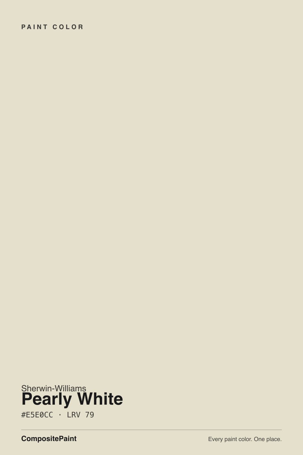
Pearly White is a cream that got talked out of being a cream. The yellow in it is real — you will see it on a full wall, not just on the chip — but it stops short of the buttery golds that make a room look like it was painted in 1998. That restraint is the appeal. It is also the risk: there is no drop of gray in here holding the warmth down, so whatever your room does to warm colors, Pearly White will do it louder than a grayed white would.
At LRV 77 it is bright, but it is not one of the bright whites, and that distinction decides most of what happens next. Alabaster SW 7008 sits at 82 and Pure White SW 7005 at 84. Three to five points sounds like nothing on a fan deck; on a wall it is the difference between a surface that reads "white" and one that reads "soft." Stand Pearly White beside either and it instantly becomes the older, warmer color — which is exactly right when that was the plan, and a problem when the brighter white turned up uninvited on your ceiling.
Undertone in one line: warm yellow with a faint green edge, never pink, never gray. If your sample looks tan, that is your floor bouncing up at it. If it looks slightly sallow, that is the green edge, and only strong daylight or a cooler white sitting next to it will bring that out.
Where It Shines
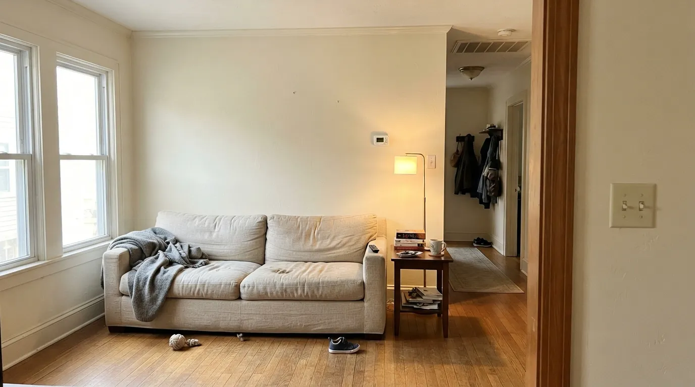
It does its best work when the whole room agrees with it: one color on walls, trim and ceiling, warm wood underfoot, brass or aged bronze on the hardware. Set up that way it stops reading as paint and starts reading as the light in the room. Small and shaded spaces get the most out of it, because LRV 77 gives back nearly all the light they get without the hard glare a near-white throws.
Where It Fails
The complaints about Pearly White are remarkably consistent, and almost none of them are about the paint by itself. They are about what is sitting next to it. Match one of these three rooms and no number of coats will save you.
This is the number one Pearly White regret: warm walls under a builder-white ceiling, or beside trim in Pure White SW 7005. The brighter white wins the comparison and Pearly White reads dingy, like a wall someone forgot to wash. Fix it by carrying Pearly White up onto the trim and ceiling as well, or move the walls to Alabaster SW 7008 and keep the bright trim you already have.
Gray LVP, gray quartz, chrome fixtures, blue-gray tile — each of those pushes the yellow forward until the walls look tinted rather than white. There is no sheen or extra coat that undoes it. In a genuinely cool room use Snowbound SW 7004, which is a white with a whisper of gray in it instead of yellow.
From about four o'clock on, west sun turns Pearly White distinctly buttery, and with grass or leaves outside the window it can flash a faint green-yellow across the wall. Plenty of people live with it happily. If you would not, Shoji White SW 7042 keeps the warmth but carries enough gray to soak up that sun.
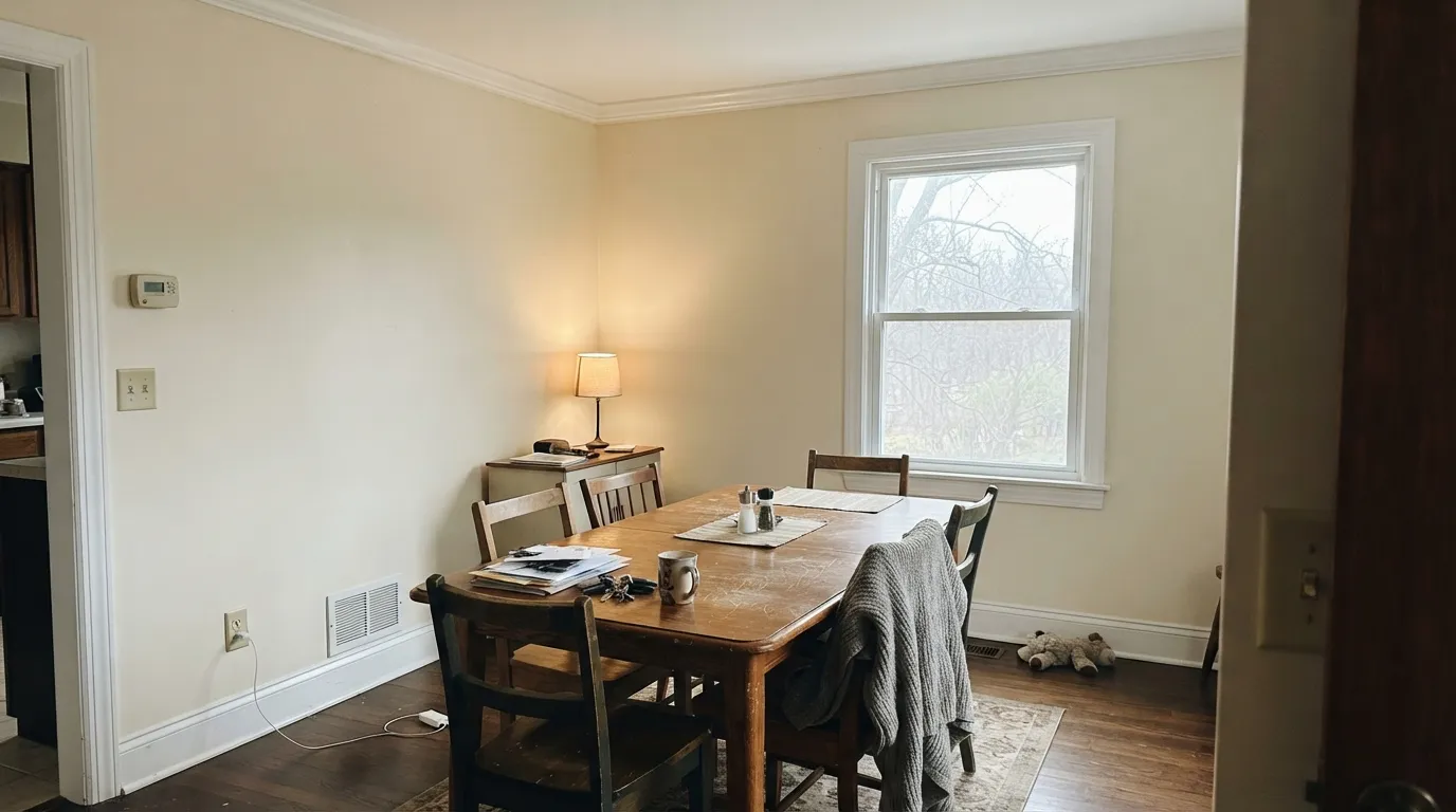
Room by Room
Warm floors, leather, rattan and brass have no friendlier backdrop than this. Eggshell on the walls, and put the same color on the trim so nothing brighter steals the comparison. If the room feels too pale, add one deep note like Urbane Bronze SW 7048 rather than a second white.
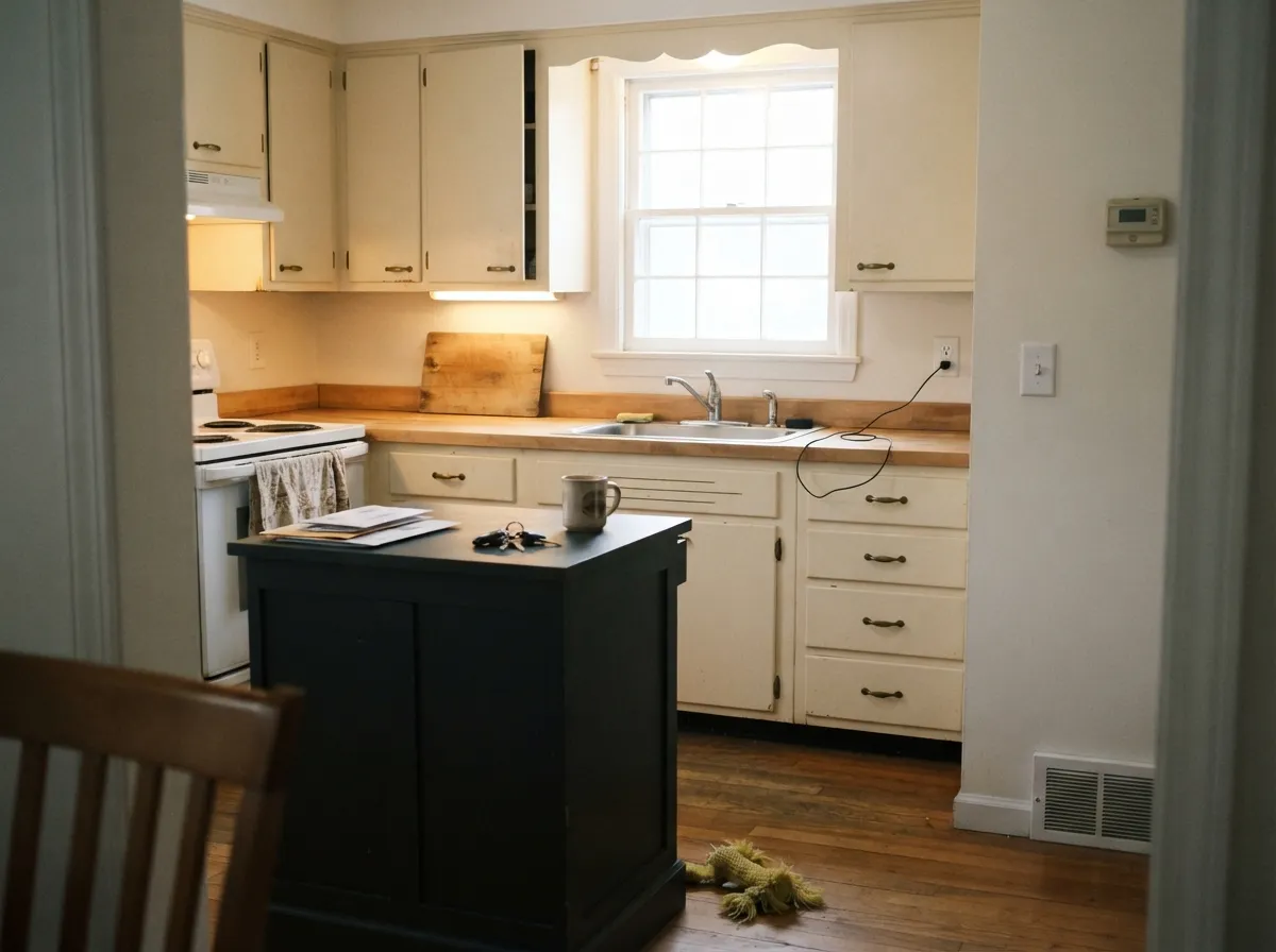
On traditional door styles with butcher block or honed granite it looks soft and expensive, and satin wipes clean around handles. Against slab fronts, waterfall quartz and chrome it simply reads dated — Alabaster SW 7008 is the safer cream for a modern kitchen.
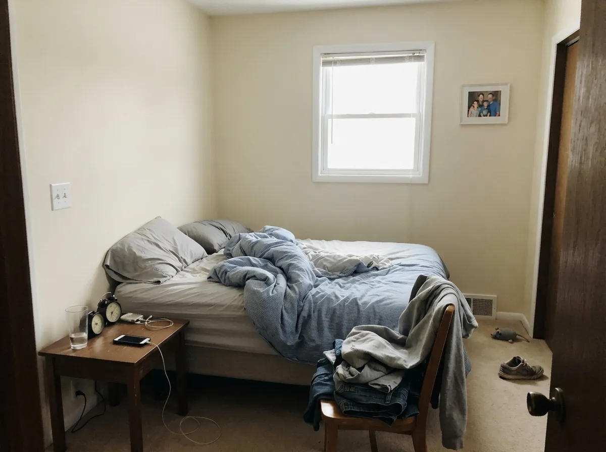
At LRV 77 it holds onto light in a room you mostly see at dawn and after dark, and 2700K lamps make it genuinely cozy at night. Evergreen Fog SW 9130 on the headboard wall gives it a partner without introducing a competing white.
Lovely with travertine, limestone, wood vanities and unlacquered brass. With cool gray marble or blue-gray tile it turns yellow, and this is the room where people actually repaint. Sample it against the stone, not against the drywall.
This is a spec trim and ceiling white across a lot of the country, and it earns that job: semi-gloss on trim, flat overhead, warm enough that millwork never looks plastic. Under a mid-tone wall like Accessible Beige SW 7036 it softens the line where a stark white would cut.
Full sun reads it lighter and cleaner than it ever looks indoors, so it works well as siding with Iron Ore SW 7069 or Urbane Bronze SW 7048 on trim and shutters. It is always the light half of the pairing and never the accent — do not expect it to carry contrast on its own.
Your Light Is the Risk
Cool daylight cancels most of the yellow and it settles into a soft neutral white. Its safest room.
Bright all day, and the warmth comes forward. Most people read it as cozy, not yellow.
Late sun turns it buttery, sometimes with a green-yellow flash off the yard. Sample this wall.
2700K lamps deepen the cream nicely. 3500–4000K holds it near white. Change bulbs before paint.
Most complaints about Pearly White are a light mismatch. Upload a photo of your actual room and see it on your walls — then ask for the same wall in north light or evening lamps before you buy a single sample.
Need It From Another Brand?
Any paint counter can custom-tint Sherwin-Williams SW 7009 directly. If you would rather stay in one brand's own deck, these are the closest stock matches, measured as ΔE2000. Under 2 is a difference you will not see on the wall.
| Brand | Closest color | ΔE | LRV | |
|---|---|---|---|---|
| Behr | Cinnamon Cake (w-f-220)W-F-220 · Behr | 0.6 | 76 | Color page → |
| Benjamin Moore | Seapearl961 · Benjamin Moore | 1.2 | 76 | Color page → |
| Valspar | Navy BeanV167 · Valspar | 0.6 | 77.6 | Color page → |
| PPG / Glidden | Oyster WhitePPG10-05 · PPG / Glidden | 1.0 | 78 | Color page → |
| Glidden | Mountain GrayPPG1021-1 · Glidden | 0.9 | 77 | Color page → |
| Dutch Boy | Moon Pie406-1DB · Dutch Boy | 0.7 | 75 | Color page → |
Similar Sherwin-Williams Colors
The nearest shades to Pearly White within Sherwin-Williams's own range, ranked by perceptual color distance — useful when you want the same look a touch lighter, darker, or warmer.
WCAG 2.1: AA is 4.5 : 1 for normal text, 3 : 1 for large text, AAA is 7 : 1.
Pearly White vs the Colors You're Also Considering
Every Pearly White sample board has the same rivals on it. The numbers show the real lightness gap — then it comes down to which risk you would rather live with.
Pick this when you want more warmth and an older, softer house feel.
Sherwin-Williams SW 7008 · LRV 82AlabasterPick this for a cleaner, brighter white that reads far less yellow.
Pick this when full cream would read sweet and you want restraint.
Sherwin-Williams SW 7012 · LRV 81CreamyPick this for a dim room that needs an obvious, glowing cream.
Within the same deck, Pearly White is the brightest of its group. Restoration Ivory SW 6413 (#E9E1CA, LRV 75) and Sagey SW 6175 (#E2E2D1, LRV 75) are four points lower, and Polar Bear SW 7564 (#E8DFCA, LRV 74), Aged White SW 9180 (#E8DECD, LRV 74), and Muslin SW 6133 (#EADFC9, LRV 74) are five below. That gap is small on a chip but enough to read as a light wall under Pearly White trim.
Across brands the near matches are tight. PPG Vanilla Love PPG1099-2 (LRV 74) at 0.37, Benjamin Moore Cream Agate OC-144 (LRV 73) at 0.42, Glidden Vanilla Love PPG1099-2 (LRV 74) at 0.48, and Behr Cool Honeydew S350-1A (LRV 75) at 0.51 all count as matches. Valspar Dream Grass 8003-27A (LRV 74) at 0.68 and Magnolia Home Soft Landing JG-17 (LRV 75) at 1.01 are visually identical in normal room light. Farrow and Ball Slipper Satin No. 2004 (LRV 75) at 2.59 is very close but worth sampling first.
Pearly White Coordinating Colors
The rule with Pearly White is short: keep everything warm, and keep other whites out of the sightline. Anything brighter and cooler standing beside it turns it dingy, which is why its real partners all sit below it rather than above. Warm greiges give you the wall-to-trim separation, muted greens pick up the faint green already in it, and one genuinely dark color handles doors and shutters.
These are the colors that keep showing up with it in finished houses, and they cover the three jobs the scheme actually needs — a darker wall, a soft color note, and a dark anchor.
Pearly White on Cabinets and Trim
Cabinets are where this color quietly outperforms its reputation. The warmth reads as age rather than as color, so shaker and inset doors look like painted furniture instead of a white box, and at LRV 77 it forgives the small dings and finger marks a brighter white would broadcast around every handle. Use a urethane-fortified cabinet enamel in satin and let it cure a full week before you load the shelves.
Trim is the job it was really spec'd for, and the honest advice there is to commit. Pearly White trim under Pearly White walls, separated only by sheen, is the look this color is best at. Pearly White trim under a bright white ceiling is the look that generates the complaints. If you want contrast, take the walls darker — never take the trim brighter.
Pearly White With Wood Tones and Floors
Warm wood is the whole reason to choose this color. Red oak, honey oak, white oak with a natural finish, walnut, butcher block, rattan and cane all meet Pearly White halfway, and the yellow that causes trouble elsewhere is exactly what makes those floors look intentional instead of accidental. If you have orange-leaning builder oak you cannot afford to replace, this is one of the few whites that calms it down rather than lighting it up.
Cool floors are the opposite story. Gray LVP, gray-washed engineered wood and blue-gray porcelain tile all set the yellow into relief, and the wall can end up looking faintly tinted from across the room. Warm area rugs and brass hardware pull it back in some spaces, but do not count on it — put a large sample board flat against the actual floor, look at it at four in the afternoon, and decide from there.
Three Ready Palettes Built on Pearly White
A color is never alone on the wall. These are complete combinations in the 60-30-10 pattern, with the reason each one holds together. Every one opens in the visualizer.
Pearly White carries the 60 percent as the only white in the house, with sheen rather than a second color separating trim from wall. Accessible Beige sits about twenty points darker in the same warm family, so the handoff between rooms reads deliberate, and the bronze door supplies the one dark note the scheme needs.
Try this palette in your roomEgret White is nine points darker, which is enough for the wall to fall away behind Pearly White cabinets without any brighter white entering the room. Iron Ore on the island takes the 10 percent, grounds all that warmth, and looks right with brass or aged bronze pulls.
Try this palette in your roomEvergreen Fog picks up the faint green already living inside Pearly White, so the accent wall looks related instead of applied. Naval on the door is the small dark 10 percent that keeps the room from going soft, and all three drop into the same warm quiet under 2700K lamps.
Try this palette in your roomPearly White FAQ
Pearly White or Alabaster — which should I pick?
Alabaster SW 7008 is three points brighter at LRV 82 and has a trace of gray holding its warmth down, so it reads more like a white and less like a cream. Pearly White is the warmer, older-feeling one. If your house already has gray floors, cool counters or bright white trim, take Alabaster. If it is full of oak, travertine and brass, Pearly White will look better on the wall.
My builder used Pearly White everywhere. Should I repaint?
Usually not the whole house. It is a common spec white because it is forgiving, easy to touch up, and inoffensive in most rooms. Repaint only where it is losing a fight — a gray-floored bathroom, a modern kitchen, a west room that goes buttery at four o'clock — and leave the hallways and bedrooms alone.
What ceiling color goes over Pearly White walls?
Pearly White itself, in flat. A standard bright ceiling white makes the walls look yellow every time you glance up, and that single pairing causes most of the bad reviews this color gets. If you want the ceiling to lift a little, have the store tint your ceiling paint to 50 percent Pearly White rather than reaching for a different white entirely.
Does Pearly White go with gray floors?
It is the hardest pairing it has. Cool gray LVP and gray-washed wood pull the yellow into the open and the wall starts to look tinted rather than white. Warm gray and greige floors are fine. If your floors are genuinely cool, tape a big sample above them next to Snowbound SW 7004 before you commit.
Will Pearly White look yellow next to white kitchen cabinets?
If the cabinets are a bright white like Extra White SW 7006 or Pure White SW 7005, yes — the walls will read cream against them and most people dislike it. It works far better the other way round, with Pearly White on the cabinets and a deeper color on the walls. The other safe option is both in Pearly White, changing only the sheen.
How many coats does it take?
Two over any existing light color. Expect the first coat to look patchy and unusually yellow — warm whites always do — and do not judge the color until the second coat is fully dry. Over a dark or saturated wall, prime first; three finish coats of an off-white over navy is an expensive lesson.
Is Pearly White too yellow for a modern house?
For a modern kitchen with slab doors, quartz and chrome, yes — it will read dated beside those materials. For a modern-warm or transitional house with wood, plaster texture and matte black hardware it works well. The metal and the stone decide this, not the architecture.
Have you painted with Pearly White?
Rate it — one tap helps the next reader decide.
Ask a Question