Sanctuary
A quiet Sherwin-Williams off-white with almost no online footprint, reviewed honestly: where its warm, creamy read holds up, the light that flattens it, and what actual cabinet owners say.

Jessica has spec'd whites and neutrals for more than 300 rooms and keeps a sample wall of painted drawdowns in her studio. Every color review is checked against real reader rooms in the comments and re-tested when a formula changes. About the testing process →
- 1Heirloom Shade63
- 2First Star69
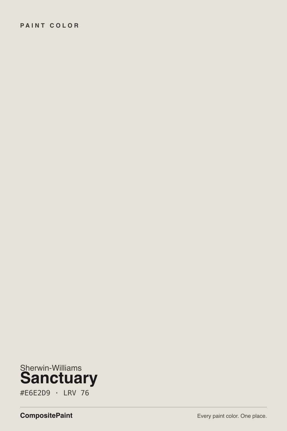
- 3Sanctuary76
- 4Alabaster82
- 5Chantilly Lace91
The Fast Verdict
Sanctuary is not famous, has never been a Color of the Year, and barely shows up in the usual design-blog rotation — but it is a real, working Sherwin-Williams formula that quietly ends up on kitchen and bath cabinets, where owners describe it as clean and warm without the sterile edge of a true white. At LRV 76 it sits in soft-white territory, not bright-white territory, with a lightly warm, low-chroma cast that leans toward greige more than cream. Judge it on what it actually does, not on how much has been written about it.
Kitchen and bath cabinets · warm wood open shelving and stone counters · quiet whole-house walls in real daylight · anyone who wants an off-white with no strong opinion of its own
You want a true bright white, not a soft one · your room runs on cool LEDs with little daylight · you want a color with an established online track record before you buy · your counters or floors are cool blue-grey
- Genuinely warm without going sterile — real cabinet owners confirm this, not just marketing copy
- Reads clean and finished next to open wood shelving, warm stone, and brass or bronze hardware
- LRV 76 keeps rooms bright without the glare a true white can throw off
- Quiet enough that it rarely fights existing furniture, floors, or trim
- A real, working SW formula — filed under Sherwin-Williams' own White family, not an obscure mis-tint
- Not a true bright white — expect a soft, in-between read at LRV 76, not a crisp one
- Cool light and dim, north-facing rooms flatten the warmth into a plain gray-beige
- Almost no independent reviews or real-world track record to check before you buy
- Looks dingy next to a colder, brighter white on the same wall or cabinet run
What Color Is Sanctuary, Really?
Sherwin-Williams files Sanctuary (SW 9583) under its own White color family, but the number tells a more honest story: at LRV 76 it falls well short of the 85-plus range that marks a true bright white, and lands squarely in what most brands call a soft white — pale, but with real body. Independent color-data sites describe it the same way: a pale, low-saturation neutral sitting between soft gray and muted beige, with a lightly warm, creamy cast rather than a crisp one. It reads as an off-white that behaves like a white, not a color chasing a name it doesn't own.
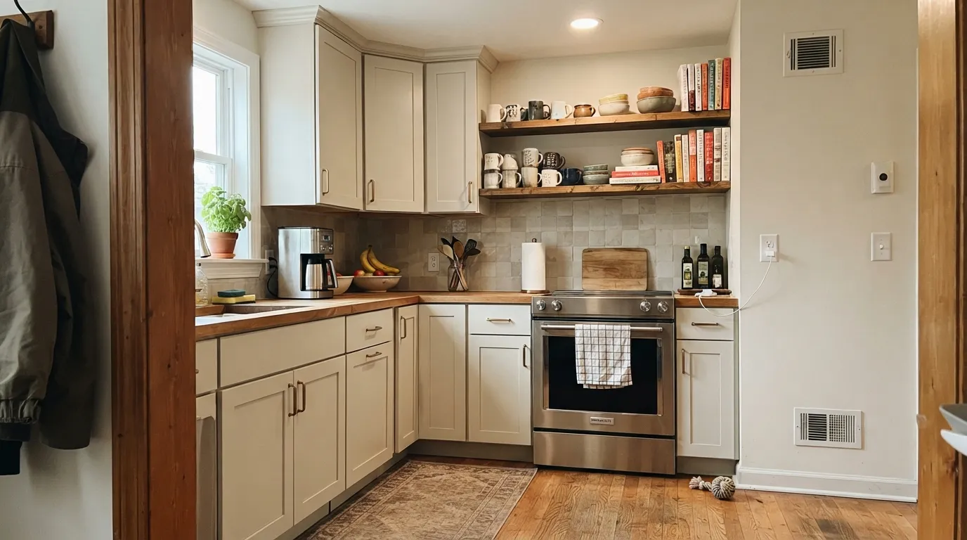
The clearest evidence of what Sanctuary is actually used for doesn't come from design blogs — it comes from homeowners. Real project photos and posts turn up almost entirely on cabinets: kitchen perimeter cabinets, bathroom vanities, built-ins. One owner posting about her kitchen cabinets even calls it "Sanctuary White," tacking on a word Sherwin-Williams never gave it, because on painted millwork that's exactly how it reads. On cabinetry it's praised for looking clean and warm without the sterility of a true white, and for sitting comfortably next to open wood shelving, warm stone counters, and brass or bronze hardware.
Undertone in one line: warm and quiet, closer to grey-beige than to cream or pink. No source flags a strong pink, green, or blue pull, but nearly every description of it mentions the same shift every color this close to neutral makes — warmer and more creamy in direct daylight, flatter and greyer once the light turns cool or indirect.
Where It Shines
Sanctuary's best-documented job is cabinetry, and it earns that reputation honestly. On kitchen perimeter cabinets or a bathroom vanity, the soft, low-chroma warmth reads as intentional and a little expensive next to open wood shelving, warm stone counters, and unlacquered brass or bronze hardware — the exact combination sources keep pointing to. It skips the slightly clinical edge a true white can have on cabinetry without tipping into full cream, which is the balance most people reaching for a "quiet warm white" are actually after.
Where It Fails
There isn't a pile of one-star reviews to draw from here — Sanctuary is too under-the-radar for that. But the physics of a pale, low-chroma warm neutral at LRV 76 are well understood, and they predict exactly three honest trouble spots.
By Sherwin-Williams' own family logic, 76 LRV is soft-white, not true-white territory — you need to clear roughly 85 for that crisp, reflective read. Sanctuary will never look stark. If you're picturing a gallery-bright kitchen, this reads dimmer and warmer than the mental picture.
Every description of Sanctuary notes the same swing every warm low-chroma neutral makes: creamy and warm in direct daylight, flatter and greyer once the light goes cool or indirect. In a north room under cool LEDs, expect it to read as a plain, slightly muddy gray-beige rather than the "warm and clean" version everyone is describing.
Sanctuary's own home turf — cabinets — is exactly where this trap shows up most: pair it with stark white counter-height trim, cool white subway tile, or bright white ceilings, and the cabinets will look faintly dingy by comparison. Every soft white in this deck falls into the same trap; keep the surrounding whites warm or matched, not colder.
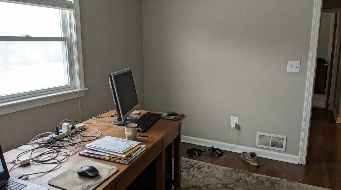
Room by Room
The best-documented use by a wide margin. Satin finish, paired with open wood shelving, warm stone counters, and brass or bronze pulls, is the combination owners keep landing on and keep being happy with.
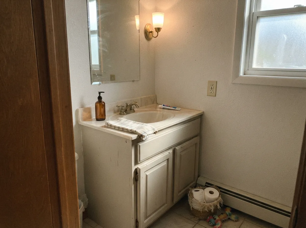
Works the same way it does in a kitchen: warm without going sterile. Satin or semi-gloss for the wipe-clean durability a vanity needs, with brass or matte-black fixtures rather than chrome, which reads colder than the paint.
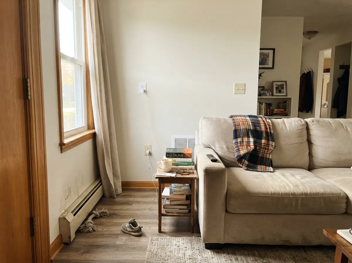
Eggshell, and only in rooms that get genuine daylight for most of the day. It's quiet enough not to fight furniture or trim, but that same quietness means a dim room gets nothing back from it — no warmth, no personality, just flat pale grey-beige.
Semi-gloss Sanctuary trim will sit softly under a slightly deeper wall color, similar to how other soft whites in the deck work. It isn't the crisp, high-contrast trim white some rooms want; save it for walls that are already warm and mid-toned.
The same warm-in-good-light, flat-in-bad-light behavior applies. 2700K lamps keep it cozy after dark; a north-facing bedroom lit only by cool overheads will look duller than the swatch promised.
Unlike most colors in this deck, there's no meaningful body of exterior project photos or reviews to draw an honest conclusion from. If you're considering it for a facade or trim, treat it as untested: sample a large board and watch it through a full day before committing to a whole house.
Your Light Is the Risk
The lightly warm, creamy cast every source describes comes forward here — this is the light the color was tinted to be seen in.
The warmth drains out and it reads as a plain, slightly muddy gray-beige — flatter than the swatch and less interesting than the name suggests.
Warmer and more creamy at midday sun, quieter and greyer as clouds roll in — a bigger swing than a true white shows, because there's more grey in the base to begin with.
2700K bulbs keep the creamy warmth alive after dark. Cool LEDs push it toward the same flat, greyer read that cool daylight does.
Most complaints about Sanctuary are a light mismatch. Upload a photo of your actual room and see it on your walls — then ask for the same wall in north light or evening lamps before you buy a single sample.
Need It From Another Brand?
Any paint counter can custom-tint Sherwin-Williams SW 9583 directly. If you would rather stay in one brand's own deck, these are the closest stock matches, measured as ΔE2000. Under 2 is a difference you will not see on the wall.
| Brand | Closest color | ΔE | LRV | |
|---|---|---|---|---|
| Behr | Barely BrownN180-1 · Behr | 1.3 | 77 | Color page → |
| Benjamin Moore | Silver Satin856 · Benjamin Moore | 1.4 | 75 | Color page → |
| Valspar | Over the MoonV181 · Valspar | 2.1 | 76.2 | Color page → |
| PPG / Glidden | Mountain GrayPPG1021-1 · PPG / Glidden | 0.8 | 76 | Color page → |
| Glidden | ParaffinPPG14-31 · Glidden | 0.2 | 75 | Color page → |
| Dutch Boy | Moon Pie406-1DB · Dutch Boy | 0.2 | 75 | Color page → |
Similar Sherwin-Williams Colors
The nearest shades to Sanctuary within Sherwin-Williams's own range, ranked by perceptual color distance — useful when you want the same look a touch lighter, darker, or warmer.
WCAG 2.1: AA is 4.5 : 1 for normal text, 3 : 1 for large text, AAA is 7 : 1.
Sanctuary vs the Colors You're Also Considering
Every Sanctuary sample board has the same rivals on it. The numbers show the real lightness gap — then it comes down to which risk you would rather live with.
Pick this if you're already sourcing Sherwin-Williams and don't want to switch brands for what is nearly the same color.
Benjamin Moore 961 · LRV 76SeapearlPick this if your painter or supplier works in Benjamin Moore — it's essentially the same LRV and the same warm-grey-beige-in-between idea.
Pick this if 80 LRV feels a shade too warm and bright and you want the quieter, lower-key version instead.
Sherwin-Williams SW 7566 · LRV 80Westhighland WhitePick this for a warmer, brighter step up from the same unhyped part of the SW deck.
Sanctuary sits in a very crowded band. Origami White SW 7636 (#E5E2DA, LRV 76), Toque White SW 7003 (#E7E2DA, LRV 76), and Zurich White SW 7626 (#E6E1D9, LRV 76) are all effectively the same color with tiny shifts in warmth. White Heron SW 7627 (#E7E1D7, LRV 76) is a hair warmer, Heron Plume SW 6070 (#E5E1D8, LRV 75) a hair deeper, and Pearly White SW 7009 (#E8E3D9, LRV 77) slightly lighter and creamier.
Across brands the matches are unusually good. Dutch Boy Moon Pie 406-1DB and Glidden Paraffin PPG14-31 both land at deltaE 0.22, Kompozit Dove White 0018 at 0.46, Rodda Freshened-Up R005 at 0.53, and HGTV Home by Sherwin-Williams Origami White HGSW 4007 at 0.57, all close enough to call matches. Benjamin Moore Silver Satin 856 (deltaE 1.45) and Farrow and Ball Strong White No. 2001 (deltaE 1.47) are visually identical in normal room light. Valspar Over the Moon V181 (deltaE 2.06) and C2 Rice Paper C2-900 (deltaE 2.1) are very close, so sample first.
Sanctuary Coordinating Colors
The rule for coordinating with Sanctuary follows straight from what it actually is: a warm, quiet neutral that wants warm company. It sits comfortably next to other warm greiges, a slightly brighter warm white for trim, and one genuine dark for contrast — and it loses its appeal fastest next to anything stark and cool. These are the partners the evidence points to:
Why Sanctuary Stays Under the Radar
There is no Color of the Year story here, no viral kitchen reveal, no design-blog think piece — a genuine search for Sanctuary's history and reception turns up remarkably little. That is not a red flag; it is simply what an unmarketed, mid-catalog Sherwin-Williams neutral looks like. It sits in the White family alongside far more famous names like Alabaster and Extra White, and it never got the campaign those colors did.
What does exist is smaller and more useful: real homeowners posting real cabinet and vanity projects, describing the same thing independently — clean, warm, not sterile. One owner even calls it "Sanctuary White" in her own post, a name Sherwin-Williams never gave it, because on painted cabinetry that is exactly the impression it leaves. A quiet color with real, satisfied users and no hype is a different thing from a color nobody trusts — this is the former.
Sanctuary With Wood Tones and Stone
The clearest, best-supported pairing advice for Sanctuary comes directly from how it's actually being used: open wood shelving, warm stone counters, and brass or bronze hardware are the combination that keeps showing up in real kitchens, and it's the one this color is built to flatter. The warmth in the paint meets the warmth in the wood and stone halfway, which is exactly why it reads "clean and warm" rather than clinical.
There isn't enough documented evidence yet to say how it behaves against cool white oak, polished chrome, or stark grey stone — nobody has published that pairing. Treat it as an open question rather than a settled one: if your materials skew cool, sample a large board against them before committing, since everything confirmed about this color so far points the other way, toward warm.
Three Ready Palettes Built on Sanctuary
A color is never alone on the wall. These are complete combinations in the 60-30-10 pattern, with the reason each one holds together. Every one opens in the visualizer.
This is the pairing the real project photos already point to: Sanctuary cabinets stay warm and clean against Agreeable Gray's own warm-neutral base, and an Iron Ore island supplies the one dark, grounding note the room needs without cooling anything down.
Try this palette in your roomWhite Dove sits only a few LRV points brighter and shares the same warm base, so the trim reads crisp without making the Sanctuary walls look dingy — the exact trap a colder trim white would set. Hale Navy at the door supplies the single dark accent the scheme is otherwise too quiet to provide on its own.
Try this palette in your roomThis mirrors the real cabinet-and-wall combination homeowners are actually building: a slightly brighter Alabaster wall keeps the small room feeling airy while the Sanctuary vanity carries the color, and Wrought Iron on the mirror frame and fixtures gives the scheme the one near-black note that makes it feel finished rather than accidental.
Try this palette in your roomSanctuary FAQ
Is Sanctuary a true white or an off-white?
Off-white. Sherwin-Williams files it under its White family, but at LRV 76 it's well below the roughly 85-plus range that marks a true bright white — by the company's own logic it's a soft white. Expect a pale, warm, low-chroma neutral, not a crisp bright one.
Is Sanctuary warm or cool?
Warm-leaning, but quiet about it. Multiple independent color sources describe the same lightly warm, creamy cast in good daylight, with the color going flatter and greyer once the light turns cool or dim. No source reports a strong pink, green, or blue pull.
Is Sanctuary good for kitchen cabinets?
Yes — this is the one use with real evidence behind it. Homeowner project photos and posts show it used most often on kitchen perimeter cabinets and bathroom vanities, praised for reading clean and warm without the sterility of a true white, especially next to wood shelving, warm stone counters, and brass hardware.
What wall color goes with Sanctuary cabinets?
A warm neutral in the same family reads as intentional rather than a fluke — Agreeable Gray or a similarly warm greige keeps the whole kitchen coherent. Avoid pairing the cabinets with a stark, cool-white wall or tile; that's the pairing most likely to make Sanctuary look faintly dingy by comparison.
How does Sanctuary compare to Alabaster or other Sherwin-Williams whites?
Alabaster (SW 7008, LRV 82) is the far more famous SW cabinet white — brighter, better documented, with its own known undertone quirks. Sanctuary sits a few points lower on LRV and gets almost no design-press attention, which makes it the quieter, less-crowded choice for the same basic job.
Why is there so little information about Sanctuary online?
Honestly, because it never had a moment — no Color of the Year, no viral room, no major design-blog feature turned up in research. What does turn up is real, unglamorous use: homeowners painting cabinets and vanities with it and being satisfied. It's a genuine, working Sherwin-Williams formula that quietly does its job without a marketing push behind it, not a color with a hidden problem.
Have you painted with Sanctuary?
Rate it — one tap helps the next reader decide.
Ask a Question