Silver Satin
Benjamin Moore's quietest almost-white, reviewed honestly: the violet flash people argue about, the rooms where it goes dingy, and what to pick instead.

Jessica has spec'd whites and neutrals for more than 300 rooms and keeps a sample wall of painted drawdowns in her studio. Every color review is checked against real reader rooms in the comments and re-tested when a formula changes. About the testing process →
- 1Heirloom Shade63
- 2First Star69
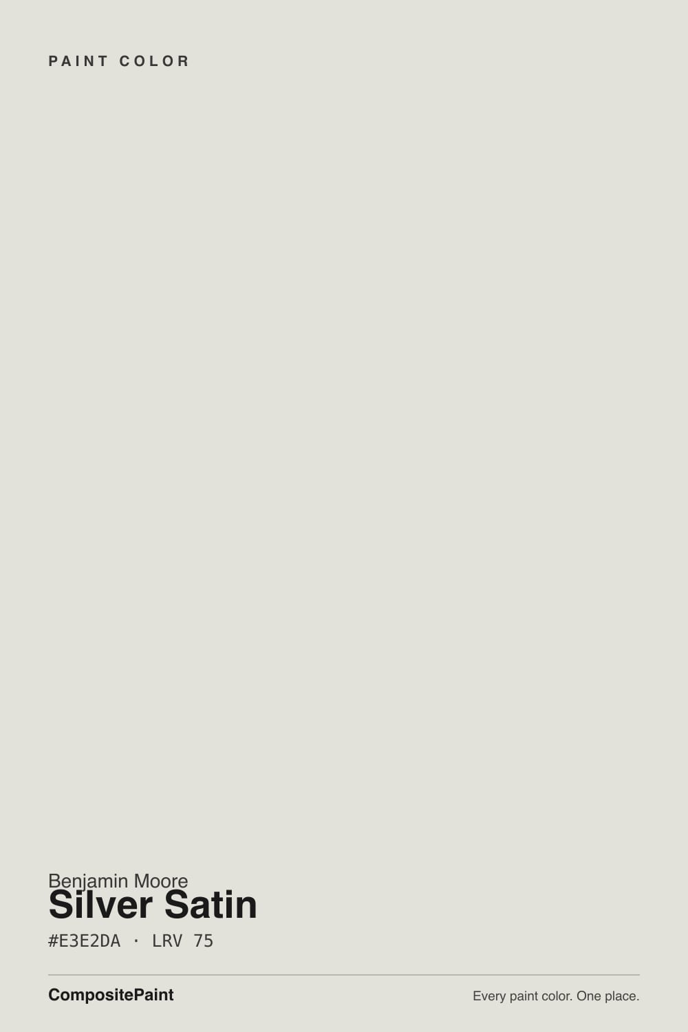
- 3Silver Satin75
- 4Alabaster82
- 5Chantilly Lace91
The Fast Verdict
Silver Satin is the near-white you pick when you want the walls to stop talking. It is a warm gray with so little pigment in it that it mostly borrows the temperature of the room around it — which is its best trick and its only real problem. In daylight with wood floors it is calm, expensive-looking and completely inoffensive. In a dim north room, or beside a slightly brighter white, it can flatten into something people describe as dingy or faintly purple.
Whole-house walls that need to stay quiet · Hallways, stairwells and rooms with modest windows · Ceilings and trim over darker walls · Anyone who finds Classic Gray half a step too warm
Your room faces north and stays dim all day · You want a crisp, bright, gallery white · Your trim will stay builder-white · You want kitchen cabinets that look decided
- Lifts dark hallways and small rooms without going bright white
- Sits comfortably between warm wood floors and cool gray stone
- Quiet enough for whole-house use — it never fights the furniture
- Excellent trim and ceiling color over mid-tone gray or greige walls
- Softer and less glaring than a high-LRV white in a sunny room
- Goes flat and dingy in dim north-facing rooms
- Reads dirty next to a slightly brighter white trim
- Can flash faintly violet under cool LEDs or beside pink-beige flooring
- Too undecided for cabinets you want to look deliberate
What Color Is Silver Satin, Really?
A warm gray pretending to be a white — and it barely commits to either. On paper the numbers say soft yellow: the hue lands at 53 degrees, the warm end. But the saturation is only about 14 percent, which means there is almost no pigment holding the color in place. That is why the internet argues about it. Benjamin Moore's own strip puts Silver Satin in a brownish-green run, while nearly every designer who has painted it reports a faint violet cast on the wall. Both camps are right. With this little color in the can, the wall shows you whatever your floor, your roof overhang and your bulbs hand it.
At LRV 75 it reflects a lot of light without ever going bright. That is the number people get wrong. Put it next to Chantilly Lace at LRV 91 and Silver Satin suddenly has a body and a shadow — it reads like a soft gray, not a white. Against White Dove at LRV 83 it still looks a step down. On its own it is light and open; in a lineup it is clearly the darker, quieter one.
Undertone in one line: a warm gray with the volume turned almost all the way down — leans faintly violet in cool light, faintly greenish next to beige, and dead neutral on a good day.
Where It Shines
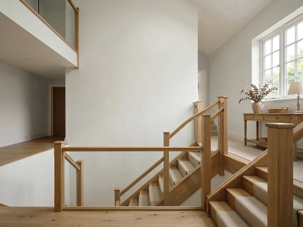
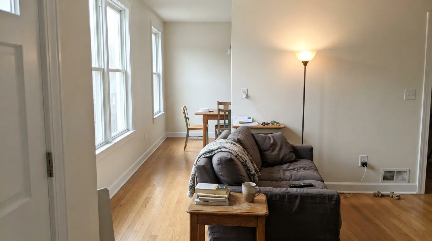
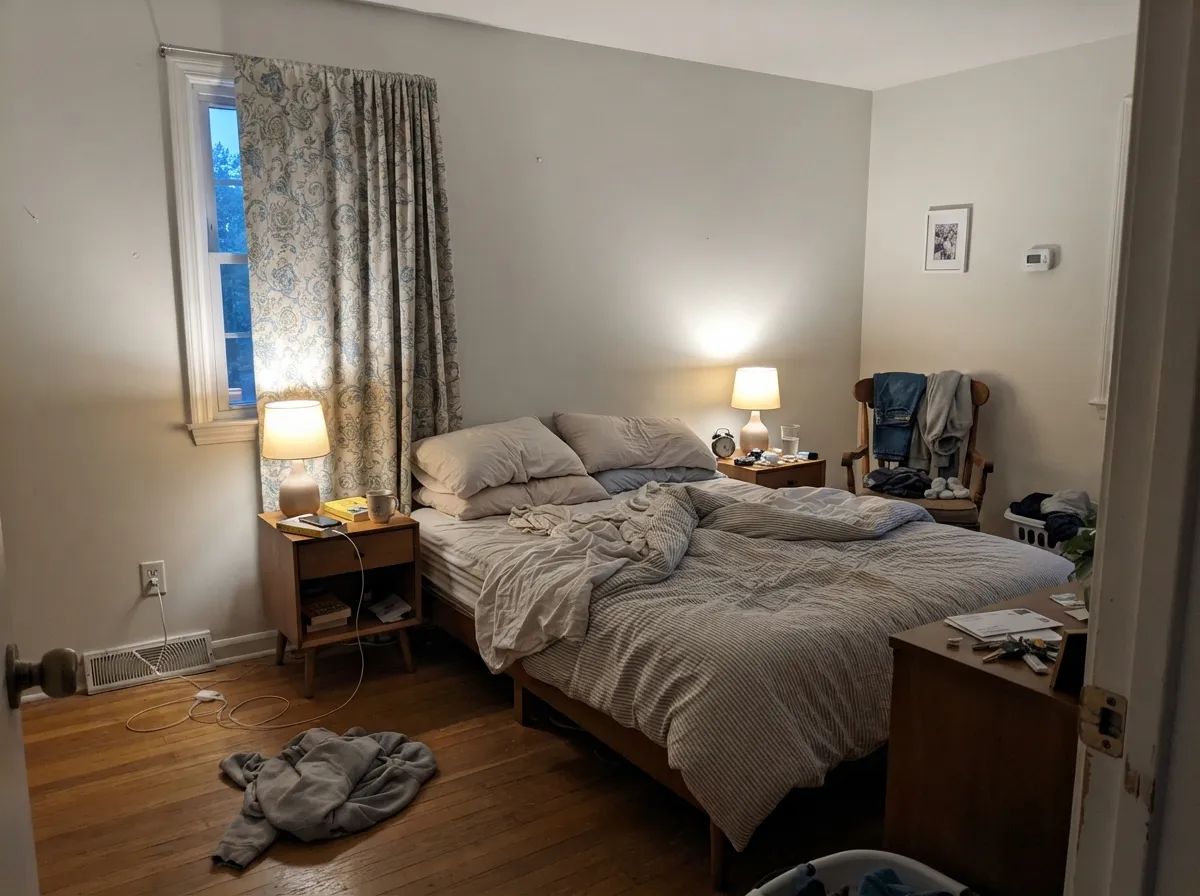
Give it daylight and something warm underfoot and it does exactly what it promises. This is a whole-house color: hallways, stairwells, open main floors, bedrooms with modest windows. It is light enough to lift a dim corridor and quiet enough that it never argues with the art, the rug or the wood.
Where It Fails
The bad reviews of Silver Satin are strikingly consistent, and none of them are about coverage or durability. All three come down to the same thing: a color with this little pigment needs help from the room, and when the room does not help, it collapses.
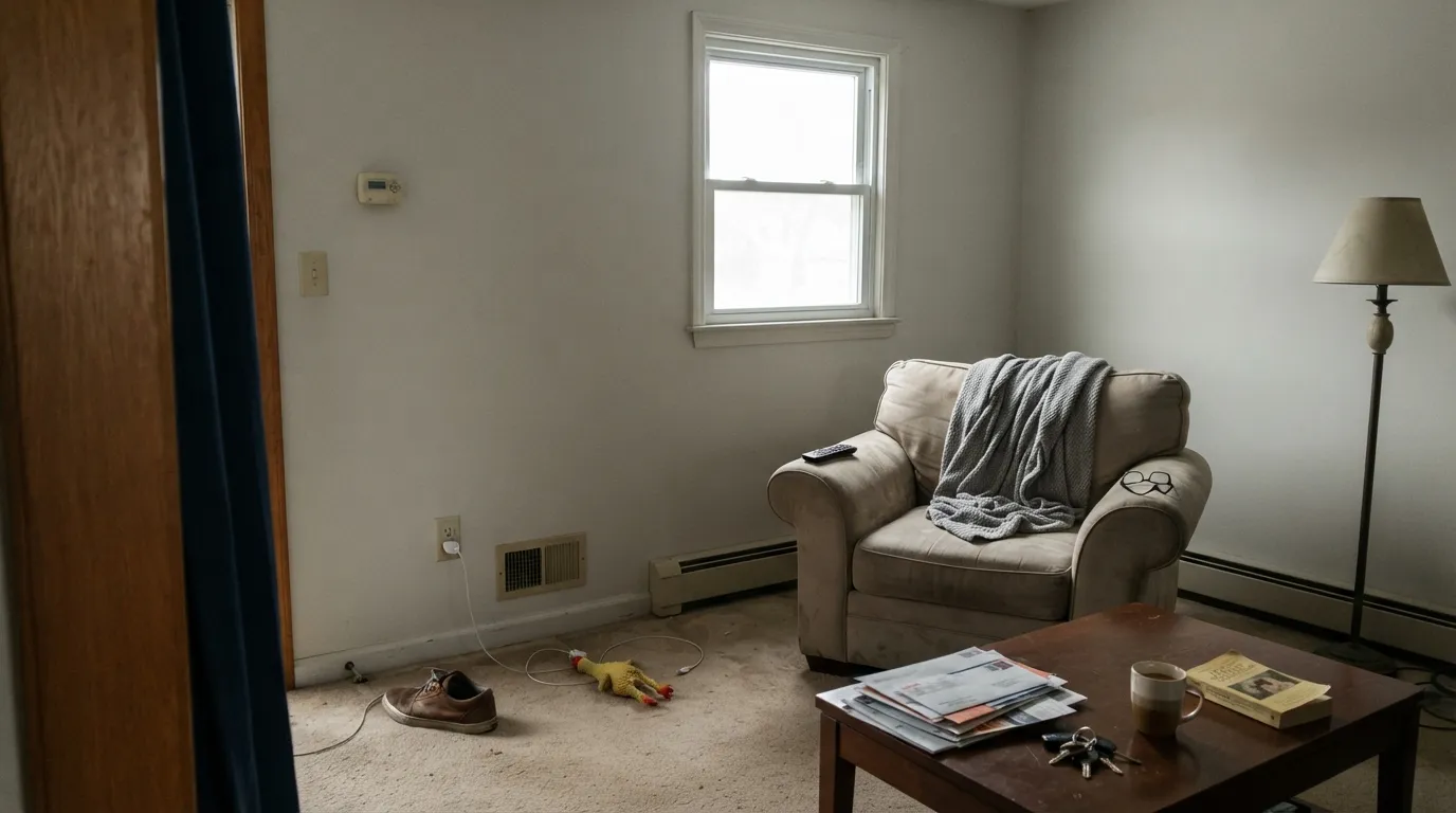
North light is cool and flat, and there is not enough warmth in Silver Satin to push back against it. Instead of soft gray you get a dull, slightly dirty gray that people describe as dingy — especially on an overcast day with no lamps on. If the room faces north and the windows are small, go warmer with Classic Gray OC-23 or step up in brightness with White Dove OC-17.
This is the most common disappointment and it is a pairing mistake, not a paint problem. Builder-white trim sits maybe five or six LRV points above Silver Satin — close enough that the eye reads the wall as grubby rather than intentional. You have two honest options: paint the trim Silver Satin too and let the sheen do the separating, or go clearly brighter with Chantilly Lace 2121-70 so the contrast looks deliberate. What does not work is the small gap in between.
Cool 4000K bulbs strip out the little warmth there is and the violet lean steps forward — this is where readers report walls that look faintly lavender at night. Warm carpet or pink-toned tile does the same thing from the opposite direction. Swap to 2700K bulbs first, because that usually solves it. If the flooring is the problem, Paper White OC-55 is the cleaner cool near-white that will not flip on you.
Room by Room
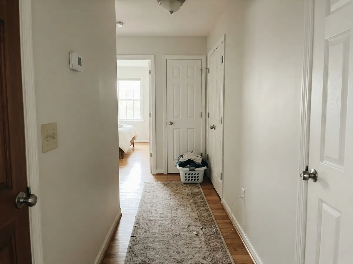
At LRV 75 it lifts a windowless corridor without turning it into a bright white tunnel. Eggshell on the walls, semi-gloss on the doors. This is the room where its lack of opinion is a genuine feature.
In south or west light it settles into a warm, soft gray that flatters oak, walnut and linen. Eggshell walls with Chantilly Lace 2121-70 trim if you want a crisp edge, or Silver Satin trim for a quiet monochrome. Skip it if the room only gets weak north light.
Under 2700K lamps it warms into something close to a soft cream, which is the most flattering version of this color. Pair with Gray Owl 2137-60 on a headboard wall if you want depth without adding another temperature.
It sits happily between warm wood floors and cool quartz, which is the argument for it. The argument against is that it reads as neither white nor gray, so cabinets can look undecided in photos. Use satin, and if you want cabinets that look chosen, White Dove OC-17 is the safer call.
Over mid-tone walls like Revere Pewter HC-172 or Chelsea Gray HC-168 it makes a softer, warmer frame than a stark white would. On ceilings use flat; it keeps the plane quiet instead of clinical.
With gray stone, white subway and chrome it is clean and calm. With pink-beige travertine or warm builder tile it can look muddy or lavender, which is exactly the complaint people post about small windowless baths. Sample it against the tile, not against a white card.
Your Light Is the Risk
Warm sun brings the yellow up and it reads as a soft warm white with real life in it.
Cool daylight cancels the little warmth there is. Expect flat gray, sometimes dingy. Test first.
2700K lamps make it gently creamy and cozy. Cool 4000K LEDs pull it gray and faintly violet.
Against white trim or a white ceiling it shows its body and looks a full step darker. Sample them together.
Most complaints about Silver Satin are a light mismatch. Upload a photo of your actual room and see it on your walls — then ask for the same wall in north light or evening lamps before you buy a single sample.
Need It From Another Brand?
Any paint counter can custom-tint Benjamin Moore 856 directly. If you would rather stay in one brand's own deck, these are the closest stock matches, measured as ΔE2000. Under 2 is a difference you will not see on the wall.
| Brand | Closest color | ΔE | LRV | |
|---|---|---|---|---|
| Sherwin-Williams | Ethereal WhiteSW 6182 · Sherwin-Williams | 0.5 | 76 | Color page → |
| Behr | Glacier ValleyHDC-NT-24 · Behr | 0.8 | 76 | Color page → |
| Valspar | PermafrostV159 · Valspar | 1.7 | 76 | Color page → |
| PPG / Glidden | Tundra FrostPPG1009-1 · PPG / Glidden | 0.6 | 75 | Color page → |
| Glidden | ParaffinPPG14-31 · Glidden | 1.4 | 75 | Color page → |
| Dutch Boy | Moon Pie406-1DB · Dutch Boy | 1.4 | 75 | Color page → |
Similar Benjamin Moore Colors
The nearest shades to Silver Satin within Benjamin Moore's own range, ranked by perceptual color distance — useful when you want the same look a touch lighter, darker, or warmer.
WCAG 2.1: AA is 4.5 : 1 for normal text, 3 : 1 for large text, AAA is 7 : 1.
Silver Satin vs the Colors You're Also Considering
Every Silver Satin sample board has the same rivals on it. The numbers show the real lightness gap — then it comes down to which risk you would rather live with.
Pick this when Classic Gray reads a touch too warm or too beige for your floors.
Benjamin Moore OC-23 · LRV 74Classic GrayPick this for dim north rooms — the extra warmth keeps it from going dingy.
Pick this when you want the walls to stay light and almost white.
Benjamin Moore OC-27 · LRV 70Balboa MistPick this when you actually want to see a gray — Balboa Mist has real color in it.
Its closest neighbor in the same deck is itself. Silver Satin appears as both 856 and OC-26 at hex #E3E2DA and LRV 75. Classic Gray OC-23 at LRV 74 and hex #E3E0D7 is fractionally darker and warmer, the more familiar choice of the two. Paper White OC-55 at LRV 74 and #E0E2DC is the cool sibling, leaning gray-blue instead of gray-yellow.
Across brands, Ethereal White SW 6182 at LRV 76 sits at a deltaE of 0.46 and Shiplap JG-22 by Magnolia Home at LRV 77 at 0.62, so both are the same color for practical purposes. Glacier Valley HDC-NT-24 by Behr at LRV 76 is 0.76, and Tundra Frost PPG1009-1 at LRV 75 is 0.64.
A little further out, Strong White No. 2001 by Farrow and Ball at LRV 76 is 1.19 and Permafrost V159 by Valspar at LRV 76 is 1.66, both visually identical in normal room light. Rice Paper C2-900 at 2.82 is very close but worth sampling first, since it carries more yellow.
Silver Satin Coordinating Colors
Silver Satin has almost no undertone of its own, which means it will happily follow whatever you put beside it. The safest partners are the ones that share its restraint: cool-leaning neutrals in the same family, a clearly brighter white for trim, and one genuinely dark note to give the scheme a spine. Where it gets into trouble is with strong warm beiges and pink-toned tans, which push it toward gray-green or lavender.
These are the colors that come up again and again in real Silver Satin houses:
Silver Satin on Trim, Ceilings and Doors
A lot of people meet Silver Satin as a trim color rather than a wall color, and it is very good at that job. Over mid-tone gray or greige walls it gives you separation without the hard, plastic edge a bright white cuts. Semi-gloss on trim and doors, flat on the ceiling. In a room with heavy millwork, running the same color on walls, trim and ceiling and letting the sheen change do the work is the most flattering way to use it.
The one rule is contrast. At LRV 75 it needs a partner that is clearly darker or clearly brighter. Trim white a handful of points above the wall is the single most common Silver Satin regret, and no extra coat fixes it. If you want brighter trim, jump properly — Chantilly Lace 2121-70 or Simply White 2143-70 both put real daylight between the two surfaces.
Silver Satin With Wood Floors and Stone
Warm mid-tone wood is where this color is happiest. Oak, maple and walnut all give Silver Satin a little borrowed warmth, and the wall answers by looking like a deliberate soft gray rather than a blank. Black hardware and gray stone hold it steady and neutral. Polished nickel and chrome do the same.
The floors to sample against first are orange-leaning builder oak and pink-beige tile or carpet. Both are warm in a way Silver Satin cannot match, and the wall compensates by leaning green or lavender. It is not always a dealbreaker, but this is the one situation where a small chip will lie to you. Tape a large sample on the wall directly above the floor and look at it in the morning, in the afternoon, and again with the lamps on.
Three Ready Palettes Built on Silver Satin
A color is never alone on the wall. These are complete combinations in the 60-30-10 pattern, with the reason each one holds together. Every one opens in the visualizer.
The 16-point LRV gap between Silver Satin and Chantilly Lace is wide enough that the trim reads crisp instead of accidental — this is the fix for the dirty-wall problem. The navy door supplies the one dark note a near-neutral house needs.
Try this palette in your roomAll three sit in the same cool-leaning neutral family, so the room steps down from 75 to 65 to 15 in LRV without ever changing temperature. Adding depth instead of a second color is what keeps Silver Satin from looking washed out.
Try this palette in your roomFull sun reads Silver Satin brighter and cleaner than it ever looks indoors, so outside it behaves like a soft white rather than a gray. The near-black trim gives the facade the contrast the body color cannot supply on its own.
Try this palette in your roomSilver Satin FAQ
Is Silver Satin warm or cool?
Technically warm, but only just. The hue sits at 53 degrees in the soft yellow range with about 14 percent saturation, so the warmth is barely there. In a sunny room it behaves like a warm gray-white; in north light it flips to a cool, flat gray.
Does Silver Satin look purple?
It can, and this is the complaint that comes up most often. There is so little pigment in it that under cool 4000K bulbs, or beside pink-beige tile and carpet, the eye picks up a faint violet cast. Swapping to 2700K bulbs fixes it in most rooms. If the flooring is what is causing it, choose Paper White OC-55 instead.
Silver Satin or Classic Gray?
They are one LRV point apart and look almost identical on a chip. Classic Gray OC-23 is the warmer, slightly beiger of the two and it is the safer pick for dim or north-facing rooms. Silver Satin is the cleaner, more neutral one, and it is better when your floors or counters already lean warm.
What trim white goes with Silver Satin walls?
Go clearly brighter or go identical — never in between. Chantilly Lace 2121-70 at LRV 91 gives a crisp edge that looks intentional. Silver Satin on trim in semi-gloss gives a soft monochrome that suits millwork-heavy rooms. A builder white only a few points brighter is what makes the walls look dirty.
Is Silver Satin good for kitchen cabinets?
It works, but it is not the strongest choice. Its neutrality means it sits fine with both wood floors and cool quartz, so it is low risk. The trade-off is that cabinets can read as undecided — neither white nor gray. If you want cabinets that look chosen, White Dove OC-17 is the better call. Use a urethane cabinet paint in satin.
Can I use Silver Satin on the ceiling?
Yes, and it is one of its best uses. In flat sheen over Silver Satin or greige walls it keeps the whole plane soft instead of hard bright white. Just do not put it on the ceiling above walls that are also near-white but a different color, because the mismatch will show as a shadow line.
Will it work in a basement or a dark hallway?
In a hallway, yes — LRV 75 returns plenty of light and the color has no strong lean to go muddy. In a basement it depends entirely on your lighting. With warm 2700K bulbs and enough of them it stays soft; under cool recessed LEDs it can go gray and lifeless.
Have you painted with Silver Satin?
Rate it — one tap helps the next reader decide.
Ask a Question