Paper White
The cool gray-green off-white people pick when true white feels too hard — reviewed honestly, including the rooms where it turns cold and the trim mistake that ruins it.

Jessica has spec'd whites and neutrals for more than 300 rooms and keeps a sample wall of painted drawdowns in her studio. Every color review is checked against real reader rooms in the comments and re-tested when a formula changes. About the testing process →
- 1Heirloom Shade63
- 2First Star69
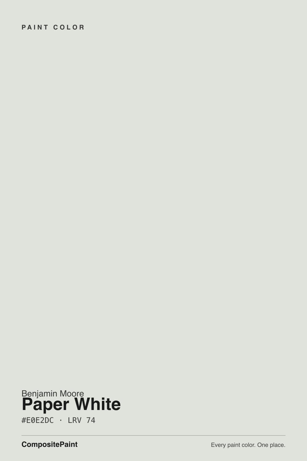
- 3Paper White74
- 4Alabaster82
- 5Chantilly Lace91
The Fast Verdict
Paper White is sold as a white and behaves like the palest gray. That is the whole story, good and bad. In a room with real daylight it looks calm, clean and expensive, and it makes honed stone, nickel and pale wood look deliberate. In a dim north room, or beside trim that is brighter than it, the same paint reads cold, flat and slightly blue — which is why almost every unhappy review of this color is really a review of the room it went into.
Ceilings that should feel soft instead of glaring · south- and west-facing rooms with real daylight · kitchens with honed stone, nickel and pale wood · one-color rooms where walls and trim match
Your room faces north and stays dim · you are keeping bright builder-white trim · your floors are orange-toned oak with brass hardware · you actually wanted a crisp, bright white
- Clean and cool without ever going yellow, pink or cream
- Softer, less glaring ceiling white than a standard bright white
- Makes honed marble, quartz, chrome and nickel look intentional
- Excellent one-color rooms — walls, trim and ceiling in three sheens
- Flexible trim white under gray, sage and charcoal wall colors
- Reads as pale gray, not white — LRV 74 is low for a white
- Goes cold and slightly blue in dim north-facing rooms
- Looks grubby next to any trim brighter than it
- Shows its green cast against orange oak and brass
What Color Is Paper White, Really?
It is a gray paint wearing a white name. The color underneath is a cool gray with a trace of green in it — so little green that nobody will ever walk in and say "green," but enough that the wall never goes cream, never goes pink, and never picks up the yellow that makes most off-whites feel soft. That is exactly why people like it: it reads clean rather than cozy. The catch is that the same lack of warmth is what people are describing when they post that it "looks blue." It is not blue. It is gray with nothing warm in it, and cool light exposes that fast.
The number that decides everything is LRV 74. Put it next to Chantilly Lace at LRV 90 and the gap is obvious and permanent: Chantilly Lace is white, Paper White is a pale gray. Sixteen points is a lot. Most trim whites live in the 80s, which means standard white trim, standard white doors and a standard white ceiling will all sit above these walls and make them look like the dirty one in the room. That is not a defect — it is the single most important thing to plan around before you buy a gallon.
Undertone in one line: cool gray with a whisper of green, never yellow and never pink. If your sample looks blue, that is north light stripping it, not blue pigment. If it looks faintly celery, that is warm oak or brass bouncing into it.
Where It Shines
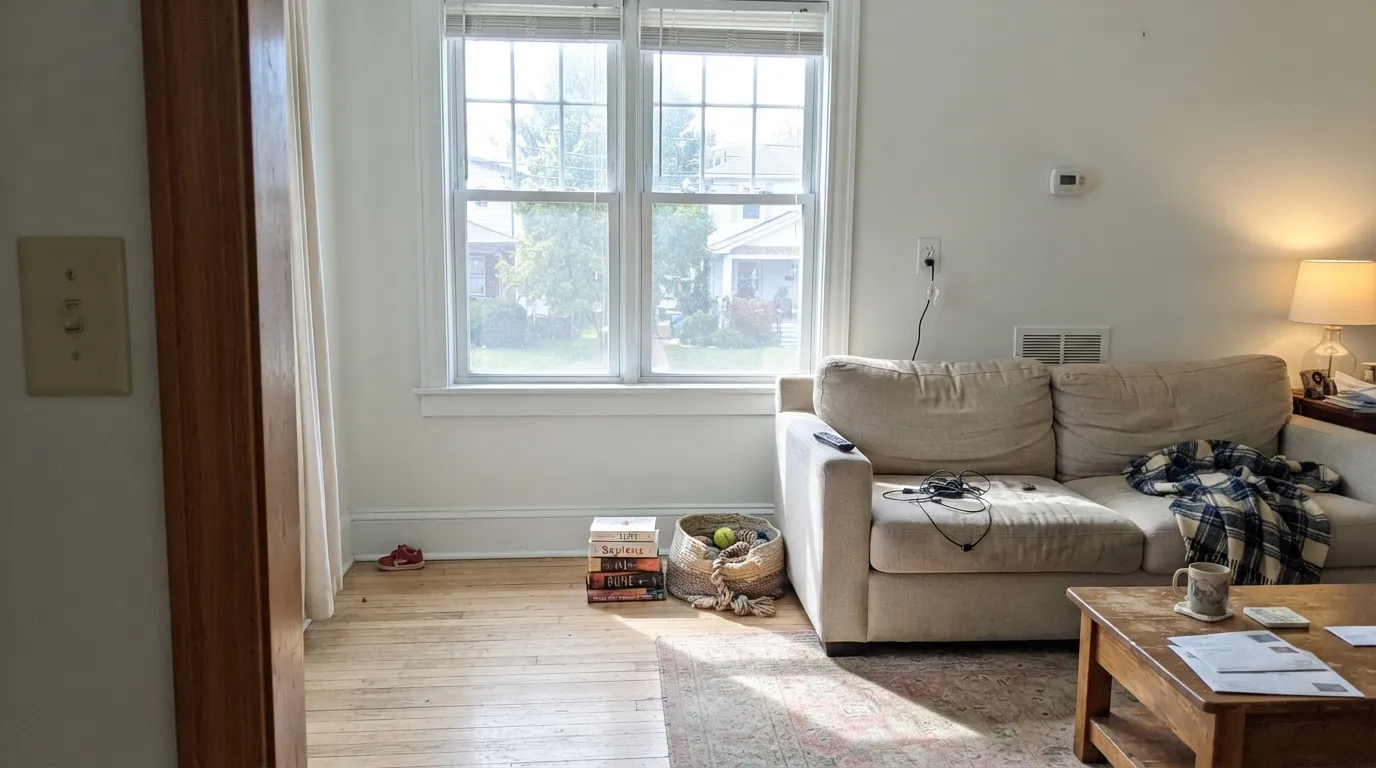
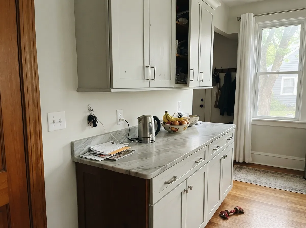
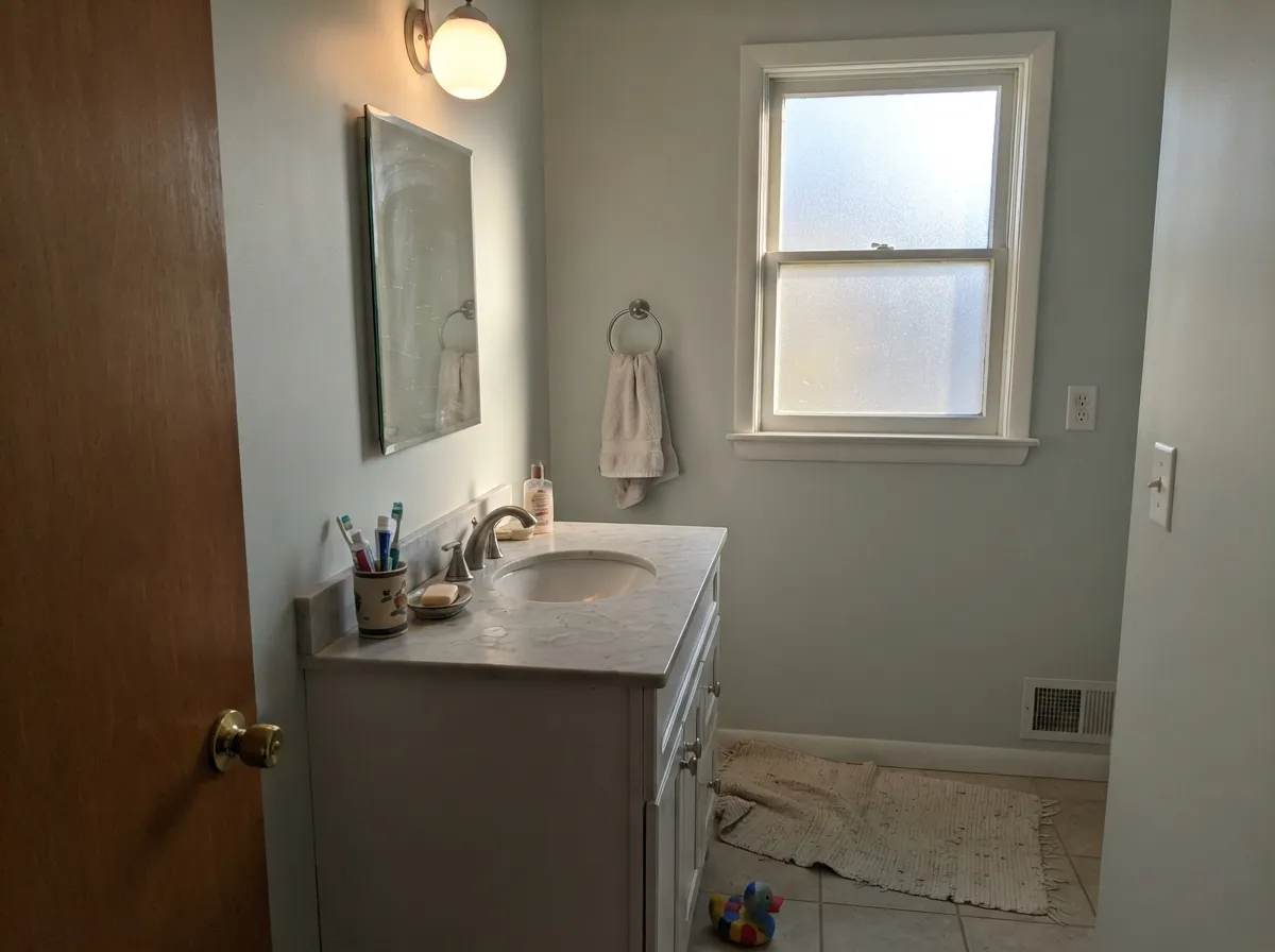
Give it daylight and cool materials and it stops looking like gray paint and starts looking like a design decision. These are the rooms where it earns its reputation: sunny walls, soft ceilings, and quiet kitchens built on stone and nickel rather than brass and oak.
Where It Fails
The bad reviews of Paper White are remarkably consistent, and all three situations are predictable before you open the can. If your room is one of these, no number of coats will fix it — the color is doing exactly what it is supposed to do, in the wrong place.
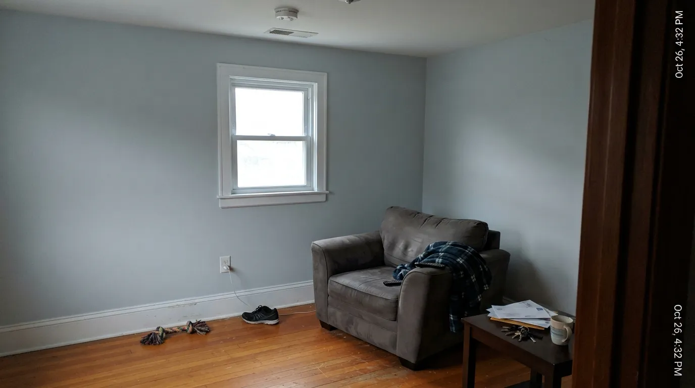
North light is cool and flat, and it has no warmth to lend a paint that brought none of its own. Homeowners describe testing it, loving the photos, then finding it "really looks blue" on the wall — or gray and clinical, like a waiting room. Go warmer with Benjamin Moore Classic Gray OC-23, which sits at nearly the same lightness but leans beige instead of green.
This is the most common regret and it has nothing to do with the paint quality. Paper White walls under Chantilly Lace OC-65 or Super White OC-152 trim lose every time — the trim looks white and the walls look grubby by comparison. Either repaint the trim in Paper White at semi-gloss, or if the bright trim stays, put a real white on the walls like Benjamin Moore Simply White OC-117.
Warm wood and warm metal push a cool wall in the opposite direction, and this is where the green in Paper White finally shows itself — people report a faint celery or sage cast in exactly this setup. If the floors and fixtures are staying warm, Benjamin Moore White Dove OC-17 meets them halfway instead of fighting them.
Room by Room
At LRV 74 a Paper White ceiling gives you light without the glare of a standard bright white, which is a real improvement in bedrooms and rooms with recessed lights. Use flat. It also quietly flatters a warmer wall color below it.
South or west exposure and it is a calm, clean backdrop that lets art and furniture do the talking. In a north-facing living room with sparse furniture it goes cold and empty-feeling — that is the room where people repaint. Eggshell.
This is where the coolness becomes an asset. With honed marble or quartz, chrome or brushed nickel, and a pale vanity it looks crisp and spa-like. Eggshell or satin on walls; keep the tile cool, not travertine-warm.
On cabinets it gives a quiet gray-white instead of a bright one, which suits gray-veined stone and nickel pulls. Satin in a urethane-fortified cabinet paint. With butcher block and unlacquered brass, skip it — that is the pairing where the green appears.
Restful and uncluttered in daylight, but it needs 2700K lamps at night or it flattens out. Pair with Benjamin Moore Gray Owl OC-52 on a headboard wall if you want depth without warmth.
Under a mid-tone wall like Chelsea Gray HC-168 or October Mist 1495, Paper White trim reads as soft painted millwork rather than a hard white line. What it cannot do is provide bright contrast — for that you need a genuine 80s-LRV white.
Your Light Is the Risk
Warm sun cancels the coolness and it finally reads as a clean, neutral white.
Cool daylight strips it bare — flat, gray, and what people call blue. Test big.
Soft and neutral in the sun hours, noticeably grayer once the sun moves off.
2700K lamps warm it back to a white. 4000K LEDs push it straight to gray.
Most complaints about Paper White are a light mismatch. Upload a photo of your actual room and see it on your walls — then ask for the same wall in north light or evening lamps before you buy a single sample.
Need It From Another Brand?
Any paint counter can custom-tint Benjamin Moore 1590 directly. If you would rather stay in one brand's own deck, these are the closest stock matches, measured as ΔE2000. Under 2 is a difference you will not see on the wall.
| Brand | Closest color | ΔE | LRV | |
|---|---|---|---|---|
| Sherwin-Williams | Glacier BaySW 9626 · Sherwin-Williams | 1.0 | 75 | Color page → |
| Behr | Winds BreathGR-W06 · Behr | 0.6 | 75 | Color page → |
| Valspar | Silver Dust7004-19 · Valspar | 1.7 | 74.8 | Color page → |
| PPG / Glidden | Tundra FrostPPG1009-1 · PPG / Glidden | 1.0 | 75 | Color page → |
| Glidden | Tundra FrostPPG1009-1 · Glidden | 1.0 | 75 | Color page → |
| Dutch Boy | Moon Pie406-1DB · Dutch Boy | 3.0 | 75 | Color page → |
Similar Benjamin Moore Colors
The nearest shades to Paper White within Benjamin Moore's own range, ranked by perceptual color distance — useful when you want the same look a touch lighter, darker, or warmer.
WCAG 2.1: AA is 4.5 : 1 for normal text, 3 : 1 for large text, AAA is 7 : 1.
Paper White vs the Colors You're Also Considering
Every Paper White sample board has the same rivals on it. The numbers show the real lightness gap — then it comes down to which risk you would rather live with.
Pick this for the cooler, cleaner version — Classic Gray leans beige.
Benjamin Moore OC-23 · LRV 74Classic GrayPick this if the room is dim and Paper White turns cold.
Pick this to avoid the purple flash Silver Satin can throw in lamplight.
Benjamin Moore 856 · LRV 75Silver SatinPick this for a hair lighter and warmer — kinder to north rooms.
Inside the brand, Horizon 1478 and OC-53 at #DFE1DB and LRV 73 is the closest neighbor, effectively the same color one step deeper. Silver Satin 856 and OC-26 at #E3E2DA and LRV 75 is lighter and slightly warmer, which makes it the better pick if Paper White looks too gray in your room. Pearl Gray 863 at #DDE1D8 and LRV 74 matches the lightness with a hair more green.
Across brands, the matches here are extremely close. Kompozit and Hirshfield's Barely White 0021 at deltaE 0.22, Behr Winds Breath GR-W06 at LRV 75 and deltaE 0.63, and Magnolia Home Chime Gray JG-119 at LRV 73 and deltaE 0.88 are all effectively the same color. Sherwin-Williams Glacier Bay SW 9626 and Glidden Tundra Frost PPG1009-1, both at LRV 75 and deltaE 0.98, are in that same group. Farrow and Ball Strong White No. 2001 at LRV 76 and deltaE 1.99 is visually identical in normal room light, while Clare Flow State at deltaE 3.25 is very close but worth sampling first.
Paper White Coordinating Colors
The rule with Paper White is to stay cool or stay muted. It partners happily with gray-greens, true grays, charcoals and navies, and it argues with anything creamy, golden or orange. The mistake to avoid is a warm off-white anywhere in the same sightline — that is the pairing that makes Paper White look faintly green instead of clean.
These are the colors that keep coming up beside it, and what each one is actually for:
Paper White on Ceilings and Trim
This is the use that almost nobody searches for and almost everybody should. A standard bright ceiling white is a hard, glaring plane, especially in a bedroom with recessed lights or in any room where you lie down and look up. Paper White at LRV 74 still bounces plenty of light but stops the glare, and because it is cool rather than creamy it does not yellow the room the way a warm ceiling white can.
As trim it only makes sense in low-contrast schemes. Under a mid-tone wall — a gray, a sage, a charcoal — Paper White millwork reads as softly painted woodwork instead of a hard bright edge, which is a genuinely handsome look in older houses. Under a light wall it disappears, and under a white wall it looks like a mistake. If your goal is crisp, visible trim, this is not the paint; step up into the 80s.
One practical note: because Paper White works on all three planes, the strongest way to use it is walls in eggshell, trim in semi-gloss and ceiling in flat. The sheen change alone gives you all the separation the room needs, and it removes the brighter-trim failure completely.
The Paper White Ladder, Lighter to Darker
Paper White has close neighbors on both sides, and if your sample is nearly right, one step is usually all you need. Going up, Silver Satin OC-26 is a touch lighter and a touch warmer — the standard fix when Paper White reads too cold in a north room, though it can throw a faint purple in lamplight. Sideways, Classic Gray OC-23 keeps the same lightness but swaps the green for beige, which is the friendlier direction for warm floors.
Going down, Horizon OC-53 is essentially the same color one step deeper and grayer, useful when Paper White washes out in a very bright south room. Keep going and you reach Gray Owl OC-52, which is a real gray rather than a white, and the natural partner if you want Paper White on the trim and ceiling with something with more weight on the walls.
Whichever way you move, sample against your trim and your floor, not against a white primer. Every complaint in this review comes from someone who judged the color on its own.
Three Ready Palettes Built on Paper White
A color is never alone on the wall. These are complete combinations in the 60-30-10 pattern, with the reason each one holds together. Every one opens in the visualizer.
Using one color at two sheens removes the brighter-trim problem entirely, and the room reads calm instead of striped. Kendall Charcoal on the door supplies the only dark note the scheme needs.
Try this palette in your roomOctober Mist is built on the same muted green as Paper White, so the island looks related to the walls rather than dropped in. Chantilly Lace is deliberately brighter here because the trim is meant to separate the two greens.
Try this palette in your roomGray Owl is nine LRV points darker with the same green-gray bones, so one wall gains weight without changing temperature. Hale Navy takes the 10 percent slot and keeps the whole scheme from reading washed out.
Try this palette in your roomPaper White FAQ
Why does Paper White look blue in my room?
There is no blue in it — it is a cool gray with a green trace, and cool north light removes the only thing keeping it neutral. Swap to 2700K bulbs and look again after dark; most people find it comes back to a white. If the room still reads blue at noon, the room is the problem, not the paint.
What trim white actually works with Paper White walls?
Either Paper White itself in semi-gloss, or a clearly brighter white in the 80s LRV — Chantilly Lace OC-65 or Decorator's White CC-20 both read cool and match its character. What does not work is anything in between, and creamy trim like White Dove OC-17 will make the walls look green by comparison.
Paper White or Classic Gray?
They sit at the same lightness, so the choice is purely temperature. Classic Gray OC-23 leans beige and is the safer pick in a dim or north-facing room. Paper White is cooler and greener, and looks better with marble, chrome and pale wood.
Is it good for kitchen cabinets?
Yes, if the counters are cool. Against gray-veined quartz or honed marble with nickel or chrome pulls it looks quietly expensive. Against butcher block, terracotta or unlacquered brass it turns faintly celery — that is the pairing to avoid. Use a satin urethane-fortified cabinet enamel.
Will it look gray or white on a full wall?
Gray, more than you expect from the chip. A two-inch sample looks white because there is nothing to compare it to; a whole wall at LRV 74 next to a white ceiling reads clearly as pale gray. Paint a poster board and hold it against the ceiling and trim before deciding.
Does Paper White work on exteriors?
It works as a soft body color, but full sun washes it out and it stops looking like a color at all — shadowed elevations will read a step grayer than the sunny side. Give it dark trim like Kendall Charcoal HC-166 or Wrought Iron 2124-10 so the house still has edges.
Have you painted with Paper White?
Rate it — one tap helps the next reader decide.
Ask a Question