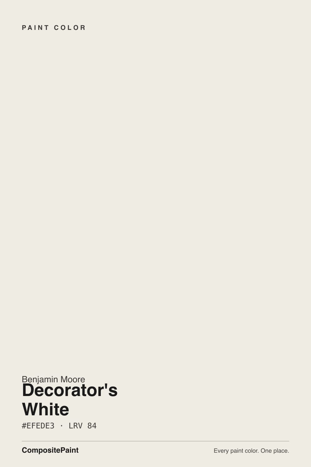
Decorator's White
The professional's cool white, reviewed honestly: where the crisp gray-violet base looks expensive, the exact rooms where it goes dingy, and what to pick instead.

Jessica has spec'd whites and neutrals for more than 300 rooms and keeps a sample wall of painted drawdowns in her studio. Every color review is checked against real reader rooms in the comments and re-tested when a formula changes. About the testing process →
- 1First Star69
- 2Classic Gray74
- 3Decorator's White83
- 4Chantilly Lace91
- 5Ultra Pure White97
The Fast Verdict
Decorator's White is the white you pick when nothing may look creamy. It is a soft white built on gray, with a blue-violet lean underneath, so it stays crisp and never yellows — which is exactly why designers spec it on trim, doors, ceilings and cool modern kitchens.
The catch is the same trait seen from the other side: put it next to a warm white, a honey-oak floor or a dim north window and the gray steps forward and the wall reads dingy.
Trim, doors and ceilings in cool or modern rooms · kitchens and baths with Carrara-type marble and cool tile · bright sunrooms and art walls · exterior trim, garage doors and fences on cool-toned houses
The room is dim or north-facing with no lamps · your other whites are warm (White Dove, Swiss Coffee, Simply White) · your floors are honey oak or golden pine · your house is red brick or warm earthy stone
- Crisp and clean with zero yellow — and it stays that way
- The reference trim, door and ceiling white for cool and modern rooms
- Matches Carrara-type marble, cool tile, chrome and stainless exactly
- A quiet gallery backdrop for bold art in bright rooms
- Excellent exterior trim, garage-door and fence white on cool-toned houses
- Goes flat, gray and dingy in dim or north-facing rooms
- Reads dirty beside any warmer white — no mixed-white houses
- Fights honey oak, orange-stained trim and red brick
- Not a safe whole-house wall white the way its name implies
What Color Is Decorator's White, Really?
A soft white built on gray rather than on cream, with a faint blue-violet lean under the gray. The name is not marketing invention: this is the white that shows up on professional trim schedules, in gallery-style rooms hung with bold art, and in the modern apartments where the whole point is that nothing on the wall looks creamy. Benjamin Moore files it in the Off-White Collection as OC-149, and you will also see the same color carried in a second fan deck under the code CC-20 — same paint, different book, which is why store staff sometimes quote you two numbers.
At LRV 85 it reflects plenty of light but it is not a bright white. That number is worth sitting with: Swiss Coffee also sits at 84 and Sherwin-Williams Pure White at 84, so brightness is not what separates these whites — temperature is. Stand Decorator's White next to Chantilly Lace (LRV 92) and it suddenly shows its body and its gray. On trim that body is the asset; it holds a clean painted edge without the plastic glare a true bright white gives under a spotlight. On four walls in weak light, that same body is the risk.
Undertone in one line: gray first, a blue-violet whisper second — never yellow, never cream. If your sample looks warm on the wall, that is a warm bulb or a reflection off an oak floor; if it looks distinctly lavender, that is cool north light exposing the violet the pigment has always carried.
Where It Shines
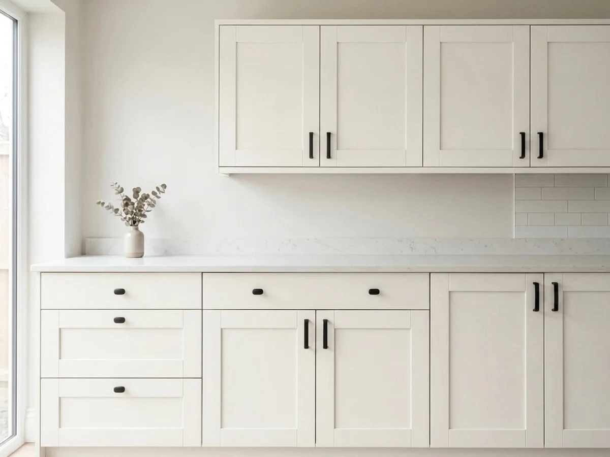
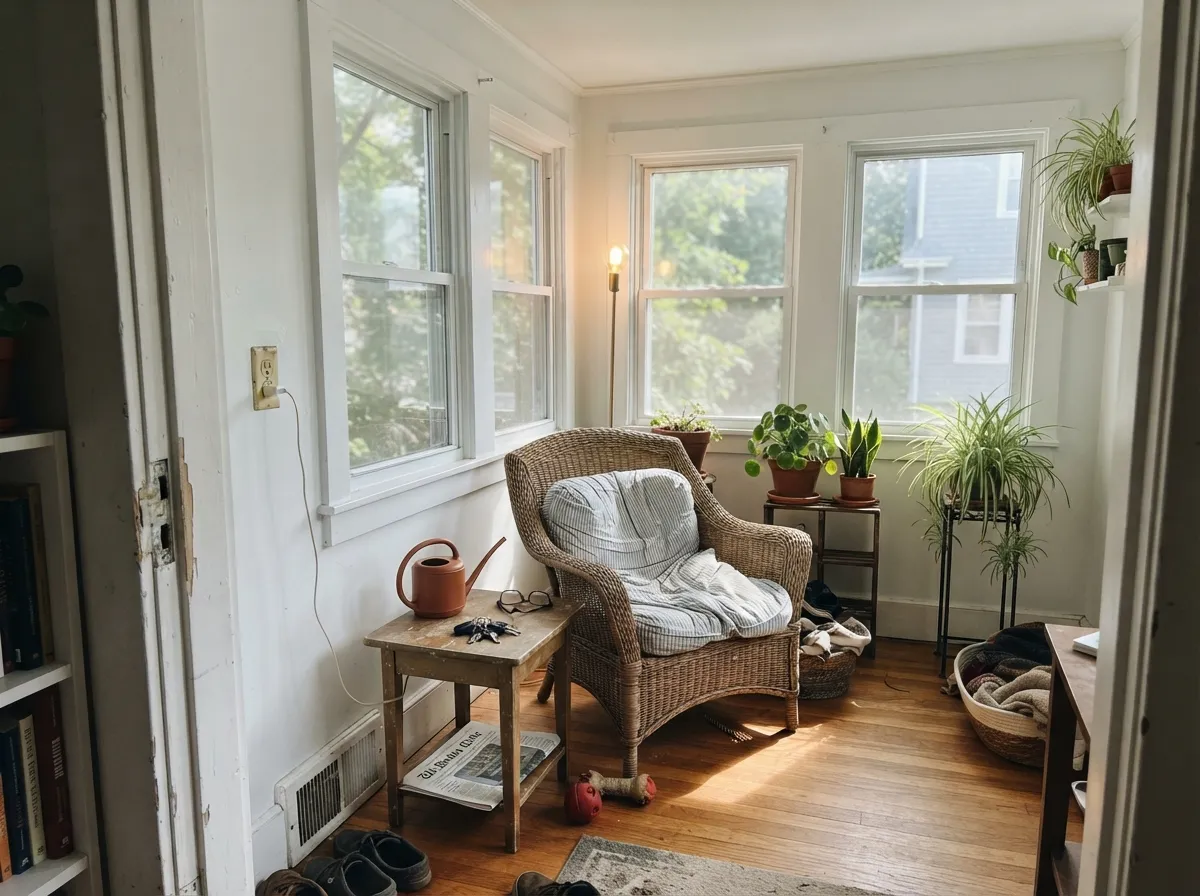
Its home is woodwork. On casings, baseboards, panel doors and built-ins it reads as crisp painted trim rather than as a color, and because there is no yellow in it, it stays looking freshly painted for years instead of aging toward cream. Its second home is the cool modern kitchen or bath: against Carrara-type marble, white subway tile, chrome and stainless, Decorator's White matches temperature instead of fighting it — the exact pairing where warm whites like White Dove start to look yellowed. Give it strong daylight and bold art and the walls do what the designers hire it for: disappear.
Where It Fails
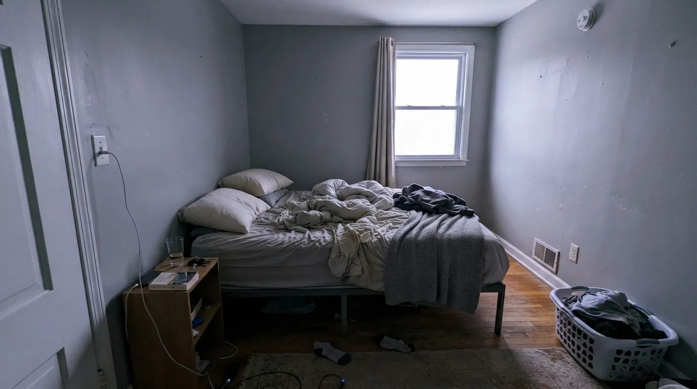
This is a polarizing white, and the bad reviews are remarkably consistent. Every one of them traces back to one of three situations, and all three are visible before you open the can. If your room matches one, this is the wrong white — no extra coat fixes any of them.
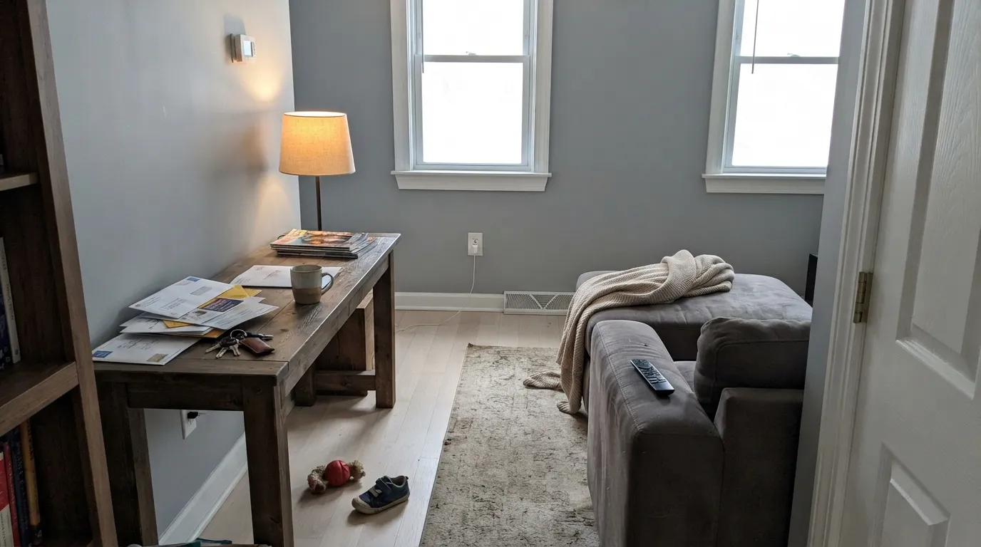
Cool daylight plus low light is the worst case: the gray base takes over, the corners shadow out to a flat concrete gray, and owners describe the result as dingy or chalky. It is the single most common complaint about this color. In a dark room, use a warmer white (White Dove) or a brighter one (Super White) and keep Decorator's White for the trim in rooms that actually get sun.
Decorator's White walls with White Dove or Swiss Coffee trim, or Decorator's White trim against a creamy wall, is the mistake that generates the angriest reviews. Side by side, the cool white reads gray and the warm white reads yellow, and neither looks intentional. Pick one temperature for the whole house. The same trap catches builder-white vinyl windows: if the window frames are a bright cool white, Decorator's White casings around them will read a shade duller.
Yellow-orange is the opposite side of the wheel from this color's violet-gray base, so golden oak floors, orange-stained trim and red brick all push it grayer while it pushes them oranger. Outside, this is the exterior rule that matters most: Decorator's White trim looks excellent on cool gray-blue siding or cool stone, and looks cold and mismatched against red brick or warm fieldstone.
Room by Room
Semi-gloss on casings, baseboards and panel doors, under gray, blue, green or white-cool walls. No yellow means no drift toward cream as the paint ages, which is the whole reason it lives on professional spec sheets. Keep every white in the room on the same temperature and it never looks anything but sharp.
Flat Decorator's White overhead reads clean without the blue glare of a stark ceiling white, and it keeps the plane quiet under cool wall colors. Use it on the ceiling whenever the trim is also Decorator's White; over warm cream walls, use a warm ceiling white instead.
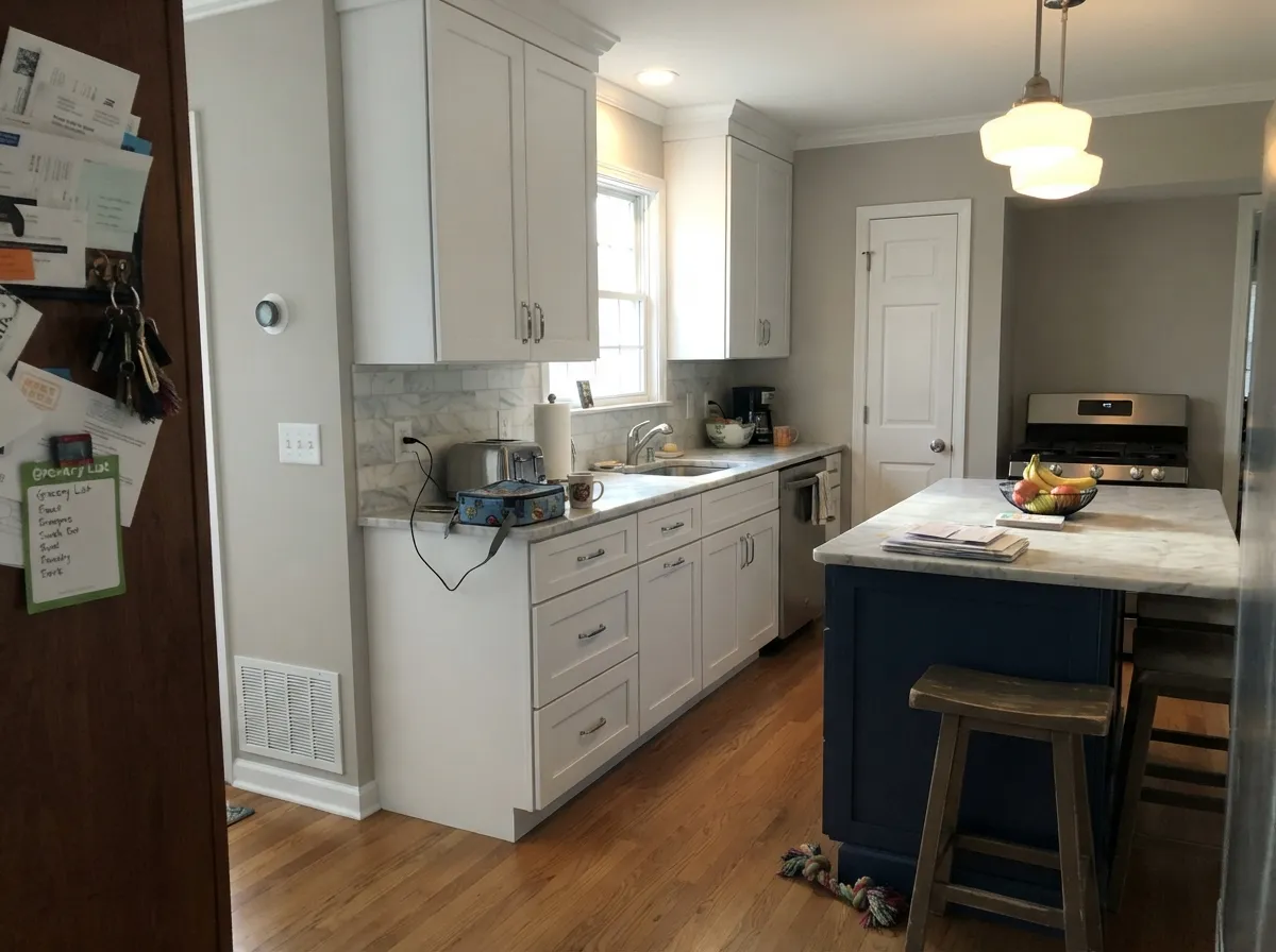
Against Carrara-type marble, white quartz with gray veining, chrome or brushed nickel, satin Decorator's White cabinets look tailored and expensive. Against butcher block, brass, terracotta or warm granite it is the wrong temperature and reads gray. Decide by the counter, not by the chip.
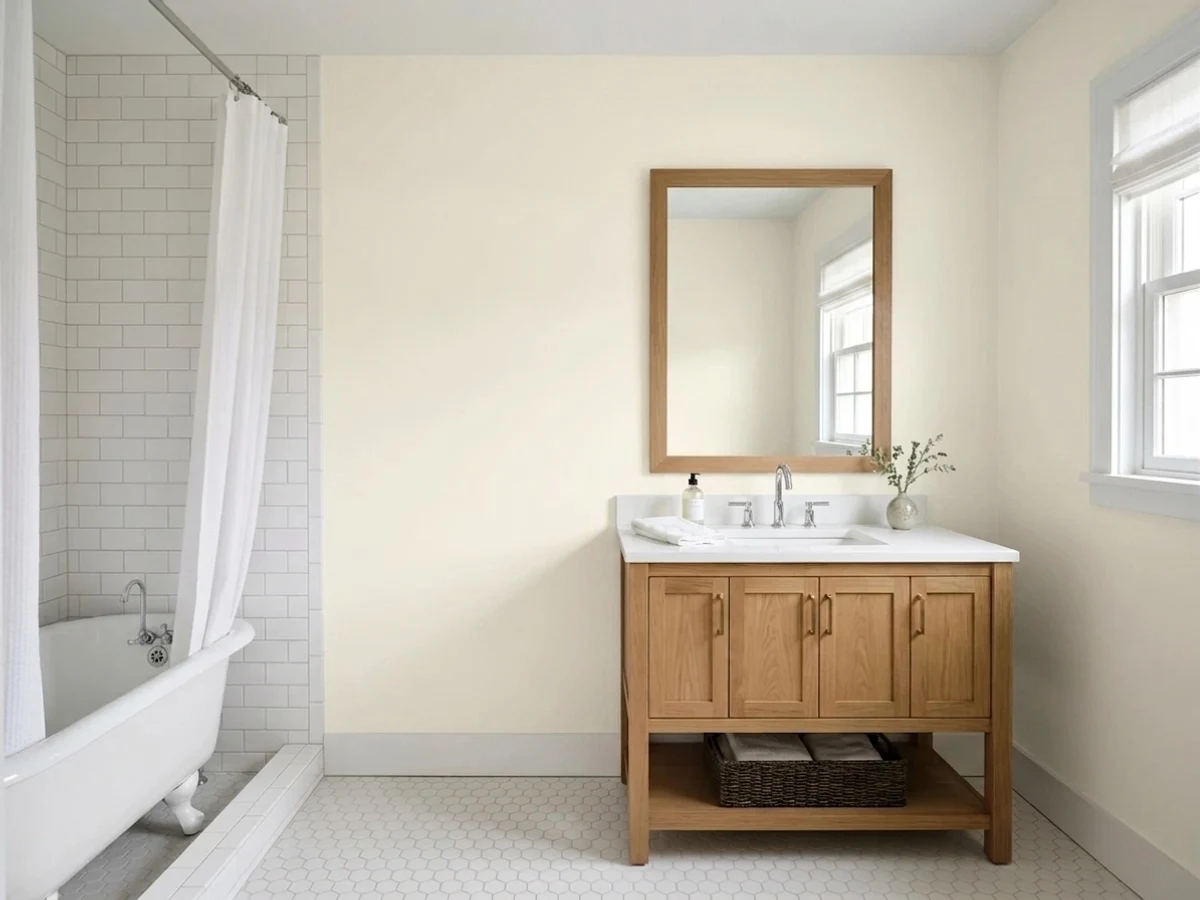
Its best small-room use: a vanity, tub surround, wainscot or the whole bath, where the cool tile and cool stone give it company it agrees with. Add a decent light — a windowless bath on one dim fixture is where the gray shows up first.
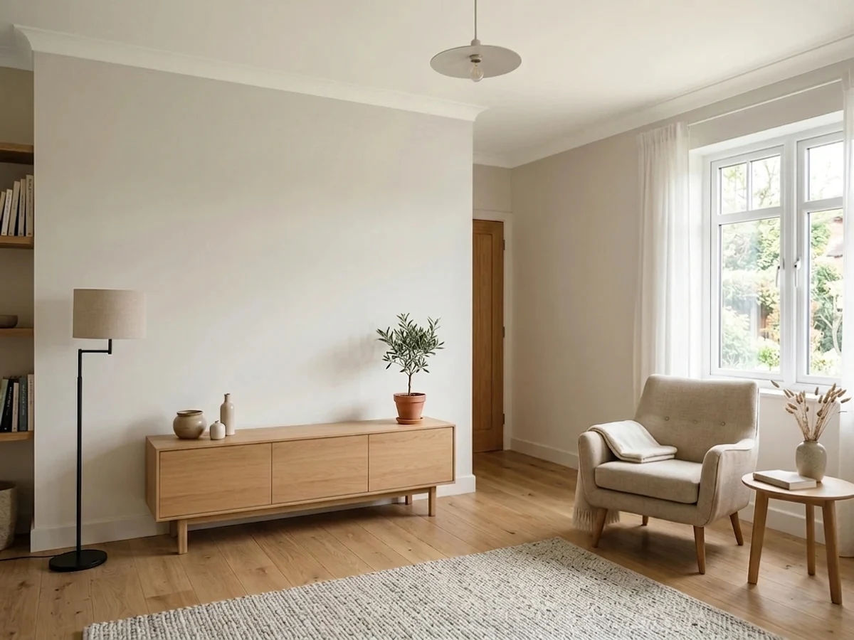
Wall use is where this color needs a permit, and sunrooms are the room that grants it. Glass on two or three sides floods out the gray base and leaves a clean, quiet white that lets plants, wicker and whatever is outside carry the color. The same logic holds for a bright living room hung with art: strong daylight plus bold canvases is what the gallery-white reputation is built on.
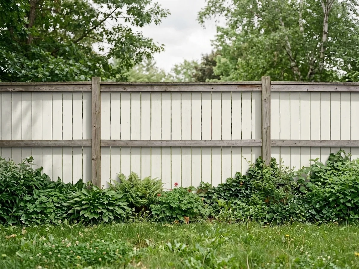
Full sun reads it brighter and cleaner than it ever looks indoors, and it will not chalk toward cream the way warm whites do. Excellent as trim and garage doors on gray, blue-gray or white siding, and a genuinely good pick for a painted fence, where the cool white stays looking washed rather than yellowed. Details and pairings in the exterior section below.
Your Light Is the Risk
South windows or a glass-walled sunroom wash out the gray and leave it clean, crisp white. This is the light it needs.
Cool, weak daylight drags the gray-violet base forward; corners shadow out and the wall reads chalky. Its one real failure light.
Neutral and cool most of the day, briefly softened by golden-hour sun. It moves less than most whites — the gray anchors it.
Cool 3500–4000K LEDs keep it crisp and true. Warm 2700K bulbs mute the violet but can leave it looking slightly muddy rather than cozy.
Most complaints about Decorator's White are a light mismatch. Upload a photo of your actual room and see it on your walls — then ask for the same wall in north light or evening lamps before you buy a single sample.
Need It From Another Brand?
Any paint counter can custom-tint Benjamin Moore CC-20 directly. If you would rather stay in one brand's own deck, these are the closest stock matches, measured as ΔE2000. Under 2 is a difference you will not see on the wall.
| Brand | Closest color | ΔE | LRV | |
|---|---|---|---|---|
| Sherwin-Williams | White SandSW 9582 · Sherwin-Williams | 1.6 | 84 | Color page → |
| Behr | Floral ScentPPL-34 · Behr | 1.4 | 85 | Color page → |
| Valspar | High Hide White7007-2 · Valspar | 1.0 | 85 | Color page → |
| PPG / Glidden | Moonlit SnowPPG1041-1 · PPG / Glidden | 0.6 | 84 | Color page → |
| Glidden | Moonlit SnowPPG1041-1 · Glidden | 1.0 | 85 | Color page → |
| Dutch Boy | White003W · Dutch Boy | 1.1 | 86 | Color page → |
Similar Benjamin Moore Colors
The nearest shades to Decorator's White within Benjamin Moore's own range, ranked by perceptual color distance — useful when you want the same look a touch lighter, darker, or warmer.
WCAG 2.1: AA is 4.5 : 1 for normal text, 3 : 1 for large text, AAA is 7 : 1.
Decorator's White vs the Colors You're Also Considering
Every Decorator's White sample board has the same rivals on it. The numbers show the real lightness gap — then it comes down to which risk you would rather live with.
Pick this when you want a white with some body, or a softer edge that will not glare under downlights.
Benjamin Moore OC-65 · LRV 92Chantilly LacePick this for the brighter, cleaner, far more flexible trim white — it sits comfortably next to warm and cool wall colors alike.
Side-by-side comparison →Pick this when the room has good light and you want the quieter, less clinical version of the same cool white.
Benjamin Moore OC-152 · LRV 87Super WhitePick this for ceilings and trim in dim rooms, where Decorator's White would go gray — Super White stays bright with the same cool temperature.
Pick this when warmth is the problem: cool marble, chrome, gray siding, modern art. Never use the two in the same sightline.
Benjamin Moore OC-17 · LRV 85White DovePick this for warm houses — oak floors, brass, cream stone, north-facing rooms. It is the safer default for most homes.
Pick this for the softer cool white; Extra White is sharper and shows drywall flaws more readily on walls.
Sherwin-Williams SW 7006 · LRV 86Extra WhitePick this if your painter works in Sherwin-Williams — it is the same crisp trim idea, a touch brighter and without the violet lean.
White Dove OC-17, LRV 83, is the closest household name to Decorator's White. Both are soft near-whites, but White Dove carries a touch more body and warmth on the wall, which makes it feel cozier in traditional rooms. Decorator's White stays a hair cleaner and more neutral in cool light, so it is the better pick for modern spaces where you want structure rather than softness.
Chantilly Lace OC-65 is a different tool entirely. At LRV 92 it is noticeably brighter and starker, essentially a true white. Choose Chantilly Lace when you want maximum crispness, such as trim, ceilings, or a gallery-style room; choose Decorator's White when a full room of true white would feel harsh.
Icicle OC-60, LRV 82, sits just below Decorator's White in lightness and looks very close on a chip. In a side-by-side sample, Icicle reads marginally dimmer; most rooms would not miss the difference, so decide with large samples in your own light.
Decorator's White Coordinating Colors
The rule with this white is simple and strict: stay on the cool side of the line. It partners beautifully with true grays, cool light grays, blue-greens and near-blacks, and it argues with cream, beige and warm greige — including warm whites, which is the pairing that ruins the most rooms. These are the colors that keep showing up beside it in schemes that work:
Decorator's White Outside: Trim, Garage Doors and Fences
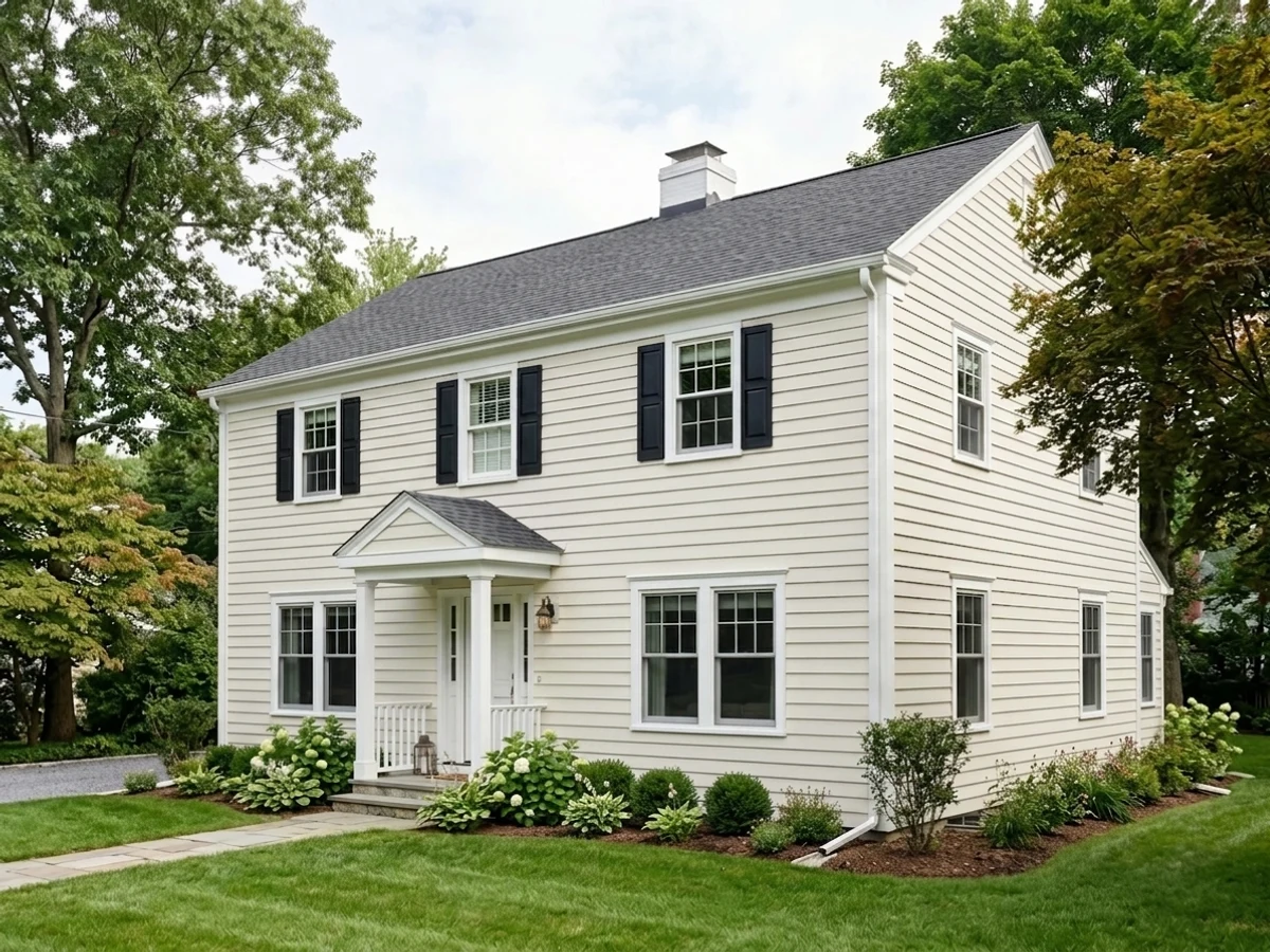
Outdoors this color is easier to live with than it is on an interior wall, because the one thing it needs — light — is free. Full sun washes the gray base out and leaves a clean, bright-looking white, and the absence of yellow means it does not drift toward cream as the coating weathers. That makes it a strong exterior trim white, a very good garage-door white, and one of the better choices for a painted fence, where a warm white can start to look tired within a couple of seasons.
The pairing decides everything. Gray, blue-gray and white siding, cool stone, black windows and charcoal roofs all keep it in family. Red brick, warm tan stucco and honey-toned cedar do not — beside them it reads cold and mismatched, and the brick looks oranger for the trouble. One more check before you commit: if the house has factory-white vinyl windows or a white vinyl fence already on site, hold a big sample against them. Factory whites are usually brighter and cooler, and a mismatch that is invisible on a chip is obvious across a facade.
Decorator's White With Wood Tones and Floors
The floor decides this color more than the wall does. Pale white oak, gray-washed wood, cool LVP, concrete and black-stained floors are its natural company — all of them share its temperature, so the white stays crisp and the room reads modern rather than cold. Walnut and espresso work too: dark, low-yellow woods give the scheme contrast without pulling it warm.
The honest no is golden. Honey oak floors, orange-stained builder trim and yellow-toned pine sit directly opposite this white's violet-gray base, so each side exaggerates the other — the floor looks oranger, the white looks grayer, and no number of coats changes the geometry. If the golden floor is staying, this is the wrong white for that room; a warm white will make the same floor look intentional. Metals follow the same logic: chrome, nickel and matte black all belong with it, while unlacquered brass is the one finish that makes it look faintly gray by comparison.
Three Ready Palettes Built on Decorator's White
A color is never alone on the wall. These are complete combinations in the 60-30-10 pattern, with the reason each one holds together. Every one opens in the visualizer.
Stonington Gray is a true gray with no greige in it, so the trim handoff stays on one temperature — the thing this white cares about most. Iron Ore doors give the scheme its single dark note and make the white read deliberate instead of plain.
Try this palette in your roomEverything here sits on the cool side of the line, which is what makes gray-veined marble and nickel hardware look intentional. Gray Owl keeps the walls light enough that the cabinets still read as the brightest thing in the room; the blue island supplies depth without adding warmth.
Try this palette in your roomBlue-gray siding shares this white's base, so trim, garage door and fence all read as one crisp frame rather than three separate whites. The navy door is the only saturated note the scheme needs, and it keeps the whole facade on the cool side where this color is strongest.
Try this palette in your roomDecorator's White FAQ
Is Decorator's White warm or cool?
Cool. It is a gray-based white with a faint blue-violet lean and no yellow at all, which is why it looks crisp beside marble and chrome and looks gray beside cream. Nothing about the light will make it read warm — the most a golden west sun does is soften it for an hour.
Decorator's White or Chantilly Lace for trim?
Chantilly Lace if you want the brighter, more flexible option — at LRV 92 it is close to a true white and it sits happily next to warm and cool wall colors alike. Decorator's White if the whole room is cool and you want trim with a little more body and less glare. The one thing you should not do is use both in the same house.
Is it good for kitchen cabinets?
In a cool kitchen, yes — it is a genuinely good cabinet white against Carrara-type marble, gray-veined quartz, white tile and nickel or chrome. In a warm kitchen with butcher block, brass or honey-toned wood it reads gray and slightly dirty; use White Dove there instead. Satin urethane-fortified cabinet enamel either way.
What wall colors go with Decorator's White trim?
Anything on the cool side: true grays like Stonington Gray, cool light grays like Gray Owl and Wickham Gray, blue-greens like Palladian Blue, and any navy or charcoal. It also works with itself — walls and trim both Decorator's White, separated only by sheen. Avoid cream, beige and warm greige walls; that is the pairing behind most of its bad reviews.
Does it work on exteriors, garage doors and fences?
Yes, and outside is where it is easiest to like. Full sun reads it brighter and cleaner than it ever looks indoors, and because there is no yellow in it, trim, garage doors and painted fences keep looking washed rather than aged. Match it to cool-toned houses — gray, blue-gray, white or cool stone. Red brick and warm fieldstone are the honest no.
Why does my Decorator's White look gray or dingy?
Almost always one of two reasons. Either the room is dim or north-facing, so the gray base has nothing to wash it out — add lamps or repaint in a warmer white. Or there is a warmer white next to it, on the trim, on the windows or on a neighboring wall, and the comparison makes the cool one look dirty. Fix the neighbor before you blame the paint.
Have you painted with Decorator's White?
Rate it — one tap helps the next reader decide.
Ask a Question