Super White
The white painters reach for when nothing else may show an undertone — reviewed honestly, including the two rooms where it turns cold and the trim mistake that ruins warm walls.

Jessica has spec'd whites and neutrals for more than 300 rooms and keeps a sample wall of painted drawdowns in her studio. Every color review is checked against real reader rooms in the comments and re-tested when a formula changes. About the testing process →
- 1Classic Gray74
- 2Alabaster82
- 3Super White87
- 4Sleek White92
- 5Ultra Pure White97
The Fast Verdict
Super White is the cleanest white Benjamin Moore sells, and that is both the reason to buy it and the reason to be careful. On trim, doors, and ceilings it is close to perfect: no undertone to fight your wall color, and clear separation from anything you put next to it. On walls it only works when the room has real light and the drywall is genuinely flat. In a dim north room, or over old patched plaster, it turns cold and shows everything.
Trim, doors, and ceilings under any wall color · gallery and art walls in bright rooms · modern kitchens with stainless, quartz, and matte black · rooms where a creamy white would look dated
Your room faces north and stays dim · your walls are old plaster or heavily patched · your walls are already a warm off-white like White Dove · you want a room that feels soft and cozy
- As close to no undertone as a mixed white gets — never fights a wall color
- LRV 87 gives clean separation on trim against nearly anything
- The safest ceiling white when you want wall colors to stay true
- Crisp, modern cabinet white next to stainless, quartz, and matte black
- Available in Aura, Advance, and Regal, so one white covers walls, trim, and cabinets
- Reads cold and clinical in dim or north-facing rooms
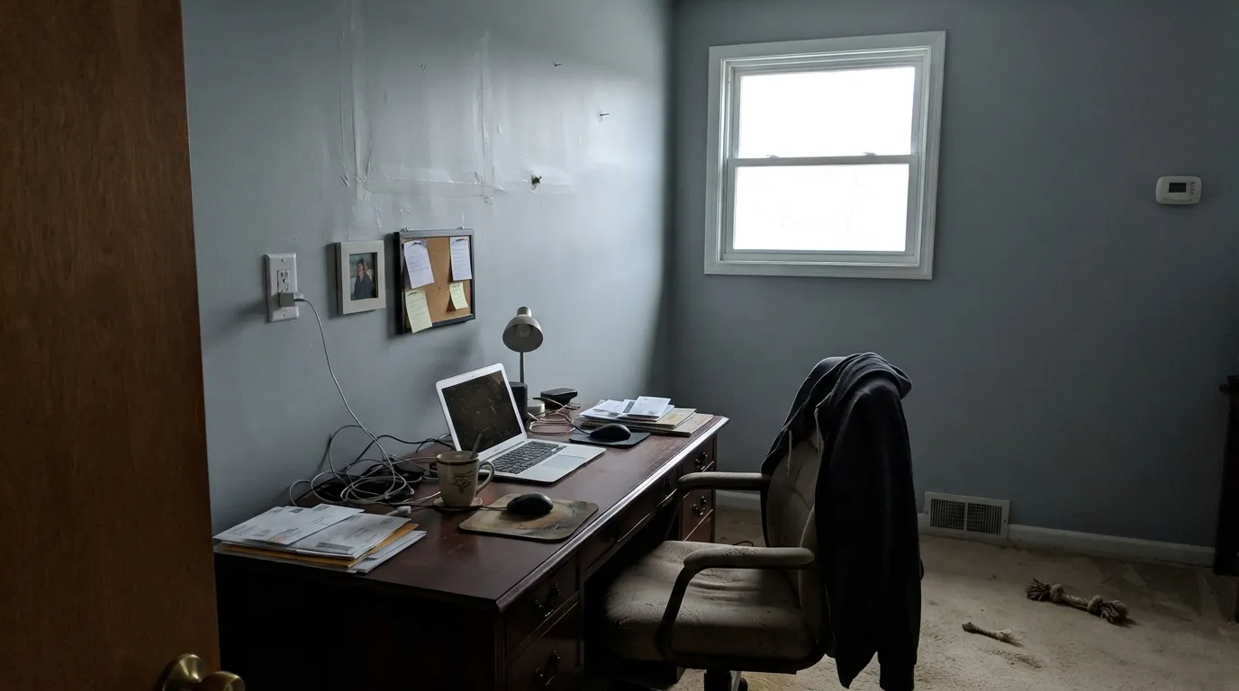
- Shows every drywall seam, nail pop, and roller lap
- Makes warm off-white walls next to it look dingy
- In Advance, white cabinets can yellow slightly in low-light spots over time
What Color Is Super White, Really?
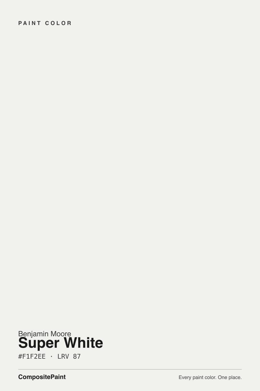
A bright, hard, near-neutral white with almost nothing under it. Most whites are built on a deliberate lean — a drop of yellow oxide for warmth, a touch of black for a gray cast, a whisper of blue for crispness. Super White is built to have as little of that as a mixed paint can. The measured numbers back it up: hue lands at 75 degrees, technically the yellow-green corner, but at 13 percent saturation there is nothing left of it to see. That is why it became the default gallery and contractor white — it does not editorialize about whatever is hanging on the wall or painted next to it.
At LRV 87 it reflects nearly everything that hits it, and the number tells you where it sits in the family. Chantilly Lace (LRV 91) is brighter and slightly bluer; White Dove (LRV 83) is four points darker and visibly creamy beside it. Super White lands between them and reads as a plain, honest white rather than a statement in either direction. On trim that gap is the whole point — it separates cleanly from a green, a navy, or a mid-gray wall without ever picking a side. On walls, the same high reflectance means every nail pop, seam, and roller lap gets its own highlight.
Undertone in one line: essentially none, which means it borrows the temperature of whatever is around it — cool daylight and gray stone make it read icy, wood and brass keep it civil, and a tree outside the window will throw a faint green cast on the wall that is not the paint's fault.
Where It Shines
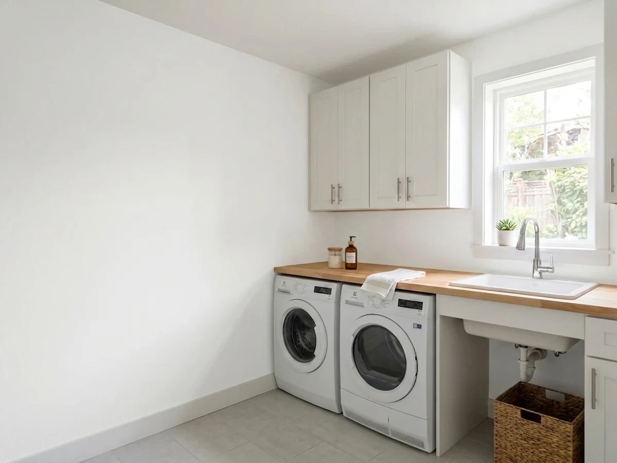
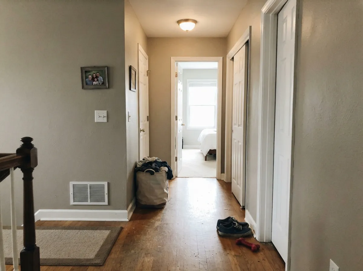
Its home is woodwork and ceilings. Semi-gloss Super White casings against a colored wall give the crisp painted-trim line people picture when they say "clean," and a flat Super White ceiling makes the whole room read taller. On walls it earns its keep in bright, modern rooms where the art, the wood, and the light are supposed to be the subject.
Where It Fails
The bad stories about Super White are remarkably consistent, and none of them are mysteries. Two are about light, one is about what you put beside it. If your project matches one of these, more coats will not save it.
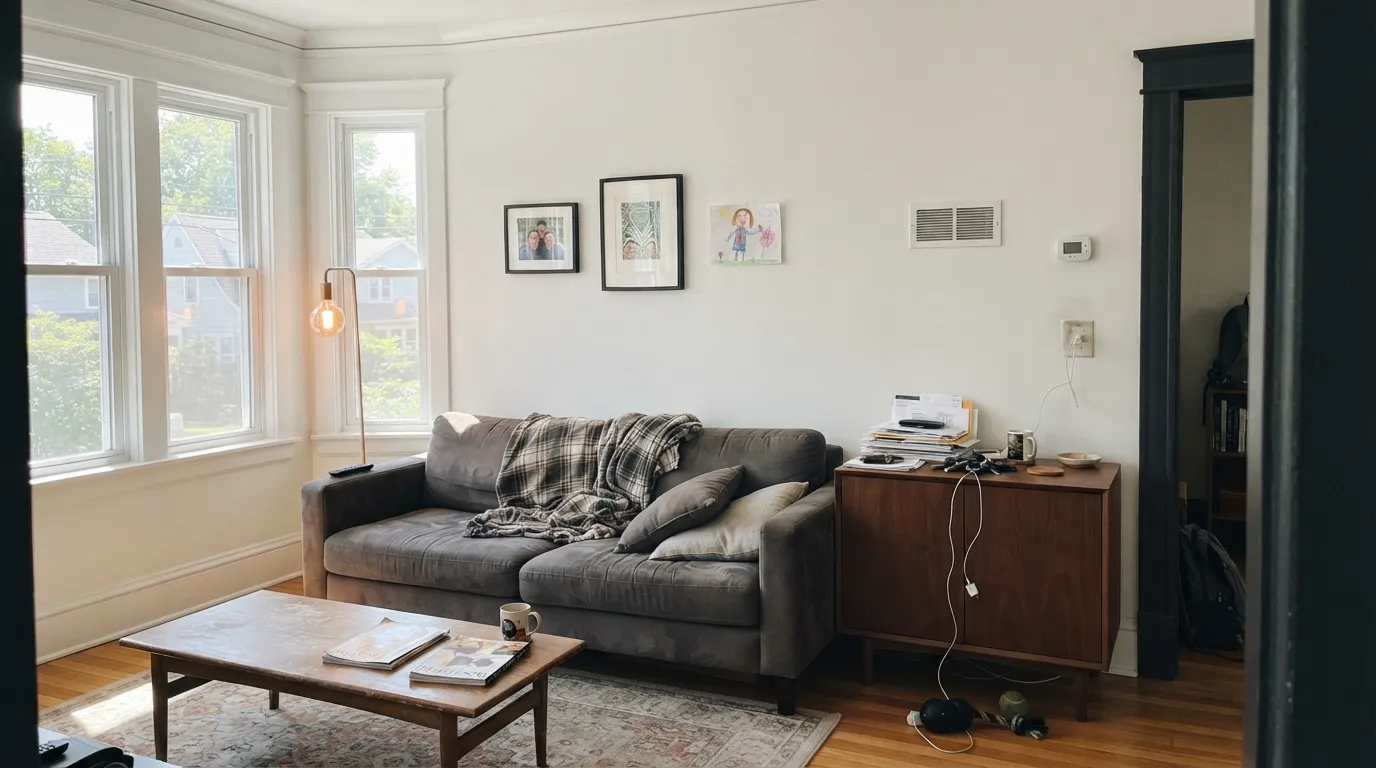
North light is cool and flat, and Super White has no warmth of its own to push back with. The wall stops reading white and starts reading gray-blue — the complaint people phrase as "it feels like a hospital." Warm 2700K bulbs help at night but do nothing at 2 p.m. Use Simply White OC-117 instead; it keeps the brightness and adds the warmth the room is missing.
This is the expensive version of the mistake. Put Super White casings and baseboards against White Dove OC-17, Swiss Coffee OC-45, or Alabaster SW 7008 walls and the trim wins — the wall instantly looks dingy and yellow, like a failed color match rather than a choice. Either paint the trim the same color as the wall in semi-gloss, or trim a warm wall with a warm white such as White Dove OC-17.
At LRV 87 there is no pigment body to hide behind. Sanding halos, tape seams, skim-coat edges, and roller laps all catch light and show as shadows, especially on a long wall with raking sun. Level-five drywall and a matte sheen fix it; if that is not happening, Decorator's White CC-20 carries a little gray that quietly blurs the flaws.
Room by Room
Semi-gloss Super White gives a hard, clean edge against almost any wall color, and with no undertone it will not argue with a green or a navy. The one rule: do not use it as trim over a warm off-white wall.
Flat Super White overhead reflects light without adding a cast, so wall colors stay true. Keep a wet edge and roll the whole plane in one session — bright flat white flashes badly if you stop halfway or touch up later.
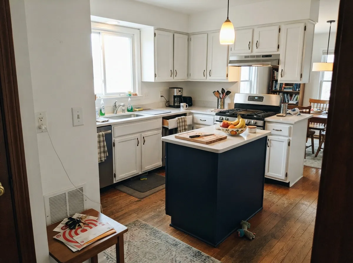
Against stainless, quartz, and matte black it is exactly the crisp cabinet white people want, in Advance satin. Next to honey oak floors and brass it reads severe, and prep has to be spotless because this white hides nothing.
In a south or west room with wood furniture and art it is a genuine gallery backdrop. In a dim room it goes clinical fast. Matte sheen, and add warmth through rugs, wood, and lamps rather than through the paint.
Small cool rooms are where high reflectance pays off, and the neutrality suits white tile, chrome, and polished nickel. Use a scrubbable eggshell or satin; flat will not survive splashes.
As trim and soffit against a colored or dark body it is sharp and classic. As the whole house it glares in direct sun and shows pollen, mildew, and rain streaks quickly — plan on washing it. Pair it with Kendall Charcoal HC-166 or Wrought Iron 2124-10.
Your Light Is the Risk
Cool flat daylight with no warmth to counter it. The wall drifts gray-blue and clinical.
Warm sun supplies the warmth the paint lacks. Bright, clean, and comfortable all day.
2700K lamps make it livable. 4000K LEDs push it straight to operating room.
Bounced green light lands on a white this reflective. Sample on the window wall first.
Most complaints about Super White are a light mismatch. Upload a photo of your actual room and see it on your walls — then ask for the same wall in north light or evening lamps before you buy a single sample.
Need It From Another Brand?
Any paint counter can custom-tint Benjamin Moore OC-152 directly. If you would rather stay in one brand's own deck, these are the closest stock matches, measured as ΔE2000. Under 2 is a difference you will not see on the wall.
| Brand | Closest color | ΔE | LRV | |
|---|---|---|---|---|
| Sherwin-Williams | SnowbeltSW 9623 · Sherwin-Williams | 1.2 | 87 | Color page → |
| Behr | Nano WhiteHDC-MD-06 · Behr | 1.5 | 88 | Color page → |
| Valspar | Santa's Beard8007-6E · Valspar | 1.0 | 89 | Color page → |
| PPG / Glidden | Delicate WhitePPG1001-1 · PPG / Glidden | 0.2 | 88 | Color page → |
| Glidden | Delicate WhitePPG1001-1 · Glidden | 0.0 | 88 | Color page → |
| Dutch Boy | Birched White004W · Dutch Boy | 2.4 | 89 | Color page → |
Similar Benjamin Moore Colors
The nearest shades to Super White within Benjamin Moore's own range, ranked by perceptual color distance — useful when you want the same look a touch lighter, darker, or warmer.
WCAG 2.1: AA is 4.5 : 1 for normal text, 3 : 1 for large text, AAA is 7 : 1.
Super White vs the Colors You're Also Considering
Every Super White sample board has the same rivals on it. The numbers show the real lightness gap — then it comes down to which risk you would rather live with.
Pick this for a plainer white with less blue in the crispness.
Benjamin Moore OC-65 · LRV 92Chantilly LacePick this for maximum brightness — the sharpest modern white BM sells.
Pick this for the cleanest, most neutral trim white of the two.
Benjamin Moore OC-149 · LRV 84Decorator's WhitePick this when Super White feels harsh; the gray softens the edge.
Within the same deck, Oxford White 869 shares the LRV of 87 but has a slightly softer hex at #F0F1EA, so it is marginally less sharp. Opulence OC-69 at LRV 88 and hex #F5F2ED is brighter and a touch warmer, and Ice Mist OC-67 at LRV 90 is the brightest and coolest of the group. Super White also lists as PM-1 at LRV 89 with the identical hex.
Across brands, Delicate White PPG1001-1 by Glidden matches the hex exactly at a deltaE of 0, so there is nothing to choose between them visually. Snowbelt SW 9623 at LRV 87 and Nano White HDC-MD-06 by Behr at LRV 88 come in at 1.2 and 1.5, visually identical in normal room light.
Further out, Wimborne White No. 239 by Farrow and Ball at LRV 89 sits at 3.21, very close but worth sampling first. Wing It by Clare, at 4.25, is close but visibly different side by side, reading warmer. Benjamin Moore is sold through independent dealers, which is worth knowing if you are matching to a color from a big-box line.
Super White Coordinating Colors
The rule with Super White is the opposite of the rule with a creamy white: give it something to contrast with, not something to blend into. It has no undertone to protect, so it pairs happily with cool grays, deep navies, near-blacks, and soft green-blues. What it does not do is sit politely beside another off-white. These are the partners it actually works with:
Super White on Trim and Ceilings
This is the job it is best at, and there is a craft side worth knowing before you buy. On woodwork, use semi-gloss and expect two coats over any previous white — a bright white over a bright white still needs the second pass to look even, because there is so little pigment doing the hiding. On raw or repaired wood, prime first; bare filler and knots telegraph straight through a white this reflective.
On ceilings, flat is the only sensible sheen, and the discipline is speed rather than technique. Cut in and roll the entire plane in one session, keeping a wet edge and rolling in one direction, because a flat bright white flashes visibly wherever a dried edge meets a fresh one. Touch-ups almost never blend on a ceiling; plan to coat the whole surface rather than spot-fixing later. If you are choosing between Super White and a dedicated ceiling white, the argument for Super White is that it will not tint the light bouncing back onto your wall color.
If you sample it and it feels too hard for your house, the two closest exits are both in the same deck. Decorator's White CC-20 gives you the same cool character with a little gray in it, which reads softer and hides wall flaws better. Simply White OC-117 keeps the brightness but adds warmth, which is the right move for a dim room.
Super White With Wood Floors and Warm Metals
This is the pairing that decides whether a Super White room feels calm or cold, and the honest answer is that it depends on how orange your wood is. Walnut, white oak, and gray-washed floors sit beautifully under it — the wood is cool enough that the white reads clean rather than clinical. Honey oak and 1990s orange-toned oak are the hard case: Super White does not soften that orange, it sharpens it, and the floor becomes the loudest thing in the room. If those are your floors and you are not refinishing, a warmer white will treat them better.
Metals split the same way. Chrome, polished nickel, and matte black are natural partners, and matte black in particular is what gives a Super White room its structure. Brass and antique bronze are not off limits, but they will read as a deliberate accent rather than a blend, so use enough of them to look intentional — hardware plus lighting plus a mirror, not one lonely faucet. Add the warmth this white will never provide through wood, textiles, and lamp temperature, and the room lands where you wanted it.
Three Ready Palettes Built on Super White
A color is never alone on the wall. These are complete combinations in the 60-30-10 pattern, with the reason each one holds together. Every one opens in the visualizer.
Super White holds the 60 percent as a clean backdrop, so art and wood grain become the only color in the room. The near-black doors give the high-contrast edge this white was made for, and Chelsea Gray on built-ins keeps that contrast from feeling like a light switch.
Try this palette in your roomPerimeter cabinets in Super White carry the room and stay crisp against quartz and stainless, while Gray Owl keeps the walls cool enough that the cabinets never look yellowed. The navy island is the 10 percent that stops an all-white kitchen from reading like a showroom.
Try this palette in your roomThis is the pairing that proves the trim rule: Revere Pewter is a mid-tone greige, so the LRV gap is wide enough that Super White reads as a deliberate crisp frame instead of making the wall look dirty. Sea Salt on one small room picks up the cool side of the white and gives the scheme a single soft color note.
Try this palette in your roomSuper White FAQ
Will Super White trim make my White Dove walls look dirty?
Yes, and this is the most common complaint about the color. Super White is four LRV points brighter and carries none of White Dove's warm gray, so side by side the wall reads yellowed and unwashed. Trim warm walls with the same color in semi-gloss, or with another warm white.
Super White or Chantilly Lace for trim?
Chantilly Lace at LRV 91 is brighter and slightly bluer; Super White at 87 is a touch plainer and less icy. If the walls are colored and you want the woodwork to read as simple white, Super White. If you want the trim itself to be the bright statement, Chantilly Lace.
Is Super White the same as untinted base white?
No. Untinted base is not a finished color and will not look the same from line to line. Super White is a specific formula with a real color number, so a gallon of Aura and a gallon of Advance will match on the wall. Order it by name, not as "just white."
What is the difference between OC-152 and PM-1?
They are the same white listed in two different fan decks — the Off-White collection and the Premium Mix line. The chip color is identical, though the published LRV differs by a point or two between decks. Give your dealer OC-152 and you will get what you sampled.
Does Super White yellow on cabinets?
It can, slightly, in Advance. That is a waterborne alkyd, and alkyds yellow a little in spots that never see daylight — the inside of a pantry door, a cabinet behind an appliance garage. Doors and drawer fronts in normal light hold up fine. Give it the full 30-day cure before heavy use.
What wall colors go with Super White trim?
Anything with real color or real depth. Mid-tone and dark walls are where it shines: Hale Navy HC-154, Revere Pewter HC-172, Chelsea Gray HC-168, Sea Salt SW 6204. The one category to avoid is warm off-whites, which lose the comparison every time.
Is Super White too bright for a ceiling?
In a room with strong daylight it can feel glaring, and a flat white ceiling this reflective shows every roller lap. In most rooms it is exactly right, especially over colored walls where a tinted ceiling white would muddy the color. Roll it in one continuous session and keep a wet edge.
Have you painted with Super White?
Rate it — one tap helps the next reader decide.
Ask a Question