White Heron
The bright white that sits between Chantilly Lace and White Dove, reviewed honestly: the whisper of green-gray in it, the exterior job it's genuinely great at, and where it goes flat.

Jessica has spec'd whites and neutrals for more than 300 rooms and keeps a sample wall of painted drawdowns in her studio. Every color review is checked against real reader rooms in the comments and re-tested when a formula changes. About the testing process →
- 1Classic Gray74
- 2Alabaster82
- 3White Heron87
- 4Sleek White92
- 5Ultra Pure White97
The Fast Verdict
White Heron is what you reach for when Chantilly Lace feels too stark and White Dove feels too creamy. At LRV 87 it is genuinely bright — nearly as bright as Super White — but the color itself carries the faintest whisper of gray-green instead of Chantilly Lace's cold neutral or White Dove's yellow warmth. That whisper is subtle enough to read as "just white" in good light and just present enough to keep it from ever looking sweet. It is not a famous, best-selling color the way its two neighbors are — it is a quieter workhorse that a smaller, loyal group of designers reach for specifically because it isn't loud.
Exteriors and modern-farmhouse trim · kitchen cabinets when Chantilly Lace felt too cold · rooms with real daylight and white oak or black hardware · anyone who tested two famous whites and disliked both
Your room is dim and north-facing · you want an obviously warm cream white · you're painting next to warm off-white trim already on the walls · you want a color with a documented, famous track record before you commit
- Bright without Chantilly Lace's stark, cold edge
- The gray-green whisper reads as "quiet" rather than as a visible color
- One of the better bright whites for modern-farmhouse exteriors
- Pairs cleanly with white oak, gray stone, and matte black hardware
- A genuine alternative once the two famous BM whites have both been ruled out
- Goes flat and slightly institutional in dim north light
- Looks faintly green next to any warmer off-white already on the walls
- At LRV 87 it shows wall imperfections in anything but flat sheen
- Less designer track record than White Dove or Chantilly Lace, so fewer real rooms to check before you buy
What Color Is White Heron, Really?
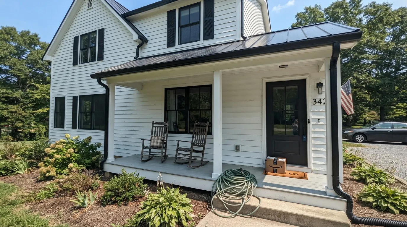
White Heron's own numbers tell the undertone story better than marketing copy does: the deck hex breaks down to red 240, green 241, blue 234 — red and green essentially tied, blue trailing by several points. That is not a warm, yellow-leaning white (where red would run ahead of green) and it is not Chantilly Lace's cool-neutral either. It is a faint green-gray cast, the kind that reads as "clean and quiet" in person and only shows up as a color word once you put a warmer or cooler white directly beside it.
At LRV 87 it sits in the top handful of the Benjamin Moore white lineup — brighter than White Dove (85) and Swiss Coffee (84), just a step under Chantilly Lace (92) and Simply White (91), and functionally tied with Super White (87). That matters more than the marketing: two whites can share an LRV and still behave completely differently, and White Heron's job is being the one of that pair with a softer, less clinical edge. It reflects almost as much light as the brightest whites in the deck without their occasional blue-cold read.
Undertone in one line: neutral leaning faintly green-gray, never yellow, never pink. It is a genuinely quiet color — the kind that mostly disappears into "it's just a nice white" until you paint a sample next to something warmer and suddenly see exactly what it is not.
Where It Shines
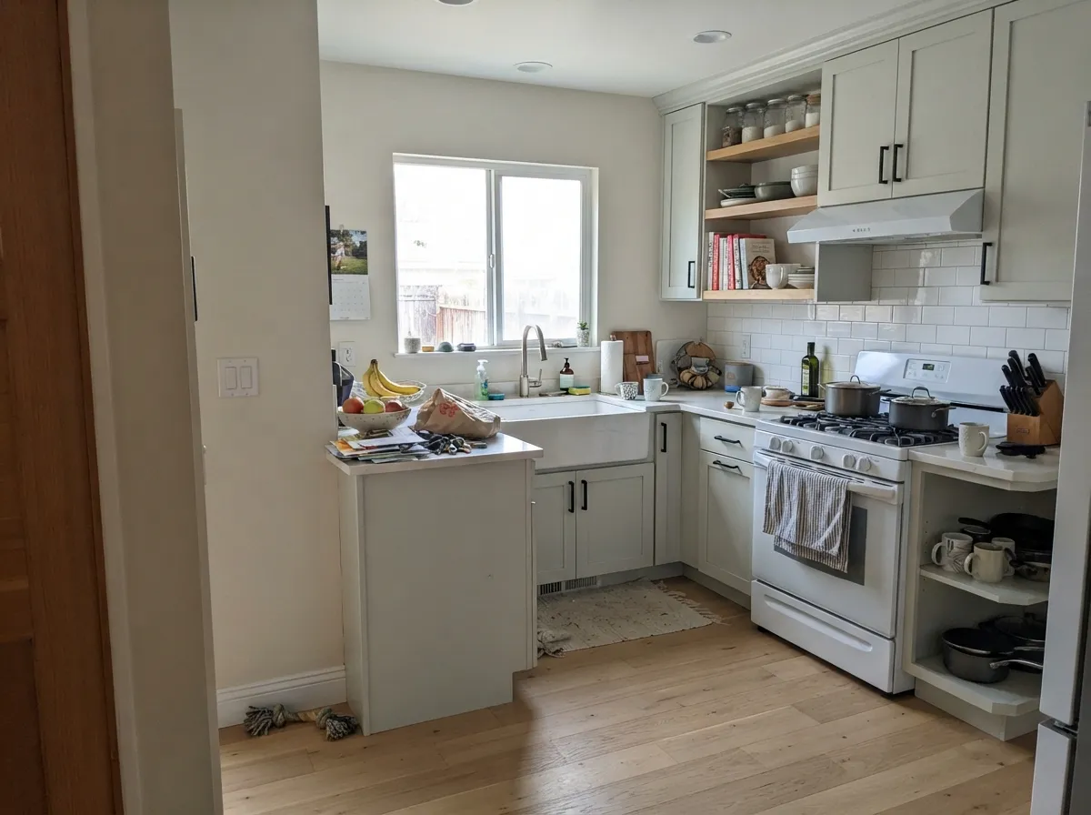
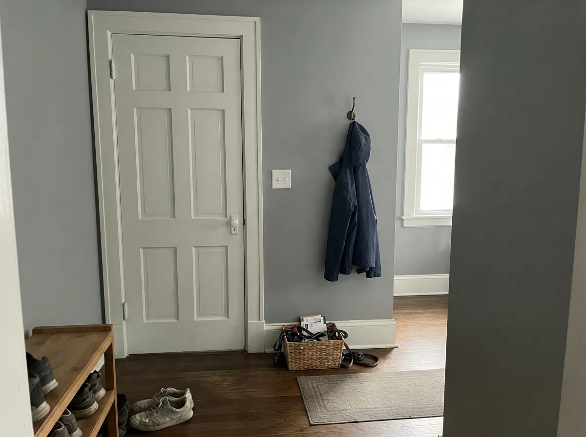
This is an exterior color first and an interior color second. On siding and trim, full daylight reads it crisp and clean without the slightly blue chill some bright whites get in strong sun, which is why it shows up so often in modern-farmhouse exterior schemes with black or charcoal accents. Indoors, it earns its keep on cabinets and trim in rooms that already get real daylight — white oak floors, brushed nickel or matte black hardware, and quartz with gray (not warm-beige) veining all sit easily next to it, because none of them are fighting the same faint gray-green lean.
Where It Fails
The complaints about White Heron cluster around three predictable situations, and none of them are unique to this color — they are what happens to any bright, cool-leaning white in the wrong conditions. If your room matches one of these, this is not your white.
Cool daylight has nothing warm to balance against White Heron's own gray-green whisper, so the color drains toward flat, slightly institutional gray. It is the same failure mode every high-LRV cool-neutral white shares — the fix is south or west light, or accepting a warmer white like White Dove instead.
Put White Heron trim beside walls or cabinetry already painted a warm cream — Swiss Coffee, Navajo White, a builder beige — and the warmer color pulls the green-gray forward in White Heron by contrast. Readers describe it as the new paint looking "dingy" or "greenish" next to the old; it is a temperature clash, not a flaw in either color. Repaint both surfaces the same white, or pick a white in the same cool-neutral family throughout.
At LRV 87 the color already reflects a lot of light; add a satin or semi-gloss on an imperfect wall and every roller stipple, patch, and drywall seam shows. This is standard for any near-white above LRV 85, but it catches first-time painters off guard specifically because White Heron looks so calm on the chip.
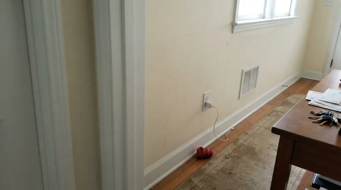
Room by Room
Full daylight keeps it crisp without a blue chill, and it holds up next to black shutters, charcoal garage doors, or a dark front door for the modern-farmhouse look. Test on the actual shaded and sun-hit sides before committing — the two elevations can read a full step apart.
With white oak, brushed nickel, or matte black pulls it reads clean and current rather than stark. Skip it if your counters or backsplash lean warm-beige — the contrast pulls White Heron's cooler side forward and the two start to argue.
Semi-gloss White Heron trim looks sharp against mid-tone gray or blue-gray walls. Never pair it with warm cream walls already in the house — repaint both the same white or expect the trim to look slightly green by contrast.
In a bright, south- or west-facing room it is a calm, quiet backdrop for furniture and art. In a dim or north-facing room it goes flat fast; add lamps with warm 2700K bulbs or choose a warmer white instead.
With gray-veined quartz, chrome or brushed nickel, and cool white tile it is effortless. With warm travertine or gold fixtures, the cooler cast starts to feel slightly off; a warmer white handles those materials better.
It is not the deck's coziest bedroom white — that is White Dove's job. In a bright room, or under warm evening lamps, it stays calm and clean; in a dim north room without lamps, it can feel a little cold at bedtime.
Your Light Is the Risk
Full, warm daylight settles the gray-green whisper into a clean, calm neutral. This is the light White Heron was built for.
Cool, flat daylight has nothing warm to balance against, and the color drifts toward institutional gray. Test on the actual wall before committing.
Warmest right at golden hour, coolest and most neutral at midday. The shift is gentle — most people read it as "the same white" all day.
2700K warm bulbs soften the gray-green nicely at night. Cool white LEDs push it back toward flat and a little clinical — swap the bulbs before you swap the paint.
Most complaints about White Heron are a light mismatch. Upload a photo of your actual room and see it on your walls — then ask for the same wall in north light or evening lamps before you buy a single sample.
Need It From Another Brand?
Any paint counter can custom-tint Benjamin Moore OC-57 directly. If you would rather stay in one brand's own deck, these are the closest stock matches, measured as ΔE2000. Under 2 is a difference you will not see on the wall.
| Brand | Closest color | ΔE | LRV | |
|---|---|---|---|---|
| Sherwin-Williams | SnowbeltSW 9623 · Sherwin-Williams | 1.2 | 87 | Color page → |
| Behr | Falling SnowPPU18-07 · Behr | 0.5 | 87 | Color page → |
| Valspar | Morning Breeze8007-5E · Valspar | 1.4 | 87 | Color page → |
| PPG / Glidden | Cotton TailPPG0998-1 · PPG / Glidden | 1.0 | 87 | Color page → |
| Glidden | Cotton TailPPG0998-1 · Glidden | 1.5 | 87 | Color page → |
| Dutch Boy | White003W · Dutch Boy | 1.0 | 86 | Color page → |
Similar Benjamin Moore Colors
The nearest shades to White Heron within Benjamin Moore's own range, ranked by perceptual color distance — useful when you want the same look a touch lighter, darker, or warmer.
WCAG 2.1: AA is 4.5 : 1 for normal text, 3 : 1 for large text, AAA is 7 : 1.
White Heron vs the Colors You're Also Considering
Every White Heron sample board has the same rivals on it. The numbers show the real lightness gap — then it comes down to which risk you would rather live with.
Pick this when Chantilly Lace tested too cold and clinical in your room — White Heron's whisper of gray-green is gentler.
Benjamin Moore OC-65 · LRV 92Chantilly LacePick this for a truly stark, gallery-cool white with zero green or yellow in it at all.
Pick this on walls at the same brightness — White Heron's softer undertone is easier to live with at full room scale.
Benjamin Moore OC-152 · LRV 87Super WhitePick this for trim and ceilings specifically — it's built for that exact job and runs slightly bluer than White Heron.
Pick this for more brightness and a cleaner, less yellow cast in a room with real daylight.
Benjamin Moore OC-17 · LRV 85White DovePick this for a warm, creamy white that never risks reading cold or green, especially in a dim room.
Pick this for the gentler, less stark version of the same idea — White Heron's undertone softens the sharpness Extra White is known for on walls.
Sherwin-Williams SW 7006 · LRV 86Extra WhitePick this if you're already working in Sherwin-Williams and want the closest match to this same crisp-bright lane.
Oxford White 869 and Oxford White CC-30 share White Heron's hex of #F0F1EA and its LRV of 87, so there is nothing to choose between them on a wall. Frostine AF-5 at LRV 86 and #EEF1EB is a whisper cooler. Aloe Vera 844 at LRV 85 and #EEF2EB pushes the green a little further. Gardenia AF-10 at #F3F0E9 and Alabaster 876 at #F2EFE8, both at LRV 85, run the other way and read slightly warmer and creamier.
Across brands, Falling Snow PPU18-07 from Behr at LRV 87 is the tightest match at a deltaE of 0.51. Snowbelt SW 9623 from Sherwin-Williams at LRV 87 comes in at 1.19, visually identical in normal room light. Wimborne White No. 239 from Farrow & Ball at LRV 89 sits at 2.04, very close but brighter, so sample it first.
White Heron Coordinating Colors
The rule for coordinating with White Heron is temperature-matching, not color-matching: stay cool-neutral to true-gray and it disappears into the background the way a good white should. Pair it with anything warm-cream and the contrast pulls its gray-green whisper forward. These are the partners that keep the temperature consistent:
Where White Heron Sits in the BM White Family
Benjamin Moore's white lineup has famous, decades-old bestsellers at both temperature extremes — White Dove and Swiss Coffee on the warm side, Chantilly Lace and Super White on the cool, bright side. White Heron doesn't try to out-warm or out-cool either camp; it sits at LRV 87, genuinely bright, but with a soft gray-green cast instead of the pure neutral of its cooler cousins or the yellow of its warmer ones.
That in-between position is the honest reason to consider it: it's the color to sample when Chantilly Lace tested too stark and White Dove tested too creamy, and neither felt right. It's not chasing the fame of either — it's a quieter option for a specific, real gap between two much more famous colors.
White Heron With Wood Tones and Stone
White oak is the best match: the wood's cool, pale grain sits comfortably against White Heron's own cool-neutral lean, which is why the two show up together so often in current kitchen and exterior work. Gray-veined quartz, chrome, nickel, and matte black hardware all sit at the same temperature and pair easily.
Warm materials are the ones to sample first: honey oak, warm-beige granite, or gold fixtures push White Heron's cooler side into relief, and the wall or cabinet can start to read faintly green next to them. It isn't an automatic dealbreaker, but it's worth a large sample against the actual material before committing to the whole room.
Three Ready Palettes Built on White Heron
A color is never alone on the wall. These are complete combinations in the 60-30-10 pattern, with the reason each one holds together. Every one opens in the visualizer.
White Heron's cool-neutral lean is exactly what keeps this from reading like generic builder-white siding — it stays crisp, not warm, against the near-black trim. The blue door is the one unexpected note that keeps the whole facade from feeling like a template.
Try this palette in your roomRepose Gray and White Heron share the same cool-neutral temperature, so the wall-to-cabinet handoff never fights — no warm-versus-cool clash. Kendall Charcoal on the island gives the room its one deep anchor and loves the same matte black hardware White Heron pairs best with.
Try this palette in your roomStonington Gray is a genuine gray with no hidden greige, so White Heron trim reads clean against it instead of fighting a warm undertone. Hale Navy gives the scheme its one saturated note without pulling either neutral off temperature.
Try this palette in your roomWhite Heron FAQ
Is White Heron warm or cool?
Cool-neutral, with a faint whisper of gray-green rather than blue. It never reads yellow or creamy the way White Dove does, but it also isn't as stark or cold as Chantilly Lace or Super White. Most people read it simply as "a clean white" until it's placed directly next to a warmer or cooler one.
How is it different from Chantilly Lace?
Chantilly Lace (LRV 92) is BM's coolest, most neutral bright white — closer to a true gallery white. White Heron (LRV 87) is a step less bright and carries a soft gray-green cast instead of pure neutral, which most people experience as slightly gentler and less clinical on four walls.
Is it good for kitchen cabinets?
Yes, especially with white oak floors, matte black or nickel hardware, and gray-toned stone. It's a weaker match with warm-beige counters or gold fixtures, where the cooler cast starts to feel slightly off rather than complementary.
What trim color goes with White Heron walls?
White Heron itself in semi-gloss is the safest choice, or a genuine cool gray like Stonington Gray if you want wall-to-trim contrast. Avoid pairing it with any warm cream trim already in the house — the temperature mismatch is the single most common complaint about this color.
Does it work on exteriors?
It's one of the color's strongest jobs. Full daylight keeps it crisp rather than blue-cold, and it pairs especially well with black or charcoal trim for a modern-farmhouse look. Walk both the sunny and shaded sides of the house with a sample before committing — they can read a step apart.
Is White Heron as popular as White Dove or Chantilly Lace?
No, and it's worth saying plainly: it doesn't have the decades-long bestseller track record either of those colors has. It's a smaller-following, genuinely useful in-between white for the specific case where both famous options tested wrong — not a color with its own famous story.
Have you painted with White Heron?
Rate it — one tap helps the next reader decide.
Ask a Question