Falling Snow
Behr's quiet pairing white, reviewed honestly: the yellow-green that sits next to sage, the honey oak that turns it primer-blue, and what to pick instead.

Jessica has spec'd whites and neutrals for more than 300 rooms and keeps a sample wall of painted drawdowns in her studio. Every color review is checked against real reader rooms in the comments and re-tested when a formula changes. About the testing process →
- 1Classic Gray74
- 2Alabaster82
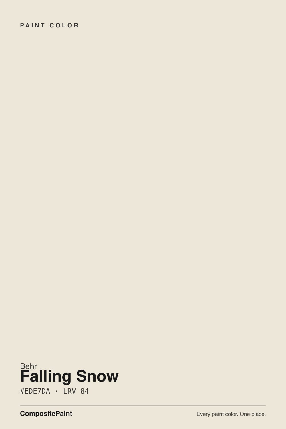
- 3Falling Snow87
- 4Sleek White92
- 5Ultra Pure White97
The Fast Verdict
Falling Snow is the off-white Home Depot already mixed for pairing, not for a white-paint identity crisis. Quiet, slightly cool, with a yellow-green mute so small that owners argue about whether it is cream or gray. At LRV 87 it is bright enough for walls and trim without Polar Bear glare, and it is the white that keeps showing up next to Behr greiges, sages, and grayed teals. It is not Swiss Coffee. It is not ice. Against honey oak it can go primer-blue. In decent daylight it is the finished white that lets the other color do the talking.
Whole-house walls + trim as the pairing white · bedrooms that should stay clean, not cream · cabinets and millwork · anyone mixing Behr greiges, sages, and grayed teals
You want Swiss Coffee cream or Polar Bear brightness · floors are honey oak or terracotta · trim stays Ultra Pure White · the room runs on cool 4000K LEDs and no lamps
- Quiet finished white — the yellow-green mute stops both cream and glare
- The pairing white for Behr greiges, sages, and grayed teals
- Same LRV 87 as Swiss Coffee without the yellow show
- Cabinets and trim: already sold as enamel, hides scuffs better than Polar Bear
- One-color rooms (walls + trim + ceiling) work cleanly
- Yellow-green can read primer-blue against honey oak and terracotta
- Reads dirty next to Polar Bear or Ultra Pure White trim
- Cool LEDs and north light pull a faint mint
- Not cream, not gallery — buyers who wanted either are disappointed
What Color Is Falling Snow, Really?
A quiet off-white with a yellow-green mute — and the mute is the whole trick. Most Home Depot whites either dump the pigment (Ultra Pure White, Polar Bear) or lean into cream (Swiss Coffee, Blank Canvas). Falling Snow sits in the thin band between them: white enough to pass as white on a wall, grayed with a yellow-green so faint that Behr files it as a cool white with a hint of green, and the most detailed independent review was told the undertone was aqua and never saw aqua on the actual wall. Owners split on camera. A Reddit thread called it soft and creamy with a teeny touch of gray, not stark at all. An older blog commenter swore it never went dingy, yellowish, or bluish. Both are looking at the same yellow-green. Cool light reads the green; warm light reads the yellow. That fence-sitting is why it plays with sage and grayed teal instead of fighting them — and why high-contrast earth tones can shove it toward unpainted primer.
At LRV 87 it reflects most of the light that hits it, but it is clearly not a bright white. Polar Bear sits at 94 and Ultra Pure White at 97; put either next to Falling Snow and the body shows. That gap is the useful part. On a wall it holds just enough color to soften shadows without looking painted; on trim it reads as painted woodwork rather than plastic-bright. It shares its LRV with Behr Swiss Coffee, which is the creamier neighbor at the same brightness, and it sits a hair above White Dove (LRV 85) and Cloud White (LRV 85). First Snow (LRV 82) is the Designer Collection snow with the similar name — powdery and a step deeper. Home Depot already sells this SKU as a cabinet, door, and trim enamel, which is how the color actually earns its keep.
Undertone in one line: yellow-green, cool-leaning, never pink and never Swiss Coffee cream. North light and cool LEDs pull the green; west sun and 2700K lamps pull the yellow. If the sample looks aqua, believe the light, not a secret blue base. If it looks dingy, look at the brighter white next to it before you blame the gallon.
Where It Shines
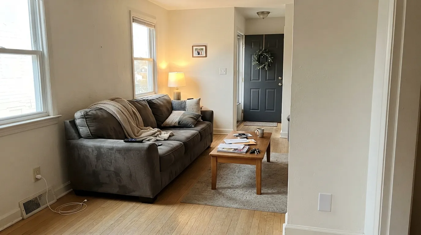
Give it real daylight, no brighter white in the same sightline, and neighbors on the green-gray side of the fence, and it does the job a pairing white is supposed to do: look finished, not like a second color. The one-color room — walls, trim, and ceiling all Falling Snow with only sheen changes — is the version that never argues. Its second home is millwork: satin on cabinets, semi-gloss on doors, sitting next to a Designer Collection greige or a quiet zen-green. Bedrooms are the quiet best room. A design blogger put it on their own primary suite walls for a reason — it stays clean without going clinical, and it does not cream up at night the way Swiss Coffee does.
Where It Fails
Almost every unhappy Falling Snow story is an undertone story, or a pairing story. The yellow-green is real, it is small on the chip, and three situations make it loud. None of them are a bad mix — but if your room matches one, this is not your white, and another coat will not hide it.
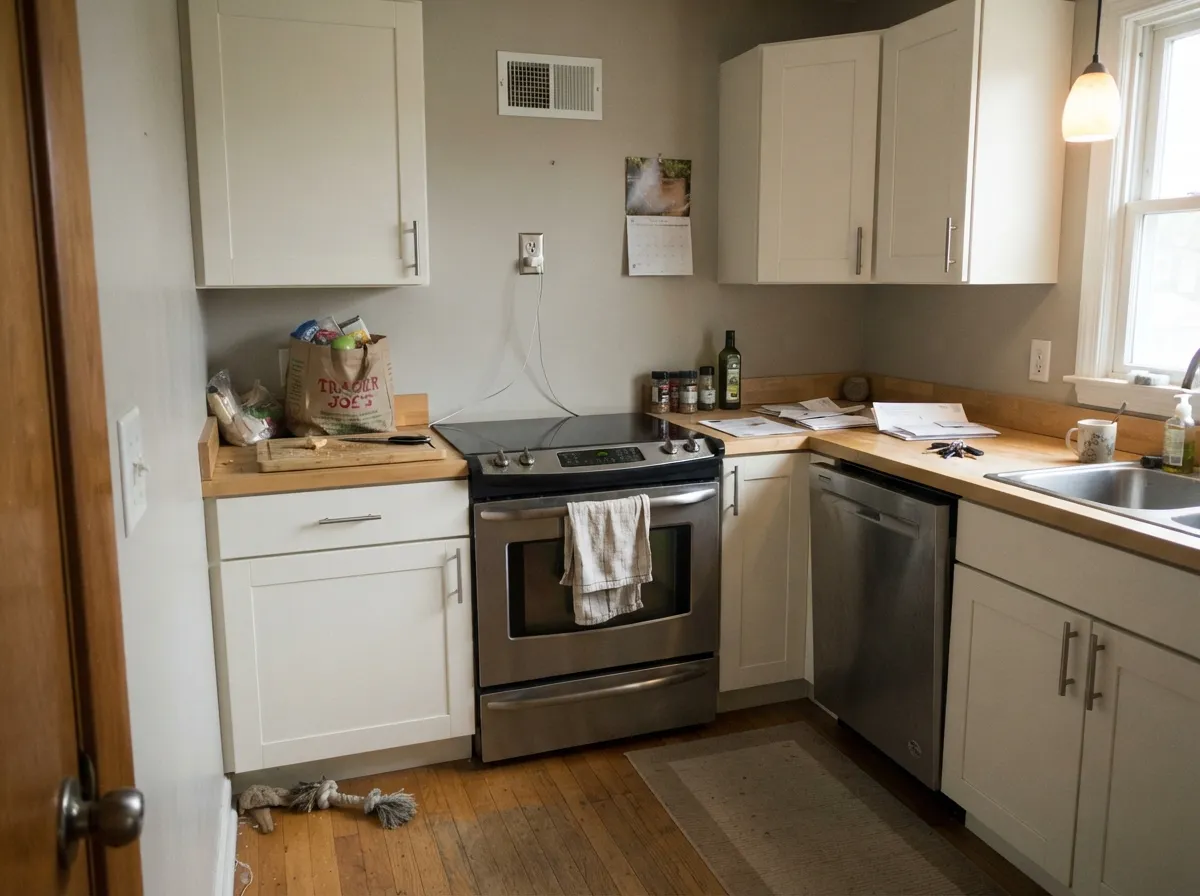
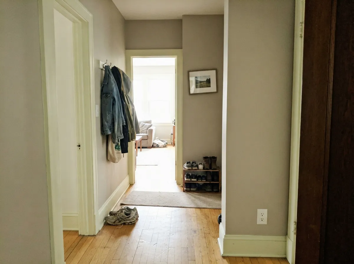
The distinctive complaint, and the one a detailed review actually flagged: next to high-contrast earth tones the wall can go blue-green, almost like unpainted primer. Yellow-orange wood is opposite that yellow-green mute on the wheel, so honey oak floors, terracotta, and orange-stained trim shove the green into the open while the walls push the wood hotter. Both sides lose. Falling Snow wants pale oak, walnut, gray-washed wood, or a large rug. If the golden floor is staying, pick Swiss Coffee and keep the warmth without the fight.
The most common Home Depot pairing mistake: Falling Snow walls, Polar Bear (LRV 94) or Ultra Pure White (LRV 97) on the trim and ceiling. The brighter white wins, and Falling Snow looks unwashed — too green-gray to be white, too pale to be a color. Whipped Cream (LRV 91) does a milder version of the same trick. The fix is the one-color rule — walls, trim, and ceiling all Falling Snow. If you insist on contrast, go darker, never brighter.
The name sounds cold. The chip looks almost white. People who actually wanted Swiss Coffee (same LRV 87, and it shows) or Blank Canvas get a cooler, greener wall than they sampled in the aisle, especially under cool LEDs. Falling Snow will not glow in a dim north room the way those creams do. If cream is the point, buy the cream. If you wanted a gallery white, Chantilly Lace is the cold-blooded one — this is not that either.
Room by Room
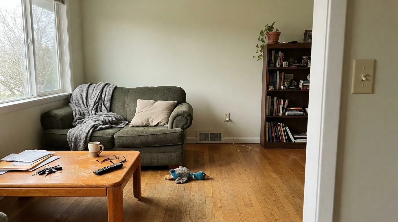
With any real daylight it is the calm backdrop that makes a greige sofa and a sage pillow look deliberate instead of matched. Eggshell walls; same color on trim in semi-gloss. Keep the wood on the pale or walnut side. Honey oak in this room is the skip — that is how the primer-blue reviews get written.
Home Depot already mixed this SKU as a cabinet, door, and trim enamel. Satin on shaker doors brightens a kitchen without Polar Bear glare, and the yellow-green mute sits comfortably next to sage, greige, and grayed teal. Pale oak, walnut, and brushed nickel are easy. Sample the doors against the slab: cool gray quartz is usually fine; a creamy warm counter can make the paint look minty by comparison. Urethane-fortified cabinet enamel either way.
This is the room a design blogger actually used it in, on the primary suite walls, and it earns that. East and south bedrooms stay clean and restful. Under 2700K lamps it warms a half-step at night without going cream. A dim north bedroom is not an automatic fail the way it is for White Dove — the color is already cool — but cool bulbs will pull the green. Keep the lamps warm.
Gray-green tile, brushed nickel, and a wood vanity that is not orange: it looks settled. Creamy beige tile or honey-oak cabinets will pull the mint. Carrara-look stone is a sample, not a given — the yellow-green can flash next to blue-gray veining. Satin or a bath-rated eggshell for wipe-down.
This is the job the color was quietly built for. Semi-gloss Falling Snow millwork under Gratifying Gray, Chic Gray, Morning Zen, or In the Moment is the pairing that keeps showing up: contrast without a brighter white making the wall look dirty. Flat on the ceiling in the same gallon keeps the plane from going clinical. Do not park Polar Bear or Ultra Pure White next to it.
Hallways are where a pairing white earns its keep, and Falling Snow carries room to room without a temperature jump as long as the adjoining colors stay on the greige-to-green side. One color, two sheens, all the way through. Exterior is a sample-the-north-wall situation: shade can pull the green and the siding can look faintly dusty from the street.
Your Light Is the Risk
Even daylight lets the yellow-green recede and the wall reads as a quiet, finished white. This is the light where owners call it creamy and other owners call it clean, and both are looking at a color that is behaving.
Cool grey daylight pulls the green forward. The wall can go faintly mint, or dingy green-gray, especially on an overcast day with no lamps. Test a full board here before you commit the house.
East morning is the cooler, cleaner read. West sun and golden hour warm it toward cream and make the yellow-green most visible for an hour. Most people like the shift; sample at 6pm if any green is your dealbreaker.
2700K lamps: creamier, the green hides, still not yellow. Cool white LEDs (4000K and up): the aqua-green the chip was accused of actually shows. 3000K is the compromise. Swap the bulbs before you repaint.
Most complaints about Falling Snow are a light mismatch. Upload a photo of your actual room and see it on your walls — then ask for the same wall in north light or evening lamps before you buy a single sample.
Need It From Another Brand?
Any paint counter can custom-tint Behr PPU18-07 directly. If you would rather stay in one brand's own deck, these are the closest stock matches, measured as ΔE2000. Under 2 is a difference you will not see on the wall.
| Brand | Closest color | ΔE | LRV | |
|---|---|---|---|---|
| Sherwin-Williams | Extra WhiteSW 7006 · Sherwin-Williams | 1.0 | 86 | Color page → |
| Benjamin Moore | Oxford White869 · Benjamin Moore | 0.5 | 87 | Color page → |
| Valspar | Du Jour7002-6 · Valspar | 1.2 | 86 | Color page → |
| PPG / Glidden | Cotton TailPPG0998-1 · PPG / Glidden | 0.6 | 87 | Color page → |
| Glidden | Cotton TailPPG0998-1 · Glidden | 1.0 | 87 | Color page → |
| Dutch Boy | White003W · Dutch Boy | 1.0 | 86 | Color page → |
Similar Behr Colors
The nearest shades to Falling Snow within Behr's own range, ranked by perceptual color distance — useful when you want the same look a touch lighter, darker, or warmer.
WCAG 2.1: AA is 4.5 : 1 for normal text, 3 : 1 for large text, AAA is 7 : 1.
Falling Snow vs the Colors You're Also Considering
Every Falling Snow sample board has the same rivals on it. The numbers show the real lightness gap — then it comes down to which risk you would rather live with.
Pick this when Polar Bear would glare and you want a quiet off-white that can sit next to greige and sage.
Behr W-F-200 · LRV 94Polar BearPick this if you want the brighter, simpler everyday white — seven LRV points up, less body, less undertone conversation.
Pick this when cream would read yellow and you want the cooler pairing white at the same brightness.
Behr W-B-700 · LRV 87Swiss CoffeePick this for dim rooms and cream — same LRV, and the warmth actually shows, which is the point of that can.
Pick this when you need it brighter (LRV 87) and the yellow-green mute that plays with sage and teal.
Behr DC-006 · LRV 82First SnowPick this if you want the Designer Collection snow — powdery gray-greige, a step deeper, and the one that reads gray the minute trim goes brighter.
Pick this when you are at Home Depot and want a cooler, slightly greener off-white for the same wall-and-trim job. Independent matchers put them next to each other; they are not the same temperature.
Benjamin Moore OC-130 · LRV 85Cloud WhitePick this if you want the warm Benjamin Moore trim default — Cloud White is the cream-and-wood millwork white, two LRV points softer.
Behr's deck has several off-whites within a few steps of Falling Snow, and the differences are small but visible side by side.
Dried Coconut (HDC-SM16-01, LRV 80) is the closest in character but four points deeper. On the wall that means slightly more body and slightly less bounce; pick it when Falling Snow washes out in a very bright, south-facing room, and keep Falling Snow for darker spaces that need every point of reflectance.
Exclusive Ivory (HDC-MD-11, LRV 80) is also deeper and reads a touch more ivory, a classic soft white for traditional trim-and-panel rooms. Ivory Palace (PPU10-14, LRV 82) sits almost between the two, marginally deeper than Falling Snow with a similar warm cast; the practical difference is small enough that coordination should decide it. If you are matching a Behr designer palette, stay with Falling Snow, since it is the off-white those collections were built around.
Falling Snow Coordinating Colors
The rule for coordinating with Falling Snow: stay on the greige-to-green side of the fence, and do not put a brighter white next to it. It flatters Designer Collection greiges, quiet zen-greens, grayed teals, and near-blacks — and it argues with honey oak, terracotta, and icy gallery whites. These are the partners that keep showing up in rooms that work:
Not in the Designer Collection — Next to It
Falling Snow is not a Color of the Year, and it has no TV-show credit. What it does have is a habit of turning up as the supporting white next to the colors Behr actually campaigns. Designer blogs put it with In the Moment, Chic Gray, and Graphic Charcoal. Behr's own coordinated palettes sit it next to Morning Zen. The Designer Collection — First Snow, Blank Canvas, Gratifying Gray, White Stone — is the short list of about thirty house colors. Falling Snow is the off-white you mix when those colors need millwork that will not glare and will not cream.
The other confusion is the name. First Snow is DC-006, powdery, a step deeper. Falling Snow is PPU18-7 (Home Depot also prints PPU18-07 on the can), brighter, greener-muted. People comparing whole-house whites on Facebook put both next to Whisper White and then argue. Sample both on the same wall if the snow names are why you are here; they are not substitutes. Independent matchers have also put Falling Snow next to Cloud White. That is a job match — warm BM trim white versus a cooler Home Depot off-white — not a temperature match. Live with a big board.
Falling Snow With Wood Tones and Floors
This decision gets made at the floor. Pale white oak and gray-washed wood are the color's best friends — the cool-neutral grain lets the yellow-green recede so the wall reads as white. Walnut is the warm version of that pairing: the dark red-brown depth makes the off-white look deliberate instead of chalky. Cream carpet is fine; true gray carpet is usually fine.
The one honest no is golden-orange: honey oak floors, orange-stained trim, terracotta tile. That family sits where the yellow-green mute has nowhere to hide, and the wall can go primer-blue — the exact shift a detailed review warned about. If the golden floor is staying, put a large rug between it and this paint, or choose Swiss Coffee and keep the warmth without the fight.
Metals are easier. Brushed nickel and chrome keep the cool read; unlacquered brass works if the wood is not orange. Matte black is the contemporary punch on doors and hardware. Sample the hardware on the actual wall, not in the aisle.
Three Ready Palettes Built on Falling Snow
A color is never alone on the wall. These are complete combinations in the 60-30-10 pattern, with the reason each one holds together. Every one opens in the visualizer.
One color at two sheens gives depth without contrast lines, so small houses read bigger and hallways flow. Cracked Pepper on the door supplies the single dark note the scheme needs — a chameleon black that stays current without stealing the walls.
Try this palette in your roomThis is the job Falling Snow was mixed for: a Designer Collection greige on the walls, the quieter off-white on the millwork, a charcoal door. Gratifying Gray is the Home Depot twin for America's favorite greige; Falling Snow trim keeps the edges soft — Polar Bear would make those walls look dirty.
Try this palette in your roomDesigner blogs keep putting Falling Snow next to In the Moment for a reason: the yellow-green mute agrees with a grayed teal instead of shoving it toward turquoise. Graphic Charcoal is the door-and-cabinet charcoal, not a wall color — one dark note so the scheme reads deliberate. Keep the floor off honey oak.
Try this palette in your roomFalling Snow FAQ
Is Falling Snow warm or cool?
Cool-leaning, with a yellow-green mute that lets people argue about it. Behr files it as a cool white with a hint of green. Warm light and 2700K bulbs pull the yellow so owners call it creamy; north light and cool LEDs pull the green. It is never Swiss Coffee cream and it is never a gallery ice white.
What trim color goes with Falling Snow walls?
Falling Snow itself, in semi-gloss. Polar Bear and Ultra Pure White are the usual suggestions and the usual mistake: both are so much brighter that the walls look dirty and a little green-gray. If you insist on contrast, go darker (a greige or charcoal), never brighter.
Is it good for kitchen cabinets?
Yes — Home Depot already sells this SKU as a cabinet, door, and trim enamel. It hides scuffs better than Polar Bear, sits well next to sage and greige, and does not fight pale oak or walnut. Honey oak and creamy warm quartz are the sample-first pairings. Use a satin urethane-fortified cabinet paint.
Falling Snow or First Snow?
Same snow idea, different job. First Snow is the Designer Collection listing: powdery gray-greige at LRV 82, and it reads gray the minute trim goes brighter. Falling Snow is five LRV points up, with the yellow-green mute, and it is the pairing white rather than the collection white. If you are painting ceilings and want less glare, First Snow. If you want millwork and whole-house walls that sit next to a green or a greige, Falling Snow.
Does Falling Snow work with oak floors?
Depends entirely on the oak. Pale white oak, walnut, and gray-washed wood are easy. Honey oak, orange-stained builder oak, and terracotta are the honest no — the yellow-green mute can go primer-blue against them. A large rug helps. If the golden floor is staying, Swiss Coffee is the safer white.
Is it in Behr's Designer Collection?
No. The Designer Collection numbers are the DC- prefix colors — First Snow, Blank Canvas, Gratifying Gray, White Stone. Falling Snow is PPU18-7, the off-white that keeps getting pulled in next to those colors as trim, ceiling, and whole-house walls. That is the honest fame: a pairing white, not a campaign color, and not a Color of the Year.
Have you painted with Falling Snow?
Rate it — one tap helps the next reader decide.
Ask a Question