Morning Zen
The quiet sage-green nobody hypes, reviewed honestly: the sunny rooms where it glows, the dim ones where it turns to mud, and what to pick instead.

Jessica has spec'd whites and neutrals for more than 300 rooms and keeps a sample wall of painted drawdowns in her studio. Every color review is checked against real reader rooms in the comments and re-tested when a formula changes. About the testing process →
- 1Evergreen Fog30
- 2Clary Sage41
- 3Morning Zen60
- 4Hancock Green66
- 5Alabaster82
The Fast Verdict
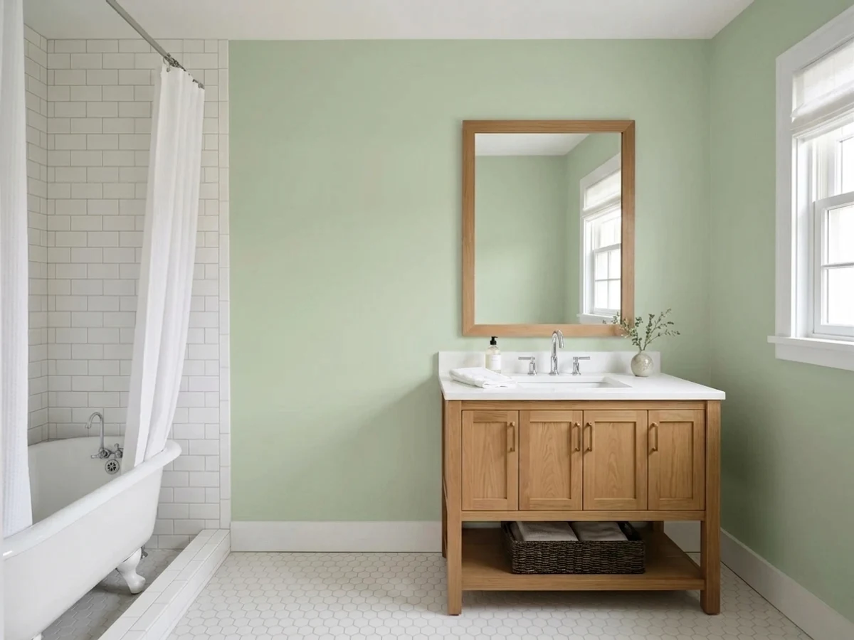
Morning Zen is a pale, grayed-down sage with a warm yellow-green lean — one of thousands of colors in Behr's deck, not a headline name, and it doesn't need to be. Give it real daylight and it reads calm and grown-up, closer to celery than mint. Take the daylight away and the same wall goes flat, muddy gray-green. It is an honest workhorse color for a sunny room, not a color that fixes a dim one.
Bedrooms and home offices with real daylight · nurseries and meditation corners · kitchens with warm wood and brass · anyone who wants green without going bold
Your room is dim, north-facing, or windowless · you want a true gray with no green in it · you're chasing a famous, camera-ready color · your fixtures are all cool-white LEDs and staying that way
- Warm, grown-up sage — celery, not mint, never craft-room green
- Genuinely calm in a sunny room without reading boring
- Flatters warm wood, oak floors and brass without a fight
- Light enough (LRV 60) to keep small rooms feeling open
- Honest, affordable quiet color — not a trend you're paying a premium for
- Goes flat, muddy gray-green in dim or windowless rooms
- Cool fluorescent light can push it toward an institutional pale green
- Warm bulbs and strong afternoon sun can tip it toward avocado
- Too pale and quiet for anyone wanting a color that reads as clearly green from across the room
What Color Is Morning Zen, Really?
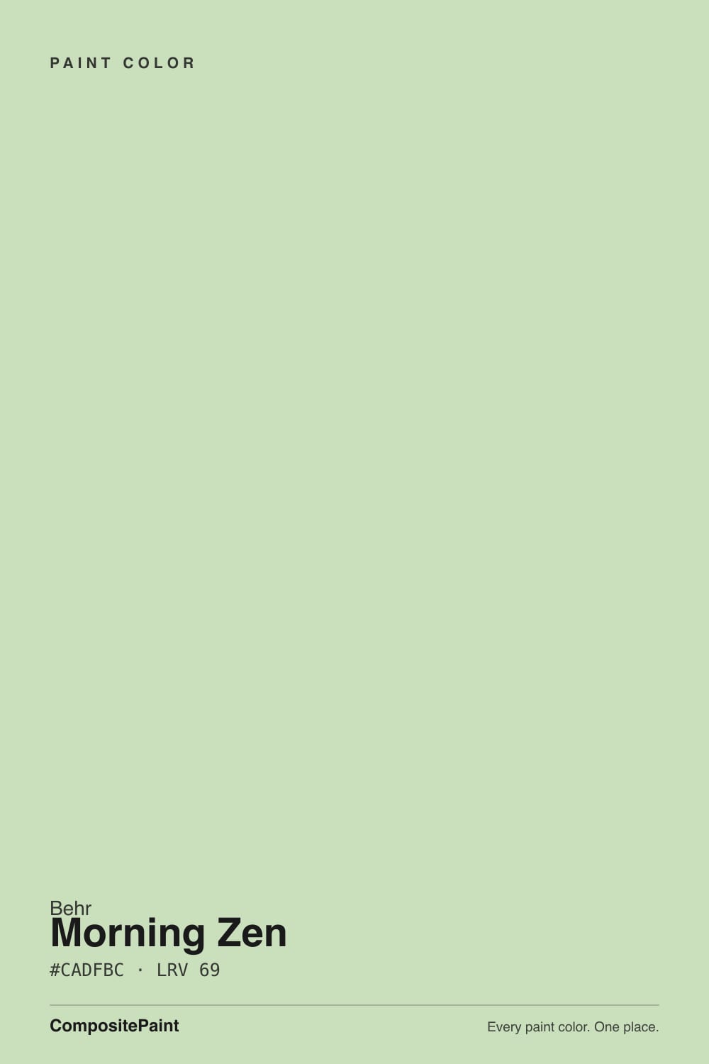
A pale, grayed-down yellow-green — sage rather than mint, and warm rather than cool. Behr's own hue angle for it sits around 66 degrees, squarely in the yellow-green family, and the gray mixed into it is what keeps the color from reading like a craft-room green. It shares shelf space with a small cluster of Behr's mood-named neutrals — Meditation Time, Modern Zen — colors grouped by feeling rather than fame. Morning Zen has no Color of the Year moment and no viral room behind it; it is simply one option among Behr's 3,000-plus colors, and the honest version of this review is that it is a dependable quiet green, not a famous one.
At LRV 60 it sits high on the light-reflecting scale — closer to a pale neutral than to a true mid-tone green. That lightness is exactly why daylight matters so much: with plenty of it, the sage reads soft and settled; without it, there isn't enough saturation left to carry the color, and the wall slides toward a flat, muddy gray-green instead. This is a color that needs a bright room to do its job, not a color that will brighten a dark one.
Undertone in one line: warm yellow-green, never blue, never a clean neutral gray. If your sample looks avocado or overly yellow, that's warm 2700K bulbs or strong afternoon sun pulling the yellow forward. If it looks flat and muddy instead of green, that's a dim or windowless room — not a flaw in the paint.
Where It Shines
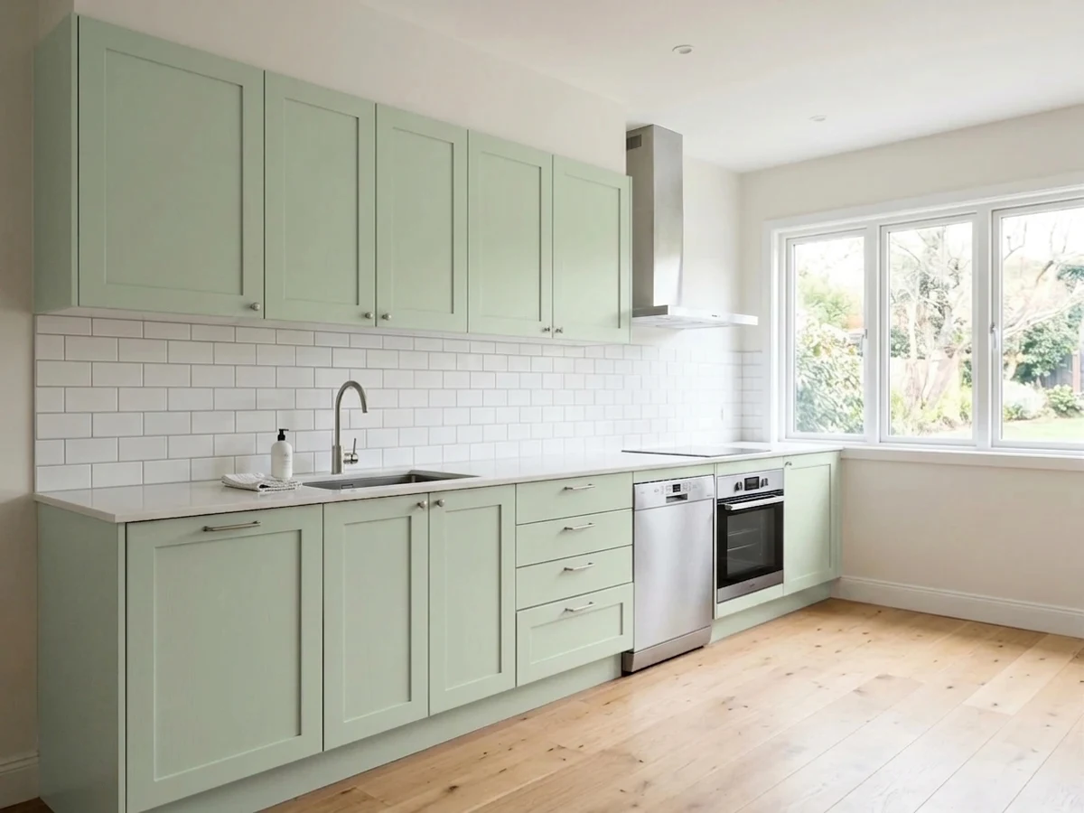
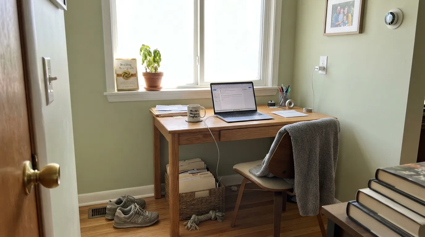
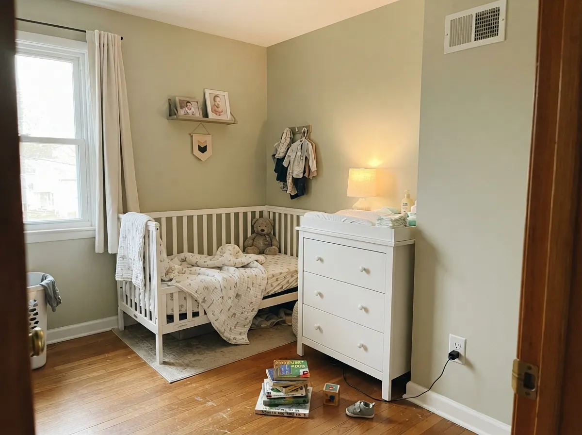
Give it a room with real windows and it earns its name: soft, settled, the kind of green that reads as calm rather than decorated. It pairs easily with warm wood and brass because its undertone is warm too, so oak floors and butcher block never fight it. Small, personal rooms are its best home — a sunny home office, a nursery, a reading nook — where a quiet color that doesn't scream for attention is exactly the point.
Where It Fails
Almost every disappointed review of a pale sage like this follows one of three scripts, and Morning Zen is no exception. None of them are a defect in the paint — but if your room matches one, sample it big before you commit a whole wall.
Without daylight there isn't enough color left to carry the wall, and the sage collapses into a flat, muddy silvery-green that reads more grim than calm. This is the single most common complaint about pale sage colors in general, and Morning Zen's LRV 60 makes it more exposed to the problem, not less — a lighter color has less pigment to fall back on when the light disappears.
The warm yellow undertone that makes this color feel grown-up in daylight can tip toward avocado under 2700K lamps or in a west-facing room at golden hour. Most people like the shift toward cozier green; if you specifically wanted a cooler, grayer sage, test the room at 6pm before deciding.
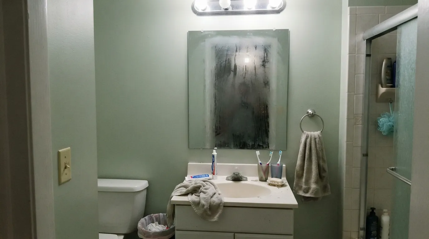
Cool artificial light strips the warmth out and leaves a pale, slightly sickly green with none of the sage's softness — the classic "institutional" read pale greens get under the wrong bulbs. Swap to warm LED bulbs first, or pick a color that doesn't depend on daylight for this particular room.
Room by Room
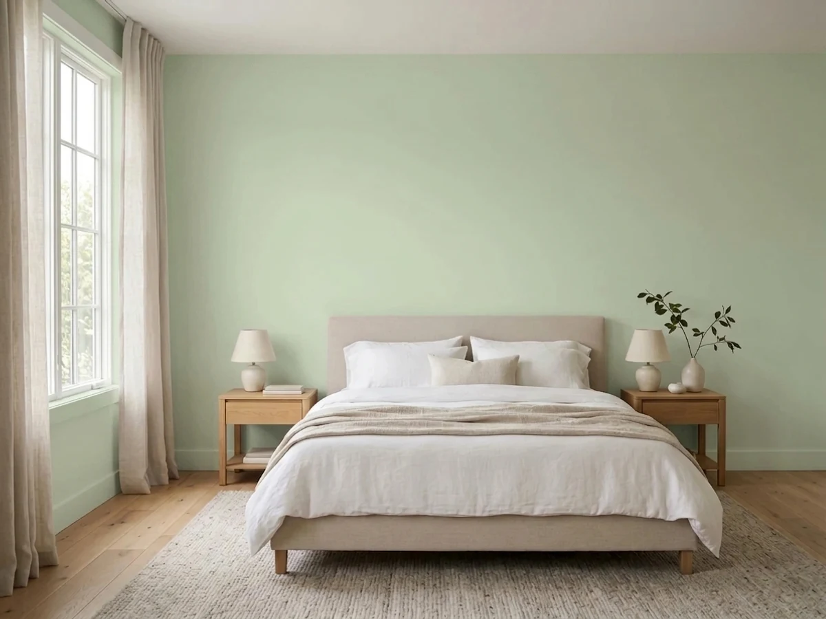
A sunny bedroom is Morning Zen's easiest win: calm, grown-up, not sweet. Eggshell on the walls, warm white trim, and it settles a room without dominating it. Skip it for a north-facing bedroom that stays dim all day.
This is the size and use case the color was built for: a small, personal room where a quiet, unbold green feels intentional rather than decorated. A window is doing most of the work here, so check the room's actual daylight before buying the gallon.
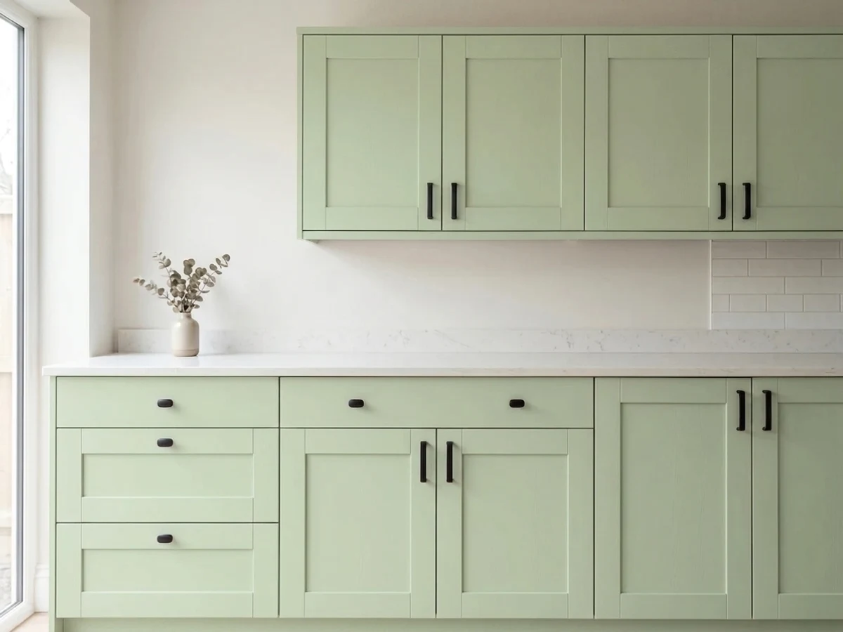
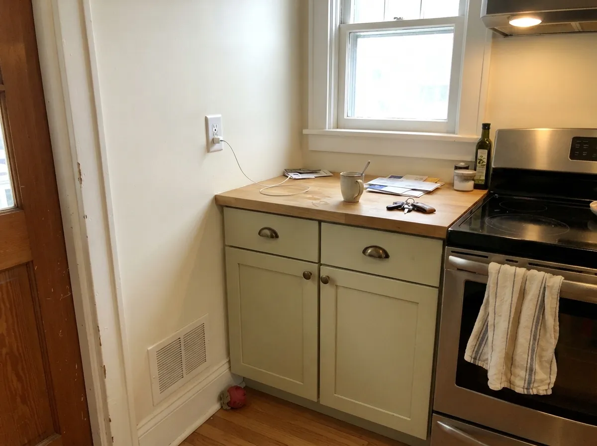
On cabinets or an island under natural light, the warm undertone flatters oak, walnut and brass without a fight. Satin cabinet enamel wipes clean. A full kitchen of walls in this color needs the same daylight test as anywhere else — a north-facing kitchen will look muddier than the sample chip promised.
A bathroom with a real window and warm bulbs: lovely, spa-like. A small interior or windowless bathroom under cool fluorescent light: the institutional read described above. Test under your actual bulbs, not the store's lighting.
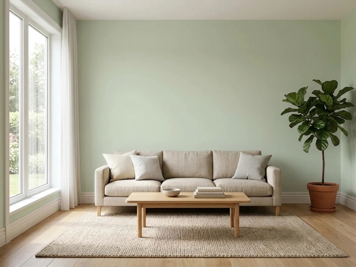
Works as a full-room color when the room gets consistent daylight; in an open-plan space that only gets light from one side, it can read differently wall to wall. Pair with warm white trim, not a stark cool white, to keep the softness intact.
This is a light-dependent interior color first. Outdoors, full sun will wash the already-pale sage out further, and it lacks the saturation to read as a deliberate exterior green from the street. If you want green on siding, look for a deeper, more saturated Behr green instead.
Your Light Is the Risk
Bright, even daylight is what this color needs to read as a settled, grown-up sage instead of a washed-out gray-green. Sample here first.
Without daylight there isn't enough saturation left, and the wall collapses into flat, muddy gray-green. This is the color's real limit.
Brighter and greener at the sun hours, quieter and grayer in between. West-facing rooms get a warm, slightly avocado flush at golden hour.
2700K warm bulbs push it cozier and more yellow-green. Cool LEDs flatten the warmth and can read institutional — keep the bulbs warm.
Most complaints about Morning Zen are a light mismatch. Upload a photo of your actual room and see it on your walls — then ask for the same wall in north light or evening lamps before you buy a single sample.
Need It From Another Brand?
Any paint counter can custom-tint Behr S380-2 directly. If you would rather stay in one brand's own deck, these are the closest stock matches, measured as ΔE2000. Under 2 is a difference you will not see on the wall.
| Brand | Closest color | ΔE | LRV | |
|---|---|---|---|---|
| Sherwin-Williams | AcanthusSW 29 · Sherwin-Williams | 1.9 | 60 | Color page → |
| Benjamin Moore | Stingray1529 · Benjamin Moore | 2.8 | 58 | Color page → |
| Valspar | Gentle Soul8004-26B · Valspar | 3.6 | 59 | Color page → |
| PPG / Glidden | Mix Or MatchPPG1031-1 · PPG / Glidden | 1.3 | 59 | Color page → |
| Glidden | Mix Or MatchPPG1031-1 · Glidden | 1.3 | 60 | Color page → |
| Dutch Boy | Seafoam Bubbles424-1DB · Dutch Boy | 2.4 | 60 | Color page → |
Similar Behr Colors
The nearest shades to Morning Zen within Behr's own range, ranked by perceptual color distance — useful when you want the same look a touch lighter, darker, or warmer.
WCAG 2.1: AA is 4.5 : 1 for normal text, 3 : 1 for large text, AAA is 7 : 1.
Morning Zen vs the Colors You're Also Considering
Every Morning Zen sample board has the same rivals on it. The numbers show the real lightness gap — then it comes down to which risk you would rather live with.
Pick this when you want the green to read as green, not to disappear into gray.
Benjamin Moore 1562 · LRV 68Healing AloePick this if you want the same pale lightness but with the green muted further into a chameleon gray-green.
Pick this when you specifically want the lighter, quieter version and your room has good daylight.
Behr N390-3 · LRV 56JojobaPick this for more color and less risk of going muddy in weaker light — still Behr, still gray-green, just deeper.
Inside the Behr deck the differences are small but real. Chilled Cucumber BIC-13 at LRV 68 and hex #C9DEB1 carries more yellow, so it reads warmer and slightly more lime. Breathe S360-2 at LRV 72 is lighter and gentler, a better choice if the room is already dim. Ocean Pearl 780C-3 at LRV 68 with hex #D3DBC1 is the most muted, closer to a green-gray than a true green.
Across brands, Kompozit and Hirshfield's Creamy Mint 0755 at LRV 68 both sit at deltaE 1.51, visually identical in normal room light. Dutch Boy Vireo Wing 127-3DB at LRV 70 is 2.1 and PPG Dreamcatcher PPG1131-3 at LRV 68 is 2.15, both very close but worth sampling first. Benjamin Moore Veranda View 541 at LRV 69 is 2.56 and reads a touch more yellow. Sherwin-Williams Cucumber SW 6722 at LRV 71 is 3.5, close and lighter, but the difference is visible when the two are next to each other.
Morning Zen Coordinating Colors
The rule for coordinating with Morning Zen is simple: stay warm, and give it real daylight before anything else. It flatters warm whites, warm wood, and brass, and it tolerates one deeper sage or one dark near-black as an anchor note far better than it tolerates cool grays or stark cool whites. These are the partners that keep the color working:
The "Zen" Name — and Why It's Not a Trend Color
It's worth saying plainly: Morning Zen is not a famous color. There is no Color of the Year story here, no viral Instagram kitchen, no designer who made it their signature. Behr's deck runs to more than 3,000 colors, and Morning Zen sits inside a small cluster named for mood rather than moment — Modern Zen, Meditation Time, and a handful of other muted neutrals share the same wellness-adjacent naming without any of them carrying an actual marketing campaign behind the name.
That is not a weakness. A color with no fame also carries no hype tax and no risk of dating itself the way a genuine trend color can. What you're buying is a dependable, affordable pale sage that Behr has quietly kept in its lineup — the kind of color a painter reaches for because it works, not because a client saw it on a mood board.
Morning Zen With Wood Tones and Floors
This color's warm yellow-green undertone makes wood pairing unusually forgiving. Honey oak, red oak, walnut and butcher block all sit comfortably next to it because the warmth on both sides matches — unlike a cooler gray-green, there's no undertone fight to manage.
The one floor that asks for a sample first is a cool, gray-washed or heavily white-washed wood. Cool floors pull against Morning Zen's warmth and can make the wall look slightly more muted and gray than it does over warmer flooring. It isn't a hard clash, but it's worth testing a large sample above the actual floor before committing a whole room.
Three Ready Palettes Built on Morning Zen
A color is never alone on the wall. These are complete combinations in the 60-30-10 pattern, with the reason each one holds together. Every one opens in the visualizer.
A crisp trim white keeps the pale sage from reading murky, and one dark charcoal note stops the room from drifting toward nursery-soft. Both partners are safe, dependable colors, so the sage stays the only decision-heavy choice in the room.
Try this palette in your roomBlank Canvas shares Morning Zen's warm yellow lean, so the wall-to-cabinet handoff is seamless instead of fighting; Wrought Iron on a single door or hardware run gives the palette the one dark anchor it needs to stop feeling washed out.
Try this palette in your roomTwo near-identical pale sages at LRV 68 and 69 layer tonally instead of contrasting, so the room reads as one calm green idea; Bitter Sage on the shelf backs adds the depth the walls are too pale to provide on their own.
Try this palette in your roomMorning Zen FAQ
Is Morning Zen green or gray?
Green — a genuinely warm, yellow-leaning sage, not a gray with a green hint. It is pale enough (LRV 60) that weak light can drain the color out and leave it looking gray-ish, but on the chip and in good daylight it reads as green.
Is it good for a nursery?
Yes, if the nursery has real daylight. The pale, quiet sage is exactly the calm-but-not-boring look many nurseries go for. In a dim or north-facing nursery, the same color reads flat and muddy — check the room's actual light before buying.
What trim white goes with Morning Zen?
A clean, fairly bright white — Behr White or a similar crisp trim white keeps the pale sage from looking dingy by comparison. A very warm cream trim can make the wall color feel duller rather than softer.
Will it work in a windowless bathroom?
It's the riskiest room for this color. Without daylight and under cool fluorescent light, pale sage greens like this one commonly read institutional rather than calm. Warm 2700K bulbs help; if you can't change the fixtures, pick a color that doesn't depend on daylight.
Does it work with oak floors?
Yes — its warm yellow-green undertone sits comfortably with honey oak, red oak and walnut. It is one of the easier sage greens to use over warm wood precisely because it isn't fighting the wood's warmth with a cool undertone of its own.
Is Morning Zen a popular or trending color?
No, and that's not a knock on it. It has no Color of the Year moment and no viral room behind it — it is one of thousands of colors in Behr's deck, grouped with a few other mood-named neutrals like Meditation Time and Modern Zen. It's a dependable quiet green for people who want that, not a color anyone will recognize by name.
Have you painted with Morning Zen?
Rate it — one tap helps the next reader decide.
Ask a Question