Jojoba
Behr's under-the-radar sage-green, reviewed honestly: the balanced gray-green Behr itself calls calming, the warm lamplight that mutes it toward beige, and what to pick instead.

Jessica has spec'd whites and neutrals for more than 300 rooms and keeps a sample wall of painted drawdowns in her studio. Every color review is checked against real reader rooms in the comments and re-tested when a formula changes. About the testing process →
- 1Sage Green22
- 2Evergreen Fog30
- 3Jojoba47
- 4Sage Brush52
- 5Soft Fern57
The Fast Verdict
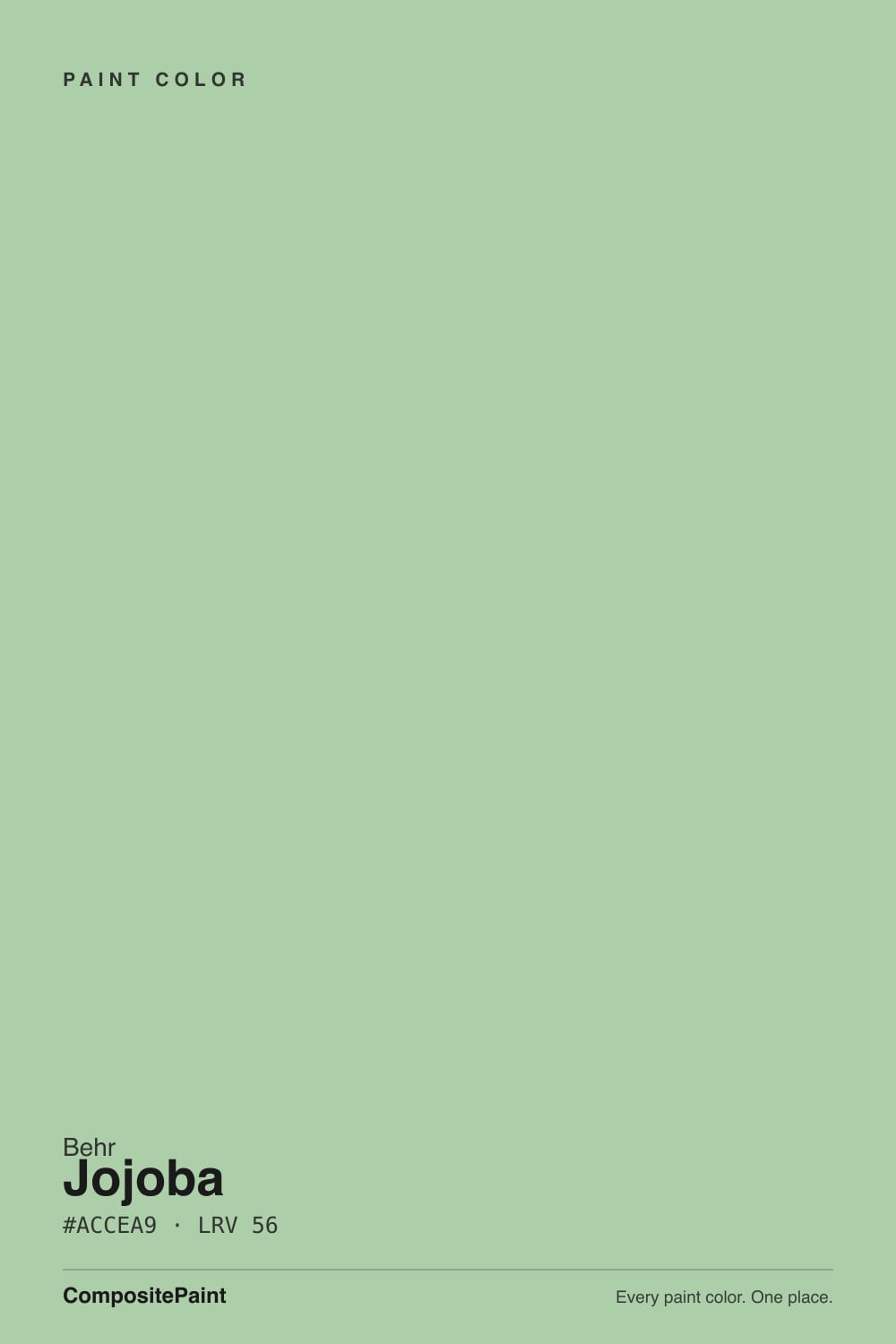
Jojoba is Behr's quiet, competent sage-green — not a design-blog darling, just a genuinely balanced gray-green that Behr's own team calls calming, and the color itself backs that up. In real daylight it reads clean and even, neither yellow-olive nor blue.
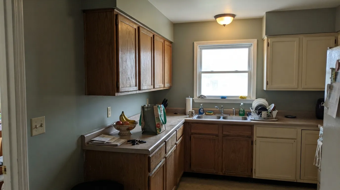
The catch: put it in a room that runs on warm lamps with little daylight, and the green retreats toward a soft gray-beige — a real, documented shift worth knowing before you commit a whole kitchen to it.
Kitchens and bathrooms wanting a calm, believable gray-green · cabinets and exterior trim or shutters — Behr sells it in a semi-gloss enamel built for exactly that · anyone who likes Saybrook Sage or SW Sage but wants a Behr-store option · nurseries and craft rooms with real daylight
Your room runs on warm lamps with little daylight · you want an obviously bold, saturated green · you need lots of real installed photos before buying — this one has few · you're not already shopping the Behr / Home Depot deck
- Genuinely balanced gray-green — reads as neither yellow-olive nor blue
- Mid-LRV 47 keeps rooms bright, not moody
- Doubles as a cabinet and exterior trim/shutter color in a semi-gloss enamel
- Pairs easily with warm wood and black hardware, minimal decorating homework
- Widely available and affordable through Behr / Home Depot tinting
- Under warm 2700K bulbs it slides toward gray-beige and loses its green identity
- Thin real-world documentation — few installed photos to preview before buying
- Not the color if you want a bold, obviously-green statement wall
- Less brand recognition than BM Saybrook Sage or SW Sage — specify the exact SKU to your painter
What Color Is Jojoba, Really?
Behr's own description is blunt and accurate: "a delightfully balanced gray-green... versatile enough for many spaces and generates a cool, calming atmosphere." That is a rare case of paint marketing matching the swatch. Pull the RGB apart and the claim holds up — red and blue sit almost level, 172 and 169, with green pulled up to 206, which is the textbook recipe for a true gray-green: not warm olive, not cool blue-green, just green with the saturation turned down. It doesn't show up in glossy design-blog roundups the way Sherwin-Williams Sage or Benjamin Moore Saybrook Sage do — Jojoba lives quietly in Behr's standard deck, mixed to order at any Home Depot, which is both its appeal and the reason it's harder to research before buying.
At LRV 47 it sits in the same mid-light band as Benjamin Moore's Saybrook Sage, also LRV 47 — a genuinely useful benchmark, since the two read almost like siblings from across a Home Depot aisle versus a paint-store one. Jojoba is the more neutral of the pair: Saybrook Sage leans a step warmer and more olive, Jojoba stays closer to true gray-green. That LRV is bright enough to keep a room from feeling closed in, but with enough body that it won't wash out to pale mint the way a lighter sage can.
Undertone in one line: gray-green first, with a soft yellow-olive cast that shows in bright daylight, and a gray-beige side that comes forward under warm bulbs. Different online color tools disagree on Jojoba's exact hex and LRV — readings from the high 40s to the mid 70s turn up in the wild — which is itself a tell: this is a color whose presence depends more than most on where you actually put it. Treat any screen swatch, including this one, as a starting point and confirm on the actual wall.
Where It Shines
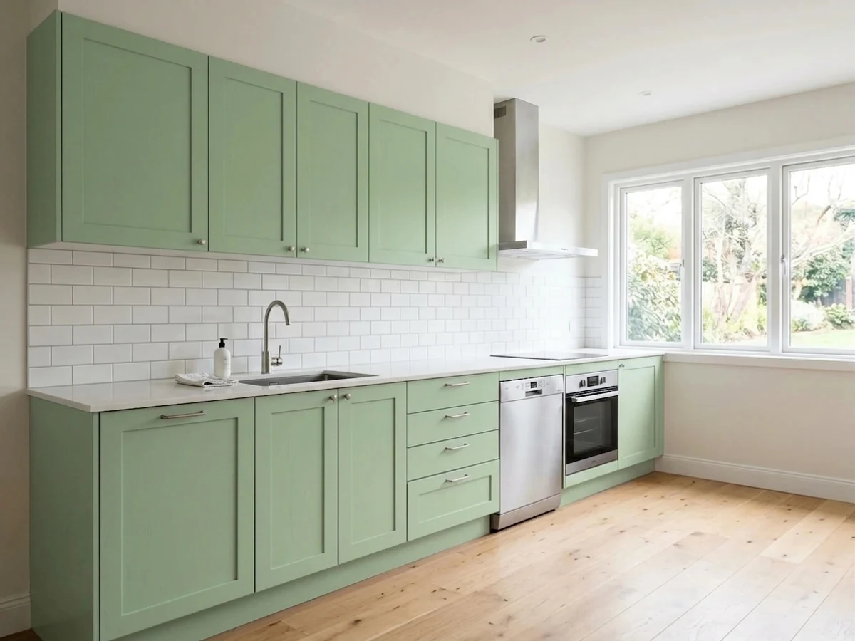
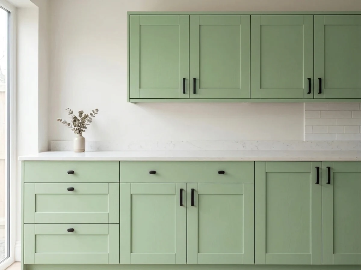
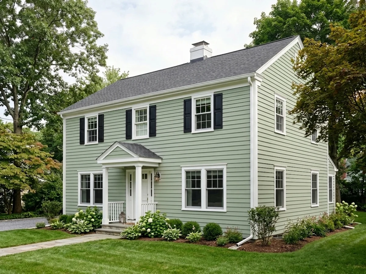
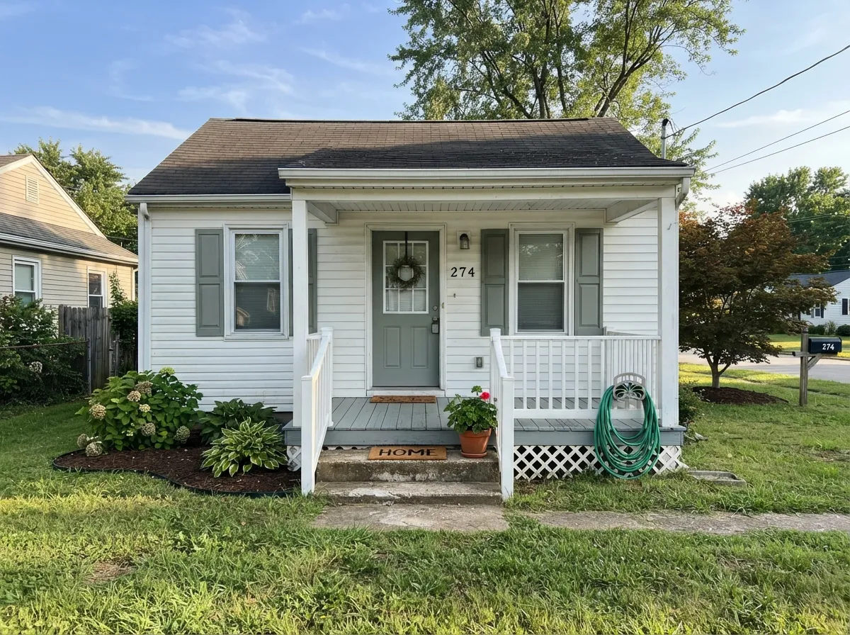
Give it real daylight and it does exactly what Behr promises: an even, calming gray-green that doesn't announce itself. It's quietly good on kitchen cabinets and exterior trim — Behr sells it in a semi-gloss enamel built for that use — and it gets along with warm wood and black hardware without demanding a whole styled room around it. The best praise for Jojoba is the least exciting kind: it behaves.
Where It Fails
Jojoba's real complaints trace back to one predictable cause, not three — which is itself a sign of how mild a color it is. But the one risk is real and worth knowing before you buy a gallon.
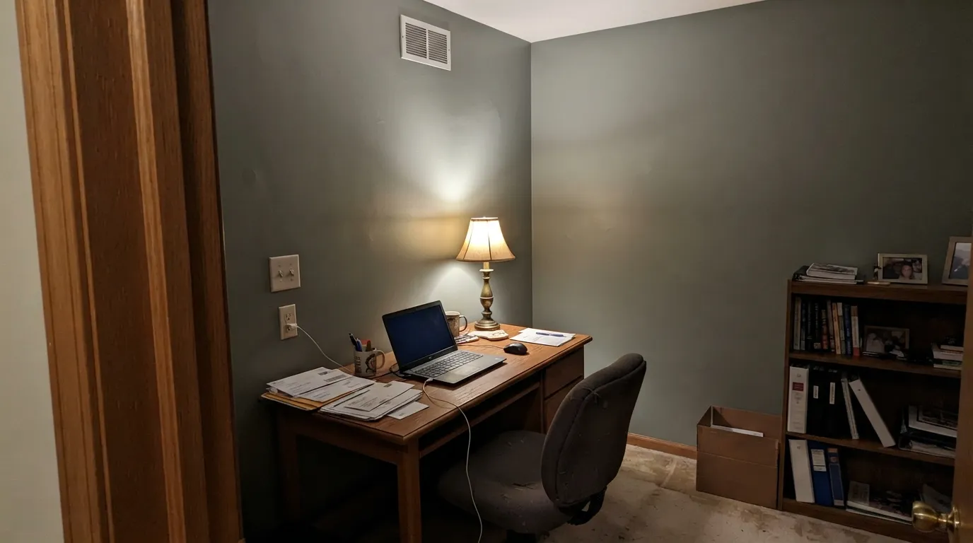
Under 2700K bulbs with no daylight to balance them, the green retreats and the wall reads gray-beige — competent, but not the sage-green you thought you bought. A room that runs on lamps after dark will spend most evenings looking more neutral than green.
Jojoba is deliberately quiet — gray-green first, statement color second. If you want a wall that reads unmistakably green from across the room, size up to something more saturated; this one will always read soft.
Jojoba doesn't have the design-blog paper trail that Sage or Saybrook Sage have — few installed-room photos turn up in a search, and the online color tools that do list it disagree on its exact hex and LRV. Get an actual peel-and-stick or store sample and look at it on your own wall before committing; don't trust a chip on a screen.
Room by Room
A kitchen with a window over the sink is Jojoba's best case: the gray-green reads clean against white or wood cabinets and stays out of the way of countertop color. Interior-facing kitchens with no natural light will see it lean more gray-beige under the can lights.
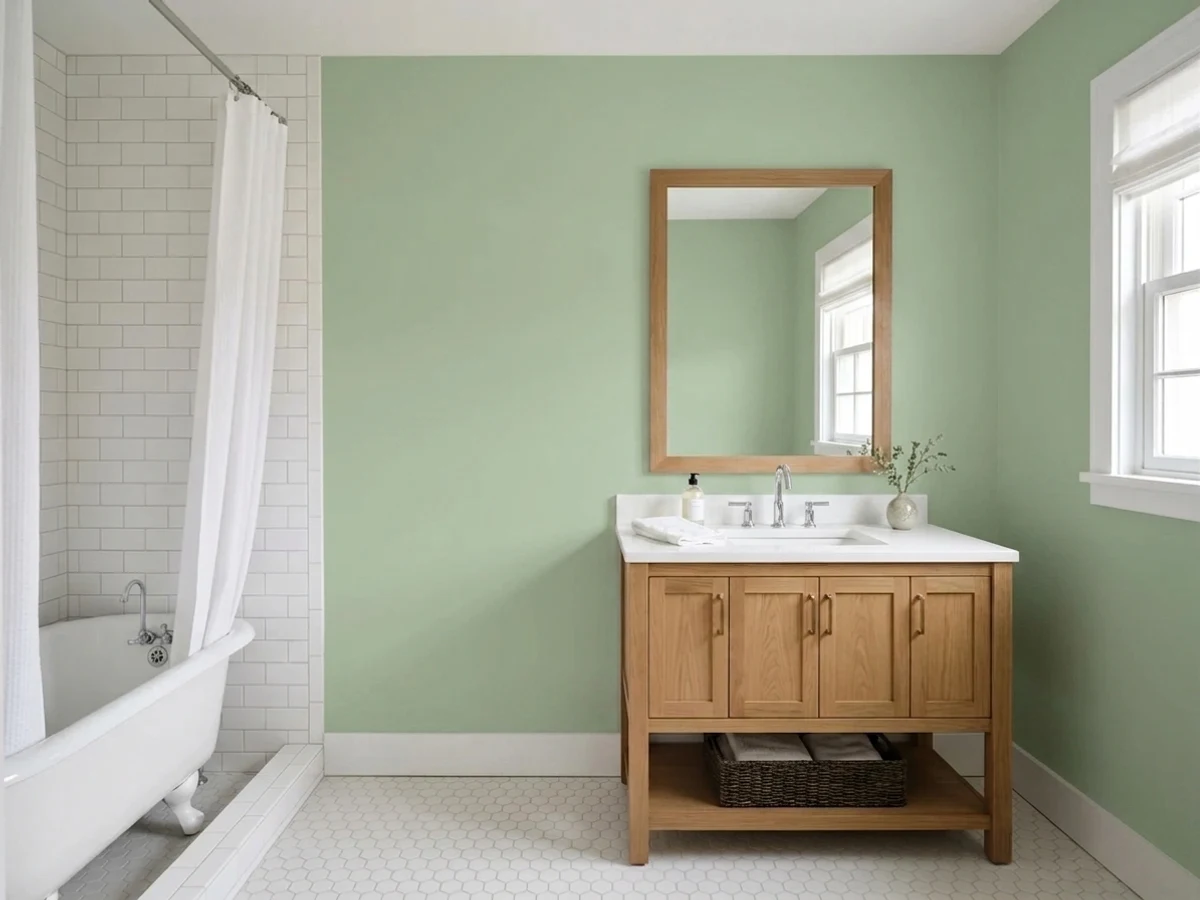
Behr's own "cool, calming atmosphere" line is most true here. Works well with white subway tile and brushed-nickel or black fixtures. Satin or semi-gloss for the humidity.
A gentle, unisex green that avoids theme-y pastel territory. Plan the light: a warm lamp at bedtime will make the wall look more gray than green during that hour — which some parents actually prefer for a calming nursery.
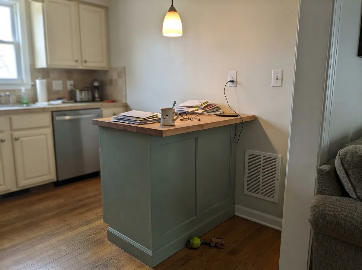
Behr markets Jojoba specifically for cabinet and trim work in a semi-gloss enamel. On lower cabinets or a kitchen island it reads as a quiet, current alternative to white without the upkeep of a darker color.
This is the other half of Behr's own use case for Jojoba. Against a white or light-gray house body it becomes a soft, grounded accent rather than a loud one — full sun brings out its yellow-olive side more than it does indoors.
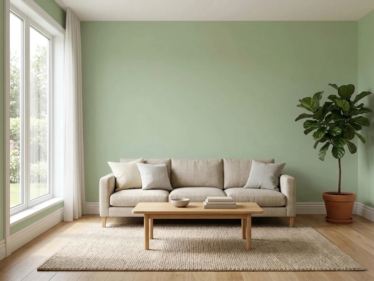
Fine in a bright room; in a north-facing or lamp-lit living room it will sit closer to a quiet gray for most of the evening. Not a bad thing if subtlety was the goal — just know which color you're actually getting after dark.
Your Light Is the Risk
A clean, balanced gray-green — exactly what the Behr chip promises. Its most honest and most flattering light.
The green retreats toward gray-beige with the daylight gone. Fine if you wanted quiet neutral; disappointing if you wanted visible green.
Cloudy light cools it toward plain gray-green; direct sun brings a soft yellow-olive cast forward. Both are the same paint, honestly lit.
Warm bulbs mute the green toward beige. Cool LEDs keep it legible as green but flatten its warmth — test both before painting a whole room.
Most complaints about Jojoba are a light mismatch. Upload a photo of your actual room and see it on your walls — then ask for the same wall in north light or evening lamps before you buy a single sample.
Need It From Another Brand?
Any paint counter can custom-tint Behr N390-3 directly. If you would rather stay in one brand's own deck, these are the closest stock matches, measured as ΔE2000. Under 2 is a difference you will not see on the wall.
| Brand | Closest color | ΔE | LRV | |
|---|---|---|---|---|
| Sherwin-Williams | Colonial Revival Sea GreenSW 2825 · Sherwin-Williams | 3.3 | 49 | Color page → |
| Benjamin Moore | Salisbury GreenHC-139 · Benjamin Moore | 1.2 | 47 | Color page → |
| Valspar | FanfareT626 · Valspar | 0.8 | 46.6 | Color page → |
| PPG / Glidden | Light SagePPG1124-4 · PPG / Glidden | 0.9 | 47 | Color page → |
| Glidden | Light Sage90YY 75/120 · Glidden | 0.9 | 75 | Color page → |
| Dutch Boy | Foggy Gray424-2DB · Dutch Boy | 1.5 | 45 | Color page → |
Similar Behr Colors
The nearest shades to Jojoba within Behr's own range, ranked by perceptual color distance — useful when you want the same look a touch lighter, darker, or warmer.
WCAG 2.1: AA is 4.5 : 1 for normal text, 3 : 1 for large text, AAA is 7 : 1.
Jojoba vs the Colors You're Also Considering
Every Jojoba sample board has the same rivals on it. The numbers show the real lightness gap — then it comes down to which risk you would rather live with.
Pick this for the cooler, more neutral gray-green at the exact same LRV.
Benjamin Moore HC-114 · LRV 56Saybrook SagePick this if you want the same depth with more olive warmth, and don't mind shopping a paint store instead of Home Depot.
Pick this for more visible green at a lighter, brighter depth.
Sherwin-Williams SW 6178 · LRV 41Clary SagePick this for a deeper, taupe-leaning sage that reads more neutral than green.
Inside the Behr deck, Restful 400F-4 at LRV 55 and hex #B7CAA2 is the closest in lightness but noticeably yellower, so it reads as a soft sage where Jojoba reads as a clean green. Laurel Mist 430E-3 at LRV 52 and hex #A8C8A1 is the same character a step darker. Quiet Teal BXC-85 at LRV 58 and hex #A7D2B8 pushes past green into blue-green territory.
Across brands, Dutch Boy Hedged Green 229-3DB at LRV 58 has a deltaE of 0.87, which makes it the same color for practical purposes. Benjamin Moore Douglas Fern 563 at LRV 55 has a deltaE of 1.08, visually identical in normal room light. Sherwin-Williams Relish SW 6443 at LRV 55 sits at 2.67, very close but worth sampling, as it carries a bit more yellow. Kompozit Garland Pine 0757 at LRV 58 is at 3.51, close but visibly different side by side.
Jojoba Coordinating Colors
The rule for coordinating with Jojoba: keep everything either warm-neutral or clearly darker, and let the green stay the only color note in the room. It pairs easily with warm woods, black or brushed-nickel hardware, and cream trim — and it gets along with its own family better than with unrelated brights. These are the partners that keep showing up:
Jojoba on Cabinets and Exteriors
Behr's own product notes point Jojoba at two specific jobs beyond walls: cabinet and trim painting, and exterior use, both recommended in a semi-gloss enamel rather than a flat wall finish. On cabinets — an island, a bathroom vanity, lower kitchen cabinetry — the extra sheen holds up to wiping, and the gray-green reads as a quiet, current alternative to the now-common all-white or navy cabinet.
Outdoors, full sun brings out more of its yellow-olive side than it shows indoors, which matters if you're only testing a sample inside the house: what you see on an interior wall in daylight will read slightly warmer and more olive once it's on a sunny shutter or front door. Pair it with a light or white body and one near-black accent — a door, gutters, light fixtures — so the green reads as a deliberate choice rather than the whole house drifting pastel.
Why Jojoba Is Hard to Preview Before You Buy
Search for Jojoba online and the gaps show fast: unlike Sherwin-Williams Sage or Benjamin Moore Saybrook Sage, there are few installed-room photos on design blogs or Houzz, and the paint-color tools that do list it disagree with each other — reported LRVs for Jojoba range from the high 40s into the low 70s, and at least one source lists a noticeably different hex than Behr's own chip.
None of that means the color behaves unpredictably on the wall; it means the color simply hasn't been photographed and argued over online the way the bigger paint-store sages have. The practical takeaway is the same one that applies to every color, just more important here: don't trust any single screen swatch, including this review's. Buy an actual sample and look at it in your own room, in your own light, before you commit.
Three Ready Palettes Built on Jojoba
A color is never alone on the wall. These are complete combinations in the 60-30-10 pattern, with the reason each one holds together. Every one opens in the visualizer.
Two greens from the same Behr deck read as a family, not a mismatch — Hidden Gem's deeper blue-green grounds the island while Jojoba keeps the walls light and Swiss Coffee's warm cream cabinets tie both back to a wood floor.
Try this palette in your roomAn all-Behr body-and-trim pairing that follows how Behr actually sells this color, with one near-black accent so the green shutters read as a deliberate choice rather than a pastel one.
Try this palette in your roomLayering Jojoba with its warmer Benjamin Moore cousin on the vanity gives the room depth without leaving the green family — the shared LRV means neither color fights the other for attention.
Try this palette in your roomJojoba FAQ
Is Jojoba a green or a gray?
Green — but a deliberately quiet one. Behr's own description calls it a "balanced gray-green," and the RGB backs that up: red and blue sit almost level, with green pulled just above them. On the wall it reads as a soft sage, not a true gray, but it will never look like a bold or saturated green either.
What white trim goes with Jojoba?
A soft, slightly warm white works better than a stark cool one — Behr Swiss Coffee is the easy match if you're already buying Behr. Behr Polar Bear is the cleaner, more neutral option if you want the green to read a little cooler and crisper.
Does Jojoba work on kitchen cabinets?
Yes — Behr specifically markets it for cabinet and trim painting in a semi-gloss enamel. It works best in doses: an island, a vanity, lower cabinetry under a lighter wall color, rather than an entire kitchen of cabinets.
Will Jojoba look different under LED lights?
Yes. Cool LEDs keep the green legible but flatten its warmth; warm 2700K bulbs pull it toward gray-beige, especially in a room with no daylight to balance them. Test the actual bulb you plan to use before committing.
Is Jojoba good for an exterior or shutters?
Yes — this is one of Behr's two stated use cases for the color, alongside cabinets. Against a white or light-gray house body it reads as a soft, grounded accent rather than a loud one, and full sun brings out more of its yellow-olive side than it shows indoors.
How does Jojoba compare to Benjamin Moore Saybrook Sage?
They share the same LRV (56), so the depth is nearly identical. Saybrook Sage leans a step warmer and more olive; Jojoba stays closer to a true, neutral gray-green. Pick based on which undertone you prefer — and which store you're already shopping at.
Have you painted with Jojoba?
Rate it — one tap helps the next reader decide.
Ask a Question