CP

Room Colors · Playroom

12 Best Playroom Paint Colors for 2026
ideas, combinations, and real rooms

12 curated picks from real playrooms — with the exact colors, honest reasons why, and the combinations that hold the room together.

Jessica Williams
Jessica Williams· Color Stylist & Interior Editor

Former interior stylist who can spot a green undertone from across a room. Jessica writes the color and mood pieces — what to choose, what pairs, and why your "white" looks pink.

The Fast Answer

Don't want to read 12 picks? These four are the safe answers.

Behr S470-5 · LRV 18
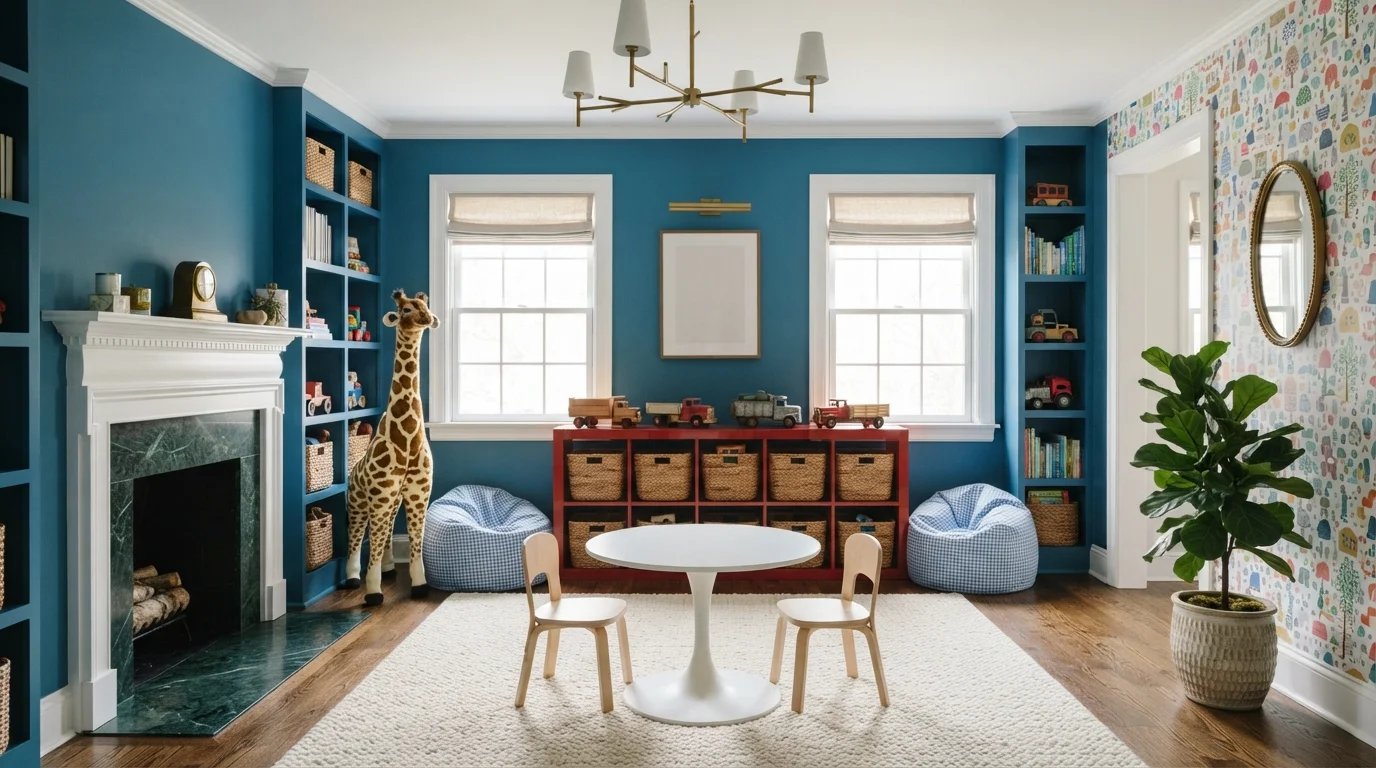
Grown-up mid-blue that anchors a shared playroom/family-room without feeling juvenile.
Clare Clare 08 · LRV 39
Calm whole-room green for playrooms open to the rest of the house — let the toys be the color.
Behr P360-6 · LRV 42
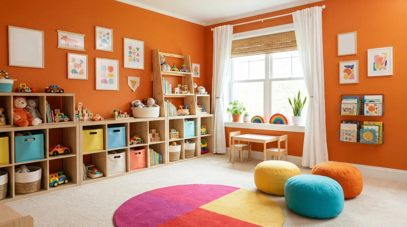
High-energy accent wall — the classic fun-playroom pop without painting the whole room.
Behr MQ6-46 · LRV 72
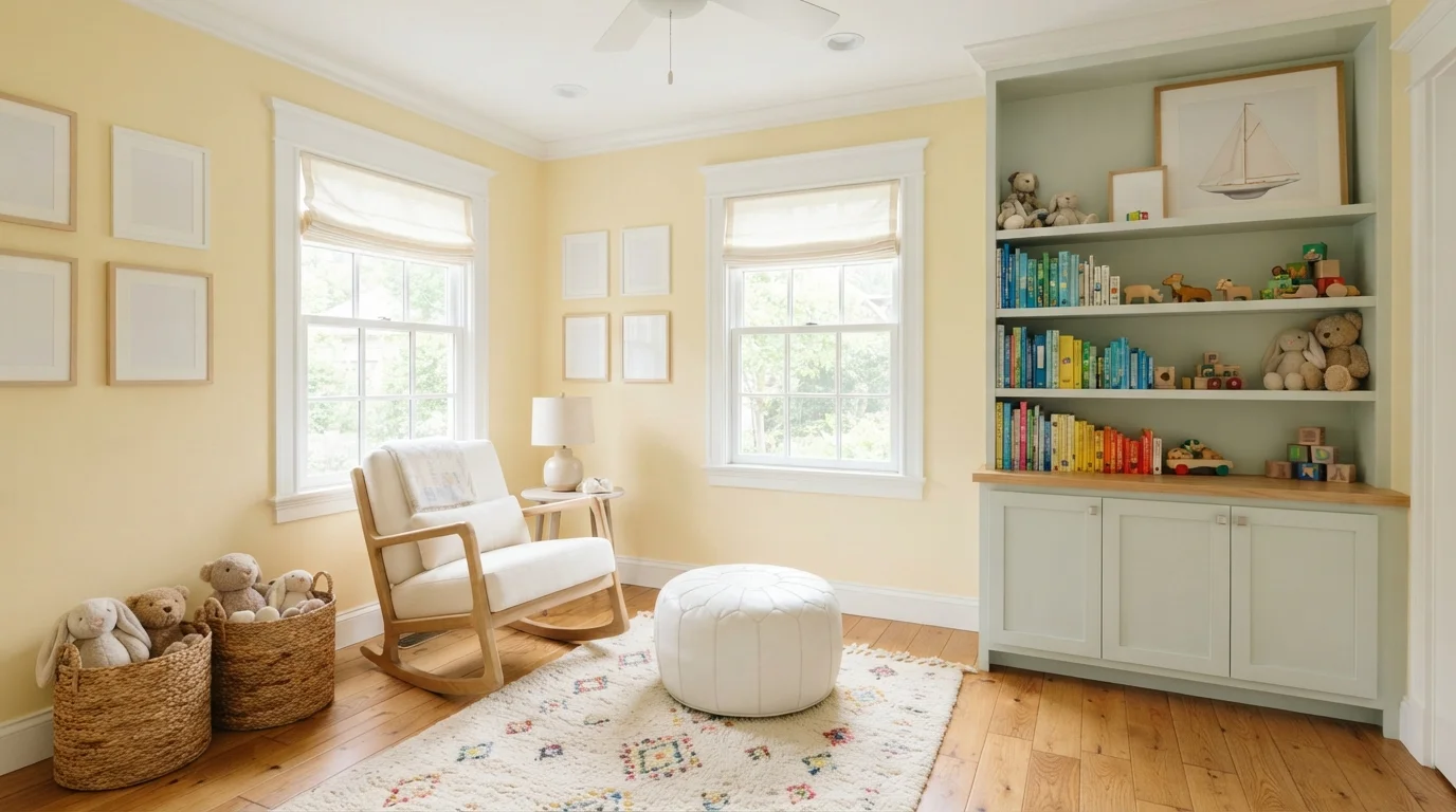
Cheerful soft yellow that warms a north-facing playroom and reads happy, not loud.
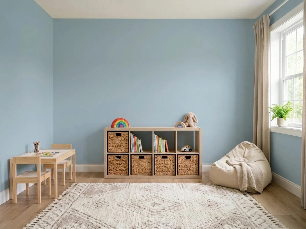
Room painted in Lost in the 80s
Lost in the 80s
Try it in your room →
Top picks · see them in a room

Top Picks for the Playroom

Pick a color family, tap a shade to see the playroom in it, then try it on your own room.

Lost in the 80s
#A4C2D2

Calm, focused blue for a play space that needs to wind down at the end of the day.

SEE IT IN YOUR ROOM →

Playroom Color Trends 2026 — What's In, What's Out

On the Way Out
  • Primary-color everythingRed, yellow, and blue on every wall reads daycare — kids end up wound up, not inspired.
  • Character theme wallsThe licensed-mural phase lasts about eighteen months; keep the paint neutral and let bedding carry the fandom.
  • Cool gray wallsThe gray decade is over everywhere, and in a playroom it always read flat and joyless.
  • Wall-to-wall chalkboardOne framed chalkboard panel still earns its keep; four walls of chalk dust never stayed clean.

The 12 Best Playroom Paint Colors

Every pick below is a real rendered playroom, not a chip. The lead color first; the swatches are the full scheme in the photo — walls, furniture, textiles, accent.

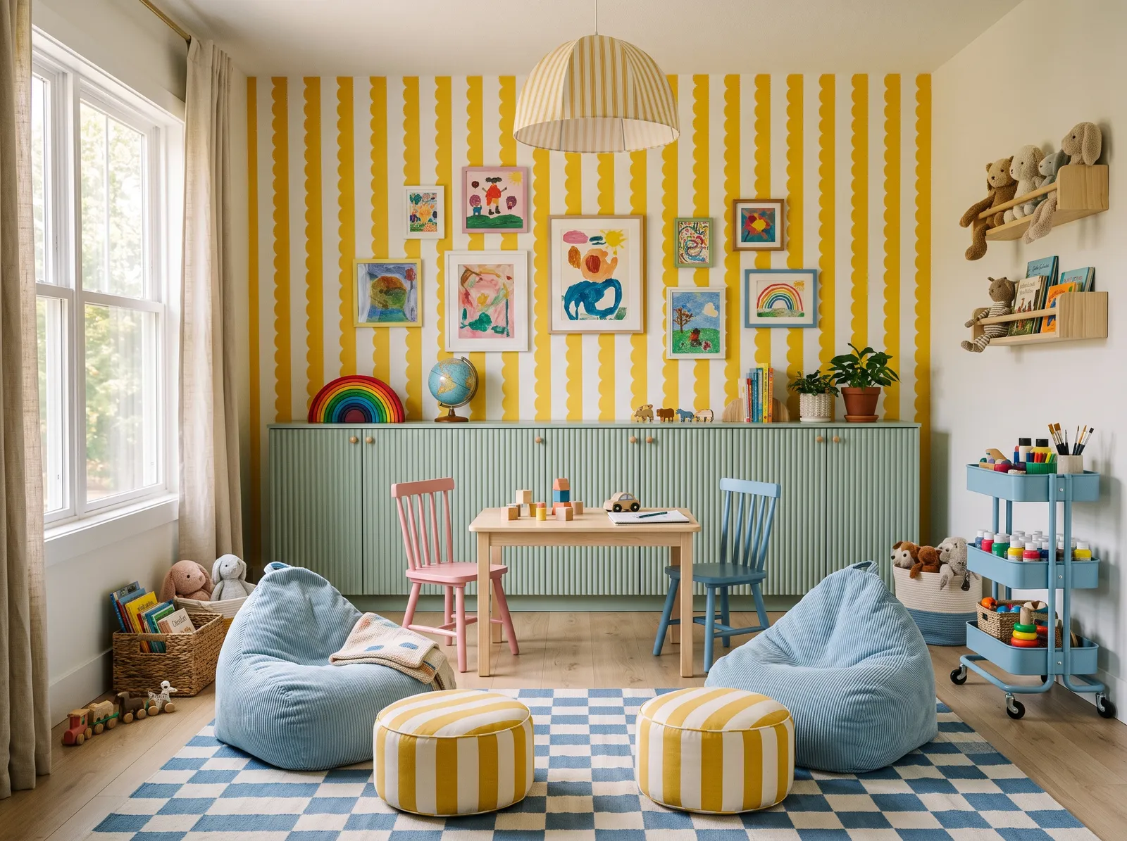
Sage and Sky — playroom painted in Basket of Gold
1Basket of GoldKompozit · Sage and Sky

Soft sage cabinets in Let It Rain meet a gentle sky-blue accent in Blue Beyond for a happy, easygoing room kids can play in for hours.

Sunny yellow is a joyful, high-energy color that instantly sparks creativity. Here, bold yellow and white striped walls pair with a soft mint green cabinet. A light wood table sits between colorful chairs, flanked by cozy sky-blue bean bags and a checkered blue rug. Striped yellow poufs tie the look together. The room feels incredibly cheerful, bright, and full of life. Cool blues and greens beautifully balance the warm yellow, keeping the high-energy pattern from feeling overwhelming. It is perfect for families wanting a stimulating, happy space for kids to play.

Walls · Kompozit
Cabinet · Benjamin Moore
Sofa · Benjamin Moore
Cushions · Behr
Rug · Kompozit
SEE BASKET OF GOLD ON YOUR WALLS →
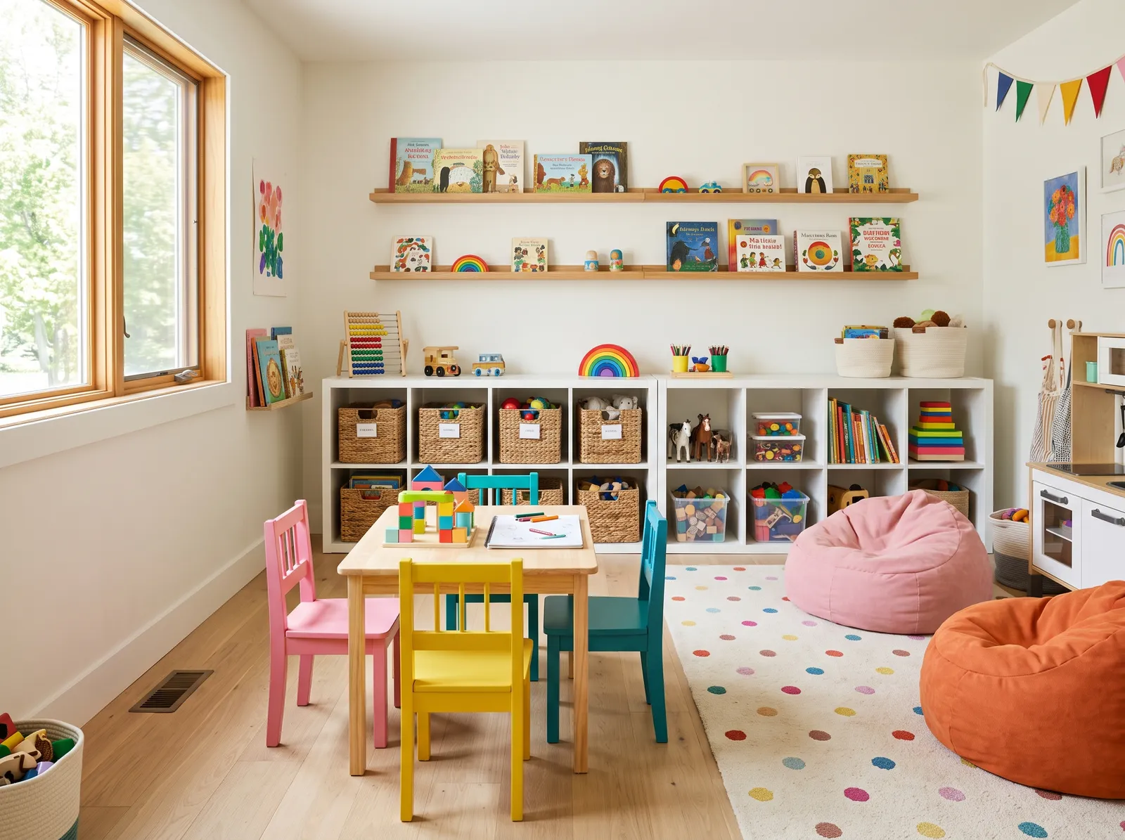
Soft White Canvas — playroom painted in Fossil
2FossilDunn-Edwards · Soft White Canvas

Creamy White Snow walls and crisp Warm White trim make a bright, simple base that lets colorful toys, rugs, and art do the talking.

Cream is the ultimate friendly backdrop for a space meant for imagination. In this cheerful playroom, that soft cream covers the walls, letting the white storage cubbies, light wood table, and colorful wooden chairs shine. A playful polka-dot rug anchors the center of the room, while plush pink and orange beanbags offer cozy spots to lounge. The entire space feels incredibly bright, energetic, and welcoming. Keeping the walls neutral ensures the rainbow of toys and furniture pops without feeling chaotic. It is perfect for active kids and design-conscious parents alike.

Walls · Dunn-Edwards
Table · Kompozit
Chairs · Dunn-Edwards
Cushions · Glidden
Rug · Valspar
SEE FOSSIL ON YOUR WALLS →
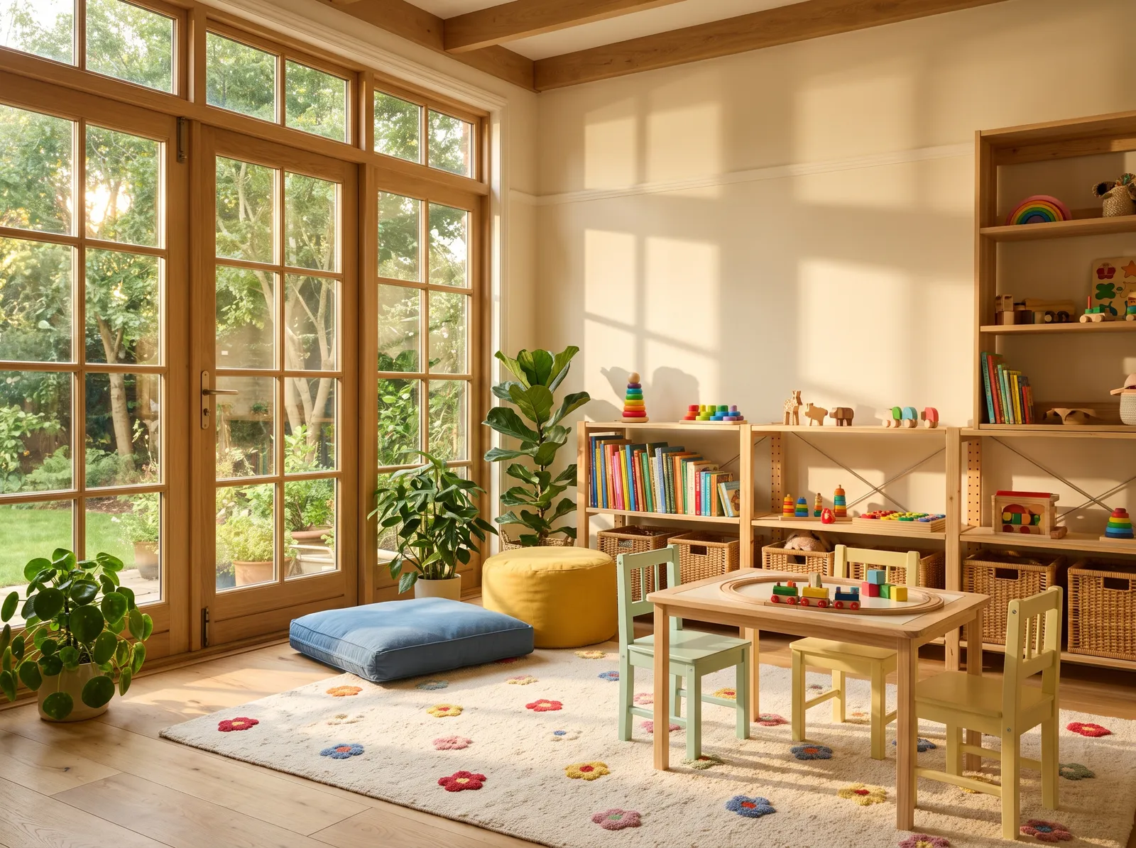
Warm Cream Sunshine — playroom painted in Pale Almond
3Pale AlmondBenjamin Moore · Warm Cream Sunshine

Warm Bunny Cake walls and soft Milk Glass trim wrap the room in gentle sunshine, cozy and bright even on the grayest days.

Cream is a soft, buttery off-white that instantly makes a space feel like a sunny afternoon. In this cheerful playroom, that warm cream coats the walls, creating a bright backdrop for the natural wood cabinets and small wooden table. A mint green chair, a mustard yellow pouf, and a slate blue floor cushion add playful pops of color, while the floral rug ties everything together. The room feels incredibly bright, happy, and calm. This combination works because the earthy wood tones ground the colorful accents beautifully. It is perfect for active families.

Walls · Benjamin Moore
Cabinet · Behr
Cushions · Diamond Vogel
Chairs · PPG / Glidden
SEE PALE ALMOND ON YOUR WALLS →
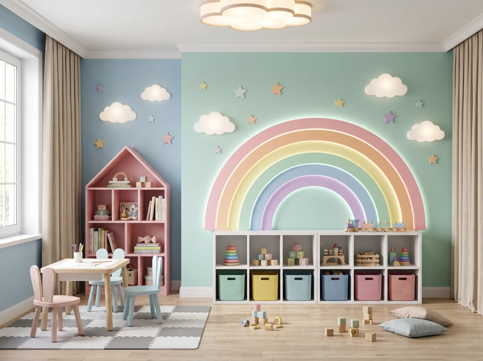
Mint, Blue and Pink — playroom painted in Dreamcatcher
4DreamcatcherBenjamin Moore · Mint, Blue and Pink

Minty Shimmering Glade walls with sky-blue Liam Blue and soft pink Jovial accents feel like a quiet rainbow that won't tire little eyes.

Mint green is a fresh, cheerful pastel that instantly brightens up a child's space. Here, it covers the main wall, paired with soft sky blue on the side, a pink house-shaped cabinet, light blue and pink chairs, and a grey-and-white checkered rug. The room feels incredibly playful, bright, and full of wonder. This combination works because the soft pastel tones share the same light intensity, keeping the colorful rainbow theme cohesive rather than chaotic. It is perfect for parents who want to design a magical, creative playroom.

Walls · Benjamin Moore
Walls · Kompozit
Cabinet · PPG / Glidden
Curtains · Benjamin Moore
Chairs · Behr
SEE DREAMCATCHER ON YOUR WALLS →
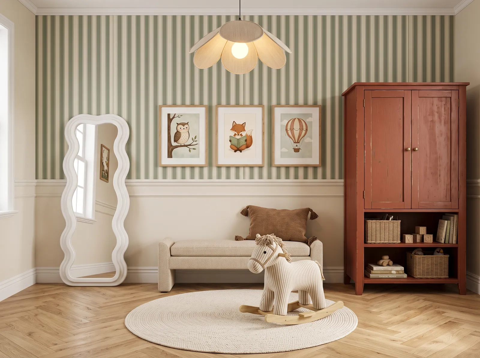
Cream and Terracotta — playroom painted in Shallot Bulb
5Shallot BulbBehr · Cream and Terracotta

Soft Bone White walls and warm Russet Red cabinets give the room a cozy, storybook feel with a grown-up touch kids won't outgrow.

Sage green is a dusty, nature-inspired shade that brings the outdoors inside. In this playful nursery, sage green stripes cover the upper walls, while a warm cream coats the lower paneling. A rustic terracotta-red cabinet anchors the corner, paired with a soft beige bench, a braided cream rug, and a cozy brown cushion. The space feels incredibly whimsical, calm, and snug. This combination works beautifully because the earthy red cabinet provides a bold, grounding contrast to the soft, airy greens and creams. It is perfect for parents who want a gender-neutral space with vintage charm.

Walls · Behr
Cabinet · Benjamin Moore
Sofa · Benjamin Moore
Rug · PPG / Glidden
Cushions · Benjamin Moore
SEE SHALLOT BULB ON YOUR WALLS →
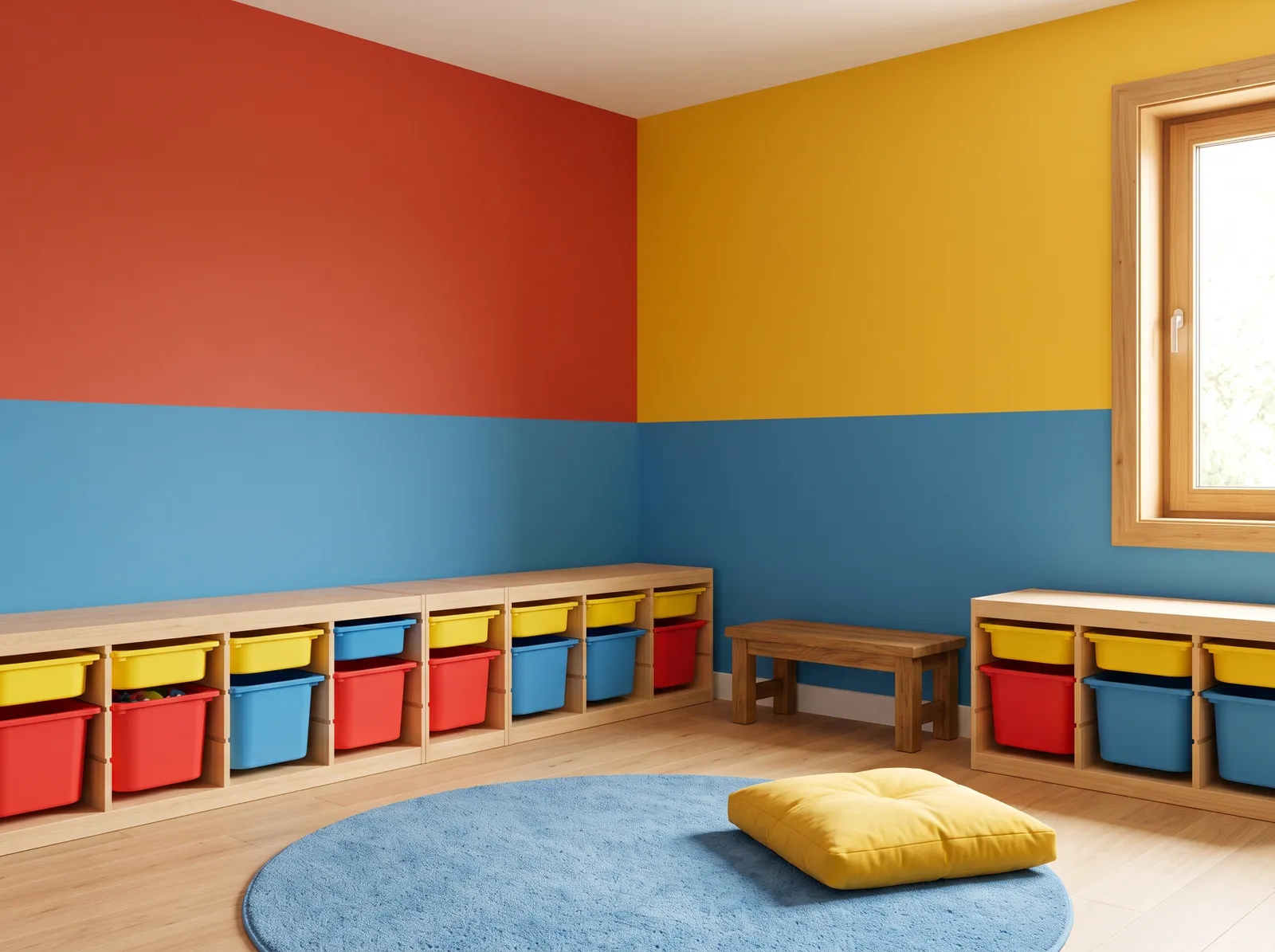
Primary Color Blocks — playroom painted in Tomato Tango
6Tomato TangoBenjamin Moore · Primary Color Blocks

Blocks of Bonfire Flame red, Sun Drops yellow, and Sailor's Sea Blue make a bold, joyful room that begs kids to jump into play.

Primary red is a bold, energetic crimson that instantly grabs your attention. In this playful space, the walls are split into blocks of vibrant red, sunny yellow, and deep sky blue, while light wood cabinets hold matching colorful storage bins. A soft blue circular rug anchors the center of the room, topped with a plump yellow floor cushion. The entire room feels incredibly cheerful, bright, and full of youthful energy. This classic primary color combination works because the high-contrast blocks stimulate creativity and keep the mood upbeat. It is perfect for a lively kids' playroom.

Walls · Benjamin Moore
Walls · Diamond Vogel
Walls · Valspar
Rug · Benjamin Moore
Cushions · Benjamin Moore
Cabinet · Valspar
SEE TOMATO TANGO ON YOUR WALLS →
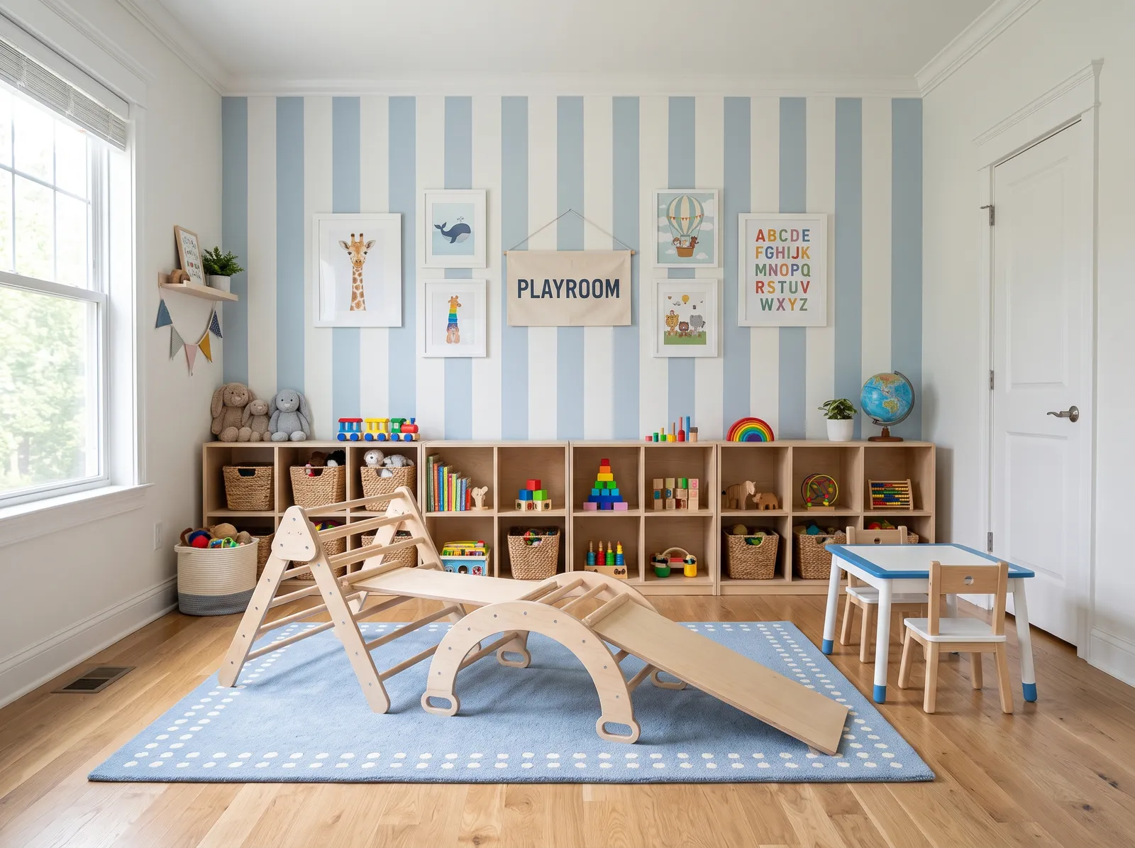
Soft Blue Stripes — playroom painted in Calm Tint
7Calm TintDiamond Vogel · Soft Blue Stripes

Soft blue Pompeii Ruins walls and clean New House White trim feel calm and cheerful, an easy backdrop for quiet, focused play.

Sky blue is a breezy, lighthearted pastel that instantly brings a sense of calm. In this playful space, sky blue and crisp white stripes adorn the walls, while natural wood cabinets line the back. A soft blue dotted rug anchors the room, matching the white and blue kids' table set. The entire setup feels incredibly cheerful, bright, and organized. Pairing cool blues with warm, natural wood keeps the space from feeling too chilly while maintaining a clean look. It is perfect for parents who want a serene play area that sparks creativity.

Walls · Diamond Vogel
Cabinet · Glidden
Rug · Valspar
Trim · Dunn-Edwards
Table · Dunn-Edwards
SEE CALM TINT ON YOUR WALLS →
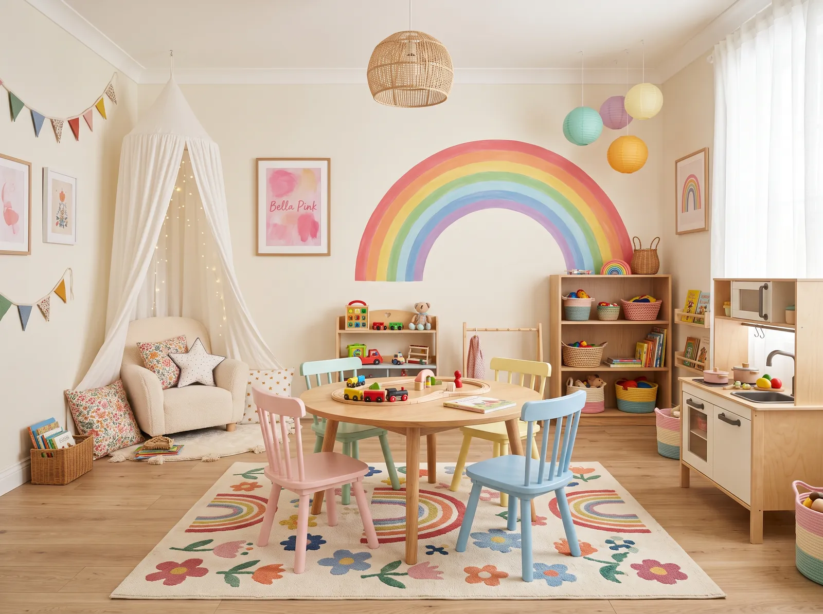
Off-White and Pink — playroom painted in Westhighland White
8Westhighland WhiteSherwin-Williams · Off-White and Pink

Warm off-white Twinkle Twinkle walls with a soft Bella Pink accent keep things light, sweet, and gentle without ever going overboard.

Cream is the ultimate friendly base color for a space meant for play. Here, it wraps the walls, while a matching cream armchair sits under a cozy canopy. The wooden table and cabinets ground the room, surrounded by pastel chairs in soft pink, blue, and yellow, all resting on a playful rainbow-patterned rug. The space feels incredibly cheerful, bright, and inviting. This combination works beautifully because the neutral backdrop lets the soft pastel accents pop without feeling overwhelming. It is perfect for parents who want a stylish yet fun playroom.

Walls · Sherwin-Williams
Table · Benjamin Moore
Chairs · Valspar
Sofa · Behr
Rug · PPG / Glidden
SEE IT ON YOUR WALLS →
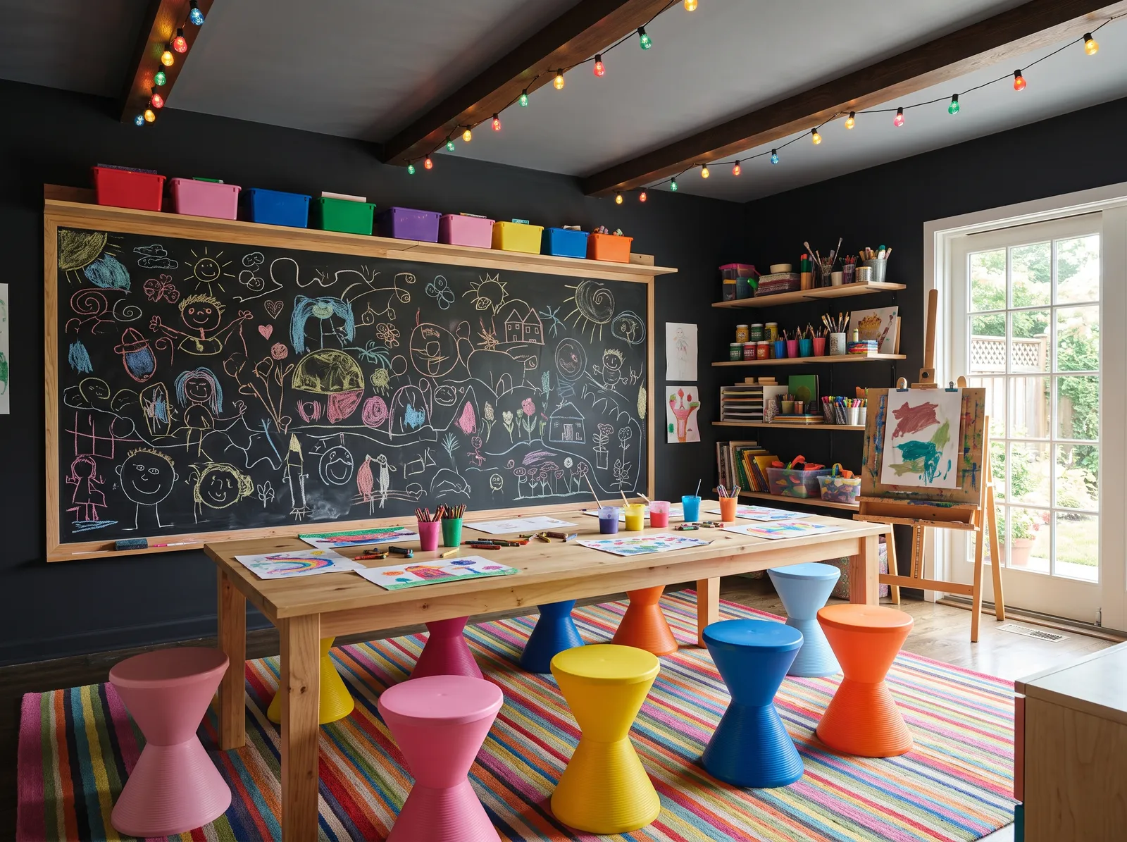
Bold Chalkboard Den — playroom painted in Tuxedo
9TuxedoValspar · Bold Chalkboard Den

Deep Hocus Pocus walls and an Anchor Gray ceiling turn the room into a cozy art den where chalk drawings and bright toys really pop.

Charcoal is a deep, dramatic gray that acts like a blank canvas. In this creative art room, the dark charcoal walls frame a massive chalkboard and contrast beautifully with the light wood craft table. Surrounding the table are playful, hourglass-shaped plastic stools in rainbow shades, all resting on a vibrant, multi-colored striped rug. The space feels incredibly cheerful, energetic, and ready for imagination. The dark background makes all those bright primary and secondary colors pop like neon lights. It is perfect for families who want to inspire endless creativity in their kids.

Walls · Valspar
Table · Dutch Boy
Chairs · Benjamin Moore
Rug · Sherwin-Williams
Ceiling · Diamond Vogel
SEE TUXEDO ON YOUR WALLS →
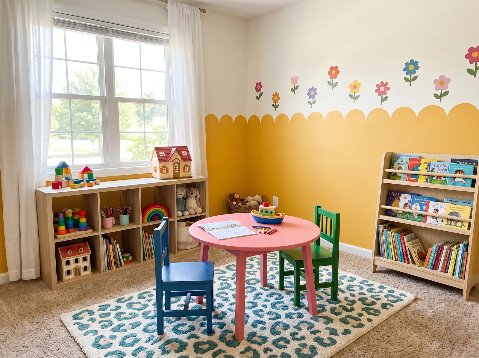
Sunny Yellow Scallops — playroom painted in Fortune Cookie
10Fortune CookieDunn-Edwards · Sunny Yellow Scallops

Golden Lemon Dream paired with soft Whisper White brings instant sunshine, a warm and happy mood even when it's cloudy outside.

Sunny yellow is a cheerful, energetic shade that instantly brings happiness into a space. In this playful room, a scalloped yellow accent wraps around cream walls, paired with light wood toy cabinets. A bright pink table sits in the center, flanked by a deep blue chair and a forest green chair, all resting on a teal leopard-print rug. The space feels incredibly joyful, bright, and full of creative energy. The combo works because the neutral cream and natural wood ground the explosion of primary and pastel accents. It is perfect for a lively kids' playroom.

Walls · Dunn-Edwards
Accent · Behr
Table · Benjamin Moore
Chairs · Benjamin Moore
Cabinet · Behr
SEE FORTUNE COOKIE ON YOUR WALLS →
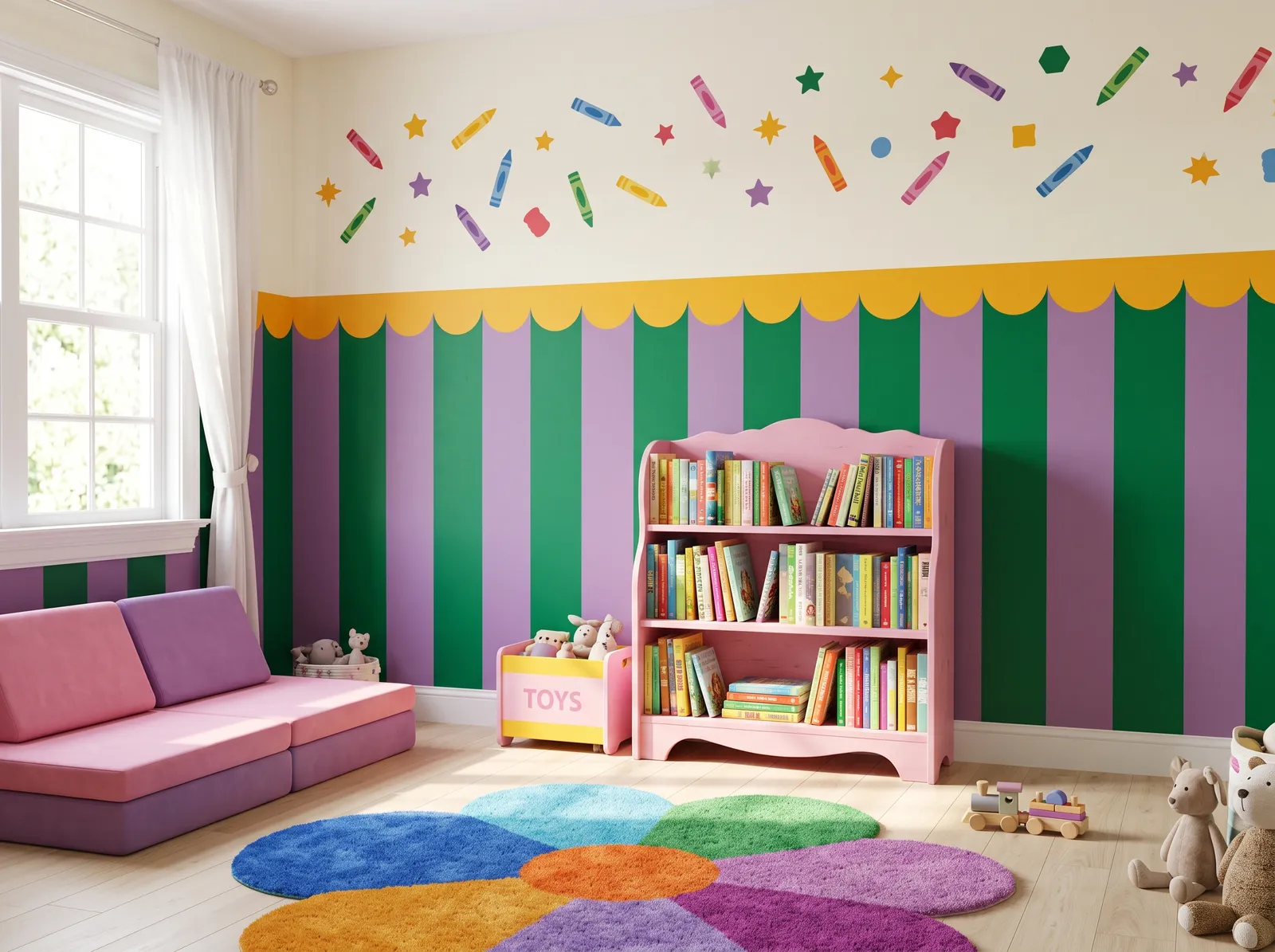
Purple, Green and Gold — playroom painted in Linwood Beach White
11Linwood Beach WhiteGlidden · Purple, Green and Gold

Soft purple Pleasant Dream with bright Blarney Stone green and Gusto Gold accents make a lively, magical room full of color and play.

Cream is a soft, warm off-white that keeps spaces feeling bright and open. Here, it pairs with bold green and purple striped walls, a sweet pink bookshelf, a matching pink and purple modular sofa, and a multi-colored flower rug. The room feels incredibly cheerful, energetic, and full of youthful wonder. This combination works because the neutral upper wall balances the high-contrast stripes below, preventing the vibrant colors from overwhelming the space. It is perfect for parents who want to create a magical, imaginative playroom for their little ones.

Walls · Glidden
Accent · Benjamin Moore
Accent · PPG / Glidden
Sofa · Dutch Boy
Cabinet · Kompozit
Rug · Dunn-Edwards
SEE IT ON YOUR WALLS →
Off-White and Red — playroom painted in Drabware
12DrabwareC2 Paint · Off-White and Red

Calm Dogwood Blossom off-white walls let cheerful Red Geranium cabinets stand out, a bright, energetic mix that still feels grounded.

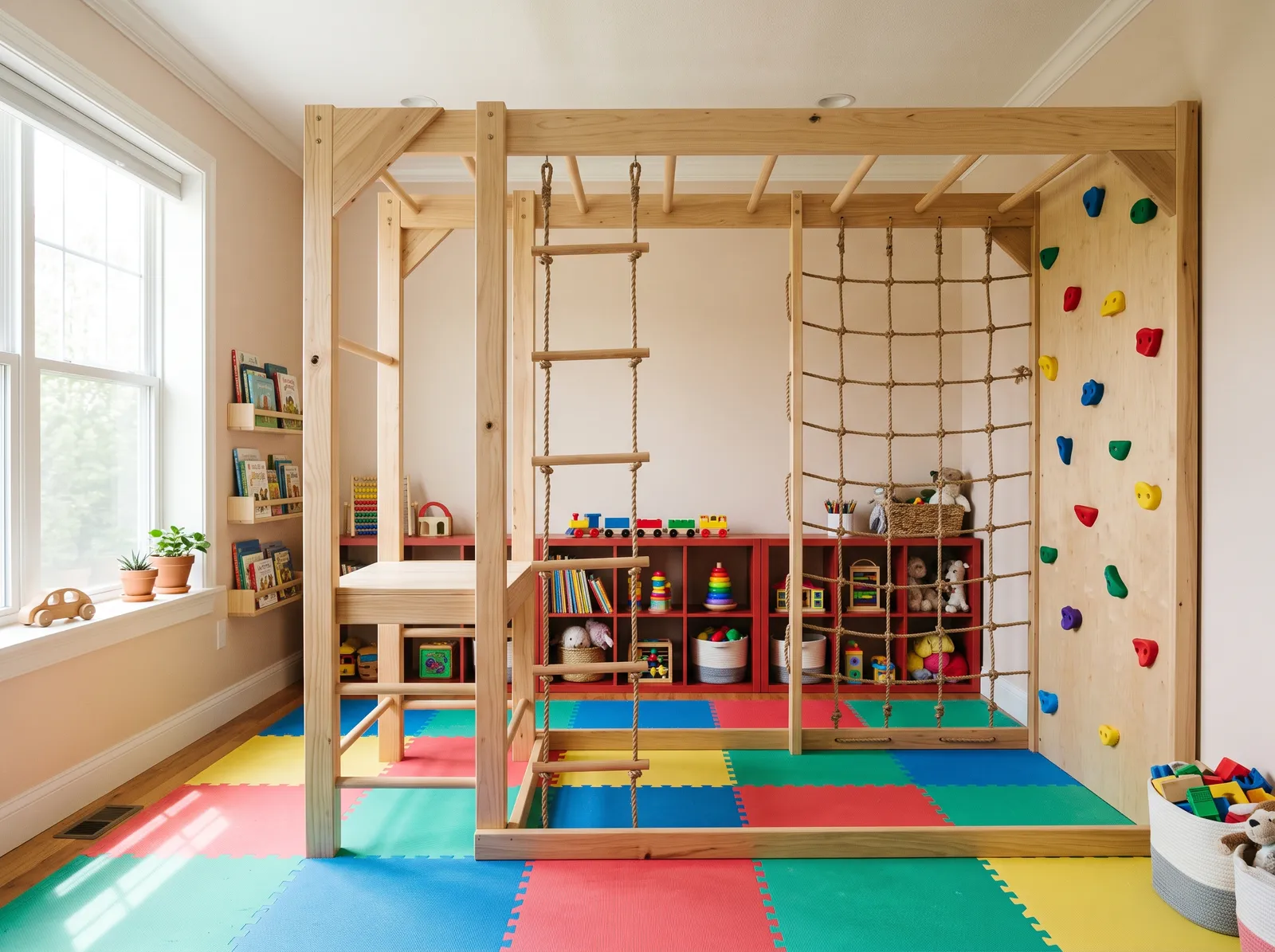
Cream is a gentle, warm off-white that keeps spaces feeling bright and open. In this active playroom, the cream walls and soft white ceiling frame a natural wood climbing gym, while deep red storage cabinets line the back wall and a multi-colored foam rug covers the floor. The room feels incredibly cheerful, energetic, and ready for adventure. This combination works because the quiet, neutral walls let the vibrant primary colors of the mats pop without overwhelming the senses. It is perfect for families wanting a high-energy play zone that still feels organized.

Walls · C2 Paint
Ceiling · Behr
Cabinet · Dunn-Edwards
Rug · Benjamin Moore
Accent · Valspar
SEE DRABWARE ON YOUR WALLS →

Playroom Wall Color Combinations

A wall color never works alone. These are the full schemes from the rooms above — the lead color first, then the supporting colors that make the photo work.

Sage and Sky
WallsBasket of GoldCabinetDreamcatcherSofaSan Francisco Bay
Walls
Basket of Gold · Kompozit · LRV 63
Cabinet
Dreamcatcher · Benjamin Moore · LRV 48
Sofa
San Francisco Bay · Benjamin Moore · LRV 36

Soft sage cabinets in Let It Rain meet a gentle sky-blue accent in Blue Beyond for a happy, easygoing room kids can play in for hours.

TRY THIS PALETTE →
Soft White Canvas
WallsFossilTableHoney GlowChairsLemon Zest
Walls
Fossil · Dunn-Edwards · LRV 88
Table
Honey Glow · Kompozit · LRV 55
Chairs
Lemon Zest · Dunn-Edwards · LRV 58

Creamy White Snow walls and crisp Warm White trim make a bright, simple base that lets colorful toys, rugs, and art do the talking.

TRY THIS PALETTE →
Warm Cream Sunshine
WallsPale AlmondCabinetSesameCushionsZenith
Walls
Pale Almond · Benjamin Moore · LRV 72
Cabinet
Sesame · Behr · LRV 42
Cushions
Zenith · Diamond Vogel · LRV 20

Warm Bunny Cake walls and soft Milk Glass trim wrap the room in gentle sunshine, cozy and bright even on the grayest days.

TRY THIS PALETTE →
Mint, Blue and Pink
WallsDreamcatcherWallsCalm TintCabinetGarden Party
Walls
Dreamcatcher · Benjamin Moore · LRV 48
Walls
Calm Tint · Kompozit · LRV 42
Cabinet
Garden Party · PPG / Glidden · LRV 47

Minty Shimmering Glade walls with sky-blue Liam Blue and soft pink Jovial accents feel like a quiet rainbow that won't tire little eyes.

TRY THIS PALETTE →

Playroom Color Ideas by Color

Set on a color family already? Each page has its own real rooms and picks.

Light or Dark Playroom Colors?

Go Light (LRV 60+) If…

The room is small, faces north, or has to work at every hour. Light warm colors make it feel bigger and stay calm in evening light — the light you actually live in.

Go Dark (LRV Under 20) If…

You want the cocoon effect and the room has real daylight. Dark works best on one feature wall — or fully color-drenched in a large room with good windows.

Your Kind of Playroom

Every variant has its own full guide with picks tuned to that room.

VISUALIZE YOUR SPACE

See It. Love It.
Paint It.

Upload one photo of your playroom and try every color on this page on your own walls — in your own light, before you buy a drop of paint.

Drag the slider to compare
playroom before paintingplayroom painted in Lost in the 80sLost in the 80sBefore

About Playroom Paint Colors

A playroom is a play space, not a bedroom, so the color can afford to be more fun than anything you would put in a room someone sleeps in. The trick is energizing without exhausting: a color the kids react to that the adults still want to walk past every day. Most playrooms land on one cheerful wall color plus a brighter accent rather than going saturated on every wall.

The honest picks skew bright but livable. Lost in the 80s is a calm, focused blue for a play space that needs to wind down at the end of the day. Fresh Apple and Scotch Lassie bring the energy in lime and grass-green, best used as an accent rather than covering every wall. Lemon Lily warms a north-facing playroom without going loud, and Tomato Tango gives a warm, optimistic pop that pairs naturally with primary-color toys and rugs. If the playroom is open to the rest of the house, Avocado Toast and Blueprint pull toward a calmer, more grown-up whole-room color that still reads playful.

Below we cover the best color directions for energy versus calm, how the room's light should steer the choice, the finish that survives markers and stacked chairs, using LRV to keep the room stimulating without overload, and the mistakes that show up most in playrooms specifically.

The Best Color Directions For A Playroom

Start by deciding whether the room is a dedicated play space or shared with the rest of the house, because that changes how bold you can go. In a closed-off, kid-only playroom, Fresh Apple as a full accent wall or Tomato Tango as a warm optimistic pop both earn their saturation — they photograph well and hold up to hours of active use without wearing on the adults, since the room has a clear boundary.

In a playroom that is open to a living or family room, pull back to Avocado Toast or Blueprint as the main wall color and save any high-saturation pick for a single accent wall, a built-in, or the toy storage itself. Lemon Lily is the flexible middle ground: cheerful enough to read as a playroom, calm enough to work as a full-room color even in a shared space. Lost in the 80s and Scotch Lassie both work either way, as a full wall in a dedicated room or as an accent in a shared one.

Let The Room's Light Pick The Color

North-facing playrooms get flat, cool light all day, which can make a color like Lost in the 80s or Blueprint read a little gray and lifeless. In that light, Lemon Lily and Tomato Tango hold their warmth and keep the room feeling sunny even without much direct sun. Fresh Apple and Scotch Lassie also read true in cooler light since green sits in the middle of the color wheel and is less prone to going flat.

South- and west-facing playrooms get strong warm light and can carry the cooler picks — Lost in the 80s and Blueprint — without them feeling cold or corporate. Since kids use this room mostly during the day, test any sample specifically under daytime conditions rather than evening lamp light, and check it at the height kids actually see it from, not just eye level for an adult.

The Right Finish For Serious Wear And Tear

Playrooms take more abuse than almost any other room in the house: markers, sticky hands, stacked chairs, spilled snacks, and the occasional crayon mural on the wall itself. Flat paint cannot survive that; it shows every scuff and rubs off the moment you actually try to clean it.

A washable eggshell — BM Regal Select, SW Cashmere, or Behr Marquee are the reliable names — wipes clean repeatedly without burnishing or leaving a shiny patch where you scrubbed. If the room sees a lot of ball play or furniture dragging along the baseboards, step up to satin on the lower few feet of wall or on any built-in shelving, and save semi-gloss for doors and window trim where hands grab constantly.

Using LRV To Keep Energy Without Overload

LRV, or Light Reflectance Value, runs 0 to 100 and tells you how much light a color bounces back — it is a useful check on whether a playroom color will feel energizing or genuinely overstimulating once it covers four walls. A full room in a low-LRV saturated color like Tomato Tango or Fresh Apple can tip from fun to a lot; both work best as an accent wall or a smaller surface like toy storage.

For the calmer whole-room options, Avocado Toast and Blueprint sit at a mid-range LRV that keeps the room lively without maxing out the visual energy, which matters in a room kids may spend hours in at a stretch. Lemon Lily's higher LRV keeps a north-facing room bright even as a full-room color. As a rule, the more wall surface a color covers, the more it pays to check the LRV before committing to full saturation.

Pairing Trim, Storage, And Flooring

White trim is the safest, most forgiving companion to any of these colors and keeps a busy playroom from feeling chaotic — it gives the eye a resting point between a bright wall and whatever toys and storage are in the room. With warmer picks like Lemon Lily or Tomato Tango, a warm white trim avoids a stark contrast; with cooler Lost in the 80s or Blueprint, a cleaner white reads crisper.

Toy storage and low shelving are the natural place to put a saturated accent color like Fresh Apple or Scotch Lassie if the main walls stay calm — it lets the room's personality live at kid height without covering every surface. Durable, easy-clean flooring like vinyl or a washable rug pairs with any of these directions; just keep the flooring itself relatively neutral so it does not compete with an already colorful room.

Common Playroom Painting Mistakes

The most common mistake is going fully saturated on every wall because it photographs well — in person, over hours of actual use, an all-Fresh-Apple or all-Tomato-Tango room gets visually tiring fast, for kids and adults alike. One calm wall color plus a single bright accent almost always outlasts a fully saturated room.

The second mistake is using flat paint in a room built for markers and sticky hands; it looks fine on day one and shows every mark within weeks. People also forget to consider whether the playroom is open to the rest of the house — a bold color that works in a closed-door playroom can clash badly when it is visible from the living room. Pick a washable finish, match the saturation level to whether the room is open or closed, and let the toys add the rest of the color.

The Questions Everyone Asks

What color should I paint my playroom?

If you want one answer, start with the safe picks above — Blueprint, Avocado Toast, Fresh Apple, Lemon Lily. They read well in any light and survive furniture changes. Then check the light: strong afternoon sun wants a step cooler, a north-facing room wants a step warmer.

What is the best paint color for a playroom?

A cheerful but livable mid-tone — a calm blue like Lost in the 80s, a soft yellow like Lemon Lily, or a whole-room green like Avocado Toast — on the main walls, with one brighter accent like Fresh Apple or Tomato Tango if you want energy. One calm color plus a single fun accent outlasts a fully saturated room.

Should a playroom be bright colors or calm colors?

Both, in the right ratio. Bright color like Fresh Apple or Tomato Tango reads as fun and suits active play, but too much of it over-stimulates a room kids spend hours in. Keep the big wall surfaces calmer and put the saturated color on an accent wall, storage, or trim instead.

What paint finish is best for a playroom?

A scrubbable eggshell or satin, such as BM Regal Select, SW Cashmere, or Behr Marquee. Playrooms take markers, sticky hands, and stacked furniture, and a washable finish wipes clean repeatedly without burnishing. Skip flat paint entirely — it shows every scuff and rubs off when you try to clean it.

What color works in a playroom with little natural light?

Warm picks like Lemon Lily or Tomato Tango hold their warmth in flat, north-facing light better than cooler blues. Greens like Fresh Apple or Scotch Lassie also read true regardless of light direction. Test any sample on the actual wall during the day, since that is when the room gets used most.

Should a playroom match the rest of the house?

If the playroom is open to a living or family room, pull the wall color toward a calmer, more grown-up shade like Avocado Toast or Blueprint and save saturated color for a single accent wall or the toy storage. A fully closed-door playroom has more freedom to go bold on every wall.

What's the difference between a playroom and a kids' bedroom for paint?

A playroom is a shared, active space, so it can take a bolder, more saturated color than a bedroom would. A children's bedroom is a room someone sleeps in, so it leans calmer and more personal, closer to a soft sage or sky blue than a full lime-green wall.

What two-color combination works best in a playroom?

The reliable pattern is a quiet main color plus one deep accent on a single wall. Keep trim and ceiling in one warm white so the two colors are the only event in the room — the combination cards above show complete schemes from real rooms.

What colors make a playroom look bigger?

High-LRV, slightly warm colors — LRV 60–75 is the sweet spot. Paint the walls and trim close to the same light color so the corners blur, and keep the ceiling white. Stark cool white actually works against you; it creates hard shadows that show the room's edges.

Ask a Question

Jessica Williams

Not sure what's right for your playroom?

Ask Jessica below — every question gets a real reply, usually within a day.