CP

Room Colors · Blue Playroom

8 Best Blue Playroom Paint Colors for 2026
ideas, combinations, and real rooms

8 curated picks from real blue playrooms — with the exact colors, honest reasons why, and the combinations that hold the room together.

Jessica Williams
Jessica Williams· Color Stylist & Interior Editor

Former interior stylist who can spot a green undertone from across a room. Jessica writes the color and mood pieces — what to choose, what pairs, and why your "white" looks pink.

The Fast Answer

Don't want to read 8 picks? These four are the safe answers.

Behr · LRV 68
Behr · Cobalt Playroom Charm · LRV 17
Vivid blue built-ins pair with cheerful primary accents and soft natural textures for an imaginative, organized play space.
Valspar · Serene Sky Blue · LRV 44
Soft sky blue walls and creamy textiles create a gentle, sunlit space filled with natural warmth and calm.
Sherwin-Williams · Powder Blue Nook · LRV 44
Soft powder blue wraps custom shelving and a cozy arched reading nook for a sweet, peaceful space.
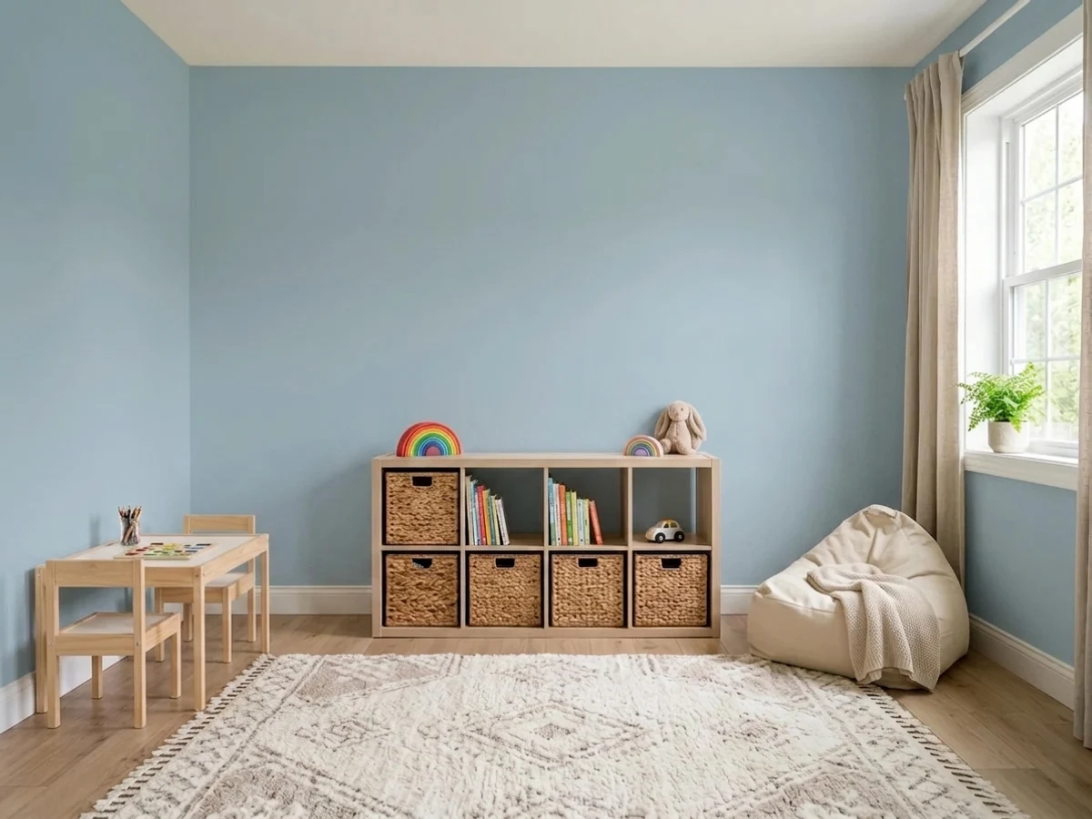
Room painted in Lost in the 80s
Lost in the 80s
Try it in your room →
Top picks · see them in a room

Top Picks for the Blue Playroom

Tap a shade to see the blue playroom in it, then try it on your own room.

Lost in the 80s
#A4C2D2

Calm, focused blue for a play space that needs to wind down at the end of the day.

SEE IT IN YOUR ROOM →

Blue Playroom Color Trends 2026 — What's In, What's Out

On the Way Out
  • Pale Powder Blue EverywhereFaded, washed-out baby blue across every wall now reads generic next to bolder, more saturated 2026 playroom colors.
  • Primary-Color OverloadRooms painted in a jumble of bright primary colors are giving way to a single confident hue with playful accents instead.
  • Sports or Cartoon Theme BlueLiteral team-color or cartoon-character blue schemes are losing ground to color-led rooms that grow with the kids.

The 8 Best Blue Playroom Paint Colors

Every pick below is a real rendered blue playroom, not a chip. The lead color first; the swatches are the full scheme in the photo — walls, furniture, textiles, accent.

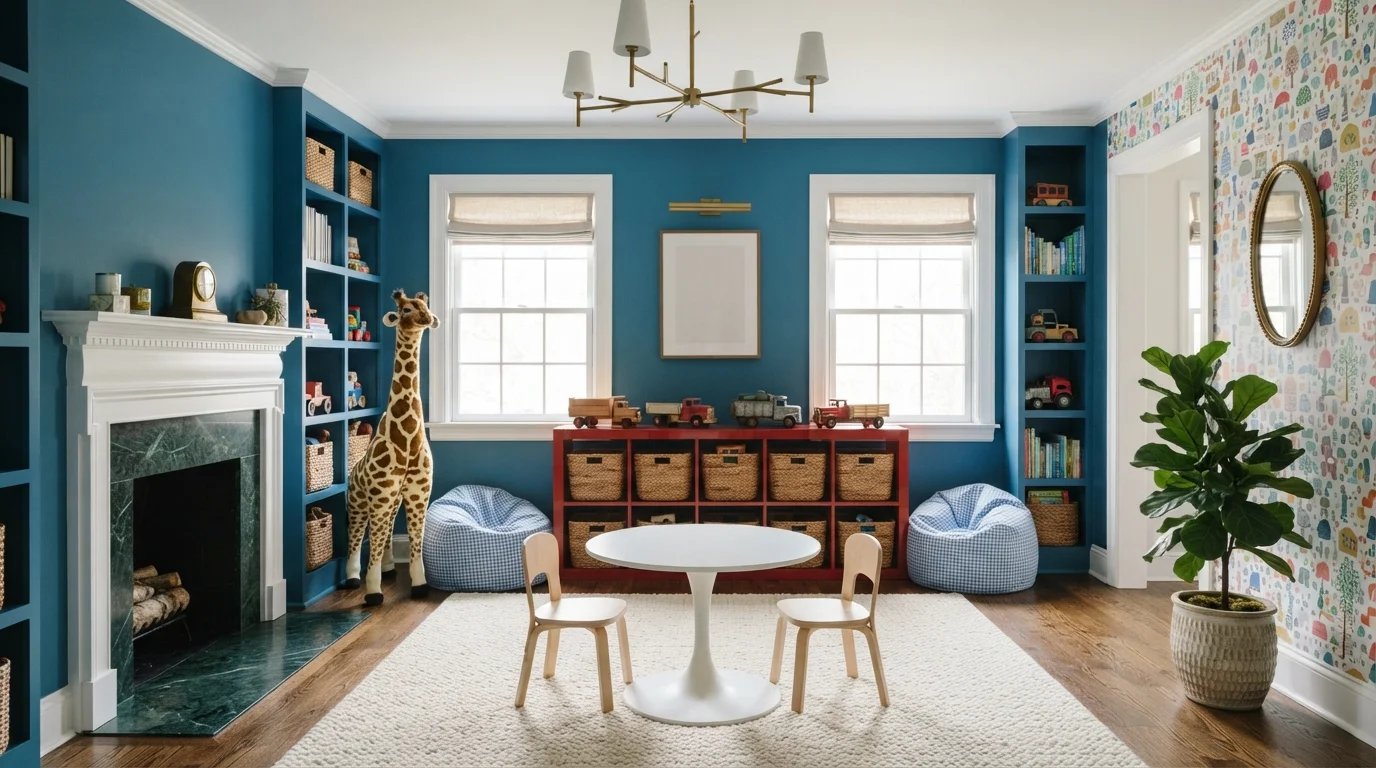
Cobalt Playroom Charm — blue playroom painted in Living Stream
1Living StreamBehr · Cobalt Playroom Charm

Vivid blue built-ins pair with cheerful primary accents and soft natural textures for an imaginative, organized play space.

Cornflower blue is a crisp, energetic medium blue full of character. In this playroom, that lively blue covers the entire wall of custom built-in shelving, while clean white brightens the ceiling, fireplace trim, and central round table. Bright red toy cubbies and patterned beanbag poufs bring punchy contrast over a soft cream rug. The room feels joyful, imaginative, and remarkably tidy. The scheme works because primary colors pop brilliantly against clean white trim and warm wood floors. It is a fantastic choice for families who want a spirited, happy home.

Walls · Behr
Trim · Clare
Accent · Rust-Oleum
Rug · Sherwin-Williams
Cabinet · Valspar
SEE LIVING STREAM ON YOUR WALLS →
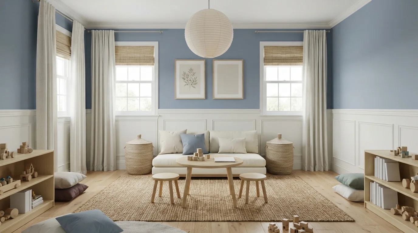
Serene Sky Blue — blue playroom painted in Morris Blue
2Morris BlueValspar · Serene Sky Blue

Soft sky blue walls and creamy textiles create a gentle, sunlit space filled with natural warmth and calm.

Sky blue is a soft, airy pastel with a soothing presence. In this playroom, gentle powdery blue coats the upper walls above classic white wainscoting, paired with a cream sofa, light blonde wood furniture, and a braided jute rug. The room feels quiet, cheerful, and uncluttered. This combination works because cool, gentle tints naturally balance the warm organic tones of woven baskets and raw wood. It is a lovely choice for anyone wanting a restful nursery, play space, or peaceful family lounge.

Walls · Valspar
Trim · Benjamin Moore
Rug · Dutch Boy
Curtains · Valspar
Table · Rodda
SEE MORRIS BLUE ON YOUR WALLS →
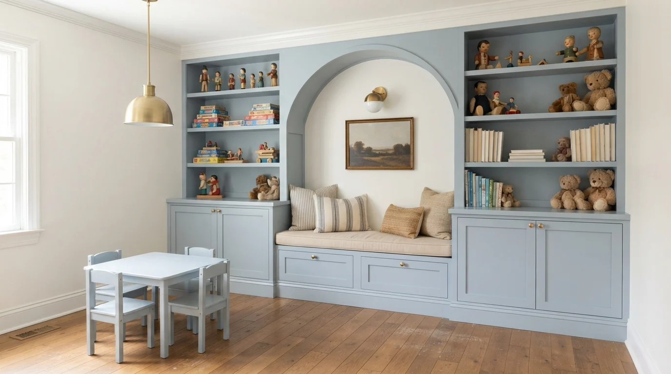
Powder Blue Nook — blue playroom painted in Faded Flaxflower
3Faded FlaxflowerSherwin-Williams · Powder Blue Nook

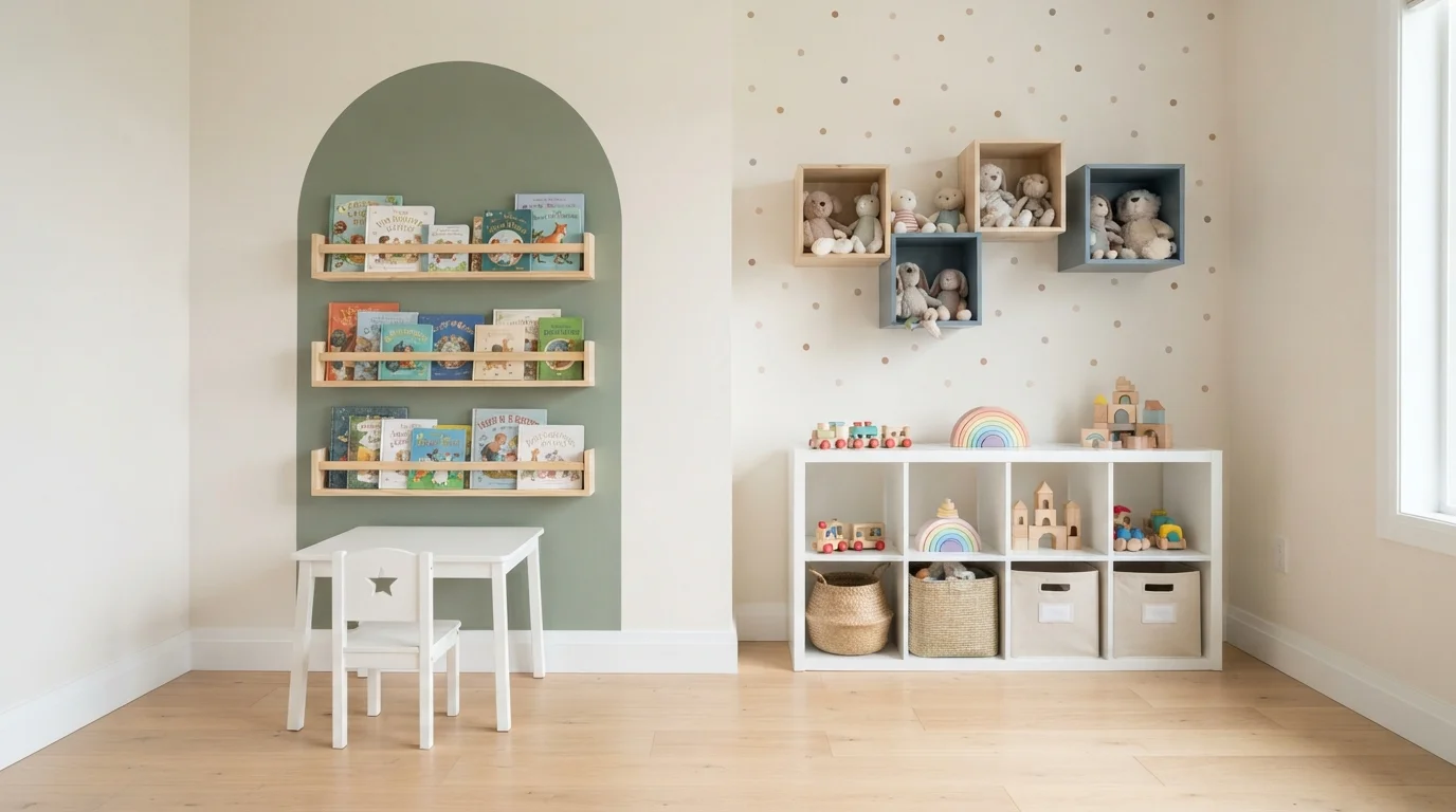
Soft powder blue wraps custom shelving and a cozy arched reading nook for a sweet, peaceful space.

Powder blue is a soft, calming light blue with gentle gray notes. In this space, the soothing blue blankets the entire wall of built-in shelves, lower cabinets, and the matching toddler table and chairs. Crisp white crown molding tops the room, while warm oak floors ground everything below. The space feels incredibly gentle, tidy, and peaceful for both playtime and quiet reading. The combination works because the warm wood floors keep the cool blue paint from feeling chilly. It is perfect for anyone creating a dreamy, organized kids' corner.

Cabinets · Sherwin-Williams
Trim · C2 Paint
Cabinet · PPG / Glidden
Cushions · Dunn-Edwards
Accent · Diamond Vogel
SEE IT ON YOUR WALLS →
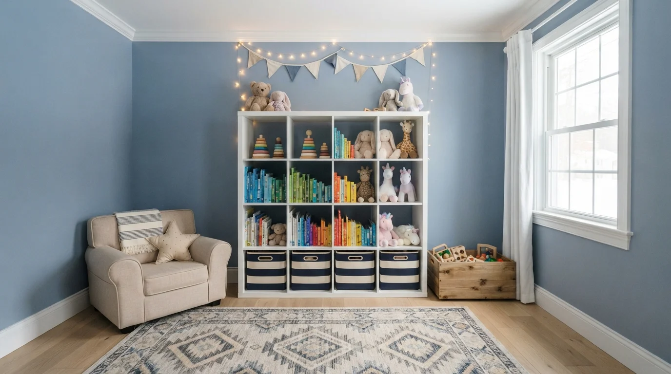
Storybook Sky Blue — blue playroom painted in John's Blue
4John's BlueDiamond Vogel · Storybook Sky Blue

Cheerful sky blue walls and playful storybook colors create a sunny, inviting retreat filled with wonder and joy.

Sky blue is a crisp, friendly shade of light blue that feels like clear daytime skies. In this kids' room, soft blue covers the walls, balanced by a clean white cube bookcase, a cozy cream reading chair, and a patterned rug full of gentle geometric shapes. The room feels joyful, bright, and completely welcoming for everyday play and quiet bedtime stories. Bright pops of primary colors across toys and book spines easily stand out against the calm, cool blue backdrop. It is a wonderful choice for anyone designing a vibrant, imaginative space for little ones.

Walls · Diamond Vogel
Trim · Behr
Cabinet · C2 Paint
Chair · Behr
Curtains · Benjamin Moore
SEE JOHN'S BLUE ON YOUR WALLS →
Muted Slate Playroom — blue playroom painted in Wave Goodbye
5Wave GoodbyeValspar · Muted Slate Playroom

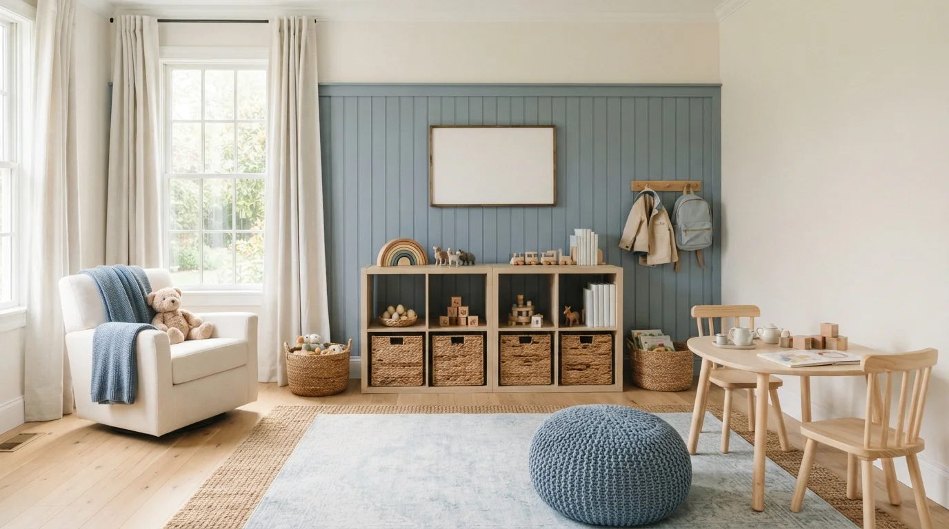
Soft slate-blue paneling and golden afternoon sunlight create a serene, grounded space for everyday play.

Soft slate blue is a gentle, quiet color with cool gray notes. Here, it covers the vertical wood slat wall, balanced by warm cream side walls, light oak furniture, and a faded vintage-style blue rug. The room feels incredibly peaceful and bright without feeling chaotic. The cool blue works because the natural blonde wood and woven jute rugs inject plenty of sunny warmth. It is a fantastic choice for parents who want a calm, organized play space that feels timeless.

Walls · Valspar
Walls · PPG / Glidden
Trim · Behr
Accent · Dunn-Edwards
Cushions · Valspar
SEE WAVE GOODBYE ON YOUR WALLS →
Dusty Blue Playroom — blue playroom painted in North Sea
6North SeaKompozit · Dusty Blue Playroom

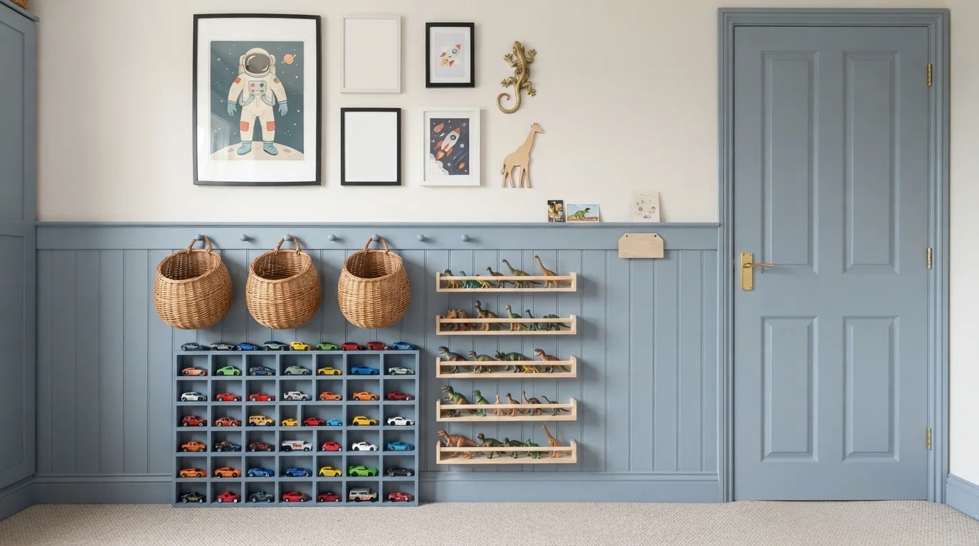
Soft slate blue wainscoting pairs with warm creamy walls to create a neat, imaginative play space full of charm.

Dusty blue is a calm, muted shade of gray-blue. In this playful space, cool slate blue covers the lower wall paneling and interior door, while soft creamy white keeps the upper wall bright and airy. The room feels incredibly tidy, cozy, and cheerful. Splitting the wall horizontally grounds all the colorful toy cars, dinosaurs, and warm wicker baskets without cluttering the eye. It is the perfect setup for anyone looking to organize a kid's bedroom with timeless, storybook character.

Walls · Kompozit
Walls · Benjamin Moore
Trim · Dunn-Edwards
Rug · Benjamin Moore
Accent · C2 Paint
SEE NORTH SEA ON YOUR WALLS →
Dusty Blue Playroom — blue playroom painted in Indigo Dreams
7Indigo DreamsValspar · Dusty Blue Playroom

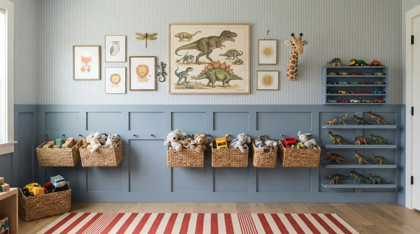
Charming slate blue wainscoting paired with playful toy displays and a bold striped rug creates a wonderfully imaginative kid's haven.

Slate blue is a gentle, dusty grayish-blue with timeless appeal. Here, the lower half of the wall wears muted blue wainscoting with matching custom shelves, while classic blue-and-white striped wallpaper climbs to the ceiling. The space feels cheerful, organized, and effortlessly cozy. The grounded slate blue helps all the colorful toy cars, plastic dinosaurs, and vibrant red striped rug pop without feeling overwhelming. It's a wonderful choice for parents wanting a stylish, storybook playroom that easily grows alongside their child.

Walls · Valspar
Accent · Valspar
Rug · Benjamin Moore
SEE INDIGO DREAMS ON YOUR WALLS →

Blue Playroom Wall Color Combinations

A wall color never works alone. These are the full schemes from the rooms above — the lead color first, then the supporting colors that make the photo work.

Cobalt Playroom Charm
WallsLiving StreamTrimFresh KicksAccentFarmhouse Red
Walls
Living Stream · · LRV 17
Trim
Fresh Kicks · · LRV 94
Accent
Farmhouse Red · · LRV 13

Vivid blue built-ins pair with cheerful primary accents and soft natural textures for an imaginative, organized play space.

TRY THIS PALETTE →
Serene Sky Blue
WallsMorris BlueTrimOxford WhiteRugMitered Edge
Walls
Morris Blue · · LRV 44
Trim
Oxford White · · LRV 87
Rug
Mitered Edge · · LRV 35

Soft sky blue walls and creamy textiles create a gentle, sunlit space filled with natural warmth and calm.

TRY THIS PALETTE →
Powder Blue Nook
CabinetsFaded FlaxflowerTrimArchitectural WhiteCabinetPeace
Cabinets
Faded Flaxflower · · LRV 44
Trim
Architectural White · · LRV 91
Cabinet
Peace · · LRV 43

Soft powder blue wraps custom shelving and a cozy arched reading nook for a sweet, peaceful space.

TRY THIS PALETTE →
Storybook Sky Blue
WallsJohn's BlueTrimWhite GloveCabinetArchitectural White
Walls
John's Blue · · LRV 36
Trim
White Glove · · LRV 91
Cabinet
Architectural White · · LRV 91

Cheerful sky blue walls and playful storybook colors create a sunny, inviting retreat filled with wonder and joy.

TRY THIS PALETTE →

The easiest scheme here is Windmill Wings or Blue Hydrangea on the main walls with crisp white trim and doors — the pale blue does the calming work while the white keeps cubbies, bookshelves, and playsets from disappearing into the wall. For durability where kids actually touch the wall, run Denim as a wainscoting or chair-rail band under Blue Hydrangea or Honolulu Blue: the lighter color keeps the room bright above eye level, and the darker denim blue along the bottom third hides the scuffs and handprints that gather near the floor without repainting.

For a bolder scheme, pair Resolute Blue on the walls with Brilliant Blue on a single accent wall or the door — both are Benjamin Moore/Sherwin-Williams blues in the same family, so the accent reads as a deeper shade of the same color rather than a clash. If the room leans nursery-to-playroom transition, Lost in the 80s on the walls with a warm white trim and honey-toned wood shelving keeps the cool blue from feeling sterile, since warm wood tones are the natural counterweight to any blue this cool.

More Playroom Color Ideas

Set on a color family already? Each page has its own real rooms and picks.

Light or Dark Blue Playroom Colors?

Go Light (LRV 60+) If…

The room is small, faces north, or has to work at every hour. Light warm colors make it feel bigger and stay calm in evening light — the light you actually live in.

Go Dark (LRV Under 20) If…

You want the cocoon effect and the room has real daylight. Dark works best on one feature wall — or fully color-drenched in a large room with good windows.

Go light — Windmill Wings, Blue Hydrangea, or Honolulu Blue, all in the low 60s LRV — if the playroom has one window, sits in a basement, or is small enough that a dark color would eat the sense of space. These pale blues bounce enough light back that the room still reads as open even with shelving, a rug, and a table taking up floor area. Lost in the 80s (LRV 51) is the next step down and still counts as a light-leaning wall color; it's a good pick when you want the room to feel a notch calmer and more settled rather than bright and busy.

Go dark on an accent wall or a lower third of the room, not all four full walls, unless the playroom gets strong natural light. Hyper Blue and Denim (LRV 10 and 14) both read as near-navy on a big wall and will make a windowless or north-facing room feel smaller and dimmer by evening, even though they're excellent at hiding scuffs down low. Brilliant Blue (LRV 15) works the same way — reserve it for a reading nook, a single wall behind a bookshelf, or trim on a play kitchen or bench, where the depth adds focus instead of closing the room in.

VISUALIZE YOUR SPACE

See It. Love It.
Paint It.

Upload one photo of your blue playroom and try every color on this page on your own walls — in your own light, before you buy a drop of paint.

Drag the slider to compare
blue playroom before paintingblue playroom painted in Lost in the 80sLost in the 80sBefore

Sheen And Finish For A Playroom

Satin or eggshell is the right call for playroom walls in any of these blues — both wipe clean with soap and water without leaving the sheen marks that semi-gloss can show on a big wall. If the room sees heavy traffic (toy carts against the wall, a climbing structure, siblings roughhousing), step up to a scrub-rated line in satin rather than jumping to semi-gloss just for durability; the higher gloss shows every roller stroke and wall imperfection under playroom lighting.

Denim and Hyper Blue are the two picks on this page worth putting in a washable, higher-durability line specifically because their whole job is hiding scuffs — that only works if the paint itself can be scrubbed without burnishing or leaving a dull patch. On the pale end, Windmill Wings and Blue Hydrangea don't need to work as hard cosmetically, but they still take more contact than a living room wall, so skip flat and matte finishes here even though they'd suit a formal room.

Common Mistakes In A Blue Playroom

The biggest one is painting all four walls in a low-LRV blue like Hyper Blue (LRV 10) in a room that only gets light from one small window. It looks moody and dramatic on the sample chip and reads as dim and closed-in by late afternoon once the toys, furniture, and rug are all in the room too. Save the darkest picks for an accent wall, a play kitchen, or trim.

The second mistake is skipping a sample test on the cooler picks. Lost in the 80s has a real teal lean under bright daylight, and Resolute Blue and Honolulu Blue will shift noticeably between morning light and evening lamp light. Paint a sample board and move it around the room over a day before committing, especially if the room already has cool-gray flooring — two cool colors stacked on each other can read colder than either does alone.

Where To Use Each Blue

Windmill Wings and Blue Hydrangea are the right choice for the main wall space in almost any playroom — they're light enough to use everywhere without a plan. Honolulu Blue and Resolute Blue work best where you want the color to register as blue, not just a tint, such as a reading corner or the wall behind open shelving.

Denim and Hyper Blue belong at kid height: a lower third of the wall, a bench, cubbies, or a play kitchen, anywhere hands and shoes make contact. Brilliant Blue is a strong single-wall or door color rather than a whole-room choice — it has real depth at LRV 15 and reads best as a deliberate accent. Lost in the 80s suits a room that also needs to double as a wind-down or reading spot, since it's the calmest of the group even at a mid-range LRV of 51.

About Blue Playroom Paint Colors

A playroom has to do two jobs a bedroom never does: hold a lot of activity and still feel calm enough that kids wind down in it at the end of the day. Blue is one of the few colors that pulls that off without going flat or babyish. The palest picks here — Windmill Wings (Benjamin Moore 2067-60) and Blue Hydrangea (Benjamin Moore 2062-60), both around LRV 62-63 — read as a soft, breezy backdrop that keeps a room stacked with bins, easels, and a play kitchen from feeling cramped. That high light reflectance matters most in playrooms, because these are so often bonus rooms, converted dens, or basements with one small window.

For a little more color presence without losing the airy feel, Honolulu Blue (Benjamin Moore 2066-60) is a true sky blue with a playful, happy cast, and Resolute Blue (Sherwin-Williams SW 6507) at LRV 40 is deep enough to feel grounded on all four walls without swallowing the light the way a navy would. Lost in the 80s (Backdrop BD-LO), LRV 51, sits in between — a cool, slightly teal-leaning light blue that Backdrop itself built its nursery palettes around, so it works if the room needs to settle a child down as much as entertain them.

The deeper picks earn their place too, but for smaller doses. Brilliant Blue (Benjamin Moore 2065-30, LRV 15), Denim (Sherwin-Williams SW 6523, LRV 14), and Hyper Blue (Sherwin-Williams SW 6965, LRV 10) bring real saturation and energy, and both Denim and Hyper Blue are picked here specifically because a darker, more saturated color hides crayon marks, scuffed baseboards, and dragged-furniture scars far better than a pale wall does. That is a genuine, practical reason to use a dark color in a room that takes this much abuse — not just a mood choice.

The Questions Everyone Asks

What color should I paint my blue playroom?

If you want one answer, start with the safe picks above — After Rain, Living Stream, Morris Blue, Faded Flaxflower. They read well in any light and survive furniture changes. Then check the light: strong afternoon sun wants a step cooler, a north-facing room wants a step warmer.

what color should i paint a playroom

A light, breezy blue is a safe, popular choice because it keeps the energy up without making the room feel chaotic. Windmill Wings (Benjamin Moore 2067-60) or Blue Hydrangea (Benjamin Moore 2062-60) both work as an all-walls color in nearly any playroom size or light level. If durability matters more than color, Denim (Sherwin-Williams SW 6523) is a stronger pick since its darker tone hides scuffs and marks between repaints.

is blue a good color for a kids playroom

Yes — blue is one of the more reliable playroom colors because the pale end (like Blue Hydrangea or Honolulu Blue, both around LRV 62) reads as cheerful and open rather than dull, while the deeper end (Resolute Blue, Denim) still feels calm instead of stimulating the way a saturated red or orange can. It also doesn't skew as gender-specific as pink or as babyish as pastel yellow, so it holds up as kids get older.

what paint sheen is best for a playroom

Satin or eggshell. Both wipe clean with soap and water, handle crayon and marker better than flat paint, and don't show the roller lines and wall flaws that semi-gloss highlights on a large wall. For the darker, scuff-hiding picks on this page — Denim and Hyper Blue — look for a washable or scrub-rated satin line, since their whole purpose is standing up to daily contact.

should a playroom be a bright color or a calming color

Most playrooms do better split between the two rather than picking one extreme. Use a calming, pale blue like Windmill Wings or Lost in the 80s (Backdrop BD-LO) across the main walls so the room doesn't feel overstimulating all day, then add energy with a bolder accent — Brilliant Blue or Hyper Blue on one wall, a door, or a play kitchen — so the room isn't flat either.

what colors go with blue in a playroom

Crisp white trim is the simplest partner for any blue on this page and keeps shelving and toys from blending into the wall. Warm wood tones — honey oak shelving, a natural wood table — balance out cooler blues like Lost in the 80s or Resolute Blue. For a second color, a soft warm neutral or a muted mustard or blush accent reads well against blue without competing with it.

What two-color combination works best in a blue playroom?

The reliable pattern is a quiet main color plus one deep accent on a single wall. Keep trim and ceiling in one warm white so the two colors are the only event in the room — the combination cards above show complete schemes from real rooms.

What colors make a blue playroom look bigger?

High-LRV, slightly warm colors — LRV 60–75 is the sweet spot. Paint the walls and trim close to the same light color so the corners blur, and keep the ceiling white. Stark cool white actually works against you; it creates hard shadows that show the room's edges.

Ask a Question

Jessica Williams

Not sure what's right for your blue playroom?

Ask Jessica below — every question gets a real reply, usually within a day.