After Rain
Behr's own Color of the Month, reviewed honestly: the light that makes it glow blue-green, the light that flattens it to gray, and what to pick instead.

Jessica has spec'd whites and neutrals for more than 300 rooms and keeps a sample wall of painted drawdowns in her studio. Every color review is checked against real reader rooms in the comments and re-tested when a formula changes. About the testing process →
- 1Resolute Blue40
- 2Honolulu Blue62
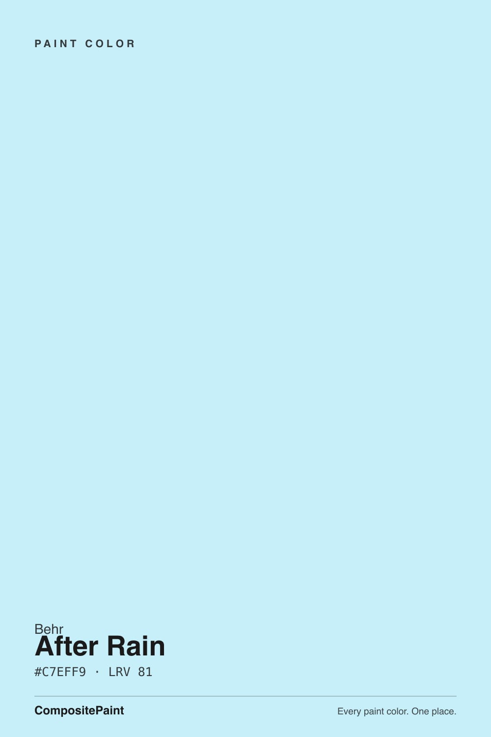
- 3After Rain68
- 4Bashful Blue74
- 5Icy Bay83
The Fast Verdict
After Rain is Behr's idea of the calmest color in the catalog: a pale, cool blue-green with just enough gray in it to stay quiet instead of candy-coated. In good daylight it reads like a clear sky after a storm — soft blue with a green whisper. Pull the light away and the gray takes over, and the color goes from "fresh" to "flat" fast. Behr trusts it enough to sell it across nearly every line it makes — interior walls, cabinet enamel, exterior wood stain, even porch floor paint — which tells you more about this color's range than any marketing copy does.
Nurseries and playrooms with real daylight · kids' bathrooms and powder rooms · a haint-blue porch ceiling or exterior trim accent · anyone who wants color without picking a "statement" color
Your room is north-facing and dim · you want a true saturated blue, not a whisper of one · your floors and trim run warm golden oak · you're painting a big open-plan wall and want the color to hold its ground in every light
- Genuinely versatile — Behr sells the same color across interior walls, cabinet enamel, exterior wood stain, and porch floor paint
- High LRV keeps small rooms bright while still adding real color
- A calm, clear-day blue-green that reads grown-up, not babyish, in a nursery
- Behr's own April Color of the Month pick — genuine brand attention, not just a deck listing
- Classic pale-blue porch-ceiling material if you want that look outside
- Goes flat and gray fast under cool LEDs or in a dim room
- Fights golden oak floors and warm beige trim
- Can wash out to near-colorless in strong direct south sun on a big wall
- Thin online track record compared to a bestseller — sample it big before committing
What Color Is After Rain, Really?
A muted blend of blue and green with a cool undertone that leans slightly toward green, and a faint gray sitting underneath it all — the gray is what keeps After Rain from reading like a nursery-catalog pastel. Behr picked it as a Color of the Month feature on its own Colorfully Behr blog, describing it as a "clear-day hue" built for casual, relaxed rooms, and it shows: this is a color designed to be easy to live with, not a color designed to be noticed first.
At LRV 68 in our deck it sits among the palest colors Behr sells with any real color in it — brighter than a typical off-white wall color, just short of a true near-white like Behr Frost (LRV 93). That height is the whole personality: it never gets heavy or moody, it just tints the light in a room blue-green instead of leaving it neutral. The tradeoff is that a color this pale needs real daylight to hold its identity; take the light away and it thins out fast.
Undertone in one line: blue-green first, gray second, never warm. In bright natural light the blue-green comes forward and the room reads fresh and airy; under softer or artificial light the gray takes over and the color goes quieter and more muted. Both are the same paint — the light decides which one you get.
Where It Shines
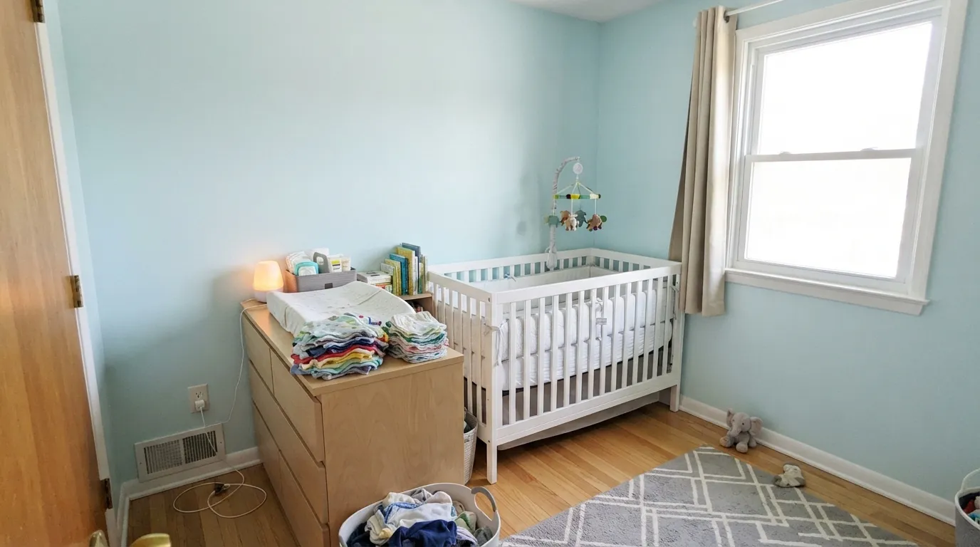
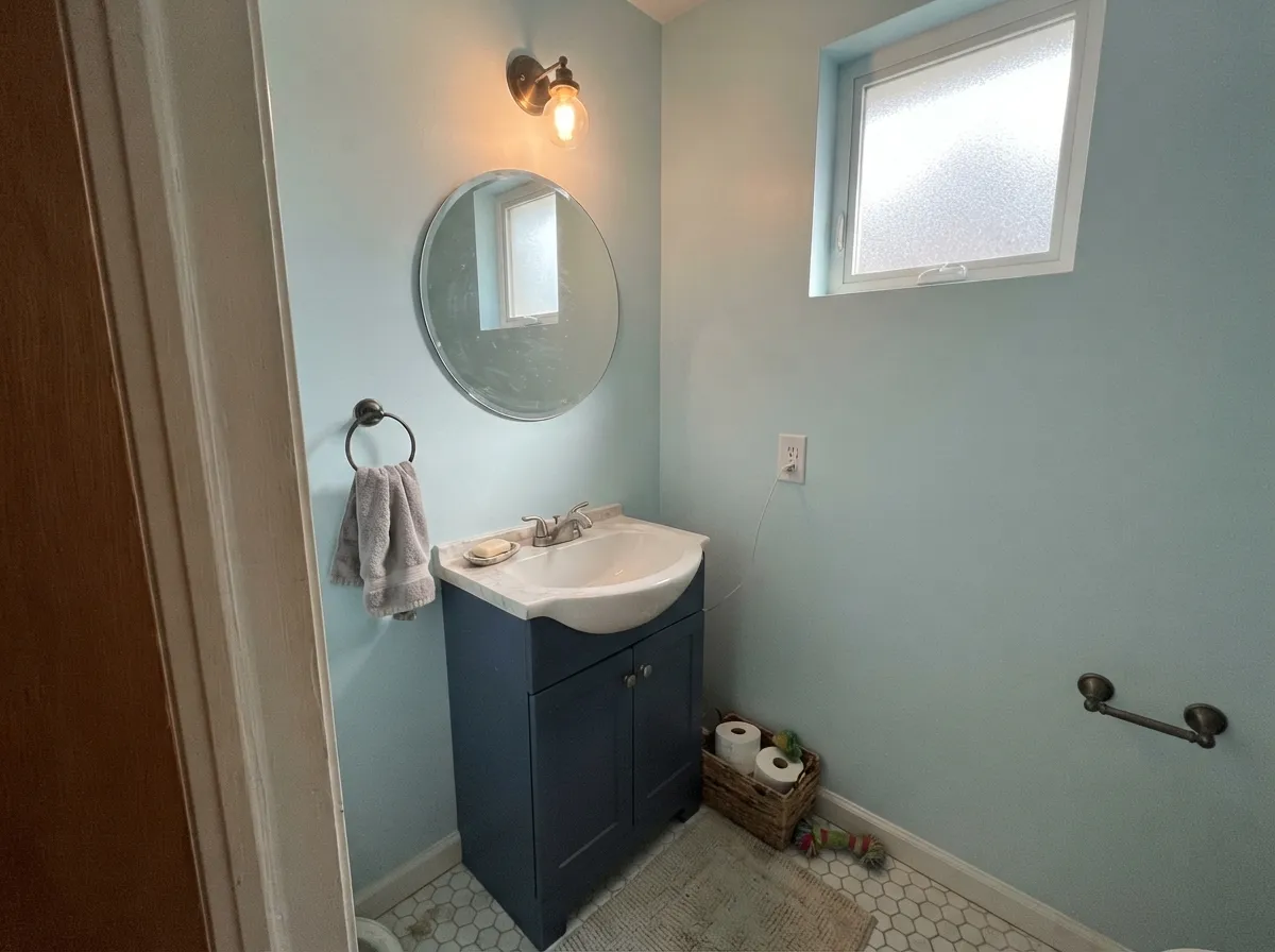
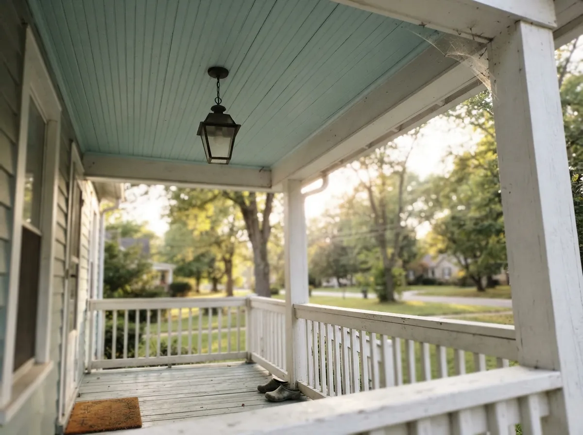
Give it real daylight and a room that wants to feel calm, not decorated, and After Rain does exactly what Behr built it to do. It is a genuine nursery and playroom color — soft enough not to overstimulate, blue-green enough to avoid the sugary pink-or-baby-blue trap — and it does the same job in a kids' bathroom or powder room, where a small dose of pale color reads finished without committing a whole house to blue. Its other home is outside: Behr sells this exact color as house-and-fence wood stain and porch-and-patio floor paint, which is the giveaway that this pale blue-green was built with the old Southern porch-ceiling tradition in mind — sky-colored overhead, calm underfoot.
Where It Fails
Almost every disappointing story with a color this pale traces back to one of three situations, and all three are predictable before the first coat goes on. None of them are the paint failing — they are a pale, light-hungry color meeting a room that can't feed it.
Take away real daylight and the gray in the base takes over completely. Readers who love this color in a sunny nursery report a flat, slightly dull gray-blue in a room that only sees artificial light after dark. Warm 2700K bulbs help; a north-facing room with no daylight at all is not this color's fight to win.
The green-leaning cool undertone argues with anything yellow-warm — honey oak, builder beige carpet, oak trim. Both sides lose: the floor looks more yellow, the wall looks more gray. Pale white oak, gray-washed floors, or a crisp white trim break give it room to read clean.
At LRV 68 there is not much pigment to spare. Strong direct sun can wash a full accent wall out to a near-colorless, chalky pale — the exact opposite of the fresh blue-green the sample chip promised. It is happier as a smaller room's whole-color choice than as one wall competing with a floor-to-ceiling window.
Room by Room
This is the room Behr built it for. Matte or eggshell, real daylight, and it stays calm and fresh without tipping into either "baby pastel" or "cold gray." Pairs easily with white trim and natural wood furniture.
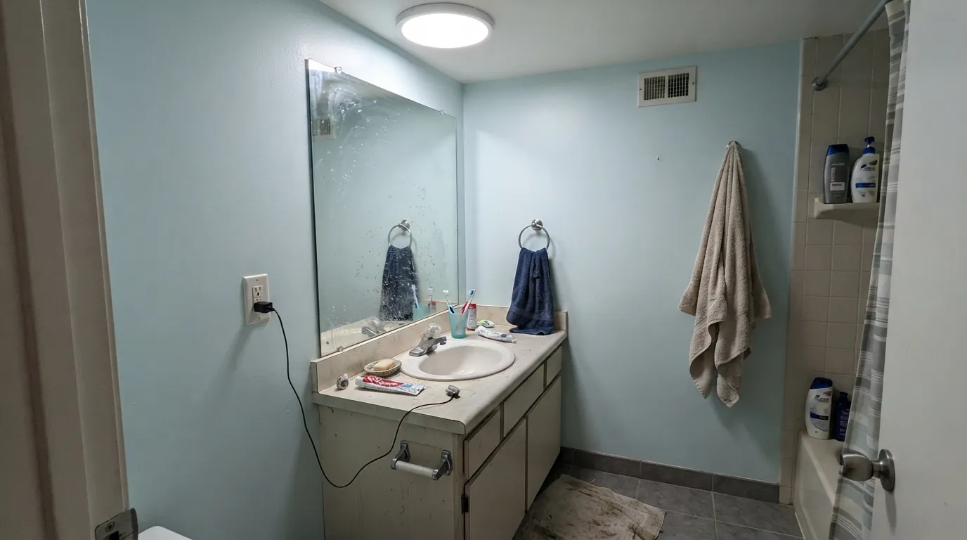
A small room takes a pale color well, and this one reads clean rather than clinical. Satin or semi-gloss for the moisture; white or navy accents keep it from going flat.
Beautiful in a bright east or south room with morning light. In a dim north bedroom it goes quiet fast — step up to a warmer, higher-chroma pale blue if the room stays dark most of the day.
On an island under white cabinets it's a gentle, coastal-leaning accent. A full kitchen in a color this pale reads unfinished rather than intentional unless the light is genuinely excellent all day.
In a closed, bright room it's a fine quiet backdrop. In an open-plan space with mixed light sources and warm wood tones nearby, it has to negotiate too much — pick a color with more body if the room does double duty as the whole main floor.
This is where Behr backs the color hardest, selling it as house-and-fence wood stain and porch-and-patio floor paint. A pale sky-blue porch ceiling over white trim is a genuine regional tradition, and this color is squarely built for it.
Your Light Is the Risk
This is the light Behr photographed it in: the blue-green comes forward and the gray recedes. East or south rooms with soft, filtered sun are its sweet spot.
Take the daylight away and the gray base takes over. Cool white LEDs with no natural light nearby is the combination behind most disappointed reviews of pale colors like this one.
Crisper and more clearly blue-green at midday; softer and grayer as the light drops toward evening. Expect the wall to look like two related colors, not one flat swatch.
Warm 2700K bulbs keep it from going cold after dark. Cool white LEDs push it toward a flatter gray-blue — swap the bulb before you second-guess the paint.
Most complaints about After Rain are a light mismatch. Upload a photo of your actual room and see it on your walls — then ask for the same wall in north light or evening lamps before you buy a single sample.
Need It From Another Brand?
Any paint counter can custom-tint Behr M520-2 directly. If you would rather stay in one brand's own deck, these are the closest stock matches, measured as ΔE2000. Under 2 is a difference you will not see on the wall.
| Brand | Closest color | ΔE | LRV | |
|---|---|---|---|---|
| Sherwin-Williams | SoarSW 6799 · Sherwin-Williams | 3.1 | 70 | Color page → |
| Benjamin Moore | Jet Stream814 · Benjamin Moore | 1.8 | 66 | Color page → |
| Valspar | Lingerie BlueV034-1 · Valspar | 0.4 | 67 | Color page → |
| PPG / Glidden | Magic WandPPG1158-2 · PPG / Glidden | 1.5 | 66 | Color page → |
| Glidden | Clear Blue Sky70BG 70/131 · Glidden | 1.2 | 70 | Color page → |
| Dutch Boy | Glacial Winds138-3DB · Dutch Boy | 1.0 | 69 | Color page → |
Similar Behr Colors
The nearest shades to After Rain within Behr's own range, ranked by perceptual color distance — useful when you want the same look a touch lighter, darker, or warmer.
WCAG 2.1: AA is 4.5 : 1 for normal text, 3 : 1 for large text, AAA is 7 : 1.
After Rain vs the Colors You're Also Considering
Every After Rain sample board has the same rivals on it. The numbers show the real lightness gap — then it comes down to which risk you would rather live with.
Pick this when you want the palest, most sky-leaning version — After Rain reads bluer, Light Drizzle reads greener.
Behr N480-1 · LRV 74Light DrizzlePick this for a slightly deeper, more clearly seafoam-green sibling from the same Behr family.
Pick this for the paler, more light-dependent, more gray-grounded version of the same calm.
Benjamin Moore 2062-60 · LRV 62Blue HydrangeaPick this if you want a powder blue that commits and holds its color even in dimmer light.
Inside the Behr deck the differences are small. First Rain P520-1 at LRV 81 has a slightly bluer hex of #C2F0FC, so it reads a touch less green. Distant Shore S500-1 and Tinted Ice M500-1 both sit at LRV 79, marginally softer and grayer than After Rain's #C7EFF9. At this lightness those gaps only show when two samples touch.
Across brands, Valspar River Mist 5003-9A at LRV 75.9 has a deltaE of 2.06, and Dunn-Edwards Frosty Day DE5826 at LRV 73 comes in at 2.49. Benjamin Moore Teardrop 2060-70 at LRV 79 is 2.81. All three are very close, so sample before you swap one for another, especially River Mist and Frosty Day, whose lower LRV figures mean they give back a little less light.
HGTV Home by Sherwin-Williams Galactic Lite HGSW 1347 at LRV 73 has a deltaE of 3.7. That is close but visibly different side by side, reading duller and less bright than After Rain.
After Rain Coordinating Colors
The rule for coordinating with After Rain: stay cool or neutral, keep it away from anything golden, and let one deeper color anchor the pale blue-green so the room doesn't drift shapeless. These are the partners that keep the color reading intentional rather than accidental:
Why Behr Made It a Color of the Month
After Rain isn't a bestseller with decades of history behind it — it's a working color from Behr's standard fan deck that the brand chose to feature on its own Colorfully Behr blog as an April Color of the Month, described in Behr's own words as a "clear-day hue" for casual, relaxed rooms. That's a smaller kind of fame than a Color of the Year, but it's real: Behr is telling its own customers this is a color worth a second look, not just a swatch buried in a wall of blues.
What earns that spotlight is the balance in the undertone. Most very pale blues either go candy-sweet (too much blue, not enough gray) or go lifeless (too much gray, not enough blue). After Rain sits in the narrow middle, which is exactly why Behr leans on it across so many different products instead of just the interior wall deck.
One Color, Every Surface
The clearest sign this color earns its keep is where Behr actually sells it: interior paint in matte, eggshell, satin, and semi-gloss; a dedicated cabinet-door-trim enamel; house-and-fence exterior wood stain; and porch-and-patio floor paint. That's an unusually wide spread for one color number — most colors in a deck get one or two of those product lines, not all of them.
For a homeowner, that range is genuinely useful: it means you can run the same exact color from a nursery wall to the trim to a porch ceiling outside without ever eyeballing a match between two different paint lines. If you're planning a whole small project — a nursery plus its closet door, or a porch ceiling plus the railing — this is one of the few colors in the Behr deck built to do the whole job in one number.
Three Ready Palettes Built on After Rain
A color is never alone on the wall. These are complete combinations in the 60-30-10 pattern, with the reason each one holds together. Every one opens in the visualizer.
A crisp white keeps the pale blue-green from reading washed-out, and one warm wood-toned piece grounds the room so it doesn't tip into all-pastel. This is the combination Behr itself photographs the color in.
Try this palette in your roomA small room can carry a pale color on all four walls without going flat, and one deep navy piece supplies the anchor the pale blue-green needs so the room doesn't read like it's missing a color decision.
Try this palette in your roomThe classic haint-blue porch move: a pale sky color overhead, a warm off-white siding, and one near-black door to keep the whole front elevation from going soft. Behr sells After Rain in exterior wood stain and porch floor paint specifically for this kind of job.
Try this palette in your roomAfter Rain FAQ
Is After Rain blue or green?
Both, technically — Behr describes it as a muted blend of blue and green with a cool, slightly green-leaning undertone and gray underneath. In bright daylight the blue-green comes forward; in softer light the gray takes over and it reads closer to a quiet gray-blue.
Is After Rain good for a nursery?
Yes — this is the room Behr built it for. It's calm without being babyish, and at LRV 68 it keeps a small room bright. It needs real daylight to hold its color, so a dim, north-facing nursery will read flatter than a sunny one.
What white trim goes with After Rain?
A clean, slightly cool-leaning white — Behr White or Frost — keeps the pale blue-green from looking washed out next to it. A very warm cream trim can pull the wall toward gray by contrast.
Does After Rain work on a porch ceiling?
It's a genuinely strong choice. Behr sells this exact color in exterior house-and-fence wood stain and porch-and-patio floor paint, which is the same pale-sky-blue idea behind the traditional Southern porch-ceiling look.
Will After Rain look too pale on the wall?
In a small room or with real daylight, no — it reads as a genuine, if quiet, blue-green. On a large wall in strong direct south sun, a color this pale (LRV 68) can wash out toward near-colorless. Sample a large piece of poster board on the actual wall before committing to a big room.
Does After Rain clash with oak floors?
With golden honey oak, yes — the cool, green-leaning undertone fights warm yellow wood and both sides look worse for it. Pale white oak or gray-washed floors are a much easier match.
Have you painted with After Rain?
Rate it — one tap helps the next reader decide.
Ask a Question