Light Drizzle
Behr's palest spa aqua, reviewed honestly: the light that keeps it seafoam, the light that turns it hospital mint, and what to pick instead.

Jessica has spec'd whites and neutrals for more than 300 rooms and keeps a sample wall of painted drawdowns in her studio. Every color review is checked against real reader rooms in the comments and re-tested when a formula changes. About the testing process →
- 1Stardew43
- 2Upward57
- 3Light Drizzle64
- 4Glass Slipper70
- 5Spring Thaw83
The Fast Verdict
Light Drizzle is Behr's quiet entry in the pale-spa category every deck seems to need one of: a whisper of blue-green riding at LRV 64, close enough to white that some rooms read it as a soft off-white and others read it as a genuine sea-glass blue. It has never had a real cultural moment — no Color of the Year nod, no viral before-and-after, no design-blog obsession, no forum debates the way its more famous cousins get — though Behr did give it a quiet "Color of the Month" spotlight on its own blog at one point. That is the extent of its fame: a brand pick, not a movement. This is a dependable, unglamorous color that does nursery and bathroom duty well, as long as you give it the right light.
Nurseries and kids' baths · powder rooms and spa-style bathrooms · laundry rooms and mudrooms · anyone who wants a hint of color without committing to a bold teal
Your room runs on cold LEDs with no daylight backup · you want the color to read as an obvious statement, not a whisper · your vanity or floor is honey oak or golden beige · you're chasing a color with a design pedigree, not a workhorse
- Genuinely calming pale seafoam that reads as a color without being loud
- Gender-neutral — a real workhorse for nurseries and kids' baths
- High LRV keeps a room feeling bright while still adding a hint of hue
- Pairs cleanly with white trim, chrome, and brushed nickel
- Widely stocked Behr color at Home Depot — easy to get, easy to match
- Cold LEDs or a dim north room turn it institutional mint
- At LRV 64 it can read almost white in strong daylight — too faint for buyers who wanted a visible color
- Fights honey oak and golden-beige finishes
- No design pedigree — nobody is chasing this one from a magazine spread
What Color Is Light Drizzle, Really?
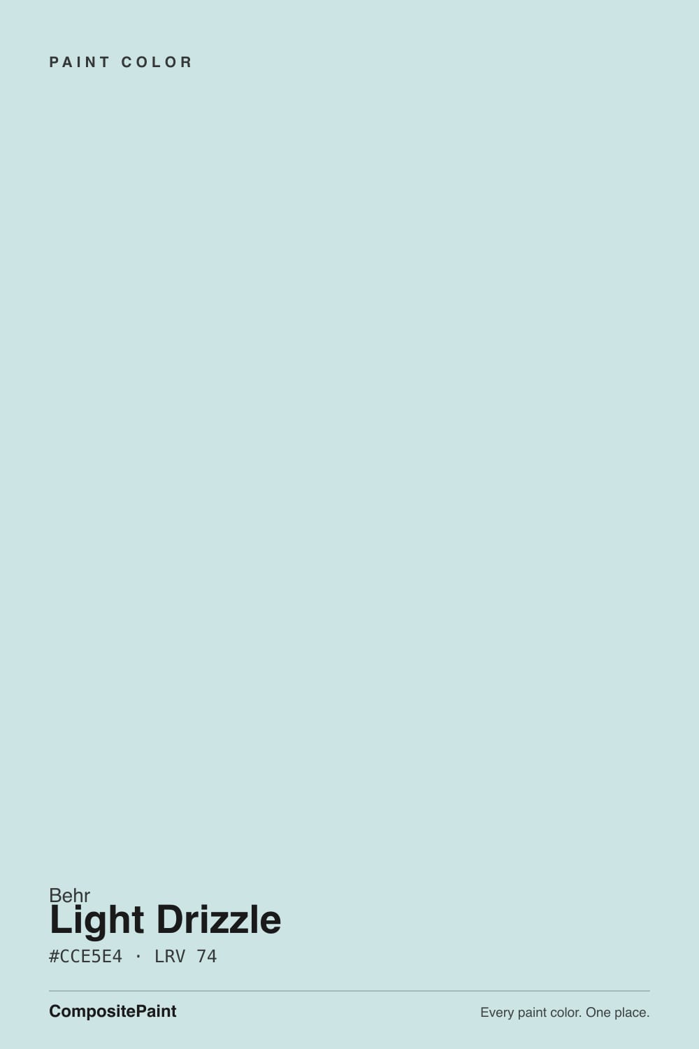
A pale, whisper-of-color paint sitting at the lightest tint step of Behr's blue-green family — its code, N480-1, is basically shorthand for "about as much color as you can add to a white and still call it a shade." It sits almost exactly on the fence between soft sky blue and pale sea glass, and that fence-sitting is the real story, not an inconsistency: Behr's own marketing leans into the rain-and-sky imagery in the name, some independent color databases file it as a cool blue-gray, and its official Behr family placement is on the blue-green side. All of those readings are honest, because at this pale a tint the gap between "blue" and "blue-green" is a couple of points of green channel that daylight, bulb temperature, and screen calibration can tip either way.
At LRV 64 it sits right at the edge where a color stops behaving like a color and starts behaving like a tinted white. That is the whole personality: in a bright, sunlit room it can wash out close to off-white, and buyers who wanted a visible statement color are sometimes disappointed by how faint it reads. Give it flatter, more even light — an overcast day, a north-adjacent room with warm lamps, artificial light at night — and the color comes forward more clearly. It is a color that needs the right conditions to prove it exists.
Undertone in one line: a near-even split between blue and green, tipped just slightly toward green in the deck's own numbers — never a saturated blue, never a saturated green. If your sample looks nearly white, that is strong daylight doing exactly what LRV 64 promises. If it looks flat, clinical mint-gray instead of a soft blue-green, that is cold light — either a north exposure or cool-temperature LED bulbs — pulling the warmth out of it. Both are the same paint being honest about the room, not a bad batch.
Where It Shines
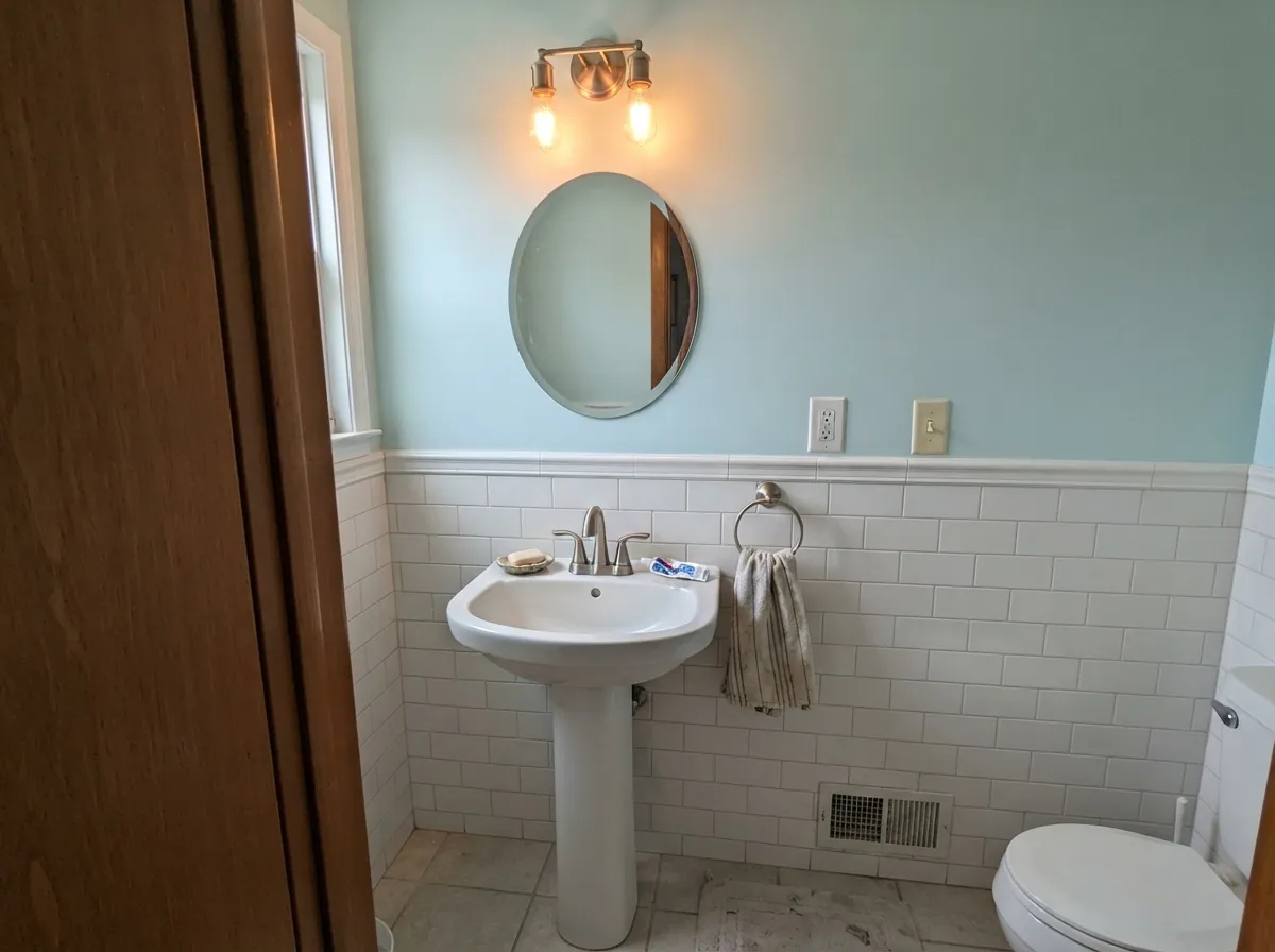
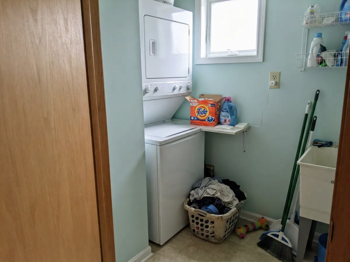
Give it a room with soft, even light — morning sun through a sheer curtain, a lamp at night, an overcast afternoon — and it settles into a genuinely calming pale seafoam. That is exactly the mood nurseries and spa-style bathrooms are built around, which is where this color earns its keep: gender-neutral enough for a nursery nobody wants to repaint at the gender reveal, quiet enough for a bathroom that should feel like a small retreat rather than a design statement. Pair it with white trim, natural wood, and warm metal, and it disappears into the background in the best way — a color that supports the room instead of announcing itself.
Where It Fails
Almost every regret story with a pale spa color like this one follows one of three scripts, and all three are predictable before the first coat goes on. None of them are the paint's fault — but if your room matches one, this is not your color, and a bigger sample will only confirm the problem, not fix it.
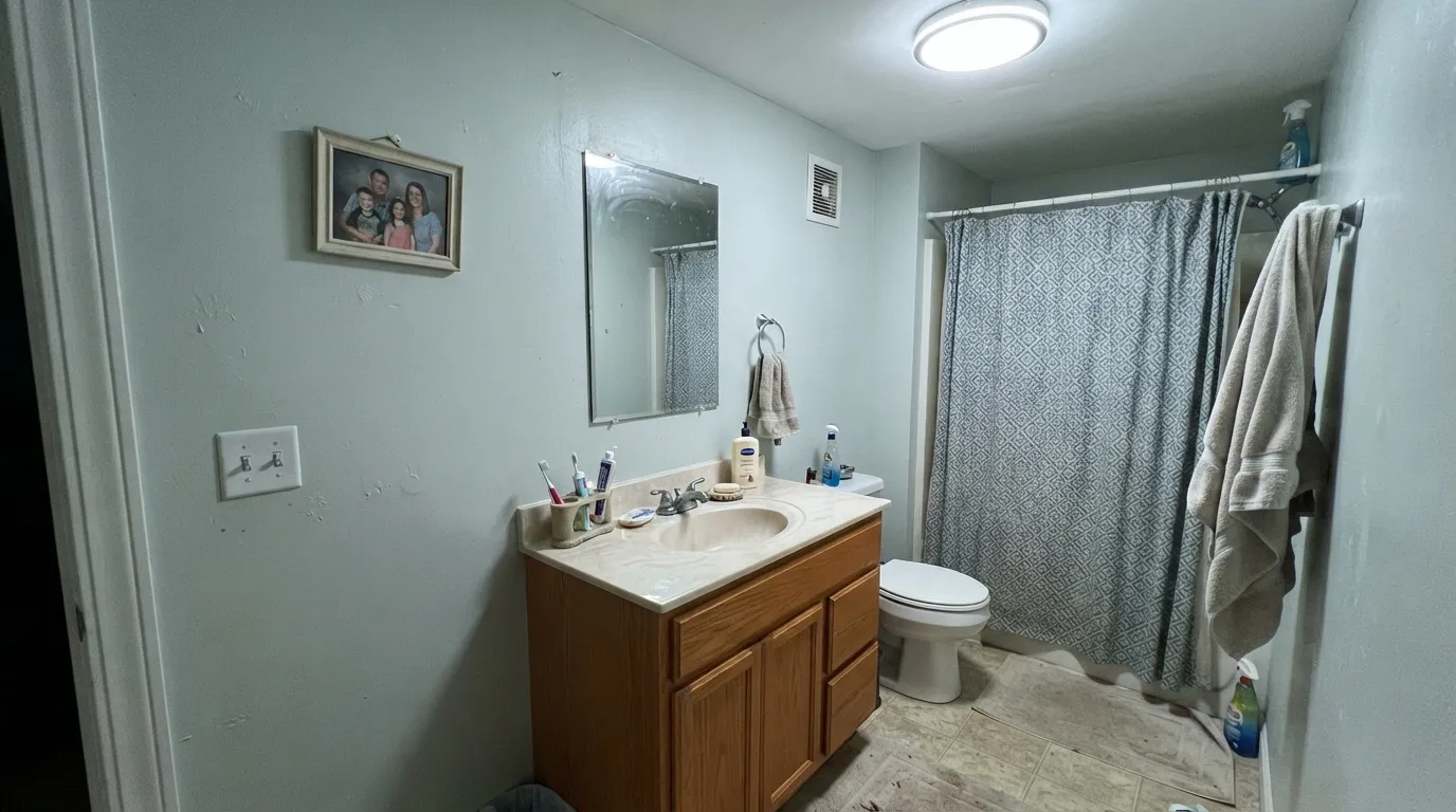
Cool-temperature LED bulbs and a room with weak or no daylight are the single most reliable way to turn this color institutional: the green-blue drains toward a flat, clinical mint that reads more like a hospital hallway than a spa. The paint did not fail; the bulb temperature did. Swap to warm 2700K bulbs before you swap the color.
At LRV 64 this is closer to a tinted white than a bold aqua, and in a bright, sun-filled room it can wash out close to invisible. If you want the wall to clearly say "teal" from across the room, this specific tint is too pale to do that job — look at Behr's own darker cousins in the same hue family, or a color like Sherwin-Williams Sea Salt that sits a full step deeper.
Cool green-blues and warm yellow-orange wood are an old fight, and this color is no exception: a honey oak vanity or golden-beige tile pulls the aqua toward a muddy, slightly sickly cast, and the aqua in turn makes the wood look more orange than it is. Pale white oak, walnut, or painted cabinetry are much safer company.
Room by Room
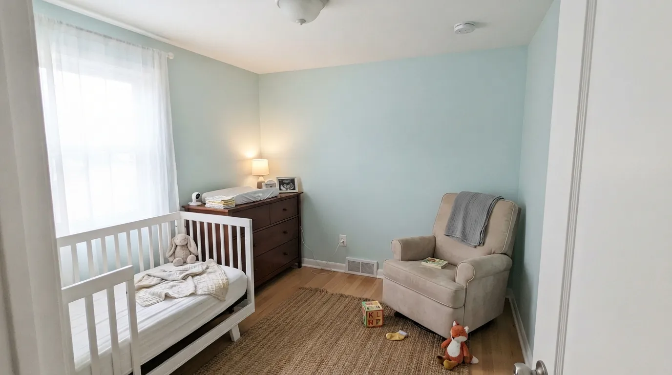
Gender-neutral, calming, and quiet enough to live with for years past the nursery stage. Eggshell wipes clean; White trim keeps the edges soft rather than clinical. Warm lamp light at 3am feeding time is where this color actually gets used most, and it holds up well there.
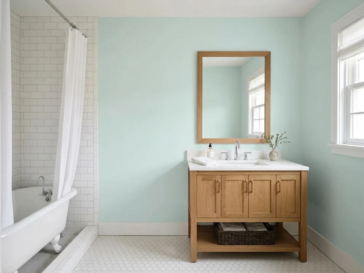
With white subway tile, chrome or brushed nickel, and a warm-bulb vanity light, it reads exactly like the small spa retreat the marketing photos promise. One real makeover swapped it in over a dated eggplant-purple powder room and the space read noticeably brighter and larger — this color's real strength is the contrast with whatever came before, not drama on its own. Satin on vanities and trim for durability; avoid pairing with honey oak cabinetry.
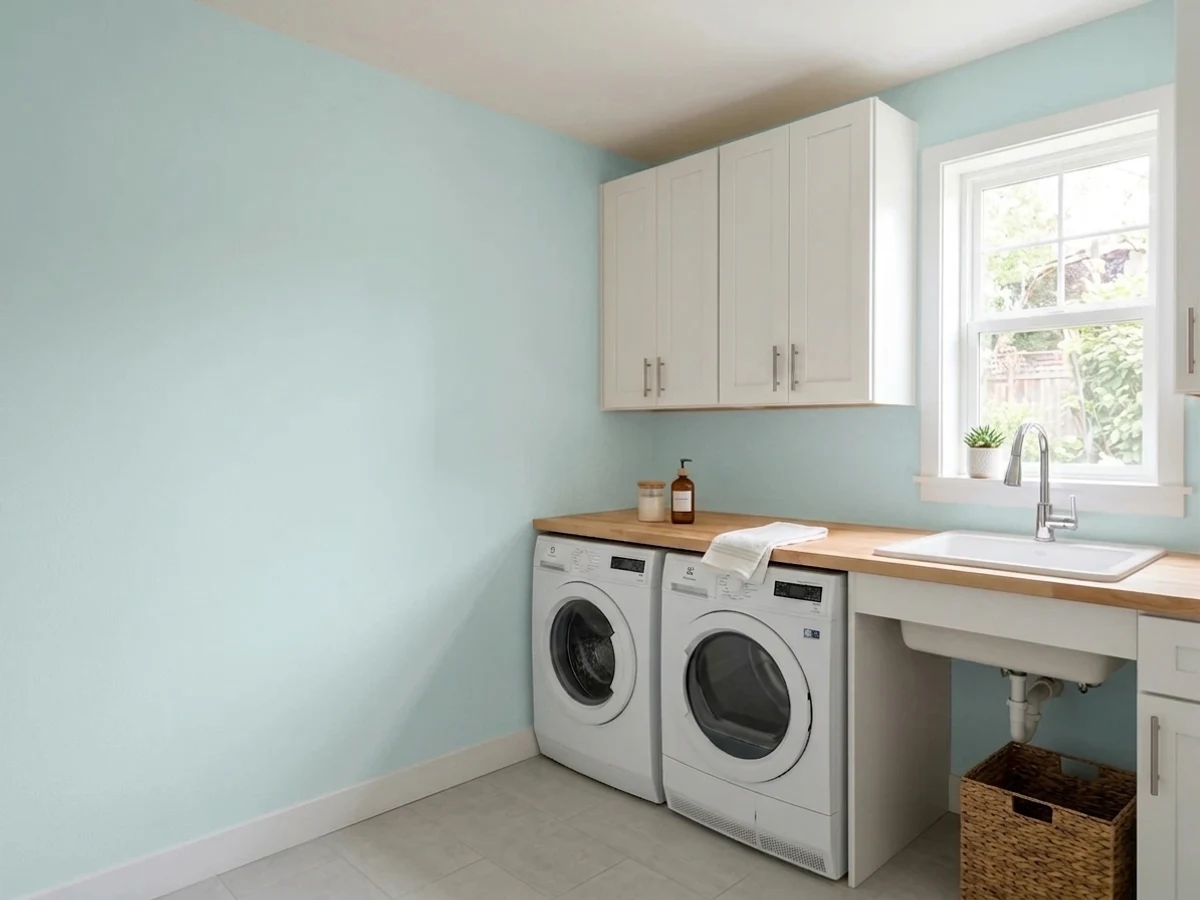
A hint of color without committing a high-traffic utility space to anything bold. It reads as a calm, slightly-more-interesting-than-white backdrop, which is exactly the job most laundry rooms need done.
Lovely in a room with real morning or afternoon sun and warm lamps at night. In a north-facing bedroom with no lamp plan, expect the flat, minty read described above — step up to a deeper, more committed aqua instead, or add warm lighting before you paint.
An island, a pantry door, or open shelving backing can carry this color well against white cabinets. A full kitchen of it fighting honey oak floors or golden-beige counters is the fastest way to a regret story.
Outdoors, strong sun pushes it so close to white that the color mostly disappears, and overcast days can wash it toward chalky gray. It is built for a controlled indoor light situation, not a facade — save it for an interior door or shutters on a covered porch if you want it outside at all.
Your Light Is the Risk
A 2700K bulb at night is this color's best friend: the green-blue softens and glows quietly instead of going cold. The nursery-at-3am light, and the color behaves.
Cool-temperature bulbs or a dim north exposure drain the warmth and leave a flat, clinical mint. The most common disappointment with this color, and the easiest to predict before painting.
At midday in strong sun it washes out close to off-white; the aqua reappears at the edges of the day when the light is softer and more angled.
Warm 2700K bulbs deepen the seafoam and keep it cozy after dark. Cool 4000K+ LEDs flatten it toward gray-mint — the fix is a $6 bulb, not a repaint.
Most complaints about Light Drizzle are a light mismatch. Upload a photo of your actual room and see it on your walls — then ask for the same wall in north light or evening lamps before you buy a single sample.
Need It From Another Brand?
Any paint counter can custom-tint Behr N480-1 directly. If you would rather stay in one brand's own deck, these are the closest stock matches, measured as ΔE2000. Under 2 is a difference you will not see on the wall.
| Brand | Closest color | ΔE | LRV | |
|---|---|---|---|---|
| Sherwin-Williams | LullabySW 9136 · Sherwin-Williams | 2.0 | 65 | Color page → |
| Benjamin Moore | Silver Mist1619 · Benjamin Moore | 0.2 | 62 | Color page → |
| Valspar | Spun Sugar8004-41A · Valspar | 0.9 | 63 | Color page → |
| PPG / Glidden | Sky SplashPPG1037-2 · PPG / Glidden | 2.1 | 63 | Color page → |
| Glidden | Misty Evening Silver30BG 64/036 · Glidden | 0.6 | 64 | Color page → |
| Dutch Boy | Silver Shores430-2DB · Dutch Boy | 1.6 | 63 | Color page → |
Similar Behr Colors
The nearest shades to Light Drizzle within Behr's own range, ranked by perceptual color distance — useful when you want the same look a touch lighter, darker, or warmer.
WCAG 2.1: AA is 4.5 : 1 for normal text, 3 : 1 for large text, AAA is 7 : 1.
Light Drizzle vs the Colors You're Also Considering
Every Light Drizzle sample board has the same rivals on it. The numbers show the real lightness gap — then it comes down to which risk you would rather live with.
Pick this for the lighter, quieter version — Light Drizzle sits closer to off-white and never carries the Sea Salt hype or the search-volume price tag.
Sherwin-Williams SW 6204 · LRV 63Sea SaltPick this for a shade deeper and greener — Sea Salt is the famous version of this same idea, and just as dependent on getting the light right.
Pick this if you're already buying Behr at Home Depot — the color story is close enough that brand loyalty should decide it.
Benjamin Moore 2123-50 · LRV 73Ocean AirPick this for the Benjamin Moore version of nearly the same near-white aqua — practically a twin at LRV 73.
Within Behr the differences are subtle. Absolute Zero N490-1 (#CEE3E4, LRV 74) is the closest, a hair bluer. Ash Blue N470-1 (#CEE6E2, LRV 75) and Seaglass HDC-CT-26A (#D0E6DF, LRV 75) both push green, with Seaglass the greenest of the group. Winterscape M480-2A (#C9E5EB, LRV 74) and Ethereal Mood MQ3-52 (#CAE6EC, LRV 75) go the other way and read as pale blues.
Across brands, Sherwin-Williams Bubble SW 6770 (deltaE 0.83), C2 Mikonos C2-721 (deltaE 0.83), and Dutch Boy Aqua Dreams 133-2DB (deltaE 0.95) are matches, though Bubble's LRV of 77 makes it read slightly lighter on a wall. Valspar Sea Breath 5006-7A (deltaE 1.44) and Glidden Lagoon Green (deltaE 1.47) are visually identical in normal room light.
Kompozit Zircon Ice 0664 (deltaE 2.08), Benjamin Moore Crystal Springs 764 (deltaE 2.39), and Dunn-Edwards Dew Not Disturb DE5708 (deltaE 2.86) are very close, so sample first. Clare Frozen (deltaE 3.81) is close but visibly different side by side.
Light Drizzle Coordinating Colors
The rule for coordinating with Light Drizzle: crisp whites, natural or pale wood, and cool or neutral metals — and keep golden, honey-toned wood at a distance. It sits comfortably next to its own deeper Behr cousins and layers well with other pale pastels when you want a nursery or bath palette that never commits to one "theme" color. These are the partners that keep the pairing honest:
A Quiet Color, Not a Famous One
Light Drizzle has no Color of the Year story and no viral renovation behind it — but it is not completely unmarketed, either. Behr's own blog gave it a "Color of the Month" feature at one point, the kind of modest, brand-driven spotlight most colors in a deck this size eventually get. What it has never had is outside pickup: no design-blog obsession, no influencer wave, and — in a wide search — no real forum debate about it on Reddit or Houzz the way genuinely famous pale spa colors like Sherwin-Williams Sea Salt attract. That absence is useful information for a buyer, not a red flag: there is no hype to live up to, and no internet argument to wade through before you commit.
What that means in practice: you won't find a wall of Pinterest boards built around this exact SKU, and it won't come pre-loaded with a set of Instagram-verified room pairings the way Sea Salt does. What you get instead is a dependable Home Depot color that behaves exactly the way its LRV and hue placement say it should — no hype to live up to, and no hype to be disappointed by.
Light Drizzle With Wood Tones and Metals
Pale white oak, whitewashed or gray-washed floors, and walnut are this color's best company — none of them push hard enough in the warm direction to fight the aqua. Painted white or navy cabinetry sits easily next to it too, which is part of why it works so well in nurseries and powder rooms that lean toward a simple, uncomplicated palette.
Honey oak, golden pine, and orange-toned builder-grade trim are the one real conflict. Yellow-orange and blue-green sit close to opposite each other, and the result is a wall that reads slightly muddy while the wood reads slightly more orange than it actually is — both sides lose. If the honey oak is staying, a large rug or a different color is the safer call.
Metals are easy: brushed nickel, chrome, and matte black all read clean against it. Warm unlacquered brass can work in small doses — a single faucet or light fixture — but a room full of yellow-gold brass hardware will nudge the same fight the honey oak causes.
Three Ready Palettes Built on Light Drizzle
A color is never alone on the wall. These are complete combinations in the 60-30-10 pattern, with the reason each one holds together. Every one opens in the visualizer.
Two pale-to-mid teals from the same Behr family, separated by a crisp white, read as a deliberate spa palette rather than a mismatch. Ultra Pure White stays on trim and ceiling only — its own review flags it as risky across four walls, so it never has to carry that job here.
Try this palette in your roomTwo near-white pastels at almost the same LRV keep the room bright, and pairing a pale pink accent with the pale aqua walls is the classic gender-neutral nursery move — neither color reads as "the" theme color on its own.
Try this palette in your roomA near-black door or hardware finish gives a small utility room one grounded note so the pale aqua and white don't drift into feeling unfinished — three Behr colors that shop and match under one roof.
Try this palette in your roomLight Drizzle FAQ
Is Light Drizzle blue or green?
Green-leaning blue — a true seafoam rather than a sky blue or a pool teal. It never tips fully toward either pure hue, which is part of why it reads as calm rather than as a statement color.
Is it good for a nursery?
Yes, and this is arguably its best job. It's gender-neutral, calming under warm lamp light, and pale enough to live with for years past the nursery stage without feeling like a theme you have to undo.
Will it look white on my walls?
In strong daylight, closer to white than most people expect — that is what an LRV of 64 does. If you want the color to read clearly as aqua from across the room, sample it first in your actual light; overcast days and evening lamp light show the color more honestly than a sunny afternoon does.
What trim white goes with Light Drizzle?
A crisp, cool-leaning white on trim keeps the pale aqua feeling clean — Behr Ultra Pure White or Polar Bear both work. A warm cream trim can push the whole wall toward a slightly muddy, less distinct green.
Does it work with oak floors or a wood vanity?
It depends on the wood tone. Pale white oak and walnut are safe. Honey oak and golden-beige wood fight it — the warm orange in the wood and the cool green-blue in the paint make each other look worse, not better.
What light bulbs should I use with it?
Warm 2700K bulbs, without much debate. Cool-temperature LEDs (4000K and up) are the single fastest way to turn this color from a soft seafoam into a flat, clinical mint — swap the bulb before you consider repainting.
Have you painted with Light Drizzle?
Rate it — one tap helps the next reader decide.
Ask a Question