Glass Slipper
The palest blue-green in the Benjamin Moore deck, reviewed honestly: the light that makes it glow blue, the light that makes it dingy, and what to pick instead.

Jessica has spec'd whites and neutrals for more than 300 rooms and keeps a sample wall of painted drawdowns in her studio. Every color review is checked against real reader rooms in the comments and re-tested when a formula changes. About the testing process →
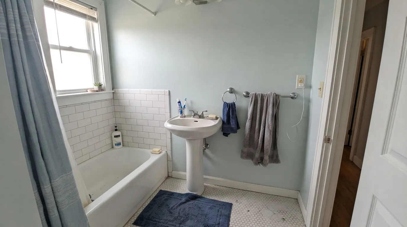
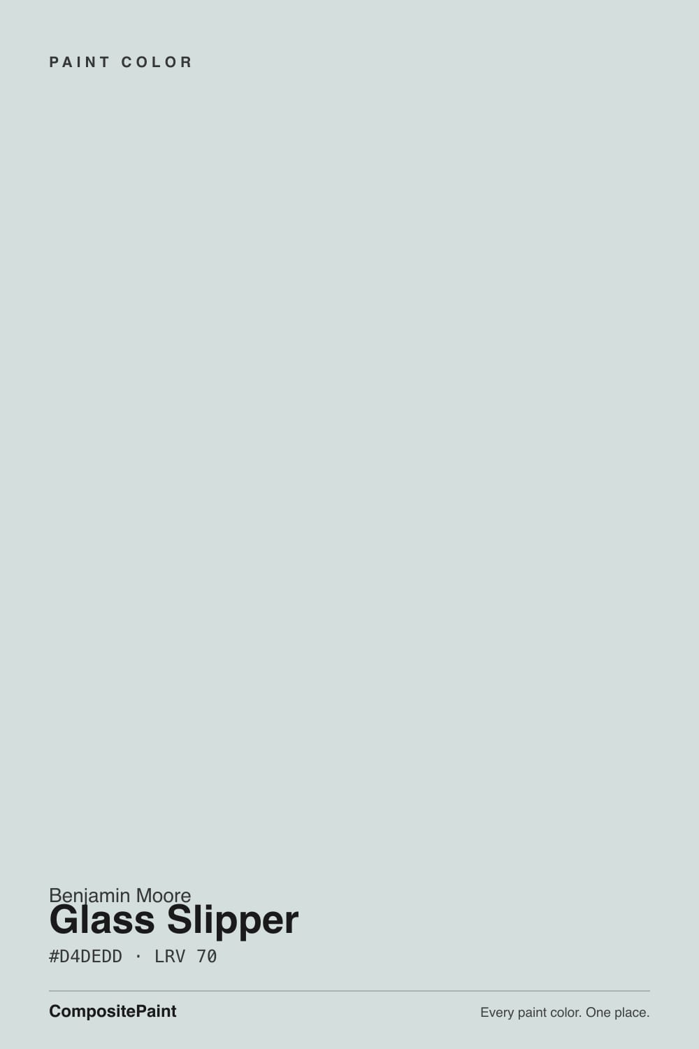
- 1Stardew43
- 2Sea Salt63
- 3Glass Slipper70
- 4Spring Thaw83
The Fast Verdict
Glass Slipper is the quietest, palest member of Benjamin Moore's blue-green family — so pale it barely commits to any of the three colors it can read as. Morning sun turns it a soft sky blue, an overcast north room turns it gray, and strong daylight can pull it toward a watery green. At LRV 70 it is close to a tinted white, which is exactly its appeal and its catch: this is a color for people who want calm and flexibility, not a color for people who want to point at the wall and name it.
Bathrooms and powder rooms that want a spa read · bedrooms that want calm without going full gray · rooms with real daylight from more than one direction · anyone who wants a hint of color without committing to a loud one
You want a color that reads the same every day, in every room · your main light is warm 2700K with little daylight backup · you want a definite, nameable blue or green, not a chameleon · your floors and trim already lean warm gold
- Genuinely calming — blue-green without going cold or empty
- High LRV (70) brightens a room the way a white does, with more character
- One of the deck's best spa-bathroom colors against white fixtures and brass or chrome
- Flexible across coastal, modern, and traditional styles
- Pale enough to pair with almost any warm or cool neutral trim
- Genuinely unpredictable — reads blue, gray, or green depending on the room, which frustrates anyone who wants a fixed answer before they buy
- Warm 2700K bulbs with little daylight turn it dull and slightly dingy
- At LRV 70 it can read as a faint off-white from across a room — not a color for anyone who wants a real blue or green statement
- Honey-oak floors and heavy gold brass fight its cool base
What Color Is Glass Slipper, Really?
A very low-chroma blue-green pulled almost all the way to gray. Benjamin Moore's blue-green family runs from saturated teals down to near-whites, and Glass Slipper sits at the pale end of that ladder — there is real pigment in the can, but so much white is mixed in that the color needs help from daylight to show its hand. That is the whole character of this paint: it does not carry its own mood into a room the way a deeper color does, it reflects the mood the room already has.
At LRV 70 it reflects far more light than any of its blue-green cousins in the BM deck — Palladian Blue sits at LRV 53, Woodlawn Blue at 61, Quiet Moments at 50. Glass Slipper is a full step or more paler than all three, which puts it closer to a tinted white than a real color statement. That is why reviewers keep landing on the same word for it: airy. It brightens a room the way a white does while still giving the eye something softer than a stark white to land on.
Undertone in one line: blue-green first, gray always underneath, and which one wins depends entirely on your light. Morning and south-facing daylight pull the blue forward; a north-facing or overcast room mutes it toward plain gray; strong, bright daylight can occasionally pull it toward a soft watery green. None of those readings is wrong — it is the same paint reporting on three different rooms.
Where It Shines
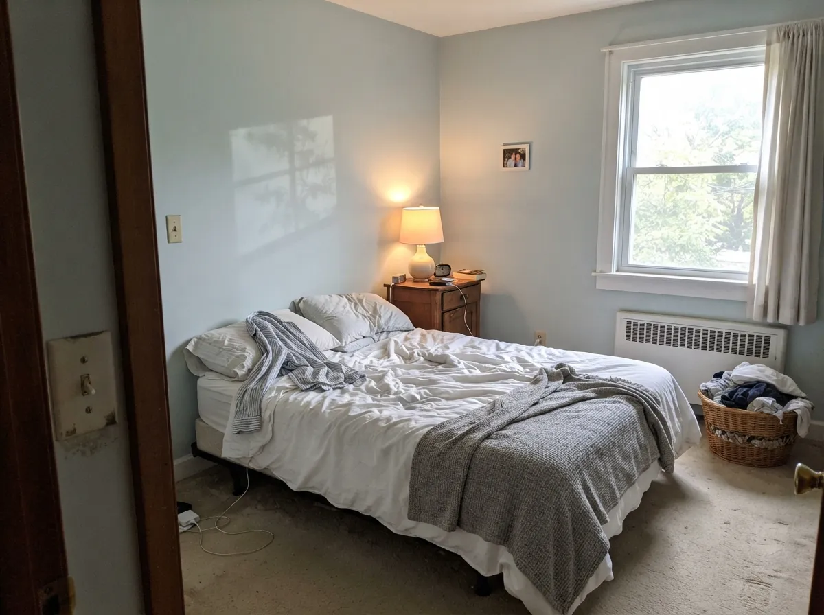
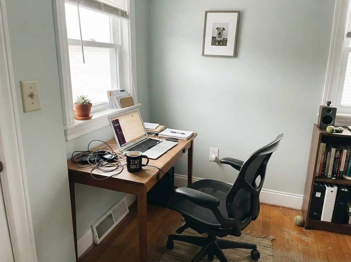
Give it a room with honest daylight and it does exactly what a spa-blue is supposed to do: calm the space down without making it feel cold or empty. Bathrooms are its best-known role — against white fixtures and a bit of chrome or brass it reads clean and a little indulgent, the color equivalent of a bathrobe. It carries the same trick into bedrooms and home offices, where the goal is a room that feels settled rather than decorated, and it flexes easily across coastal, modern, and traditional styles because it never pushes hard enough in one direction to fight any of them.
Where It Fails
The regret stories about Glass Slipper follow one of three scripts, and all three come from the same root cause: this color changes more than most, and people who did not expect that feel misled by their own sample chip.
Yellow 2700K light with little or no window backup drains the blue out and leaves a flat, slightly dingy gray-green — the opposite of the crisp, fresh color the sample promised. This is a genuinely cool-leaning paint; it needs daylight or a cooler bulb to look like itself at night.
Glass Slipper reading blue in the store, gray in your north-facing hallway, and faintly green in your sunroom is not three different paint jobs going wrong — it is the same paint doing what a pale, low-chroma blue-green always does. If you need certainty before you commit, this is the wrong shade; pick something with more pigment and less white in the mix, like Woodlawn Blue or Palladian Blue.
A cool, pale blue-green sitting on top of warm golden-orange wood or a room full of shiny brass creates the same fight every time: the floor looks more orange, the walls look chalkier and colder than they are. It is not a hard rule against wood or brass — walnut, white oak, and a little matte black or brushed nickel are fine — it is specifically the honey-gold combination that turns into a complaint.
Room by Room
Against white tile, chrome, or unlacquered brass it reads clean, quiet, and a little expensive — the classic spa-bathroom move. Eggshell or satin so it wipes down without going shiny.
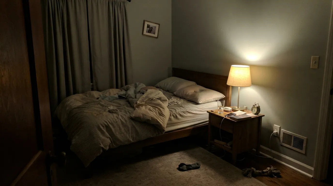
A calm, restful color for a bedroom that gets real morning or south light. In a dim, north-facing bedroom running only on lamps, it can settle into the gray side and lose its point — add a cooler-temperature bulb or accept the grayer read.
Enough color to feel considered on a video call, calm enough not to be distracting. Pairs well on the desk wall with a warm wood surface and a cooler-toned task light.
In a bright, multi-window room it stays lively and shifts pleasantly through the day. In a single-window or heavily shaded room it can read flat; check the actual room at different hours before committing a whole floor to it.
On an island or a breakfast-nook accent wall under white cabinets it is a gentle, coastal note. A full kitchen of it against warm butcher block and brass hardware asks the color to fight its own undertone all day.
Gender-neutral, soft, and pale enough not to overwhelm a small room. Because it shifts with the light, test the actual crib wall at the hours the baby will be in the room, not just midday.
Your Light Is the Risk
Morning and strong daylight pull the blue forward and the color reads fresh, like a clear sky just after fog lifts. Its best and most honest self.
Yellow 2700K light with no window backup mutes the blue-green into a flat, slightly dingy gray. Test the actual room after dark before you commit.
South and east rooms lean blue; north-facing and overcast rooms lean plain gray; strong bright sun can occasionally pull it toward a soft watery green.
Warm 2700K bulbs push it toward muddy gray-green at night. Cool-white LEDs keep the blue-gray crisp but can feel a touch sterile — a mid-range 3000K bulb is the usual compromise.
Most complaints about Glass Slipper are a light mismatch. Upload a photo of your actual room and see it on your walls — then ask for the same wall in north light or evening lamps before you buy a single sample.
Need It From Another Brand?
Any paint counter can custom-tint Benjamin Moore 1632 directly. If you would rather stay in one brand's own deck, these are the closest stock matches, measured as ΔE2000. Under 2 is a difference you will not see on the wall.
| Brand | Closest color | ΔE | LRV | |
|---|---|---|---|---|
| Sherwin-Williams | Dew DropSW 9641 · Sherwin-Williams | 1.1 | 70 | Color page → |
| Behr | River VeilMQ3-50 · Behr | 1.9 | 71 | Color page → |
| Valspar | Pool TileT665 · Valspar | 0.6 | 70.6 | Color page → |
| PPG / Glidden | Winter's BreathPPG1038-3 · PPG / Glidden | 0.8 | 71 | Color page → |
| Glidden | Sea FrostPPG1037-1 · Glidden | 1.5 | 70 | Color page → |
| Dutch Boy | Wales Gray436-1DB · Dutch Boy | 2.3 | 70 | Color page → |
Similar Benjamin Moore Colors
The nearest shades to Glass Slipper within Benjamin Moore's own range, ranked by perceptual color distance — useful when you want the same look a touch lighter, darker, or warmer.
WCAG 2.1: AA is 4.5 : 1 for normal text, 3 : 1 for large text, AAA is 7 : 1.
Glass Slipper vs the Colors You're Also Considering
Every Glass Slipper sample board has the same rivals on it. The numbers show the real lightness gap — then it comes down to which risk you would rather live with.
Pick this for the palest, quietest version of the same mood, closer to a tinted white than a real blue.
Benjamin Moore HC-144 · LRV 53Palladian BluePick this if you want more color and less white — Palladian Blue is the deeper, more confident spa green-blue that Glass Slipper only hints at.
Pick this when you want the palest option in the family and less risk of an unexpected turquoise flash.
Benjamin Moore 1563 · LRV 50Quiet MomentsPick this for a deeper green-gray calm that holds more color at LRV 50 — but watch for its own known turn toward turquoise in bright light.
Pick this for the whisper-quiet version, when even Woodlawn Blue feels like too much commitment.
Benjamin Moore HC-147 · LRV 61Woodlawn BluePick this for a more saturated step in the same blue-green family — a full LRV point darker and easier to spot as color from across the room.
Its closest Benjamin Moore siblings are nearly interchangeable. Glacier Lake 867 at #D3DEDC and LRV 71 and Mountain Mist 868 at #D4DDDC and LRV 71 are the same color for practical purposes. Gray Cloud 2126-60 at #D7DCDE and LRV 70 shifts the lean from green toward blue. Iceberg 2122-50 at LRV 73 and Ocean Air 2123-50 at #D3E1E1 and LRV 73 are both brighter and more openly aqua, while Bunny Gray 2124-50 at LRV 69 is the most neutral.
Across brands the matches are tight. Behr White Metal N520-1 at deltaE 0.52, Valspar Pool Tile T665 at 0.57, and PPG and Glidden Winter's Breath PPG1038-3 at 0.76 all stand in directly. Sherwin-Williams Dew Drop SW 9641 at deltaE 1.14 and Glidden Sea Frost PPG1037-1 at 1.52 are visually identical in normal room light. Dunn-Edwards Cold Water DE6316 at 2.29 and Clare Headspace PNT100-LT-34 at 2.57 are very close, so sample first. Farrow and Ball Blackened No. 2011 at 4.61 is close but visibly different, with far less green.
Glass Slipper Coordinating Colors
The rule for coordinating with Glass Slipper is simple: keep trim and neighbors warm-soft rather than stark, and keep wood and metal tones on the cooler or neutral side. It pairs easily with the rest of Benjamin Moore's blue-green ladder for a tonal look, and with warm off-whites for trim that doesn't fight it. These are the partners that keep showing up in rooms that work:
A Quiet Workhorse, Not a Famous One
Glass Slipper has never been a Color of the Year and it doesn't have a viral before-and-after moment attached to its name. It sits quietly in Benjamin Moore's large blue-green family, well below flashier siblings like Palladian Blue, doing steady work in bathrooms and bedrooms without asking for attention — the kind of color a designer reaches for specifically because a client wants 'something calm, not a statement.'
That honest obscurity is not a knock against it. Colors this pale and this light-dependent rarely become famous, because fame in paint tends to go to colors with a clear, repeatable identity — the ones a magazine caption can name in one word. Glass Slipper's whole appeal is that it refuses to be pinned to one word, which makes it a poor fit for a trend story and a genuinely good fit for a real house.
Glass Slipper With Wood Tones and Floors
Cool and neutral wood tones are this color's best company. White oak, gray-washed floors, and walnut all sit comfortably against the pale blue-green because they don't fight its cool base — walnut in particular gives the room a grounded, slightly coastal-traditional feel that flatters the paint's quiet character.
Honey oak is the pairing to test carefully, and in most cases to avoid. Golden-orange wood sits on the opposite side of the color wheel from a cool blue-green, so the two tend to argue: the floor reads more orange, the wall reads chalkier and colder, and neither side looks as good as it would alone. If a honey-oak floor is not going anywhere, a large warm-toned rug between it and the walls does more good here than almost any other fix.
Three Ready Palettes Built on Glass Slipper
A color is never alone on the wall. These are complete combinations in the 60-30-10 pattern, with the reason each one holds together. Every one opens in the visualizer.
White Dove keeps the trim and vanity soft instead of stark, so the pale blue-green stays the focus; Wrought Iron on the mirror and fixtures gives the room the one sharp, dark note a spa palette needs so it doesn't wash out.
Try this palette in your roomCloud White trim keeps the room from feeling clinical, and Van Deusen Blue on a single accent wall or furniture piece gives the pale walls a real anchor of color — the deep navy is what makes the pale blue-green read as a deliberate palette instead of an accident.
Try this palette in your roomSimply White brightens the trim and shelving without competing with the wall color, and Chelsea Gray on a desk wall or cabinet base gives the room the weight a home office needs so it reads focused, not floaty.
Try this palette in your roomGlass Slipper FAQ
is glass slipper blue, green, or gray?
All three, depending on your light — that is the honest answer, not a dodge. It is a genuine blue-green pigment diluted almost to gray, so morning and south light pull the blue forward, north and overcast light push it toward plain gray, and strong bright daylight can occasionally pull it toward a soft watery green. If you need one fixed color, this is not it; if you like a color that keeps things interesting, it is a good one.
what trim white goes with glass slipper?
White Dove or Cloud White both work well — their soft warmth keeps the trim from feeling stark against the cool wall color, which reads better than a bright, blue-white trim fighting for the same cool space. Simply White is the better pick if you want the trim to read brighter and cleaner.
is it good for a bathroom?
It's one of the deck's best-known bathroom picks. Against white fixtures and chrome or unlacquered brass it reads clean and a little spa-like, and at LRV 70 it still keeps a small bathroom feeling bright rather than closed in. Use eggshell or satin so it wipes down easily.
does it work with honey oak floors?
Not comfortably. Honey oak and other golden-orange wood tones sit opposite this cool blue-green, so the floor tends to look more orange and the walls look chalkier and colder than they actually are. Walnut, white oak, and gray-washed floors are much better partners.
how does it look under LED vs. warm bulbs?
Warm 2700K bulbs with no daylight backup push it toward a dull, slightly dingy gray-green — this is a genuinely cool-leaning color and it shows at night under warm light. Cool-white LEDs keep the blue-gray crisp but can feel a little sterile; a mid-range 3000K bulb is the usual middle ground.
is glass slipper too plain — does it just read as an off-white?
From across a room, sometimes, yes — at LRV 70 it is close to a tinted white and will not announce itself the way a deeper blue-green does. That is by design: it is a color for people who want a hint of calm, not a color for people who want a wall you can point to and name. If you want something unmistakably colored, look at Woodlawn Blue or Palladian Blue instead.
Have you painted with Glass Slipper?
Rate it — one tap helps the next reader decide.
Ask a Question