Cloud White
Benjamin Moore's classic millwork white, reviewed honestly: where the cream flatters a room, the exact kitchens where it turns yellow, and what to buy instead.

Jessica has spec'd whites and neutrals for more than 300 rooms and keeps a sample wall of painted drawdowns in her studio. Every color review is checked against real reader rooms in the comments and re-tested when a formula changes. About the testing process →


- 1First Star69
- 2Classic Gray74
- 3Cloud White85
- 4Chantilly Lace91
- 5Ultra Pure White97
The Fast Verdict
Cloud White is a warm white that does not hide its warmth. On trim, doors and cabinets that is exactly the point — it makes painted woodwork look soft and finished instead of plastic-bright. On four big sunny walls, or beside a cool white quartz counter, the same cream is the thing people complain about. Match it to a warm room and it is close to perfect; drop it into a cool one and you will see yellow.
Trim, doors and millwork in a warm-toned house · kitchen cabinets with brass and wood · ceilings over warm walls · north-facing rooms that need warmth without beige
Your counters are cool gray marble or bright white quartz · your trim will stay a brighter white · the room bakes in west sun all afternoon · you want a crisp gallery look
- Warm and finished on trim — makes woodwork look painted, not plastic
- LRV 85 keeps dim and small rooms bright while still showing real color
- Softens orange-leaning oak floors instead of amplifying them
- Hides fingerprints and dust on cabinets better than a bright white
- Flatters brass, bronze, butcher block and every warm wood tone
- Reads openly yellow on big wall planes in strong afternoon sun
- Looks dingy next to cool gray marble, white quartz and white appliances
- Any brighter white beside it makes it look dirty
- On four matte walls in a dim room it flattens out — too little pigment to catch light
What Color Is Cloud White, Really?
This is a cream, not a neutral. Most off-whites hide their warmth behind a drop of gray so the wall reads simply calm; Cloud White does the opposite and lets the yellow sit right on the surface, over a very soft taupe base. That is why it built its reputation on millwork. On a narrow band of trim or a door panel, visible warmth is a feature — the woodwork looks painted and old-house correct instead of factory white. Spread the same paint across four big walls and that feature becomes the loudest thing in the room.
At LRV 85 it reflects most of the light that hits it, so brightness is never the problem. Brightness is also not the thing that separates it from its rivals: White Dove sits at the same LRV, so the two are equally light and the entire difference is temperature. The real gap is against the crisp whites — Chantilly Lace at 92 and Simply White at 91 are both a clear step cleaner, and next to either of them Cloud White stops looking white and starts looking ivory. Whites are only ever judged against their neighbors.
Undertone in one line: warm yellow over a faint taupe — never pink, never green. If it looks dingy on your wall, look at what is next to it, because a cool white counter or a brighter trim white will do that to it every time.
Where It Shines
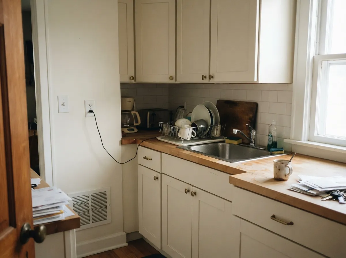
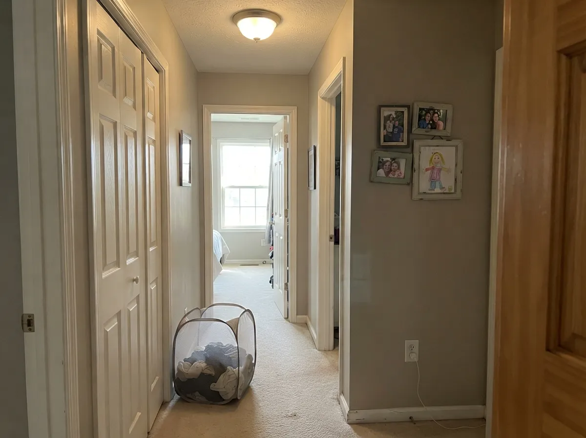
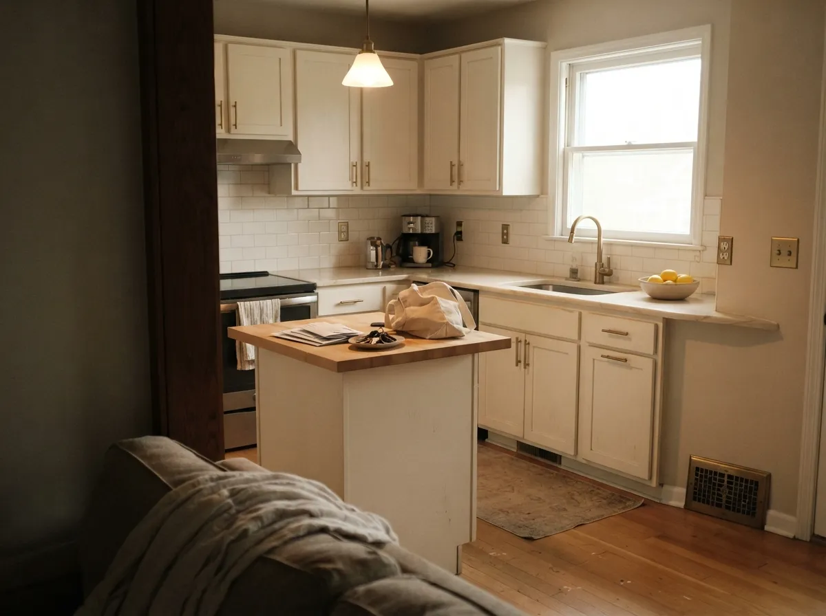
Give it warm company and it is hard to beat. Trim, doors and cabinets are its home turf, and warm wood floors, brass hardware and butcher block all meet it halfway. In a north-facing room it does its quietest good work: the cool daylight trims the yellow back and leaves a soft white that still feels warm.
Where It Fails
The bad reviews for Cloud White are remarkably consistent, and none of them are about the paint failing. They are all about the room it went into. If yours matches one of these three, buy a different white now instead of repainting later.
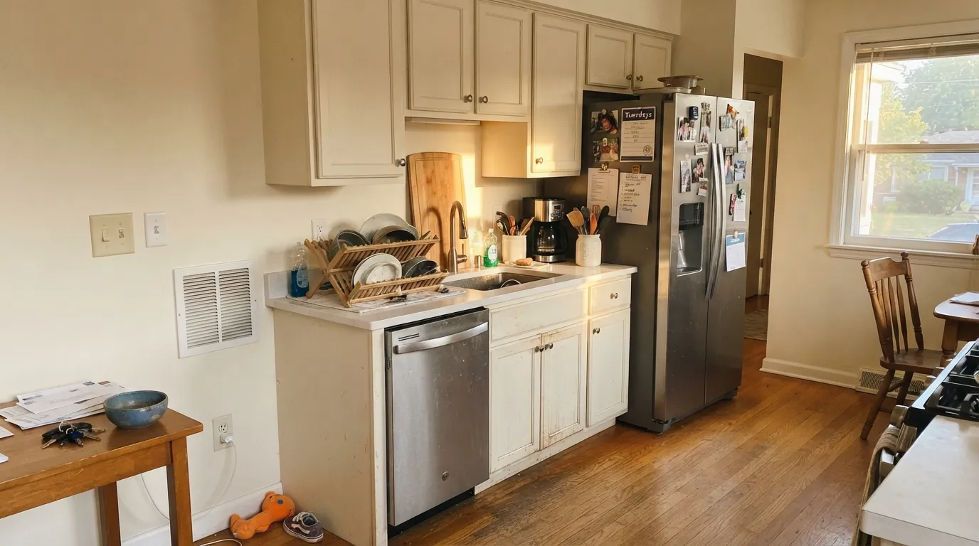
This is the single most common complaint, almost word for word: walls and trim both in Cloud White, and the kitchen just reads yellow-y. Stainless, white appliances and cool white quartz sit at the opposite temperature and push the cream forward all day. Use Simply White OC-117 instead — it is the color people actually switch to after this happens.
Cloud White walls under builder-white trim, or under a stark white ceiling, is a pairing mistake. The brighter white wins and the walls look yellowed and slightly dirty. Keep the room in one family: White Dove OC-17 trim reads as a match rather than a contrast, or move the walls up to Simply White OC-117 and use Cloud White on the trim.
Carrara-type stone and gray-veined quartz are cool, and the warm-over-taupe base of Cloud White looks dingy beside them. This is the bathroom that gets repainted. With cool stone, pick a clean white like Chantilly Lace OC-65 and let the marble be the soft one.
Room by Room
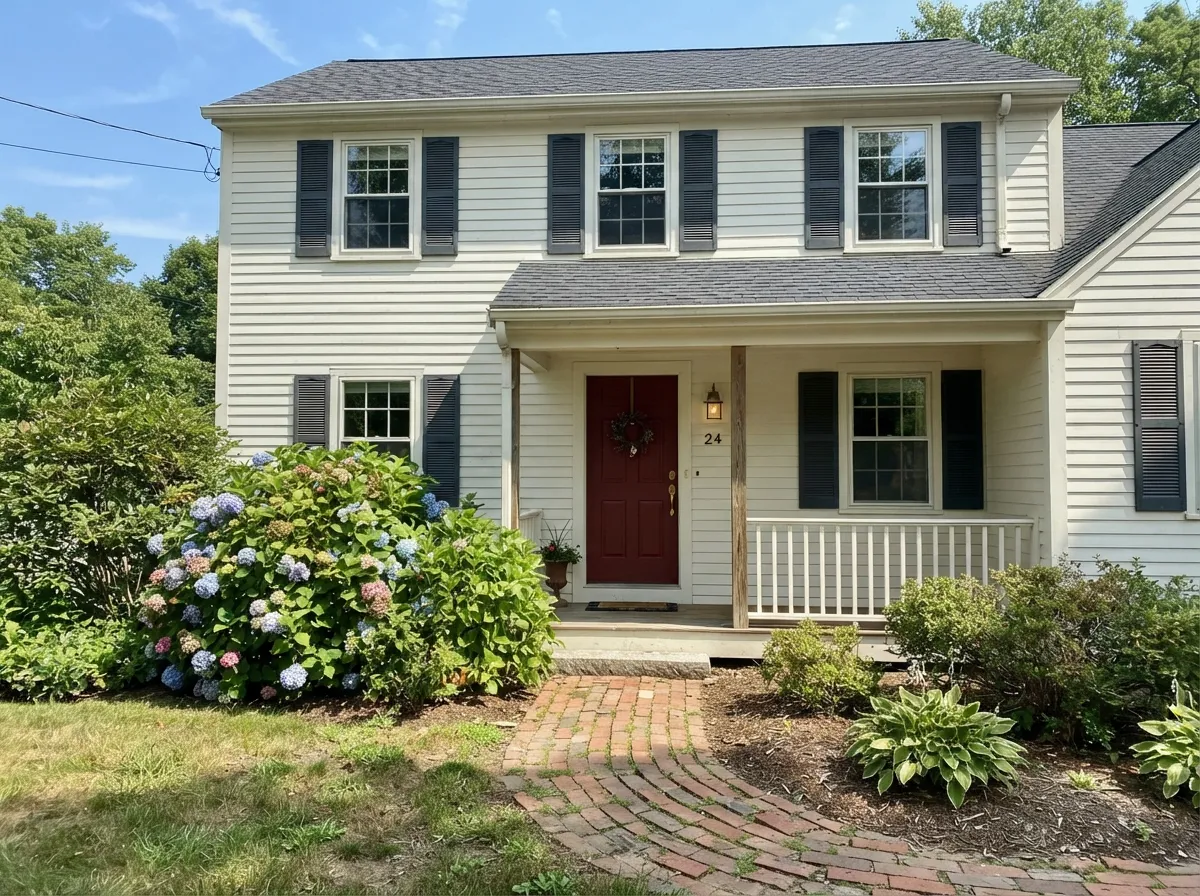
Your Light Is the Risk
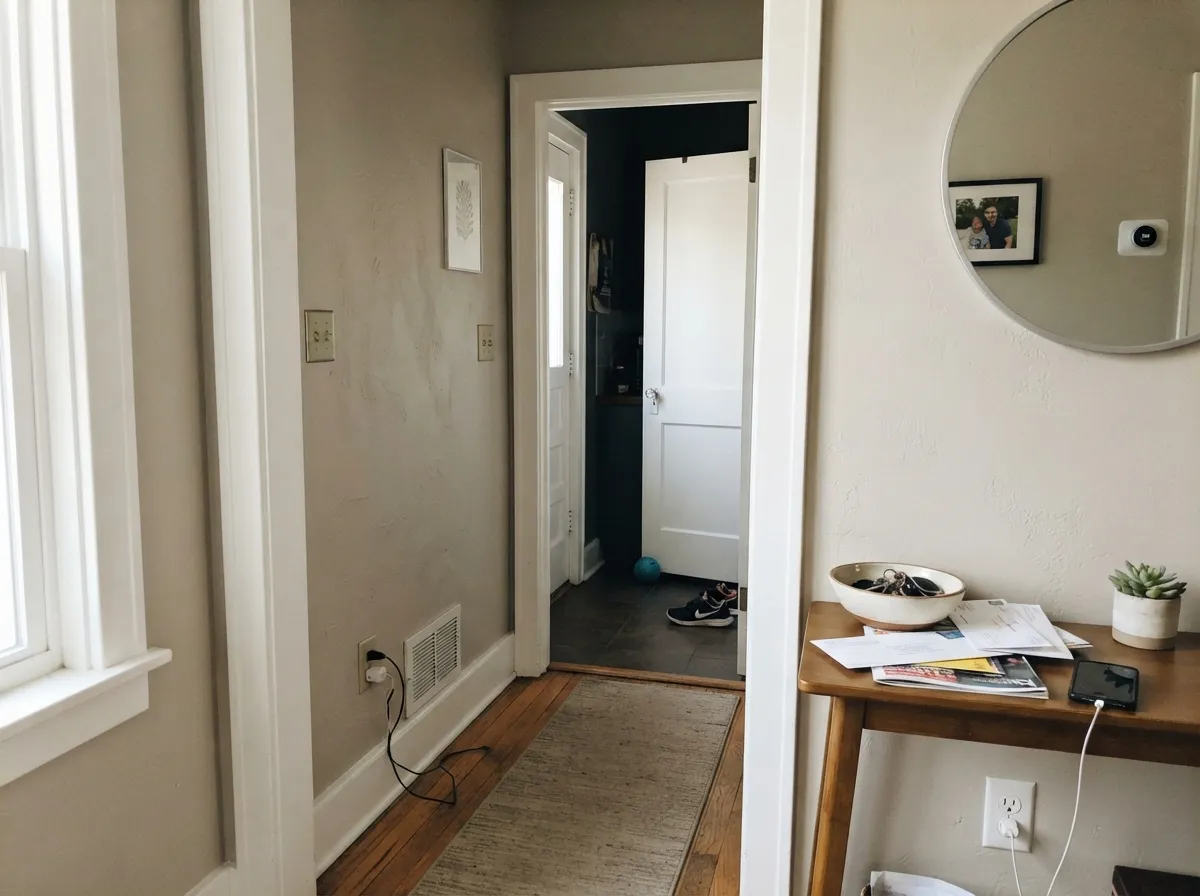
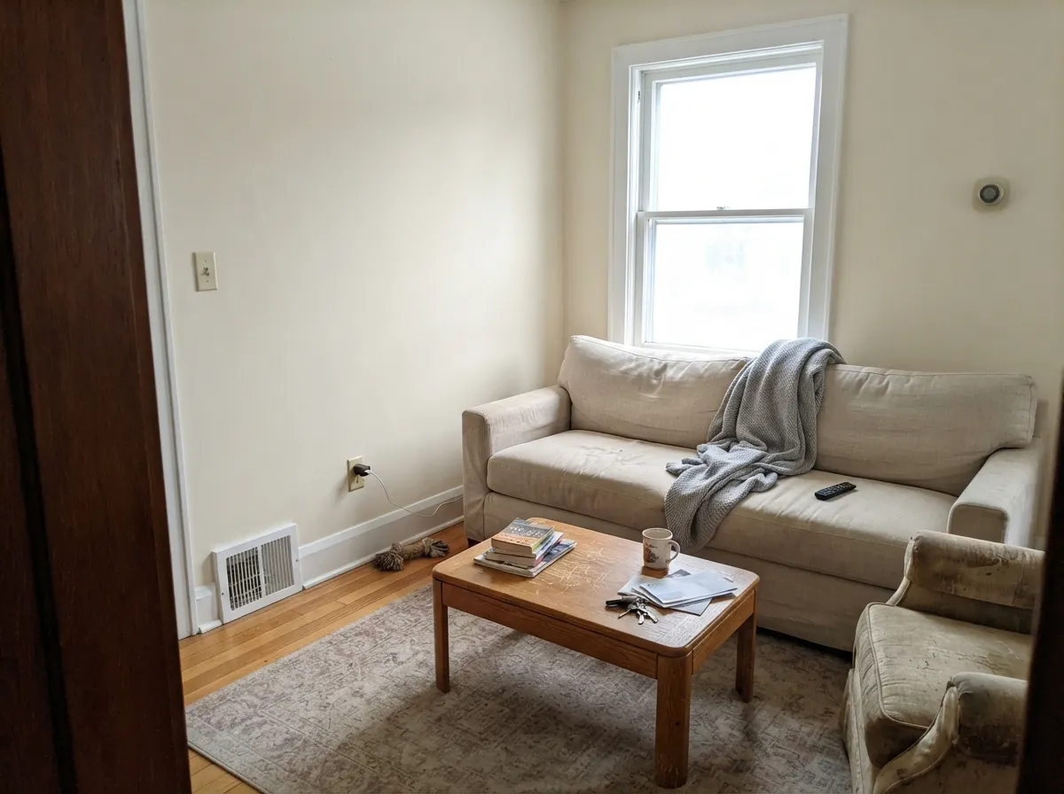
Cool daylight trims the yellow back and leaves a soft warm white. Its best room.
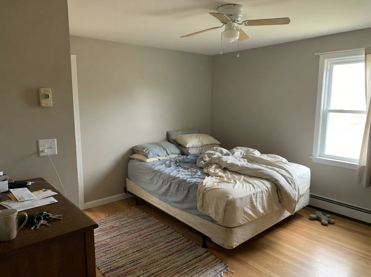
Hours of warm sun push the cream forward. By afternoon the walls read ivory.
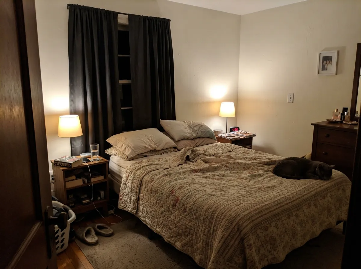
2700K bulbs turn it buttery. 3000K to 3500K holds it near its daytime color.
With no real daylight there is little pigment to catch. Warm lamps fix most of it.
Most complaints about Cloud White are a light mismatch. Upload a photo of your actual room and see it on your walls — then ask for the same wall in north light or evening lamps before you buy a single sample.
Need It From Another Brand?
Any paint counter can custom-tint Benjamin Moore 967 directly. If you would rather stay in one brand's own deck, these are the closest stock matches, measured as ΔE2000. Under 2 is a difference you will not see on the wall.
| Brand | Closest color | ΔE | LRV | |
|---|---|---|---|---|
| Sherwin-Williams | WhitetailSW 7103 · Sherwin-Williams | 2.0 | 86 | Color page → |
| Behr | Swiss Coffee 18121812 · Behr | 0.4 | 87 | Color page → |
| Valspar | Morning Breeze8007-5E · Valspar | 0.9 | 87 | Color page → |
| PPG / Glidden | Crumb CookiePPG18-01 · PPG / Glidden | 0.2 | 87 | Color page → |
| Glidden | Clear YellowPPG1215-1 · Glidden | 0.5 | 87 | Color page → |
| Dutch Boy | Brightened Cream005W · Dutch Boy | 1.0 | 89 | Color page → |
Similar Benjamin Moore Colors
The nearest shades to Cloud White within Benjamin Moore's own range, ranked by perceptual color distance — useful when you want the same look a touch lighter, darker, or warmer.
WCAG 2.1: AA is 4.5 : 1 for normal text, 3 : 1 for large text, AAA is 7 : 1.
Cloud White vs the Colors You're Also Considering
Every Cloud White sample board has the same rivals on it. The numbers show the real lightness gap — then it comes down to which risk you would rather live with.
Pick this when you want the cream to actually show on the wall.
Benjamin Moore OC-17 · LRV 85White DovePick this when you want warmth nobody notices — the safer whole-house default.
Side-by-side comparison →Pick this for softer millwork that never looks stark against wood.
Benjamin Moore OC-117 · LRV 91Simply WhitePick this for bright kitchens and cool appliances, where Cloud White reads yellow.
Side-by-side comparison →White Dove OC-17 shares the same LRV of 85, so the two are equally bright; the difference is undertone. White Dove is a softer, more balanced warm white, while Cloud White carries more visible cream. Side by side, Cloud White looks slightly more yellow, White Dove slightly more gray-soft. Choose White Dove when you want warmth that stays nearly invisible; choose Cloud White when you want the walls to read gently ivory, especially in cool north light.
Simply White OC-117, at LRV 91, is a step brighter and cleaner. It still leans warm, but the higher reflectance makes it feel fresher and less creamy. It favors kitchens and modern trim; Cloud White favors cozier, softer rooms.
Chantilly Lace OC-65, LRV 92, is the crisp one of the group, close to a true white. Against it, Cloud White looks distinctly cream. Pick Chantilly Lace for galleries and stark modern interiors; pick Cloud White when that look feels cold.
Cloud White Coordinating Colors
The rule with Cloud White is temperature discipline: everything around it should be warm or at least warm-tolerant. It is very good company for warm greiges, tans, muted greens, deep navies and near-blacks, and it argues openly with icy blues, cool grays and blue-gray stone. These are the partners that keep showing up in rooms where Cloud White works:
Cloud White on Trim, Doors and Ceilings
Millwork is the job this color was built for, and it is still the job it does best. On a baseboard, a casing or a six-panel door, you only ever see Cloud White in a narrow band against a larger wall color, and at that scale the warmth stops being cream and starts being softness. It draws the line between wall and trim without the hard, slightly plastic snap a bright white gives an old house. Semi-gloss on trim and doors, flat on ceilings.
The choice that decides everything is the wall color it frames. Warm walls make it look intentional: a greige like Revere Pewter, a tan like Manchester Tan, a muted green like October Mist. Cool walls expose it — put Cloud White trim against a blue-gray wall and the casings look faintly yellowed, and no sheen change rescues that. The same logic runs overhead. A Cloud White ceiling over a warm wall reads soft; over a cool wall it reads wrong. If you want a dark counterweight in the same room, Wrought Iron on interior doors is the pairing that keeps the warmth and still gives you contrast.
Cloud White With Floors, Counters and Tile
Wood is the easy part. Red oak, honey oak, white oak, walnut, cedar and butcher block all sit comfortably against Cloud White, and if your floors lean orange this is one of the few whites that calms them down instead of making them louder. Brass, bronze and unlacquered hardware belong in the same sentence.
Hard surfaces are where it gets decided. Warm-toned quartz, creamy limestone, travertine and beige-flecked granite all read as one family with Cloud White. Cool gray-veined quartz, Carrara-type marble, blue-gray porcelain tile and bright white appliances do not — beside them the wall or the cabinet looks slightly dirty, and that comparison is permanent because the stone is not moving. If the counters are already installed and they are cool, take the hint and use a cleaner white: Chantilly Lace for a true white, Simply White if you still want a trace of warmth.
Three Ready Palettes Built on Cloud White
A color is never alone on the wall. These are complete combinations in the 60-30-10 pattern, with the reason each one holds together. Every one opens in the visualizer.
Cloud White carries the 60 percent, and White Dove trim sits at the same brightness with less cream, so the edge reads clean instead of competing. The navy door supplies the one dark note the scheme needs without introducing a second temperature.
Try this palette in your roomThe cabinets dominate a kitchen, so Cloud White is the 60 percent here and Edgecomb Gray takes the walls — both sit on a warm base, so the handoff has no visible seam. Wrought Iron on the island grounds all that softness and makes brass hardware read as a decision rather than an accident.
Try this palette in your roomDirect sun washes the cream out of Cloud White, so the body reads as a warm soft white and Kendall Charcoal gives it the dark frame that keeps it from looking washed. The red door is the 10 percent, and it works because all three colors sit on the warm side of the line.
Try this palette in your roomCloud White FAQ
Is Cloud White too yellow for a whole house?
For a warm house, no. For a house with cool gray floors, white quartz and a lot of west sun, yes — that is exactly the combination people repaint. Sample it on the sunniest wall you own and on the darkest one, and judge it at 4pm, not at noon.
Cloud White or Simply White for trim?
Cloud White if the walls are warm — greige, tan, muted green, cream — because it reads as softly painted woodwork. Simply White if the room is bright and full of cool white surfaces like new appliances and quartz, where Cloud White starts to look yellow. In a kitchen that gets strong afternoon sun, Simply White is the safer buy.
Can I use Cloud White on the ceiling over a different wall color?
Yes, in flat, as long as the wall color is warm. Over greige, tan or a warm green it reads as a soft, deliberate ceiling instead of a cold lid. Over a cool gray or blue wall it tips the other way and the ceiling looks faintly yellow from every angle.
Does Cloud White work with gray floors and cool quartz?
This is its weakest pairing. Cool gray LVP and bright white or gray-veined quartz put the cream in relief and the wall can look dingy beside them. If the floors and counters are already in, go to Chantilly Lace OC-65 or Simply White OC-117 instead of fighting it.
Is Cloud White the same as Cloud Cover?
No, and people mix them up constantly. Cloud White OC-130 is a warm cream white; Cloud Cover OC-25 is nearly the same brightness but leans gray and cool. If your sample looked colder than expected, check the code on the can — you may have the wrong one.
How many coats does Cloud White need?
Two over any existing light color. Over builder beige, a dark wall, or bare drywall repairs, prime first with a tinted primer, because a warm white this light has almost no hiding power on its own. Skipping the primer is how people end up rolling four coats.
Have you painted with Cloud White?
Rate it — one tap helps the next reader decide.
Ask a Question