Manchester Tan
The classic warm tan every traditional house has worn, reviewed honestly: where it glows, the rooms where it turns olive or drab, and what to pick instead.

Jessica has spec'd whites and neutrals for more than 300 rooms and keeps a sample wall of painted drawdowns in her studio. Every color review is checked against real reader rooms in the comments and re-tested when a formula changes. About the testing process →
- 1Light French Gray53
- 2Accessible Beige58
- 3Manchester Tan63
- 4Pale Oak69
- 5Shoji White74
The Fast Verdict
Manchester Tan is the tan people mean when they say "warm neutral" — sandy, grounded, and easy to live with under wood trim and white millwork. The chip itself is a warm yellow-orange tan, but there is enough yellow-green in it that cool light can tip it olive, and that is the one complaint you see over and over. Give it daylight, warm-to-neutral bulbs and white trim and it looks like money. Give it a dim north room with a lawn outside the window and it looks like a 2005 rental.
Foyers, dining rooms and traditional millwork · houses with honey oak floors, doors or trim · open main floors that need one calm warm color · anyone who finds gray cold and true beige too yellow
Your room is north-facing and dim · your floors or tile are cool gray · you want a light, airy off-white · you run 4000K daylight bulbs
- Genuinely warm without tipping yellow or gold in normal daylight
- The best neutral in the deck for honey oak floors, doors and trim
- Deep enough at LRV 63 to make white trim look crisp and intentional
- Flows well across foyer, dining and living rooms as one whole-floor color
- Flatters brass, bronze, leather and warm stone with no effort
- Flashes olive-green in north light and next to a green yard
- Reads flat builder beige in dim halls, basements and windowless rooms
- Goes gold and dated under 2700K bulbs with yellowed woodwork
- Fights cool gray floors, tile and quartz
What Color Is Manchester Tan, Really?
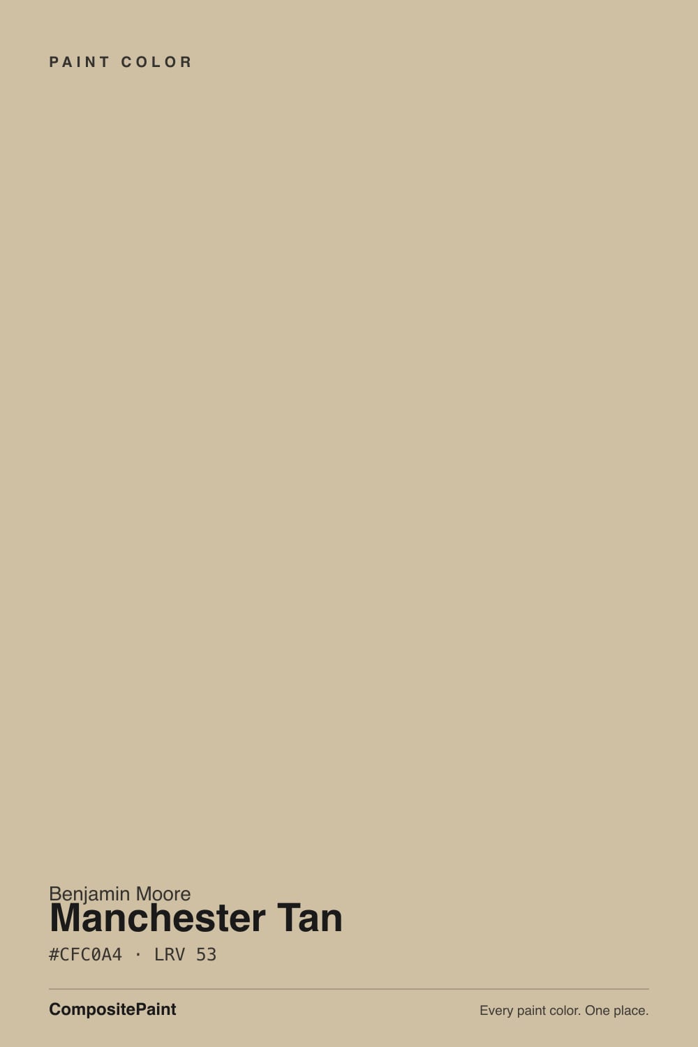
A real tan, not a greige. The chip sits in the warm yellow-to-orange range at moderate saturation, so on a big wall you read sand and warmth, not gray. What surprises people is the second half of that yellow: in cool light it can lean toward olive. This is the single most-repeated thing homeowners say about Manchester Tan — "is mine looking green?" — and it is not a mistint. Warm light pulls the orange side forward and it reads tan; cool light drains the orange and leaves the yellow, and yellow plus gray light is olive.
At LRV 63 it sits at the exact middle of the light scale, which is deeper than most people expect from a fan-deck chip. Next to Edgecomb Gray (HC-173) at LRV 63 it is clearly the darker, warmer, more colored wall, and even against Revere Pewter (HC-172) at 56 it reads a step heavier. That depth is the point in a foyer or dining room, where you want the walls to feel like a color. It is also the reason a windowless hallway can end up looking closed in.
Undertone in one line: warm yellow-orange tan with a yellow-green tilt that only shows in cool light — never pink, never gray. If your sample looks olive, look at the window before you blame the paint.
Where It Shines
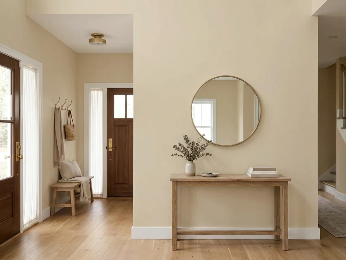
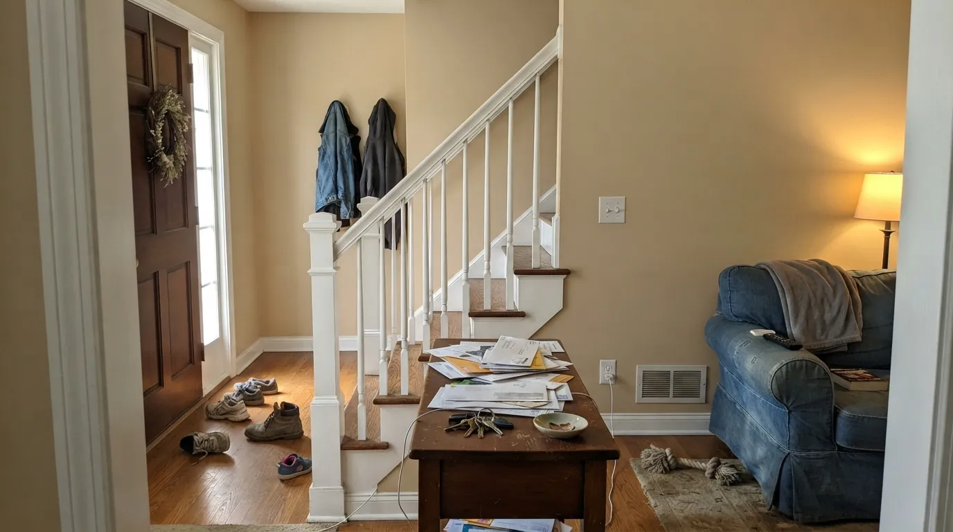
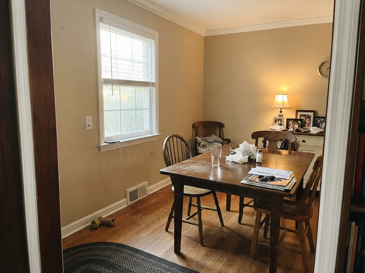
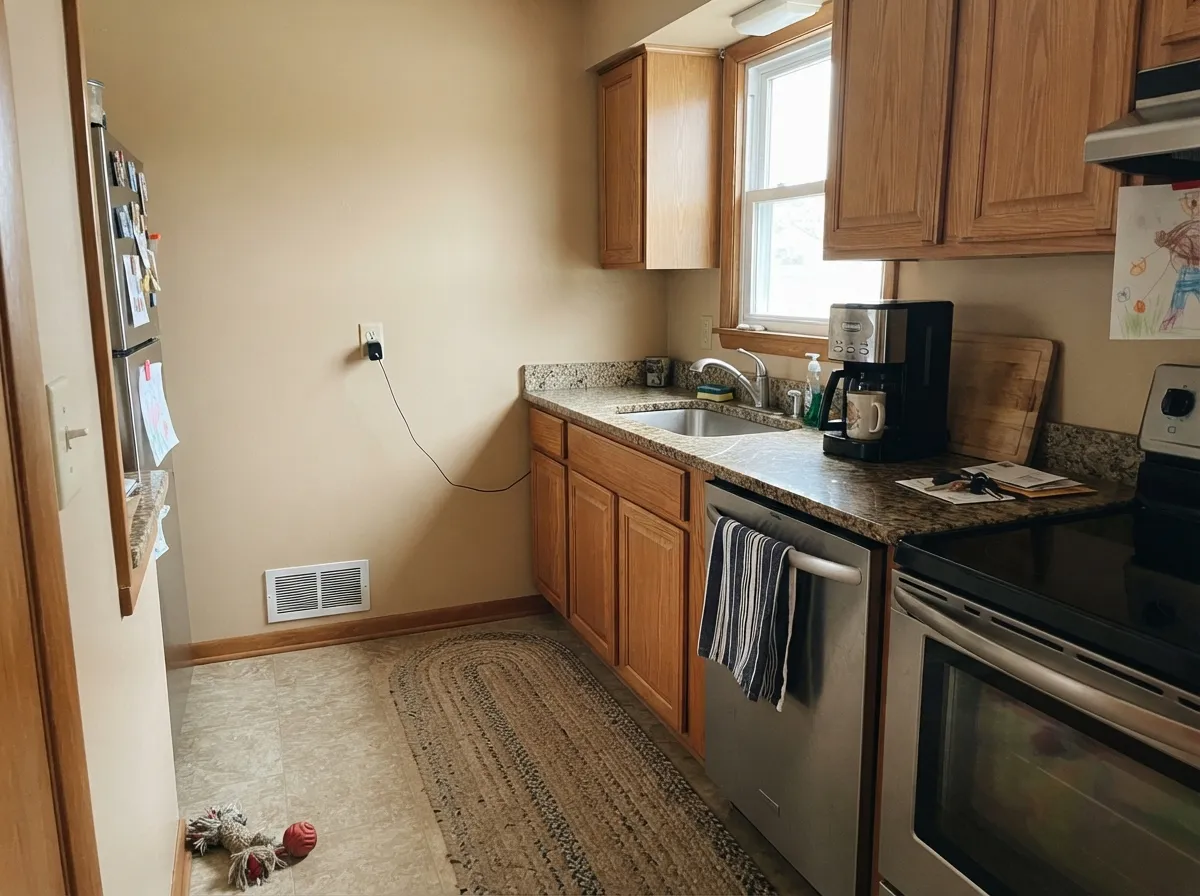
Its home turf is the traditional main floor: an entry with white millwork, a dining room with wood furniture, a kitchen where the oak is staying. Warm daylight and warm materials are what this color was built to sit against, and in those rooms it does the job almost nothing else does — warmth without yellow, depth without weight.
Where It Fails
The bad Manchester Tan stories are remarkably consistent, and all of them come down to light and what is sitting next to it. If your room matches one of these three, more coats will not save it.
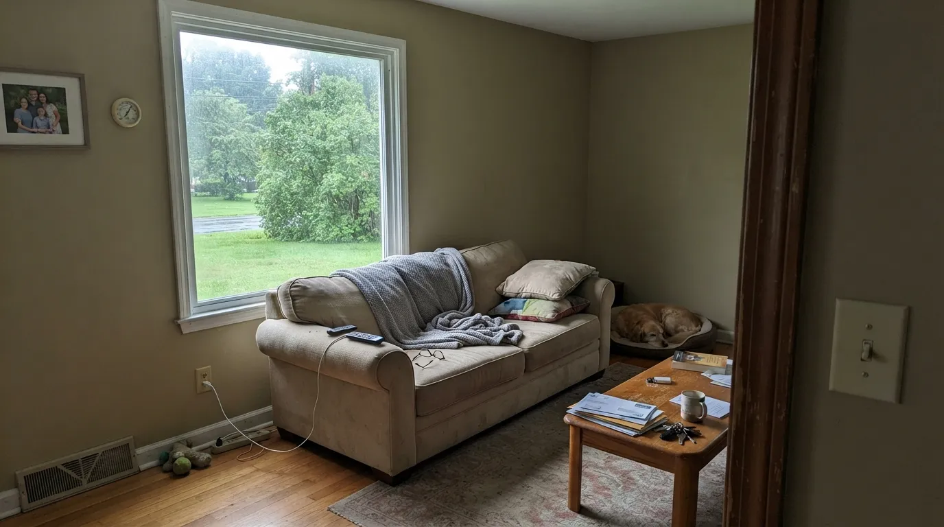
Cool north light plus green bounced off a lawn or a maple is the exact recipe that turns this color olive. Homeowners describe walls that "look mossy" or "have a green cast" and cannot un-see it. If that is your window, use Edgecomb Gray (HC-173) instead — it holds warmth without a yellow-green base to expose.
At LRV 63 there is real pigment here, and with no daylight to bounce it, it collapses into flat builder beige — the "muddy and blah" reviews all come from rooms like this. Go lighter rather than fighting it: Pale Oak (OC-20) or Ballet White (OC-9) keep the same warm family with far more light bounce.
Gray LVP, blue-gray carpet and cool quartz all sit at the opposite temperature, and the contrast shoves Manchester Tan toward yellow — the wall starts reading dingy next to the floor. With cool gray flooring, use Revere Pewter (HC-172), which meets gray halfway instead of arguing with it.
Room by Room
The color earns its reputation here: warm enough to feel like a welcome, deep enough to make white trim look crisp. Eggshell, or a scuff-resistant matte if kids and backpacks live in that hall. Pair with White Dove (OC-17) trim and a Hale Navy (HC-154) front door.
Candlelight and 2700K bulbs deepen it into something close to soft caramel, which flatters wood tables and warm metals. Eggshell on walls, and if there is wainscot, Chelsea Gray (HC-168) below the chair rail gives the room a spine without going dark.
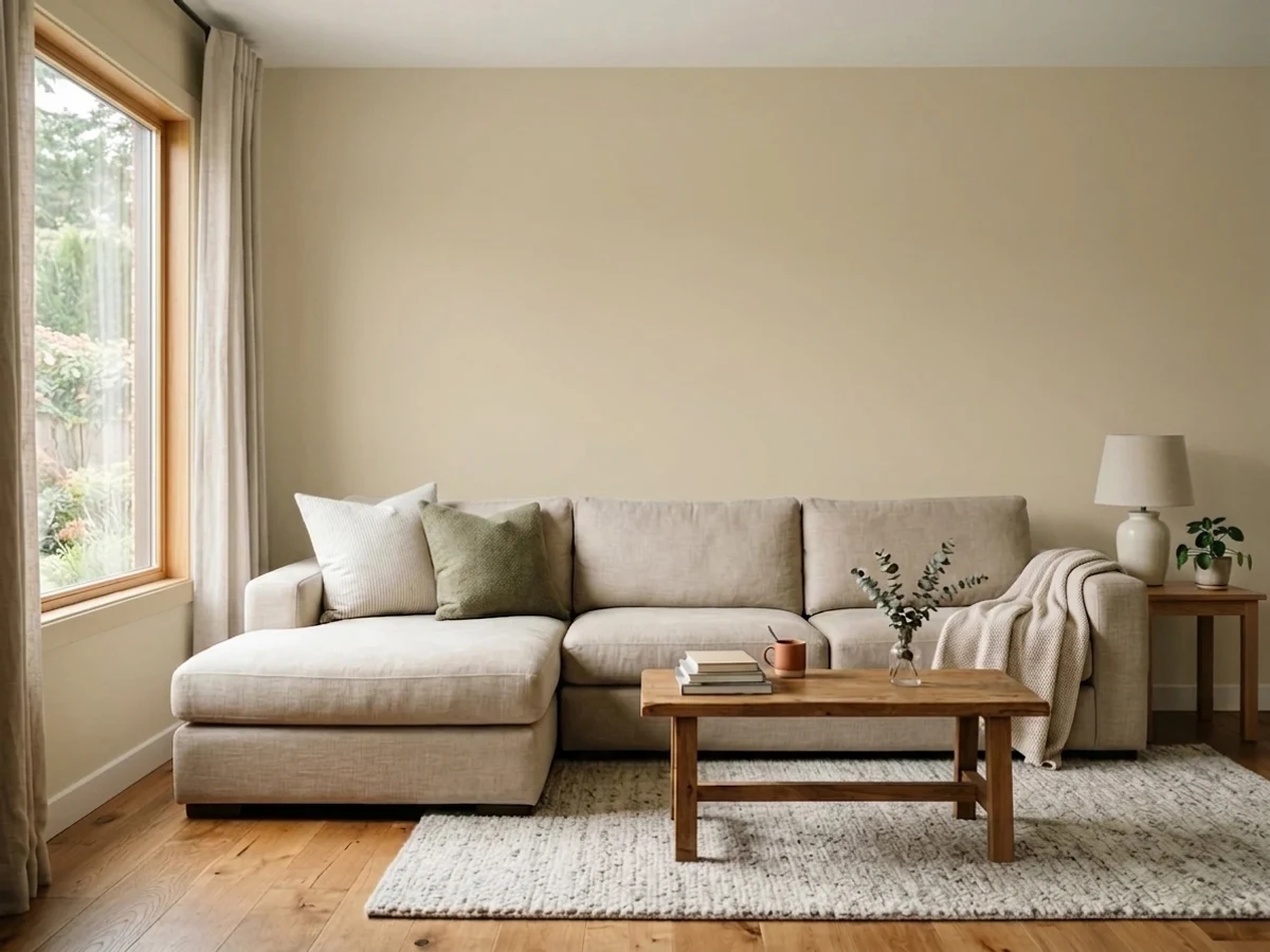
With two windows or more it is a calm backdrop that makes leather, oak and brass look intentional. In a one-window living room it flattens fast; add lamps before you decide. Keep the ceiling a clean white so the walls do not close in overhead.
With honey oak cabinets, butcher block or warm speckled granite it is one of the best rescue colors in the deck, because it agrees with the orange instead of fighting it. With cool gray quartz and white shaker doors it looks dated — use Edgecomb Gray (HC-173) there. On cabinets themselves, satin, with Cloud White (OC-130) uppers.
Under lamps it goes soft and enveloping, which is what most people want at night. North-facing bedrooms are where the olive complaint starts, so test a big sample on the wall that faces the window. Eggshell, White Dove (OC-17) trim and ceiling.
Full sun lightens it into a soft sand-beige body color that reads far brighter than it does indoors. It wants crisp white trim and one dark note — Kendall Charcoal (HC-166) shutters or a Hale Navy (HC-154) door. Avoid pairing it with cool gray stone or blue-gray roofing.
Your Light Is the Risk
Warm sun brings the orange side forward. Rich, sandy, never olive — this is the color at its best.
Cool gray daylight strips the orange and leaves yellow, which reads olive. The number one complaint.
2700K bulbs deepen it to warm khaki — cozy in a dining room, heavy in a bedroom. 3000K is the sweet spot.
Lawn or leaves right at the window bounce green in all summer. Same wall looks fine in winter.
Most complaints about Manchester Tan are a light mismatch. Upload a photo of your actual room and see it on your walls — then ask for the same wall in north light or evening lamps before you buy a single sample.
Need It From Another Brand?
Any paint counter can custom-tint Benjamin Moore HC-81 directly. If you would rather stay in one brand's own deck, these are the closest stock matches, measured as ΔE2000. Under 2 is a difference you will not see on the wall.
| Brand | Closest color | ΔE | LRV | |
|---|---|---|---|---|
| Sherwin-Williams | Oyster BarSW 7565 · Sherwin-Williams | 1.2 | 64 | Color page → |
| Behr | Natural AlmondPPU4-12 · Behr | 1.4 | 65 | Color page → |
| Valspar | QuillV094-1 · Valspar | 1.4 | 65.3 | Color page → |
| PPG / Glidden | Wright Pearl GrayFLLW918 · PPG / Glidden | 1.3 | 63 | Color page → |
| Glidden | Georgian Ivory40YY 62/134 · Glidden | 1.4 | 62 | Color page → |
| Dutch Boy | Elemental White421-1DB · Dutch Boy | 0.9 | 63 | Color page → |
Similar Benjamin Moore Colors
The nearest shades to Manchester Tan within Benjamin Moore's own range, ranked by perceptual color distance — useful when you want the same look a touch lighter, darker, or warmer.
WCAG 2.1: AA is 4.5 : 1 for normal text, 3 : 1 for large text, AAA is 7 : 1.
Manchester Tan vs the Colors You're Also Considering
Every Manchester Tan sample board has the same rivals on it. The numbers show the real lightness gap — then it comes down to which risk you would rather live with.
Pick this when you want committed warmth and real depth on the wall.
Benjamin Moore HC-173 · LRV 63Edgecomb GrayPick this for a lighter, cooler, more current greige — and for north rooms.
Side-by-side comparison →Pick this if you want the slightly cleaner, better-known of the two.
Benjamin Moore HC-80 · LRV 52Bleeker BeigePick this if samples of this one look a touch sharp — Bleeker reads softer.
Bleeker Beige (HC-80) at LRV 52 is the closest neighbor; the two are nearly interchangeable, with Bleeker reading a hair softer. If you already like Manchester Tan, there is little practical reason to switch between them.
Shaker Beige (HC-45) at LRV 54 is slightly lighter and a touch warmer, a good pick if Manchester Tan feels a little heavy in a low-light room. Wheeling Neutral (HC-92) at LRV 52 sits at nearly the same brightness but a shade more golden.
Against Grant Beige (HC-83) at LRV 56 and Edgecomb Gray (HC-173) at LRV 63, Manchester Tan is the warmer, deeper of the group; Grant Beige is a bit lighter, and Edgecomb Gray is noticeably lighter and greiger. Choose Manchester Tan when you want committed warmth, and lean to the others when you want more light bounce or a cooler, grayer neutral.
Manchester Tan Coordinating Colors
The rule with Manchester Tan is to keep partners on the warm side of neutral and give the scheme one clearly dark note. It layers happily with the rest of the Benjamin Moore historical warm neutrals, takes navy and charcoal beautifully, and gets uncomfortable next to icy blues, true cool grays and blue-gray stone. These are the pairings that come up again and again in real houses:
Manchester Tan With Wood Tones and Floors
This is the question that brings most people to this color, and the answer is unusually clear: warm wood loves it. Honey oak, red oak, maple that has ambered, oak stair treads, oak doors that are not getting painted this decade — Manchester Tan meets all of them halfway. Cool grays make that orange look like a mistake; this tan makes it look like a choice. If you inherited a house full of golden oak and are not ready to strip it, this is the shortest path to a room that looks settled.
Walnut and darker stained floors also work, though the contrast is stronger and the room needs white trim to keep it from feeling brown all over. The pairing that needs a real sample first is cool gray LVP or gray-washed wood. Against those, Manchester Tan reads yellow and slightly dirty, and no rug will fully fix it. Tape a two-foot sample directly above the actual floor, look at it at 3 p.m. and again at 9 p.m., and believe what you see.
Lighter and Darker Than Manchester Tan
If the samples look right in temperature but wrong in weight, move along the same warm family instead of changing direction. Lighter: Pale Oak (OC-20) and Ballet White (OC-9) keep the softness and give a dim room far more bounce, which is the fix for hallways and basements where Manchester Tan goes muddy. They lose some of the tan character, so expect a wall that reads warm off-white rather than a color.
Darker and richer: Bleeker Beige (HC-80) is its near twin at LRV 52 and reads a hair softer, Grant Beige (HC-83) at 56 is slightly lighter and greiger, and Shaker Beige (HC-45) at 54 is a touch warmer and better in low light. For a genuine step down in a study or dining room, Alexandria Beige (HC-77) holds the same family with real depth. Line up all of them on one poster board rather than on the wall one at a time — side by side is the only way these read differently.
Three Ready Palettes Built on Manchester Tan
A color is never alone on the wall. These are complete combinations in the 60-30-10 pattern, with the reason each one holds together. Every one opens in the visualizer.
White Dove is warm enough to stay friendly against the tan, so the trim looks soft rather than bleached. The navy door gives the scheme its one dark note and stops the entry from reading beige-on-beige.
Try this palette in your roomDecorator's White is cooler and cleaner than White Dove, which pushes the tan's warmth forward and keeps the room from going all-beige. Chelsea Gray under the chair rail carries the 10 percent dark note and makes the wall color look deliberate at night.
Try this palette in your roomWhen the oak is staying, Manchester Tan agrees with its orange instead of fighting it, and Cloud White keeps the upper cabinets warm enough not to expose the wood as yellow. Kendall Charcoal on the island anchors the room so the warm tones do not read as one soft blur.
Try this palette in your roomManchester Tan FAQ
Does Manchester Tan look green?
It can, and this is the most common surprise with it. The color carries a yellow base, and when cool north light or green reflected off a lawn removes the warm side, what is left reads olive. In south and west rooms with warm-to-neutral bulbs it stays a straightforward tan. Sample it on the wall closest to the window before you commit.
Is Manchester Tan dated?
It is dated by company, not by itself. Paired with yellowed woodwork, Tuscan-speckled granite and heavy drapes, it reads straight out of 2005. With clean white trim, 3000K bulbs, simple textiles and modern lighting it looks calm and current. The paint is not the problem; the room around it usually is.
Manchester Tan or Edgecomb Gray?
Manchester Tan is warmer and, at LRV 63 against Edgecomb Gray's 63, noticeably deeper on the wall. Choose Manchester Tan when you have wood tones to flatter and want the room to feel warm. Choose Edgecomb Gray when your room is north-facing, your floors are gray, or you want a lighter, more neutral look.
Does it work with honey oak floors and trim?
This is where it earns its keep. Oak's orange cast makes cool grays look sour, while Manchester Tan sits in the same warm family and lets the wood read intentional. Keep any painted millwork a clean white so there is a crisp break between the tan wall and the wood.
What bulbs should I use with it?
3000K is the sweet spot. At 2700K the tan deepens toward gold and khaki, which is lovely in a dining room and heavy everywhere else. At 4000K and above the warmth drains out and the olive side appears. Check the color at night under your real bulbs before you buy gallons.
Will it work with gray floors or gray tile?
Usually not well. Cool gray flooring sits at the opposite temperature and makes the wall look yellowed and dingy by comparison. If the gray floors are staying, Revere Pewter (HC-172) or Edgecomb Gray (HC-173) will sit against them far more comfortably.
How many coats does it take?
Two over an existing light or beige wall. Going over a deep red, gold or navy, prime with a gray-tinted primer first, because a mid-tone tan does not hide saturated color on its own. Cut in the second coat while the roller work is still wet to avoid flashing in the corners.
Have you painted with Manchester Tan?
Rate it — one tap helps the next reader decide.
Ask a Question