Classic Gray
The gray that is barely a gray, reviewed honestly: the rooms where it turns into plain white, the mauve flash people miss, and what to pick instead.

Jessica has spec'd whites and neutrals for more than 300 rooms and keeps a sample wall of painted drawdowns in her studio. Every color review is checked against real reader rooms in the comments and re-tested when a formula changes. About the testing process →
- 1Heirloom Shade63
- 2First Star69
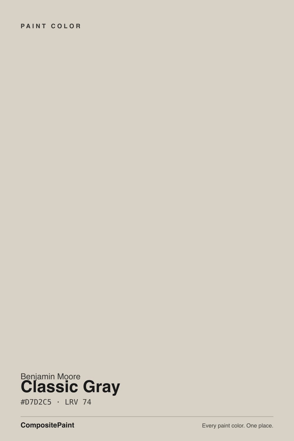
- 3Classic Gray74
- 4Alabaster82
- 5Chantilly Lace91
The Fast Verdict
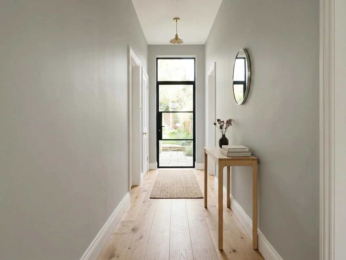
Classic Gray is the color you pick when you want a wall to look soft and finished without picking a color. It is really an off-white with a whisper of warm gray in it, and that whisper is the whole product. In a medium-light room it gives you depth, shadow and a clean backdrop that flatters wood floors. In a bright south-facing room it stops being gray at all — which is the one thing nobody tells you before you buy five gallons.
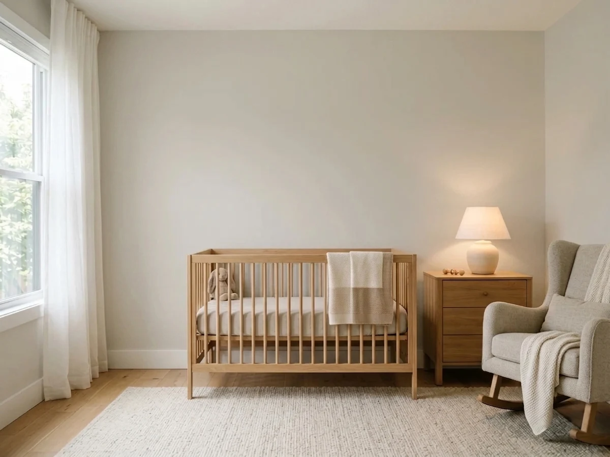
Medium-light rooms and whole-house schemes · new builds with a lot of white trim · bedrooms and nurseries · anyone who wants gray without commitment
Your room gets strong all-day sun · you actually want to see gray on the wall · you need contrast against white trim · your lighting is dim with cool LED bulbs
- The lightest usable warm neutral — brightens dim rooms without going stark
- Flows through a whole house without clashing with anything
- Violet-pink base means it works with cool floors and gray stone, unlike most warm neutrals
- Never goes yellow or mustard, even under warm bulbs
- Forgiving to sample and forgiving to live with
- Washes out to plain white in strong sun — the most common regret
- Can flash mauve or dusty pink in cool north light
- Goes flat and drab in dark rooms and under cool LEDs
- Too light to give any contrast against white trim
What Color Is Classic Gray, Really?
The name is the most misleading thing about it. Classic Gray is not a gray in the way Repose Gray or Gray Owl are grays — it is an off-white with a very small amount of warm pigment stirred in. The warmth sits on the red-orange side, which on a wall shows up as a passive violet-pink cast rather than a yellow-beige one. That is unusual and it is why the color plays nicely with cool floors and cool stone in a way most warm neutrals do not. It is also why it occasionally throws people: a violet base behaves very differently from a yellow base when the light turns.
At LRV 74 it reflects most of the light in a room, and that number is doing a lot of work. Next to White Dove OC-17 at LRV 85 you can clearly see Classic Gray has body — it looks like a color. Next to Edgecomb Gray HC-173 at LRV 63 it looks like a white. Both comparisons are true at the same time, which is exactly the confusion people describe. What determines which version you get is not the paint, it is how much daylight the room already has.
Undertone in one line: warm gray built on violet-pink, not yellow — which means it goes mauve in cold light, never mustard in warm light.
Where It Shines
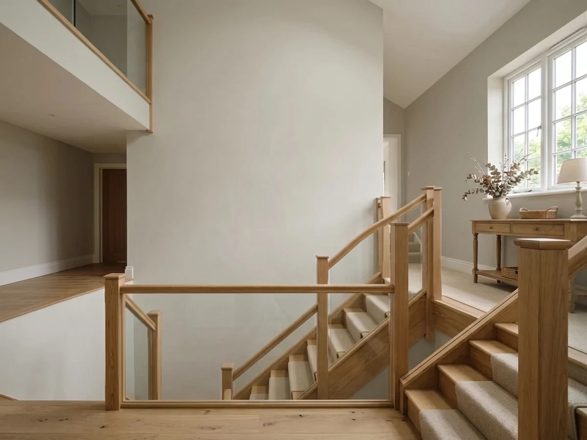
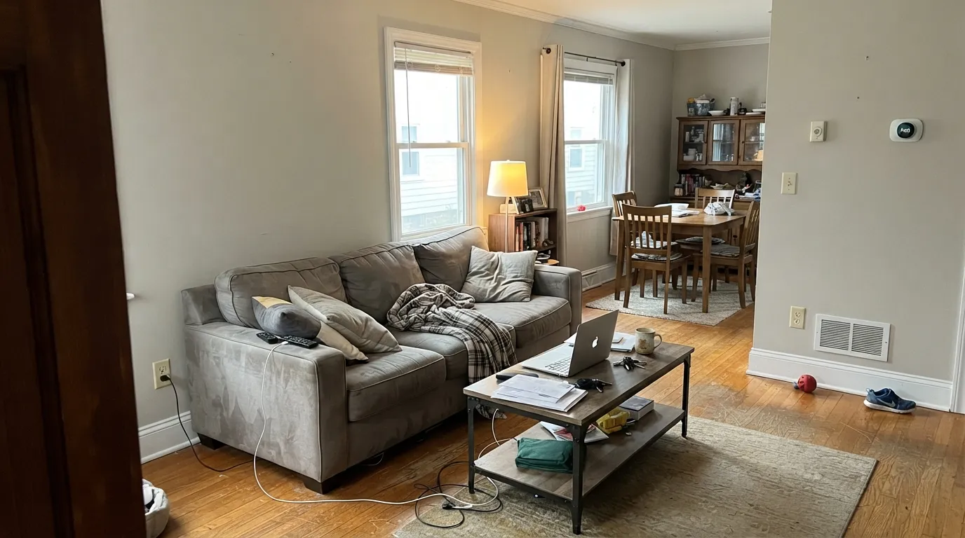
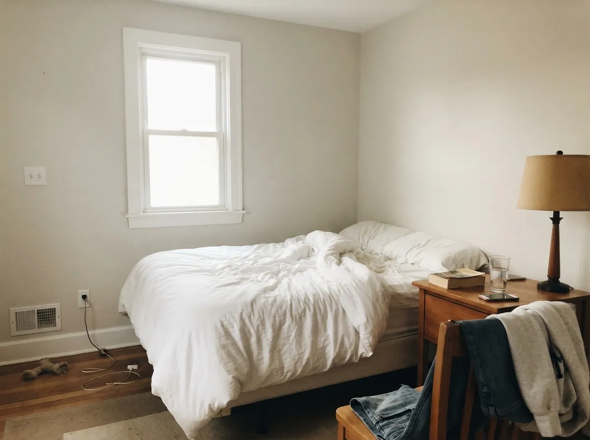
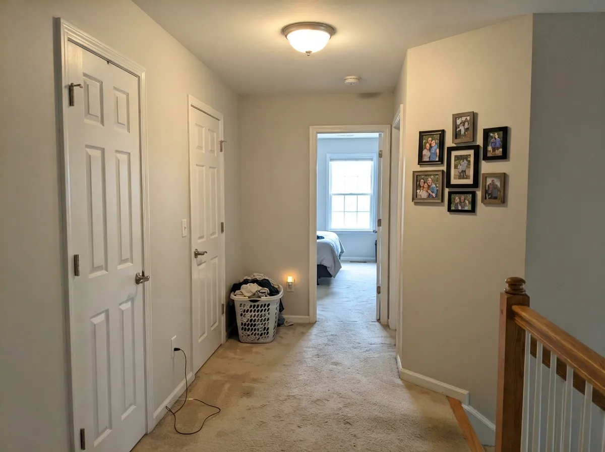
Give it a room with normal, moderate daylight and it does something very few light neutrals manage: it stays soft without going dull. Whole-house schemes are where it earns its reputation, because it never fights an adjacent room, and bedrooms are where people love it most — the warmth keeps it restful instead of hospital-clean.
Where It Fails
The bad reviews for Classic Gray are almost never about quality. They are about expectation. Three situations produce nearly all of the disappointment, and you can predict every one of them from your windows before you open a can.
This is the number one complaint, and it is loud: people paint a sunny living room and end up with what looks like builder white. At LRV 74 there is not enough pigment left to survive strong all-day sun, and against white trim the wall reads as nothing at all. If your room is bright and you want to actually see gray, go a full step down to Edgecomb Gray HC-173 at LRV 63.
The violet-pink base is quiet in normal light, but gray daylight pulls it forward and the wall can drift mauve — people describe it as a faint purple or dusty pink cast, usually in the afternoon. It is real, it is not the painter's fault, and no extra coat fixes it. If your light is genuinely cool and you want gray, pick an honest cool gray with a green base instead: Gray Owl OC-52.
Without daylight the color loses its warmth and goes flat and slightly dingy — the exact word people use is drab. Warm 3000K bulbs recover most of it, but if the space has almost no light and only overhead cans, take a warmer white that glows on its own: White Dove OC-17.
Room by Room
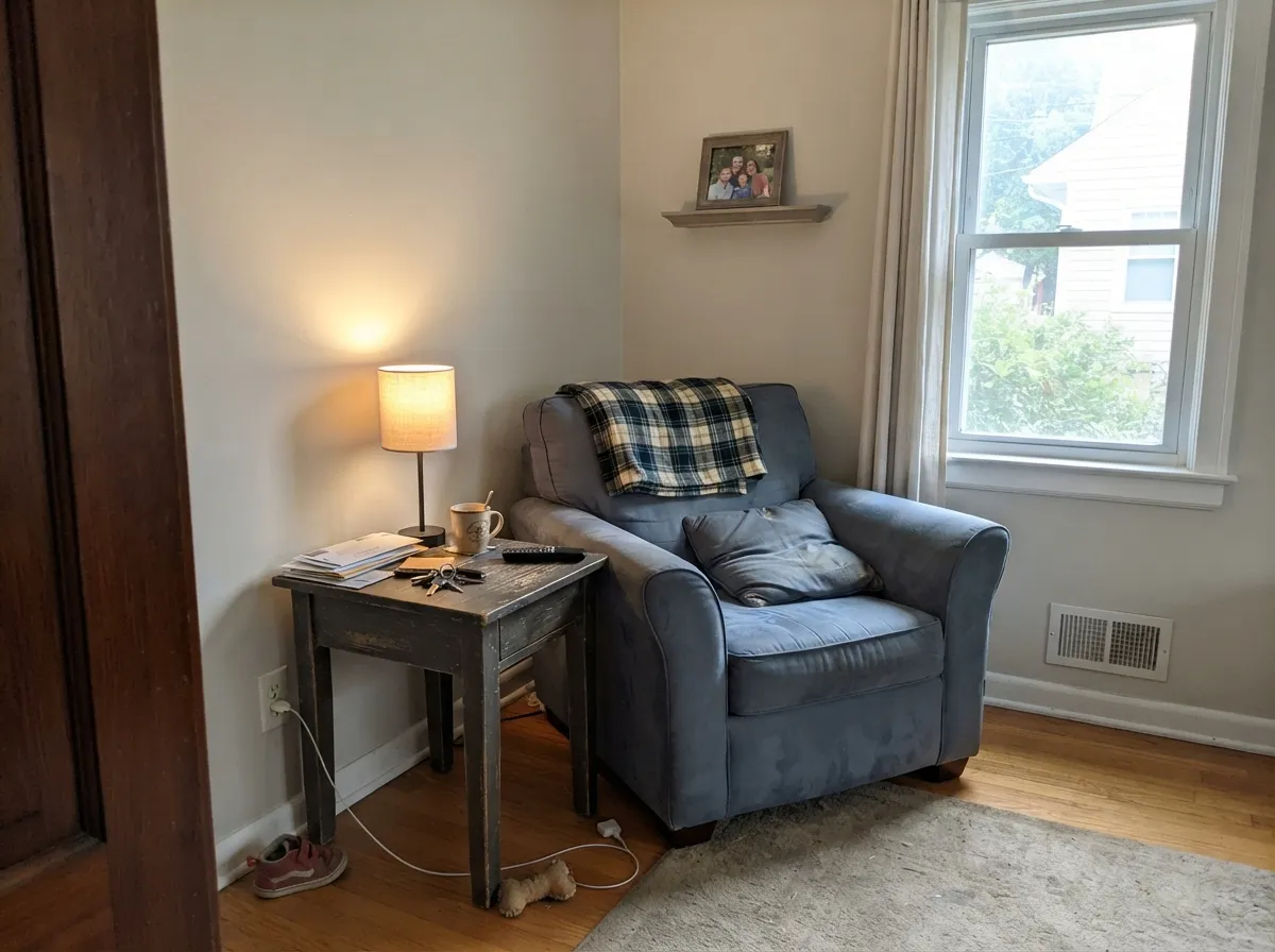
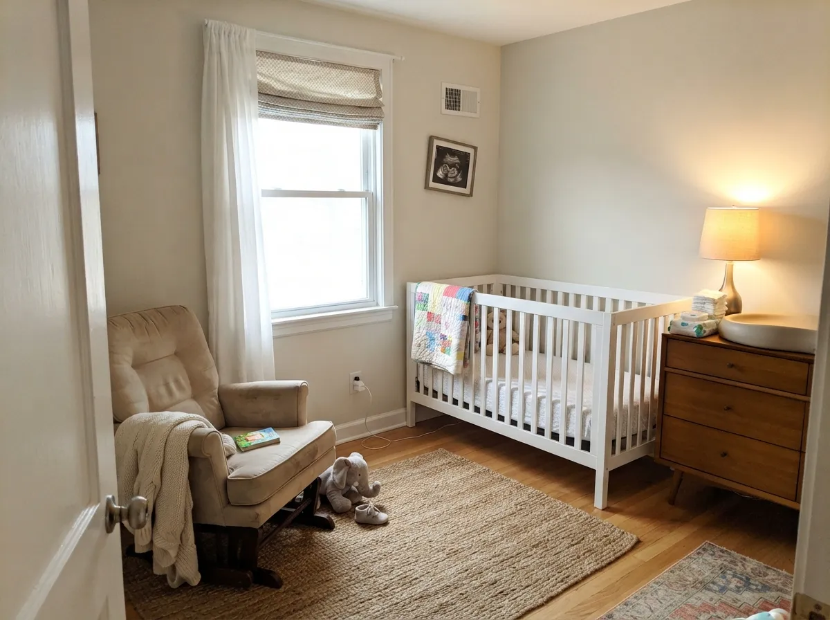
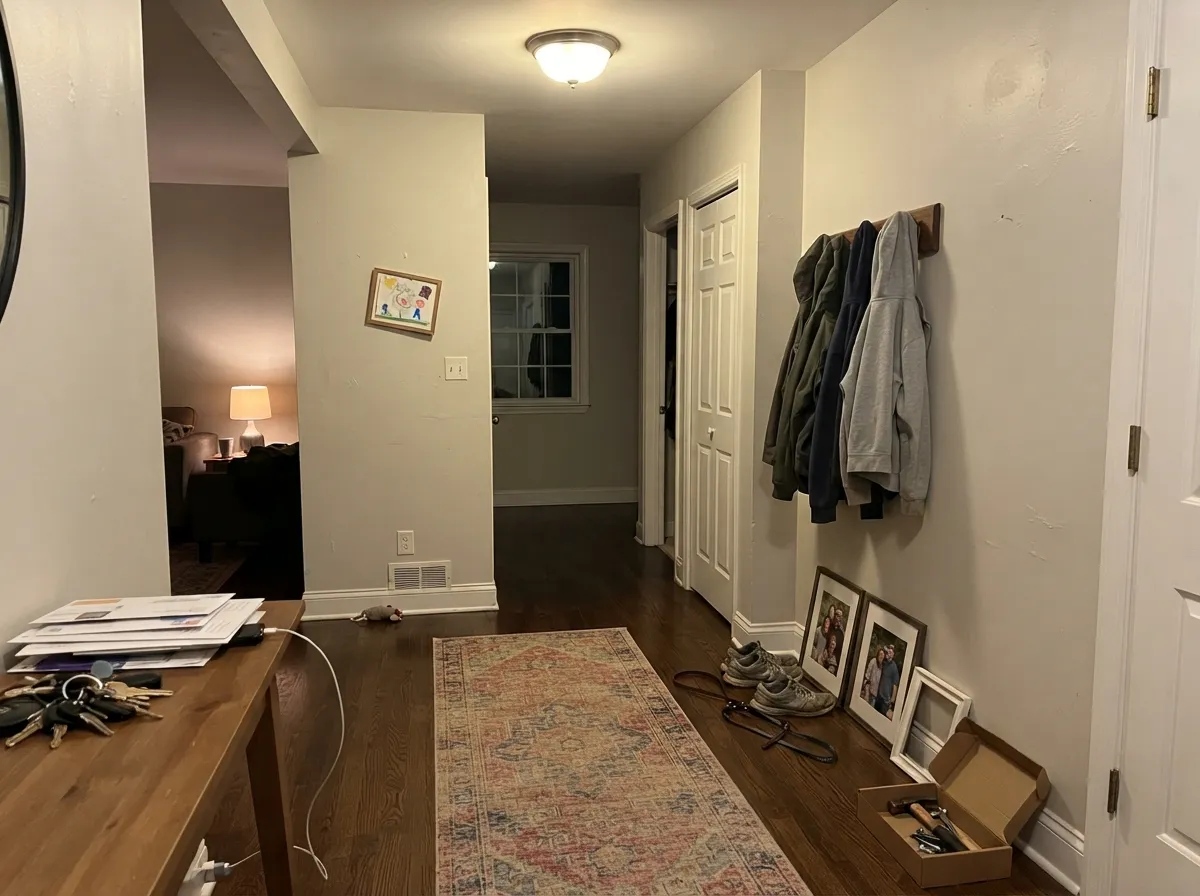
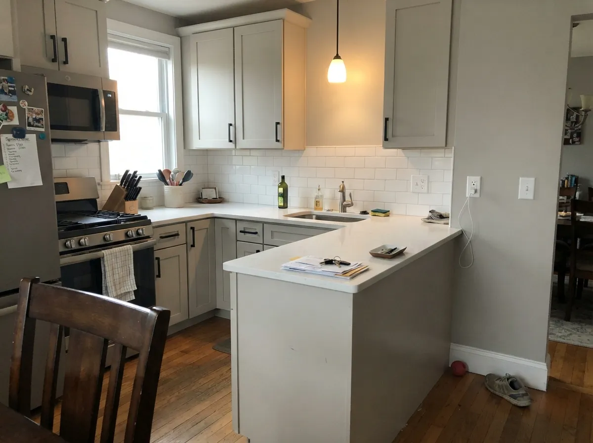
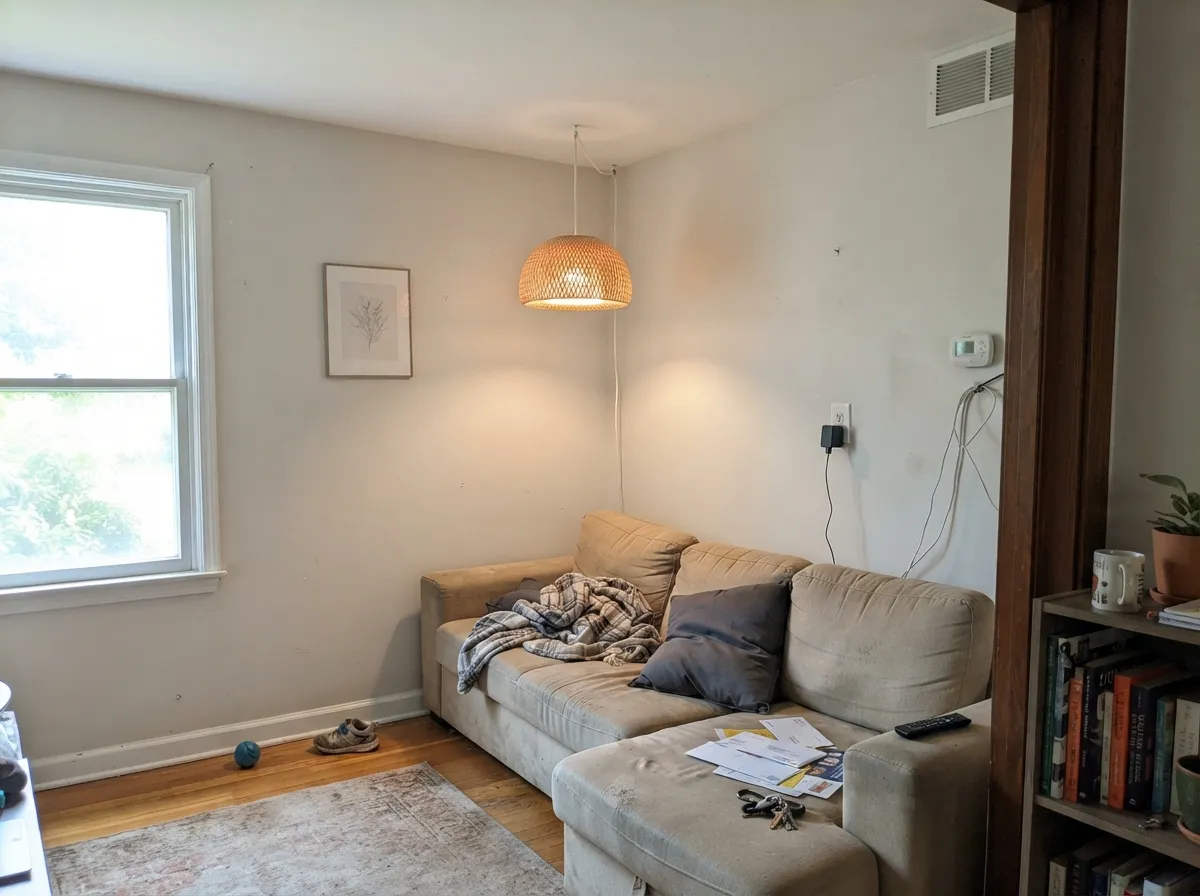
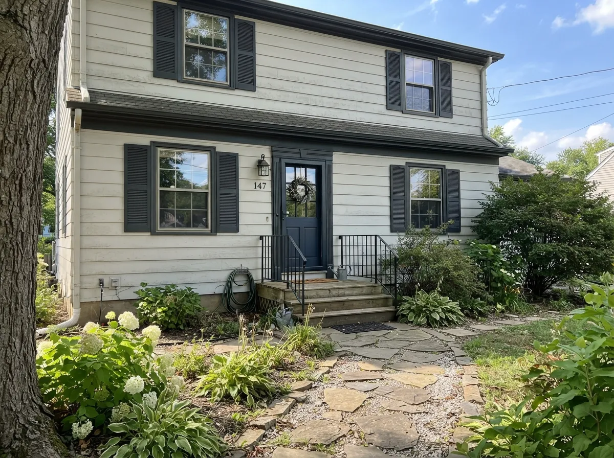
Your Light Is the Risk
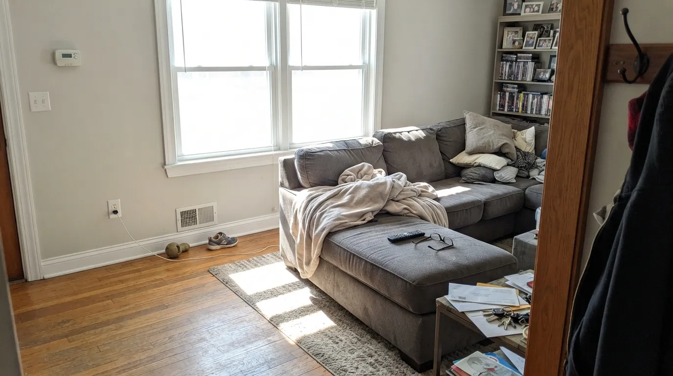
One or two normal windows is its sweet spot: soft, warm, clearly a color. This is the room it was made for.
Cool daylight is where it finally looks like gray. Watch overcast afternoons — that is when mauve can surface.
Strong sun bleaches out the small amount of pigment. Expect off-white, not gray, for most of the day.
Warm 2700K to 3000K bulbs keep it creamy and soft. Cool 4000K LEDs make it drab and pull the violet forward.
Most complaints about Classic Gray are a light mismatch. Upload a photo of your actual room and see it on your walls — then ask for the same wall in north light or evening lamps before you buy a single sample.
Need It From Another Brand?
Any paint counter can custom-tint Benjamin Moore 1548 directly. If you would rather stay in one brand's own deck, these are the closest stock matches, measured as ΔE2000. Under 2 is a difference you will not see on the wall.
| Brand | Closest color | ΔE | LRV | |
|---|---|---|---|---|
| Sherwin-Williams | Moderne WhiteSW 6168 · Sherwin-Williams | 0.5 | 74 | Color page → |
| Behr | Roadster WhiteN370-1 · Behr | 1.0 | 74 | Color page → |
| Valspar | Gilded Linen6002-1A · Valspar | 0.5 | 73.8 | Color page → |
| PPG / Glidden | ParaffinPPG14-31 · PPG / Glidden | 0.5 | 75 | Color page → |
| Glidden | HourglassPPG1022-1 · Glidden | 1.1 | 75 | Color page → |
| Dutch Boy | Moon Pie406-1DB · Dutch Boy | 0.6 | 75 | Color page → |
Similar Benjamin Moore Colors
The nearest shades to Classic Gray within Benjamin Moore's own range, ranked by perceptual color distance — useful when you want the same look a touch lighter, darker, or warmer.
WCAG 2.1: AA is 4.5 : 1 for normal text, 3 : 1 for large text, AAA is 7 : 1.
Classic Gray vs the Colors You're Also Considering
Every Classic Gray sample board has the same rivals on it. The numbers show the real lightness gap — then it comes down to which risk you would rather live with.
Pick this for a dim room or a whole house that needs maximum light.
Benjamin Moore HC-173 · LRV 63Edgecomb GrayPick this when the room is bright and Classic Gray disappears into white.
Pick this for the airier, lighter version with less risk of going moody.
Benjamin Moore OC-27 · LRV 70Balboa MistPick this when you want walls that stay visibly gray after dark.
Side-by-side comparison →Edgecomb Gray HC-173 is the most common head-to-head. At LRV 63 it is a full step darker and noticeably more beige on the wall. Choose Edgecomb Gray when a room gets strong light and Classic Gray keeps washing out to white; choose Classic Gray when you want the lightest possible greige for a dimmer space or a whole-home scheme.
Balboa Mist OC-27, at LRV 70, sits closer in depth but reads slightly grayer and moodier. In a bright room the two are hard to tell apart; in low light Balboa Mist holds its gray while Classic Gray softens toward cream. Pick Balboa Mist if you specifically want walls that stay gray.
Gray Owl OC-52, LRV 65, is the cool counterpart. It leans green-blue rather than warm, so it suits crisp, cooler schemes with white marble and chrome, while Classic Gray suits wood tones, brass, and warmer fabrics.
Classic Gray Coordinating Colors
Because Classic Gray is built on violet-pink rather than yellow, it coordinates more widely than most warm neutrals — it does not fight cool gray floors, white marble or blue-gray tile the way a yellow-based greige does. The rule is contrast, not temperature: pair it with something clearly brighter or clearly darker, because anything close to its own depth will just look like a mistake.
That is the trap people fall into most often. Pale Oak OC-20 and Balboa Mist OC-27 are lovely colors, but they sit within a few LRV points of Classic Gray, so putting them in adjoining rooms reads as one uneven paint job rather than two colors. These are the partners that actually work:
The Classic Gray Ladder: Going Lighter and Darker
Most people who search for Classic Gray are really trying to find the right rung on a ladder, so here is the ladder. Going up, Chantilly Lace OC-65 at LRV 92 is the clean white and White Dove OC-17 at LRV 85 is the warm one — both give you enough separation to use as trim over Classic Gray walls. Going down, Edgecomb Gray HC-173 at LRV 63 is the next real step, and Revere Pewter HC-172 at LRV 56 is the deep end.
The rungs between are the dangerous ones. Pale Oak OC-20 sits around LRV 70 and Balboa Mist OC-27 around 70 as well, close enough that swapping between them changes almost nothing in a finished room. If you sampled all three and cannot decide, that is the answer: they are the same decision, and you should be choosing between Classic Gray and Edgecomb Gray instead.
For a whole-house plan, the reliable structure is Classic Gray on the main-floor walls, Edgecomb Gray or Revere Pewter in one grounded room like a den or dining room, and Chantilly Lace on every piece of trim in the house. That gives you real steps between rooms instead of five versions of the same soft neutral.
Classic Gray on Cabinets and Exteriors
On cabinets the color succeeds or fails on one question: is there something whiter in the room? With white quartz, a white subway backsplash or a bright ceiling, Classic Gray cabinets read as a soft, deliberate not-quite-white and they hide fingerprints far better than a true white does. With cream counters, travertine or a warm tile floor there is nothing to push against, and the cabinets look like white ones that need a wipe. Use a urethane-fortified cabinet enamel in satin and plan on brass or matte black hardware, both of which the warm base flatters.
Outside, full sun washes it a step lighter still, so treat it as a warm off-white body color rather than a gray one. That is not a problem as long as you frame it: Kendall Charcoal HC-166 or a black like Wrought Iron 2124-10 on the trim and shutters gives the facade the contrast the paint cannot supply on its own, and Hale Navy HC-154 makes a clean front door. Walk a sample board around the whole house before committing, because the shaded north elevation will look a full step grayer and cooler than the sunny south side.
Three Ready Palettes Built on Classic Gray
A color is never alone on the wall. These are complete combinations in the 60-30-10 pattern, with the reason each one holds together. Every one opens in the visualizer.
Chantilly Lace at LRV 92 is bright enough to make Classic Gray read as an actual color instead of a tired white, which is the whole point of using this wall color at all. The navy door supplies the single dark note a scheme this light needs to look deliberate.
Try this palette in your roomSimply White cabinets are bright enough to hold their own against the walls, so the kitchen reads crisp while the walls stay soft. Kendall Charcoal on the island grounds all that lightness and gives brass hardware something to sit against.
Try this palette in your roomWhite Dove trim keeps the contrast gentle so the room feels enveloping rather than edited, and it pushes Classic Gray very slightly toward taupe, which reads cozy at night. Palladian Blue behind the bed is the one 10 percent color note, quiet enough that it never wakes the room up.
Try this palette in your roomClassic Gray FAQ
Is Classic Gray actually gray, or is it white?
It is a gray on paper and an off-white in practice. At LRV 74 there is only a small amount of pigment, so in a bright room it will read as a soft white and in a medium or north-lit room it will read as a genuine light gray. If you want to see gray no matter the light, Edgecomb Gray HC-173 or Balboa Mist OC-27 are the safer buys.
Is Classic Gray warm or cool?
Warm, but not the way beige is warm. The undertone leans red-orange, so it comes across as a passive violet-pink warmth rather than a yellow one. That is why it sits comfortably with gray floors and cool countertops, where a yellow-based greige would look out of place.
Does Classic Gray look purple?
It can, in cool light. The violet-pink base is invisible most of the time, but on an overcast afternoon in a north-facing room the wall can drift toward a dusty mauve. It is subtle rather than shocking, and warm 3000K bulbs cancel most of it, but if any purple would bother you, choose a green-based gray like Gray Owl OC-52 instead.
What trim white goes with Classic Gray?
Chantilly Lace OC-65 is the right answer for most people. At LRV 92 it is bright enough to keep Classic Gray reading as a color rather than a dingy white, which is the mistake that ruins this pairing. If you want less contrast and a softer, warmer room, White Dove OC-17 works, but expect the walls to look slightly more taupe beside it.
Classic Gray or Edgecomb Gray?
Let your windows decide. Edgecomb Gray HC-173 is a full step deeper at LRV 63, so it holds its color in bright rooms where Classic Gray bleaches out to white. Classic Gray wins in dim rooms, small rooms and hallways, where Edgecomb Gray can start to feel heavy.
Can I use Classic Gray on kitchen cabinets?
Yes, if something else in the kitchen is clearly whiter. Against a white quartz counter or a white backsplash it reads as a soft, expensive not-quite-white. Against cream counters or wood-toned everything it just looks like white cabinets that need cleaning. Use a urethane-fortified cabinet enamel in satin.
What sheen should I use on the walls?
Eggshell for living rooms, bedrooms and hallways, because a light color at this LRV already bounces plenty of light and a shinier finish would show every roller mark. Use flat on ceilings and semi-gloss on trim. In bathrooms and kids' rooms step up to a scrubbable matte or satin.
Have you painted with Classic Gray?
Rate it — one tap helps the next reader decide.
Ask a Question