Benjamin Moore Classic GrayvsBenjamin Moore Pale Oak
Classic Gray and Pale Oak are built on the same pink-violet base, which is why people cross-shop them constantly. Classic Gray is the near-white one. Pale Oak has just enough body to still look chosen.

Built from our full reviews of both colors — same measured data, same real-room photos. About the testing process →
The Numbers
Classic Gray is slightly lighter (LRV 74 vs 69, 5-point delta).
The Real Difference on a Wall
These two are relatives, not rivals. Both are warm neutrals whose warmth sits on the red side rather than the yellow side, and that single fact explains most of their behavior. It is why both play nicely with cool gray floors, gray marble and cool quartz, where a yellow-based beige would look wrong. It is also why both can throw pink when the light turns cool. The real difference is how much pigment is in the can: Classic Gray is essentially an off-white with a whisper of warm gray stirred in, and Pale Oak is a milky taupe you can actually see on the wall.
Sun separates them fastest. Put Classic Gray in a bright, south-facing room and it stops being gray at all, reading as builder white against white trim, which is the number one regret people post about it. Pale Oak washes out in a glassy, sun-flooded room too, but it takes more sun to get there and it usually keeps a soft taupe. Flip it around: in a medium-light room with one or two normal windows, Classic Gray is at its very best, soft and clearly a color, while Pale Oak in the same room looks like a full, considered neutral rather than a whisper.
In dim rooms and against trim they diverge again. A dark hallway or a windowless space drains Classic Gray, and it goes flat and slightly dingy, though warm 3000K bulbs recover most of it. Pale Oak has enough body to stay a color there, but it is the one more likely to turn lavender under cool bulbs. Both argue with cream, and this is where people get burned: their pink-warm base makes yellow-cream trim and cabinets look dirty, and the wall looks colder to compensate. Both want a clean white beside them, and neither one gives you much contrast against a soft white, so if you want the trim to pop, go bright.
Unusually for a pair, both flash the same direction, toward pink and mauve when the light goes cool. Pale Oak is the stronger offender, showing a definite lavender in a north room at midday and under 4000K bulbs, while Classic Gray does it more quietly, usually on overcast afternoons. Swap every bulb in the room to 2700K or 3000K before you blame the paint.
What Each Color Really Is
The name is the most misleading thing about it. Classic Gray is not a gray in the way Repose Gray or Gray Owl are grays — it is an off-white with a very small amount of warm pigment stirred in. The warmth sits on the red-orange side, which on a wall shows up as a passive violet-pink cast rather than a yellow-beige one. That is unusual and it is why the color plays nicely with cool floors and cool stone in a way most warm neutrals do not. It is also why it occasionally throws people: a violet base behaves very differently from a yellow base when the light turns.
At LRV 74 it reflects most of the light in a room, and that number is doing a lot of work. Next to White Dove OC-17 at LRV 85 you can clearly see Classic Gray has body — it looks like a color. Next to Edgecomb Gray HC-173 at LRV 63 it looks like a white. Both comparisons are true at the same time, which is exactly the confusion people describe. What determines which version you get is not the paint, it is how much daylight the room already has.
A greige built on the warm side of the fence — soft red-orange taupe, grayed way down. The important part is how little color is actually in it. At roughly a quarter saturation it barely commits to anything, which is exactly why it flatters furniture and floors instead of competing with them. It is the reason Pale Oak shows up in round-up after round-up as the safe warm neutral: it is a color that agrees with the room you already have.
At LRV 69 it reflects a lot of light without going blank. That number is the useful comparison point. Edgecomb Gray sits at 63 and reads visibly heavier and greener on the same wall; Classic Gray at 74 reads almost like a warm white with the color drained out. Pale Oak lands in the gap — light enough for a dim hallway, still colored enough that you can tell somebody chose it.
Specs Side by Side
| Spec | Classic Gray | Pale Oak |
|---|---|---|
| Brand | Benjamin Moore | Benjamin Moore |
| SKU | 1548 | OC-20 |
| Hex | #E3E0D7 | #DDD9CE |
| RGB | 227, 224, 215 | 221, 217, 206 |
| LRV | 74 | 69 |
| Undertone | yellow / warm | red-orange / warm |
| Family | White | Neutral |
How Light Changes Them
One or two normal windows is its sweet spot: soft, warm, clearly a color. This is the room it was made for.
Cool daylight is where it finally looks like gray. Watch overcast afternoons — that is when mauve can surface.
Strong sun bleaches out the small amount of pigment. Expect off-white, not gray, for most of the day.
Warm 2700K to 3000K bulbs keep it creamy and soft. Cool 4000K LEDs make it drab and pull the violet forward.
Cool, indirect daylight pulls the violet forward. Sample here first, not in the sunny room.
Warm and creamy, but a sun-flooded room can wash it out to plain off-white.
2700K: warm taupe, cozy. 3500K and up: gray, then pink. Buy the bulbs before the paint.
Warm at the sun hours, grayer the rest of the day. Most people like the movement.
Both Colors in Real Rooms
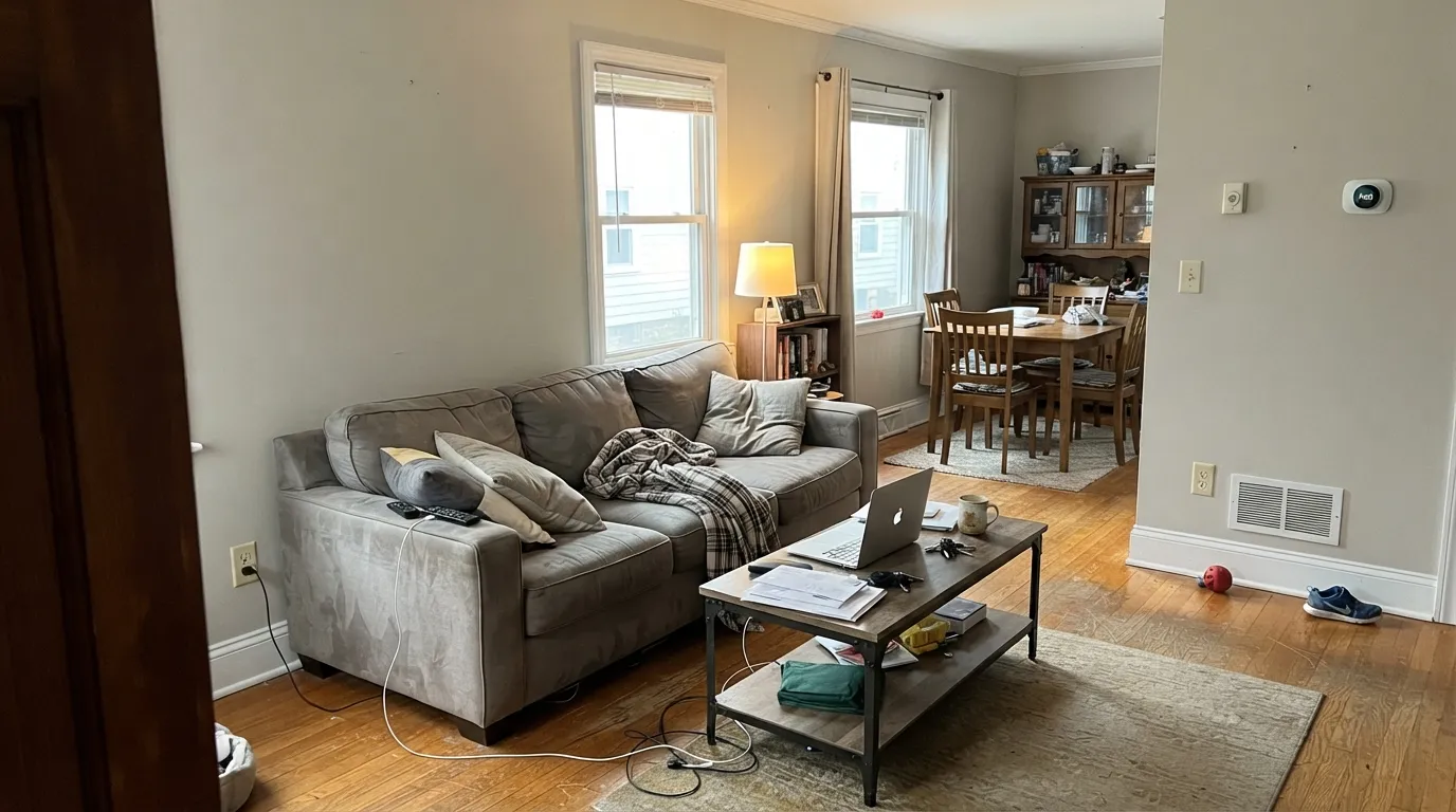
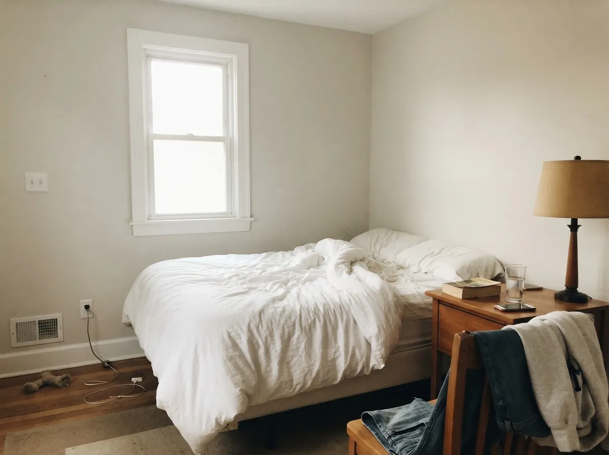
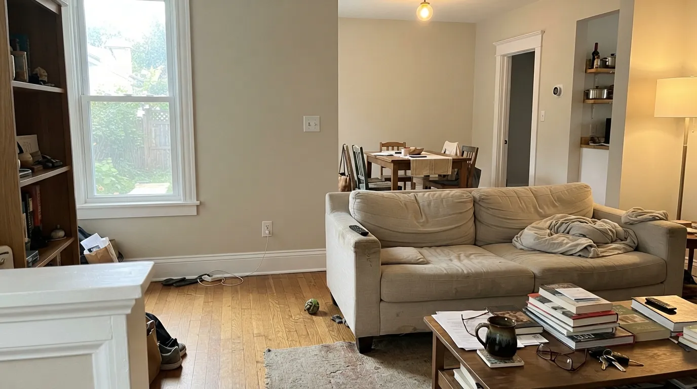
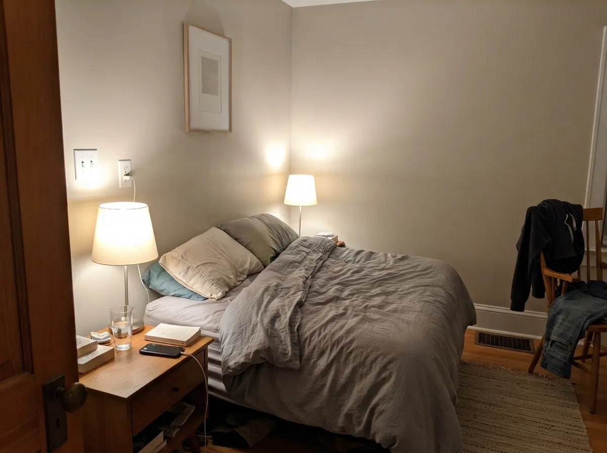
Photos from our full reviews — the same rooms and captions, so you can judge each color where it actually lives, not on a chip.
When to Pick Which
Choose Classic Gray if you want the wall to read as a soft white with a little depth rather than a color, which is why it works so well in bedrooms, nurseries and new builds full of white trim. It is the better pick for a medium-light or slightly dim room that needs brightening without going stark. Skip it if your room is sun-flooded and you genuinely want to see gray.
Choose Pale Oak if you sampled Classic Gray and it looked like nothing on the wall. It keeps enough color to look deliberate across a whole floor plan, and it flatters oak, walnut and warm red-toned wood floors instead of competing with them. It is also the better answer for a dim hallway that needs light but not blankness.
No comparison page can see your light. Upload one photo of your room and try both colors on the same walls, seconds apart.
Classic Gray vs Pale Oak FAQ
Which one is safer in a north-facing room?
Classic Gray, and it is the one room where it finally looks like an actual gray instead of a white. Watch overcast afternoons, because that is when its violet base can surface. Pale Oak is the riskier of the two here, since cool midday light strips its warm side and leaves a clear lavender. If you hate purple undertones in any amount, use Edgecomb Gray instead, because its green-gray base flashes the opposite way.
What trim white works with each?
Use a clean white with both: White Dove, Simply White or Chantilly Lace. Chantilly Lace gives you the most contrast, which matters most with Classic Gray, since it is light enough that a soft white trim barely separates from the wall. Never pair either color with a yellow-cream trim or cabinets, because that is exactly the combination that produces the my-walls-look-dirty complaint.
Do they work with cool gray floors and gray quartz?
Yes, unusually well for warm neutrals, and this is their best trick. Because their warmth is pink-based rather than yellow-based, they sit next to cool gray LVP, gray marble and cool quartz without the clash you get from a standard beige. That is the main reason designers keep reaching for these two in houses with cool fixed finishes.
Which is the better whole-house color?
Pale Oak. It holds its character across different exposures, so a bright living room and a shaded bedroom still look related. Classic Gray whole-house works nicely in a house with moderate, even light, but in the sunniest rooms it disappears into off-white while the darker rooms still read gray, and that gap can feel like two different paints.
Can I use either one on cabinets?
Classic Gray makes a good soft-white cabinet color when a stark white feels too sharp, especially in a bath or laundry. Pale Oak on cabinets reads clearly greige and needs warm counters and warm floors around it, otherwise the pink edge shows under undercabinet LEDs. Spray both in satin, and check the color at night before you commit the whole run.
Ask a Question