Balboa Mist
The soft greige everyone recommends until it flashes lavender — reviewed honestly, including the exact rooms where that happens and what to paint instead.

Jessica has spec'd whites and neutrals for more than 300 rooms and keeps a sample wall of painted drawdowns in her studio. Every color review is checked against real reader rooms in the comments and re-tested when a formula changes. About the testing process →
- 1Revere Pewter55
- 2Agreeable Gray60
- 3Balboa Mist66
- 4Shoji White74
- 5Dover White83
The Fast Verdict
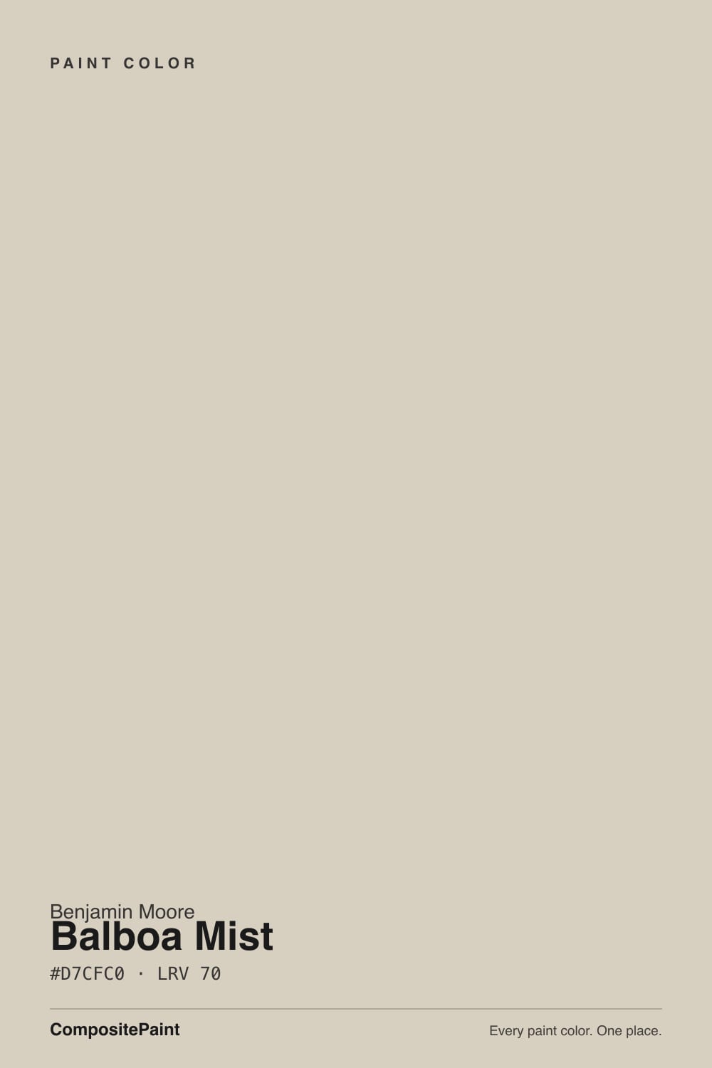
Balboa Mist is the light greige people pick when beige feels dated and gray feels cold. In moderate daylight it is exactly that: soft, quiet, expensive-looking.
But there is a whisper of violet in the gray half, and cool flat light pulls it straight out, which is why the internet is full of "my walls look lavender" posts. Sample it big, look at it at night, and check your trim and cabinets before you commit.
Bedrooms and living rooms with moderate daylight · open plans mixing warm wood and cool stone · walls beside crisp white trim · anyone who wants greige to actually read gray
Your room is north-facing and dim · your cabinets or tile are cream or almond · you run cool LED bulbs everywhere · you want the color to be obvious
- Light enough at LRV 67 to brighten small and windowless rooms
- Reads gray, not beige — the reason people pick it over Edgecomb Gray
- Gets along with mixed fixed finishes in open plans
- Flatters white oak, linen, honed limestone, and aged brass
- Excellent whole-house wall color when the light suits it
- Flashes lavender in north light and under cool LED bulbs
- Clashes with cream, almond, and honey-oak finishes
- Washes out to a plain off-white in bright midday south sun
- Too passive on exteriors without dark trim to frame it
What Color Is Balboa Mist, Really?
On paper Balboa Mist is a warm light gray — a greige, gray with warmth mixed through it. What the numbers do not tell you is which way the gray leans, and this one leans very slightly violet. That is the whole story of this color. In good daylight the violet stays hidden and you get a soft, sophisticated neutral. In cool, flat, dim light the violet steps forward and the wall picks up a lavender or pink-gray cast. Both versions are the same can of paint.
At LRV 67 it reflects a lot of light, so rooms stay open and bright. Put it next to Classic Gray OC-23 at LRV 74 and Balboa Mist looks like the one with actual color in it. Put it next to Sherwin-Williams Agreeable Gray SW 7029 at LRV 60 and Balboa Mist looks almost like an off-white. That is the useful range to hold in your head: it is a real color, but a very light one, and in a bright south room at midday it can lose almost all of it.
Undertone in one line: warm gray with a violet edge — never green, never yellow. If your sample looks lavender, that is not your eyes and it is not a bad can. That is the color, under light that does not suit it.
Where It Shines
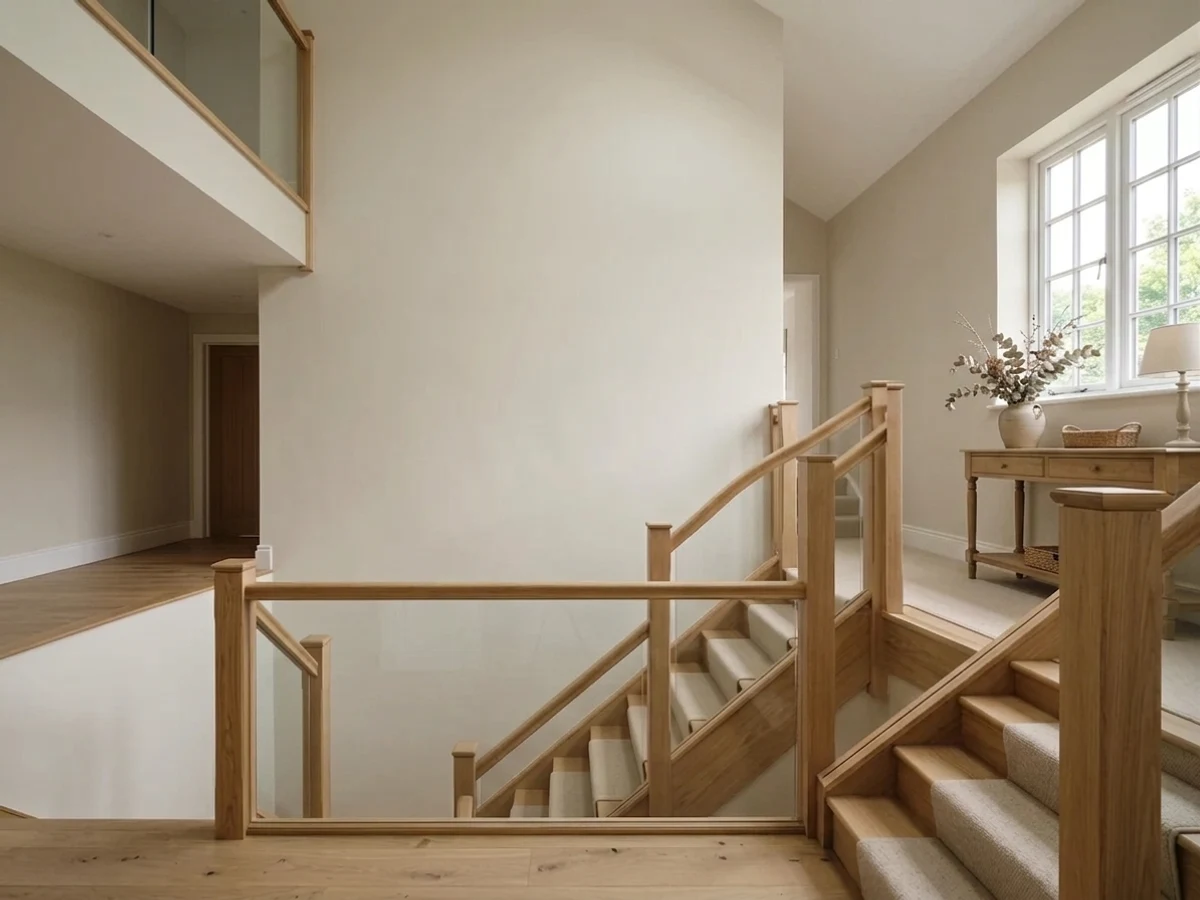
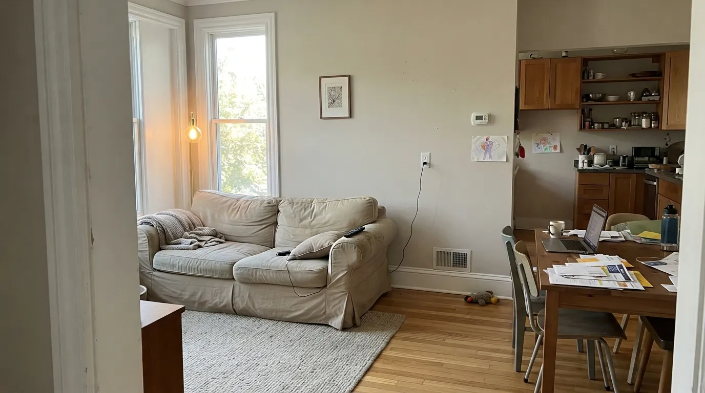
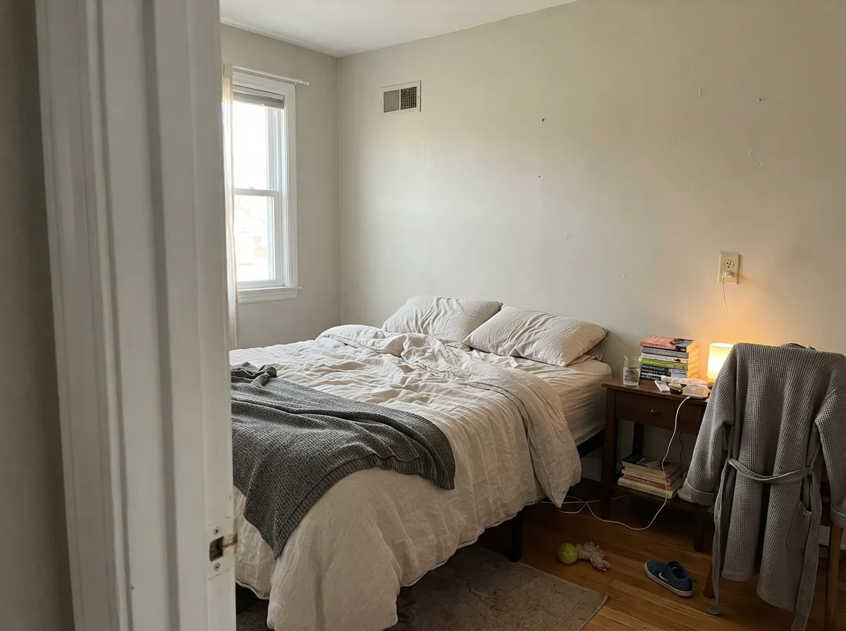
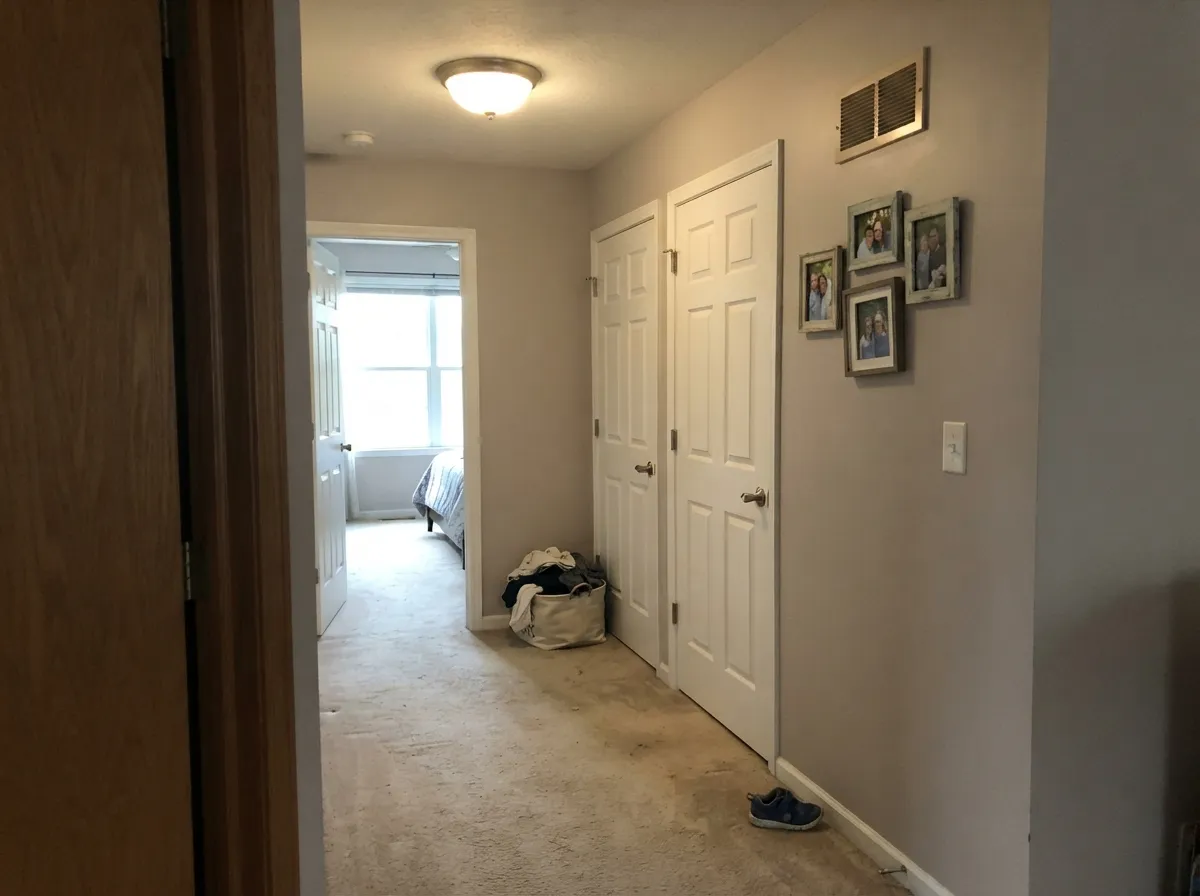
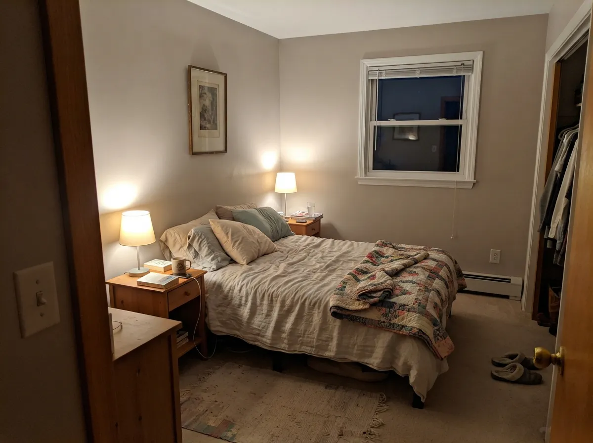
Give it moderate, honest daylight and crisp white trim and this is one of the prettiest light neutrals Benjamin Moore makes. Bedrooms and living rooms in east or west light are where it earns its reputation, and hallways are where it proves it can carry a whole house without arguing with anything.
Where It Fails
The bad reviews for Balboa Mist are remarkably consistent. Three situations produce almost all of them, and every one is predictable before you open the can. If your room matches, this is not your color and a second coat will not save it.
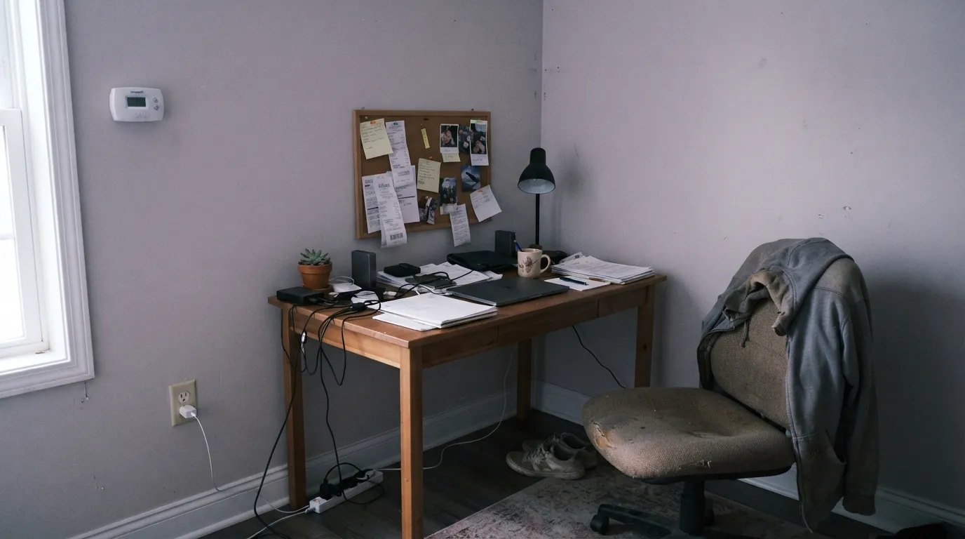
Cool, flat northern light strips the warmth and exposes the violet. Homeowners describe walls that went lavender-gray, and darker and drabber than the chip promised. If you want the same softness without the risk, use Edgecomb Gray HC-173 — same family, warmer base, no violet to flash.
This is the pairing that ruins it. Violet-gray walls beside yellow-cream oak cabinets or almond tile make both sides look wrong: the cabinets go dirty yellow and the wall goes pink. With cream fixed finishes pick Pale Oak OC-20, which shares a golden base with them instead of fighting it.
The most common real story is a kitchen or dining room that looks perfect in daylight and turns faintly lavender at night. Cool 4000K and higher LEDs do it every time. Swap to 3000K bulbs first — that fixes most rooms. If your fixtures are not changeable, Classic Gray OC-23 is lighter and leans green instead of violet.
Room by Room
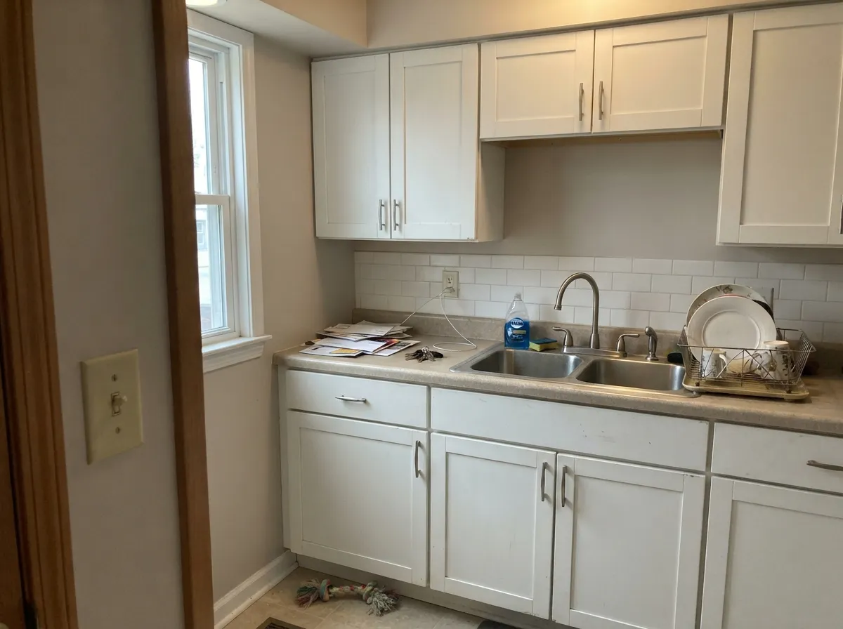
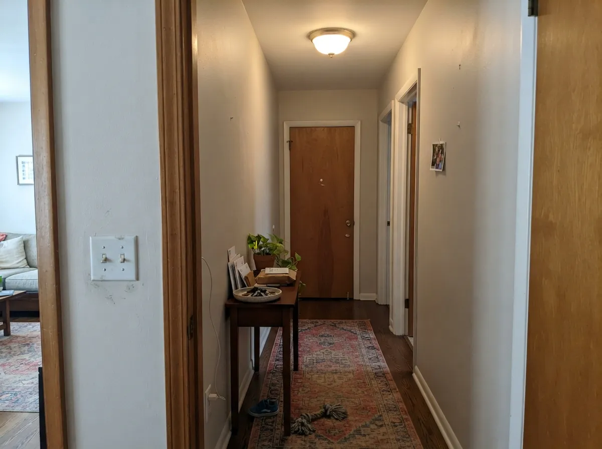
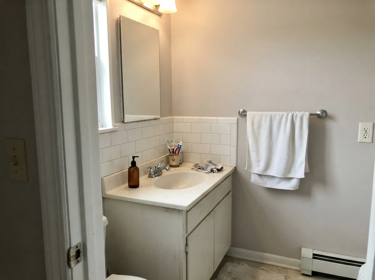
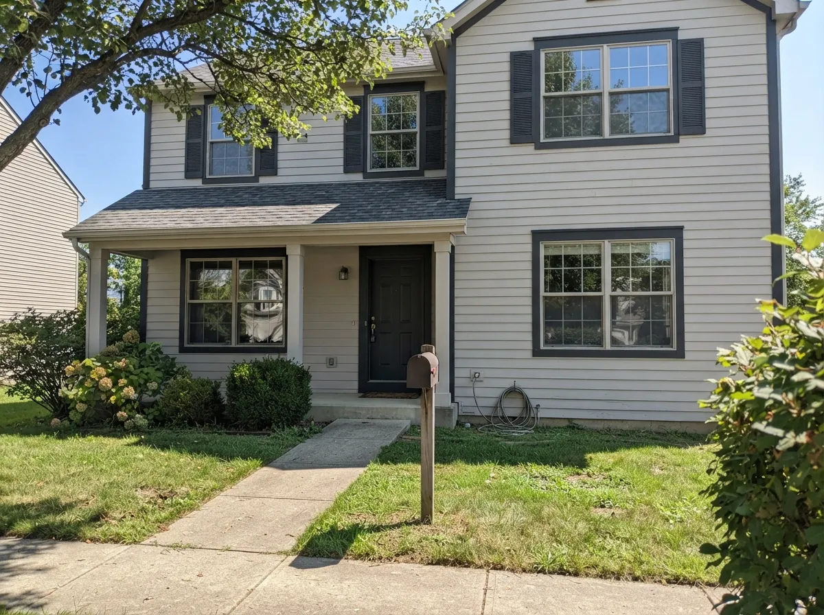
Your Light Is the Risk
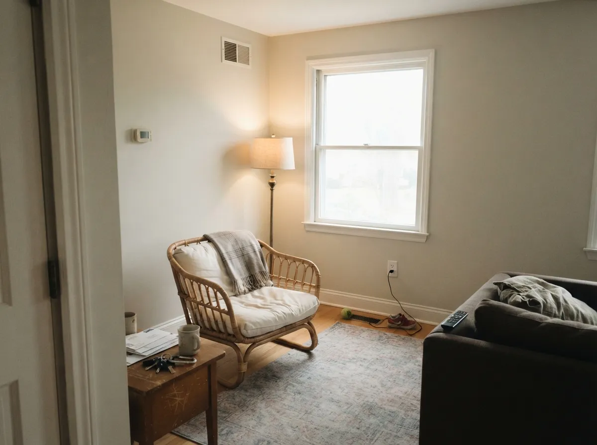
Cool flat daylight pulls the violet forward. Lavender-gray walls, darker than the chip. Test big.
Peak sun bleaches it toward off-white. The greige only comes back late in the day.
Moderate daylight is where it behaves — soft, warm-gray, exactly the color on the chip.
Cool 4000K LEDs turn it lavender. 3000K warm-white is the sweet spot; 2700K pushes it pink.
Most complaints about Balboa Mist are a light mismatch. Upload a photo of your actual room and see it on your walls — then ask for the same wall in north light or evening lamps before you buy a single sample.
Need It From Another Brand?
Any paint counter can custom-tint Benjamin Moore 1549 directly. If you would rather stay in one brand's own deck, these are the closest stock matches, measured as ΔE2000. Under 2 is a difference you will not see on the wall.
| Brand | Closest color | ΔE | LRV | |
|---|---|---|---|---|
| Sherwin-Williams | LimewashSW 9589 · Sherwin-Williams | 1.0 | 67 | Color page → |
| Behr | Ginger SugarMQ3-18 · Behr | 0.2 | 68 | Color page → |
| Valspar | Stony Path5007-1B · Valspar | 2.0 | 68.2 | Color page → |
| PPG / Glidden | Silent SmokePPG1025-2 · PPG / Glidden | 0.6 | 68 | Color page → |
| Glidden | Silent SmokePPG1025-2 · Glidden | 0.5 | 68 | Color page → |
| Dutch Boy | Pearly Gray442-1DB · Dutch Boy | 2.2 | 70 | Color page → |
Similar Benjamin Moore Colors
The nearest shades to Balboa Mist within Benjamin Moore's own range, ranked by perceptual color distance — useful when you want the same look a touch lighter, darker, or warmer.
WCAG 2.1: AA is 4.5 : 1 for normal text, 3 : 1 for large text, AAA is 7 : 1.
Balboa Mist vs the Colors You're Also Considering
Every Balboa Mist sample board has the same rivals on it. The numbers show the real lightness gap — then it comes down to which risk you would rather live with.
Pick this when you want the neutral to read gray and stay quiet.
Benjamin Moore OC-20 · LRV 67Pale OakPick this with cream, oak, or almond finishes — its golden base agrees with them.
Side-by-side comparison →Pick this when you want the color to actually be visible on the wall.
Benjamin Moore OC-23 · LRV 74Classic GrayPick this for a near-white that leans green instead of violet.
Side-by-side comparison →Edgecomb Gray HC-173, hex #D2C9B7 at LRV 63, is the closest rival and the more clearly beige of the two. It is darker and holds more yellow, so a room in Edgecomb Gray feels warmer and slightly cozier, while Balboa Mist stays lighter and reads more gray.
Classic Gray OC-23, hex #D7D2C5 at LRV 74, is lighter still and a shade cooler and greener. Choose it when you want something that behaves almost like a warm white; choose Balboa Mist when you want the greige to be visible.
Pale Oak OC-20, hex #D9D1C0 at LRV 67, is the nearest of the three in character, sitting between the other two with slightly more pink-beige in warm light.
Across brands, Behr Aged Beige PPU7-09 at a deltaE of 0.43 and C2 Gimlet C2-945 at 0.48 are effectively the same color. Sherwin-Williams Grecian Ivory SW 7541 at 0.8 and Farrow and Ball Shaded White No. 201 at 1.01 are visually identical in normal room light. Benjamin Moore is sold through independent dealers, so bring the OC-27 code when comparing.
Balboa Mist Coordinating Colors
The rule with Balboa Mist is to keep its partners on the clean or cool side. Crisp whites and true grays hold it in place; creams, almonds, and yellow-based whites drag the violet out and make the wall look pink. These are the partners that consistently work:
How to Keep Balboa Mist From Going Purple
Almost every lavender complaint can be traced to one of two things: the bulbs or the neighbors. Start with the bulbs, because that fix costs about fifteen dollars. Cool white LEDs at 4000K and above are the single biggest trigger, and daylight-labeled bulbs at 5000K are worse. Move the room to 3000K warm white and the violet usually settles back into gray. Skip 2700K unless you like the color pinker, because very warm bulbs push it the other way.
Then look at what the wall touches. Cream trim, almond tile, honey oak, and yellow-based builder whites all sit opposite the violet and amplify it. Swap the trim to a cleaner white — Chantilly Lace OC-65 or Decorators White CC-20 — and the same wall reads noticeably grayer. If the offender is a floor or a countertop you cannot change, that is your answer: pick a different wall color rather than fighting the room.
Last, sample honestly. Paint two coats on a two-foot board, not the wall, and move it to each corner of the room. Look at it at 10am, at 4pm, and after dark with the lights you actually own. This color changes more between those three moments than almost anything else in the Benjamin Moore deck.
Balboa Mist's Lighter and Darker Neighbors
If Balboa Mist is close but not quite right, you almost never need to leave this corner of the deck. One step lighter is Classic Gray OC-23, which behaves more like a warm white and leans green rather than violet — the usual choice when Balboa Mist samples too dark or too moody. Pale Oak OC-20 sits at nearly the same lightness but with a golden base, which is the swap to make when the room is full of cream and oak.
Going the other way, Edgecomb Gray HC-173 is the warmer, slightly deeper version and the safest substitute in north-facing rooms. Collingwood OC-28 is deeper again and shares the same cool-violet character, so it is a natural next-room-down color if you liked the character but wanted more of it. Revere Pewter HC-172 is two clear steps darker and turns the same idea into a proper mid-tone greige for a den or a dining room.
A practical way to use this: put Balboa Mist on the main floor and Classic Gray OC-23 in the adjoining rooms with the least light, or drop to Revere Pewter HC-172 in one enclosed room for contrast. Because they share a family, the transitions at doorways look deliberate instead of accidental.
Three Ready Palettes Built on Balboa Mist
A color is never alone on the wall. These are complete combinations in the 60-30-10 pattern, with the reason each one holds together. Every one opens in the visualizer.
Chantilly Lace is a clean, slightly cool white, and that contrast is what keeps Balboa Mist reading as gray instead of sliding toward beige. The navy door gives the scheme its one dark note without introducing a second undertone to manage.
Try this palette in your roomSimply White is bright and only lightly warm, so it lifts the walls without the cream-versus-violet fight that ruins this color beside almond cabinets. Kendall Charcoal on the island anchors all that lightness and keeps the room from floating.
Try this palette in your roomDecorators White is a cool, crisp trim white that pushes the walls back toward gray and away from pink. Wrought Iron behind the bed supplies the contrast a light greige cannot make on its own, and the two neutrals stay friendly under lamps.
Try this palette in your roomBalboa Mist FAQ
Why does my Balboa Mist look purple?
Because there is a small amount of violet in the gray, and cool light exposes it. North-facing rooms, overcast days, basements, and 4000K LED bulbs are the usual culprits. Change the bulbs to 3000K first — that alone fixes a lot of rooms — and if the wall still reads lavender in daylight, the color is wrong for that space.
Balboa Mist or Pale Oak?
Balboa Mist is grayer and cooler; Pale Oak is softer and slightly golden. Choose Balboa Mist when you want the neutral to stay gray and disappear. Choose Pale Oak OC-20 when the room has cream trim, oak floors, or beige tile, because its warmer base sits with them instead of fighting them.
Does it work with cream or oak cabinets?
Usually not. Cream and honey oak are built on yellow, and this color's violet edge is the opposite side of the wheel, so the wall reads pink and the cabinets read dirty. If the cabinets are staying, use Pale Oak OC-20 or Edgecomb Gray HC-173 instead.
Is Balboa Mist good for kitchen cabinets?
It can be, for a low-contrast look where the cabinets recede into the walls. It is light enough to keep a small kitchen open, but it shows grease marks more than a deeper color would, so use a urethane-fortified cabinet paint in satin. On perimeter cabinets with a Kendall Charcoal HC-166 island it looks intentional rather than undecided.
Does Balboa Mist work on an exterior?
It is one of its weaker uses. Full sun flattens it and the house can look washed out and colorless from the street. It only works when the trim does the heavy lifting — dark shutters and trim in Kendall Charcoal HC-166 or Wrought Iron 2124-10. For a light body color with more staying power outside, Edgecomb Gray HC-173 is the better buy.
Should the ceiling be Balboa Mist too?
In most rooms, no. Ceilings sit in their own shade all day, which is the cool flat light that brings the violet out, so a Balboa Mist ceiling is where lavender shows up first. Use Chantilly Lace OC-65 in flat overhead. The exception is a small bedroom where you want the whole envelope soft and low-contrast.
Have you painted with Balboa Mist?
Rate it — one tap helps the next reader decide.
Ask a Question