Natural Cream
Benjamin Moore's quiet cream, reviewed honestly: the rooms where it glows, the afternoon light that turns it butter, and what to paint instead.

Jessica has spec'd whites and neutrals for more than 300 rooms and keeps a sample wall of painted drawdowns in her studio. Every color review is checked against real reader rooms in the comments and re-tested when a formula changes. About the testing process →
- 1Revere Pewter55
- 2Agreeable Gray60
- 3Natural Cream65
- 4Shoji White74
- 5Dover White83
The Fast Verdict
Natural Cream is for people who tried gray and found it depressing. It is a real cream with the sweetness turned down, so it warms a room without ever reading as a decorated yellow. It behaves beautifully in cool north light and in open plans where one color has to cover everything. Its two honest weaknesses: strong afternoon sun pushes it toward butter, and a bright blue-white trim makes it look dirty.
North-facing rooms that feel cold and flat · open plans where one color runs everywhere · kitchen cabinets next to oak or warm stone · anyone who found gray depressing
Your main room bakes in west afternoon sun · your trim stays a bright blue-white · your counters are cool gray marble · you want crisp, modern, high-contrast walls
- Warms a cold north-facing room without turning beige
- Holds up as one color across a whole open floor plan
- Flatters oak, walnut, rattan, linen and unlacquered brass
- Enough body at LRV 65 that white trim finally reads crisp
- Reads as a chosen color, not a builder default
- Goes visibly butter-yellow in late west-facing sun
- Can flash faintly green on flat, overcast days
- Looks dingy next to a bright blue-based white trim
- Fights cool gray marble and blue-white quartz counters
What Color Is Natural Cream, Really?
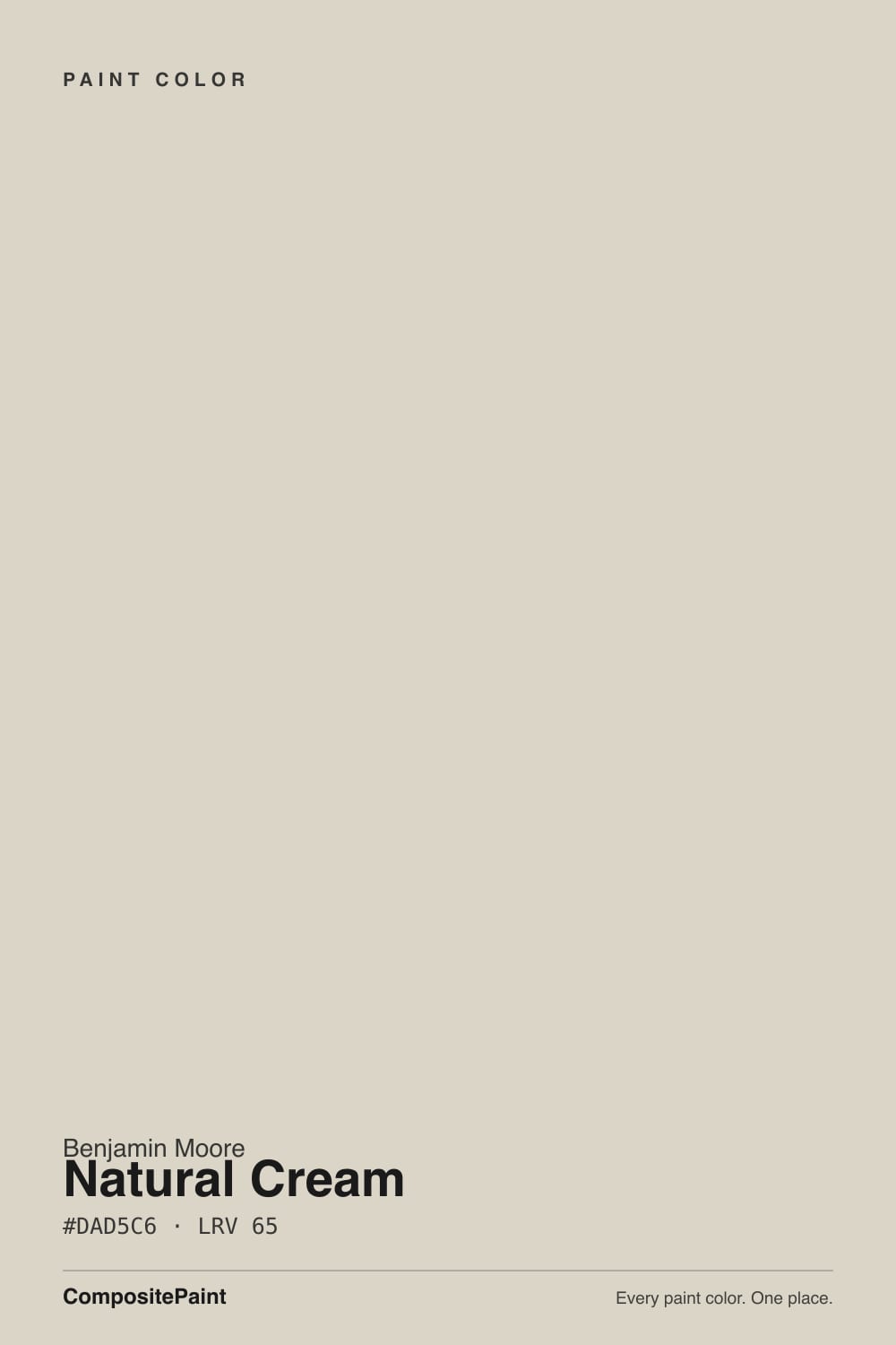
It is a genuine cream, not a white pretending to be warm. The hue sits at 45 degrees — straw and oatmeal territory, not peach, not pink — and the saturation is held at 21 percent, which is low enough to keep it a neutral and high enough that you will absolutely see it. That is the honest part most people miss. On a two-inch chip Natural Cream looks like nothing at all. On four walls it announces itself as a soft, buttery, definitely-not-white color, and homeowners who expected an off-white are the ones who get surprised.
At LRV 65 it sits a long way below the whites it gets compared to. White Dove is 83. Eighteen points is not a nuance — it is the difference between a wall that reads "painted white" and a wall that reads "painted a color." The upside is that it still reflects plenty of light, so rooms do not go heavy, and white trim finally has something to be crisp against. The downside is that in a small room with one small window it will land noticeably deeper and creamier than the chip promised.
Undertone in one line: warm straw-yellow with a trace of gray holding it down — never pink, never orange. If your sample looks slightly green, that is cool overcast light pulling the gray forward against the yellow, not a bad can of paint.
Where It Shines
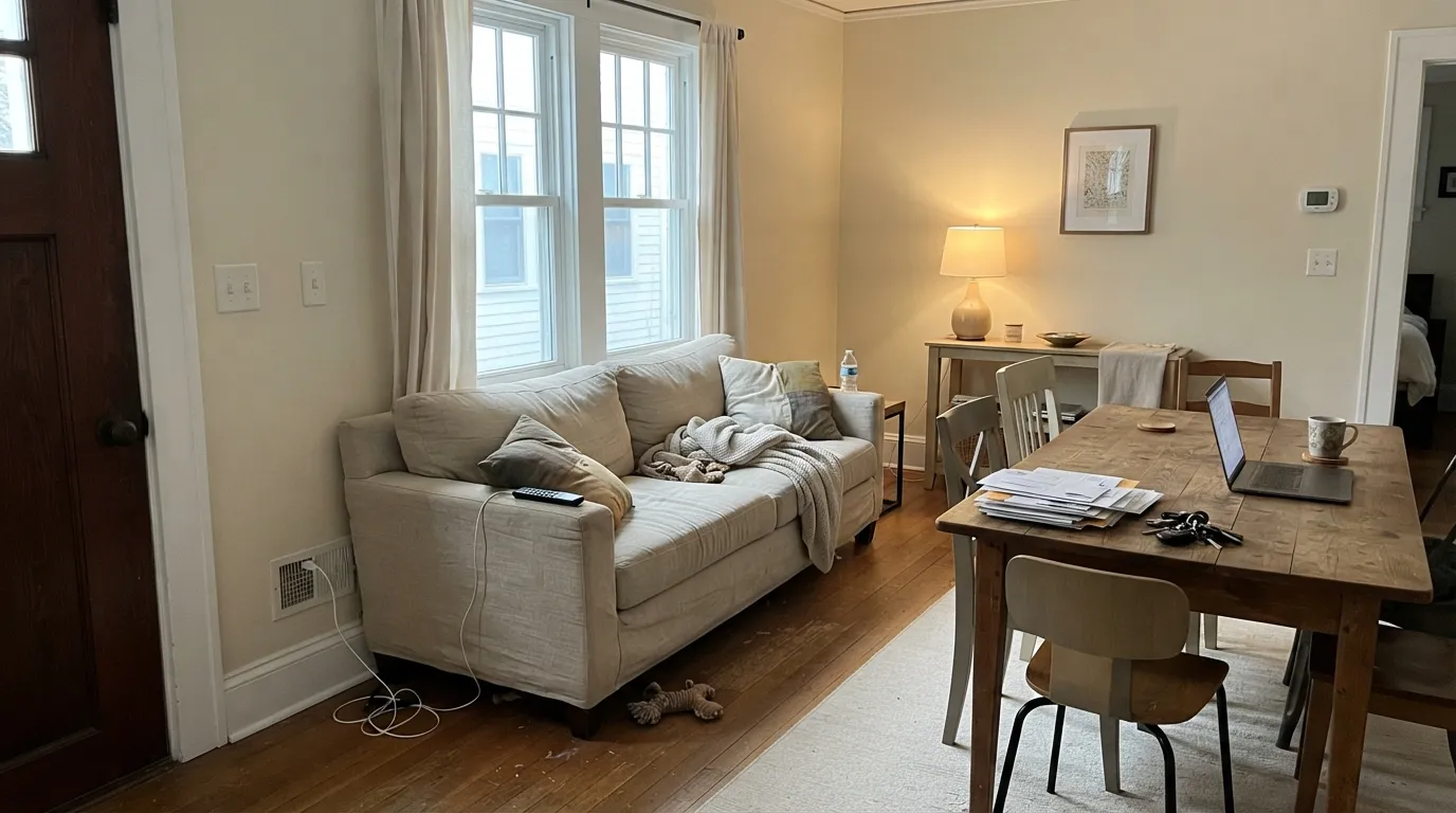
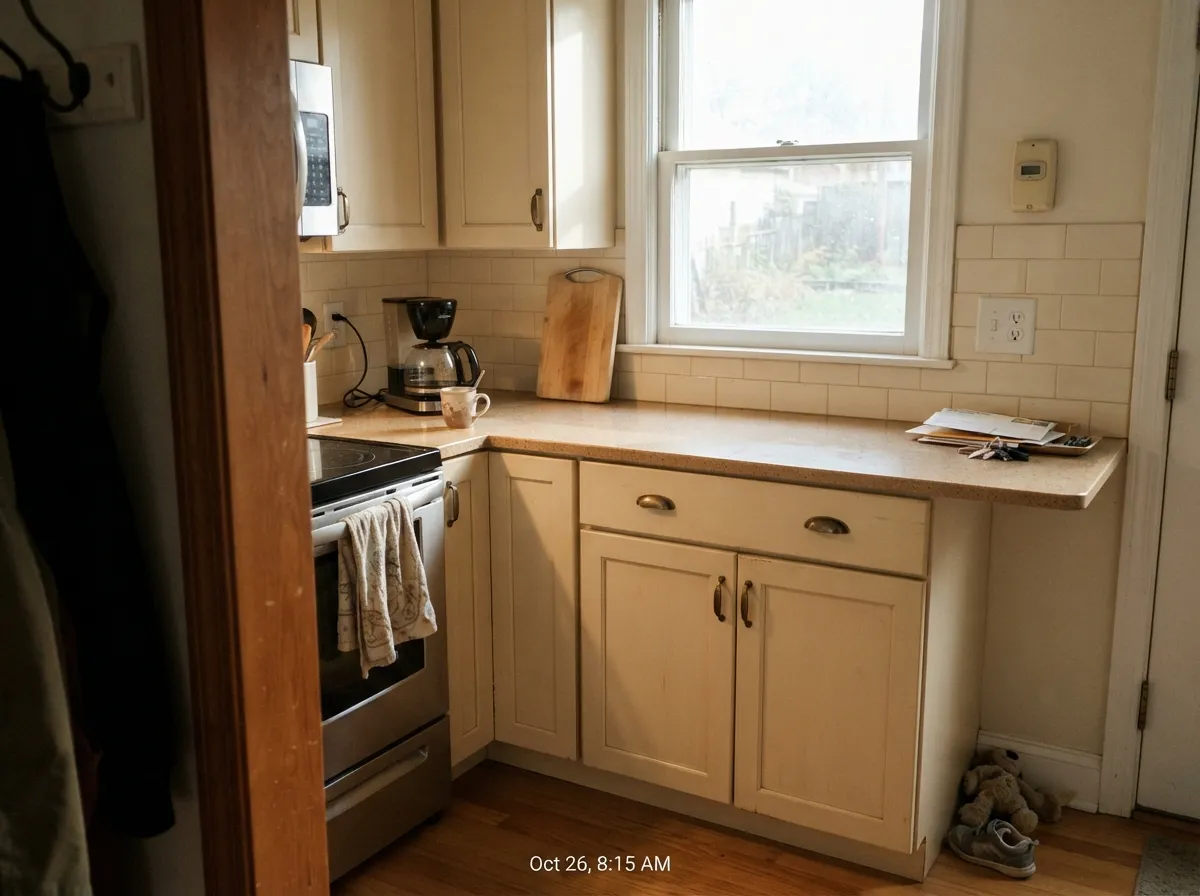
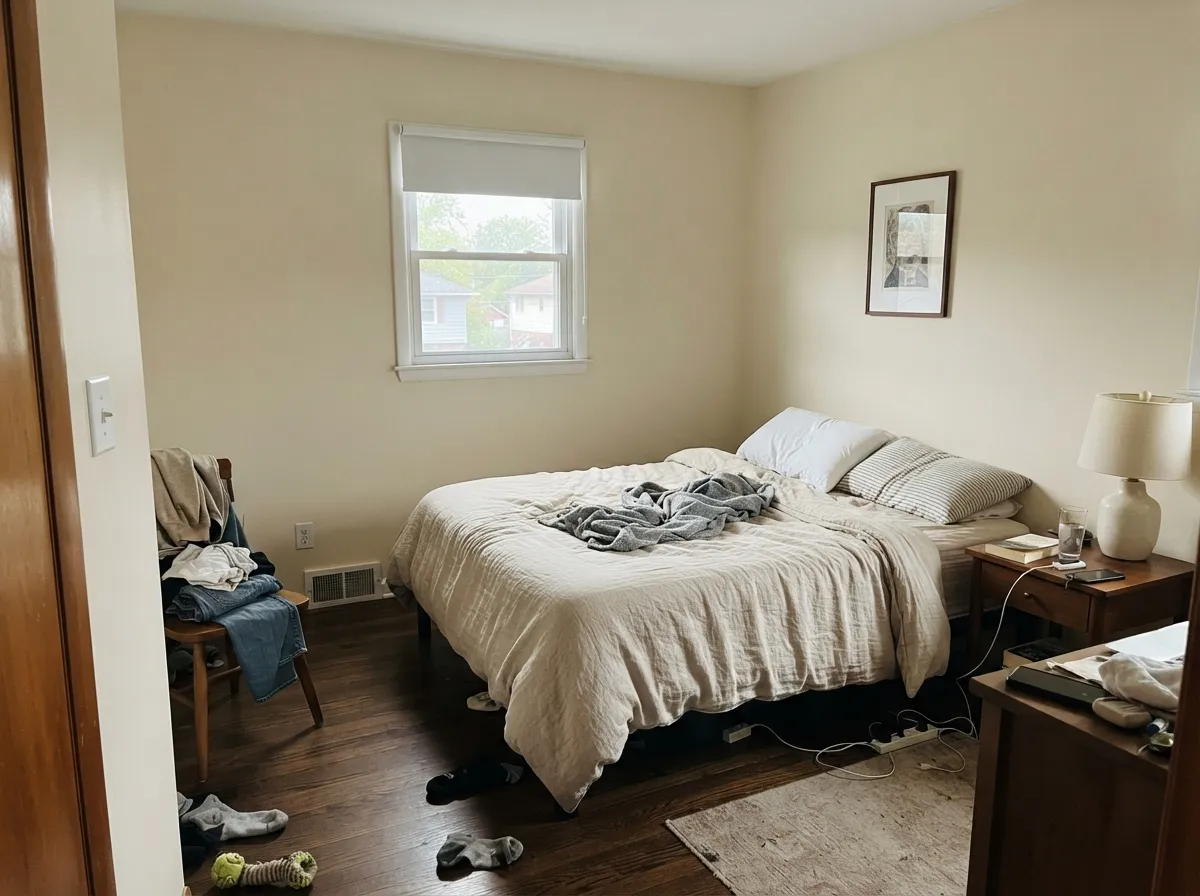
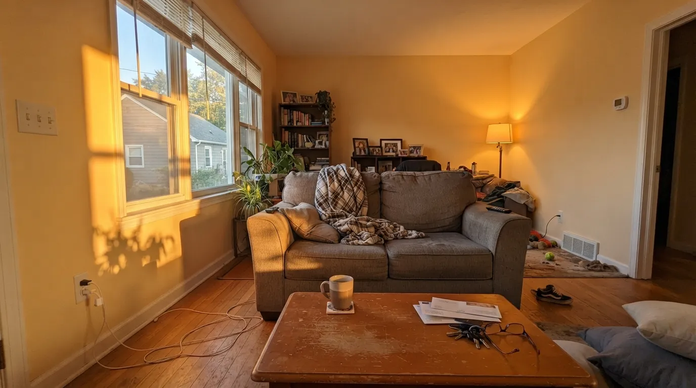
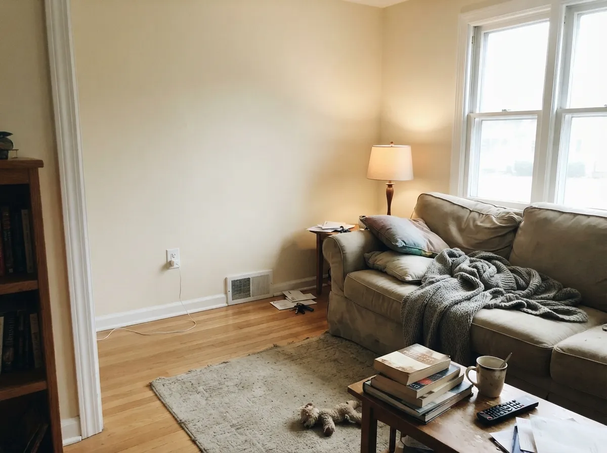
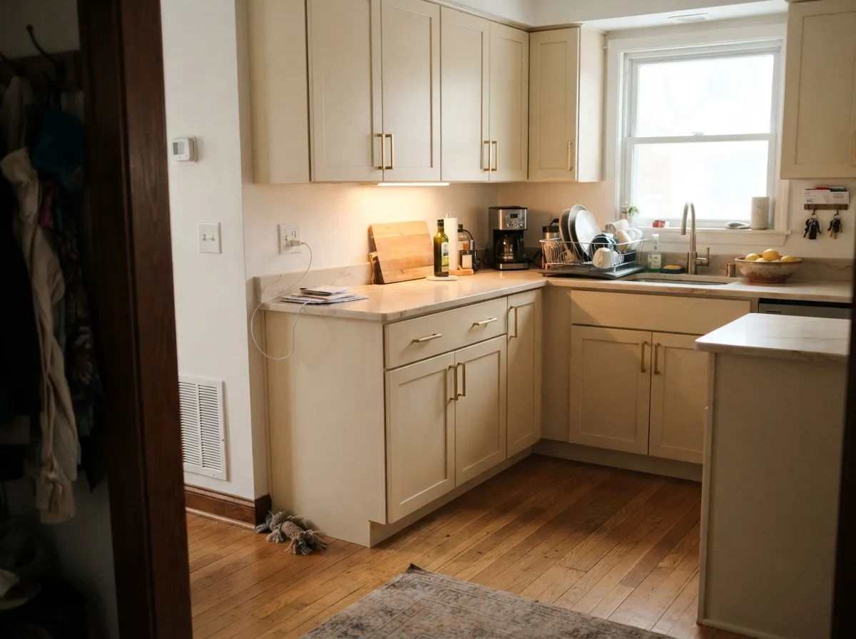
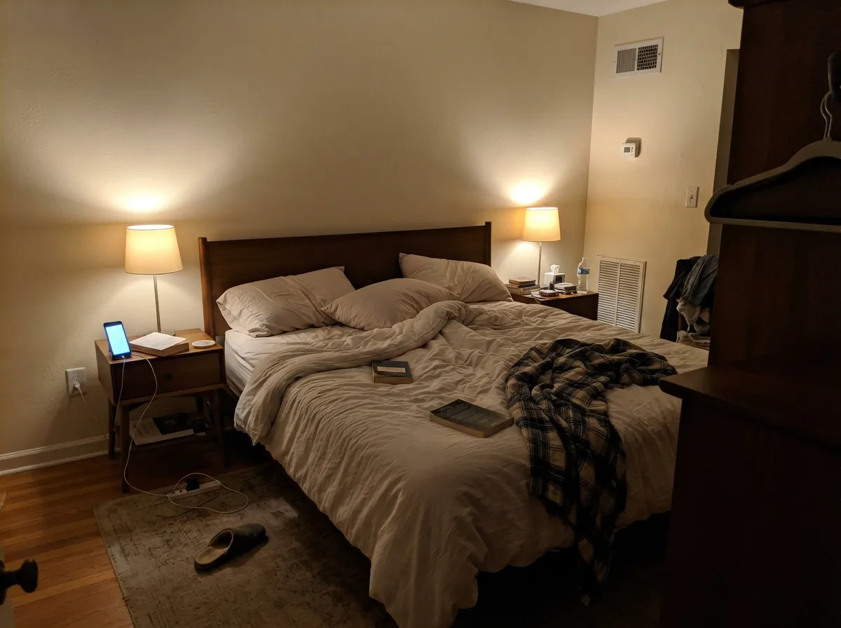
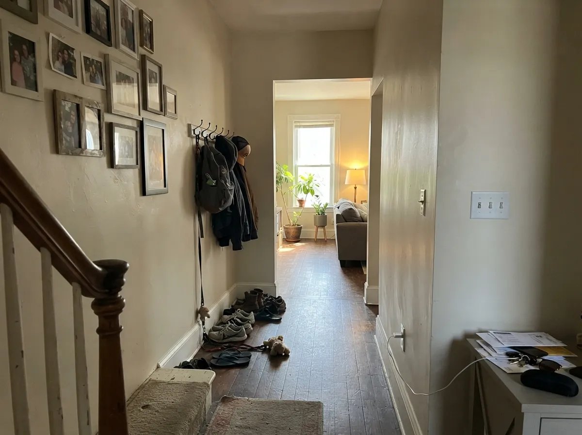
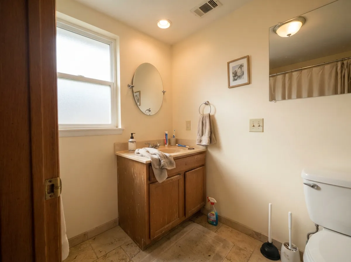
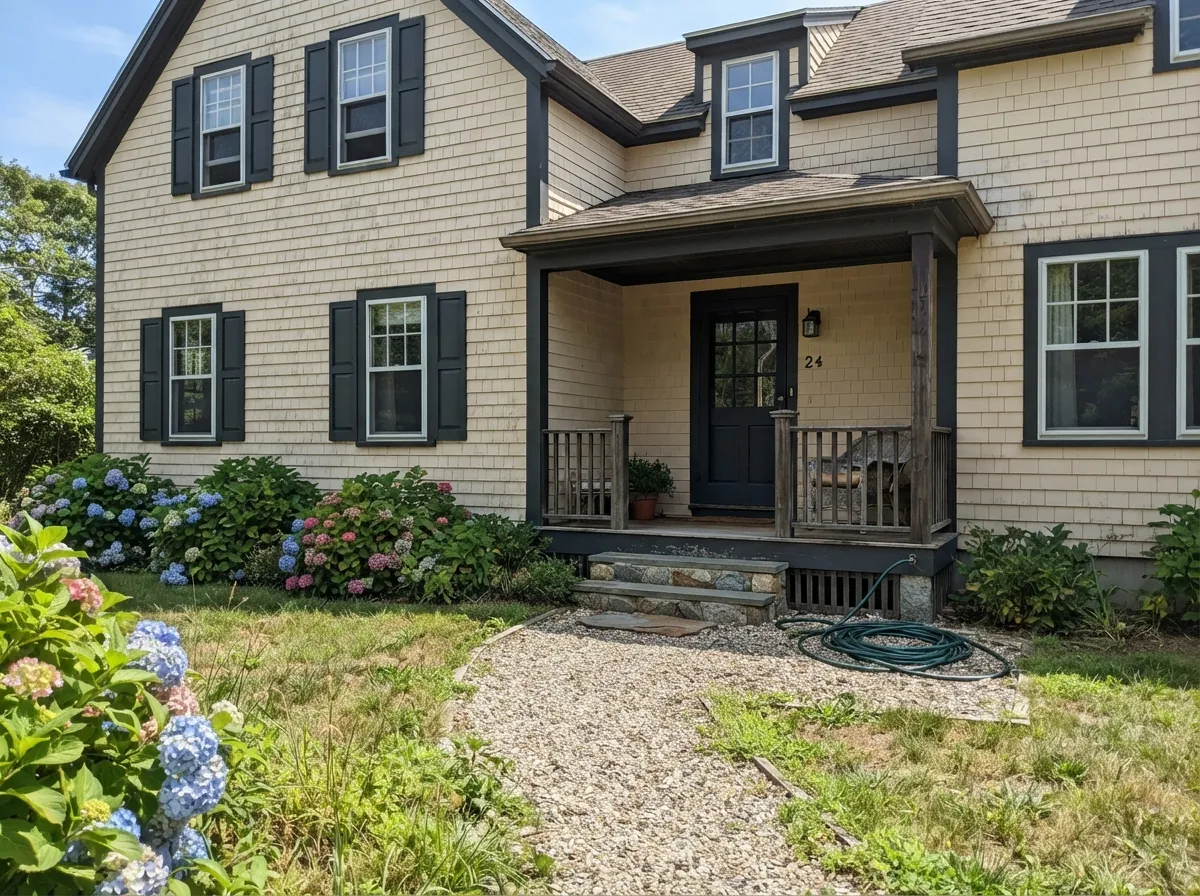
Its best work happens where the light is cool and the materials are warm — north rooms, open main floors, kitchens with oak and brass. These are the rooms it was made for, photographed in the light they actually get.
Where It Fails
The complaints about Natural Cream are consistent and predictable, and all three come down to light or to what is next to it. If your room matches one of these, no primer and no extra coat will save it.
This is the number one regret. Low western sun is the warmest light a house gets, and it lands on a wall that already carries 21 percent yellow saturation. From about four o'clock the walls go frankly butter, and by the time you notice, the room is painted. If the room is west-facing, go grayer: Edgecomb Gray HC-173 holds the same warmth with the yellow pulled back.
In flat, colorless daylight the small amount of gray in the mix steps forward and meets the yellow, and the wall can read faintly green or slightly dirty. It corrects itself the moment a warm bulb comes on, but people who work from home in a north room on a rainy week do notice it. If a green flash would bother you, Swiss Coffee OC-45 is the cleaner cream.
Paint Chantilly Lace 2121-70 trim against Natural Cream walls and the trim wins by a mile — the walls stop reading cream and start reading dingy. This is a pairing mistake, not a paint problem. Use a warm trim white instead: Cloud White OC-130 or White Dove OC-17.
Room by Room
Your Light Is the Risk
Cool daylight cancels the yellow and leaves a soft warm off-white. This is the room to buy it for.
Strong warm light amplifies the straw. By late afternoon a west room reads clearly creamy — sample first.
Flat gray daylight pulls the gray base forward and the wall can look faintly green. Lamps fix it.
2700K lamps deepen the cream — cozy, and most people prefer it. 4000K LEDs flatten it toward plain off-white.
Most complaints about Natural Cream are a light mismatch. Upload a photo of your actual room and see it on your walls — then ask for the same wall in north light or evening lamps before you buy a single sample.
Need It From Another Brand?
Any paint counter can custom-tint Benjamin Moore OC-14 directly. If you would rather stay in one brand's own deck, these are the closest stock matches, measured as ΔE2000. Under 2 is a difference you will not see on the wall.
| Brand | Closest color | ΔE | LRV | |
|---|---|---|---|---|
| Sherwin-Williams | LimewashSW 9589 · Sherwin-Williams | 2.4 | 67 | Color page → |
| Behr | Canvas TanUL170-14 · Behr | 1.2 | 67 | Color page → |
| Valspar | September Fog6003-1A · Valspar | 1.6 | 67.8 | Color page → |
| PPG / Glidden | Veil Of DuskPPG1029-2 · PPG / Glidden | 1.1 | 68 | Color page → |
| Glidden | Soft Herbal Sage70YY 65/090 · Glidden | 1.4 | 65 | Color page → |
| Dutch Boy | Existence420-1DB · Dutch Boy | 1.5 | 63 | Color page → |
Similar Benjamin Moore Colors
The nearest shades to Natural Cream within Benjamin Moore's own range, ranked by perceptual color distance — useful when you want the same look a touch lighter, darker, or warmer.
WCAG 2.1: AA is 4.5 : 1 for normal text, 3 : 1 for large text, AAA is 7 : 1.
Natural Cream vs the Colors You're Also Considering
Every Natural Cream sample board has the same rivals on it. The numbers show the real lightness gap — then it comes down to which risk you would rather live with.
Pick this when gray reads cold and the room needs real warmth.
Benjamin Moore HC-173 · LRV 63Edgecomb GrayPick this if the cream looks too yellow — it is grayer and calmer.
Pick this for actual wall color that still reads soft and warm.
Benjamin Moore OC-17 · LRV 85White DovePick this when you want an off-white, not a cream, on the walls.
Inside the brand, Nature's Essentials 1521 shares the same hex value of #DAD5C6 and is published at LRV 67, so on a wall the two are interchangeable. Elmira White HC-84 at #DBD3C3 and LRV 65 is a touch drier. Edgecomb Gray HC-173 at #D9D3C4 and LRV 63 is the popular greige alternative: slightly darker and noticeably less yellow, which is the choice if Natural Cream feels too creamy for you.
Across brands the close matches are unusually tight. Kompozit Poseidon's Beard 0419 and C2 Paint Potato Leek C2-914, both at LRV 67 and deltaE 1, are visually identical in normal room light, as is Behr Canvas Tan UL170-14 at LRV 67 and deltaE 1.22. Farrow and Ball Skimming Stone No. 241 at LRV 67 and deltaE 1.98 falls in the same band. Sherwin-Williams Limewash SW 9589 at LRV 67 and deltaE 2.43 is very close but worth sampling first, and Magnolia Home Yarn JG-132 at deltaE 3.51 is close but visibly different side by side.
Natural Cream Coordinating Colors
The rule with Natural Cream is to keep every partner on the warm side. It pairs happily with warm whites, muted greens, deep navies and charcoals, and it argues with anything blue-based — cool grays, icy whites, blue-gray stone. These are the partners that actually work in real rooms:
Natural Cream on Kitchen Cabinets
This is where the color quietly outperforms its reputation. Kitchens are full of warm materials — oak and walnut floors, butcher block, travertine, quartz with warm flecks, brass and unlacquered brass hardware — and a stark white cabinet next to all of that looks cold and slightly plastic. Natural Cream meets those materials at their own temperature, so the room reads finished rather than assembled.
Two practical notes. Kitchens usually run brighter and warmer than the rest of a house, with undercabinet lights adding a second warm source, so expect the doors to look creamier here than the same color on a bedroom wall. And check your counter before anything else: warm quartz, soapstone and travertine are safe, while cool gray marble and blue-white engineered stone will make the cabinets look yellowed. Use a urethane-fortified cabinet enamel in satin, and keep the wall above lighter so the cabinets stay the darkest cream in the room.
The Natural Cream Ladder: Lighter and Darker
If the sample board is close but not right, you do not need a different color family — you need a different rung. Going lighter, Ballet White OC-9 keeps the same soft character with less yellow showing and suits sunny rooms where Natural Cream tips butter. Staying at the same weight but pulling the warmth back, Edgecomb Gray HC-173 is the greige version, and Manchester Tan HC-81 is the tan version with a slight green lean.
Going darker, Baby Fawn OC-15 is barely a step down and useful when you want one room slightly deeper than the rest. Shaker Beige HC-45 is a real step darker and works as a dining room or study color under the same trim white. Painting a ladder of three on one board and standing it against your floor is faster than ordering five more samples.
Three Ready Palettes Built on Natural Cream
A color is never alone on the wall. These are complete combinations in the 60-30-10 pattern, with the reason each one holds together. Every one opens in the visualizer.
Cloud White is warm enough to keep the cream looking intentional instead of dingy, which a blue-white trim would ruin. The navy door gives the scheme its single dark note so the walls can stay quiet everywhere else.
Try this palette in your roomCream cabinets under a lighter warm white keep the contrast soft so the wood floor and brass do the talking. Cushing Green shares the same muted, earthy base, so the island grounds the room without turning it into a color scheme.
Try this palette in your roomSage and cream sit on the same warm side of the wheel, so the accent wall reads restful rather than decorated. White Dove overhead keeps the ceiling from looking blue-white against the cream, which is the mistake that flattens this scheme.
Try this palette in your roomNatural Cream FAQ
Does Natural Cream look green?
Sometimes, and only in specific light. On a flat overcast day, or in a north room with no lamps on, the small amount of gray in the mix steps forward against the yellow and the wall can flash faintly green. Turn on a 2700K lamp and it goes straight back to cream. It also leans green when a cool greige is painted right next to it, so avoid that pairing.
Will it look yellow in a west-facing room?
Yes, from mid-afternoon on. Low western sun is the warmest light a house gets and it lands on a color that already carries real yellow. Expect butter-toned walls for two or three hours a day. If that sounds bad, use Edgecomb Gray HC-173 in that room and save Natural Cream for the north side.
Natural Cream or Ballet White?
Ballet White OC-9 is the lighter, more gray-tempered version — it hides its warmth better in strong sun and reads closer to an off-white on a wall. Natural Cream is more honestly a cream and gives a dim room more to work with. In a bright, sunny house pick Ballet White; in a cold, north-lit house pick Natural Cream.
Does it work with orange oak floors?
It works better than most whites do. Builder oak with an orange cast makes cool whites look blue and makes the floor look louder. Natural Cream meets the orange halfway, so the floor calms down instead of shouting. Keep the trim warm too — Cloud White OC-130 rather than a blue-white.
Can I paint the ceiling Natural Cream as well?
You can, in flat, and it works well in a room that feels harshly bright. Be aware the contrast with white trim will be very slight, so the room will read soft and enveloping rather than crisp. If you want any definition at all, put White Dove OC-17 on the ceiling instead.
How many coats does it need?
Two over any existing light or white wall. Over a dark or saturated color, prime first with a gray-tinted primer, because a low-saturation cream has very little pigment to hide with and three finish coats is the expensive way to find that out.
What sheen should I use in a hallway?
Eggshell on the walls and semi-gloss on the doors and trim. Hallways take bag scuffs and hand marks, and at LRV 65 Natural Cream hides them better than a bright white would. Skip matte here — it looks lovely and it does not wipe clean.
Have you painted with Natural Cream?
Rate it — one tap helps the next reader decide.
Ask a Question