Limewash
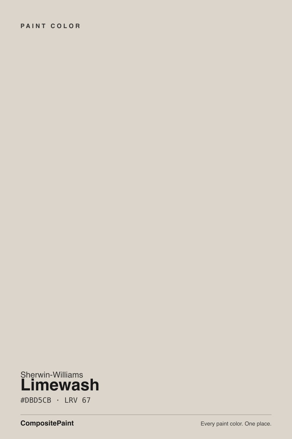
SW 9589 · #DBD5CB · LRV 67 — warm red-orange tone, light — bounces daylight without going clinical.
- 1Revere Pewter55
- 2Agreeable Gray60
- 3Limewash67
- 4Shoji White74
- 5Dover White83
What Color Is Limewash, Really?
Limewash SW 9589 is a light warm greige. The hex is #DBD5CB and the hue sits at 38 degrees, in the tan and yellow part of the wheel, with saturation around 18 percent, so the warmth is present but muted. Its LRV of 67 puts it in the light band: bright enough to keep a room open, dark enough that nobody will mistake it for white.
The appeal is that it behaves like a neutral without going flat. There is enough warmth to stop it reading cold and enough gray to stop it reading yellow or cream, which is what makes it usable as a whole-house wall color next to white trim. It sits comfortably with oak, limestone, linen, and with both black and brass metal.
Two things to check before committing. First, the name describes a finish, not this product. SW 9589 is a standard paint color and will not give you the cloudy, mineral surface of an actual limewash coating. Second, at 18 percent saturation it takes direction from its surroundings. Cool north light can tip it slightly gray, and warm light or warm flooring can push it toward beige. Sample it on more than one wall.
The base lean is warm, sitting at 38 degrees, which is the tan and soft yellow range. Saturation of about 18 percent keeps that warmth from turning into obvious beige, so most rooms read it as a light greige with a warm side.
The undertone shows most against clean white trim, where the tan becomes clear, and it hides against anything already beige, where the same wall can look almost gray. Winter Walk SW 9628 at LRV 66, hex #D8D5CC, is cooler and grayer, and standing next to it makes Limewash look distinctly warm. Kestrel White SW 7516 at LRV 68, hex #E0D6C8, is creamier, and next to that Limewash looks gray again.
This is a color to sample against your floors, not just your trim. Warm oak or a red-toned wood will draw the tan forward, while a gray-washed floor will push it toward stone.
Best Rooms and Uses for Limewash
This is a whole-house wall color. At LRV 67 it works in living rooms, bedrooms, hallways, and open plans, giving walls a soft tone instead of leaving them white, without darkening anything. It is a common choice when white feels too plain and beige feels too heavy.
Kitchens take it well on walls above tile and on perimeter cabinets when you want a quiet, warm kitchen rather than a bright white one. It also suits bathrooms, where it flatters warm stone and brass fixtures.
On exteriors it works as a light body color on stucco, siding, or brick, paired with white or darker trim. The warmth keeps large light walls from looking cold in sun.
As trim it is usually too close in value to work against pale walls. Keep trim in a proper white so the edges read cleanly, and let Limewash carry the larger surfaces.
How Lighting Changes Limewash
At LRV 67 there is enough reflectance to keep rooms bright without the glare of a near-white, which is part of why the color travels well through a house.
North-facing rooms cool it down. The tan retreats and Limewash reads as a soft, quiet gray-beige, sometimes with a faint cool cast on shadowed walls. South-facing rooms bring the warmth forward and the color can look closer to a light beige, especially in afternoon sun. East rooms are warm early and settle neutral; west rooms stay quiet until late in the day and then warm noticeably.
Bulbs work the same way. Warm 2700K lamps make it feel cozy and clearly beige after dark. Neutral 3500K to 4000K bulbs keep it in greige territory. Because the color sits in the middle of warm and cool, it will look meaningfully different between two rooms in the same house.
Most complaints about Limewash are a light mismatch. Upload a photo of your actual room and see it on your walls — then ask for the same wall in north light or evening lamps before you buy a single sample.
Need It From Another Brand?
Any paint counter can custom-tint Sherwin-Williams SW 9589 directly. If you would rather stay in one brand's own deck, these are the closest stock matches, measured as ΔE2000. Under 2 is a difference you will not see on the wall.
| Brand | Closest color | ΔE | LRV | |
|---|---|---|---|---|
| Behr | Pebbled ShoreECC-18-2 · Behr | 0.5 | 67 | Color page → |
| Benjamin Moore | Balboa Mist1549 · Benjamin Moore | 1.0 | 66 | Color page → |
| Valspar | September Fog6003-1A · Valspar | 1.3 | 67.8 | Color page → |
| PPG / Glidden | Casual ElegancePPG1075-3 · PPG / Glidden | 1.8 | 67 | Color page → |
| Glidden | Steel MePPG1018-1 · Glidden | 2.1 | 67 | Color page → |
| Dutch Boy | Misted Mauve446-1DB · Dutch Boy | 4.7 | 68 | Color page → |
Similar Sherwin-Williams Colors
The nearest shades to Limewash within Sherwin-Williams's own range, ranked by perceptual color distance — useful when you want the same look a touch lighter, darker, or warmer.
WCAG 2.1: AA is 4.5 : 1 for normal text, 3 : 1 for large text, AAA is 7 : 1.
Limewash vs Similar Colors
Winter Walk SW 9628 at LRV 66 is the cooler twin. Its hex #D8D5CC holds less warmth, so side by side it reads gray while Limewash reads warm. Kestrel White SW 7516 at LRV 68, hex #E0D6C8, goes the other direction and is clearly creamier. Drift of Mist SW 9166 at LRV 69 is lighter and cooler again, Crushed Ice SW 7647 at LRV 66 is a cooler gray-beige, and Taupe of the Morning SW 9590 at LRV 65 is the browner, slightly deeper option.
Across brands, Behr Pebbled Shore ECC-18-2 and Farrow and Ball Skimming Stone No. 241 both sit at deltaE 0.46 and LRV 67, effectively the same color. Benjamin Moore Balboa Mist 1549 at LRV 66 and deltaE 1.03 is visually identical in normal room light, as is Valspar September Fog 6003-1A at deltaE 1.29. Backdrop Real Real at deltaE 3.29 is very close but should be sampled first, and Dutch Boy Misted Mauve 446-1DB at deltaE 4.67 is close but visibly different side by side, with a pink lean this color does not have.
Colors That Go With Limewash
White trim is the natural pairing. A bright white keeps the walls clearly separate and makes the warmth easy to see; a soft warm white blends the two into a calmer, quieter room. Either works because the color sits between warm and cool.
For a second tone in the same family, Taupe of the Morning SW 9590 at LRV 65, hex #DAD2C6, is a slightly deeper and browner step, and Kestrel White SW 7516 at LRV 68 goes creamier. Drift of Mist SW 9166 at LRV 69 and Windfresh White SW 7628 at LRV 69 are both a touch lighter if you want a soft ceiling or an adjoining room that lifts.
Across brands, Behr Pebbled Shore ECC-18-2 and Farrow and Ball Skimming Stone No. 241, both at LRV 67 and deltaE 0.46, carry the same color in another line.
Materials that suit it: white oak, limestone, linen, rattan, aged brass, and matte black hardware.
Coordinated palette
Generated by hue-rotating #DBD5CB in HSL space. Pair Limewash with one accent and one neutral — the swatches below are starting points, not final picks.
Limewash FAQ
Is Limewash warm or gray?
It is a warm greige. The hue sits at 38 degrees in the tan range, but saturation is only about 18 percent, so the warmth stays muted and the color often reads gray in cool north light. Against a clean white trim the tan becomes obvious; against a beige it can look almost gray.
What LRV is Limewash?
Limewash has an LRV of 67 on a scale from 0 for black to 100 for pure white. That is in the light band, so it reflects a good amount of light and keeps rooms open, while still being clearly a color rather than a white. It suits full walls in most rooms without darkening them.
Does Limewash look like a real limewash finish?
No. SW 9589 is a standard paint color, not a mineral coating, so it goes on flat and even with none of the cloudy, mottled texture of a true limewash. If you want that broken, layered look you need an actual limewash or a specialty finish product; the paint only gives you the color.
Does Limewash work in a dark room?
Yes. At LRV 67 it returns enough light to keep a low-light room from feeling closed in, and the warm 38 degree undertone stops it from turning cold and gloomy the way a gray-blue neutral can. Expect it to read more gray than beige in north-facing rooms.
What white trim goes with Limewash?
Both directions work. A bright white gives clear separation and lets the warmth of the wall show, which suits modern and transitional rooms. A soft warm white blends the wall and trim into a calmer whole. Avoid a trim white with a strong yellow cast, since it can make the walls look gray by comparison.
What is the closest match to Limewash in other brands?
Behr Pebbled Shore ECC-18-2 and Farrow and Ball Skimming Stone No. 241 both sit at LRV 67 with a deltaE of 0.46, which makes them the same color in another line. Benjamin Moore Balboa Mist 1549 at LRV 66 and deltaE 1.03 is visually identical in normal room light.
Have you painted with Limewash?
Rate it — one tap helps the next reader decide.
Ask a Question