Crushed Ice
A near-white warm gray reviewed honestly: the rooms where its quietness is the point, and the rooms where it disappears into nothing.

Jessica has spec'd whites and neutrals for more than 300 rooms and keeps a sample wall of painted drawdowns in her studio. Every color review is checked against real reader rooms in the comments and re-tested when a formula changes. About the testing process →
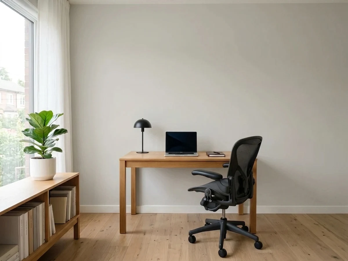
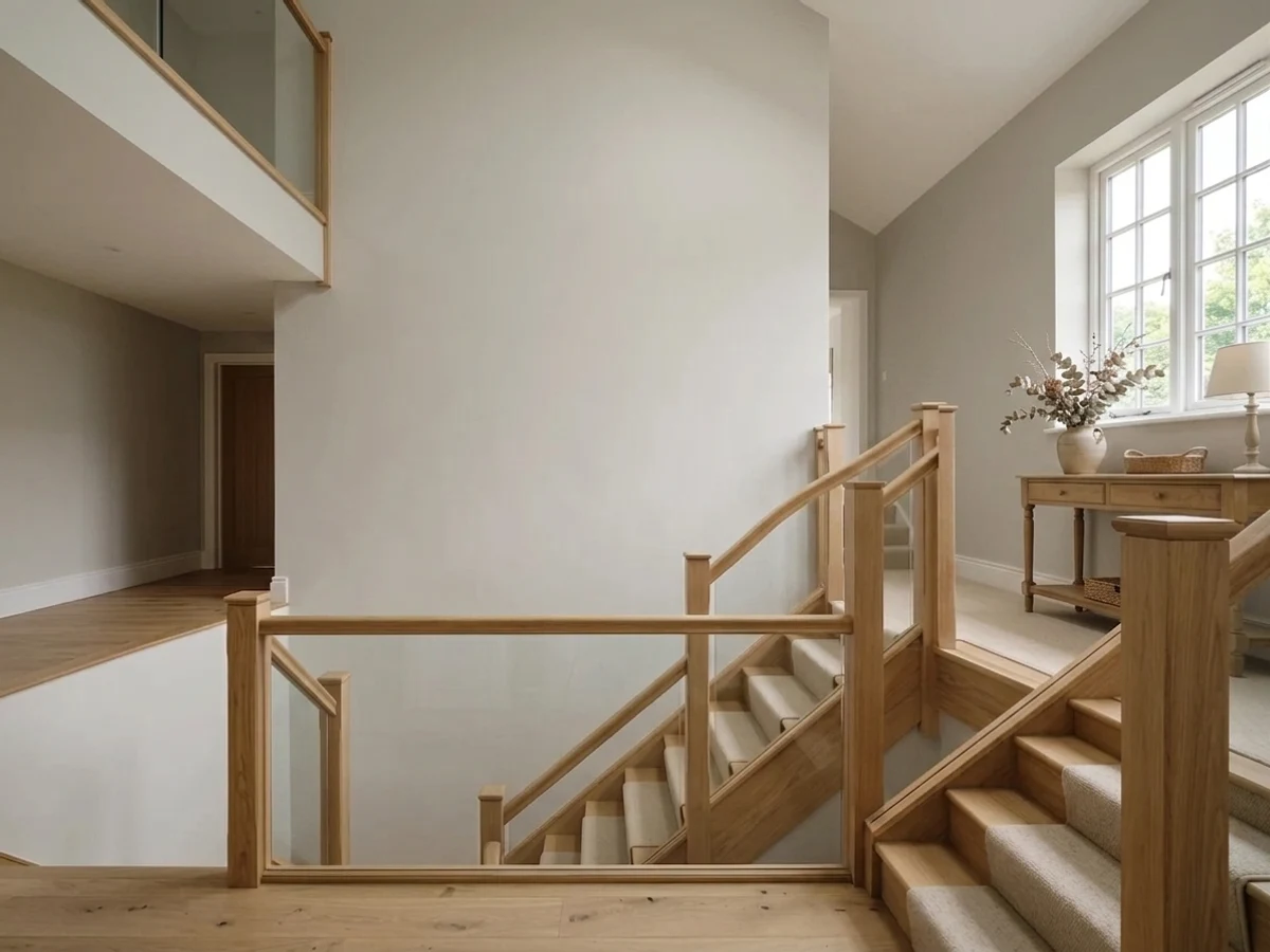
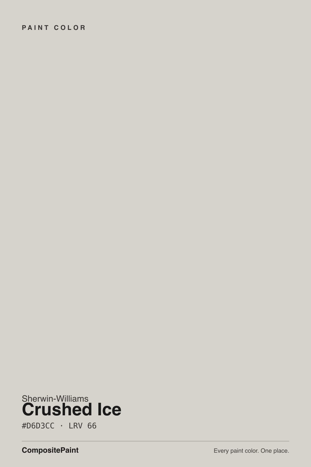
- 1Revere Pewter55
- 2Agreeable Gray60
- 3Crushed Ice66
- 4Shoji White74
- 5Dover White83
The Fast Verdict
Crushed Ice is the color you pick when you want the walls to stop talking. At LRV 66 it keeps a room bright, and the warm lean is so faint that most people simply read it as a soft, clean gray. That restraint is both the strength and the risk: it flatters wood, art and stone, and it can also vanish next to bright white trim until the wall looks like it was never painted. Sample it big, and decide on purpose whether you want a color or a background.
Hallways, stairwells and open plans that need one quiet color · rooms where wood, art and stone should lead · dim rooms that need light without going white · low-contrast schemes where walls and trim nearly match
You want the wall to read as an actual color · your trim stays a bright builder white · the room is full of green stone or a green view · you want gray that shows up in photos
- Bright at LRV 66 without going stark white
- Warm enough to avoid a cold, hospital feel
- Sits comfortably between cool tile and warm wood
- Flows through open plans and hallways with no clashes
- Easy to trim, cabinet or ceiling — almost nothing fights it
- Reads like unwashed white next to bright white trim
- Picks up green from views, carpet and stone
- Too little saturation to carry a room on its own
- Goes flat and slightly taupe in cool north light
What Color Is Crushed Ice, Really?
A light greige that most people would call a warm gray without thinking twice. The warmth is technically there — the hue sits in the red-orange direction — but only about 11 percent saturation reaches the wall, so it never announces itself as beige. What you actually see is a soft, slightly softened gray with no cold blue edge. That is the whole point of the color: it is warm enough to stop a room feeling clinical and gray enough to never look tan.
At LRV 66 it reflects a lot of light without being a white. Put it beside Repose Gray SW 7015 at LRV 58 and Crushed Ice looks a full step lighter and far less gray; put it beside Pure White SW 7005 at LRV 84 and it suddenly shows its body and reads clearly as a color. That second comparison is the one that decides most projects. Against darker floors and furniture it behaves like a bright, calm neutral. Against a bright white ceiling and trim it behaves like a faint shadow.
Undertone in one line: warm gray with the warmth turned almost all the way down — never yellow, never blue, but easily pushed green or taupe by whatever large surface sits next to it.
Where It Shines
Its best work is the work nobody notices. Run it through a hallway, up a stairwell and across an open main floor and everything connects without a single color argument, because there is almost nothing in it to argue with. Rooms with real wood, textiles and art are where it earns its keep.
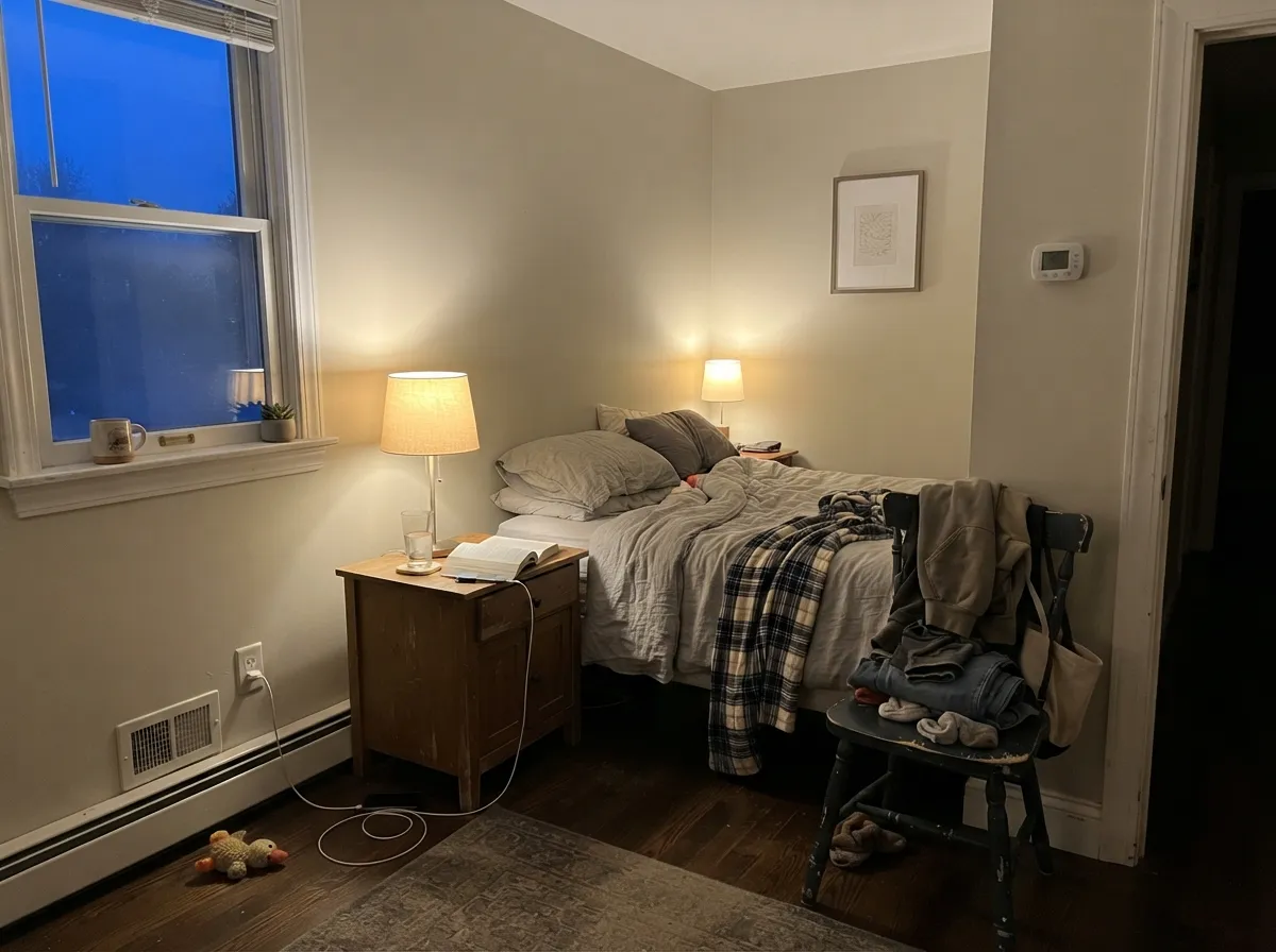
Where It Fails
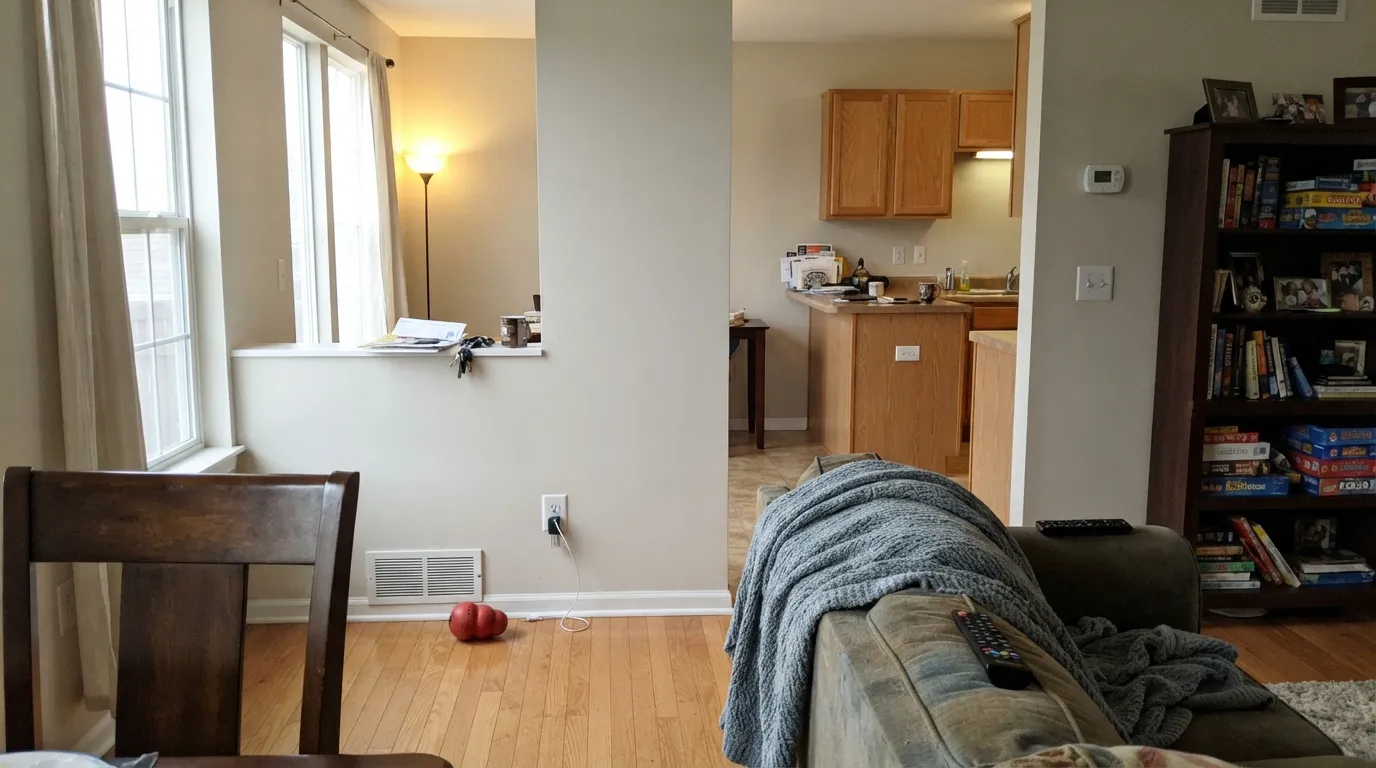
The unhappy stories about Crushed Ice are almost never about the paint being wrong. They are about the color being asked to do a job a near-neutral cannot do. Three situations account for nearly all of them.
This is the number one disappointment. With Pure White SW 7005 or a builder white on the trim and ceiling, the eye takes the white as its reference and Crushed Ice stops reading as a soft neutral — it reads as a wall that needs washing. The fix is contrast or commitment: step the walls down to Repose Gray SW 7015 so the gray is deliberate, or run trim and walls in Crushed Ice at different sheens so there is nothing to lose against.
Cool north daylight cancels the small warm lean, and a gray LVP or gray-washed floor bounces its own cast up the wall. What is left can drift toward a flat, faintly taupe-lilac gray that looks nothing like the chip. If the room faces north and the floors are cool, go warmer on purpose with Agreeable Gray SW 7029 or Accessible Beige SW 7036.
At 11 percent saturation there is not enough color in the paint to resist anything. A lawn outside a big window, a green-flecked granite counter, or green carpet will tint the wall, and the effect is strongest on the wall facing the source. If the room is full of green, use a neutral with more backbone such as Shoji White SW 7042.
Room by Room
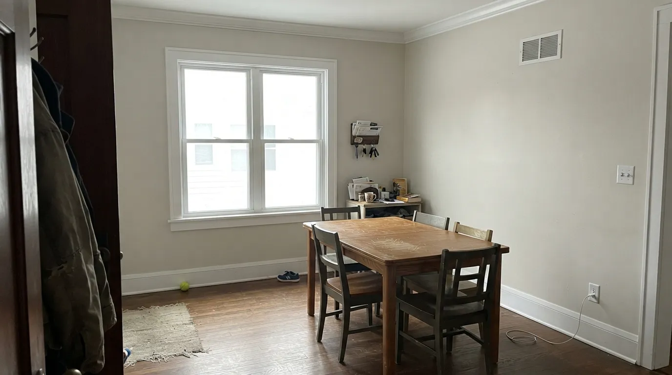
It sits back and lets furniture, rugs and art carry the room, which is exactly what most people want from an open living space. Eggshell on the walls, Pure White SW 7005 in semi-gloss on the trim if you want a visible edge. Add one dark note somewhere — a black frame wall, Iron Ore SW 7069 built-ins — or the room reads unfinished.
Narrow spaces with borrowed light are where LRV 66 pays off; it brightens without the glare of a flat white. It also flows between rooms of different temperatures without a visible change of mind. Eggshell holds up to hands and luggage better than flat.
Under 2700K bulbs the faint warmth comes forward at night and the room feels soft rather than gray. Under cool 4000K LEDs it goes clean and a little cold. Pair with Snowbound SW 7004 trim and a muted accent like Evergreen Fog SW 9130 if the room needs one color note.
Low saturation is a real advantage behind art, screens and shelving because it does not throw a cast onto anything. Eggshell keeps glare down on video calls. Keep the frames and hardware dark so the wall has something to hold onto.
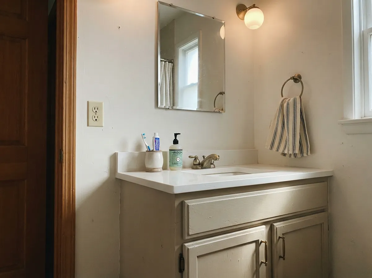
On a vanity in satin it is a softer, less clinical alternative to white and hides water spotting better. With warm quartz and brass it is excellent. With green-veined marble or cool blue-gray tile, sample first — this is where the cast problem shows up fastest.
Full sun washes it lighter still, so it reads almost white on a facade. That works when the trim, shutters or door supply real contrast — Iron Ore SW 7069 or Naval SW 6244 — and falls flat on an elevation with white trim and nothing else.
Your Light Is the Risk
The warmth comes forward and it reads as a soft greige all day. Its best window.
Cool daylight cancels the warm lean and leaves a plain, slightly chilly gray.
2700K lamps make it faintly beige; 4000K LEDs keep it gray. Choose the bulb first.
Lawns, green counters and gray floors tint it. The wall nearest the source shifts most.
Most complaints about Crushed Ice are a light mismatch. Upload a photo of your actual room and see it on your walls — then ask for the same wall in north light or evening lamps before you buy a single sample.
Need It From Another Brand?
Any paint counter can custom-tint Sherwin-Williams SW 7647 directly. If you would rather stay in one brand's own deck, these are the closest stock matches, measured as ΔE2000. Under 2 is a difference you will not see on the wall.
| Brand | Closest color | ΔE | LRV | |
|---|---|---|---|---|
| Behr | Soft SecretPPU25-10 · Behr | 1.6 | 66 | Color page → |
| Benjamin Moore | Lilac HushCSP-490 · Benjamin Moore | 1.3 | 64 | Color page → |
| Valspar | Tempered Gray4004-1A · Valspar | 0.5 | 64.9 | Color page → |
| PPG / Glidden | Wright Cloud WhiteFLLW961 · PPG / Glidden | 2.8 | 65 | Color page → |
| Glidden | Old Fossilstone Grey40YY 64/035 · Glidden | 0.8 | 64 | Color page → |
| Dutch Boy | Weeping Birch405-1DB · Dutch Boy | 2.5 | 63 | Color page → |
Similar Sherwin-Williams Colors
The nearest shades to Crushed Ice within Sherwin-Williams's own range, ranked by perceptual color distance — useful when you want the same look a touch lighter, darker, or warmer.
WCAG 2.1: AA is 4.5 : 1 for normal text, 3 : 1 for large text, AAA is 7 : 1.
Crushed Ice vs the Colors You're Also Considering
Every Crushed Ice sample board has the same rivals on it. The numbers show the real lightness gap — then it comes down to which risk you would rather live with.
Pick this if you want light and quiet, not a visible gray.
Sherwin-Williams SW 7015 · LRV 58Repose GrayPick this when the wall should actually read as gray.
Pick this for a lighter, cleaner room that stays near-white.
Sherwin-Williams SW 7029 · LRV 60Agreeable GrayPick this for warmer greige that holds up in dim rooms.
The in-brand neighbors differ mostly in temperature. Silverpointe SW 7653 at LRV 64 and Guild Grey SW 9561 at LRV 63 are cooler and slightly darker, so they read more clearly as gray. Grey Heron SW 9566 at LRV 65 is nearly the same brightness with a similar quiet lean. Taupe of the Morning SW 9590 at LRV 65 is the warm option, closer to a light greige than a gray. Limewash SW 9589 at LRV 67 is a point lighter and softer.
Across brands, Valspar Tempered Gray 4004-1A at LRV 64.9, C2 Paint Grout C2-994 at LRV 65, Glidden Old Fossilstone Grey 40YY 64/035 at LRV 64, and Rodda Silver CA030 at LRV 67 are all exact color matches on the numbers. Behr Soft Secret PPU25-10 at LRV 66 and Benjamin Moore Lilac Hush CSP-490 at LRV 64 are visually identical in normal room light. Farrow & Ball Dimpse No. 277 at LRV 66 is very close but cooler, so sample it first.
Crushed Ice Coordinating Colors
The rule with a near-neutral this quiet is that the partners have to do the work. Anything within a few LRV points will read as the same color from across the room, so the useful pairings are either a clean trim white or something genuinely dark. These are the colors that make Crushed Ice look intentional rather than accidental:
Crushed Ice on Cabinets and Vanities
This is the use that surprises people. On a kitchen island, a laundry run or a bathroom vanity, Crushed Ice gives you the look of a white cabinet without the clinical edge and without every fingerprint showing. The low saturation means it does not fight quartz, and the light value keeps a small bathroom feeling open.
The one decision to make first is the wall color, because cabinets and walls in near-identical neutrals look like a mistake. Either go warmer and lighter on the walls with Alabaster SW 7008, or step the walls down to Repose Gray SW 7015 so the doors read lighter. Use a urethane-fortified cabinet enamel in satin, and expect two coats plus a bonding primer over factory-finished doors.
Lighter and Darker Than Crushed Ice
If the sample is close but not right, you usually need a step rather than a different family. Going lighter, Eider White SW 7014 at LRV 73 keeps the same soft character but sits nearer white — good when Crushed Ice looks heavier than you hoped, though it leans slightly more violet in cool light.
Going darker, Silverpointe SW 7653 at LRV 64 is barely darker but distinctly cooler, so it reads more like a real gray. Agreeable Gray SW 7029 at LRV 60 is the warmer step down and the safest choice if Crushed Ice looked chilly in your room. Repose Gray SW 7015 at LRV 58 is the biggest drop and the one that finally gives you visible gray walls.
Three Ready Palettes Built on Crushed Ice
A color is never alone on the wall. These are complete combinations in the 60-30-10 pattern, with the reason each one holds together. Every one opens in the visualizer.
Crushed Ice on 60 percent of the surfaces keeps every room connected, and Pure White gives the trim a clean edge without shouting. Iron Ore is the one dark note that stops the whole scheme from reading washed out.
Try this palette in your roomCabinets in Crushed Ice read as a quiet, grown-up alternative to white and hide fingerprints far better, while Alabaster keeps the walls a shade warmer so the doors stand slightly forward. Urbane Bronze on the island gives the room its 10 percent anchor and loves brass pulls.
Try this palette in your roomTaking Crushed Ice over the ceiling removes the hard line a bright white overhead would draw, so a small bedroom reads calmer and taller. Snowbound is soft enough that the trim never makes the walls look dirty, and Evergreen Fog supplies the single restful color note.
Try this palette in your roomCrushed Ice FAQ
Does Crushed Ice look purple?
It can look faintly taupe-lilac, and it happens in one predictable setup: cool north light over gray-toned floors, with no warm lamps on. In that combination the small warm lean cancels out and the leftover gray drifts violet against cooler surfaces. In south light or under 2700K bulbs it stays plainly warm gray.
Will it just look like white on my walls?
Against bright white trim, close to it. At LRV 66 there is a clear gap from a true white, but the eye only sees that gap if something in the room stays lighter. If the trim, ceiling and cabinets are all bright white, expect the walls to read as a slightly dirty version of them rather than as a color.
Crushed Ice or Repose Gray?
Repose Gray SW 7015 sits at LRV 58, eight points darker, and it reads clearly as gray on the wall. Crushed Ice reads as light and quiet. Pick Repose Gray for a room that should look gray in photos; pick Crushed Ice for a bright background you barely notice.
Does it work with gray LVP floors?
Only with a sample on site. Cool gray flooring bounces its own tone up the wall and pulls Crushed Ice colder and flatter than the chip. Warm gray or greige LVP is a much safer match. If the floor is clearly blue-gray, Agreeable Gray SW 7029 handles it better.
What sheen should I use, and does it show roller marks?
Eggshell on walls, semi-gloss on trim, satin on cabinets, flat on ceilings. Very light low-saturation colors like this show lap marks and flashing more than mid-tones because there is no depth of color to hide them. Keep a wet edge, roll full walls in one session, and prime patched drywall.
Is it a good whole-house color?
Yes, it is one of the easier ones. Nothing in it fights north-facing or south-facing rooms, so it carries through hallways, bedrooms and open plans without needing a second neutral. Just plan one dark accent per floor — a door, an island, built-ins — so the house does not read washed out.
How many coats over an old beige wall?
Two, with a good roller and full loading. Going over a beige or tan that is darker or more saturated, the second coat is where the yellow finally stops peeking through, and a third is not unusual in raking daylight. Over a saturated red or navy, prime with a gray-tinted primer first.
Have you painted with Crushed Ice?
Rate it — one tap helps the next reader decide.
Ask a Question