Taupe of the Morning
A quiet Sherwin-Williams warm neutral almost nobody talks about, reviewed honestly: what it actually is, the light that flatters it, and the near-twin you may already know.

Jessica has spec'd whites and neutrals for more than 300 rooms and keeps a sample wall of painted drawdowns in her studio. Every color review is checked against real reader rooms in the comments and re-tested when a formula changes. About the testing process →
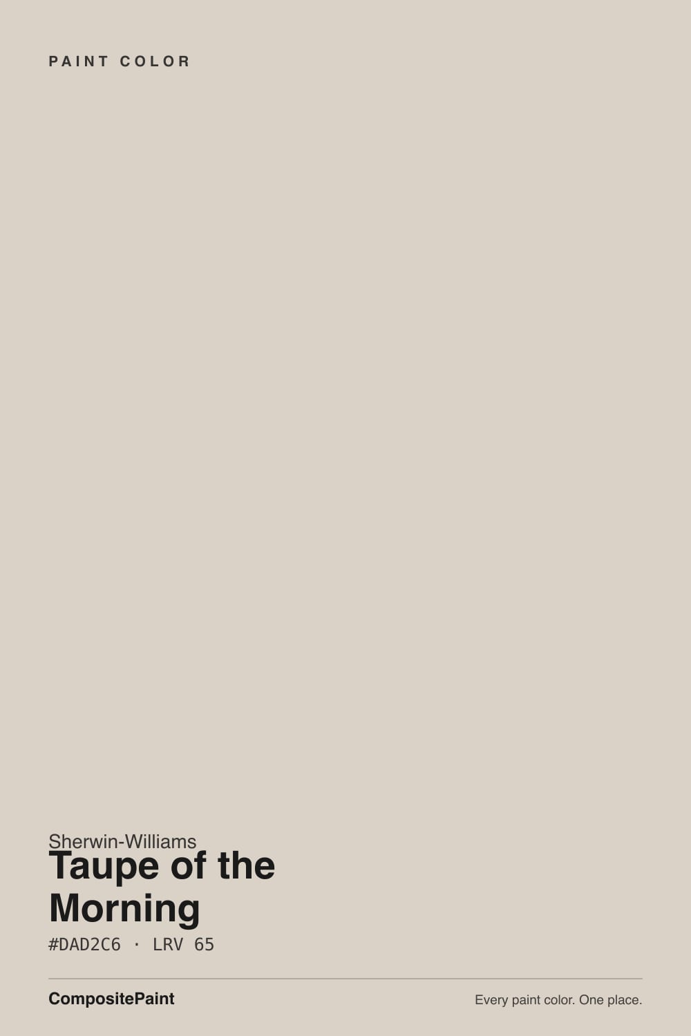
- 1Revere Pewter55
- 2Agreeable Gray60
- 3Taupe of the Morning65
- 4Shoji White74
- 5Dover White83
The Fast Verdict
Taupe of the Morning is a light, warm taupe that has none of the marketing history of Agreeable Gray or Accessible Beige and, on the wall, barely needs it — it does the same quiet job, just a shade lighter and with almost nobody writing about it. At LRV 65 it sits closer to an off-white than a true greige: warm, low-contrast, easy to live with. It is not a famous color. It is a competent one, and that is a fine thing to be.
Whole-house walls in a home with decent daylight · rooms with warm wood floors and trim · buyers who want an Agreeable-Gray-adjacent neutral without the Agreeable Gray saturation · anyone repainting a beige house who isn't ready to go full gray
Your room is genuinely dim and north-facing · you run cool white LEDs and won't switch bulbs · you already own Benjamin Moore Natural Cream and don't need a second can of nearly the same color · you want a color with a documented Color-of-the-Year story to point to
- Light, warm, low-contrast — easy to live with in almost any room with daylight
- Functionally interchangeable with Benjamin Moore Natural Cream if your painter already stocks that brand
- Lighter than Agreeable Gray and Accessible Beige, so it opens up a room instead of grounding it
- Flatters oak, walnut and brass without tipping into the yellow-beige builder look
- A safe upgrade over dated builder-beige without committing to a true gray
- No confirmed track record — we could not verify designer buzz, Color of the Year status, or real owner complaint threads for this specific SKU
- Goes flat and slightly murky in cool north light with no lamps
- Reads dingy next to a stark blue-white trim
- Clashes gently with cool gray quartz or gray-washed flooring
What Color Is Taupe of the Morning, Really?
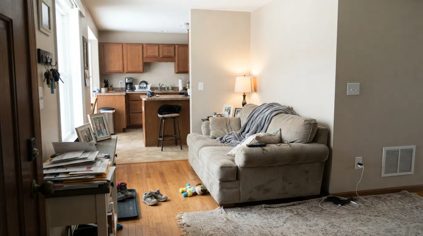
A light warm taupe — more tan than gray, with red and yellow sitting close together in the mix and almost no blue in it at all. Run the hex and it lands as a warm, muted off-white rather than a true mid-tone greige: the kind of color that reads "neutral" before it reads "a color." Sherwin-Williams gives it a cute name and files it as a standard-deck neutral, not a headline color, and that is an honest description of what it is — there is no viral moment or Color of the Year credit behind this one that we could verify, and we are not going to invent one.
At LRV 65 it is meaningfully lighter than the workhorse greiges most people already know — Agreeable Gray sits at 60, Accessible Beige at 58 — so it opens a room instead of grounding it. It is close enough to Benjamin Moore's Natural Cream (also LRV 65, nearly the same hex) that the two are functionally interchangeable on a wall; if your painter already stocks one brand, that is the more useful fact than any story about the name.
Undertone in one line: warm tan first, the faintest whisper of pink second, no green and no blue. If a sample looks flat gray on your wall, that is cool daylight or cool LED bulbs doing it — not a hidden undertone. If it looks slightly dusty-pink, that is warm evening lamplight, and it is the flattering direction, not a flaw.
Where It Shines
Give it a room with real daylight and warm materials and it does exactly what a light neutral should: it recedes, warms the light, and gets out of the way of furniture and art. It is at its best carrying an open-plan main floor where you want one calm color from the entry to the kitchen, and on a whole-house repaint over a dated builder-beige it reads as a genuine upgrade — lighter, cleaner, still warm enough that oak trim and beige tile don't suddenly look wrong next to it.
Where It Fails
The complaints this color would get, if enough people had written about it, follow the same three patterns every light warm neutral runs into. None of them are unique to this paint — but they are worth planning around before you buy the gallon.
Cool, indirect daylight strips the warmth out of any light taupe and can leave it reading flat, slightly murky gray. The color did not change; the light feeding it did. Add warm 2700K lamps or, if the room stays dim year-round, step down to something with more built-in warmth like Natural Cream.
Pair it with a stark blue-white trim (Extra White territory) and the warm taupe on the wall starts to look dingy by comparison — the same optical trick that trips up every soft off-white. Keep the trim closer in temperature: Pure White or the wall color itself in semi-gloss.
Because the undertone is warm and light, it needs warm or neutral company underfoot. Cool blue-gray quartz counters or gray-washed vinyl plank pull the warmth into relief and the wall can start to read slightly pink or dirty by contrast. Sample it above the actual flooring before committing to the whole room.
Room by Room
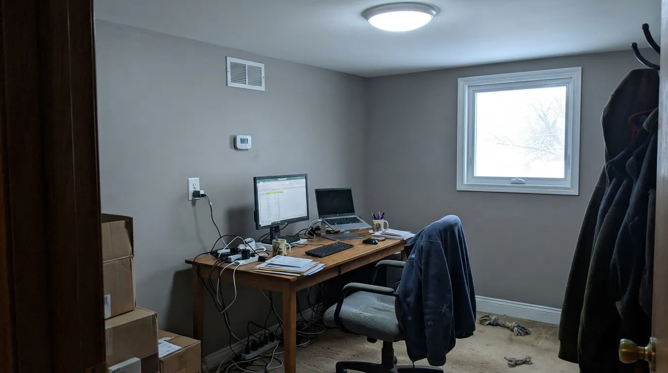
In any room with a real window it is a calm, light backdrop for furniture and art. Eggshell on the walls, the same color or Pure White on trim in semi-gloss.
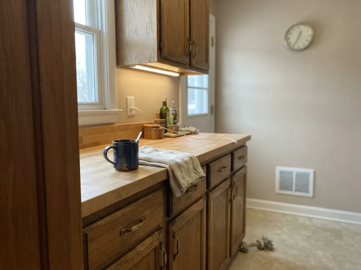
Oak cabinets, butcher block, brass hardware all sit comfortably against it. On cabinets themselves, go with a dedicated cabinet white like Alabaster and let this color carry the walls instead.
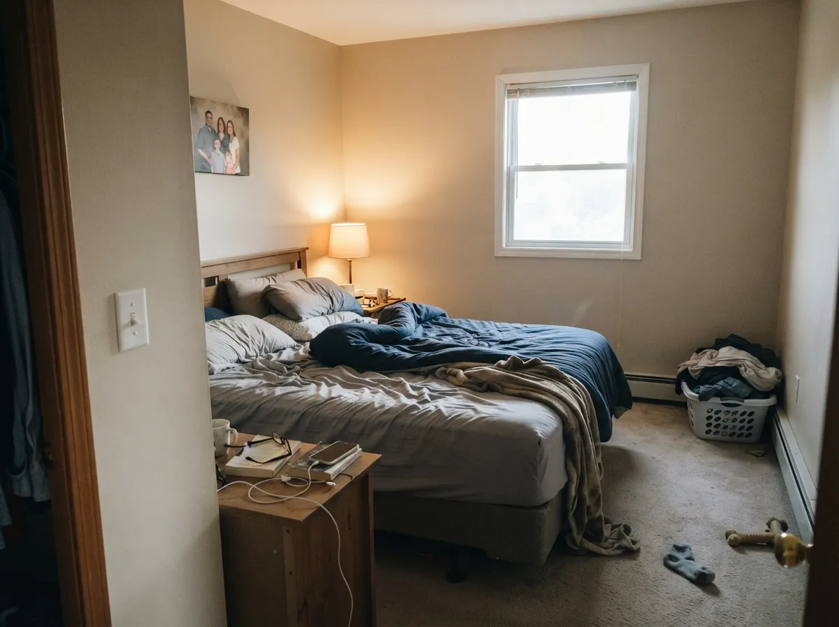
At night under 2700K lamps it turns gently cozy rather than beige. A north-facing bedroom with no lamp plan is the one place to test carefully first.
With warm stone or wood vanities it is easy. With cool gray or blue-veined marble it can start to look slightly murky — sample against the actual counter.
One light, warm neutral running from entry to kitchen to living room keeps a house feeling bigger and more finished than a room-by-room color scheme. This is where a light workhorse taupe earns its keep.
We could not verify real exterior use of this specific color. As a light warm taupe it should behave like its cousins — brighter and slightly cooler-reading in full sun — but sample a large board outdoors before committing a whole house to it.
Your Light Is the Risk
The warm tan glows softly and stays light without tipping beige-yellow. The most flattering, most honest light for this color.
Cool, indirect daylight drains the warmth and can leave it looking flat and slightly murky. Test a sample here before you commit.
Warmer and more golden at the sun-facing hours, quieter and more neutral the rest of the day — a gentle shift, not a color change.
2700K lamps push it toward a soft, dusty warmth. Cool white LEDs flatten it toward gray — swap the bulbs before you swap the paint.
Most complaints about Taupe of the Morning are a light mismatch. Upload a photo of your actual room and see it on your walls — then ask for the same wall in north light or evening lamps before you buy a single sample.
Need It From Another Brand?
Any paint counter can custom-tint Sherwin-Williams SW 9590 directly. If you would rather stay in one brand's own deck, these are the closest stock matches, measured as ΔE2000. Under 2 is a difference you will not see on the wall.
| Brand | Closest color | ΔE | LRV | |
|---|---|---|---|---|
| Behr | Jodhpur TanN180-2 · Behr | 1.7 | 65 | Color page → |
| Benjamin Moore | Alaskan Skies972 · Benjamin Moore | 1.9 | 63 | Color page → |
| Valspar | Warm Putty6006-1A · Valspar | 0.5 | 64.8 | Color page → |
| PPG / Glidden | Gray BeigePPG14-30 · PPG / Glidden | 0.5 | 65 | Color page → |
| Glidden | Papyrus Paper50YY 65/071 · Glidden | 0.5 | 65 | Color page → |
| Dutch Boy | Warmed Silver440-1DB · Dutch Boy | 0.8 | 63 | Color page → |
Similar Sherwin-Williams Colors
The nearest shades to Taupe of the Morning within Sherwin-Williams's own range, ranked by perceptual color distance — useful when you want the same look a touch lighter, darker, or warmer.
WCAG 2.1: AA is 4.5 : 1 for normal text, 3 : 1 for large text, AAA is 7 : 1.
Taupe of the Morning vs the Colors You're Also Considering
Every Taupe of the Morning sample board has the same rivals on it. The numbers show the real lightness gap — then it comes down to which risk you would rather live with.
Pick this if Sherwin-Williams is your store and you don't want to pay a mixing fee to match a different brand's can.
Benjamin Moore OC-14 · LRV 65Natural CreamPick this if Benjamin Moore is already in your painter's cart — it is close enough to the same color that switching brands mid-project won't show.
Pick this for a lighter, quieter wall that opens a room instead of grounding it.
Sherwin-Williams SW 7029 · LRV 60Agreeable GrayPick this for the deeper, grayer, far more documented version of the same warm-neutral idea — the color everyone's painter has already mixed a hundred times.
Pick this for more warmth and less risk of the color reading flat gray on an overcast day.
Benjamin Moore OC-20 · LRV 67Pale OakPick this for a slightly cooler, more gray-leaning light neutral at almost the same LRV.
Pick this for a steadier warm read that leans tan rather than toward mauve when the light goes cool.
Sherwin-Williams SW 7014 · LRV 67Eider WhitePick this if you want a well-documented SW light neutral, with a known mauve-in-cool-light risk you can plan a lamp schedule around.
Natural Tan SW 7567 shares the same LRV of 65 and a very close hex of #DCD2C3, so on a wall the two are hard to separate. Natural Tan holds a touch more yellow-tan and slightly less gray. Grey Heron SW 9566, also LRV 65, goes the other way at #D6D2CA, reading cooler and more gray. Whirlwind SW 9576 at LRV 63 is a shade deeper with a similar warm cast.
Across brands the matches are very tight. Valspar Warm Putty 6006-1A at deltaE 0.45, PPG Gray Beige PPG14-30 at 0.53, Glidden Papyrus Paper 50YY 65/071 at 0.54, and Behr Windrush HDC-CT-19 at 0.68 are all the same color for practical purposes. Farrow and Ball Skimming Stone No. 241 at 1.13 and Benjamin Moore Alaskan Skies 972 at 1.93 are visually identical in normal room light. C2 Paint Parchment C2-915 at 2.3 is very close and worth sampling, and Magnolia Home Stoneware Pieces JG-55 at 4.08 is close but visibly different side by side.
Taupe of the Morning Coordinating Colors
Treat it the way you would any light warm neutral: keep the trim close in temperature, keep the accents warm-to-neutral, and save the cool blues and stark whites for somewhere else in the house. These are the partners that keep the warmth intact rather than fighting it:
An Honestly Quiet Color
Most of the colors reviewed on this site earned that review because a lot of people have painted them and told the internet what happened. Taupe of the Morning has not gone through that — we could not find a designer-blog moment, a Color of the Year credit, or a real thread of owner complaints and praise for this specific SKU, and we are not going to manufacture one. What we can tell you is what the deck data and the color science say: it is a light, warm, low-saturation taupe that behaves like every other member of its family, with the same north-light risk and the same trim-temperature rule as its more famous cousins.
That makes it a reasonable pick for exactly one situation: you want a light warm neutral, you're already committed to Sherwin-Williams for the rest of the job, and you'd rather not pay to have a different brand's color matched. It is not a color to chase for bragging rights. It is a color to use because it works, quietly, and that is a legitimate reason to paint a wall.
Taupe of the Morning With Wood Tones and Floors
Warm wood is the easy pairing: honey oak, red oak, walnut and butcher block all sit comfortably against this color because both are working in the same warm-tan direction. It softens orange-leaning builder oak rather than fighting it, which is the main job a light warm neutral needs to do in an older house.
The pairing that needs a sample first is cool gray flooring — gray-washed engineered wood or gray LVP. Because the color itself is light and warm, a cool gray floor can pull the wall toward looking slightly pink or dirty by contrast. It is not a guaranteed clash, but test a large sample above the actual floor before committing the whole room.
Three Ready Palettes Built on Taupe of the Morning
A color is never alone on the wall. These are complete combinations in the 60-30-10 pattern, with the reason each one holds together. Every one opens in the visualizer.
Pure White trim stays close enough in temperature that it never makes the warm taupe walls look dingy, and Urbane Bronze on the door supplies the single dark, grounding note the scheme needs without touching the walls.
Try this palette in your roomAlabaster cabinets and Taupe of the Morning walls share the same warm base, so the transition from wall to cabinet never shows a seam; Evergreen Fog on the island adds the one muted color note without fighting either neutral.
Try this palette in your roomWhite Dove trim keeps the warm taupe from reading dingy, the way a stark blue-white would, and Peppercorn on one wall or a pair of nightstands gives the room its single dark anchor for evening lamplight to catch.
Try this palette in your roomTaupe of the Morning FAQ
Is Taupe of the Morning warm or cool?
Warm — a light tan-taupe with no blue in it. It only reads cool or flat when the light feeding it is cool: north-facing daylight or cold LED bulbs. Under real daylight or 2700K lamps, the warmth is clear.
Is Taupe of the Morning the same as Benjamin Moore Natural Cream?
Not officially, but on the deck data they are close enough to be functionally the same paint: identical LRV (65) and nearly identical hex. If your painter already stocks one brand, pick that one rather than sourcing a second can to split the difference.
What trim color goes with Taupe of the Morning walls?
A white close in temperature — Pure White or the wall color itself in a higher sheen. A stark, blue-leaning white like Extra White will make the warm taupe walls look slightly dingy by contrast.
Does it work with oak floors?
Yes. It's a warm color, so honey oak, red oak and walnut all sit comfortably against it — none of the orange-amplifying clash that happens with cooler or more purple-leaning neutrals.
Is this a good whole-house color?
It is a reasonable one, especially over a dated builder-beige where you want something lighter and cleaner without going full gray. It doesn't have the decades of documented whole-house use that Agreeable Gray or Accessible Beige do — treat it as a competent, lower-risk pick, not a can with a long track record behind it.
Will it look pink in some light?
It can flush slightly warm-pink under evening lamplight and west sun — that's the flattering direction and most people like it. It does not go pink in daylight; if a sample looks off, it's more likely reading flat and gray from cool light than pink.
Have you painted with Taupe of the Morning?
Rate it — one tap helps the next reader decide.
Ask a Question