Warm Putty
A light putty greige reviewed honestly: the rooms where it stays between beige and gray, the north light that turns it drab, and what to pick instead.

Jessica has spec'd whites and neutrals for more than 300 rooms and keeps a sample wall of painted drawdowns in her studio. Every color review is checked against real reader rooms in the comments and re-tested when a formula changes. About the testing process →
- 1Light French Gray53
- 2Accessible Beige58
- 3Warm Putty64.8
- 4Shoji White74
- 5Dover White83
The Fast Verdict
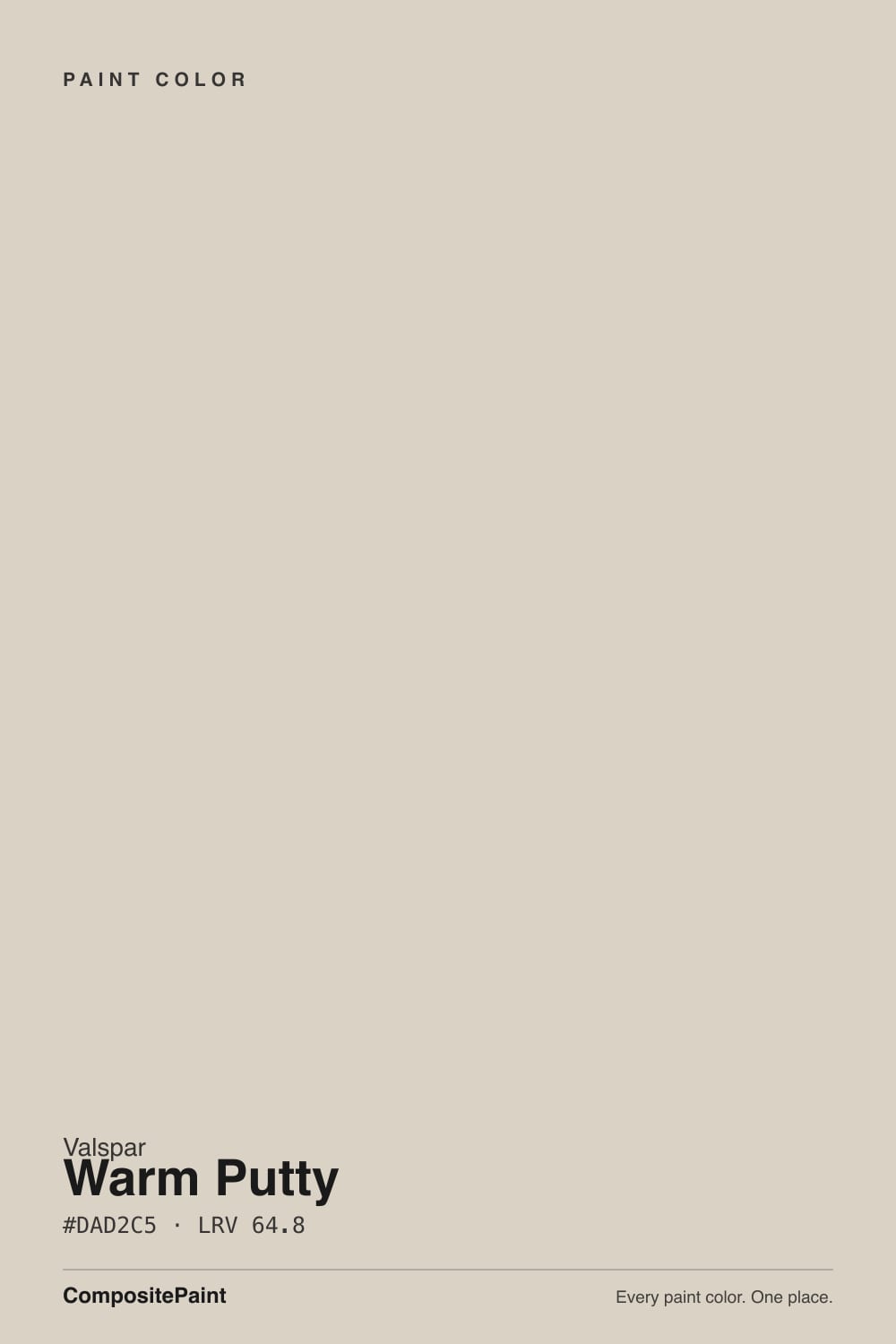
Warm Putty is the color you pick at Lowe's when beige went yellow and gray went cold. At LRV 64.8 it is a light putty greige — grayish beige with a taupe warmth, not a cream and not a true gray. South light brings the beige forward without tipping tan; north light greys it until it looks drab. It is a quiet whole-house wall, as long as your floors are not already this color.
Whole-house walls in decent daylight · living rooms and bedrooms with oak · kitchens that need warmth without yellow · anyone who finds beige too tan and gray too cold
Your room faces north and stays dim · you actually want gray · your floors are already this putty · leftover builder-white trim · cool gray stone or LVP
- Sits cleanly between beige and gray — taupe putty, not yellow, not cold
- LRV 64.8 is genuinely whole-house: light enough for halls, enough body to not wash out
- Flatters oak, walnut, and brass without the orange push a cream beige gives wood
- Easy Lowe's buy, and Valspar already lists Dove White as the coordinating trim
- Hides fingerprints on cabinets better than a true white
- Goes flat, drab gray in dim or north rooms with no lamps
- Disappears against beige tile, tan carpet, or honey oak already in this range
- Looks dirty next to a brighter builder or gallery white
- Too little gray if you actually wanted gray, too little tan if you wanted beige
What Color Is Warm Putty, Really?
A light putty greige — beige grayed down until it stops reading tan, then left just warm enough that it never goes office-gray. Valspar files it Neutral with a Warm tag, which is the honest label: the chip sits on a taupe-beige axis with almost no pink and none of the violet flash that haunts cooler greiges. Owners keep describing it the same way: the softness of beige without the tan, the look of gray without the chill. That middle is the whole point of the color, and it is why it keeps showing up as a Lowe's whole-house fallback rather than as a trend pick.
At LRV 64.8 it sits in the useful gap between the famous greiges. Edgecomb Gray (LRV 63) is the closest analog — a hair deeper and more tan on the same wall. Goose Feathers (LRV 65) is the cooler Valspar sibling, a step grayer, with less putty in it. Agreeable Gray (LRV 60) is deeper and more chameleon. That number is light enough to carry a hallway and still hold a little shadow, so the wall does not wash to off-white. Put it next to Valspar Dove White (LRV 85.1) and Warm Putty suddenly shows its body. That gap is the useful part.
Undertone in one line: warm taupe-beige — putty, never pink, never green, never the lavender Repose Gray is famous for. If your sample looks yellow, that is south sun or honey oak bouncing up, not a cream hiding in the can. If it looks drab gray, the room does not have enough light.
Where It Shines
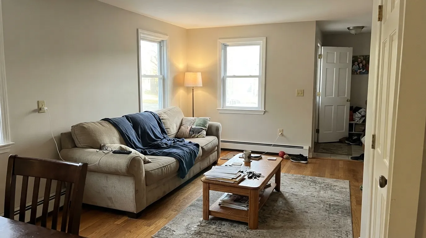
Give it real daylight and warm wood and it does the job people hire a putty greige for: the walls stop being a decision. It carries living room into hall into bedroom without a handoff fight, and because the cast is taupe rather than yellow it does not push oak orange the way a cream beige would. Its second home is the kitchen wall behind wood or white cabinets, where the warmth reads finished instead of builder-beige. Brass, linen, walnut, and a soft white like Dove White are the company it was mixed for.
Where It Fails
Almost every regret story about Warm Putty follows one of three scripts, and all three are visible before the first coat. None of them are a bad batch — but if your room matches one, this is not your greige, and more coats will not fix it.
North light is cool and gray, and it strips the taupe warmth this color has. What is left is a flat, slightly muddy gray that readers describe as drab or dirty. The paint did not change; the light removed half of it. If the room has one small window and you will not add lamps, pick Accessible Beige (LRV 58) and keep the warmth the light will not give you — or commit to 2700K bulbs before you roll.
The Houzz version of this complaint is specific: Warm Putty next to beige tile, tan carpet, or honey oak that already sits in the same putty range. The wall and the floor become one plane, and the room reads unfinished rather than calm. This color needs a value change at the floor — medium oak, walnut, or a rug with contrast — or it disappears into the materials it was supposed to flatter.
The most common pairing mistake: Warm Putty walls, leftover builder-white or a crisp gallery white on the trim. The brighter white wins and the greige looks unwashed. Chantilly Lace (LRV 90) and Extra White (LRV 86) are the worst neighbors for exactly this reason. The fix is the trim, not the wall — Valspar Dove White, the white Valspar already lists as a coordinator, shares enough warmth that the edge stays clean.
Room by Room
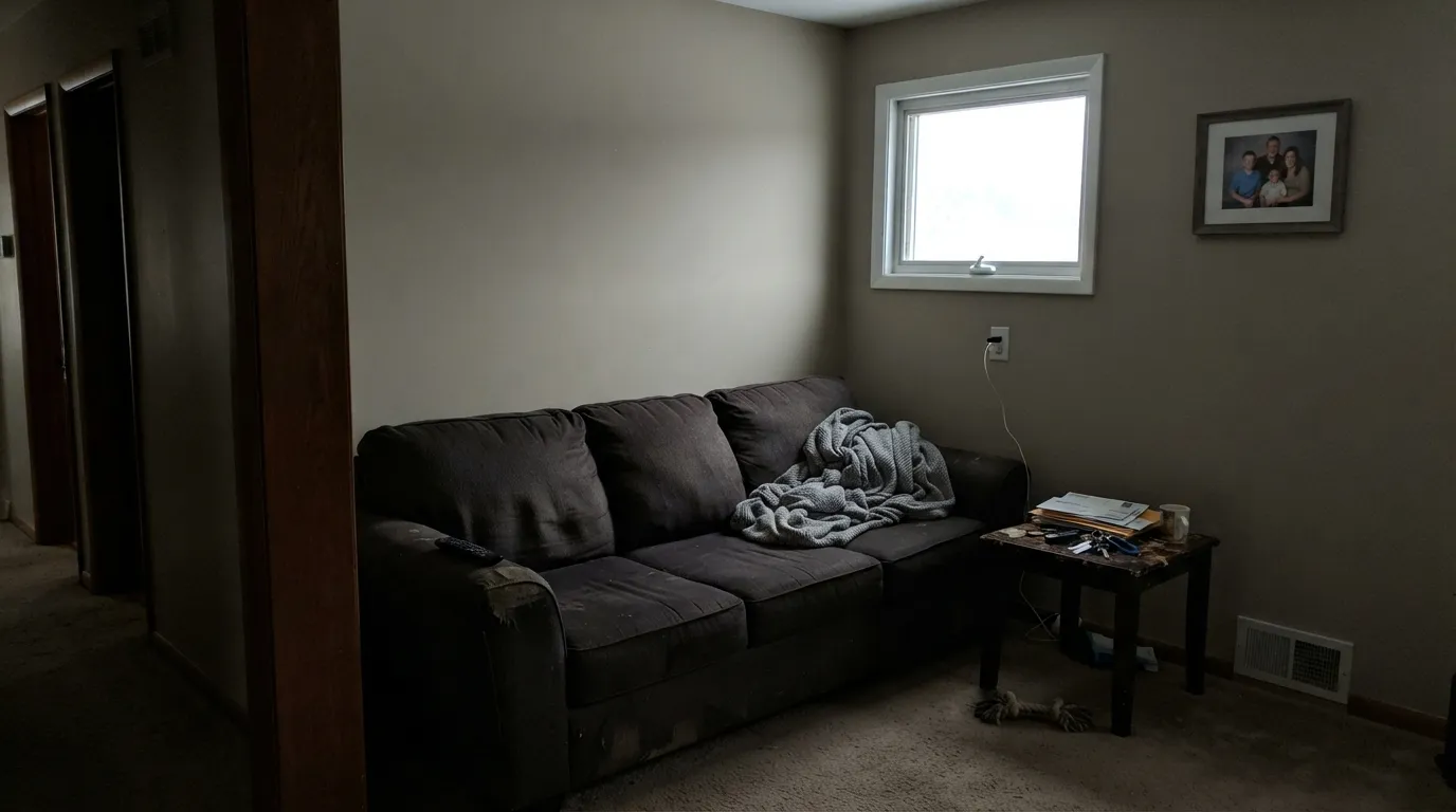
With any real daylight it is the calm backdrop that makes a worn sofa, oak floors, and mixed art look deliberate instead of undecided. Eggshell on the walls; Dove White or Valspar Swiss Coffee on trim in semi-gloss. Add one dark note — a Hale Navy built-in or an Iron Ore table — or the room can read too soft to remember.
This is what the color is actually built for: one putty greige across a living, dining, hall, and bedroom run with three different exposures, and it holds together in all of them. Hallways are the test. If the sample still looks like itself at the dark end of the hall, you can roll the floor. If it has already gone drab there, do not bet the house on it.
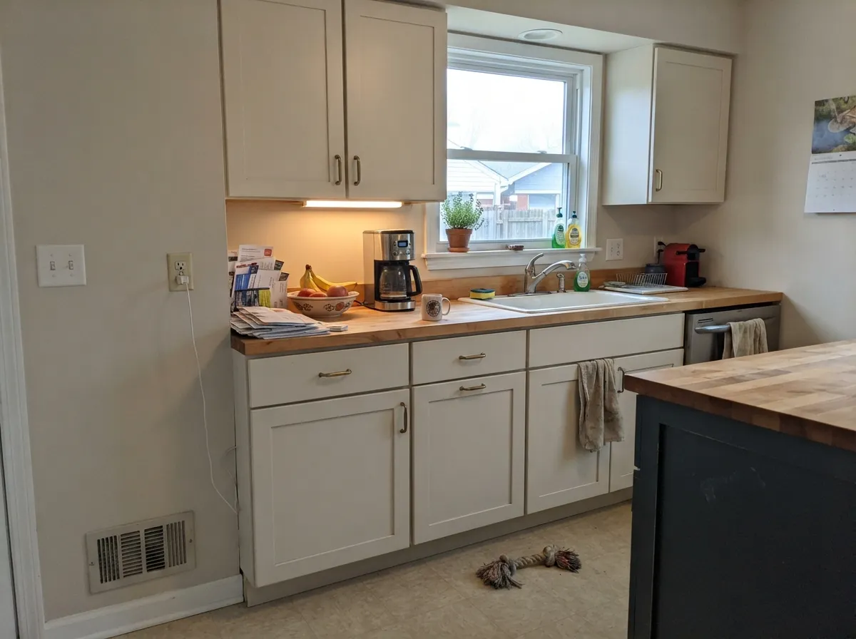
As a wall color behind white or wood cabinets it is close to foolproof: warm enough for brass and butcher block, quiet enough that it does not go yellow. On cabinets it hides fingerprints better than white, which is why DIY kitchen videos keep reaching for it — satin enamel, and a counter that is not the same putty. A full wrap of Warm Putty walls and cabinets needs hardware and a darker island or it blurs into one beige box.
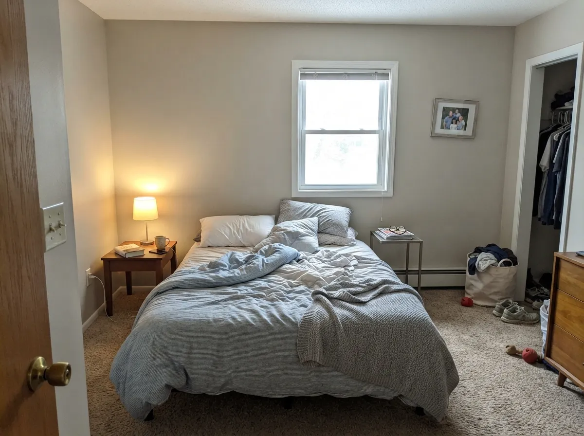
Under 2700K bedside bulbs the taupe comes forward and the room goes quietly cozy, with a soft honey cast rather than a cream one. Morning east light keeps it a true greige. A north bedroom with one window and cool cans is the room to sample on the darkest wall before you commit; if that wall goes drab, this is not your bedroom color.
With travertine, beige tile, wood vanities and brass, it is a soft whole-house carry-through. Against cool gray marble or blue-gray subway it looks dirty by comparison — that bathroom wants a cleaner gray, not a putty greige. Eggshell or satin; skip flat in a wet room.
Full sun lifts it about a step lighter and a touch more beige than the indoor read, which is typical of any light greige. It works as understated siding with Iron Ore or Kendall Charcoal trim and a Hale Navy door. Walk the shady north wall with a sample board; that elevation will read grayer than the sunny south one.
Your Light Is the Risk
The beige side comes forward without tipping yellow or tan. Soft, light, clearly putty. This is the light that makes the whole-house case.
Cool gray daylight strips the taupe and leaves a flat, slightly muddy gray. Sample the darkest wall first — or pick a warmer beige.
More beige in morning warmth, more neutral at midday, a hair honey through west afternoon. The move is small, which is the point of this color.
2700K lamps keep the greige and bring a soft honey glow. Cool 4000K LEDs push it gray and a little dead — swap bulbs before you repaint.
Most complaints about Warm Putty are a light mismatch. Upload a photo of your actual room and see it on your walls — then ask for the same wall in north light or evening lamps before you buy a single sample.
Need It From Another Brand?
Any paint counter can custom-tint Valspar 6006-1A directly. If you would rather stay in one brand's own deck, these are the closest stock matches, measured as ΔE2000. Under 2 is a difference you will not see on the wall.
| Brand | Closest color | ΔE | LRV | |
|---|---|---|---|---|
| Sherwin-Williams | Taupe of the MorningSW 9590 · Sherwin-Williams | 0.5 | 65 | Color page → |
| Behr | Jodhpur TanN180-2 · Behr | 2.1 | 65 | Color page → |
| Benjamin Moore | Alaskan Skies972 · Benjamin Moore | 1.6 | 63 | Color page → |
| PPG / Glidden | Gray BeigePPG14-30 · PPG / Glidden | 0.8 | 65 | Color page → |
| Glidden | Papyrus Paper50YY 65/071 · Glidden | 0.6 | 65 | Color page → |
| Dutch Boy | Existence420-1DB · Dutch Boy | 1.7 | 63 | Color page → |
Similar Valspar Colors
The nearest shades to Warm Putty within Valspar's own range, ranked by perceptual color distance — useful when you want the same look a touch lighter, darker, or warmer.
WCAG 2.1: AA is 4.5 : 1 for normal text, 3 : 1 for large text, AAA is 7 : 1.
Warm Putty vs the Colors You're Also Considering
Every Warm Putty sample board has the same rivals on it. The numbers show the real lightness gap — then it comes down to which risk you would rather live with.
Pick this for the Lowe's tint of the same easy warm greige, a touch lighter, with less of Edgecomb's green flicker off a lawn.
Benjamin Moore HC-173 · LRV 63Edgecomb GrayPick this if you want the famous Benjamin Moore version of this idea — a hair deeper, a hair more tan, and your painter already stocks it.
Pick this for a lighter, puttier read with less of the cool-light shift Agreeable Gray is known for.
Sherwin-Williams SW 7029 · LRV 60Agreeable GrayPick this if you want the famous Sherwin-Williams greige, a step deeper, and your painter already stocks it.
Warm Putty Coordinating Colors
The rule for coordinating with Warm Putty is simple: stay on the soft side of white and give the scheme one dark note. It likes warm woods, brass, muted sage, and navy; it argues with icy gallery whites and cool blue-gray stone. Valspar already prints Dove White on the coordinating card — use that or Soft Wool on trim, then pick the dark from the list below.
The Putty Middle: Why This Chip Exists
Warm Putty is not a celebrity color. It has never been a Color of the Year, it does not trend on design blogs, and most of the people who live with it found it on a Lowe's strip while hunting for something that was not quite beige and not quite gray. That obscurity is useful. Valspar parks it in Neutral, marks the undertone Warm, and prints Dove White next to it as the trim. The RGB spread — 218, 210, 197 — is the chemistry of putty: enough yellow to stay warm, enough gray to stay clean.
The sibling that confuses shoppers is Goose Feathers, a hair lighter and a hair cooler on the same shelf. If Warm Putty is the putty-beige middle, Goose Feathers is the near-gray middle. Sample both on the same wall for a day. South rooms and oak floors usually pick Warm Putty; north rooms and mixed gray finishes usually pick Goose Feathers. Honest obscurity is part of the appeal — this is the greige a lot of people actually live with, not the one they screenshot.
Warm Putty With Wood Tones and Floors
Medium oak, walnut, and cedar are the easy yes. The wall has enough gray in it to keep from pushing those woods orange the way a cream beige would, and enough warmth that the floor does not look leftover. Pale unstained white oak is safe and gives the room a quieter, more modern cast. Brass and antique bronze sit naturally against it; matte black is the contrast the color often needs.
The flooring that needs a big sample first is honey oak or beige tile already in this putty range — the Houzz complaint in one sentence. Wall and floor become one value, and the room looks unfinished rather than calm. A large rug with contrast usually fixes it; if the golden floor is staying and you want the wall to show, step deeper to Smoked Oyster or keep Warm Putty on the walls and paint the trim a cleaner white so something in the room has an edge.
Cool gray LVP, gray-washed wood, and Carrara-type stone sit on the other side of the fence. Beside them the taupe comes forward and the wall can read slightly yellow-dirty. A large warm rug between the floor and the wall often fixes it; if the gray floor is wall-to-wall and staying, test before you roll, or move to Repose Gray and let the whole room stay cool.
Three Ready Palettes Built on Warm Putty
A color is never alone on the wall. These are complete combinations in the 60-30-10 pattern, with the reason each one holds together. Every one opens in the visualizer.
One putty greige and its in-brand coordinating white keep the floor plan in one temperature; Dove White is the closest thing to White Dove you can tint at Lowe's. Hale Navy is the single dark note so the house does not read as one pale plane.
Try this palette in your roomAlabaster is a cabinet white with enough warmth to sit next to Warm Putty without making the walls look dirty. Iron Ore grounds the island; brass or black pulls both finish the contrast so the putty does not blur into the wood.
Try this palette in your roomSoft Wool is the nearly-White-Dove trim hiding on the same Lowe's shelf, so the edge stays warm without going cream. Warm Eucalyptus — Valspar's 2026 Color of the Year — adds one muted sage-olive note that behaves like a neutral instead of a theme.
Try this palette in your roomWarm Putty FAQ
Is Warm Putty gray or beige?
Greige — specifically a putty greige, which is beige grayed down until it stops looking tan. Valspar files the chip as Neutral with a Warm undertone. In south light the beige side comes forward; in north light it reads more gray. It will not give you a true gray, and it will not give you a creamy beige. If you want one of those on purpose, pick Repose Gray or Accessible Beige instead of hoping this one will commit.
What trim white goes with Warm Putty?
A soft, slightly warm white, not a bright one. Valspar Dove White is the in-brand answer — Valspar already lists it as a coordinator. Valspar Swiss Coffee and Soft Wool work too. White Dove works if your painter is in Benjamin Moore. Avoid Chantilly Lace, Extra White, and leftover builder white: they make the walls look dirty. Semi-gloss on the trim, eggshell on the walls.
Is it good for a whole house?
Yes — that is the job it is built for, as long as the house has decent daylight. LRV 64.8 carries through halls and rooms with different exposures without a color-cast fight. Walk a big sample into the darkest corner before you commit; if that corner already looks drab, do not roll every room.
Does Warm Putty work with oak floors?
Medium and walnut-stained oak are its best company — the wall has enough gray in it to keep from pushing the wood orange. Pale white oak is fine. The flooring that needs a sample first is honey oak or beige tile already in this putty range: the wall and the floor can become one plane. Cool gray LVP is the other test — those finishes pull the warmth forward and the wall can read slightly yellow.
How does it compare to Edgecomb Gray?
They are doing the same job at almost the same lightness. Edgecomb Gray (LRV 63) is the famous Benjamin Moore warm greige, a hair deeper and more tan, with a known green flicker off grass and a known fade in dark rooms. Warm Putty is the Lowe's tint of that idea — a touch lighter, a touch more putty, less of a public reputation. If your painter is already in Benjamin Moore, pick Edgecomb. If you tint at Lowe's, stay here.
Will it work in a north-facing room?
Only if you add warm lamps. Cool north daylight strips the taupe and leaves a flat gray that people describe as drab. Sample on the darkest wall, look at it on an overcast afternoon, and plan on 2700K bulbs as part of the paint job. If you refuse lamps, pick Accessible Beige and keep the warmth the light will not give you.
Have you painted with Warm Putty?
Rate it — one tap helps the next reader decide.
Ask a Question