Warm Eucalyptus
Valspar's 2026 Color of the Year, reviewed honestly: the light that turns it green, the light that turns it gray, and the deck twin that's almost the exact same color.

Jessica has spec'd whites and neutrals for more than 300 rooms and keeps a sample wall of painted drawdowns in her studio. Every color review is checked against real reader rooms in the comments and re-tested when a formula changes. About the testing process →
- 1Essex Green6
- 2Vintage Vogue12
- 3Warm Eucalyptus21
- 4Evergreen Fog30
- 5Clary Sage41
The Fast Verdict
Warm Eucalyptus is Valspar's answer to a decade of "millennial olive": a muted gray-green grounded by a warm brown undertone, with just enough of a cool, leafy edge to keep it from reading beige. Named 2026 Color of the Year, it is being pushed hard as the next great neutral — and at LRV 21 it has the depth to earn that word without going as dark or as saturated as a true forest green. Give it brass hardware and warm wood and it glows; put it in a dim north room under cool bulbs and it goes flat and murky, which is the one trap almost every complaint traces back to.
Kitchen cabinets with brass or gold hardware · bedrooms and dens that want a grounding, calm color · bathrooms and powder rooms for color-drenching · Craftsman, Bungalow and mid-century exteriors near mature trees
You pictured a true eucalyptus-leaf green, not a muted gray-green · your room is dim, north-facing, and lit with cool LEDs · your hardware and fixtures are chrome or nickel, not brass · you need one identical read from room to room
- 2026 Color of the Year — genuinely versatile, not a one-season trend color
- Reads as a calm neutral in daylight, a real warm green under lamp light — earns both labels
- Brass hardware, gold fixtures and warm-veined marble or butcher block make it glow
- LRV 21 is deep enough to anchor a room without dropping into true-forest-green darkness
- Works as walls, cabinets, doors, and exterior siding — one color doing several jobs
- Goes flat and murky in dim, north-facing rooms under cool LEDs
- Not a true green — buyers picturing bright eucalyptus-leaf green get a muted gray-green instead
- Chrome and nickel hardware fight the warm undertone; wants brass or gold
- Its warm-and-cool dual undertone means it can read differently room to room — sample before committing to a whole house
What Color Is Warm Eucalyptus, Really?
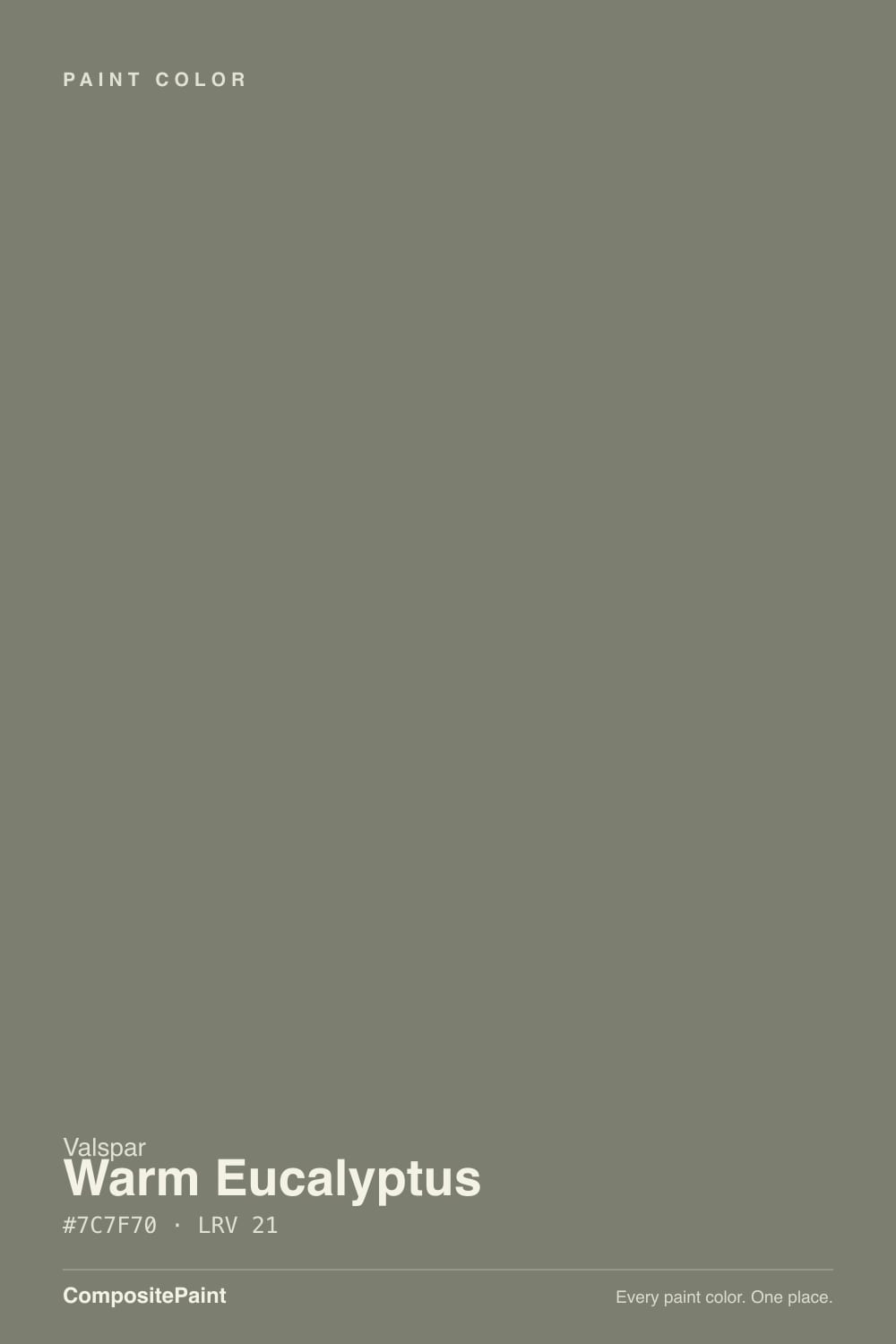
Warm Eucalyptus is Valspar's 2026 Color of the Year, announced as a deliberate step past the "millennial olive" moment: a mid-tone gray-green Valspar's own color team frames as a new neutral rather than another trend green. The undertone is the whole story — a warm brown base with just a slight cool, leafy edge layered on top — which is why the same paint can look like a warm, grounded olive in one room and a cooler, more neutral sage-gray in another. That duality is on purpose; it is also exactly what makes the color unpredictable if you skip a sample.
At LRV 21 it sits in genuine mid-to-dark territory — deep enough to anchor a room and hold its color in bright light, without dropping into true-forest-green darkness. The closest color in our own deck is Sherwin-Williams Dried Thyme, which lands at hex #7B8070 against Warm Eucalyptus's #7C7F70 — the same LRV 21 and a one-digit difference in the numbers. If your painter stocks Sherwin-Williams instead of Valspar, Dried Thyme is not "similar," it is close enough to call the same color.
Undertone in one line: warm brown first, a cool green edge second — never a true, saturated green. That distinction matters because of a real naming coincidence: Behr also sells a color called Eucalyptus Wreath, and it is a genuinely different animal — a true, more saturated green, not a muted gray-green. If you searched "eucalyptus paint color" expecting Behr's brighter green and landed on this Valspar instead, that mismatch — not a flaw in the paint — is the source of most "this isn't what I expected" reactions.
Where It Shines
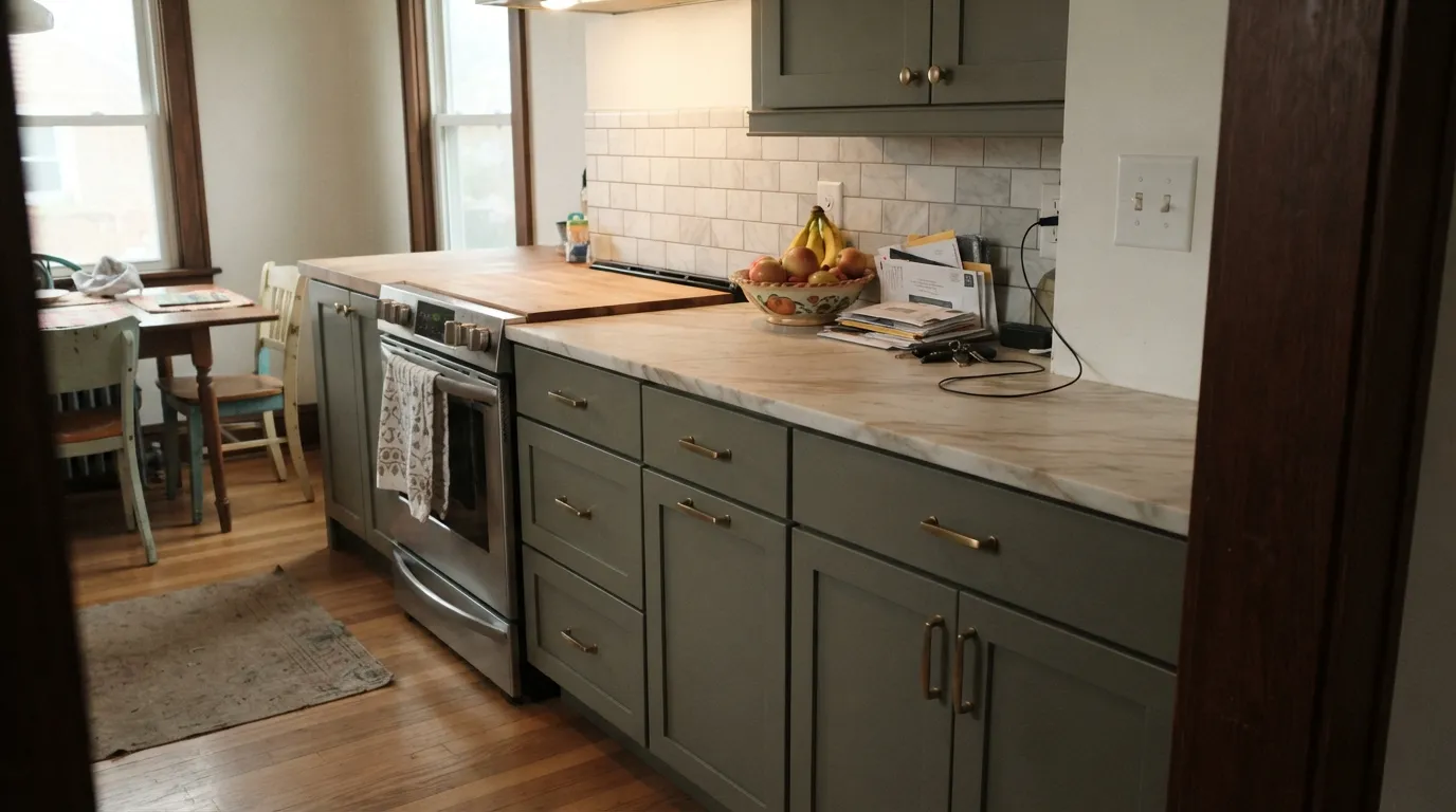
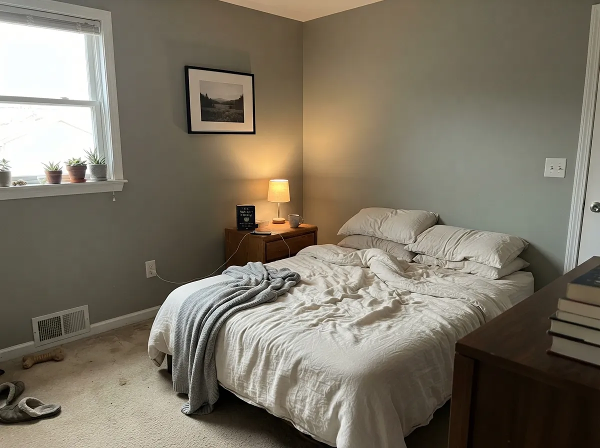
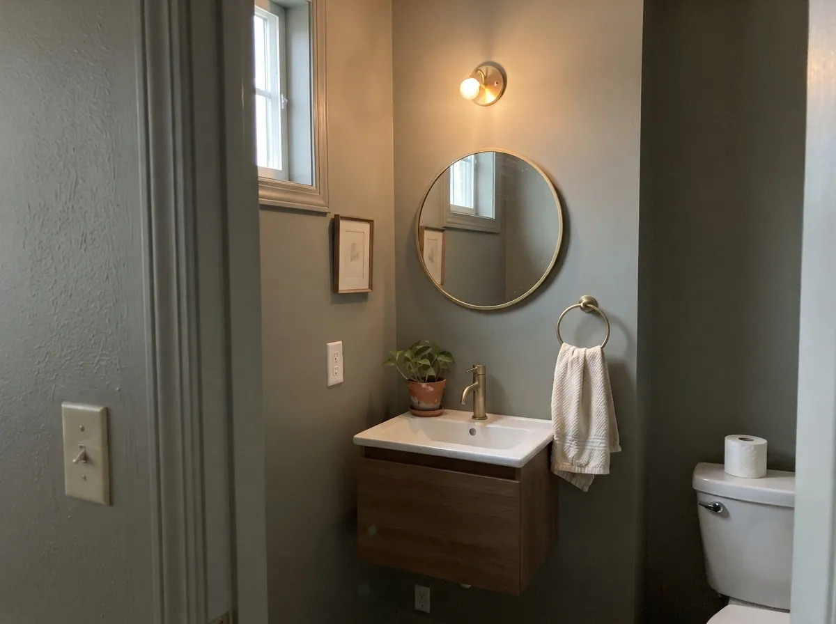
This color was built for rooms that want to feel grounded rather than bright. Kitchen cabinets are its best job: brass or antique-gold hardware warms up the gray in the undertone, and it sits comfortably against warm-veined marble or butcher block without competing. Bedrooms, home offices and dens take to it the same way — a calm, low-key color for rooms you spend quiet time in. Small rooms are where it gets genuinely bold: a fully drenched powder room or bathroom — walls, trim, even the ceiling — reads sophisticated rather than dark, because LRV 21 still bounces enough light to avoid a cave effect in a five-by-seven room.
Where It Fails
Almost every disappointed review of Warm Eucalyptus comes down to one of three predictable mismatches — a wrong expectation, a wrong light, or a wrong metal. None of them are a flaw in the paint itself.
"Eucalyptus" reads bright and leafy in most people's heads, and Behr sells a color under nearly the same name that actually is that bright, saturated green. Valspar's Warm Eucalyptus is a muted, grayed-down olive — closer to Sherwin-Williams Dried Thyme than to anything you'd call grass-green. If a true green is the goal, Behr Eucalyptus Wreath or SW Evergreen Fog get you there; this color will always read more neutral than green on the wall.
Cool light strips the warm brown out of the undertone and leaves the cooler green edge exposed and unsupported — the wall goes flat, murky, almost drab. It is the same mechanism behind every muted-green complaint on this site: warm-undertone colors need warm light to read as intended. Swap to 2700K bulbs before blaming the paint.
Cool metals fight the warm brown base the way cool light does — brushed nickel cabinet pulls or a chrome faucet next to Warm Eucalyptus make the color look duller and grayer than it does next to brass. Unlacquered brass or antique gold is doing real work in every photo where this color looks its best; it is not just styling.
Room by Room
Deep enough to anchor an island or a full run of lowers, warm enough not to fight butcher block or warm-veined marble. Brass or gold pulls are doing half the work here — budget for a hardware swap if your kitchen currently runs chrome. Satin cabinet enamel, not high-gloss.
Its most forgiving room: low, mixed light (daylight plus a lamp) is exactly the kind of light that keeps the warm and cool sides of the undertone in balance. Matte finish softens texture; White Dove or Alabaster trim keeps the edges soft rather than stark.
Valspar itself pushes this color for full color-drenching in small baths — walls, trim, sometimes the ceiling, all one color. It works because LRV 21 still reflects enough light that a small room reads intentional and cozy, not like a cave. Add brass fixtures and a warm-veined vanity top.
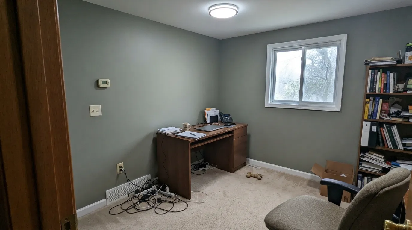
A grounding color for a room built for focus rather than entertaining. It pairs naturally with leather, walnut and brass task lighting, and it is calm enough that it will not fight a busy bookshelf or gallery wall.
Handsome in a room with real daylight and warm wood furniture, riskier in an open floor plan where it has to negotiate with a kitchen and dining area's own colors and metals. Keep the hardware and light-bulb temperature consistent across the whole open space.
One of Valspar's headline uses for the color: siding on Craftsman, Bungalow and mid-century homes, especially with mature trees, wood accents or stone nearby. Full sun reads it brighter and more clearly green than it does indoors; pair with crisp white or dark bronze trim rather than another muted color.
Your Light Is the Risk
Warmer, greener and a touch lighter than the chip — the read Valspar's own launch photos show. This is the color at its most confident.
Cool daylight leans the color more neutral, cooler and noticeably deeper. Fine if you wanted quiet gray-green; disappointing if you wanted the warmth of the samples.
Warmer and greener at the sun hours, quieter and grayer once the direct light passes. Expect real movement through the day, not a static color.
2700K warm bulbs bring the brown undertone forward and the color reads cozy. Cool LEDs cancel that warmth and leave it dull — swap bulbs before you swap paint.
Most complaints about Warm Eucalyptus are a light mismatch. Upload a photo of your actual room and see it on your walls — then ask for the same wall in north light or evening lamps before you buy a single sample.
Need It From Another Brand?
Any paint counter can custom-tint Valspar 8004-28F directly. If you would rather stay in one brand's own deck, these are the closest stock matches, measured as ΔE2000. Under 2 is a difference you will not see on the wall.
| Brand | Closest color | ΔE | LRV | |
|---|---|---|---|---|
| Sherwin-Williams | Dried ThymeSW 6186 · Sherwin-Williams | 1.1 | 21 | Color page → |
| Behr | ManuscriptPPU8-23 · Behr | 4.2 | 21 | Color page → |
| PPG / Glidden | Autumn GrayPPG1028-5 · PPG / Glidden | 2.3 | 21 | Color page → |
| Glidden | Autumn GrayPPG1028-5 · Glidden | 2.6 | 21 | Color page → |
| Dutch Boy | Sweetbrier425-5DB · Dutch Boy | 1.1 | 21 | Color page → |
| HGTV Home by Sherwin-Williams | Farm to TableHGSW 3263 · HGTV Home by Sherwin-Williams | 1.1 | 21 | Color page → |
Similar Valspar Colors
The nearest shades to Warm Eucalyptus within Valspar's own range, ranked by perceptual color distance — useful when you want the same look a touch lighter, darker, or warmer.
WCAG 2.1: AA is 4.5 : 1 for normal text, 3 : 1 for large text, AAA is 7 : 1.
Warm Eucalyptus vs the Colors You're Also Considering
Every Warm Eucalyptus sample board has the same rivals on it. The numbers show the real lightness gap — then it comes down to which risk you would rather live with.
Pick this if you specifically want the Valspar deck, or the 2026 Color of the Year story attached to the can.
Sherwin-Williams SW 6186 · LRV 21Dried ThymePick this if your painter stocks Sherwin-Williams instead of Valspar — the hex and LRV are close enough to call it the same color.
Pick this for more depth and a warmer, browner undertone than Evergreen Fog's cooler gray-green.
Sherwin-Williams SW 9130 · LRV 30Evergreen FogPick this for a lighter, more famous sage that still reads gray-green — the safer, more tested cabinet choice.
Pick this for a color that still reads clearly green, not just a dark neutral.
Sherwin-Williams SW 6208 · LRV 12Pewter GreenPick this for a noticeably deeper, smokier take — nearly black-green on cabinets, only a lean of green in most light.
Pick this for the muted, grayed-down neutral read instead of a clearly green one.
Behr N390-5 · LRV 32Eucalyptus WreathPick this if you actually want a true, saturated green — Behr's own "eucalyptus" color and this Valspar one are easy to mix up by name and are not the same color.
Warm Eucalyptus Coordinating Colors
The pattern for coordinating with Warm Eucalyptus: soft or crisp whites for trim, warm metals over cool ones, and either a lighter gray-green companion or one confident dark note for contrast. These are the deck partners that do the work:
Why Valspar Picked It: The 2026 Color of the Year Story
Valspar's color of the year picks have leaned toward calm, restorative blues and greens for several years running — 2025's Encore was a bold atmospheric blue, and Warm Eucalyptus continues that same conversation about comfort and nature connection rather than breaking from it. The framing Valspar uses is explicit: this is meant to read as a new kind of neutral, a step past the flatter, more yellow-green "millennial olive" that dominated the last decade of green paint.
That positioning is worth taking seriously rather than dismissing as marketing. A genuinely muted, dual-undertone gray-green does behave more like a neutral than a statement green — it is why designers are already using it as a background color, not just an accent, and why it shows up on cabinets and exteriors as often as on a single feature wall. Whether it lasts past 2026 the way a true neutral does, or fades the way most color-of-the-year picks do within a few seasons, is the one thing no amount of research can answer yet.
Warm Eucalyptus on Exteriors and With Wood Tones
Outside, this color gets pushed hard for Craftsman, Bungalow and mid-century homes — especially ones with mature trees nearby, or wood and stone accents on the facade already. Full sun reads it brighter and more clearly green than it does indoors, which is the opposite of most muted colors that just wash out; pair it with crisp white trim for definition or a near-black door and shutters for a confident dark note, rather than another muted color that will just blur into it from the street.
Indoors, warm wood is the easy pairing — walnut, warm oak, butcher block and leather all sit comfortably against the color's brown undertone. Cooler, gray-washed wood floors are the one combination to sample first: the color's cool leafy edge can pull a gray floor toward a slightly muddier read than it shows on its own, so test a large sample directly above your actual floor before committing a whole room.
Three Ready Palettes Built on Warm Eucalyptus
A color is never alone on the wall. These are complete combinations in the 60-30-10 pattern, with the reason each one holds together. Every one opens in the visualizer.
A soft off-white keeps the room bright while Warm Eucalyptus carries the cabinets; Kendall Charcoal on the island adds one deeper note so the kitchen doesn't read as a single flat green box. Brass pulls tie all three together.
Try this palette in your roomOne color at two sheens on the walls and trim gives the small room depth without a hard contrast line, exactly the color-drenching move Valspar itself recommends for baths. A lighter ceiling keeps the room from feeling capped.
Try this palette in your roomCrisp white trim keeps the gray-green from reading muddy from the street, and a near-black door gives the facade one confident dark note. Full sun reads Warm Eucalyptus brighter and greener than it does indoors, so this combination holds up in strong light.
Try this palette in your roomWarm Eucalyptus FAQ
Is Warm Eucalyptus green or gray?
Both, depending on the light — that duality is the whole personality of the color. In warm south light or under 2700K lamps, the brown undertone comes forward and it reads like a genuine muted olive-green. In cool north light or under cool LEDs, the gray dominates and it reads as a quiet, neutral gray-green. It is never a true, saturated green in either light.
Is Warm Eucalyptus really Valspar's 2026 Color of the Year?
Yes — Valspar announced it as its 2026 Color of the Year, following 2025's Encore, a blue. Valspar's color team has leaned toward calming blues and greens for several years running, and this pick continues that story rather than breaking from it.
What's the difference between Warm Eucalyptus and Sherwin-Williams Dried Thyme?
Almost nothing on paper — Dried Thyme is hex #7B8070 at LRV 21, against Warm Eucalyptus's #7C7F70 at the same LRV 21. If your painter or contractor works in Sherwin-Williams rather than Valspar, Dried Thyme is close enough to use as a direct swap.
Is Warm Eucalyptus the same as Behr Eucalyptus Wreath?
No, and this is the single most common mix-up with this color. Behr Eucalyptus Wreath is a true, more saturated green (LRV 32); Valspar Warm Eucalyptus is a muted gray-green (LRV 21) with a warm brown undertone. They share a name association, not a color.
Does it work on kitchen cabinets?
It's one of its best applications. Deep enough to anchor an island or a full run of cabinets without going as dark as a true forest green, and it pairs especially well with brass or antique-gold hardware and warm-veined marble or butcher block. Use a satin cabinet enamel.
What trim color goes with Warm Eucalyptus?
Either direction works depending on the look you want: a bright white (Benjamin Moore Simply White, Sherwin-Williams Extra White) gives crisp, defined contrast, while a soft off-white (Sherwin-Williams Alabaster, Benjamin Moore White Dove) keeps the whole room feeling organic and low-contrast. Avoid stark builder-white trim on an otherwise warm room — it can make the green look duller by comparison.
Have you painted with Warm Eucalyptus?
Rate it — one tap helps the next reader decide.
Ask a Question