Eucalyptus Wreath
Behr's genuinely green sage alternative, reviewed honestly: the family strip it comes from, the light that sinks it to murky, and what to pick instead.

Jessica has spec'd whites and neutrals for more than 300 rooms and keeps a sample wall of painted drawdowns in her studio. Every color review is checked against real reader rooms in the comments and re-tested when a formula changes. About the testing process →
- 1Vintage Vogue12
- 2Sage Green22
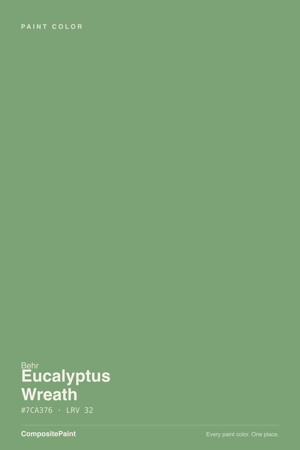
- 3Eucalyptus Wreath27
- 4Clary Sage41
- 5October Mist47
The Fast Verdict
Eucalyptus Wreath is what happens when Behr's sage aisle accidentally makes an actual green. Where Evergreen Fog and Clary Sage grind their color down to a whisper of gray, this one keeps its saturation — a medium, leaf-toned green with a warm, slightly yellow lean rather than the cool mint its name promises. It is the darkest of a three-step Behr strip, it never had a Color of the Year moment, and it is honestly better for that: a quiet, useful workhorse for cabinets, doors and exteriors that isn't trying to be anyone's trend color.
Kitchen and bathroom cabinets · front doors, shutters, and exterior trim · mudrooms and laundry rooms that want one committed color · anyone who wants a real green instead of another gray sage
You actually want the fashionable gray-green sage look · your room is dim and north-facing with no lamps · your floors or cabinets lean red (cherry, mahogany) · you want a color your painter or neighbors will already recognize by name
- A genuine, saturated green — not another washed-out gray sage
- Sold specifically in Behr's cabinet, door and trim lines
- Holds up well on exteriors against a pale or greige body
- Mid-depth (LRV 27) reads confident without needing near-black commitment
- Honestly obscure — no trend fatigue, no name recognition to fight
- Marketed as "cool gray" but leans warmer and yellower than the copy suggests
- Sinks to murky, muddy green in dim or north-facing rooms
- Clashes with red-toned wood like cherry or mahogany
- Whole-room walls are a bigger commitment than the cabinet-and-trim use it was built for
What Color Is Eucalyptus Wreath, Really?
Behr's own listing leans on "cool gray undertones" tempering the green, but that is marketing gloss more than what the pigment does on a wall. The RGB behind Eucalyptus Wreath (124, 163, 118) runs slightly redder than it does bluer, which is the fingerprint of a warm, yellow-leaning green, not a cool one — and independent colorists who've swatched it agree: it sits "squarely in sage territory" but reads "a touch too yellow" for a true cool eucalyptus. Call it what it actually is: a genuine, moderately saturated green with a warm lean, closer in spirit to a garden hedge than to the desaturated gray-sages (Evergreen Fog, Clary Sage, Sage) that dominate this part of every deck right now.
It is also the deepest step of a three-color Behr strip: Jojoba (N390-3) is the palest, Bitter Sage (N390-4) sits in the middle, and Eucalyptus Wreath (N390-5) is the darkest. At LRV 27 it has real depth — enough to hold its green identity through a normal daylight room without washing pastel — but it is not so dark that it needs treating like a near-black. The catch is that saturation and mid-depth together make it light-hungry: pull the daylight away and the color has nowhere to hide, unlike a grayed-out sage that just goes flatter.
Undertone in one line: green first, a warm whisper of yellow second — never blue, never a true neutral gray. If your sample reads washed-out or muddy, your light is too weak for it; if it reads olive or khaki, that's warm lamp light pushing the yellow forward, not a different paint.
Where It Shines
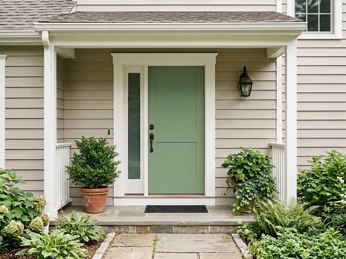
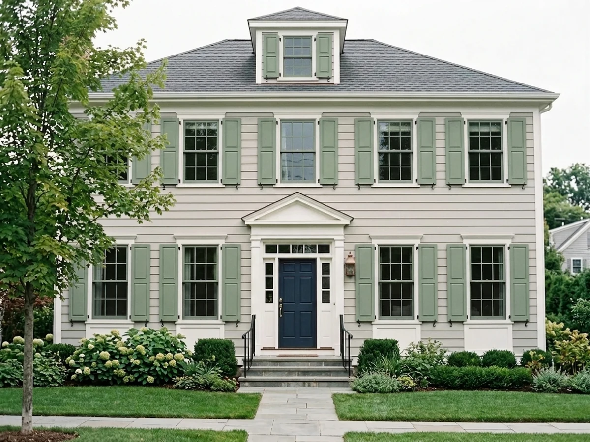
Behr sells this exact color, N390-5, in its cabinet-and-trim lines (Premium, Dynasty) and in Marquee exterior — which tells you where it actually earns its keep. On cabinets and doors, in real daylight or under kitchen task lighting, the green reads rich and leafy without tipping cartoonish. Outside, on a front door or shutters against a pale or greige body, it reads like a deliberate, grown-up green — not a trend color, just a good one. Give it walnut or white oak, matte black hardware, and real light, and it looks like it was chosen on purpose.

Where It Fails
The regret stories with a true green like this one follow three predictable scripts, and none of them are the paint's fault — they're what happens when the room, the marketing copy, or the neighboring materials don't match what the pigment actually is.
Behr's own copy talks up "cool gray undertones," and the chip in a paint fan can look like a quiet sage. On four walls or a full run of cabinets, the green comes forward and it reads as a real green, not the whisper-of-gray sage the marketing implies. If gray-green calm is the actual goal, Evergreen Fog or Saybrook Sage grind the color down much further — use one of those instead.
Red sits directly opposite green on the color wheel, so red-brown wood floors or cabinets fight this color instead of complementing it — each side pushes the other toward mud. Walnut, espresso, or a pale white oak read as intended; a cherry floor or cherry trim is the one honest no.
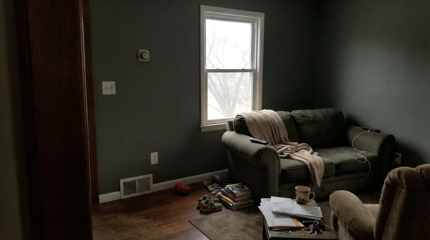
At LRV 27 with real saturation, this color needs daylight to hold its identity. Weak, cool, north-facing light sinks it toward a murky, almost charcoal-green that loses the leafy character entirely — the opposite of what buyers picture from the chip. Add warm lamps, or step up to the lighter Bitter Sage from the same family strip.
Room by Room
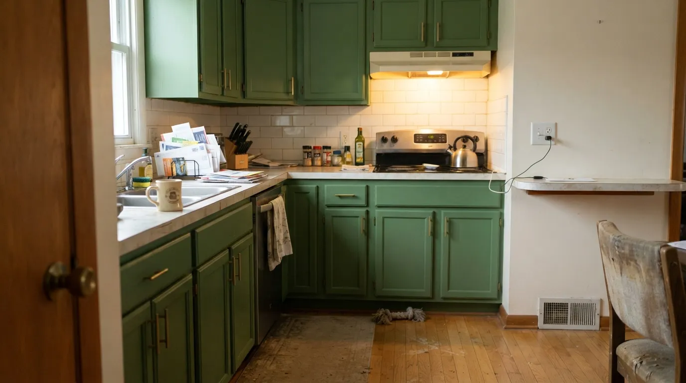
This is the exact use Behr sells the color for: satin or semi-gloss on shaker doors, brass or matte-black hardware, warm wood or white walls around it. It reads confident without going neon.
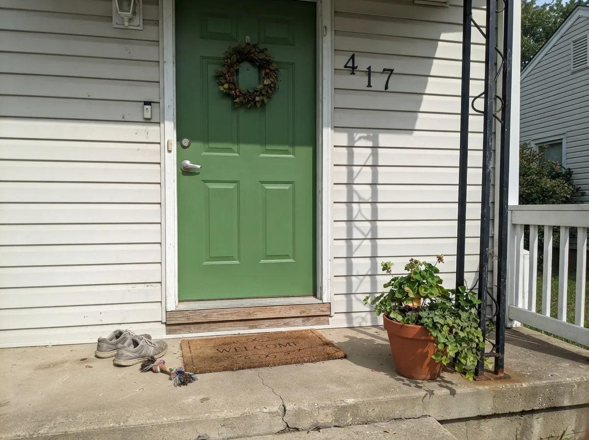
Against a white, greige, or pale gray house body it is a grown-up curb-appeal green with no trend baggage. Behr Marquee exterior is formulated specifically for one-coat coverage in this color line.
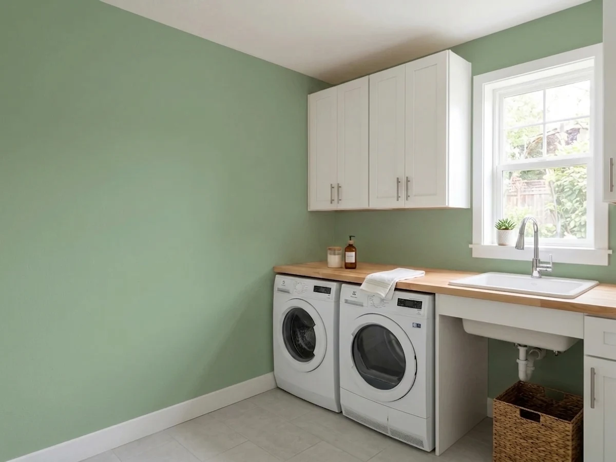
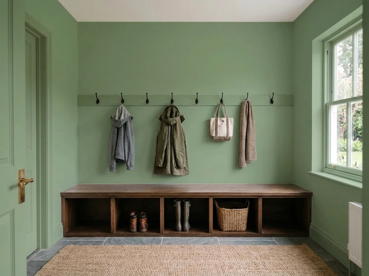
A small, high-traffic room can carry a saturated color like this well — it reads intentional rather than overwhelming at a smaller scale. Skip it if the room has only a frosted or north window.
Under a warm-veined marble or quartz top and brass fixtures, the green looks custom. Cold blue-gray stone will fight it — sample the two together before committing.
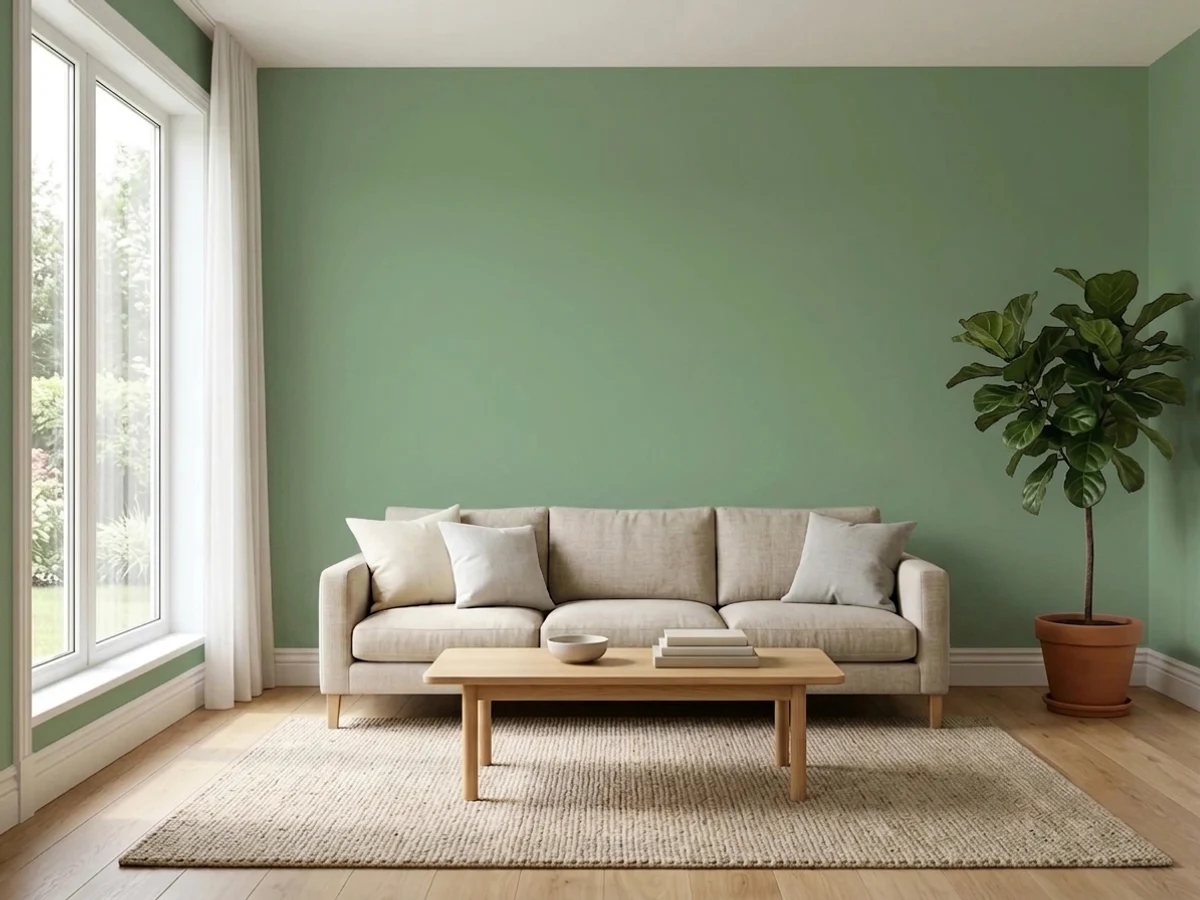
One wall, real daylight, walnut or leather furniture: it works as a grounded, unfussy accent. In an open floor plan it has to negotiate with every adjoining room's undertone, so keep the rest of the palette warm and neutral.
Four walls of this color in a room with weak or north light is where the complaints start: the green sinks toward murky and loses the character people bought it for. Reserve the full-wall commitment for rooms with real daylight.
Your Light Is the Risk
Strong, direct daylight is where the green reads truest and freshest — leafy and saturated without going murky.
Weak, cool daylight drains the color toward a flat, muddy near-charcoal green. Test a large sample before committing a whole room.
Cooler and slightly minty in morning light, warmer and more olive-gold as the afternoon sun comes in from the west.
Warm 2700K lamps push the yellow forward and tip it toward olive or khaki at night. Cool LEDs keep it crisper and closer to a true green.
Most complaints about Eucalyptus Wreath are a light mismatch. Upload a photo of your actual room and see it on your walls — then ask for the same wall in north light or evening lamps before you buy a single sample.
Need It From Another Brand?
Any paint counter can custom-tint Behr N390-5 directly. If you would rather stay in one brand's own deck, these are the closest stock matches, measured as ΔE2000. Under 2 is a difference you will not see on the wall.
| Brand | Closest color | ΔE | LRV | |
|---|---|---|---|---|
| Sherwin-Williams | LeafletSW 9674 · Sherwin-Williams | 3.7 | 30 | Color page → |
| Benjamin Moore | Secret PathCSP-800 · Benjamin Moore | 1.2 | 28 | Color page → |
| Valspar | Agreeable GreenV097-4 · Valspar | 0.8 | 28.2 | Color page → |
| PPG / Glidden | MesmerizePPG1030-5 · PPG / Glidden | 4.3 | 27 | Color page → |
| Glidden | Walkstone Moss10GY 26/112 · Glidden | 2.4 | 26 | Color page → |
| Dunn-Edwards | Stone CreekDE6278 · Dunn-Edwards | 4.5 | 26 | Color page → |
Similar Behr Colors
The nearest shades to Eucalyptus Wreath within Behr's own range, ranked by perceptual color distance — useful when you want the same look a touch lighter, darker, or warmer.
WCAG 2.1: AA is 4.5 : 1 for normal text, 3 : 1 for large text, AAA is 7 : 1.
Eucalyptus Wreath vs the Colors You're Also Considering
Every Eucalyptus Wreath sample board has the same rivals on it. The numbers show the real lightness gap — then it comes down to which risk you would rather live with.
Pick this when you want the deepest, most committed version of that same green.
Behr N390-4 · LRV 40Bitter SagePick this for the lighter step in the same three-color Behr strip — same green family, one shade paler, more forgiving in weaker light.
Pick this when you want a color that unmistakably reads as green from across the room.
Sherwin-Williams SW 9130 · LRV 30Evergreen FogPick this if you actually want the grayed-out, trend-sage look — it's built to whisper, not to read as a true green.
Within Behr, Wethersfield Moss (460F-4) at hex #78A584 and LRV 33 is the same depth with more blue, so it reads cooler and slightly more coastal. Olivine (420F-5) at #7FA569 and LRV 32 goes the other way, pulling yellow and reading more like an olive. Milkweed Pod (S380-5) at #8BAA76 and LRV 36 is a lighter, softer version of the same idea.
Across brands, Farrow and Ball Emerald Green (No. W53) at LRV 31 has a deltaE of 2, Valspar Spring Leaves (5008-6B) at LRV 30.1 is 2.03, and Dutch Boy Botanic Green (229-5DB) at LRV 32 is 2.19. All three are very close, but sample first, since a mid-tone green shows small shifts clearly on a full wall.
Dunn-Edwards Garden of Eden (DE5607) at 2.43 and Glidden Misty Emerald Lake (70GY 30/254) at 2.99 sit in the same band, while Sherwin-Williams Pickle (SW 6725) at 4.01 and HGTV Home Welsh Green (HGSW 1283) at 4.2 are close but visibly different side by side.
Eucalyptus Wreath Coordinating Colors
This color wants warm, neutral company and a dark anchor — not another loud color competing for attention. Warm off-whites keep it from feeling closed in, black or near-black gives it contrast to play against, and its own lighter family members let you layer depth without introducing a second hue.
One Swatch Strip, Three Depths
Eucalyptus Wreath doesn't stand alone on the Behr color card — it's the darkest of a three-step green strip that also includes Jojoba (N390-3, the palest) and Bitter Sage (N390-4, the middle depth). That's a genuinely useful, underused trick: instead of hunting for a coordinating green from a different family, you can pull all three straight off the same strip and know they'll layer cleanly — pale on the ceiling or an accent shelf, mid-depth on a bench or built-in, and Eucalyptus Wreath carrying the main color statement.
None of the three has had a Color of the Year moment or a viral design-blog spread. That's not a knock — it's exactly why they're useful: a quiet, dependable strip a painter can reach for without the color coming with a trend expiration date attached.
Eucalyptus Wreath With Wood Tones and Stone
Walnut, espresso and pale or white-washed oak are this color's best company — the wood's warmth meets the green's warm lean instead of fighting it. Honey oak is workable but less flattering than with the true gray-sage colors, since two warm-yellow tones next to each other can start to feel busy rather than calm.
The one real no is red-toned wood: cherry, mahogany, or any reddish-stained cabinet or floor. Red and green sit directly opposite each other on the color wheel, and the clash is visible immediately — the wood reads more orange, the paint reads more muddy. For stone counters or backsplash, warm-veined marble or quartz flatters it; cold blue-gray stone is the pairing to sample carefully before committing.
Three Ready Palettes Built on Eucalyptus Wreath
A color is never alone on the wall. These are complete combinations in the 60-30-10 pattern, with the reason each one holds together. Every one opens in the visualizer.
A warm off-white keeps the room from feeling closed in around a saturated cabinet color, and the near-black island gives the green something dark to play against instead of fighting a second bright white.
Try this palette in your roomA dependable everyday white body lets the door carry all the color, and black shutters give the green a dark anchor so it reads deliberate instead of accidental against the light siding.
Try this palette in your roomTwo depths from the same Behr green strip layer the walls and the built-ins without introducing a new hue, and the warm trim keeps a small, saturated room from feeling like a cave.
Try this palette in your roomEucalyptus Wreath FAQ
Is eucalyptus wreath a true green or a gray sage?
A true green. Behr's copy leans on "cool gray undertones," but the color itself is more saturated and more clearly green than the gray-sage colors (Evergreen Fog, Sage, Clary Sage) that dominate the trend right now, and it reads slightly warm rather than cool. If you want the whisper-of-gray sage look, pick one of those instead.
What's the difference between eucalyptus wreath and behr's other n390 greens?
Jojoba (N390-3), Bitter Sage (N390-4) and Eucalyptus Wreath (N390-5) are three depths of the same Behr green strip, palest to darkest. Eucalyptus Wreath is the deepest and most saturated of the three.
Is it good for kitchen cabinets?
Yes — this is the use Behr formulates it for, selling N390-5 in its cabinet, door and trim paint lines. Satin or semi-gloss, brass or matte-black hardware, and real daylight or task lighting are what make it work.
Does it work as an exterior color?
Yes. It's sold in Behr's Marquee exterior line and reads as a grounded, classic green front door or shutter color against a pale or greige house body. Pair it with a dark trim (black or near-black) for contrast.
Will it look dark or muddy in my room?
It can, if the room is dim and north-facing. At LRV 27 with real saturation, this color depends on daylight to hold its green identity — weak light sinks it toward a murky, near-charcoal green. Test a large sample on the actual wall before committing a full room.
What wood tones pair well with it?
Walnut, espresso and pale white oak all work well. Cherry or mahogany is the one real clash — red-toned wood sits opposite green on the color wheel, so the two fight instead of complementing each other.
Have you painted with Eucalyptus Wreath?
Rate it — one tap helps the next reader decide.
Ask a Question