Bitter Sage
The sage that didn't get the gray-out memo, reviewed honestly: where Bitter Sage reads fresh and green, the honey-oak clash that turns it avocado, and what to pick instead.

Jessica has spec'd whites and neutrals for more than 300 rooms and keeps a sample wall of painted drawdowns in her studio. Every color review is checked against real reader rooms in the comments and re-tested when a formula changes. About the testing process →
- 1Vintage Vogue12
- 2Sage Green22
- 3Bitter Sage34
- 4Clary Sage41
- 5October Mist47
The Fast Verdict
Bitter Sage is what a sage green looks like before a stylist grays it down for a moodboard. Behr built it with real chroma — closer to a fresh herb than the dusty, almost-neutral sages everyone else is chasing — and at LRV 34 it holds that color in a normal room without going dark or heavy. It is not a famous color; it has no Color of the Year plaque and no viral room. It is a well-made, medium-saturation green that quietly does its job in bedrooms, dining rooms and cabinetry, and it deserves more attention than its obscurity suggests.
Bedrooms and dining rooms that want real color, not a hint of it · kitchen islands and cabinetry · exteriors with white or cream trim · anyone who tried a trendy grayed sage and it read too close to beige
You actually want the grayed, almost-neutral sage from every recent kitchen photo · your floors are honey oak or golden pine · the room runs on cool white LEDs with no real daylight · you want a color nobody will ever ask you to name
- Real saturation — reads as green, not a grayed-out neutral pretending to be one
- LRV 34 holds its color without going dark or feeling heavy
- Cabinetry and islands look custom, not trend-chasing
- Interior and exterior formulations — one color works on siding and cabinets
- A quiet, underused color in a market flooded with grayed sages
- Fights honey oak and golden wood — reads dated avocado together
- Not the grayed, near-neutral sage most kitchen boards are chasing
- Cool LEDs and dim rooms flatten it toward muddy olive
- Obscure enough that most stores and painters won't have a sample chip on hand
What Color Is Bitter Sage, Really?
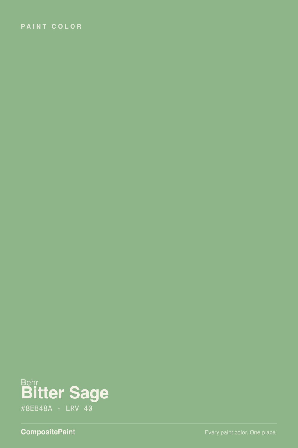
Most colors sold as "sage" spend their whole formula fighting the word green — popular sages like Sherwin-Williams Sage and Evergreen Fog are grayed down until they read closer to a warm neutral than a plant. Bitter Sage skips that step. It carries real saturation: a warm yellow-green with enough chroma that it reads confidently as green in a normal room, not a green-adjacent gray. It sits inside Behr's enormous deck of more than 3,000 colors without a headline — no Color of the Year run, no design-blog viral moment — just a well-built medium green that homeowners keep finding on their own, mostly for bedrooms, dining rooms and painted cabinetry.
At LRV 34 it is a genuine mid-tone: light enough to keep a small room from feeling closed in, dark enough to hold its color instead of washing pale the way a lighter sage does. That depth is the reason it reads fresh rather than pastel — put it next to a lighter, grayed sage like Saybrook Sage and Bitter Sage is unmistakably the greener, more saturated color of the two.
Undertone in one line: warm yellow-green, never blue or teal. If your sample looks muddy or flat, that is cool light draining the yellow out of it — not a different paint.
Where It Shines
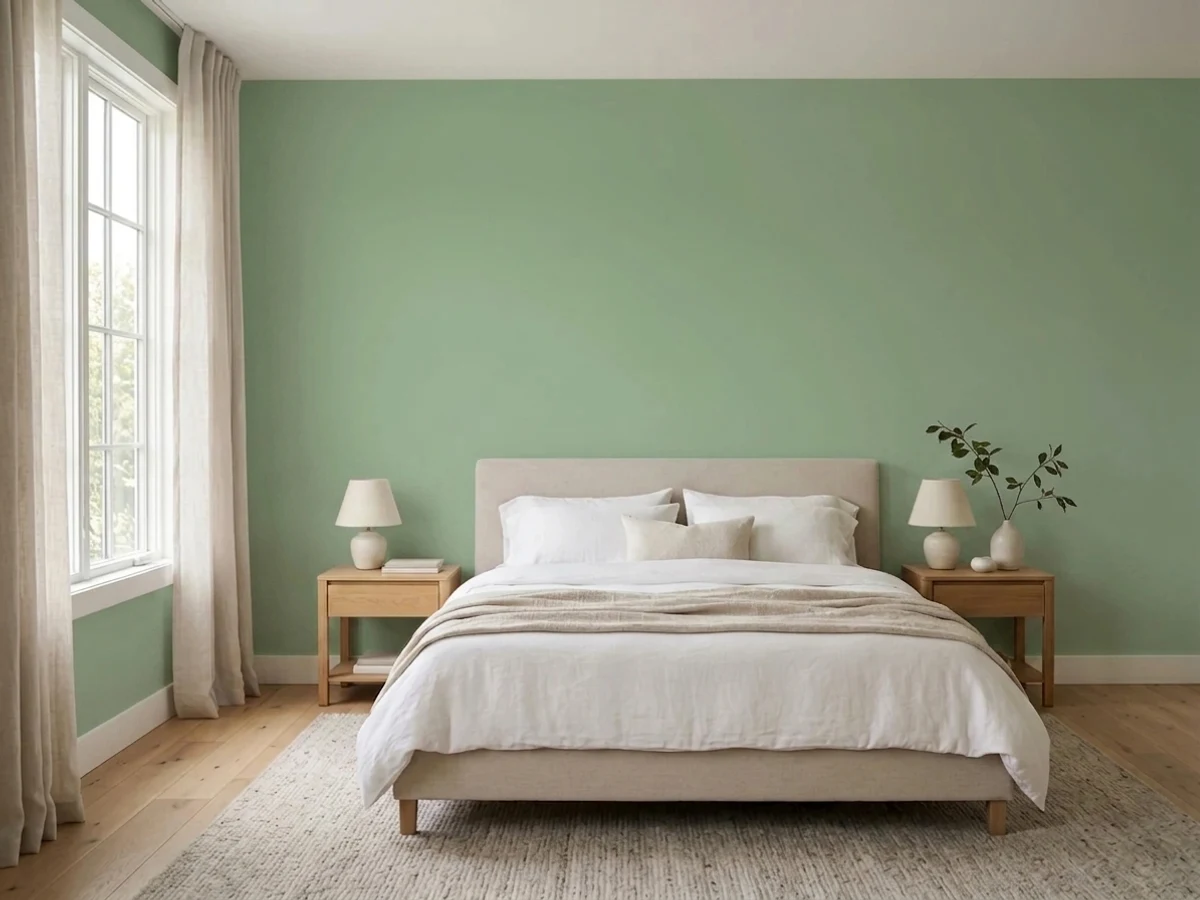
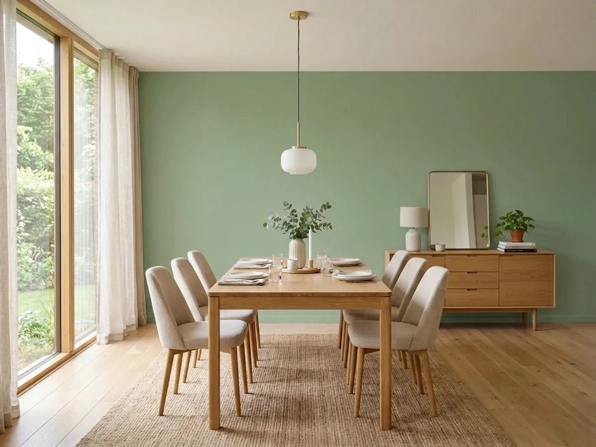
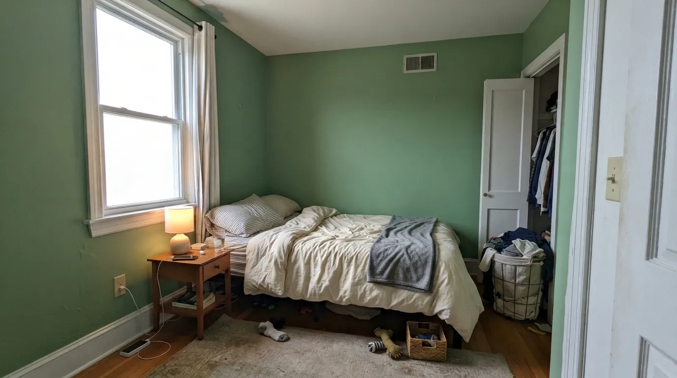
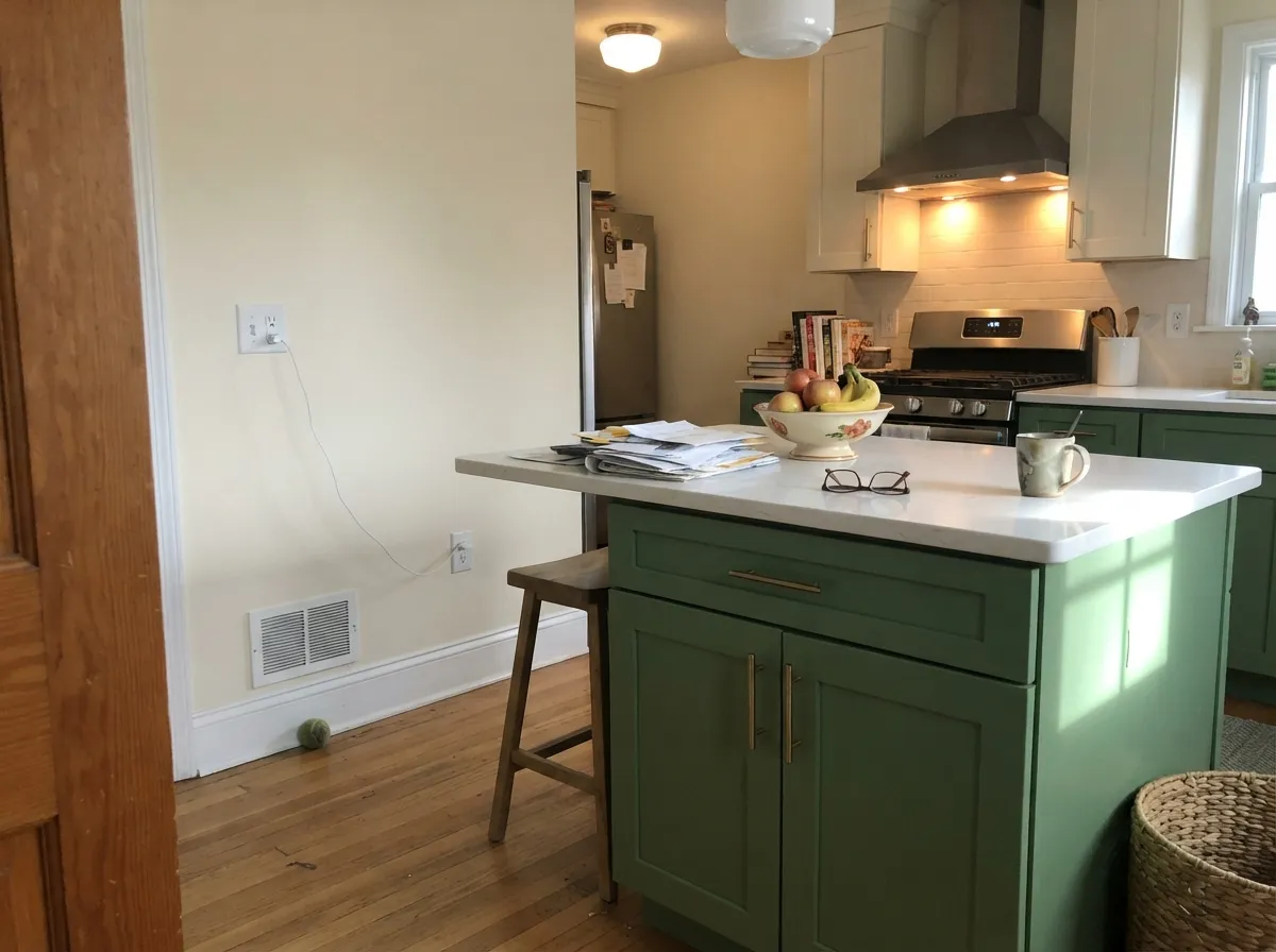
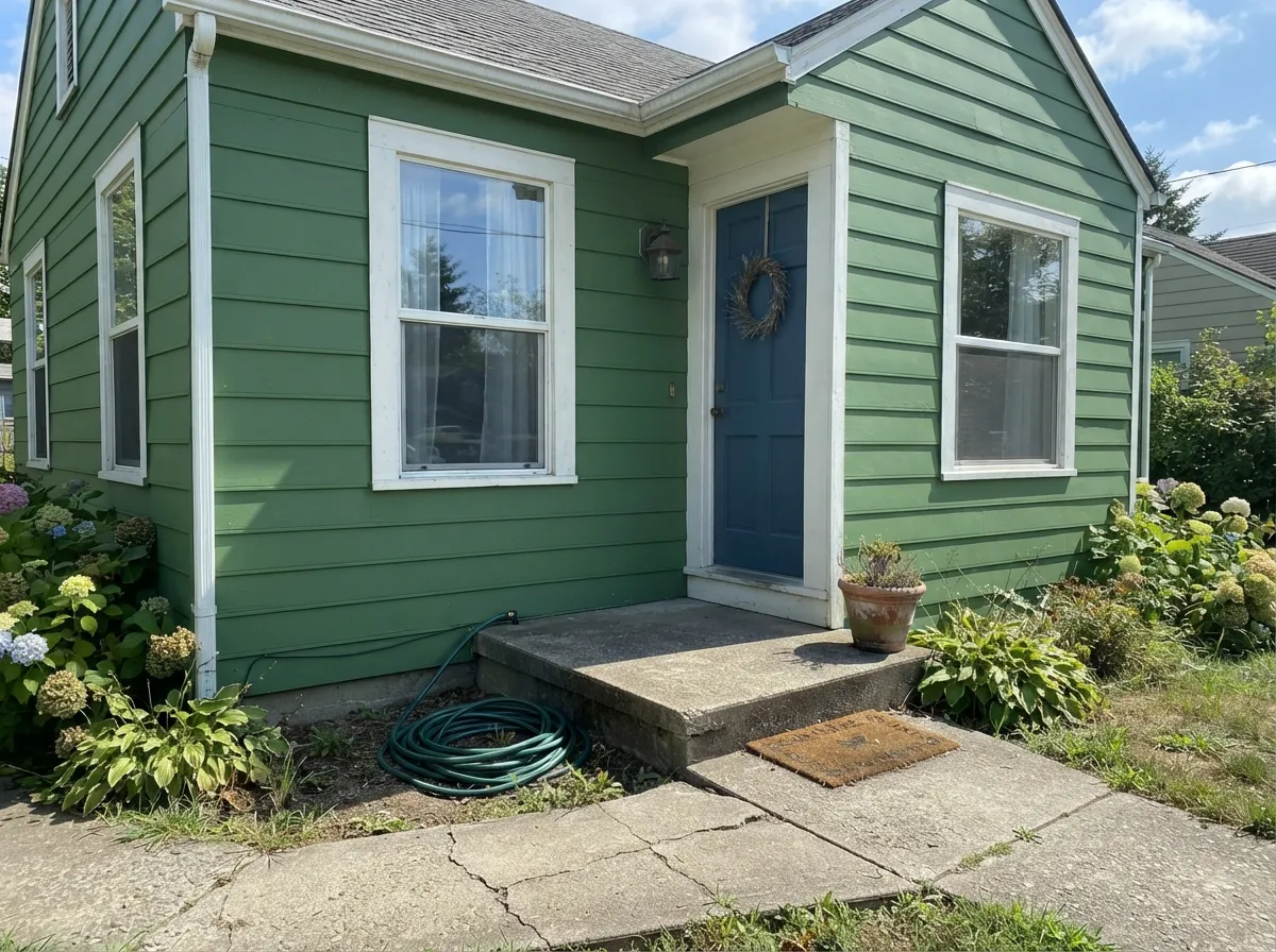
Give it a room with real, even daylight and it looks exactly like the plant it's named for: fresh, a little herbal, not trying to pass for gray. It is at its best in bedrooms and dining rooms where a full wall of real color is the point, and on cabinetry — an island, a hutch, a bathroom vanity — where satin paint and brass or matte-black hardware make it look intentional rather than accidental. Outdoors, paired with white or cream trim, it reads like a proper cottage green instead of a leftover-gallon afterthought.
Where It Fails
Nearly every regret story with a saturated green like this comes down to one of three mismatches, and all three show up before the first coat if you're paying attention.
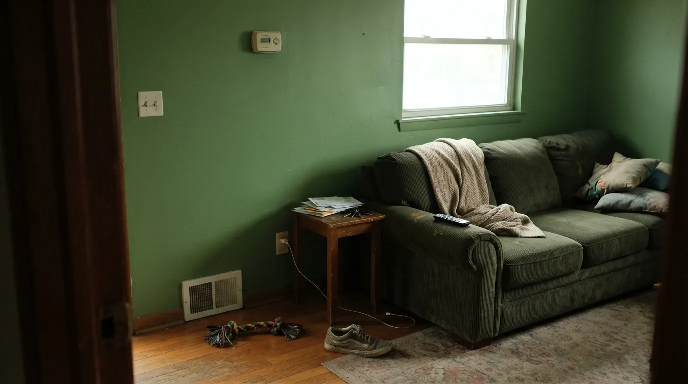
Yellow-orange and yellow-green sit close enough on the color wheel to compete instead of cooperate: put Bitter Sage against honey oak floors or golden pine trim and the two fight for the same warm-yellow territory, pulling the whole room toward a dated avocado-and-orange look. Walnut, espresso, whitewashed oak, or a large rug between the two solves it; honey oak wall-to-wall does not.
If your reference photo is a board of Evergreen Fog cabinets or a spread of Saybrook Sage walls, Bitter Sage will surprise you — it is measurably greener and less neutral than either. That is not a flaw in the paint, it is a mismatch in expectations. If gray-first is the goal, pick one of those instead and let Bitter Sage be the color you choose on purpose.
Cool light strips the yellow out of a yellow-green and leaves a flat, slightly muddy olive-gray that loses the fresh read entirely. It isn't a north-room-only problem — any room with little daylight and cool-white bulbs will do it. Warm 2700K bulbs bring the color back; cool 4000K-plus LEDs are the actual culprit behind most disappointed reviews.
Room by Room
A full wall, or all four, in real daylight reads calm but distinctly colored — a rare green that still feels restful. Eggshell hides wall texture; White Dove trim keeps the edges soft instead of clinical.
Under a chandelier or pendant, a dining room in Bitter Sage with a walnut table and brass fixtures looks considered rather than trendy. It is deep enough to hold up against evening candlelight without going murky.
Satin Bitter Sage on an island or a run of lower cabinets, paired with a lighter wall color, is the move — a whole kitchen of it is a bolder bet than most cooks want. Keep it away from honey-oak open shelving.
Works best in rooms with genuine window light; in a dim or north-heavy living room it can go flat by late afternoon. Pair with warm neutrals rather than cool grays to keep the room from reading two-toned.
On a vanity under a marble or quartz top it is a fast, high-impact upgrade. On all four walls of a small, window-less bathroom it can feel closed-in; add a mirror and a brighter light fixture if you go that far.
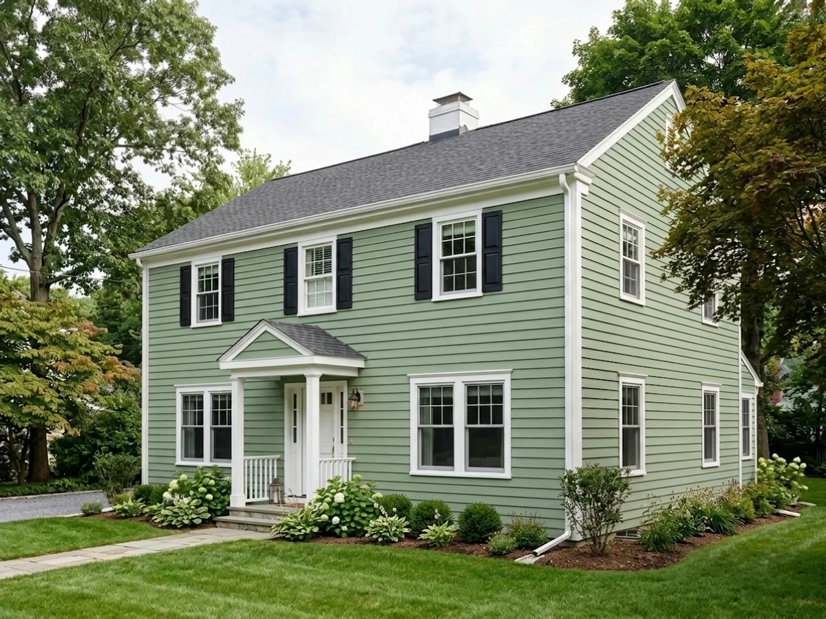
Behr sells it in exterior formulations for a reason: full sun keeps the green honest without bleaching it, and white or cream trim gives it the crisp cottage look it's built for. Skip it on a house shaded all day by mature trees — the color needs the light.
Your Light Is the Risk
Diffused daylight — big windows, no direct hot sun — keeps the yellow-green fresh and clearly herbal. This is where the color earns its name.
Little daylight plus cool-white bulbs drains the yellow and leaves a flat, muddy olive-gray. Swap to warm bulbs before blaming the paint.
Cooler and crisper in morning light, noticeably warmer and more olive by late afternoon as the sun angle drops.
2700K bulbs push it toward a deeper, warmer olive-green at night. Cool 4000K-plus LEDs are the single most common reason it reads dull indoors.
Most complaints about Bitter Sage are a light mismatch. Upload a photo of your actual room and see it on your walls — then ask for the same wall in north light or evening lamps before you buy a single sample.
Need It From Another Brand?
Any paint counter can custom-tint Behr N390-4 directly. If you would rather stay in one brand's own deck, these are the closest stock matches, measured as ΔE2000. Under 2 is a difference you will not see on the wall.
| Brand | Closest color | ΔE | LRV | |
|---|---|---|---|---|
| Sherwin-Williams | Acacia HazeSW 9132 · Sherwin-Williams | 4.7 | 32 | Color page → |
| Benjamin Moore | Herb Bouquet460 · Benjamin Moore | 1.8 | 35 | Color page → |
| Valspar | BushelT617 · Valspar | 1.6 | 33.4 | Color page → |
| PPG / Glidden | EdamamePPG1030-4 · PPG / Glidden | 2.2 | 35 | Color page → |
| Glidden | Tender Forest Sage30GY 33/144 · Glidden | 1.6 | 33 | Color page → |
| Dutch Boy | Mossed Thicket424-3DB · Dutch Boy | 1.4 | 35 | Color page → |
Similar Behr Colors
The nearest shades to Bitter Sage within Behr's own range, ranked by perceptual color distance — useful when you want the same look a touch lighter, darker, or warmer.
WCAG 2.1: AA is 4.5 : 1 for normal text, 3 : 1 for large text, AAA is 7 : 1.
Bitter Sage vs the Colors You're Also Considering
Every Bitter Sage sample board has the same rivals on it. The numbers show the real lightness gap — then it comes down to which risk you would rather live with.
Pick this if you want it to actually look green on the wall, not gray with a memory of green.
Sherwin-Williams SW 9130 · LRV 30Evergreen FogPick this for the trendy grayed cabinet sage everyone else is painting.
Pick this for real chroma that won't wash out under mixed daylight.
Sherwin-Williams SW 7732 · LRV 32SagePick this for a softer, more muted grey-green with less commitment.
Inside Behr, Forest Path N400-4 at #8AB68F and LRV 41 is a hair lighter and slightly cooler, while Potting Moss BXC-82 at #98B086 and LRV 39 is warmer and more olive. Promenade 400F-5 at #9DB388 leans further yellow-green, and Mermaid Net 480F-4 at #7EB699 shifts clearly toward teal. Athenian Green 440F-4 at #89B782 is the freshest and most leaf-like of the group. Across brands, Glidden Chatty Cricket PPG1131-5 at LRV 39 comes in at a deltaE of 0.88, effectively the same color. Benjamin Moore Gumdrop 564 at LRV 42 and deltaE 1.93, Dunn-Edwards Foliage DE5612 at LRV 38 and deltaE 1.94, and Hirshfield's Green Bonnet H0080 at LRV 40 and deltaE 1.95 are all visually identical in normal room light. Sherwin-Williams Mesclun Green SW 6724 at LRV 42 and deltaE 4.56 is close but visibly different side by side, reading distinctly more yellow at #9DB682.
Bitter Sage Coordinating Colors
The rule with Bitter Sage: keep the whites clean rather than creamy, keep the wood cool-to-neutral rather than honey-gold, and let one near-black or charcoal carry the contrast. These are the partners that keep it looking intentional:
Why Bitter Sage Isn't the Sage You've Seen Everywhere
Bitter Sage has no Color of the Year run and no design-press moment — it is one entry in a deck of more than 3,000 Behr colors, and it stayed there quietly while Evergreen Fog and its grayed cousins became the sage everyone recognizes. The rooms it does show up in are ordinary ones: a first-time homeowner's guest-room repaint, a scattering of bedroom and dining-room boards, cabinetry projects looking for "furniture-grade" green. Nobody is arguing about it on design forums, mostly because it hasn't been discovered at scale.
That obscurity is the actual selling point. Because it skipped the gray-out treatment that made the trend sages so ubiquitous, Bitter Sage still reads as a real color choice rather than a safe default — the green version of picking a genuinely warm white instead of whatever off-white is currently popular. If the grayed sage look already feels overexposed in your neighborhood, this is the version that still looks like a decision.
Bitter Sage With Wood Tones and Floors
This pairing gets decided at the floor. Walnut, espresso and other dark, red-brown woods are the easiest match — the depth keeps the green reading intentional rather than candy-bright. Whitewashed or gray-washed oak is safe and gives the room a cooler, more Scandinavian cast that keeps Bitter Sage from feeling like the only warm thing in the room.
Honey oak, golden pine, and orange-leaning builder trim are the real no. Yellow-orange and yellow-green sit close enough on the wheel that they amplify each other instead of balancing, and the combination reads more "dated kitchen" than "fresh green." A large rug or a change to a darker floor stain fixes it; painting around wall-to-wall honey oak does not.
Metals split the same way: unlacquered brass and matte black both work, aged bronze is safe, and polished chrome is the one finish that reads coldest against this particular warm green.
Three Ready Palettes Built on Bitter Sage
A color is never alone on the wall. These are complete combinations in the 60-30-10 pattern, with the reason each one holds together. Every one opens in the visualizer.
White Dove keeps the edges soft instead of clinical, and Wrought Iron gives one true dark note so the green reads deliberate rather than accidental.
Try this palette in your roomAlabaster keeps the surrounding walls quiet so the island carries all the color; Kendall Charcoal on a pantry door gives one near-black note that keeps the palette from feeling too soft.
Try this palette in your roomWhite trim keeps the green crisp instead of murky in full sun, and a black door supplies the one high-contrast note the scheme needs.
Try this palette in your roomBitter Sage FAQ
Is Bitter Sage the same as the trendy grayed sage everyone's using?
No — that's the biggest misconception with this color. Evergreen Fog, Sage and most other popular "sage greens" are grayed down until they read almost neutral. Bitter Sage keeps real saturation and reads distinctly green on the wall. If you want the grayed, near-neutral look, pick one of those instead; if you want an honest green, this is it.
Is it warm or cool?
Warm — a yellow-green with no blue in it. In cool light (north rooms, cool-white LEDs) it can flatten toward a muddy olive-gray, but it never turns teal or blue-green.
Does it work with honey oak floors?
Not well. Yellow-orange wood and yellow-green paint compete for the same warm territory and the combination reads dated — think an avocado-and-orange 1970s kitchen. Walnut, espresso, whitewashed oak, or a large rug between the two work much better.
Is it good for kitchen cabinets?
Yes, especially in doses — an island, a hutch, lower cabinets under a lighter wall color. Use a satin cabinet-grade enamel. A full kitchen of it is a bigger commitment and needs the wall color and countertops to genuinely support that much green.
What trim white goes with Bitter Sage?
A clean, fairly bright white — White Dove or Simply White both work — rather than a warm cream, which can push the whole wall further toward olive. Semi-gloss trim against matte or eggshell walls keeps the edge crisp.
Can I use it outside?
Yes — Behr sells it in exterior formulations, and full daylight keeps the green honest rather than washing it out. Pair with white or cream trim for a cottage look; avoid it on a house shaded all day, where it can look flat rather than fresh.
Have you painted with Bitter Sage?
Rate it — one tap helps the next reader decide.
Ask a Question