Juniper
The muted blue-green Sherwin-Williams barely markets, reviewed honestly: where its cool cast turns rich, the light that flattens it to gray, and what to pick instead.

Jessica has spec'd whites and neutrals for more than 300 rooms and keeps a sample wall of painted drawdowns in her studio. Every color review is checked against real reader rooms in the comments and re-tested when a formula changes. About the testing process →
- 1Essex Green6
- 2Vintage Vogue12
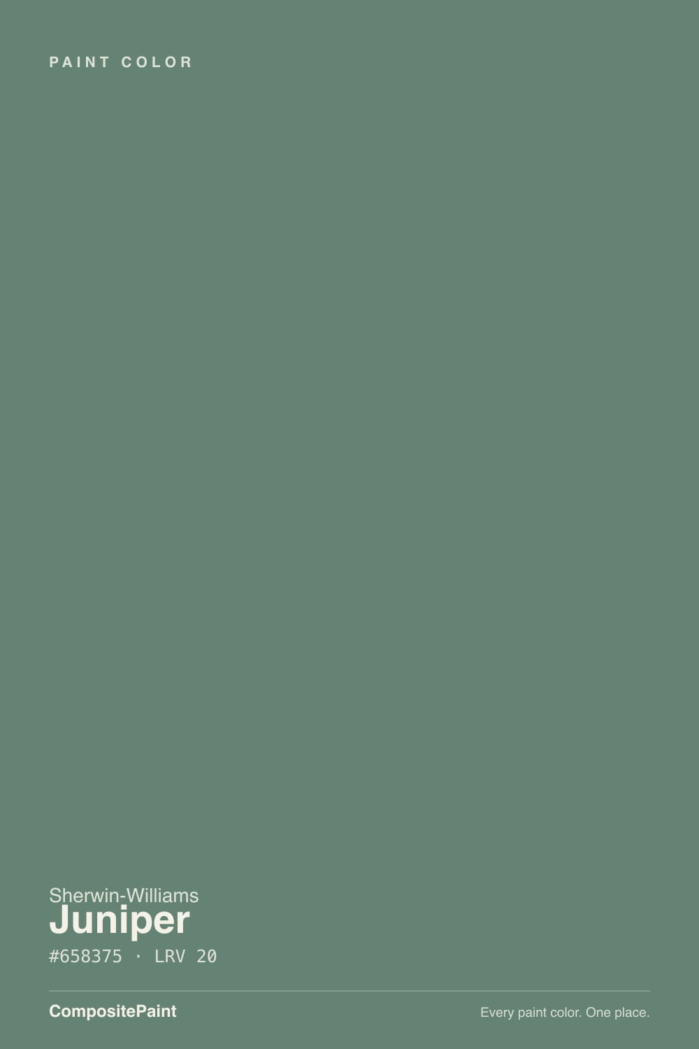
- 3Juniper20
- 4Evergreen Fog30
- 5Clary Sage41
The Fast Verdict
Juniper is the quiet blue-green in the Sherwin-Williams deck — no Color of the Year push, no viral design-blog moment, just a deep, gray-cast green with a genuinely cooler lean than its more famous siblings. At LRV 20 it has real weight: rich on cabinets and vanities, composed and a little moody in a lamplit bedroom. It has one honest weakness — take the warmth out of the room and it stops reading as green at all.
Kitchen cabinets and islands · powder-room and bathroom vanities · bedrooms and dens that want a cool, composed color story · anyone who already tried Evergreen Fog or Retreat and wants something less olive, more blue-green
You want a lively, saturated green rather than a muted one · your room is north-facing and stays dim without lamps · your counters, floors and trim already run cool gray · you want a color you can point to as trending or famous
- A genuinely cooler, more blue-leaning green than the deck's other reviewed cabinet greens
- LRV 20 gives it real depth — reads as a color decision, not a pale suggestion of green
- Excellent on cabinets, islands, and vanities where it only has to negotiate with one room
- Composed and a little moody under warm lamplight — a good bedroom or den color
- No trend hype to age out of — it's been a quiet deck color, not a marketed moment
- Muted and gray-cast by design — not the color to pick if you want a lively, saturated green
- Cool daylight or cool-white LEDs flatten it toward gray-teal, hiding the green almost entirely
- Needs a warm material in the room (wood, brass, cream) or the whole space reads cold
- No confirmed famous-use pedigree to reassure a nervous buyer — you're trusting the color, not a headline
What Color Is Juniper, Really?
Juniper's numbers tell the real story: RGB 101/131/117. Green is the clear high channel, but blue (117) sits close behind it and red (101) trails well below both — that is a genuine blue-green, closer to teal than to sage, with just enough gray desaturation to keep it from looking like a crayon color. It is a different animal from Sherwin-Williams' other reviewed cabinet greens: Retreat (SW 6207, #7A8076) and Dried Thyme (SW 6186, #7B8070) both have their blue channel as the lowest of the three, which is what makes them read warm and olive. Juniper flips that — blue is mid-pack, not last — and the result is a cooler, more composed green with a faint teal whisper the olive greens don't have.
At LRV 20 it sits in genuinely deep territory — the same depth bracket as Retreat and Dried Thyme (both LRV 21), well below the lighter, more famous Evergreen Fog (LRV 30) or Clary Sage (LRV 41). That depth is what makes it work as a real color statement on cabinets or a vanity instead of a pale suggestion of green. It's also the honest tradeoff of any LRV-20 color: push it into a dim room with no warm light and it slides toward near-black before most people would still call it "green."
The undertone research turned up no confirmed Color of the Year status, no documented viral room, no named designer collection — nothing that would justify calling this a famous color. It isn't. Juniper is a deck workhorse: a well-made, genuinely cooler blue-green that quietly does a specific job (cabinets, vanities, a lamplit bedroom) without ever having been marketed hard. That's not a knock — it's an honest description of where it sits.
Where It Shines
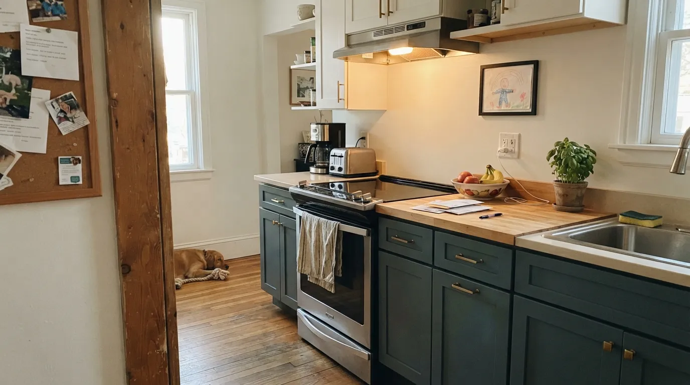
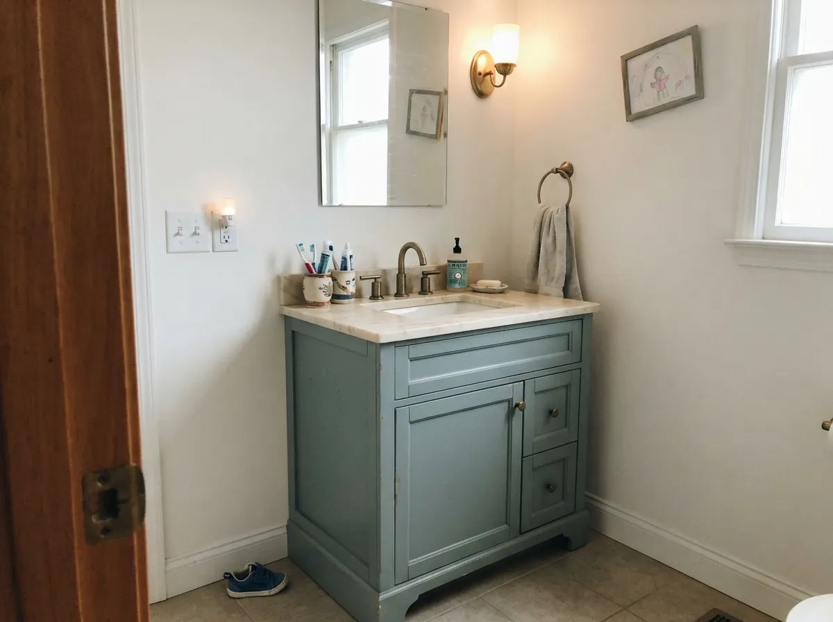
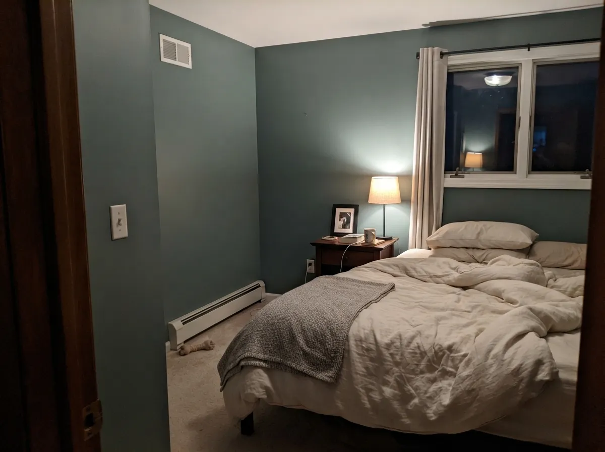
Give it warm light and something to reflect against — brass, walnut, aged leather, a cream wall — and the blue-green comes forward and reads rich rather than murky. Cabinets and vanities are its strongest jobs: deep enough at LRV 20 to feel like a real color decision, contained enough as a single piece of furniture that its cool lean never has to negotiate with the whole house. In a bedroom or den under a warm lamp it turns composed and a little moody in the good way, without tipping into gloom.
Where It Fails
Almost every regret story that fits this kind of deep, cool green follows one of three scripts, and all three are predictable before the first coat. None of them are the paint's fault — but if your room matches one, sampling bigger will only confirm the mismatch.
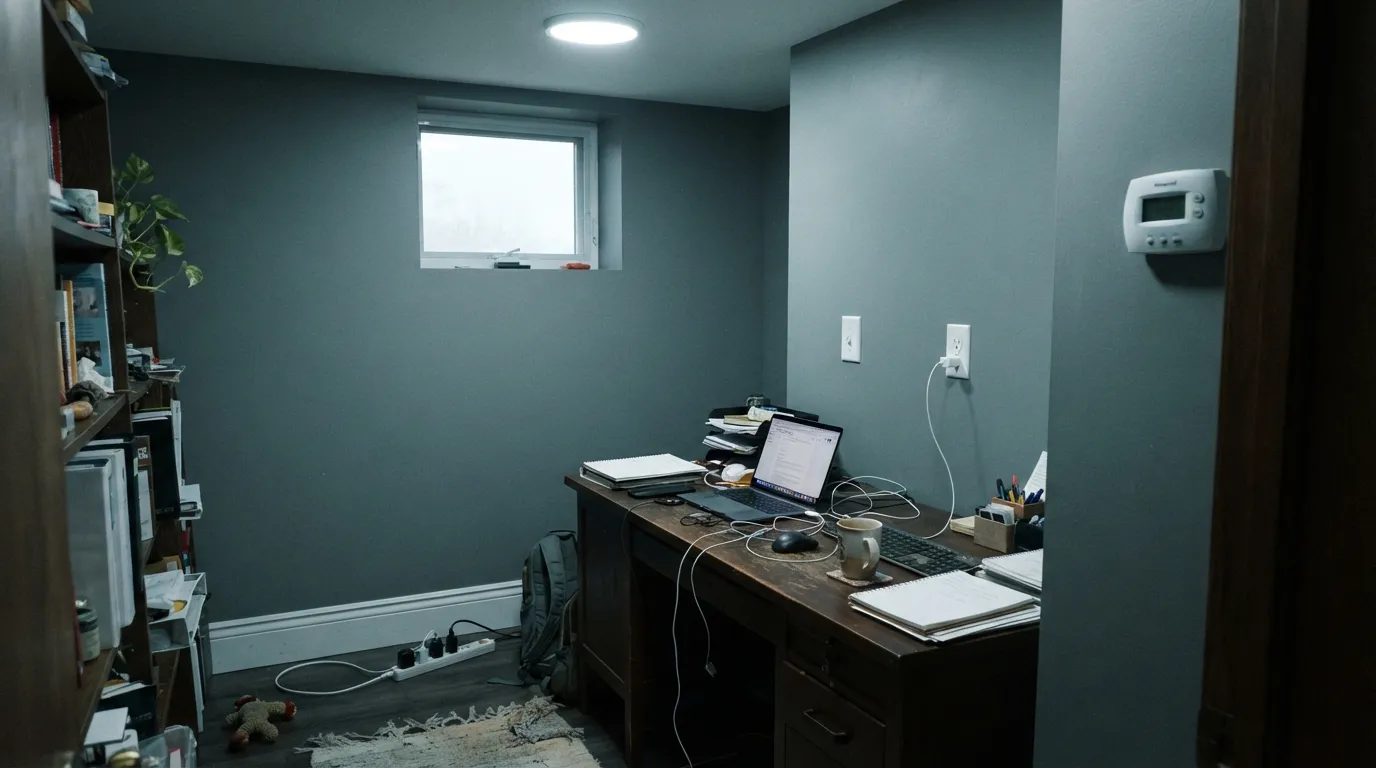
Juniper is muted by design — the gray cast is most of the color's identity. In a dim room, LRV 20 plus low saturation can read closer to charcoal-slate than to any green you'd point at on a swatch card. If you want a green that announces itself, this reads too quiet.
Cold north daylight or bare cool-white LEDs strip out what little warmth the color has and flatten it toward gray-teal — you lose the green almost entirely. This is a lighting problem, not a paint defect, and it fixes with 2700K bulbs, not a return trip to the store.
Pair Juniper with cool gray quartz, cool white trim and brushed-nickel hardware and the whole space goes cold and flat with no anchor. It needs at least one warm material — wood, brass, cream — in the room to keep the blue-green from reading as plain gray.
Room by Room
Deep enough to feel intentional, contained enough not to fight the rest of the room. Satin cabinet enamel, brass or unlacquered hardware, and a warm counter (butcher block, warm quartz, cream stone) let the blue-green come forward instead of going flat.
The same logic as cabinets, at a smaller scale: a single Juniper vanity under a warm-white marble top and brass fixtures reads custom without repainting a whole bathroom. Satin finish for wipe-down durability.
Matte or eggshell on all four walls, 2700K bulbs, and cream or white bedding. Skip it if the room is north-facing and you refuse lamps — that combination is exactly the fails scenario above.
Low, warm light flatters it the same way it flatters a bedroom. Walnut shelving, leather, brass task lighting all give it something to play off of.
Beautiful in a closed, warm-lit room; riskier across an open plan where it has to hold its color under mixed daylight from multiple exposures. Contain it to one room or one wall rather than running it through a whole open floor.
Sherwin-Williams lists and markets Juniper as an interior color, and research turned up no documented exterior use. Treat it as an interior pick — cabinets, vanities, bedrooms, dens — rather than reaching for it on siding or trim.
Your Light Is the Risk
Warm daylight or a 2700K lamp brings the blue-green forward and gives the color real richness — this is the light where Juniper looks like a deliberate choice, not a dark accident.
Cool, flat daylight strips the warmth out and pushes the color toward gray-slate. In a dim north room the green can all but disappear. Sample here before committing.
Reads coolest and grayest at midday under bright overhead light, then warms and deepens as the light lowers toward evening — a gentle shift, not a dramatic one.
2700K warm bulbs pull the blue-green forward and make it feel rich and composed. Cool white LEDs do the opposite — flatten it toward gray. Bulb temperature matters more than usual with this color.
Most complaints about Juniper are a light mismatch. Upload a photo of your actual room and see it on your walls — then ask for the same wall in north light or evening lamps before you buy a single sample.
Need It From Another Brand?
Any paint counter can custom-tint Sherwin-Williams SW 9679 directly. If you would rather stay in one brand's own deck, these are the closest stock matches, measured as ΔE2000. Under 2 is a difference you will not see on the wall.
| Brand | Closest color | ΔE | LRV | |
|---|---|---|---|---|
| Behr | Sycamore GroveS420-5 · Behr | 1.6 | 22 | Color page → |
| Benjamin Moore | Willow Grove636 · Benjamin Moore | 2.7 | 19 | Color page → |
| Valspar | Hanging Vine5005-6B · Valspar | 1.8 | 18.9 | Color page → |
| PPG / Glidden | Salal LeavesPPG1137-6 · PPG / Glidden | 2.6 | 19 | Color page → |
| Glidden | Gloucester Green30GG 20/128 · Glidden | 2.2 | 20 | Color page → |
| Dutch Boy | Lawn Games328-5DB · Dutch Boy | 2.5 | 21 | Color page → |
Similar Sherwin-Williams Colors
The nearest shades to Juniper within Sherwin-Williams's own range, ranked by perceptual color distance — useful when you want the same look a touch lighter, darker, or warmer.
WCAG 2.1: AA is 4.5 : 1 for normal text, 3 : 1 for large text, AAA is 7 : 1.
Juniper vs the Colors You're Also Considering
Every Juniper sample board has the same rivals on it. The numbers show the real lightness gap — then it comes down to which risk you would rather live with.
Pick this for a cooler, more distinctly blue-green cast — Juniper reads less like plain dark green, more like a muted teal.
Sherwin-Williams SW 6207 · LRV 21RetreatPick this for a warmer, more neutral-olive take at the same depth — Retreat's blue channel is the lowest of its three, which is what keeps it earthy instead of blue-leaning.
Pick this for a cabinet green with a cooler, blue-green edge instead of an olive one.
Sherwin-Williams SW 6186 · LRV 21Dried ThymePick this if you want the warmer, more olive-khaki cabinet green — Dried Thyme leans earthy where Juniper leans cool.
Pick this for more depth and a more clearly blue-green identity than Evergreen Fog's quieter gray-sage.
Sherwin-Williams SW 9130 · LRV 30Evergreen FogPick this for the lighter, better-known gray-sage — Evergreen Fog is the safer, more forgiving pick if you want a name you've already seen everywhere.
Juniper Coordinating Colors
The rule for coordinating with Juniper is simple: keep at least one warm material in the room. It flatters soft warm whites, warm wood, brass, and near-blacks with their own faint green lean — and it goes flat and cold stacked against pure cool grays or stark cool whites with nothing warm to balance them. These are the partners that keep it composed rather than cold:
Why Juniper Flies Under the Radar
Sherwin-Williams' green family has one bona fide star: Evergreen Fog, named 2022 Color of the Year and repeated on design blogs and dupe lists ever since. Juniper sits a few numbers away in the same family with a nearly identical résumé on paper — a muted, gray-cast green good for cabinets, vanities, and bedrooms — and none of the attention. Research for this review turned up plenty of technical listings and color-match sites, but no design-blog features, no viral room, no named collection.
That's a fair trade for a lot of buyers. Evergreen Fog's fame means more people have already tested it, more painters have already worked with it, and more rooms exist to compare against. Juniper's obscurity means less social proof — but also a genuinely cooler, more blue-leaning color that doesn't look like the same sage you've already seen on every third listing photo. Pick it because it does the job you want, not because it comes with a headline.
Juniper With Wood Tones and Metals
Warm wood is the easiest pairing: walnut, butcher block, warm oak and cedar all give the cool blue-green something to play off of, the same way brass and unlacquered hardware do. On a cabinet or vanity project, that warm material is doing real work — it's the difference between the color reading rich and reading flat.
Cool gray floors or countertops are the pairing to test first. Two cool-leaning materials next to each other with nothing warm in the room can read collectively cold rather than composed — the exact complaint pattern behind the fails section above. A warm rug, warm lighting, or a single warm accent usually fixes it; if the whole room is committed to cool gray already, this may not be the green to add on top.
Three Ready Palettes Built on Juniper
A color is never alone on the wall. These are complete combinations in the 60-30-10 pattern, with the reason each one holds together. Every one opens in the visualizer.
Alabaster's soft warm white keeps the cool blue-green from tipping cold, and Wrought Iron's own faint green undertone (its blue channel sits mid-pack, same shape as Juniper's) lets a dark island or light fixtures echo the cabinets instead of fighting them.
Try this palette in your roomCream walls keep the small room airy while the vanity carries all the color; Kendall Charcoal's warm-toned dark (its red channel is the highest of the three) gives one grounding note without competing with Juniper's cooler lean.
Try this palette in your roomPale Oak's soft warm neutral is the anchor Juniper's cool cast needs on the trim; Wrought Iron shares enough of the same green-leaning dark that a door or bed frame in it reads like a shadow of the wall color rather than a separate decision.
Try this palette in your roomJuniper FAQ
Is Juniper warm or cool?
Cool. Its RGB math (101/131/117) puts blue as the second-highest channel, not the lowest — a genuine blue-green rather than the warmer olive-green of colors like Retreat or Dried Thyme. Warm light and warm materials in the room are what keep it from reading flat.
Is Juniper a good kitchen cabinet color?
Yes — it's one of the best jobs for this color. Sherwin-Williams lists it for cabinets, and at LRV 20 it has enough depth to read as a real color decision without needing a whole room to support it. Satin cabinet enamel, brass hardware, and a warm counter material are the winning combination.
Will Juniper look black in a dim room?
Not literally black, but close in spirit — LRV 20 combined with low saturation means a dim, north-facing room without warm lamps can push it toward a charcoal-slate read where the green is hard to see. It needs either real daylight or warm bulbs to stay legible as a color.
What's the difference between Juniper and Retreat or Dried Thyme?
Depth is nearly identical — all three sit around LRV 20–21. The difference is undertone: Retreat and Dried Thyme are warmer and more olive because their blue channel is the lowest of the three; Juniper's blue channel sits in the middle, which gives it a cooler, more distinctly blue-green cast.
Is Juniper a trending or famous color?
No — and it's worth being honest about that. Research turned up no Color of the Year status, no documented viral room, no named designer collection behind it. It's a quiet deck color that does a specific job well (cool-toned cabinets, vanities, bedrooms) rather than a color with a marketing story.
What trim or wall color goes with Juniper?
A soft warm white or cream — Alabaster or Swiss Coffee both work — keeps the cool blue-green from reading cold. Avoid pairing it with stark cool-white trim or cool gray countertops without at least one warm material (wood, brass, cream) somewhere in the room.
Have you painted with Juniper?
Rate it — one tap helps the next reader decide.
Ask a Question