Studio Blue Green
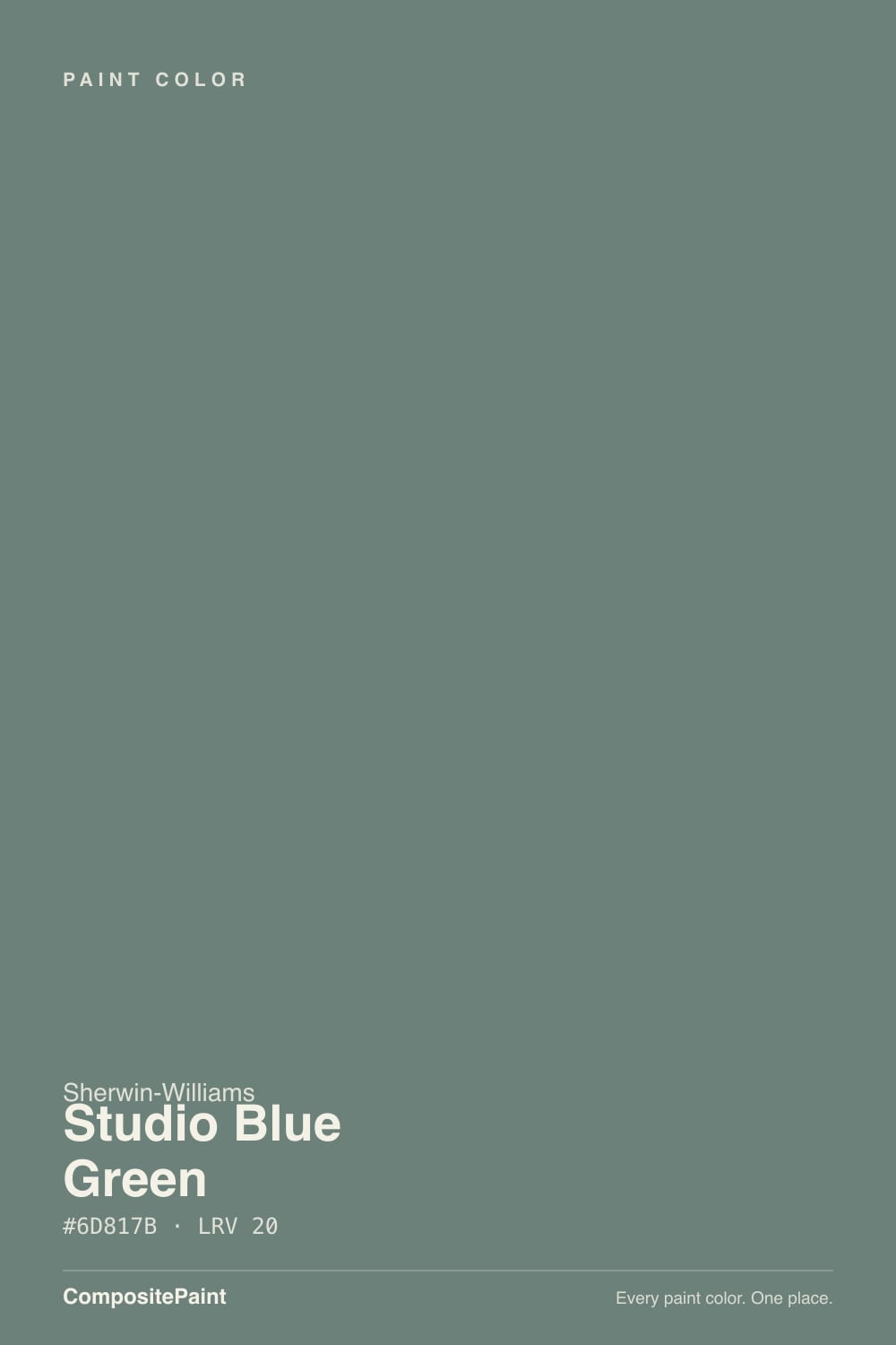
SW 47 · #6D817B · LRV 20 — cool blue-green tone, dark — high drama, needs strong daylight or warm bulbs.
- 1Salamander6
- 2Hidden Gem14
- 3Studio Blue Green20
- 4Van Courtland Blue31
- 5Wythe Blue48
What Color Is Studio Blue Green, Really?
Studio Blue Green (SW 47) is a deep, muted teal. Its hex is #6D817B and its LRV is 20, which puts it well into the dark band, so it absorbs most of the light in a room and reads as a color with real weight. The undertone is a cool blue-green lean at a hue of 162 degrees, but saturation is only about 8 percent, which means this is a heavily grayed teal rather than a bright one.
That greyed quality is the appeal. It gives you the calm, watery character of a blue-green without the saturation that makes teal hard to live with. On cabinets or a paneled wall it reads as a soft dark color with a sea-glass tint, closer to a weathered green-gray than to anything tropical.
Before committing, be honest about the light. At LRV 20 and 8 percent saturation, this color loses its identity in dim conditions and can simply look dark gray after sunset or in a north-facing corner. It needs strong daylight, or warm bulbs, or both, for the blue-green to be visible at all. Look at a big sample, not a chip, since the color barely registers at small scale.
Studio Blue Green sits at a hue of 162 degrees, which is the point where green starts turning toward blue, and its saturation is only about 8 percent. That combination is why the name is honest but the color is subtle: there really is both blue and green in it, and there is not much of either.
Which side shows depends on the company it keeps. Next to a warm beige or an oak floor the blue comes forward and the color reads cooler and more teal. Next to a true blue it flips and looks distinctly green. Against a crisp white it looks most like itself, a grayed sea-glass tone; against a warm cream it can drop toward plain gray-green.
Because the saturation is so low, test a large sample rather than a chip. On a small card this color often reads as a flat dark gray, and the blue-green only appears once it covers a real surface.
Best Rooms and Uses for Studio Blue Green
This is a cabinet and joinery color first. At LRV 20 it gives kitchen cabinets, an island, a bathroom vanity, a laundry room, or a run of built-ins deep, quiet color that still behaves like a neutral against wood counters and warm stone. Because the saturation is low, it does not date the way a brighter teal would.
On walls it suits rooms you want to feel calm and enclosed: a bedroom, a study, a dining room, or a powder room where the darkness is part of the point. In a bright room it can take all four walls; in a dim one, use it on one wall, on wainscoting, or on the lower half of a two-tone scheme.
Outdoors it works as a front door, shutters, or a darker body color on a house with plenty of natural surroundings, where the blue-green sits comfortably next to greenery, stone, and wood. Keep trim in a separate white rather than matching it.
How Lighting Changes Studio Blue Green
At LRV 20 there is not much light coming back, so this color depends heavily on what the room gives it. In a south-facing room with strong daylight the blue-green is clear and the color looks alive, like weathered sea glass. West-facing rooms behave similarly from midday on, with the late warm light softening the coolness.
North-facing rooms are the hard case. Cool, indirect light plus 8 percent saturation plus a low LRV can flatten it into a dark gray with only a hint of color. East rooms show the green side in morning light and settle into something quieter by afternoon.
Bulbs make a real difference here. Warm 2700K lighting adds back the color the low saturation lacks and keeps it from going dead at night. Cooler 3500K to 4000K bulbs push it toward gray-blue and can drain the character out. Always check a large sample after dark before you commit.
Most complaints about Studio Blue Green are a light mismatch. Upload a photo of your actual room and see it on your walls — then ask for the same wall in north light or evening lamps before you buy a single sample.
Need It From Another Brand?
Any paint counter can custom-tint Sherwin-Williams SW 47 directly. If you would rather stay in one brand's own deck, these are the closest stock matches, measured as ΔE2000. Under 2 is a difference you will not see on the wall.
| Brand | Closest color | ΔE | LRV | |
|---|---|---|---|---|
| Behr | Aspen ValleyN430-5 · Behr | 1.4 | 20 | Color page → |
| Benjamin Moore | Porch SwingCSP-750 · Benjamin Moore | 3.8 | 19 | Color page → |
| Valspar | Blueridge Fir5004-4B · Valspar | 2.2 | 21.2 | Color page → |
| PPG / Glidden | Blue BloodPPG1034-6 · PPG / Glidden | 3.6 | 20 | Color page → |
| Glidden | Dwarf SprucePPG1136-6 · Glidden | 1.3 | 21 | Color page → |
| Dutch Boy | In The Brush427-6DB · Dutch Boy | 2.0 | 20 | Color page → |
Similar Sherwin-Williams Colors
The nearest shades to Studio Blue Green within Sherwin-Williams's own range, ranked by perceptual color distance — useful when you want the same look a touch lighter, darker, or warmer.
WCAG 2.1: AA is 4.5 : 1 for normal text, 3 : 1 for large text, AAA is 7 : 1.
Studio Blue Green vs Similar Colors
Inside the Sherwin-Williams deck the differences are mostly about how green each one goes. Taiga (SW 9654) is #768078 at LRV 21, a touch lighter and greener with less blue. Juniper (SW 9679), #658375 at LRV 20, is clearly greener at the same depth. Teal Stencil (SW 18), #627F7B at LRV 19, keeps the blue but is more saturated, and Portsmouth (SW 9644), #768482 at LRV 22, is the greyest and quietest of the group.
Across brands the closest is Glidden Dwarf Spruce (PPG1136-6) at a deltaE of 1.32 and C2 Paint Tempest (C2-679) at 1.72, both visually identical in normal room light. Dutch Boy In The Brush (427-6DB) at 2.03, Dunn-Edwards Dark Lagoon (DEC788) at 2.13, Valspar Blueridge Fir (5004-4B) at 2.16, and Magnolia Home Tranquility (JG-78) at 2.35 are all very close but worth sampling first.
Further out, PPG Blue Blood (PPG1034-6) at 3.59 and Benjamin Moore Porch Swing (CSP-750) at 3.83 are close but visibly different side by side.
Colors That Go With Studio Blue Green
White trim is the simplest and best partner. At LRV 20 the color sits far below any trim white, so casing, ceilings, and doors read clean automatically. A crisp white shows the blue-green most clearly, while a warmer white softens it and leans the scheme cozier.
Its Sherwin-Williams neighbors sit within two points of it, so they are alternates rather than companions: Taiga (SW 9654) at LRV 21, Rookwood Blue Green (SW 2811) at LRV 21, Teal Stencil (SW 18) at LRV 19, Juniper (SW 9679) at LRV 20, Retreat (SW 6207) at LRV 21, and Portsmouth (SW 9644) at LRV 22. Pairing two of them will look accidental rather than layered.
Warmth should come from materials. Oak, walnut, and rattan all read richer against it, and brass or aged bronze hardware is the classic pairing because the warm metal is the opposite of the cool blue-green. Natural stone and unlacquered fittings work for the same reason. Chrome and cool nickel keep it colder and more clinical.
Coordinated palette
Generated by hue-rotating #6D817B in HSL space. Pair Studio Blue Green with one accent and one neutral — the swatches below are starting points, not final picks.
Studio Blue Green FAQ
Is Studio Blue Green blue or green?
It is genuinely both. The hue sits at 162 degrees, right where green turns toward blue, so it reads as a teal rather than one or the other. Saturation is only about 8 percent, which means the color is heavily grayed and its blue or green side shows depending on what sits next to it.
What LRV is Studio Blue Green?
Studio Blue Green has an LRV of 20. Light reflectance value runs from 0 for black to 100 for pure white, so 20 is well into the dark range. It absorbs most of the light that hits it, which gives cabinets and walls real depth but also means the room needs good daylight or lamps.
Does Studio Blue Green work in a dark room?
It works, but the color largely disappears. With an LRV of 20 and only 8 percent saturation, low light turns it into a flat dark gray with barely any blue-green left. If the room is north-facing or dim, add warm 2700K bulbs to bring the color back, or use it on cabinetry where task lighting does the work.
What white trim goes with Studio Blue Green?
Any standard trim white gives plenty of contrast against LRV 20, so the choice is about mood. A crisp, cleaner white makes the blue-green read most clearly and looks sharper. A warm white softens the coolness and suits a scheme built around oak, brass, and natural materials.
Is Studio Blue Green good for kitchen cabinets?
Yes, cabinetry is where it performs best. At LRV 20 it gives cabinets or an island substantial depth, and because the saturation is low it behaves almost like a dark neutral rather than a bold teal. It pairs naturally with wood counters, warm stone, and brass or bronze hardware, and it stays legible under kitchen task lighting.
How is Studio Blue Green different from Juniper?
Juniper (SW 9679) is #658375 at LRV 20, the same depth but clearly greener, with less of the blue that gives Studio Blue Green (#6D817B) its teal character. Side by side, Juniper looks like a forest green-gray and Studio Blue Green looks like sea glass. Pick based on whether you want the color to lean green or cool.
Have you painted with Studio Blue Green?
Rate it — one tap helps the next reader decide.
Ask a Question