Portsmouth
A cool blue-green-gray hiding in Sherwin-Williams' own "neutral" family, reviewed honestly: the light where it turns teal, the light where it turns to mud, and what to pick instead.

Jessica has spec'd whites and neutrals for more than 300 rooms and keeps a sample wall of painted drawdowns in her studio. Every color review is checked against real reader rooms in the comments and re-tested when a formula changes. About the testing process →
- 1Salamander6
- 2Hidden Gem14
- 3Portsmouth22
- 4Van Courtland Blue31
- 5Wythe Blue48
The Fast Verdict
Portsmouth is Sherwin-Williams' quietest chameleon: a cool, deeply muted blue-green-gray that the brand's own site files under "neutral" even though nobody would call it gray once it's on a wall. Give it real south or west daylight and warm metal and it settles into a sophisticated teal-charcoal that flatters cabinets, doors, and moody dens. Give it a dim north room with no lamps and it goes flat and hard to name. It has never had a Color of the Year moment — this is a working color, not a headline one, and that is exactly the case for it.
Kitchen islands and cabinets · home offices and dens meant to feel calm · front doors and exterior accents · anyone who wants a color that reads a little different through the day, on purpose
Your room is small, north-facing, and lamp-free · you need one fixed color that photographs the same every time · your floors are honey oak with nothing to break it up · you want a color everyone online already has reference photos of
- A genuinely sophisticated blue-green-gray, not another copy of the sage or greige everyone already has
- LRV 22 is dark enough to anchor cabinets and doors without going near-black
- Flatters brass, aged bronze, and warm wood
- Filed as a neutral by Sherwin-Williams, so it pairs more easily than a loud teal would
- A real option for cabinets, doors, and accents — not only walls
- Shifts noticeably between teal, slate-gray, and green depending on light — a real problem if you want one fixed color
- Goes flat and hard to describe in dim, north-facing rooms
- Fights honey oak and yellow-warm trim
- Little name recognition — no Color of the Year run, so far fewer real-room reference photos exist online than for Sherwin-Williams' bestsellers
What Color Is Portsmouth, Really?
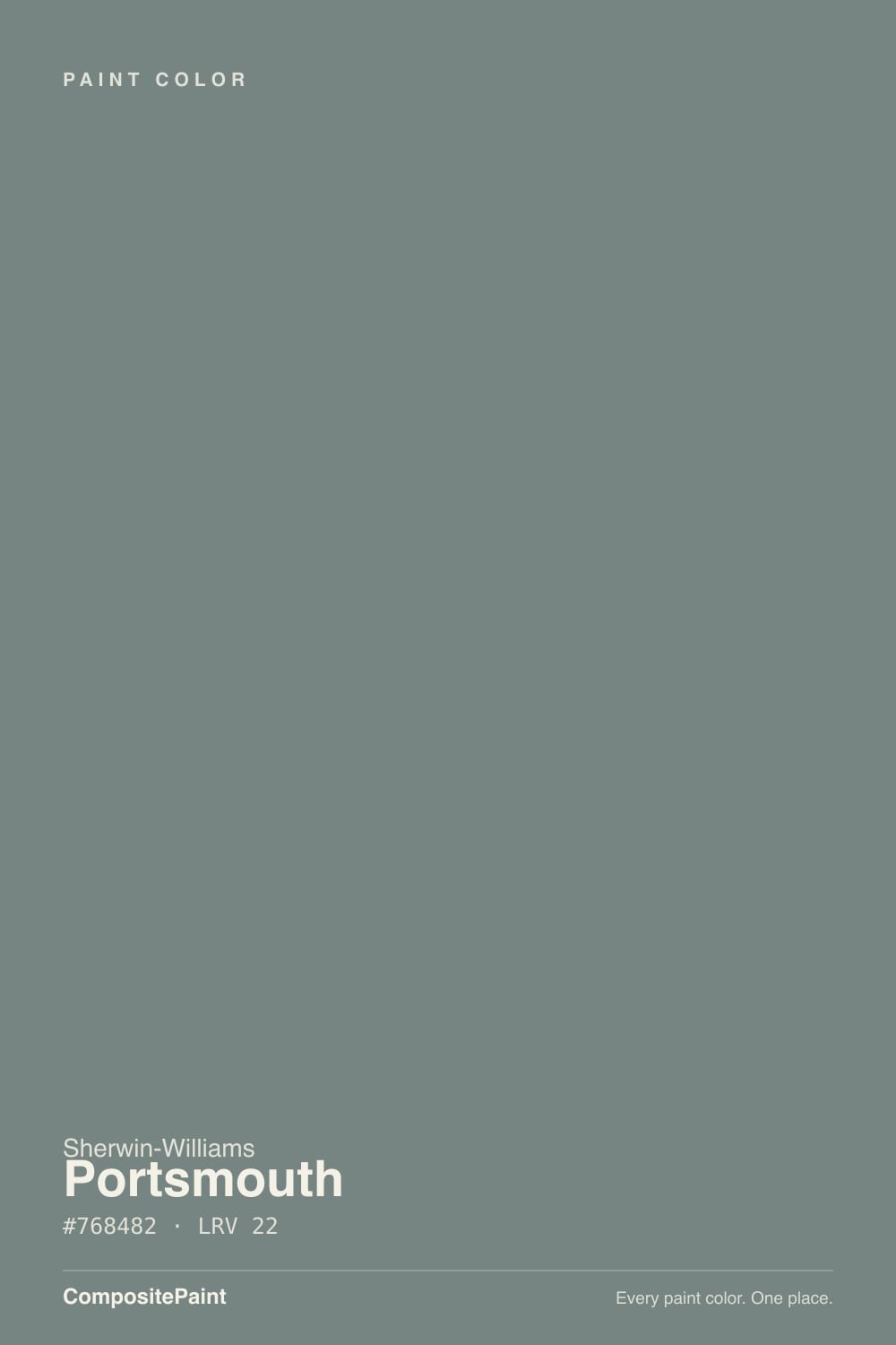
Portsmouth sits in the exact spot between teal, deep sea-green, and cool gray — Sherwin-Williams' own site files it under "neutral," which says more about how quietly it behaves than about its actual hue. Its RGB values lean blue-green with a real dose of gray weighing it down: a muted, low-saturation mix rather than a bright teal. It reads closer to weathered pewter or sea-worn slate than to anything you'd call turquoise, and unlike a lot of the deck's other green-grays it has no famous backstory — no viral room, no Color of the Year run. It is a color professionals reach for when they already know what they want, not one people arrive at by searching a trend.
At LRV 22 it sits in the same dark-medium band as Sherwin-Williams' cabinet favorite Retreat (LRV 21) and just above the deeper Pewter Green (LRV 12) — dark enough to read as a real color decision rather than an off-white, but not so dark it swallows a small room the way a true near-black would. South and west light keep the blue-green legible all day; north light and overcast skies push it toward a flatter, harder-to-name gray-charcoal.
Undertone in one line: cool blue-green first, gray second, never warm. If your sample reads plain gray, that's north light or cool LEDs erasing the color; if it reads almost teal, that's strong daylight doing the color justice — both are the same paint, just different weather.
Where It Shines
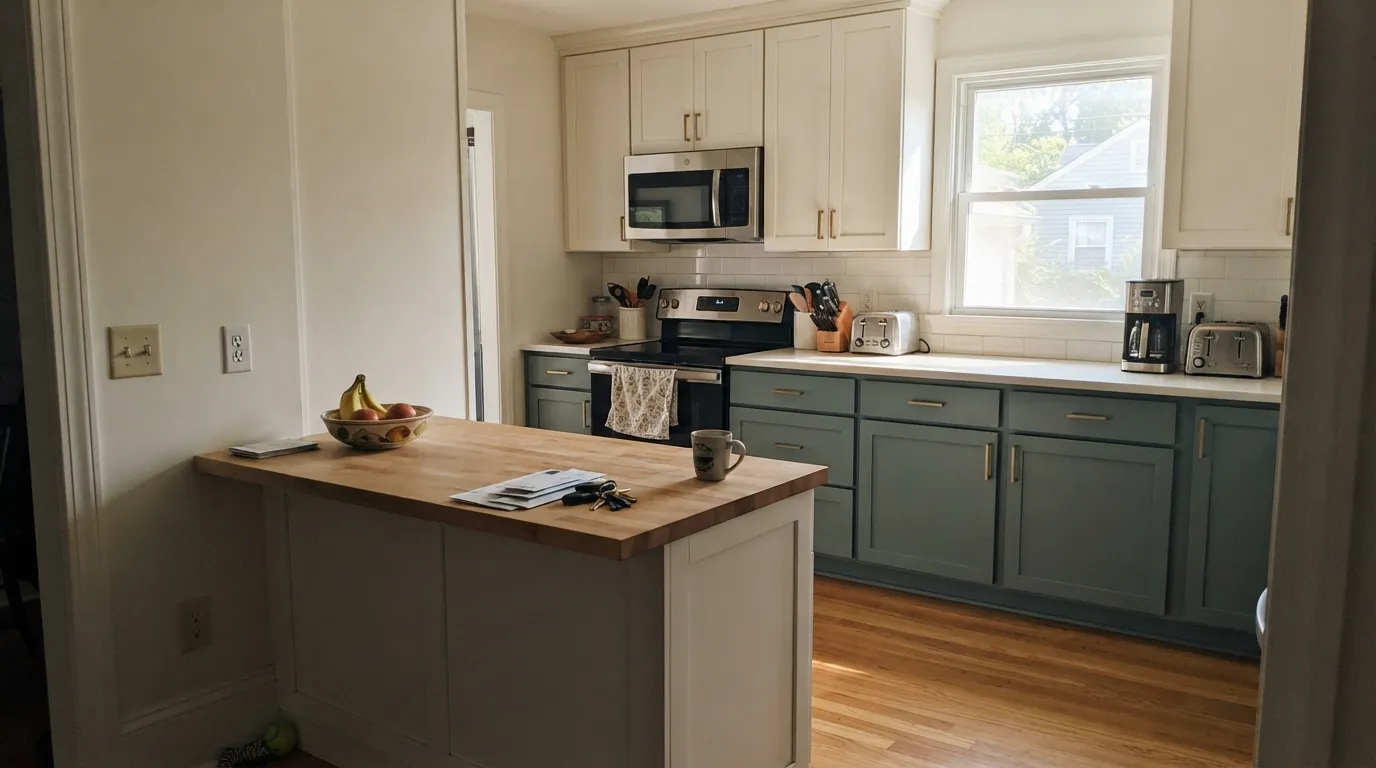
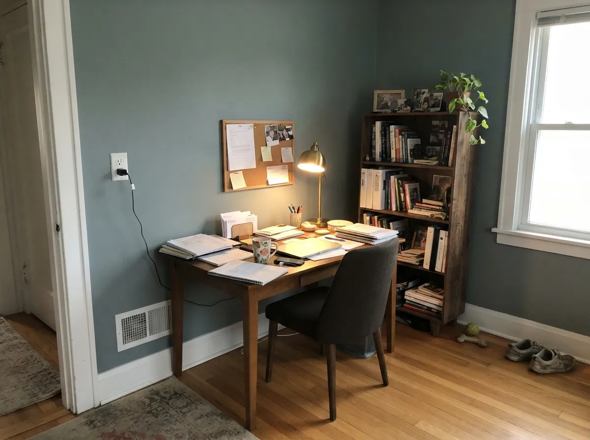
This is a color built for the pieces of a room that get their own decision — cabinets, an island, a front door, built-ins — more than for four open walls in flat daylight. In real south or west light, paired with brass or aged bronze hardware and warm wood, it reads sophisticated and current without chasing a trend. Its second home is the small, deliberately calm room: a den, a home office, a powder room, where the color has nowhere to hide and nothing to compete with.
Where It Fails
Portsmouth's real weakness isn't that it looks bad — it's that it refuses to hold still, and buyers who expect one fixed color are the ones who end up disappointed. Here are the three situations behind almost every regret.
Cool north light strips the blue-green out and leaves a flat, hard-to-name gray-charcoal that photographs muddy. The paint didn't change — the light did. Add warm 2700K lamps or move this color to a room with real south or west exposure.
Portsmouth genuinely shifts: teal in bright sun, slate-gray under clouds, faintly green under warm bulbs. That range is the appeal for some buyers and the exact complaint for others. If you need a wall that photographs the same in every listing photo, pick a more stable color like Retreat or Rainwashed.
Yellow-leaning wood pulls against the cool blue-green base, and the two end up fighting instead of pairing. Walnut, espresso, or pale white oak read far better next to it than orange-toned builder oak.
Room by Room
An island or lower cabinets in satin, paired with a warm white upper cabinet and brass pulls, grounds a kitchen without going full black. It flatters butcher block and cream-veined stone; cool gray marble argues with it the same way it argues with most cool-leaning colors.
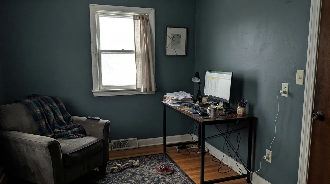
A closed-door room where the color's mood-shifting is a feature, not a bug. Pair it with walnut shelving and a warm lamp; matte or eggshell keeps texture soft and lets the color read as atmosphere rather than a hard color statement.
South- or west-facing open living rooms handle it well, especially as an accent wall or built-in color. North-facing open living rooms risk the muddy, hard-to-name read described above.
A vanity in satin under a cream-veined or warm-toned counter looks deliberate and calm. Cool gray marble is the one stone that fights it.
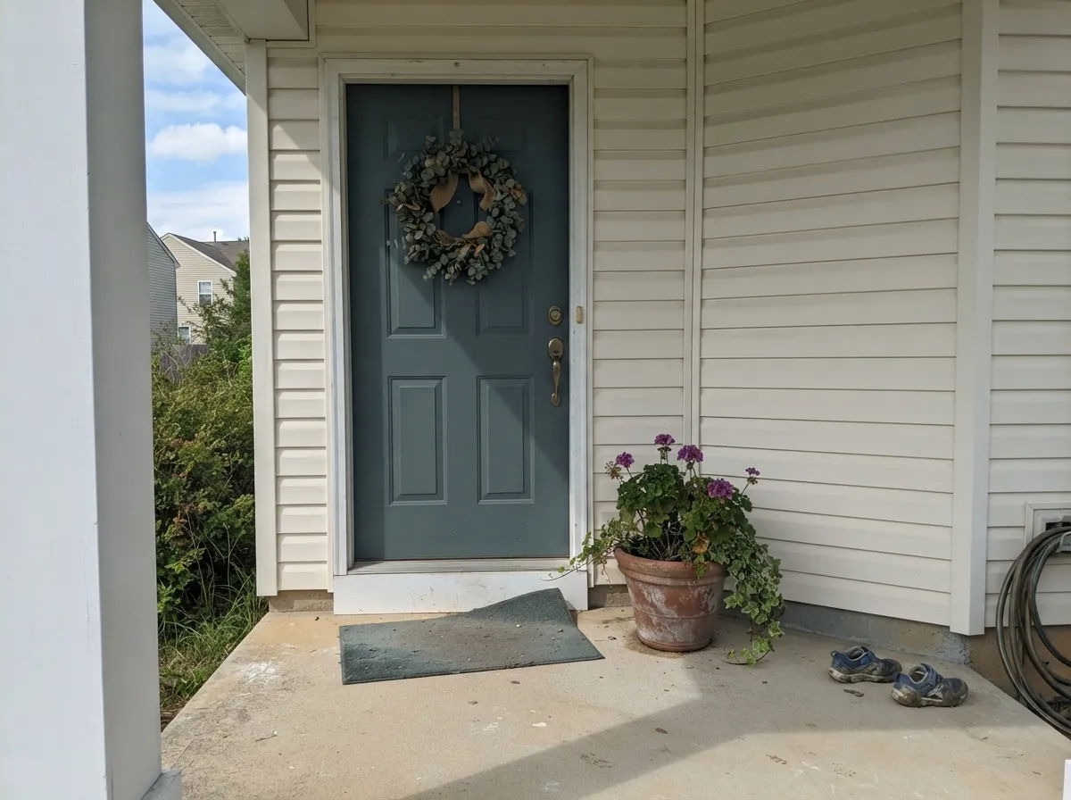
On a front door or shutters against a warm white body, it reads confidently teal-charcoal in daylight. A whole exterior in Portsmouth is a bigger bet — like any exterior color it will shift with weather and time of day, more visibly than it does indoors.
Dark enough at LRV 22 to feel enveloping at night under warm bulbs. Skip it in a north-facing bedroom that only ever sees cool daylight — that's the room where the color goes flat.
Your Light Is the Risk
Full daylight keeps the blue-green legible and the color reads confidently teal-charcoal instead of plain gray. This is the light it was made to be seen in.
Cool, low north light drains the color out and leaves a flat, muddy gray-charcoal that's hard to describe, let alone photograph. Test a large sample before committing a whole room.
East light: bright, faintly green mornings that quiet down by afternoon. West light: the color deepens and richens toward evening, closer to slate than teal.
Warm 2700K bulbs nudge it faintly yellow-green and cozier at night; cool white LEDs push it back toward a colder, flatter gray. Bulb choice moves this color more than most.
Most complaints about Portsmouth are a light mismatch. Upload a photo of your actual room and see it on your walls — then ask for the same wall in north light or evening lamps before you buy a single sample.
Need It From Another Brand?
Any paint counter can custom-tint Sherwin-Williams SW 9644 directly. If you would rather stay in one brand's own deck, these are the closest stock matches, measured as ΔE2000. Under 2 is a difference you will not see on the wall.
| Brand | Closest color | ΔE | LRV | |
|---|---|---|---|---|
| Behr | Echo ParkMQ6-10 · Behr | 1.7 | 22 | Color page → |
| Benjamin Moore | Apollo BlueCW-645 · Benjamin Moore | 0.6 | 24 | Color page → |
| Valspar | Pacific PalisadesV100-5 · Valspar | 1.6 | 22.4 | Color page → |
| PPG / Glidden | Dwarf SprucePPG1136-6 · PPG / Glidden | 3.1 | 22 | Color page → |
| Glidden | Rough RidePPG1036-5 · Glidden | 2.3 | 23 | Color page → |
| Dutch Boy | Felted Blue430-5DB · Dutch Boy | 3.5 | 23 | Color page → |
Similar Sherwin-Williams Colors
The nearest shades to Portsmouth within Sherwin-Williams's own range, ranked by perceptual color distance — useful when you want the same look a touch lighter, darker, or warmer.
WCAG 2.1: AA is 4.5 : 1 for normal text, 3 : 1 for large text, AAA is 7 : 1.
Portsmouth vs the Colors You're Also Considering
Every Portsmouth sample board has the same rivals on it. The numbers show the real lightness gap — then it comes down to which risk you would rather live with.
Pick this for the cooler, more teal-leaning version at nearly the same depth.
Sherwin-Williams SW 6207 · LRV 21RetreatPick this if you want the warmer, greener sibling — Retreat trades Portsmouth's blue lean for a straighter cabinet green.
Pick this when you want real depth — LRV 22 instead of a pale wash.
Sherwin-Williams SW 6211 · LRV 47RainwashedPick this for a lighter, brighter version of the same blue-green family that works on open walls, not just cabinets.
Portsmouth Coordinating Colors
The rule for coordinating with Portsmouth is simple: keep the whites and neutrals warm, save the cool-toned partners for accents, and let brass or aged bronze do the metal work. These are the partners that keep showing up in rooms that work:
Portsmouth's Story: A Quiet Worker, Not a Celebrity
There's no famous room, no Color of the Year plaque, no viral before-and-after behind Portsmouth — and that's worth saying plainly rather than pretending otherwise. Sherwin-Williams itself files it under "neutral" on its own color-family pages, which is a slightly odd label for a color that clearly reads blue-green on a wall, but it captures how the paint actually behaves: quiet, recessive, easy to build a room around rather than a statement piece that demands attention.
In practice it turns up mostly in the hands of people who already know what they want: cabinet painters, kitchen designers, and homeowners searching specifically for a dark, cool green-gray rather than browsing a trend list. That's a smaller footprint than Sherwin-Williams' headline colors, and it means fewer real-room photos to compare against online — but it also means Portsmouth isn't chasing a moment it will later be dated by. It's a dependable specialty color, not a bestseller, and there's nothing wrong with that.
Portsmouth With Wood Tones and Metals
Metals are the easy decision: unlacquered brass and aged bronze are its best friends, warming up the cool blue-green without fighting it, and matte black works too for a more graphic look. Polished chrome reads cooler and more clinical against it than brass does, but because Portsmouth is already a cool color, chrome doesn't clash the way it would against a warm color — it's a valid, if less cozy, option.
Wood is where the real decision gets made. Walnut, espresso, and pale white oak all sit comfortably next to Portsmouth because their warmth is muted enough not to compete. Orange-leaning honey oak is the one genuine clash: its yellow undertone pulls directly against Portsmouth's blue-green base, and each side ends up looking slightly off next to the other. A large rug or a stain refresh closes that gap; without one, this color is a harder sell in a honey-oak kitchen.
Three Ready Palettes Built on Portsmouth
A color is never alone on the wall. These are complete combinations in the 60-30-10 pattern, with the reason each one holds together. Every one opens in the visualizer.
Alabaster and Pure White share the same soft warm-white family, so the kitchen stays quiet everywhere except the island, where Portsmouth gets to do all the talking. Brass hardware ties the blue-green and the warm white together.
Try this palette in your roomA single deep color on four walls needs a clean trim break, not a competing one — Pure White does that without going stark. Iron Ore on the built-ins adds one true dark note so the room reads deliberate, not just dim.
Try this palette in your roomAlabaster body with Pure White trim is about as safe as exterior neutrals get; the door is where Portsmouth gets to be the whole point, reading confidently teal-charcoal against all that warm white.
Try this palette in your roomPortsmouth FAQ
Is Portsmouth teal, green, or gray?
All three, depending on the light — that's the honest answer. It's a cool blue-green with a real dose of gray in it. Sherwin-Williams lists it as a neutral, but on a wall in good daylight most people call it teal or slate; in dim light it can pass for plain gray.
Is SW 9644 Portsmouth a dark color?
Medium-dark. At LRV 22 it sits close to Retreat (LRV 21) and well above the much darker Pewter Green (LRV 12). It reads as a real color decision, not an off-white, but it's not near-black either.
Is Portsmouth good for kitchen cabinets?
Yes — it's arguably its best job. An island or lower cabinets in satin, paired with a warm white upper cabinet and brass hardware, is a dependable combination that grounds a kitchen without going full black.
What trim or wall white goes with Portsmouth?
A soft warm white like Alabaster or Pure White keeps the pairing calm. Since Portsmouth already leans cool, a stark, blue-white trim can make the whole room feel colder than intended — warm white is the safer default.
Does Portsmouth work in a north-facing room?
Only with warm lamps doing real work. Cool north daylight is this color's one real weakness — it drains the blue-green out and leaves a flat, muddy gray-charcoal. A south- or west-facing room shows the color as intended.
Is Portsmouth a popular or trending color?
Honestly, no — and that's not a knock. It's never had a Color of the Year run or a viral moment, and it has far fewer real-room reference photos online than Sherwin-Williams' bestsellers. It's a working color that cabinet painters and designers reach for on purpose, not one people discover by scrolling a trend list.
Have you painted with Portsmouth?
Rate it — one tap helps the next reader decide.
Ask a Question