Software
The cool mid-gray Sherwin-Williams keeps putting in living rooms, reviewed honestly: what LRV 23 really costs you, where the blue shows up, and what to pick instead.

Jessica has spec'd whites and neutrals for more than 300 rooms and keeps a sample wall of painted drawdowns in her studio. Every color review is checked against real reader rooms in the comments and re-tested when a formula changes. About the testing process →
- 1Black Fox7
- 2Pewter Green12
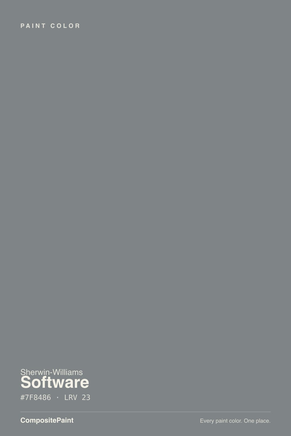
- 3Software23
- 4Stardew43
- 5Quietude48
The Fast Verdict
Software is what people think they are buying when they ask for "a nice gray" and end up with greige. It is a genuine gray with a quiet blue undertone and real depth, so it looks deliberate instead of builder-default.
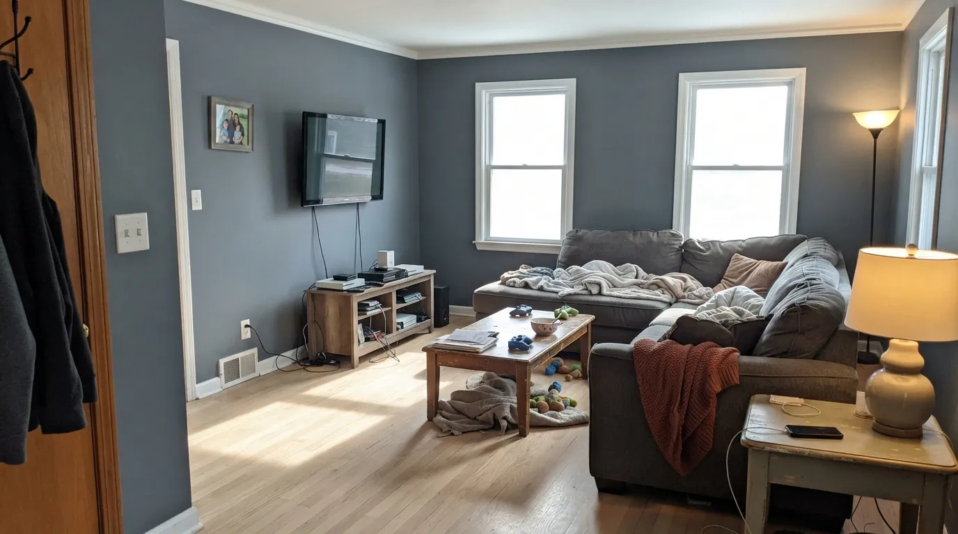
The catch is the depth: at LRV 23 it takes light out of a room, and the blue that hides on the chip comes forward once it covers four walls. Give it windows and it is one of the best mid-deep grays Sherwin-Williams makes.
Family rooms and living rooms with real windows · home offices and media rooms · kitchen islands and lower cabinets · accent walls · gray siding with white trim
Your room is small and dim · you actually want a warm gray or greige · your floors are honey oak · the rest of your open plan is beige
- An actual gray — no beige, no brown, no muddy middle
- Deep enough (LRV 23) to look chosen rather than builder-default
- Outstanding on islands, lower cabinets and interior doors
- Makes white trim, black windows and white oak look sharp
- One of the few grays that works indoors and on siding
- The blue shows on four walls — it is not a true neutral
- LRV 23 eats light; small dim rooms close in fast
- Fights honey oak and every orange-toned wood
- Awkward beside warm beige in an open plan
What Color Is Software, Really?
A mid-to-deep gray with a low-chroma blue undertone — and "low-chroma" is the whole story. The blue is weak enough that on a two-inch chip Software passes for a straight neutral gray, which is exactly why people buy it. Spread across four walls, that same weak blue accumulates and the room reads cool and slightly steely. Sherwin-Williams files it as a neutral and shelved it on its dot-com-era strip alongside Network Gray, Web Gray and Cyberspace, and the family resemblance is real: these are cool, modern, screen-colored grays, not the warm greiges that dominated the last decade.
The number that catches people out is LRV 23. That is not a mid-tone — it sits near the dark end of what most people will accept on walls, closer to a charcoal than to the light grays it gets compared with. Practically, it means Software absorbs far more light than it returns. In a bright room that is a feature: the color holds its shape all day and makes white trim look crisp and intentional. In a small room with one window it is a tax you pay every hour the sun is down.
Undertone in one line: gray first, a quiet blue second, and a faint violet flicker in the coolest daylight — never green, never brown. If your sample looks like a plain neutral gray, your light is warm; if it looks like wet slate, your light is cold. Both are the same paint telling the truth about your room.
Where It Shines
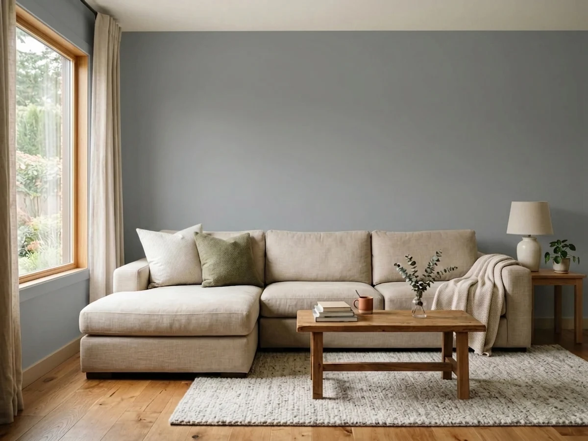
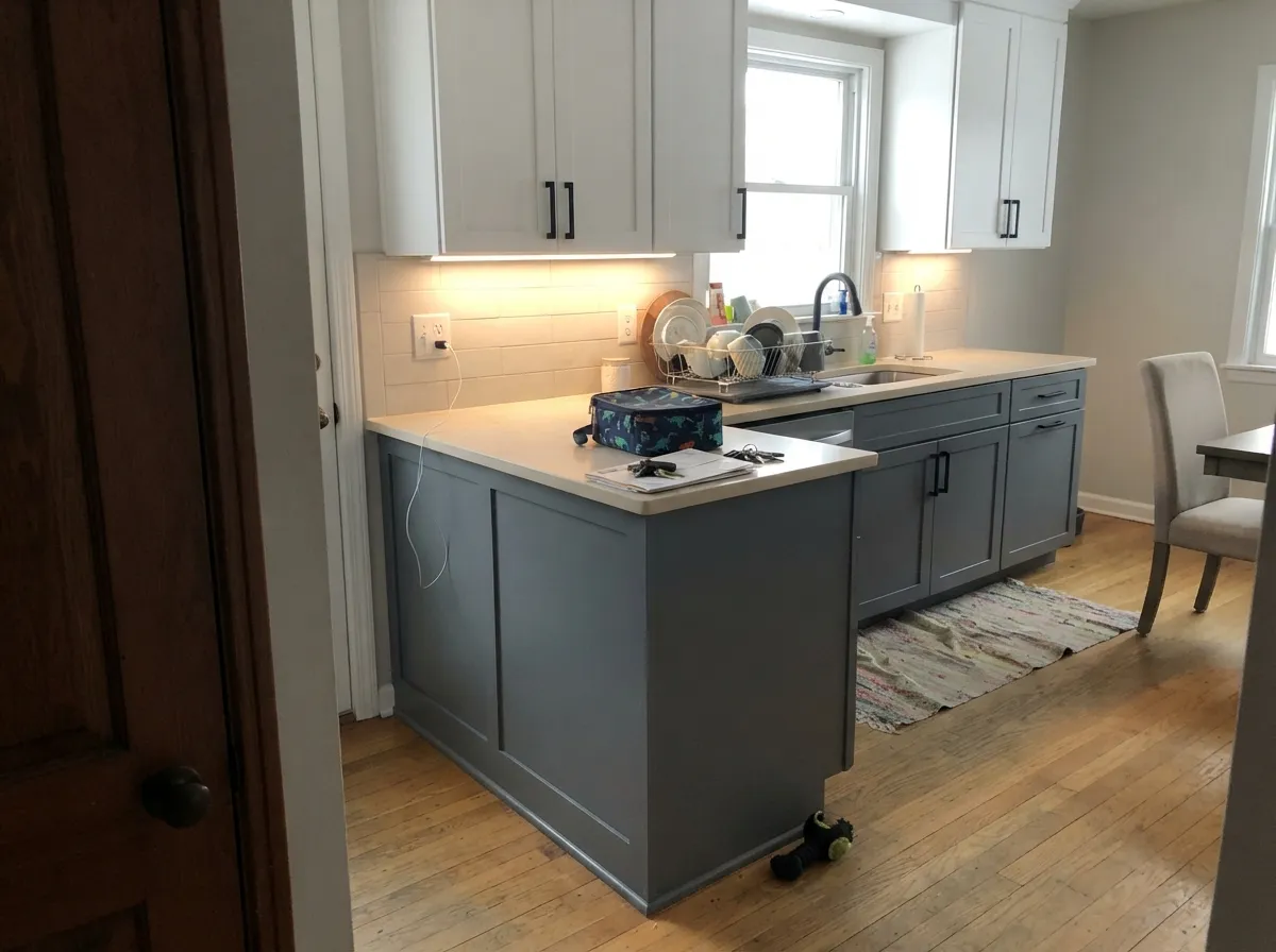
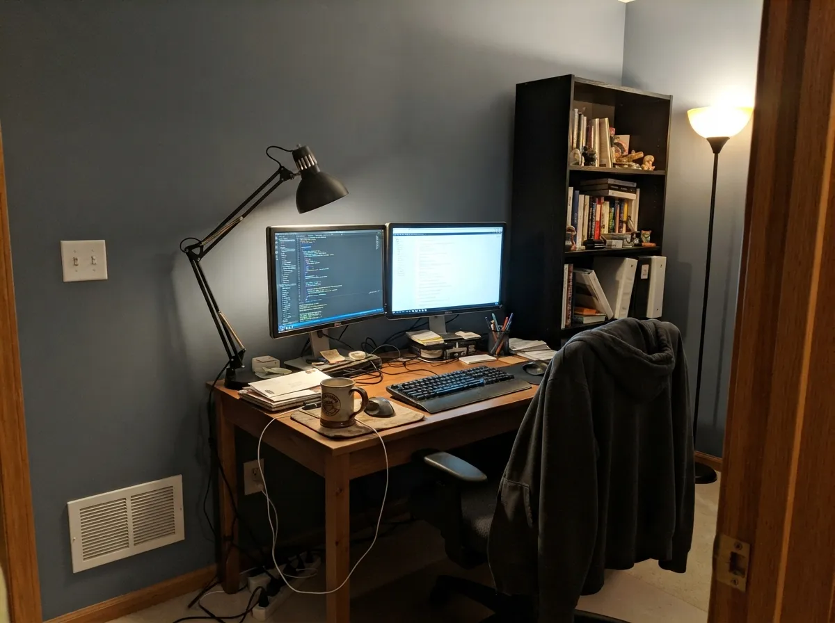
Give it windows and something warm to argue with and Software is excellent. It is a proper gray, so it never muddies into that half-beige color people complain about, and the depth means a family room reads finished rather than unpainted. It is even better in doses: on an island, on lower cabinets, on an office wall behind a monitor, or on siding under white trim, where the cool blue lean stops looking like an accident and starts looking like a decision. Its natural company is white oak, matte black, brushed nickel and anything with a cool white in it.
Where It Fails
Almost every regret story about Software follows one of three scripts, and all three are visible before you open the can. None of them are the paint's fault — but if your room matches one, sampling bigger will only confirm it.
This is the number-one mismatch. On the chip Software reads neutral; on the wall the blue shows, and in cool daylight it can flash faintly violet. If your mental picture is a cozy gray that plays nicely with beige carpet and oak trim, this is the wrong half of the deck — look at Dovetail, which is the same depth with a warm base.
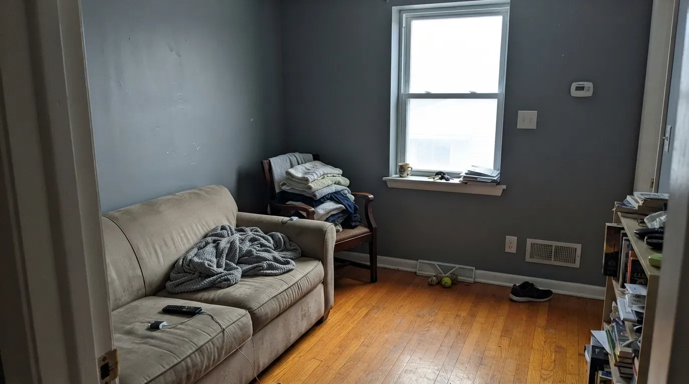
LRV 23 absorbs light instead of bouncing it. In a bright open family room that is fine; in a nine-by-ten den with a single north window it closes the walls in and readers describe it as cave-like or office-cubicle gray. The fix is not more coats — it is a lighter cool gray like Passive, or lamps in every corner if you are set on the depth.
Orange sits opposite blue on the wheel, so golden oak floors, orange-stained trim and yellowed builder cabinets all push Software bluer while the wall pushes the floor more orange. Both sides lose. White oak, walnut, gray-washed LVP and dark stained floors are the company this color wants.
Room by Room
This is where the depth pays for itself: a family room usually has the biggest windows in the house, so LRV 23 stops being a liability and becomes atmosphere. The TV wall in particular looks better dark than light. Eggshell walls, Pure White trim and ceiling, and one warm element — leather, a rust throw, a wood mantel — to keep the cool from taking over.
Same logic, more caution. A formal living room with two windows and pale furniture handles it well; a narrow one with a single north window does not. In an open plan, check what the adjacent walls are wearing first — Software next to a warm beige looks like a mistake rather than a transition.
Rooms that live under artificial light are the safest place to spend this color. The gray kills screen glare, monitors and black shelving look sharp against it, and nobody expects a media room to be bright. Eggshell, and put the warmth in the lamps.
One of its strongest uses. Software on an island or on the lower run, with white uppers and a light wall, gives you the two-tone kitchen without the heaviness of charcoal. It is genuinely popular with cabinet painters for that reason. Satin urethane-fortified cabinet enamel; matte black or brushed nickel pulls, not brass.
It can be beautiful — a cool, quiet, hotel-ish bedroom — but it is the room most likely to end up dim. If the bedroom faces north or has one small window, the cool gray goes flat and cold by four in the afternoon. Commit to 2700K bulbs on both sides of the bed, or pick something lighter.
Software is specified for exteriors as well as interiors, and full sun treats it well: outdoor light lifts it a step and the blue reads as clean modern gray rather than steel. With crisp white trim and a black or navy door it is a straightforward, low-risk siding color. Details in the exterior section below.
Your Light Is the Risk
Bright all-day sun offsets the depth and keeps the blue to a whisper. This is the room to spend it in.
Cool daylight amplifies the blue and drains the room. Steely, flat, sometimes faintly violet — test hard here.
Golden hour warms it into a soft plain gray for an hour, then it snaps back cool. A bigger swing than most grays.
2700K bulbs mute the blue toward a balanced gray — this color's best artificial light. 4000K LEDs turn it clinical.
Most complaints about Software are a light mismatch. Upload a photo of your actual room and see it on your walls — then ask for the same wall in north light or evening lamps before you buy a single sample.
Need It From Another Brand?
Any paint counter can custom-tint Sherwin-Williams SW 7074 directly. If you would rather stay in one brand's own deck, these are the closest stock matches, measured as ΔE2000. Under 2 is a difference you will not see on the wall.
| Brand | Closest color | ΔE | LRV | |
|---|---|---|---|---|
| Behr | Legendary GrayPPU26-03 · Behr | 0.7 | 22 | Color page → |
| Benjamin Moore | Englewood Cliffs1607 · Benjamin Moore | 0.6 | 24 | Color page → |
| Valspar | City Storm4008-2A · Valspar | 1.2 | 23 | Color page → |
| PPG / Glidden | Garrison GrayPPG1039-5 · PPG / Glidden | 2.7 | 23 | Color page → |
| Glidden | Garrison GrayPPG1039-5 · Glidden | 2.2 | 23 | Color page → |
| Dutch Boy | Refined Gray435-5DB · Dutch Boy | 0.9 | 22 | Color page → |
Similar Sherwin-Williams Colors
The nearest shades to Software within Sherwin-Williams's own range, ranked by perceptual color distance — useful when you want the same look a touch lighter, darker, or warmer.
WCAG 2.1: AA is 4.5 : 1 for normal text, 3 : 1 for large text, AAA is 7 : 1.
Software vs the Colors You're Also Considering
Every Software sample board has the same rivals on it. The numbers show the real lightness gap — then it comes down to which risk you would rather live with.
Pick this when you want an actual gray and Dovetail keeps reading brown to you.
Sherwin-Williams SW 7018 · LRV 26DovetailPick this if you want this depth with a warm base — it is the greige answer to the same question, and it forgives honey oak.
Pick this for walls — the two are nearly the same depth, but Software holds gray longer across a whole room.
Sherwin-Williams SW 6249 · LRV 24Storm CloudPick this on a front door or a single piece of built-in millwork, where its bluer read is the point.
Software Coordinating Colors
The rule for coordinating with Software is temperature discipline: stay cool on the neutrals and put the warmth in one deliberate accent instead of leaking it in through beige. Clean whites work, cool light grays work, near-blacks work, and one earthy note keeps the whole thing from feeling like an office lobby. These are the partners that keep showing up in rooms that work:
Software on Exteriors
Outside, Software behaves better than its indoor reputation suggests. The thing that makes it risky on interior walls — LRV 23 swallowing a dim room — barely applies to a facade, because full sun is orders of magnitude brighter than anything indoors. Sun lifts it visibly, the blue undertone stops reading as steel and starts reading as clean modern gray, and the depth gives a house the definition that a pale gray never manages from the street.
The pairing decides the result. Crisp white trim is the default and the safe answer; a soft or creamy white will look yellowed against it. For the dark note, near-black or navy on the door and shutters — Iron Ore is the obvious pick, Naval if you want the door to be the color story. What to avoid: warm tan stone, beige-toned brick and honey-stained cedar accents, which put the same orange-versus-blue argument on the front of your house. And expect a real difference between elevations: the shaded north face reads a full step deeper than the sunny south side, so walk a big sample around the house before you commit.
Software With Wood Tones and Floors
This decision gets made at the floor, not at the paint counter. White oak — unstained or lightly whitewashed — is the best match by a distance: it is the one common wood with no orange in it, and against Software it looks intentional and current. Walnut, dark-stained oak and gray-washed LVP all work too, the first two by contrast, the last by agreement. Cool gray carpet is fine; so is a plain jute rug.
The honest no is golden. Honey oak floors, orange-stained trim, yellowed 1990s cabinets and beige-pink carpet all sit opposite this color on the wheel, and each side exaggerates the other: the floor goes more orange, the walls go more blue, and no number of coats fixes geometry. If the golden floor is staying, either put a big low-contrast rug between it and this paint or pick Dovetail and keep the depth without the argument.
Metals are simpler: matte black, brushed nickel, chrome and pewter all belong here. Unlacquered brass is the one to be careful with — it can look great as a single deliberate accent, but a whole kitchen of warm brass against Software pushes the walls bluer than most people want.
Three Ready Palettes Built on Software
A color is never alone on the wall. These are complete combinations in the 60-30-10 pattern, with the reason each one holds together. Every one opens in the visualizer.
A cool gray this deep needs one warm counterweight or the room reads like a waiting area. Pure White keeps the trim clean without going icy, and the terracotta note — a door, a rug, a pair of chairs — is what stops the whole scheme from feeling cold.
Try this palette in your roomThree steps of the same cool family, stacked light to dark from the ceiling down — the oldest trick for making a kitchen feel taller. Software carries the weight at floor level without the funeral-black of a charcoal island, and Passive on the walls keeps the room from going dark once the uppers stop.
Try this palette in your roomOutdoors the rules invert: full sun lifts Software a step, so the crispest white in the deck is the right trim rather than a soft one. Iron Ore gives the facade its single dark note and ties back to black window frames and gutters.
Try this palette in your roomSoftware FAQ
Is Software gray or blue?
Gray, with a blue undertone that is quiet on a chip and clearly visible on four walls. It will not read as a blue room, but nobody will call it a warm gray either. In cool north light it can flash faintly violet; under 2700K bulbs it settles into a balanced neutral gray.
Is Software too dark for a living room?
It depends entirely on your windows, not on the room's size. LRV 23 is close to the dark end of what people accept on walls, so a bright family room with two or three windows handles it easily and a single-window room does not. If you love the color but the room is dim, use it on one wall, the fireplace surround or the built-ins instead.
What trim white goes with Software?
A clean white, not a creamy one. Pure White is the everyday choice indoors — bright enough to snap against the gray, soft enough not to look surgical. Extra White is the sharper option and the better call outdoors. Warm creams look yellow next to it, which is the second-most-common pairing complaint after the undertone.
Is Software good for kitchen cabinets?
Yes — it is one of its best uses. On an island or a lower run under white uppers it gives you a two-tone kitchen with real weight but none of the heaviness of a charcoal. Use a satin urethane-fortified cabinet enamel and pair it with matte black or brushed nickel; brass hardware pulls the blue forward and reads like a fight.
Software or Dovetail — which should I pick?
They are close in depth and opposite in temperature. Dovetail (LRV 26) has a warm greige base and works over honey oak, beige carpet and cream trim. Software is a true cool gray and works with white oak, black windows and crisp white trim. Sample both in the actual room: whichever one stops looking like the other one is your answer.
Does Software work on exteriors?
Yes. It is specified for interior and exterior work, and outdoor light suits it — full sun reads it a step lighter and cleaner than it looks inside, so the blue lean turns into modern gray rather than steel. Keep the trim a crisp white, put a black or navy note on the door, and remember the shaded north face of the house will look noticeably deeper than the sunny side.
Have you painted with Software?
Rate it — one tap helps the next reader decide.
Ask a Question