Storm Cloud
A genuine blue-gray reviewed honestly: the door and island jobs it was built for, the dim room that flattens it, and what to pick instead.

Jessica has spec'd whites and neutrals for more than 300 rooms and keeps a sample wall of painted drawdowns in her studio. Every color review is checked against real reader rooms in the comments and re-tested when a formula changes. About the testing process →
- 1Black Fox7
- 2Pewter Green12
- 3Storm Cloud23
- 4Stardew43
- 5Quietude48
The Fast Verdict
Storm Cloud is what a true blue-gray looks like when it isn't trying to be a headline. On the chip it can pass for a plain gray; on a door, an island, or a wall in real daylight, the blue steps forward and settles the question. At LRV 24 it's deep enough to hold that color instead of washing out, but not so deep it reads black. It's a professional's pick more than a trend pick — dependable on the surfaces it's built for, honest about the ones where it struggles.
Front doors and shutters · kitchen islands and cabinetry · exterior siding on a coastal or modern-farmhouse house · home offices and dens with real daylight
You want undeniable navy blue, not a gray with a blue whisper · your room is dim, north-facing, and short on lamps · your floors and trim are honey oak · you want a color your neighbor has already painted
- A genuine blue-gray — not a greige or a warm gray wearing a cool name
- Reads sophisticated on a front door, an island, or shutters without going full navy
- LRV 24 holds real color in daylight instead of washing out
- Plays clean with white trim, black hardware, and brass alike
- A dependable professional pick with no trend hype to live up to or fall out of
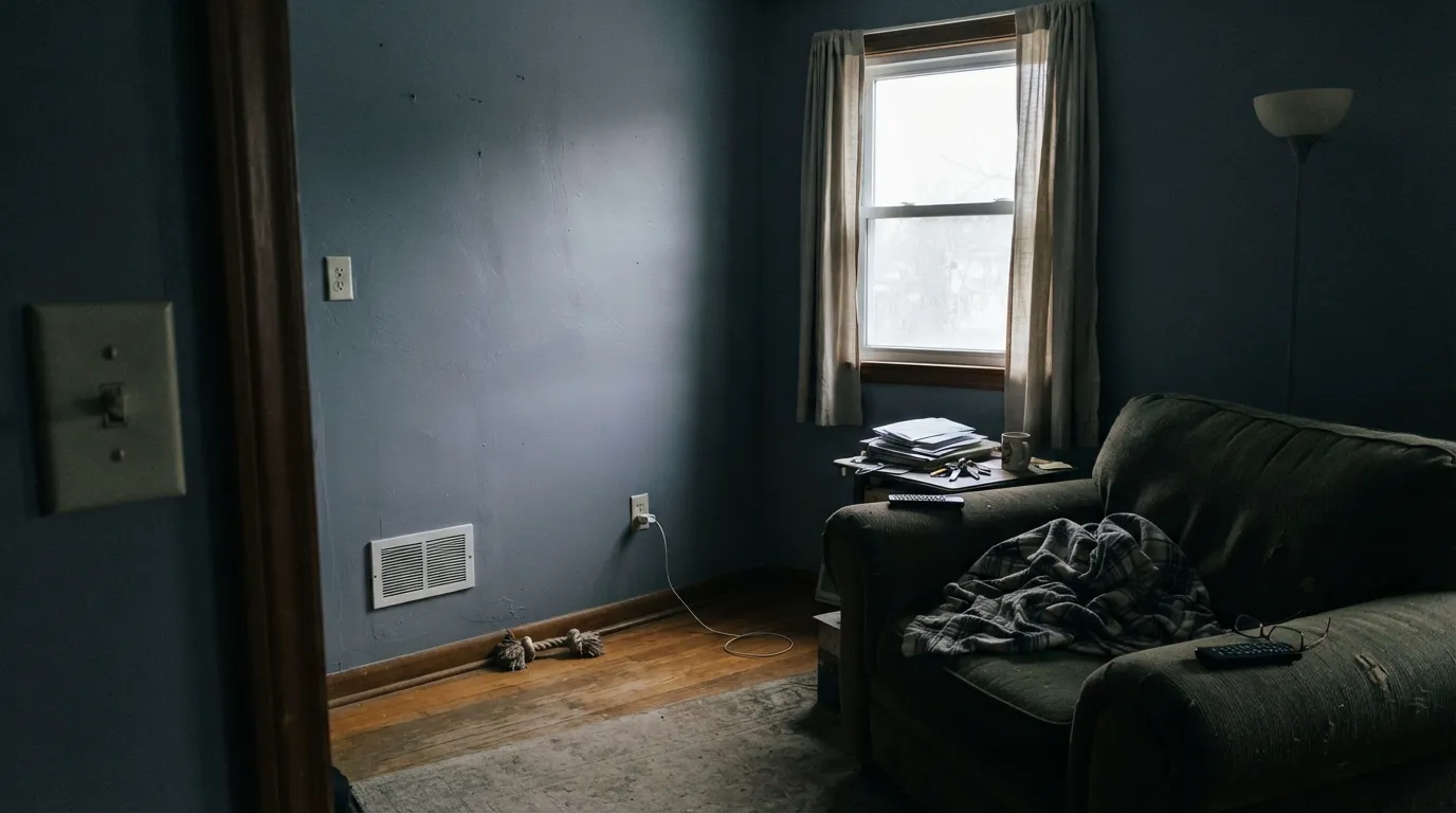
- Goes flat and almost purple-charcoal in a dim, north-facing room
- Fights honey oak and other warm gold wood tones
- Heavy across four full walls without real daylight or evening lamps
- Not a color you'll find endless owner reviews about before you commit
What Color Is Storm Cloud, Really?
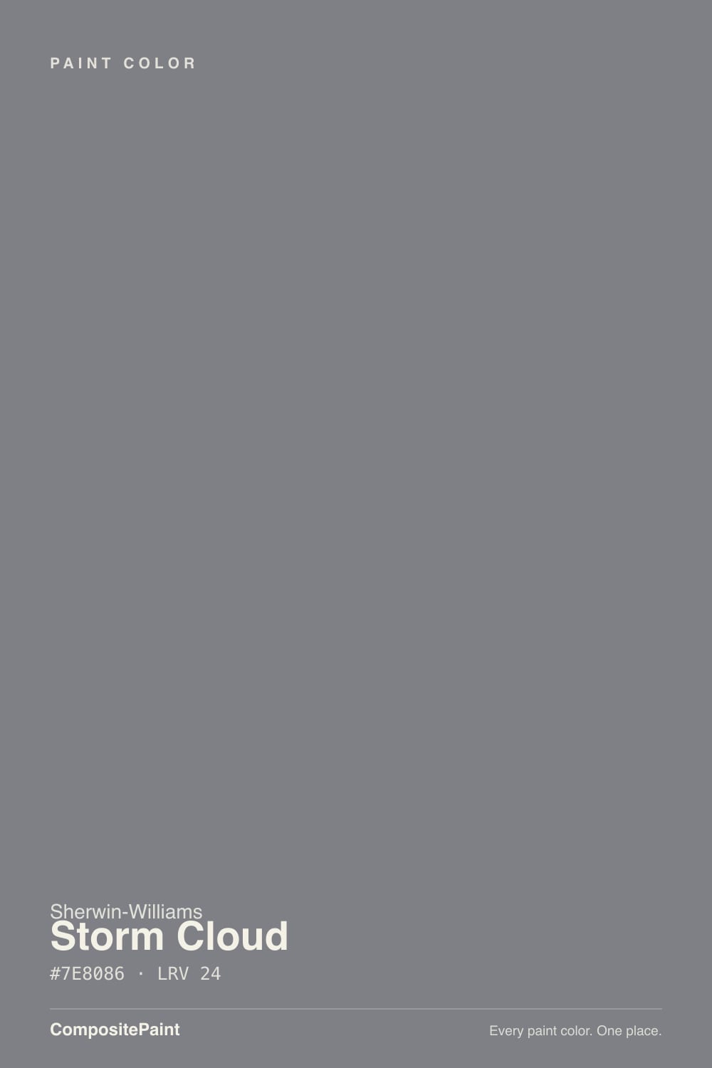
A blue-gray where the blue sits close enough to neutral that it can hide on a paint chip. Look at it under a store's fluorescent lights and it reads like a plain, unremarkable gray. Put it on a front door, an island, or a full wall and let real daylight hit it, and the blue steps forward — not a loud, saturated blue, but a cool, storm-at-dusk cast that settles the argument about whether this is 'gray' or 'blue.' It is both, depending on the light, and that is the entire character of the color.
At LRV 24 it sits in the useful middle of the deck's dark neutrals — deeper than a true mid-tone gray, but nowhere near the near-black end where Sherwin-Williams's own Peppercorn (LRV 11) or Iron Ore (LRV 6) live. That depth is what makes it work on doors and islands without needing three coats to look intentional, and it's close in weight to Benjamin Moore's Chelsea Gray (LRV 22) — similar darkness, different temperature, since Chelsea Gray leans warm greige where Storm Cloud stays cool.
Undertone in one line: a cool, quietly blue-violet gray — never warm, never green. If it reads flat and almost purple-charcoal, that's a dim room draining the color, not a defect; if it reads distinctly blue, that's honest daylight doing its job.
Where It Shines
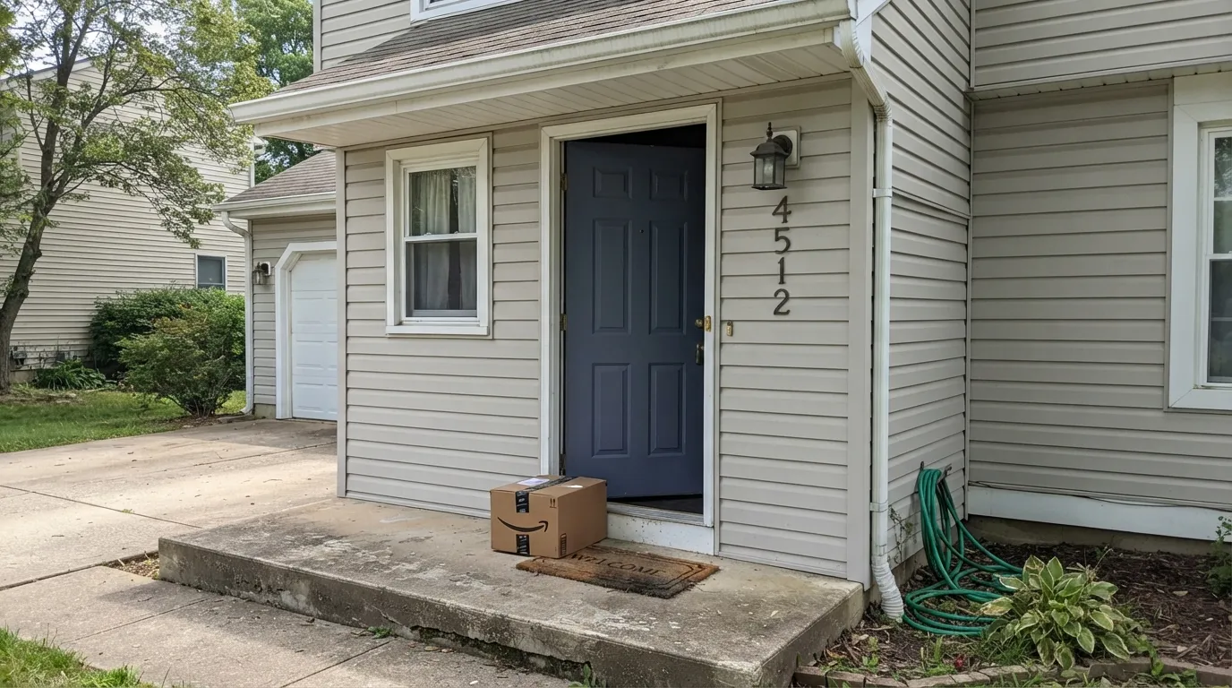
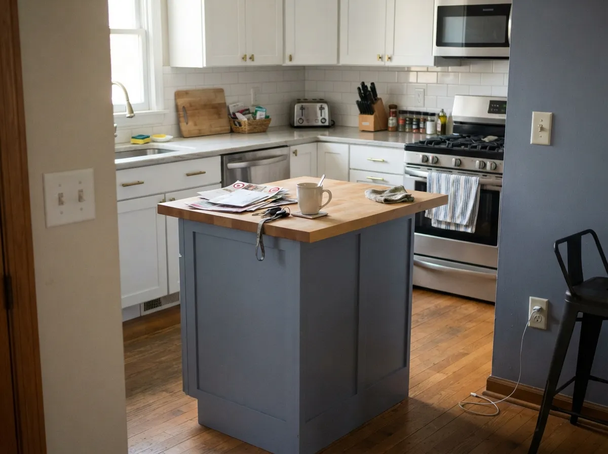
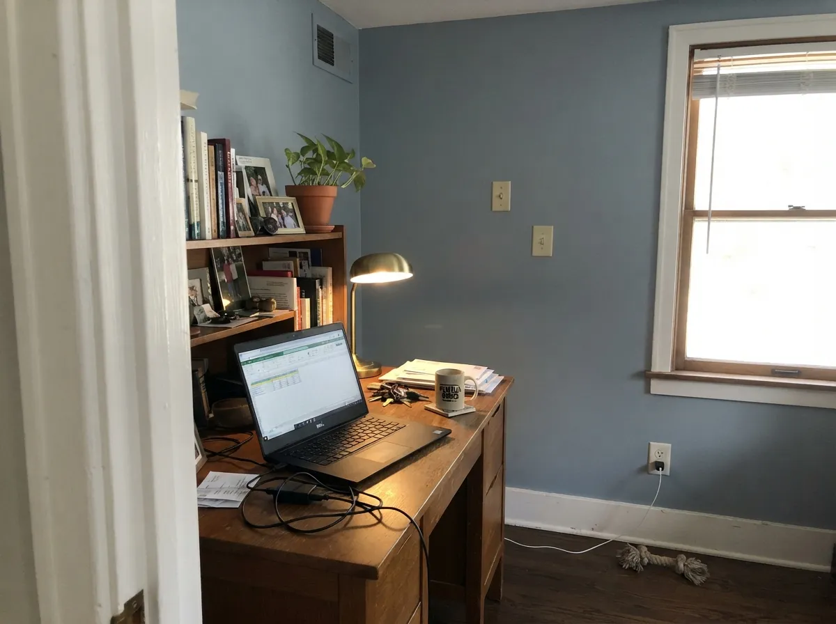
This is a color built for one surface at a time, not a whole open floor plan. On a front door with real daylight hitting it morning to evening, it reads as a deliberate, sophisticated choice against white or greige siding — moody without tipping into black. On a kitchen island under white or warm-wood perimeter cabinets it does the same job indoors: enough color to anchor the room, cool enough to stay out of the way of brass or black hardware. Give it a well-lit office, den, or exterior wall and it holds its blue-gray honestly all day instead of drifting toward mud.
Where It Fails
Almost every disappointing Storm Cloud story comes from one of three predictable situations, and none of them are the paint's fault — they're a mismatch between a cool, LRV 24 blue-gray and a room that can't support it.
North light is already cool and gray; it strips out what little warmth Storm Cloud has and drains its depth toward flat, almost purple-charcoal. It doesn't look like a rich blue-gray anymore — it looks murky. Test a large sample on the actual wall before committing a whole room without strong lamps.
Yellow-orange sits opposite blue on the color wheel, so golden oak floors and warm builder trim fight this color instead of framing it — the wood pushes orange, the paint pushes cold, and neither side wins. Walnut, espresso, white oak, or black hardware are the safe companions.
At LRV 24 this is a real dark neutral, not a pale accent gray. Painted on every wall of a room that only gets daylight for a few hours, it can feel heavy and cave-like by evening. It was built to anchor one surface — a door, an island, an accent wall — more than to fill a whole room without a lighting plan.
Room by Room
Semi-gloss Storm Cloud against a white, greige, or light-brick house reads as a deliberate, grown-up statement rather than a trend color. It changes visibly through the day — flatter at dawn, distinctly blue at midday, near-charcoal at dusk — and most owners consider that a feature, not a flaw.
Under white or warm-wood perimeter cabinets, a Storm Cloud island reads as intentional cool contrast without going full navy. Satin, urethane-fortified cabinet enamel; brass or black pulls both work, since the color is neutral enough not to fight either metal.
It works as a full siding color on coastal and modern-farmhouse houses, and as shutters or trim against a lighter body. Darker exterior colors run hotter in full sun than pale ones, so walk the house and sample both the sunny and shaded sides before ordering gallons.
With a real window and a desk lamp, it makes a calm, focused backdrop that photographs well on video calls. In a windowless or north-facing office it can go flat and dull fast — add a warm lamp or pick a lighter comparison instead.
A Storm Cloud vanity under a white or marble-look counter, with brass or nickel hardware, is a low-risk way to try the color before betting a whole room on it. Satin finish for wipe-down durability.
On four walls it is a real commitment: beautiful with south or west light and a mix of warm lamps at night, noticeably heavier in a dim or north-facing room. If you're not sure your room qualifies, start with one accent wall instead.
Your Light Is the Risk
A north-window's soft, even light without direct sun lets the blue-gray read true and calm — rich, not muddy, not washed out.
Low light strips the color down to a flat, almost purple-charcoal shadow of itself. Fine for a dark accent; disappointing if you wanted a lively blue-gray.
Direct sun at either end of the day pulls a faint warmth into it for an hour or two, then it settles back to its cool blue-gray self.
2700K warm bulbs soften the blue and make it cozier at night; cool white LEDs push it colder, closer to a true storm-gray than a soft dusk color.
Most complaints about Storm Cloud are a light mismatch. Upload a photo of your actual room and see it on your walls — then ask for the same wall in north light or evening lamps before you buy a single sample.
Need It From Another Brand?
Any paint counter can custom-tint Sherwin-Williams SW 6249 directly. If you would rather stay in one brand's own deck, these are the closest stock matches, measured as ΔE2000. Under 2 is a difference you will not see on the wall.
| Brand | Closest color | ΔE | LRV | |
|---|---|---|---|---|
| Behr | Forever DenimPPU14-05 · Behr | 1.7 | 23 | Color page → |
| Benjamin Moore | Bachelor Blue1629 · Benjamin Moore | 2.4 | 22 | Color page → |
| Valspar | Sharkfin4007-2A · Valspar | 3.0 | 23.6 | Color page → |
| PPG / Glidden | Garrison GrayPPG1039-5 · PPG / Glidden | 3.5 | 23 | Color page → |
| Glidden | Slate Ridge70BG 23/065 · Glidden | 1.4 | 23 | Color page → |
| Dutch Boy | Felted Blue430-5DB · Dutch Boy | 3.7 | 23 | Color page → |
Similar Sherwin-Williams Colors
The nearest shades to Storm Cloud within Sherwin-Williams's own range, ranked by perceptual color distance — useful when you want the same look a touch lighter, darker, or warmer.
WCAG 2.1: AA is 4.5 : 1 for normal text, 3 : 1 for large text, AAA is 7 : 1.
Storm Cloud vs the Colors You're Also Considering
Every Storm Cloud sample board has the same rivals on it. The numbers show the real lightness gap — then it comes down to which risk you would rather live with.
Pick this for the cooler, more distinctly blue-gray version of the same charcoal-deep weight.
Benjamin Moore HC-168 · LRV 22Chelsea GrayPick this if you want the same depth but warmer — Chelsea Gray leans greige instead of blue and gets along with golden wood tones Storm Cloud fights.
Pick this when you want the blue to be visible, not a rumor — and you want two shades more daylight-holding depth.
Sherwin-Williams SW 7674 · LRV 11PeppercornPick this if you want a darker gray that borrows its undertone from whatever room it's in, instead of committing to blue.
Within the Sherwin-Williams deck the differences are small but real. Software (SW 7074) is #7F8486 at LRV 23, a shade greener and just slightly darker. Serious Gray (SW 6256) at #7D848B and LRV 23 has more visible blue. Downing Slate (SW 2819), #777F86 at LRV 21, is darker and cooler still, while Cityscape (SW 7067), #7F817E at LRV 22, drops the blue and reads more neutral-warm.
Across brands the closest is Valspar Nuts and Bolts (8004-46E) at a deltaE of 0.76, a true match, followed by Benjamin Moore Charcoal Linen (2133-40) at 1.02, which is visually identical in normal room light.
Watch out for the name collision: Dunn-Edwards also sells a Storm Cloud (DE6362), but at #808283 with a deltaE of 2.94 it is a different color, very close but worth sampling first. Further out, Behr Game Over (T12-10) at 3.66 and Diamond Vogel Ocean Frigate (0555) at 4.27 are close but visibly different side by side.
Storm Cloud Coordinating Colors
The rule for coordinating with Storm Cloud is simple: keep the neighbors cool or neutral, and let it be the only committed color note in the room. It pairs cleanly with crisp whites, near-blacks, and lighter members of its own blue-gray family — and it argues with anything warm-gold. These are the partners that show up again and again in rooms that work:
Storm Cloud on Exteriors
Outside is where Storm Cloud does its most reliable work. It reads as a purposeful, current blue-gray on siding, shutters, and doors, comfortable in coastal and modern-farmhouse settings without leaning as heavy or trend-specific as a full black or navy exterior. Against a white, cream, or light-greige body it gives a house real contrast without going stark.
The two things worth planning for: darker exterior colors run hotter in direct sun over the course of a day than pale ones, which is a normal consideration for siding and trim materials, not a defect of the paint. And a house has a sunny side and a shaded side — walk the full exterior with a large sample before ordering, since the shaded elevation will read cooler and flatter than the side that gets afternoon sun.
Storm Cloud With Wood Tones and Hardware
Metals are the easy call: brass, black iron, and brushed nickel all read well against it, since the color is neutral enough not to compete with any of them. Polished chrome is the one finish that can make it feel a touch colder than intended, though it's rarely a dealbreaker.
Wood is where the decision actually gets made. Walnut, espresso, white oak, and gray-washed floors all sit comfortably with Storm Cloud because they don't fight its cool base. Honey oak, golden pine, and orange-leaning stains are the genuine mismatch — the wood pushes warm, the paint pushes cool, and the two sides visibly argue rather than blend. If a golden floor is staying put, treat Storm Cloud as a door or island color rather than a wall color in that room.
Three Ready Palettes Built on Storm Cloud
A color is never alone on the wall. These are complete combinations in the 60-30-10 pattern, with the reason each one holds together. Every one opens in the visualizer.
A crisp white body lets the Storm Cloud door read as a deliberate, sophisticated statement instead of getting lost. Iron Ore shutters echo the same cool family at a deeper depth without competing with the door for attention.
Try this palette in your roomAlabaster keeps the surrounding cabinetry soft and warm, so the cool blue-gray island reads intentional rather than heavy. Extra White overhead keeps the room bright, which is exactly the kind of real daylight this color needs to look its best.
Try this palette in your roomWhite Dove trim keeps the cool walls from tipping cold, giving the room a warm frame around a cool center. Peppercorn on the door adds a second dark note without introducing a third undertone to manage — this only works with a real window in the room.
Try this palette in your roomStorm Cloud FAQ
Is Storm Cloud gray or blue?
Both, depending on the light. On the paint chip and under weak indoor light it can pass for a plain gray. On a door or a sunlit wall the blue steps forward and it reads unmistakably blue-gray. That range is the whole point of the color, not an inconsistency.
Is Storm Cloud good for kitchen cabinets or an island?
Yes, especially as an island or accent against lighter perimeter cabinets. At LRV 24 it holds real color without needing extra coats, and it stays neutral enough to work with brass or black hardware. Use a satin, urethane-fortified cabinet enamel for durability.
What colors pair with a Storm Cloud front door?
White or light greige siding gives it the most contrast and makes the door the clear focal point. Iron Ore or black shutters and trim echo the same cool family at a darker depth. Avoid pairing it directly against warm honey-tone brick or wood, which fights the blue.
Does Storm Cloud work with honey oak floors?
Not comfortably. Yellow-orange sits opposite blue on the color wheel, so warm gold oak floors and this color pull against each other — the floor reads more orange, the paint reads colder. Walnut, espresso, white oak, or gray-washed floors are the better match.
Is Storm Cloud too dark for a whole room?
It can be, in a dim room. LRV 24 is a real dark neutral, not a pale accent gray, so four walls in a room with limited daylight and no evening lamps can feel heavy. In a room with strong daylight and warm lamps at night, a full wall or even the whole room can work — sample a large board first.
How is Storm Cloud different from Peppercorn or Chelsea Gray?
Peppercorn (SW 7674, LRV 11) is darker and more neutral, borrowing its undertone from the room rather than committing to blue. Chelsea Gray (BM HC-168, LRV 22) sits at nearly the same depth as Storm Cloud but leans warm greige instead of cool blue. Storm Cloud is the one that stays honestly, visibly blue-gray.
Have you painted with Storm Cloud?
Rate it — one tap helps the next reader decide.
Ask a Question