Quietude
Sherwin-Williams' bestselling spa color, reviewed honestly: when it reads sage, when it turns blue, and the rooms where it is simply too much color.

Jessica has spec'd whites and neutrals for more than 300 rooms and keeps a sample wall of painted drawdowns in her studio. Every color review is checked against real reader rooms in the comments and re-tested when a formula changes. About the testing process →
The Fast Verdict
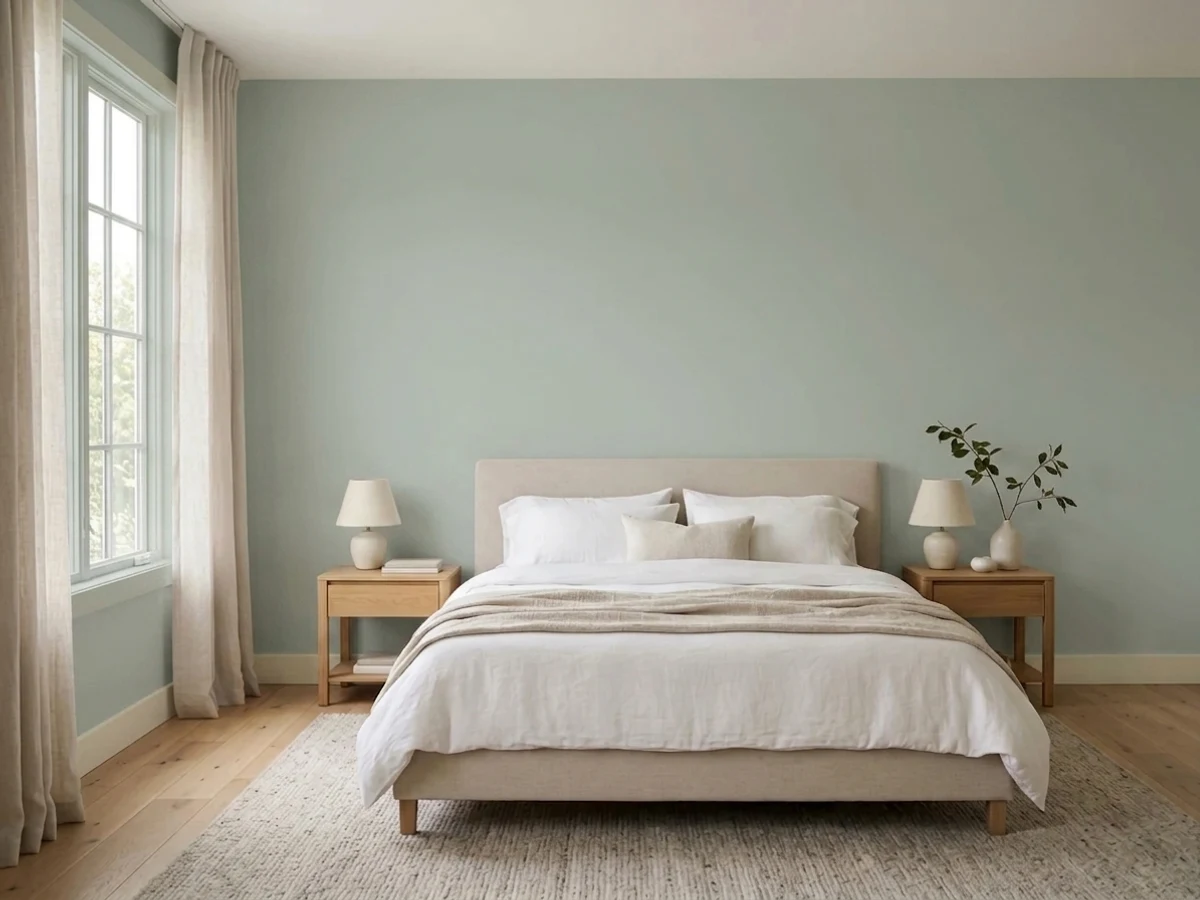
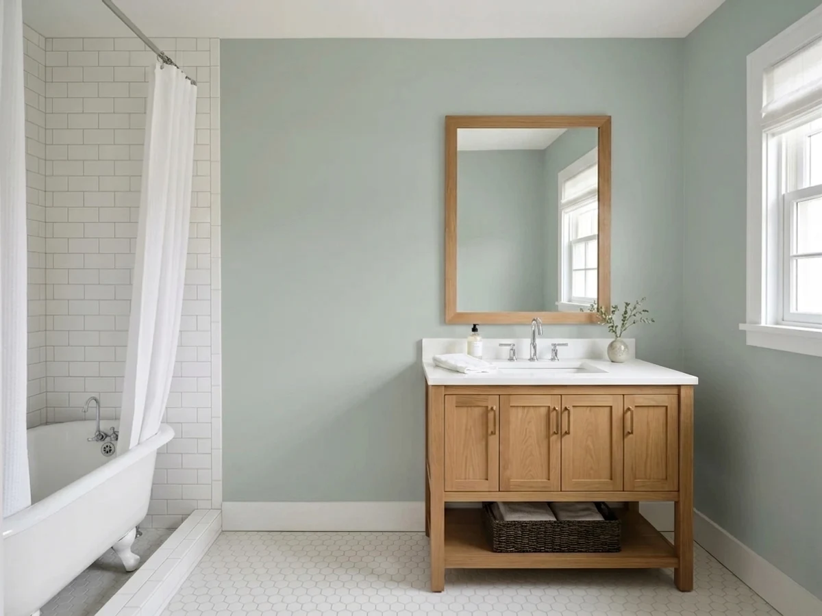
Quietude is the calm blue-green everyone wants until they see how much color it really has. In good daylight it is a soft, layered sage-gray that makes a bathroom or bedroom feel like a held breath. In dim rooms and under cool bulbs it drops the green and goes flatly blue. Treat it as a color, not as a safe neutral, and it is one of the best mid-tones Sherwin-Williams makes.
Bathrooms and bedrooms you want to feel calm · kitchen and vanity cabinets with wood counters · older and transitional homes · anyone who wants real color that still behaves quietly
Your room is dim and faces north · your trim or cabinets are cream · your whole main floor is one open room · you want a sage that stays green in every light
- Reads gray, sage or dusty blue depending on the room — it is genuinely flexible
- Calm without being pale: real color that still functions as a neutral
- Excellent on cabinets and vanities with wood counters and brass or black hardware
- Small rooms and bathrooms feel finished, not decorated
- Ages well — a soft mid-tone that has not looked dated in twenty years
- Goes flatly blue in north light and under cool LED bulbs
- Too much color for a big open-concept main floor
- Argues with cream trim, cream cabinets and warm beige
- At LRV 41 it darkens dim corners more than the chip suggests
What Color Is Quietude, Really?
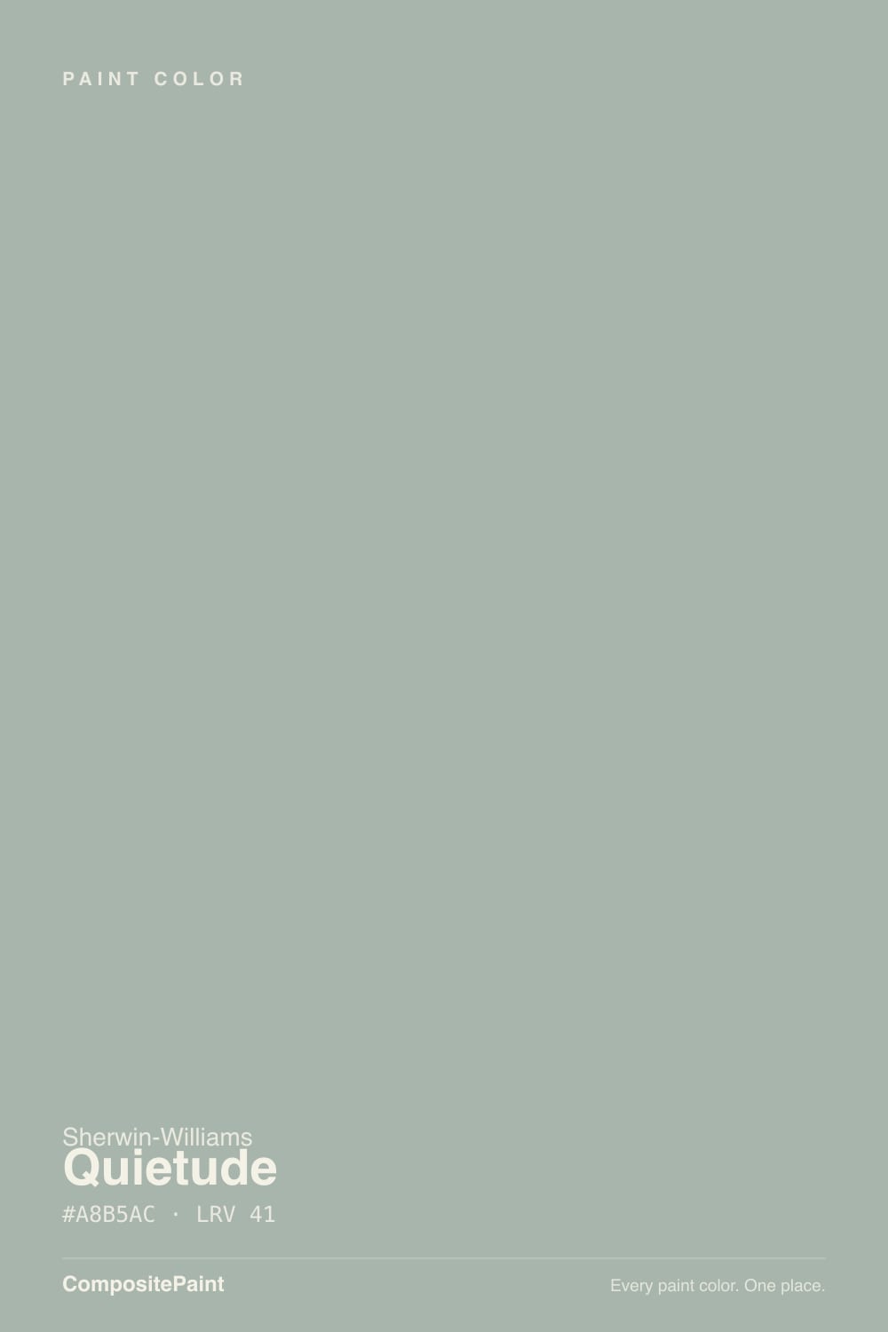
Sherwin-Williams files Quietude under greens, and on the fan deck that is exactly what it looks like: a soft, dusty sage. On a wall it behaves differently. The saturation is only about 8 percent, so the gray comes forward first and the hue underneath is free to drift — toward green in warm daylight, toward blue in cool light and cool rooms. That drift is the entire story of this color. People who love it call it a crossover; people who return it call it "the green that turned blue." Both are describing the same paint.
At LRV 41 it is a genuine mid-tone, and this is where most disappointment starts. Put it next to Sea Salt (SW 6204, LRV 63) — the color it is most often shopped against — and the gap is huge. Sea Salt is a pale backdrop that barely announces itself. Quietude has roughly half the light reflectance, which means about twice the presence: it holds its color in the corners of a room, it reads clearly from across the house, and in a dim space it goes noticeably deeper than the chip in your hand. If you came looking for "Sea Salt with a little more," understand that you are getting a lot more.
Undertone in one line: gray-green with a blue back door — never warm, never truly sage, and never fully neutral.
Where It Shines
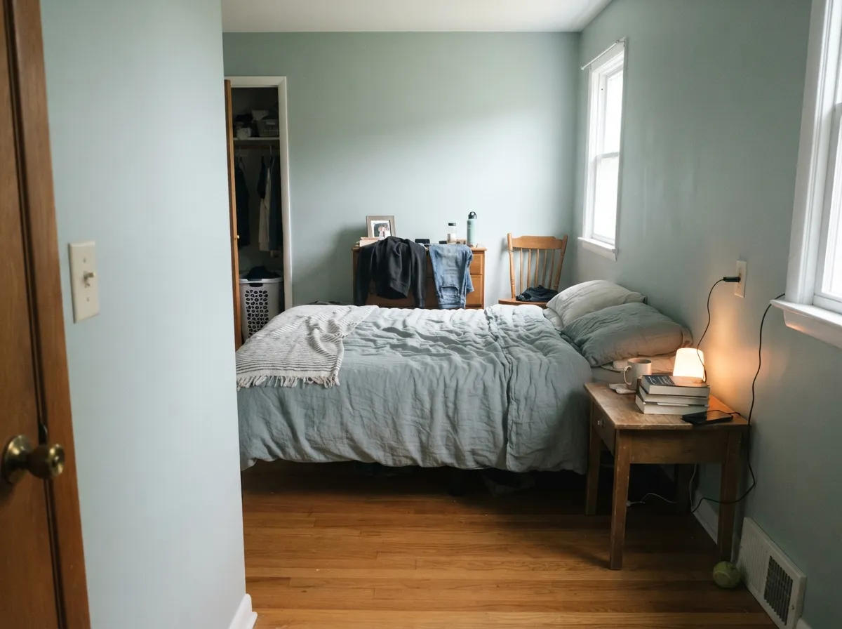
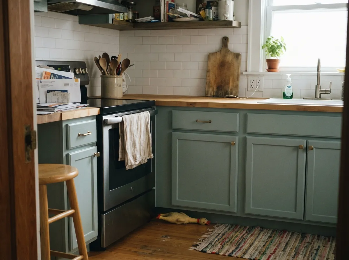
Give it daylight and a small room and it does the thing people buy it for. Bathrooms are its home turf: white fixtures, a wood or stone vanity top, and Quietude on all four walls reads restful instead of decorated. Bedrooms are a close second, and cabinets are the sleeper use — in satin, against butcher block or walnut, it looks like a color a designer chose.
Where It Fails
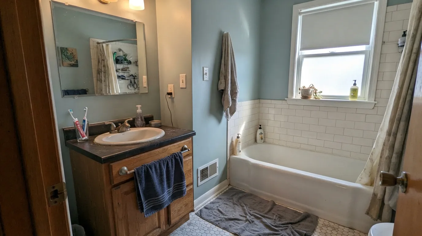
The complaints about Quietude are unusually consistent, and none of them are about the paint quality. All three come down to the same thing: a low-saturation color has no opinion of its own, so the room decides what it becomes. If your room matches one of these, sample hard or pick something else.
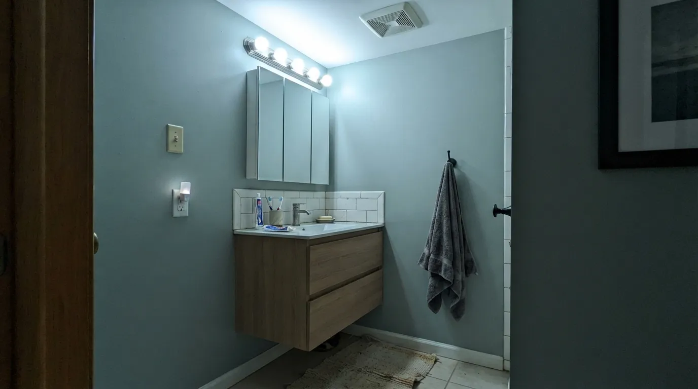
This is the number one story. Cool light strips the warm side out of the hue and the green simply leaves — what stays is a flat, chilly blue-gray that people describe as hospital-like. It happens most often in windowless bathrooms and at night under 4000K bulbs. Swapping to 2700K bulbs fixes about half of it. If you need it to stay green in bad light, use Evergreen Fog (SW 9130) instead, which has enough color to hold its ground.
At LRV 41 with real chroma, Quietude stops being a background the moment it runs across forty feet of connected wall. Kitchen, living, dining, hallway — the color repeats until the whole floor feels committed to a spa theme, and it darkens the far corners that never see a window. For open plans, step up to Sea Salt (SW 6204) or Oyster Bay (SW 6206) and save Quietude for the rooms with doors.
Cream and Quietude make each other look worse. The cream pulls yellow, and by contrast the green in Quietude jumps forward and reads much stronger than you sampled. This is the most common regret in kitchens with existing cream cabinetry. Fix it with a clean trim white — Pure White (SW 7005) — or, if the cream is staying, choose grayer and warmer with Oyster Bay (SW 6206).
Room by Room
Small, tiled, mostly white fixtures: this is where the spa reputation is earned. Use satin for moisture and wipe-downs, and keep trim and ceiling in Pure White (SW 7005) so the walls stay the only color. Windowless bathrooms need warm 2700K bulbs or the color turns blue at night.
It quiets a bedroom without going dark, and at LRV 41 it still leaves the room feeling light. Snowbound (SW 7004) on trim and ceiling keeps the edges clean. If the bedroom faces north and stays dim, expect the moody blue version — sample on two walls before you commit.
Satin on cabinet doors with wood or butcher-block counters is where this color looks most expensive, and it takes brass and matte black hardware equally well. Note that satin reflects more light than the flat chip, so cabinets come out a step lighter than you expect. Alabaster (SW 7008) or Pure White (SW 7005) on the walls above.
In a defined living room with two windows it is calm and grown-up, especially with warm wood furniture. In an open plan it takes over. Eggshell walls, and one warm element — a rug, leather, or oak — to stop the whole room from going cool.
Both are rooms people want quiet, and both are small enough to carry a mid-tone. Quietude behaves well with black-framed shelving and looks deliberate on a dining room's lower wall under a chair rail. Pair with Urbane Bronze (SW 7048) on built-ins for depth.
Full sun lifts it into a restful sage-gray that suits craftsman, cottage and coastal homes. The failure point outside is warm orange brick or terracotta roof tile, which fights the cool green hard. Details in the exterior section below.
Your Light Is the Risk
Cool daylight pushes it blue and moody. The sage you sampled at the store does not show up.
Warm sun brings the green forward all day. This is the soft spa version people picture.
Green and fresh in the sun hours, grayer between them. It moves — most people enjoy it.
2700K bulbs keep it sage. 3500K and up turn it cold blue. Change bulbs before you change paint.
Most complaints about Quietude are a light mismatch. Upload a photo of your actual room and see it on your walls — then ask for the same wall in north light or evening lamps before you buy a single sample.
Need It From Another Brand?
Any paint counter can custom-tint Sherwin-Williams SW 6212 directly. If you would rather stay in one brand's own deck, these are the closest stock matches, measured as ΔE2000. Under 2 is a difference you will not see on the wall.
| Brand | Closest color | ΔE | LRV | |
|---|---|---|---|---|
| Behr | City Of BridgesBXC-16 · Behr | 1.6 | 47 | Color page → |
| Benjamin Moore | Imperial Gray1571 · Benjamin Moore | 2.3 | 47 | Color page → |
| Valspar | Bog Fog8003-34D · Valspar | 1.5 | 48 | Color page → |
| PPG / Glidden | Blue WillowPPG1145-4 · PPG / Glidden | 3.6 | 47 | Color page → |
| Glidden | Green Smoke50GY 48/075 · Glidden | 2.2 | 48 | Color page → |
| Dutch Boy | Trout Gray426-4DB · Dutch Boy | 3.0 | 47 | Color page → |
Similar Sherwin-Williams Colors
The nearest shades to Quietude within Sherwin-Williams's own range, ranked by perceptual color distance — useful when you want the same look a touch lighter, darker, or warmer.
WCAG 2.1: AA is 4.5 : 1 for normal text, 3 : 1 for large text, AAA is 7 : 1.
Quietude vs the Colors You're Also Considering
Every Quietude sample board has the same rivals on it. The numbers show the real lightness gap — then it comes down to which risk you would rather live with.
Pick this when you want real color on the wall, not a whisper.
Sherwin-Williams SW 6204 · LRV 63Sea SaltPick this for open plans and pale, airy rooms — it is far lighter.
Pick this when you want the blue-green to actually show up.
Sherwin-Williams SW 6206 · LRV 35Oyster BayPick this if your trim is cream, or you want grayer and safer.
Oyster Bay (SW 6206) at LRV 44 is Quietude's closest relative but leans a touch grayer and slightly lighter, so it feels a hair more neutral and reads less blue. Choose Oyster Bay when you want the same spa mood with less color commitment, and Quietude when you want the green-blue to be a little more present.
Forever Green (SW 9653) at LRV 44 pushes further toward true green and is a bit lighter, so it looks more clearly sage on the wall. If you want people to read the color as green rather than gray, Forever Green does that; Quietude keeps the green quieter.
Silvermist (SW 7621) at LRV 47 is lighter and leans more clearly blue, giving an airier, cooler feel. Pick Silvermist for a brighter, more coastal blue-green and Quietude when you want a deeper, more grounded mid-tone that can still read gray.
Quietude Coordinating Colors
The rule for coordinating with Quietude is the opposite of the warm-white rule: stay clean or stay cool, and skip cream. Anything with yellow in it — cream trim, warm beige walls, honey-toned builder oak — forces the green forward and makes the color look stronger and more dated than it is. Clean whites, soft grays and deeper greens all keep it in its lane.
For a second wall color in a connected room, a lighter cousin from the same family flows better than a contrasting neutral. For the dark note every scheme needs, go all the way down — a mid-tone gray next to a mid-tone green just looks muddy.
Quietude on Cabinets and Vanities
Cabinets are the use that surprises people. On a wall Quietude has to survive whatever the light does; on a cabinet door it sits at eye level, surrounded by counter, hardware and backsplash, and those materials steady it. The result is a soft green-gray cabinet that looks custom rather than trendy, and it does not read as a green kitchen the way a true sage would.
Two practical notes. First, sheen changes the color: satin and semi-gloss reflect more light than the flat fan deck chip, so finished doors land a visible step lighter and slightly grayer. Order a sample door or paint a scrap of the actual door material before you commit. Second, it takes both metals — unlacquered brass warms it up, matte black sharpens it — so hardware is a genuine choice, not a constraint. Wood counters and white or gray-veined quartz both work; avoid warm cream-toned granite with heavy yellow flecks.
Quietude on Exteriors
Outside, Quietude behaves better than most cool mid-tones because full sun does two useful things: it lifts the LRV visually so the siding never looks heavy, and it warms the hue so the green shows rather than the blue. On craftsman, cottage and coastal houses it lands as a restful sage-gray that looks like it has always been there. Shaded north elevations will read a full step bluer than the sunny side, so walk the whole house with the sample board.
The one thing that ruins it is warm masonry. Orange or red brick, terracotta roof tile and warm flagstone all sit at the opposite temperature and make the siding look cold and slightly off, and no trim color rescues that pairing. Gray stone, white-washed brick, black window frames and natural cedar are the easy wins. For trim, Pure White (SW 7005) gives the coastal look and Iron Ore (SW 7069) gives the modern one; a front door in Naval (SW 6244) or Urbane Bronze (SW 7048) supplies the dark note the facade needs.
Three Ready Palettes Built on Quietude
A color is never alone on the wall. These are complete combinations in the 60-30-10 pattern, with the reason each one holds together. Every one opens in the visualizer.
Quietude takes the 60 percent because a bathroom is small enough to carry a mid-tone on every wall. Pure White keeps the edges clean instead of creamy, and the bronze vanity supplies the one dark note that stops the room from floating away.
Try this palette in your roomCabinets are the 60 percent surface in a kitchen, and Quietude in satin gives them depth without reading as a colored kitchen. Alabaster is warm enough to soften the cool green without tipping into cream, and Iron Ore anchors the island so the room has a real dark and a real light.
Try this palette in your roomSnowbound is a clean white with the faintest gray, so it edges Quietude without the yellow fight a cream trim would start. Evergreen Fog is the same family two steps deeper, which gives the room a tone-on-tone accent that never reads as a decorated feature wall.
Try this palette in your roomQuietude FAQ
Is Quietude green or blue?
Both, and the room decides. It is officially a green, but the hue is so low in saturation that warm daylight pulls it sage and cool light pulls it dusty blue. South-facing rooms usually get the green version; north-facing rooms and cool LED bulbs usually get the blue one. Sample it on two different walls before you buy the gallons.
Is Quietude a warm or cool color?
Cool. There is no warmth hiding in it, which is why it needs one warm element in the room — wood, leather, brass, a jute rug — to keep from feeling chilly. Warm 2700K bulbs help a lot at night.
What white trim goes with Quietude?
Pure White (SW 7005) at LRV 84 is the safe answer: clean, slightly cool, and it lets the green stay quiet. Snowbound (SW 7004) works the same way with a touch less brightness. Avoid cream whites — cream makes Quietude read much greener than you sampled.
Is Quietude too dark for a small bathroom?
No. At LRV 41 it is a mid-tone, not a deep color, and small bathrooms are exactly where it looks best. What matters more than the size is the light: a windowless bathroom with cool bulbs will look cold and blue no matter how small or large it is.
Quietude or Sea Salt?
Sea Salt (SW 6204, LRV 63) is much lighter and reads as a soft backdrop; Quietude at LRV 41 reads as an actual color. Use Sea Salt for open floor plans and rooms you want to feel airy. Use Quietude for a single room you want to feel enveloped and calm. They also work together, Sea Salt in the open areas and Quietude behind a door.
Does Quietude work on kitchen cabinets?
Yes, and it is one of its best uses. Satin sheen on the doors, wood or butcher-block counters, brass or matte black pulls. Expect the finished doors to read one step lighter than the fan deck chip, because satin bounces more light than the flat sample.
Will Quietude clash with my brick or stone?
It can. Warm orange brick, terracotta roof tile and warm-toned flagstone all fight the cool green and make the siding look off. Gray stone, white brick and natural cedar are the easy partners. Hold a large sample board directly against the masonry in full sun before committing to an exterior.
Have you painted with Quietude?
Rate it — one tap helps the next reader decide.
Ask a Question