Rainwashed
Sherwin-Williams' signature spa green-blue, reviewed honestly: the light where it turns sea-glass, the light where it goes flat and gray, and what to pick instead.

Jessica has spec'd whites and neutrals for more than 300 rooms and keeps a sample wall of painted drawdowns in her studio. Every color review is checked against real reader rooms in the comments and re-tested when a formula changes. About the testing process →
- 1Stardew43
- 2Quietude48
- 3Rainwashed59
- 4Gray Owl65
- 5Glass Slipper70
The Fast Verdict
Rainwashed is Sherwin-Williams' answer to "I want something calming but not boring gray." It is a genuine blue-green built over a soft gray base — Sherwin-Williams even files it under greens — and that gray keeps it from ever reading candy or trendy. Give it real daylight and white tile or light oak and it looks like sea glass; take the daylight away and it goes flat and a little dull. It rewards a room with a real window and punishes a room without one.
Bathrooms with white tile and chrome or nickel · bedrooms with linen bedding and light wood · sunrooms and view rooms with south or west light · a kitchen island or built-in that wants one calm accent
Your room faces north with no lamps · you actually want a plain neutral gray · your fixtures are yellow brass over honey oak and you won't test the combination · you want a color that looks the same at 9am and 9pm
- A genuine blue-green chameleon, never a boring flat neutral
- LRV 59 keeps rooms bright without going stark or clinical
- Its best rooms — bathrooms and bedrooms — are exactly where most buyers want it
- Gray base keeps it grounded instead of reading candy-coastal
- Works indoors and out, with white trim as the reliable anchor
- Not a neutral gray, despite sitting near them on the fan deck
- Goes flat and dull-aqua in a dim, north-facing room
- Reads greener in warm light and bluer in cool light — some buyers want one fixed color
- Yellow brass and honey oak can clash with its cool lean
What Color Is Rainwashed, Really?
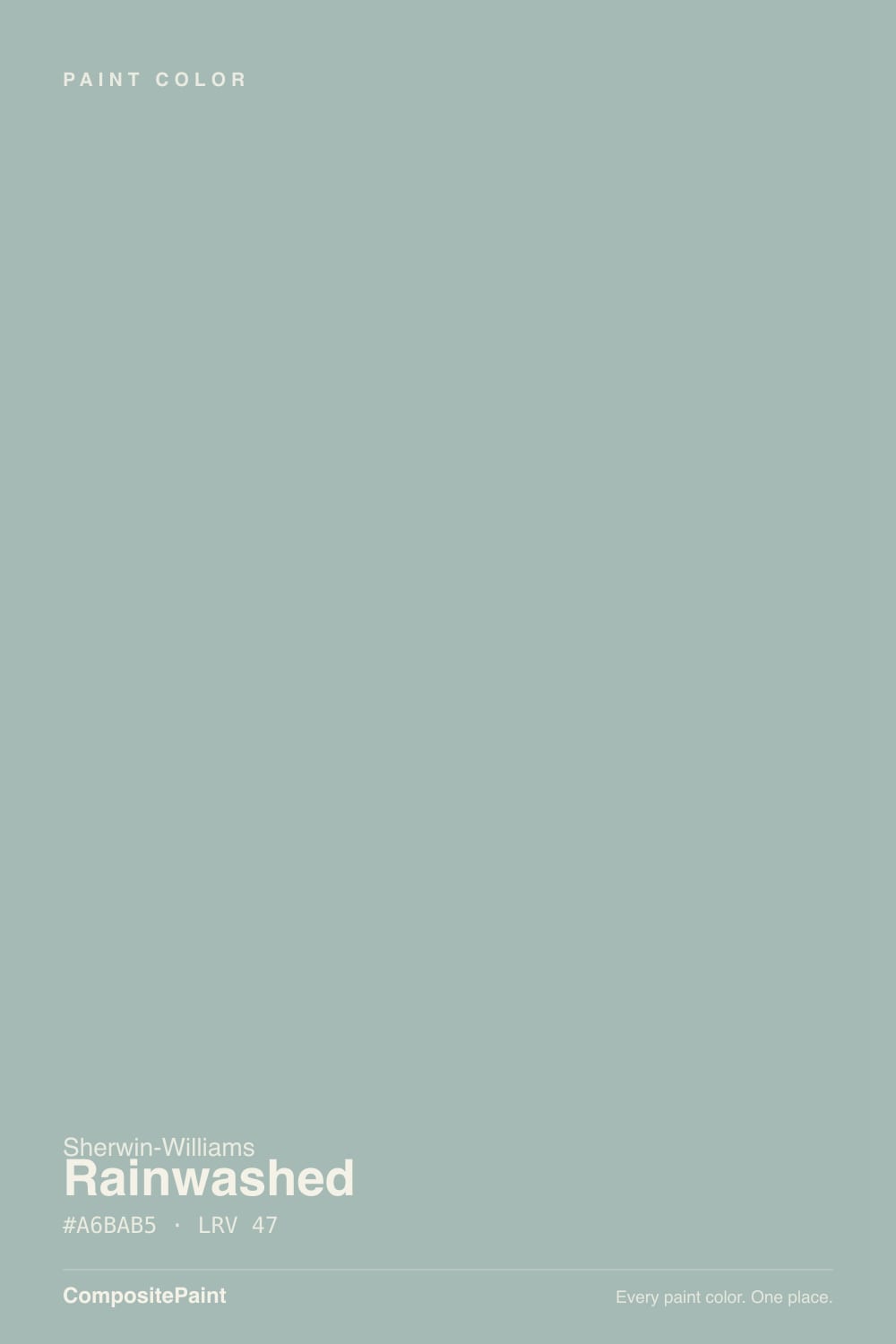
Rainwashed is built on two pigment directions over a soft gray base: a clear blue and a quieter green, which is why Sherwin-Williams classifies it as a green but almost everyone who owns it describes it as blue-green or seafoam. At RGB 194/205/197 the green channel edges out the blue by a hair, which is the whole story in one number — it is close enough to call it either color, and the room's light decides which one wins on a given afternoon.
At LRV 59 it sits in the medium-light range: bright enough to keep a bathroom or bedroom from feeling closed in, deep enough to read as a real color rather than an off-white with a tint. Put it next to Sea Salt (LRV 63) and Rainwashed reads noticeably more saturated and more blue — Sea Salt is the lighter, greener, more muted cousin. That gap matters because shoppers standing at the fan-deck wall, scanning past the grays and greiges, often grab Rainwashed expecting one more quiet neutral. It is not one. It is a color with a real personality that happens to be well-behaved.
Undertone in one line: blue and green in close to equal measure over gray, never a true neutral. Warm afternoon light pulls it toward sea-glass green; cool morning or overcast light pulls it toward aqua-blue-gray. Both are the same paint being honest about the light in the room, not a bad batch or a bad wall prep.
Where It Shines
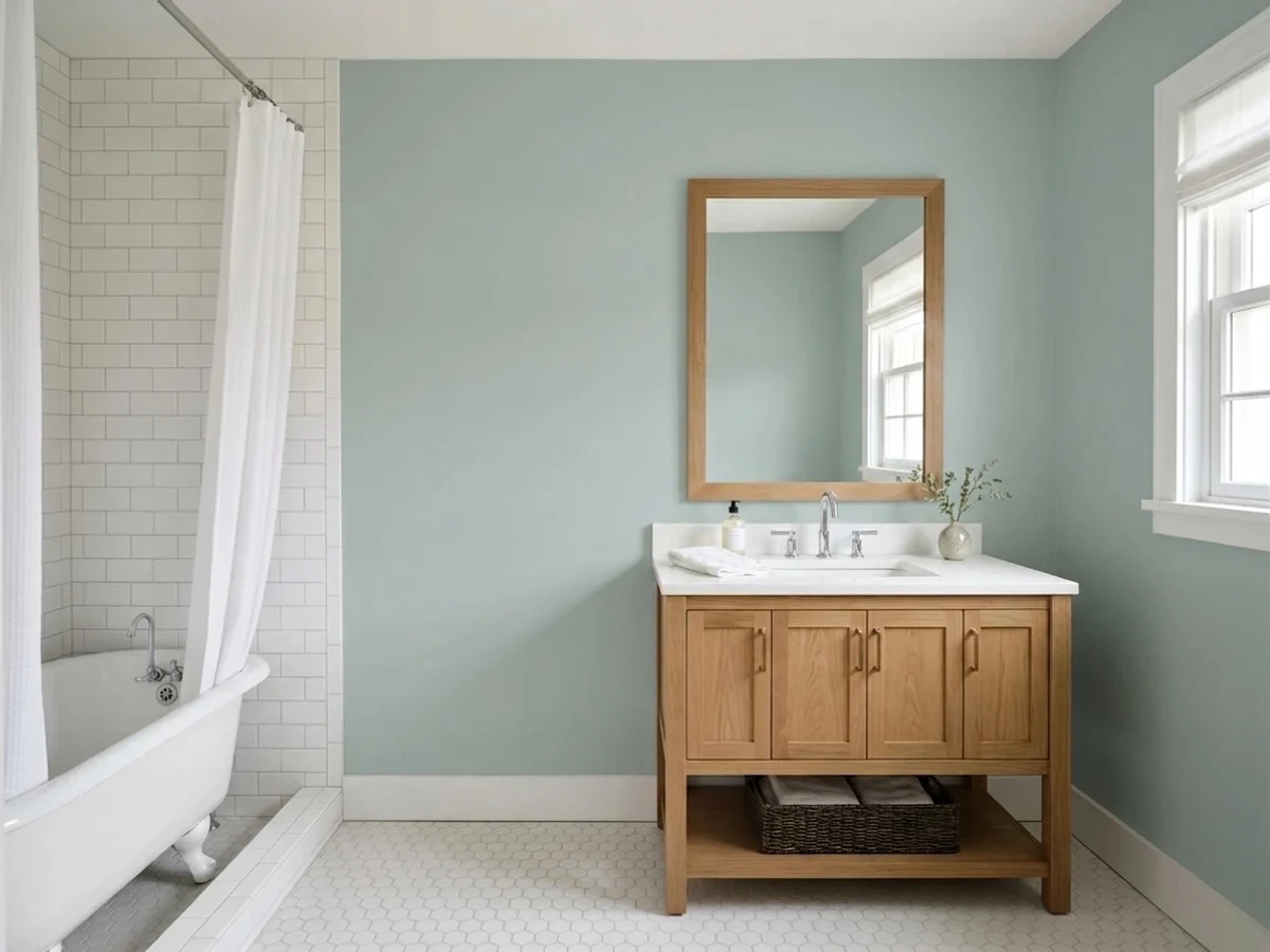
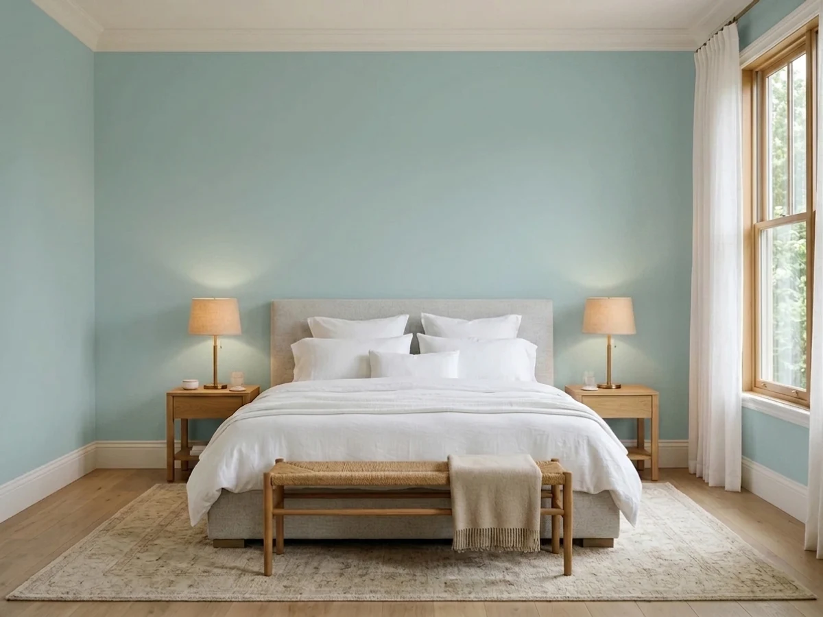
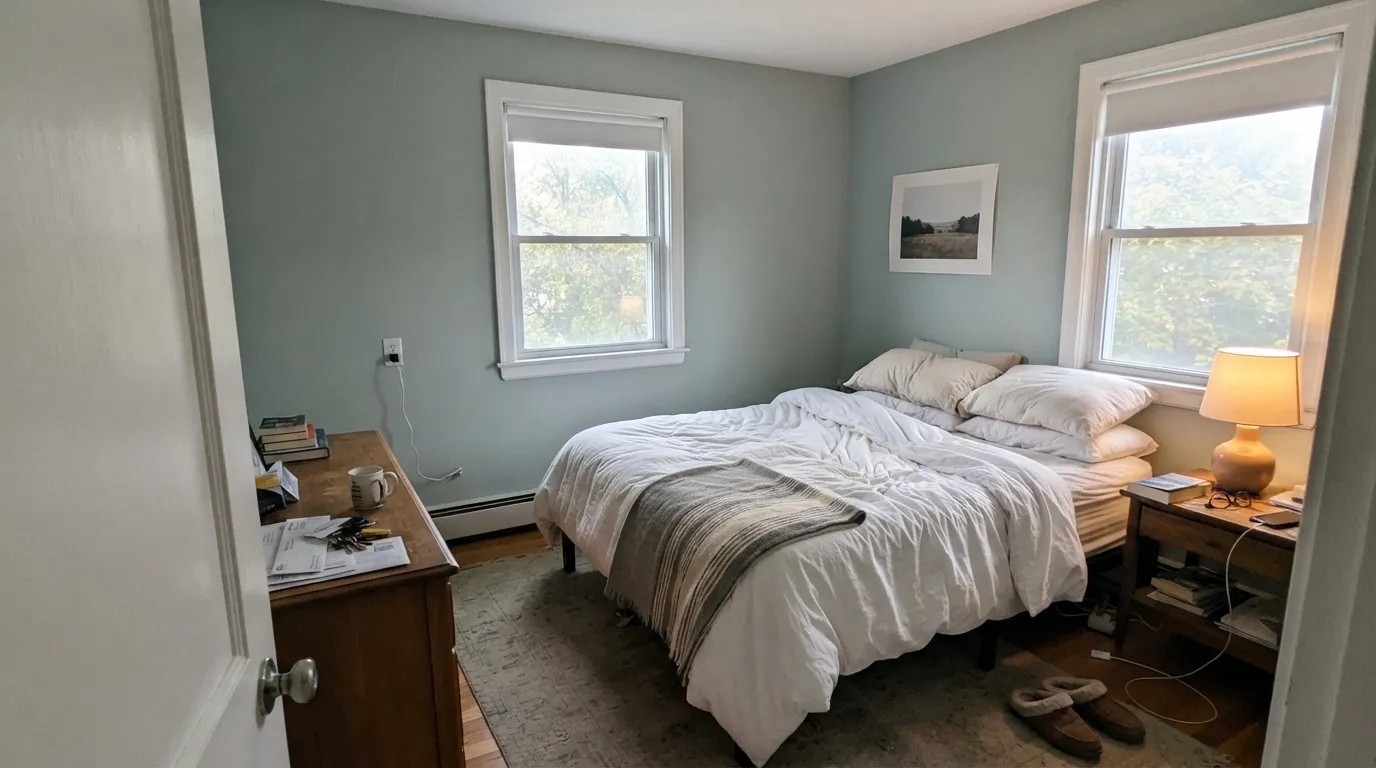
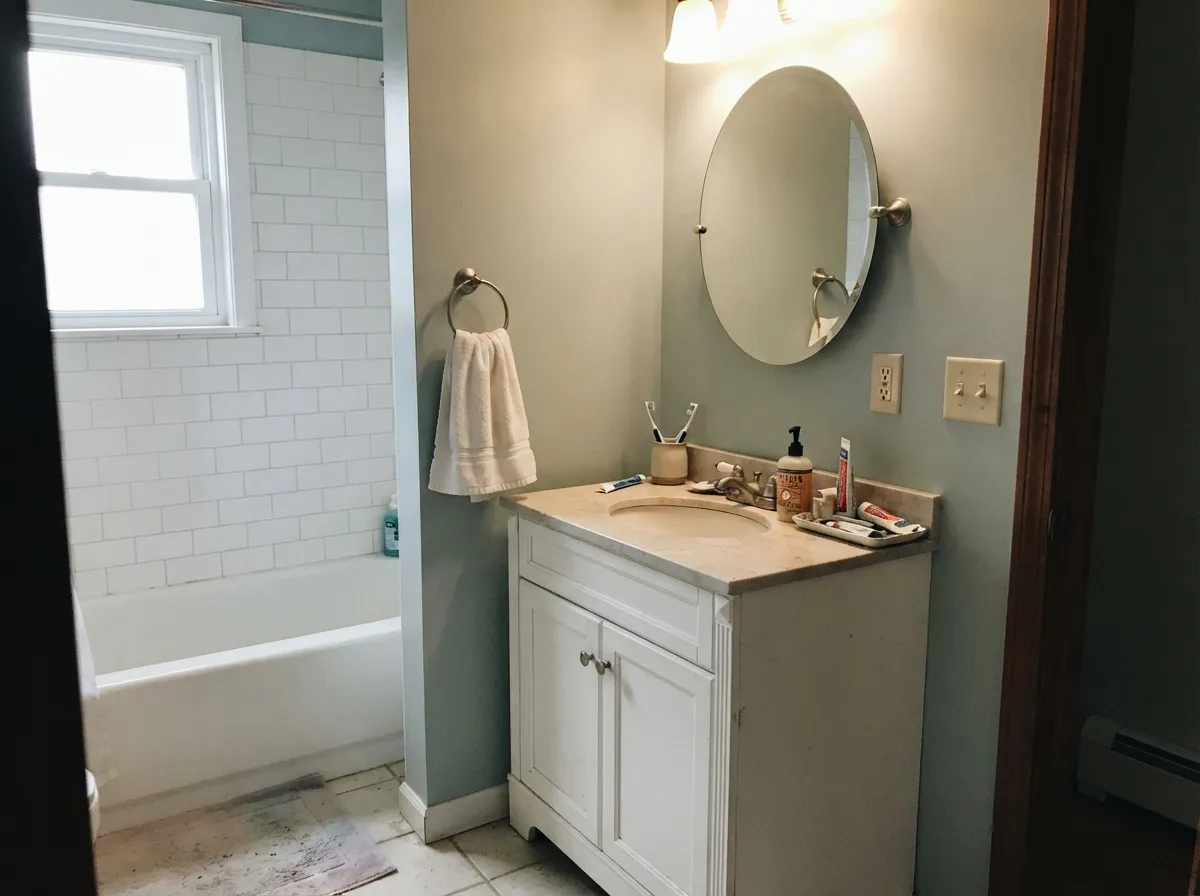
Give it a real window and it does exactly what the name promises: a fresh, just-rinsed calm that reads as intentional design rather than an accident. Bathrooms are its signature job — against white subway tile, marble-look counters and chrome or brushed nickel, it turns a builder-grade bath into something that looks like a spa upgrade. Bedrooms are close behind: with white or natural-linen bedding and light oak furniture it stays a coastal, restful envelope, and its gray base keeps it from going flat and lifeless the way a purer blue can once the sun sets.
Where It Fails
Almost every disappointed review of Rainwashed comes from one of three situations, and all three are predictable before the first coat goes on. None of them are the paint's fault — but if your room matches one, sampling a bigger swatch will only confirm the problem, not fix it.
Rainwashed sits on the fan deck near a wall of quiet grays and greiges, and plenty of buyers grab it assuming it will behave like one. On four walls the blue-green is unmistakable — it is a color, not a neutral. If a true quiet gray is actually what you want, look at Silver Strand instead and let Rainwashed be the color it insists on being.
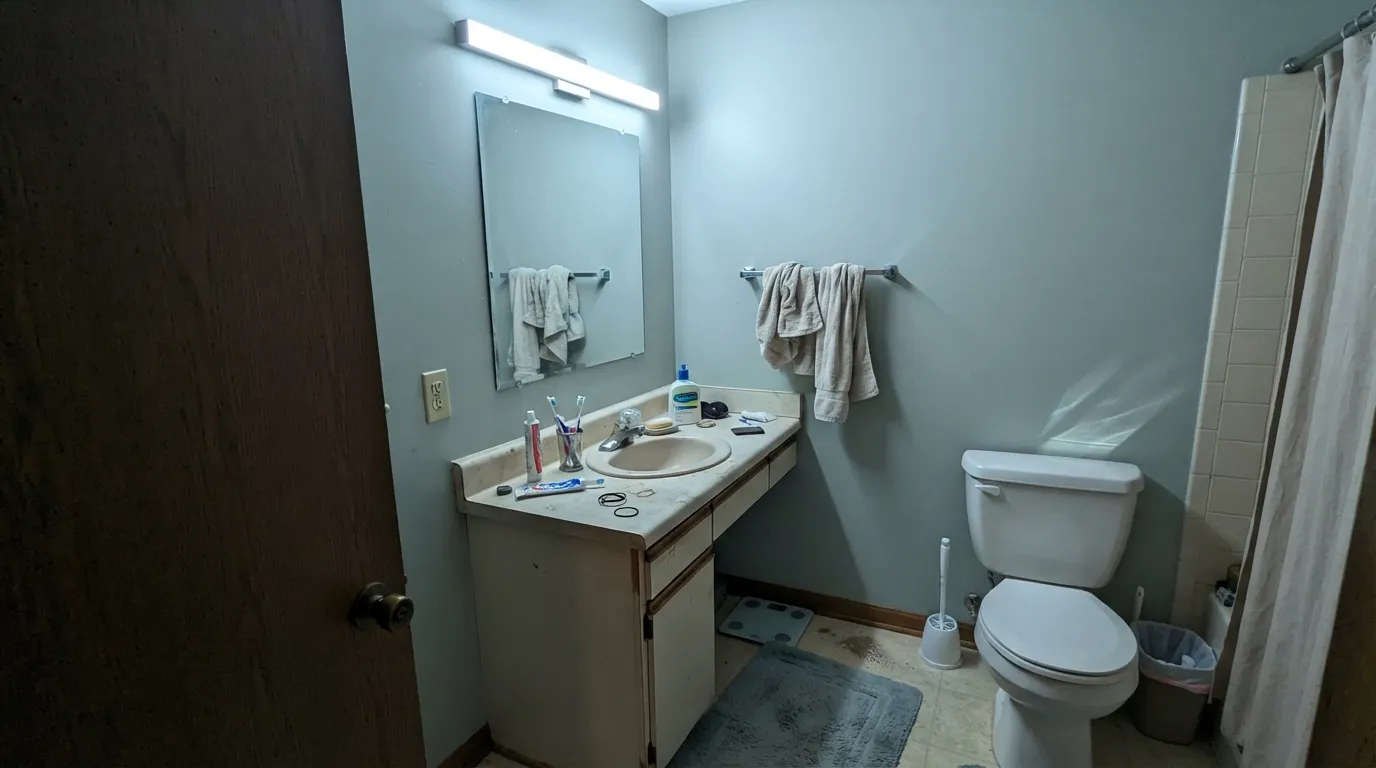
Cool overcast light drains the green out and leaves a flat, slightly dull aqua-gray that readers describe as lifeless rather than calming. The fix is not more coats — it is warm 2700K lamps, or picking a color that does not depend on daylight to hold its personality.
Because Rainwashed leans cool, it can sit slightly at odds with warm golden wood and yellow brass — the pairing reads a little minty instead of intentional. Chrome or brushed nickel is the safer metal, and walnut or whitewashed wood is a friendlier floor than honey oak.
Room by Room
The signature use. With white tile, marble-look counters and chrome or brushed nickel it reads like a deliberate spa upgrade rather than a paint job. Satin finish stands up to steam and wipes down easily.
Against white or linen bedding and light oak furniture it delivers a genuinely restful, coastal-calm envelope. Its gray base keeps it from going lifeless under warm 2700K evening lamps the way a purer blue often does.
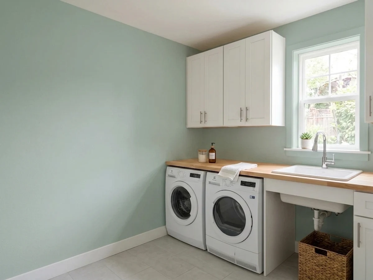
Soft enough to be calming, colorful enough not to read sterile. Pairs easily with white furniture and light wood — a common choice for exactly this reason.
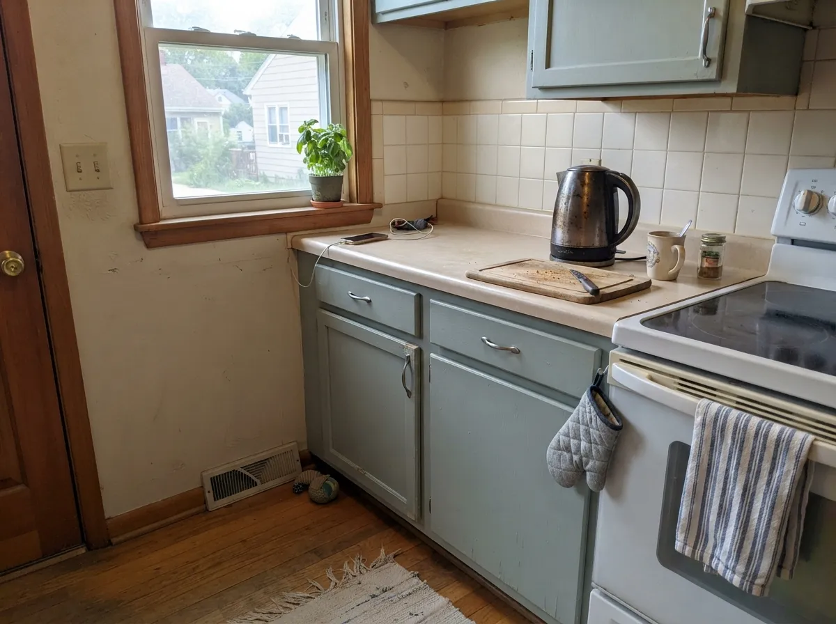
A Rainwashed island under white upper cabinets and warm wood counters reads custom and beachy without overwhelming the space. A full kitchen of it is a bigger bet — sample the whole run of cabinets, not just one door.
In a bright, view-heavy room it echoes water and sky instead of competing with them. Test it in the room's actual light before committing — this is the room type where the color shows its full range.
Works well as siding with white trim and navy or charcoal shutters for a coastal, farmhouse-adjacent look. Full sun washes it a touch lighter and greener than it reads indoors; the shaded side of the house will read grayer — walk the sample around before ordering.
Your Light Is the Risk
Real sun brings the green and blue into balance — this is the honest sea-glass color the name promises. Sample here first.
Cool gray daylight drains the green and leaves a flat, slightly dull aqua-gray. Fine if you half-wanted gray; disappointing if you wanted the color.
Warmer light pulls it toward sea-glass green; cooler light pulls it toward aqua-blue-gray. Most owners like the movement — it is part of the appeal.
2700K warm bulbs pull it toward a soft, sage-leaning green. Cool LEDs push it icy and gray — swap the bulbs before you swap the paint.
Most complaints about Rainwashed are a light mismatch. Upload a photo of your actual room and see it on your walls — then ask for the same wall in north light or evening lamps before you buy a single sample.
Need It From Another Brand?
Any paint counter can custom-tint Sherwin-Williams SW 6211 directly. If you would rather stay in one brand's own deck, these are the closest stock matches, measured as ΔE2000. Under 2 is a difference you will not see on the wall.
| Brand | Closest color | ΔE | LRV | |
|---|---|---|---|---|
| Behr | Frosted JadePPU11-13 · Behr | 1.9 | 61 | Color page → |
| Benjamin Moore | Sage Tint458 · Benjamin Moore | 1.9 | 59 | Color page → |
| Valspar | Ocean Froth8003-34C · Valspar | 0.5 | 59 | Color page → |
| PPG / Glidden | Babbling BrookPPG1144-3 · PPG / Glidden | 3.2 | 59 | Color page → |
| Glidden | Life LessonPPG1128-3 · Glidden | 2.9 | 58 | Color page → |
| Dutch Boy | Coastal Mist427-1DB · Dutch Boy | 1.0 | 58 | Color page → |
Similar Sherwin-Williams Colors
The nearest shades to Rainwashed within Sherwin-Williams's own range, ranked by perceptual color distance — useful when you want the same look a touch lighter, darker, or warmer.
WCAG 2.1: AA is 4.5 : 1 for normal text, 3 : 1 for large text, AAA is 7 : 1.
Rainwashed vs the Colors You're Also Considering
Every Rainwashed sample board has the same rivals on it. The numbers show the real lightness gap — then it comes down to which risk you would rather live with.
Pick this for more saturated color and a clearer sea-glass presence — Sea Salt can read almost too quiet by comparison.
Sherwin-Williams SW 6204 · LRV 63Sea SaltPick this for a lighter, greener, more muted chameleon that stays calmer across more lighting conditions.
Side-by-side comparison →Pick this for the lighter, airier version that still reads coastal without committing to that much depth.
Sherwin-Williams SW 6212 · LRV 41QuietudePick this for the deeper, moodier color one number over in the same coastal-cool family — a genuine mid-tone, not a wash.
Pick this for a touch more grounding gray and slightly less green.
Benjamin Moore HC-144 · LRV 60Palladian BluePick this if your painter works in Benjamin Moore — the same spa-green-blue idea, at a nearly identical LRV.
Pick this when you want the color to be the point of the room, not a background it disappears into.
Sherwin-Williams SW 7057 · LRV 59Silver StrandPick this if you actually wanted the quiet neutral gray you thought you were buying — Silver Strand keeps its color ambition low.
Rainwashed is easy to confuse with its neighbors on the SW rack. Quietude (SW 6212, LRV 48) sits right beside it and reads a hair greener and grayer, with less of the blue Rainwashed shows. If you want the same softness but leaning more toward sage, Quietude is the pick; for a clearer watery aqua, choose Rainwashed.
Comfort Gray (SW 6205, LRV 47) shares the same LRV but is more of a muted gray-green with less blue, so it feels more grounded and less coastal on the wall.
Sea Salt (SW 6204) is the famous comparison. At LRV 63 it is noticeably lighter and greener, almost a soft gray in dim rooms, while Rainwashed is deeper and clearly more blue. Pick Sea Salt for a barely-there tint that acts like a neutral, and Rainwashed when you want the aqua to actually show.
Rainwashed Coordinating Colors
The rule for coordinating with Rainwashed: keep whites bright rather than creamy, and let other blue-greens or grounding darks do the rest of the work. It pairs cleanly with crisp trim whites, layers well with lighter or deeper members of its own coastal-cool family, and takes a single dark accent without losing its calm. These are the partners that keep showing up in rooms that work:
Rainwashed on Exteriors
Outside, Rainwashed reads as a genuine coastal-farmhouse siding color rather than the softer, more interior-feeling color the reviews above describe. Full sun washes it a touch lighter and greener than it reads indoors, while the shaded elevation of the same house will read noticeably grayer — walk the sample panel around all four sides before ordering paint by the gallon.
White trim is the dependable frame, and navy or charcoal shutters give the facade the contrast it wants. Avoid pairing it with warm builder-beige stone or brick veneer if you can help it; the cool lean of the paint and the warm lean of the masonry argue with each other more than either color argues on its own.
Rainwashed With Wood Tones and Floors
This color's cool lean makes the floor and wood choice matter more than usual. Light oak, whitewashed wood and driftwood-gray tones are its best friends — they share the same washed-out, coastal quality and let the blue-green read as intentional. Walnut and other dark woods work too, giving the room a contrast that reads more traditional than beachy.
The one combination worth testing before committing is honey oak with yellow brass. Rainwashed's cool base can sit slightly at odds with that warm, golden pairing — not a hard clash the way a true color-wheel complement would be, but enough that some readers describe the result as minty rather than calm. Chrome or brushed nickel hardware sidesteps the issue entirely.
Three Ready Palettes Built on Rainwashed
A color is never alone on the wall. These are complete combinations in the 60-30-10 pattern, with the reason each one holds together. Every one opens in the visualizer.
Pure White is the trim that keeps Rainwashed crisp instead of dingy; Naval on a mirror frame or vanity hardware gives the room one dark, saturated note so the whole scheme reads deliberate rather than pastel.
Try this palette in your roomBeach Glass shares Rainwashed's blue-green-gray lean at a deeper value, so a headboard wall reads like tonal layering instead of a mismatched accent. White trim keeps the room from feeling closed in.
Try this palette in your roomAlabaster keeps the perimeter bright enough that the island reads as a design choice, not a leftover can of paint; Iron Ore on the hood gives the kitchen one grounding dark note, the classic coastal-farmhouse formula.
Try this palette in your roomRainwashed FAQ
Is Rainwashed more blue or more green?
Close to equal — Sherwin-Williams files it under greens, but the blue is strong enough that most owners call it blue-green or seafoam. Warm light pulls it green, cool light pulls it blue; neither read is wrong, it depends on your room.
What's the difference between Rainwashed and Sea Salt?
Sea Salt (LRV 63) is lighter, greener and more muted — a quieter chameleon that stays calm in more lighting conditions. Rainwashed (LRV 59) is deeper and more clearly blue-green, with more presence on the wall.
What trim color goes with Rainwashed?
Pure White is the most reliable pairing — bright with only a faint warmth, it frames Rainwashed cleanly and keeps the sea-glass read sharp. Alabaster works if you want a softer, warmer scheme, especially in bedrooms.
Does Rainwashed work in a north-facing room?
It is the riskiest light for this color. Cool, dim north exposure drains the green and leaves a flat, dull aqua-gray. Warm 2700K lamps help; without them, sample carefully before committing a whole room.
Is Rainwashed good for a nursery?
Yes — it is a common gender-neutral pick. It is calming without reading sterile, and it pairs easily with white furniture and light wood.
Can I use Rainwashed on kitchen cabinets or an island?
Yes, especially as an island or accent rather than the whole kitchen. It pairs best with chrome or brushed nickel hardware and light-to-mid wood counters; test it against honey oak and yellow brass before committing, since the cool lean can fight both.
Have you painted with Rainwashed?
Rate it — one tap helps the next reader decide.
Ask a Question