Naval
The navy everyone pins for islands and front doors, reviewed honestly: where it earns the hype, the rooms where it turns into flat black, and what to use instead.

Jessica has spec'd whites and neutrals for more than 300 rooms and keeps a sample wall of painted drawdowns in her studio. Every color review is checked against real reader rooms in the comments and re-tested when a formula changes. About the testing process →
- 1Naval4
- 2Waterloo13
- 3Charcoal Blue19
The Fast Verdict
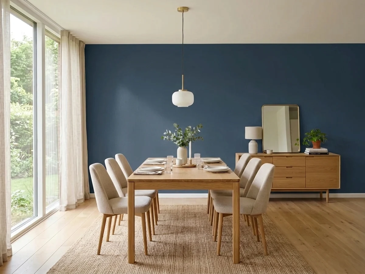
Naval is the dark blue that stays blue. Most navies quietly turn into charcoal on a wall; Naval keeps enough color that people can name it across the room.
The catch is its LRV of 4 — it swallows light, so in a dim room it stops being blue and becomes a flat black shape. Use it where light hits it and it is one of the best dark colors Sherwin-Williams sells.
Kitchen islands and lower cabinets with white uppers · front doors and shutters · a study or bedroom with real windows · anyone who wants dark without going black
The room has one small window or none · you want every cabinet dark in a small kitchen · you hate wiping dust and fingerprints · a sun-baked deck or south-facing wall
- Actually reads blue, not charcoal, in daylight
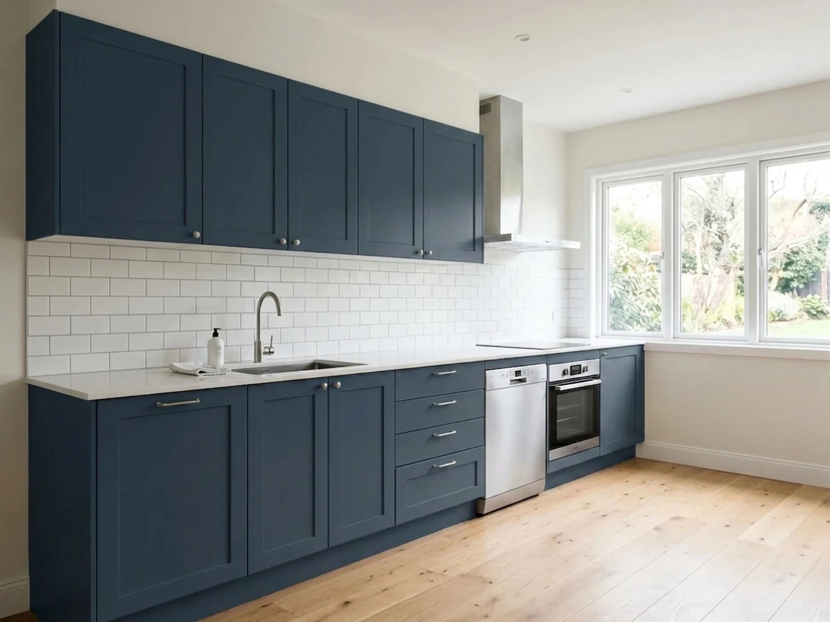
- The island-and-white-uppers kitchen it was made for
- Dark and dramatic without the harshness of true black
- Loves brass, warm oak, and crisp white trim
- Works indoors and out — door, shutters, siding, cabinets
- Goes flat black in dim or windowless rooms
- Shows dust, fingerprints, and every chip on cabinets
- Deep base means two to three coats, and brush touch-ups show
- Can shift grayish-purple in hard sun on horizontal surfaces
What Color Is Naval, Really?
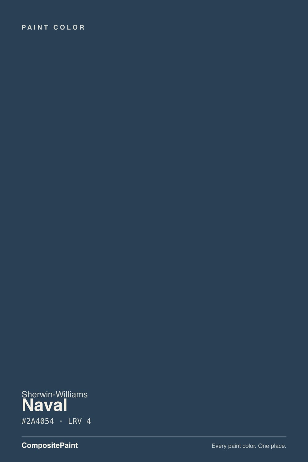
A saturated dark blue with just enough gray to keep it from looking like a child's paint set. That gray is the whole reason it works: it takes the edge off the blue without draining it, so Naval lands between a primary navy and the gray-blues everyone else calls navy. There is no green pull and no teal to speak of. When someone says a color "looks navy" from across a kitchen, this is usually the one they mean.
At LRV 4 it reflects almost nothing — the same neighborhood as a true black. Put it beside Tricorn Black (SW 6258, LRV 3) and you finally see the blue clearly; put it in a hallway with no lamp on and that blue disappears. Compared with Hale Navy (BM HC-154, LRV 6), Naval is a step deeper and clearly more colorful, where Hale Navy behaves like a soft charcoal that happens to be blue. That difference decides most of the arguments people have about these two.
Undertone in one line: cool, honest blue with a light gray mute — never purple, never teal, never green. If your Naval looks purple, check the light source and the sheen before you blame the can; low-angle sun and full sun on a horizontal surface are what push it that way.
Where It Shines
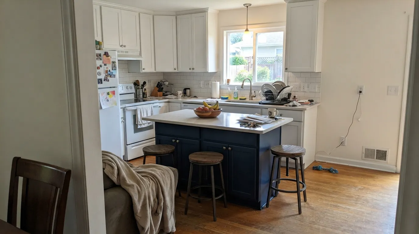
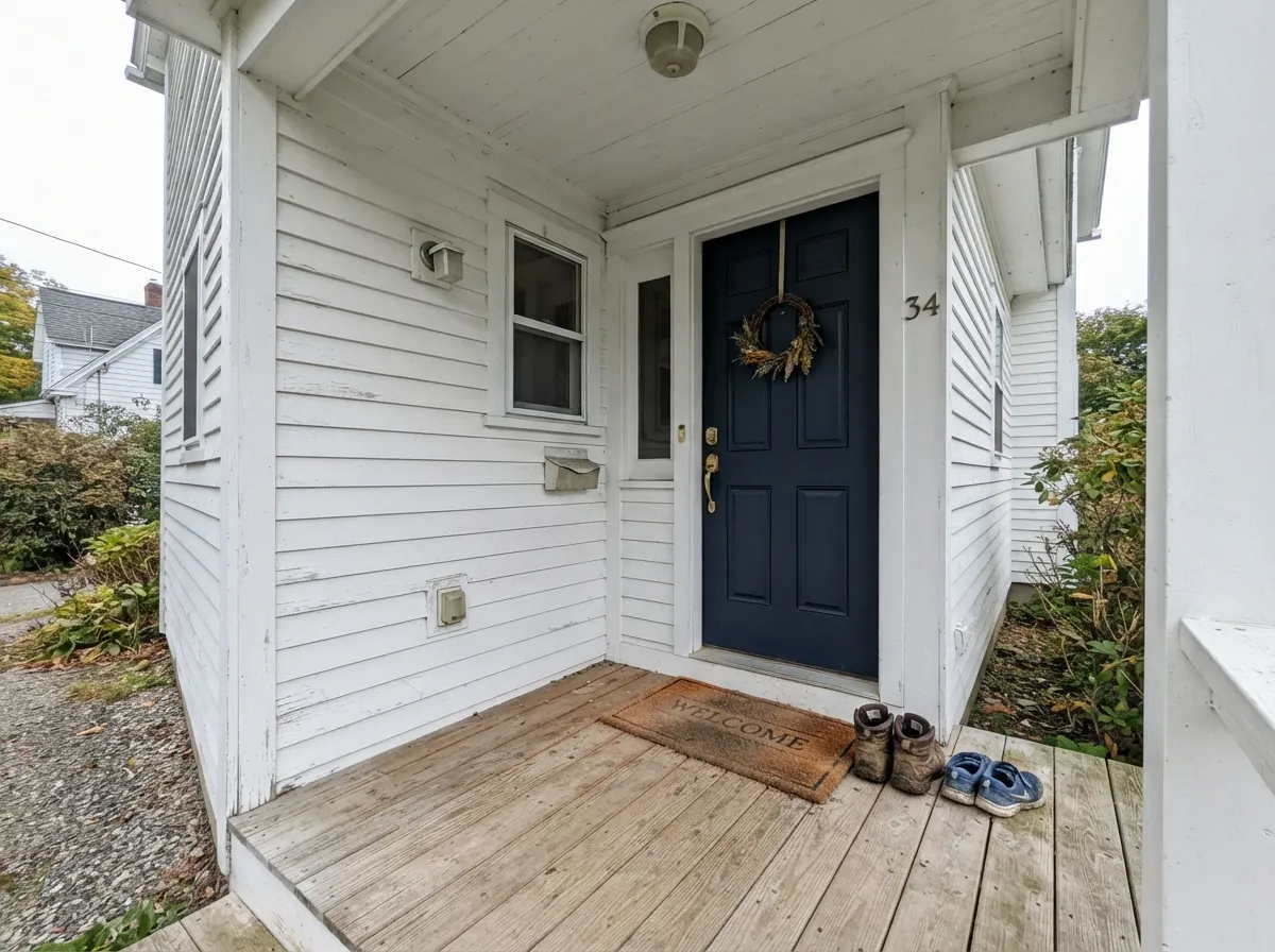
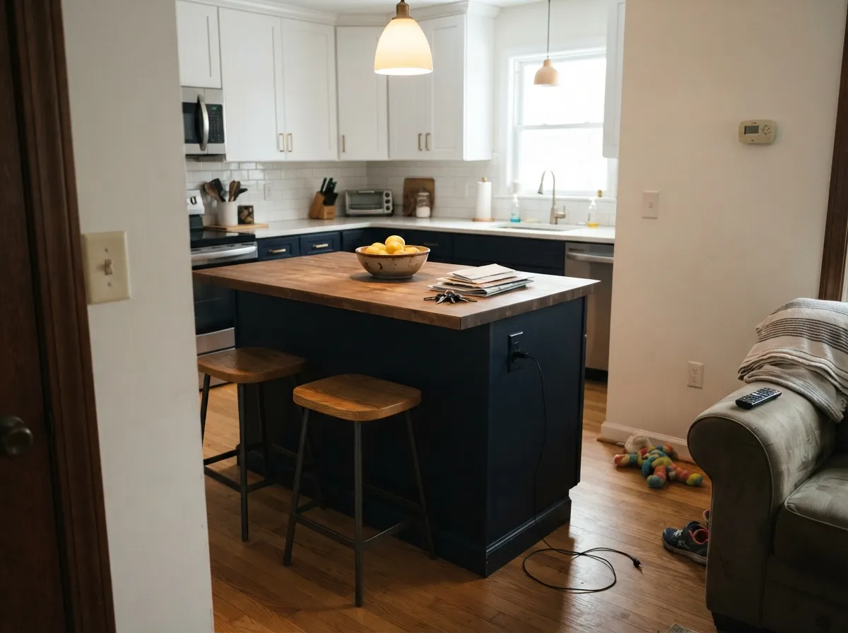
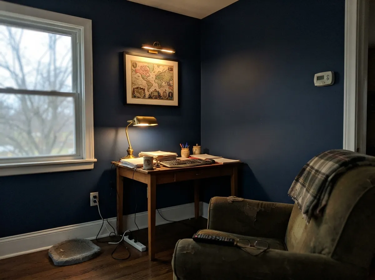
It does its best work as the dark half of a two-color room: a Naval island under white uppers, a Naval door in a white entry, a study where the blue is allowed to close in on purpose. The one thing it needs in every case is a light source pointed at it.

Where It Fails
The complaints about Naval are remarkably consistent, and none of them are mysteries. Three situations account for almost every unhappy story, and you can predict all three before you open the can.
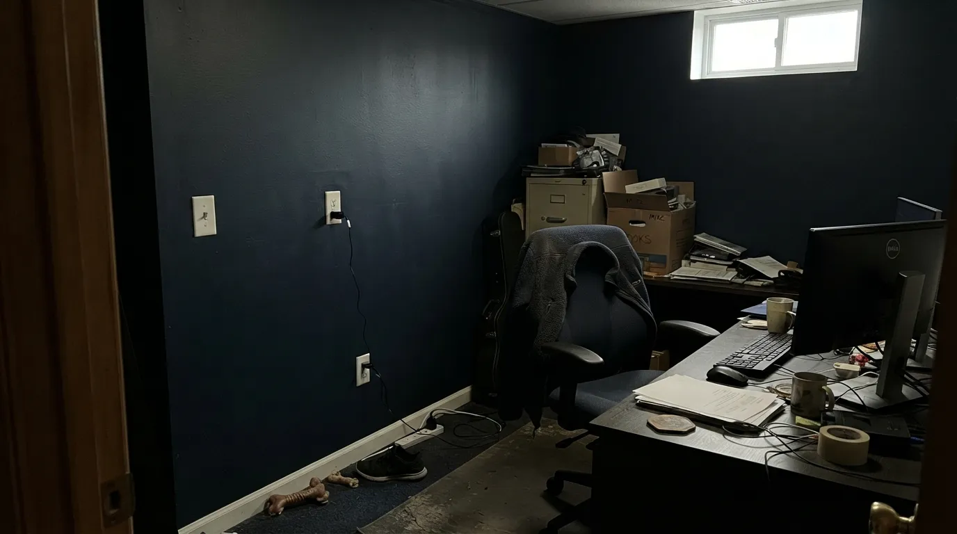
At LRV 4 there is nothing for the eye to work with. The blue drops out, the walls go flat black, and corners stop reading as corners — people describe it as a hole in the house. If you want blue you can still see at dusk, use Indigo Batik (SW 7602, LRV 8) or the grayer Cyberspace (SW 7076, LRV 12).
Naval on the island is a classic; Naval on all of it, uppers included, in a 10x12 kitchen makes the room feel like a closed box, and it kills the counter light you cook by. Keep the uppers Pure White (SW 7005) and the island Naval, or drop the whole kitchen to Cyberspace (SW 7076) if you want dark everywhere.
The unhappiest reports come from horizontal surfaces outdoors, where people say the finished color came out a grayish purple-blue rather than the navy on the chip. Strong low-angle sun plus a flat sheen does that to deep blues, and dark exterior colors on south and west faces fade faster too. For deck boards or big sun-hammered planes, a mid-tone like Peppercorn (SW 7674) holds up better; save Naval for the door, shutters, and shaded elevations.
Room by Room
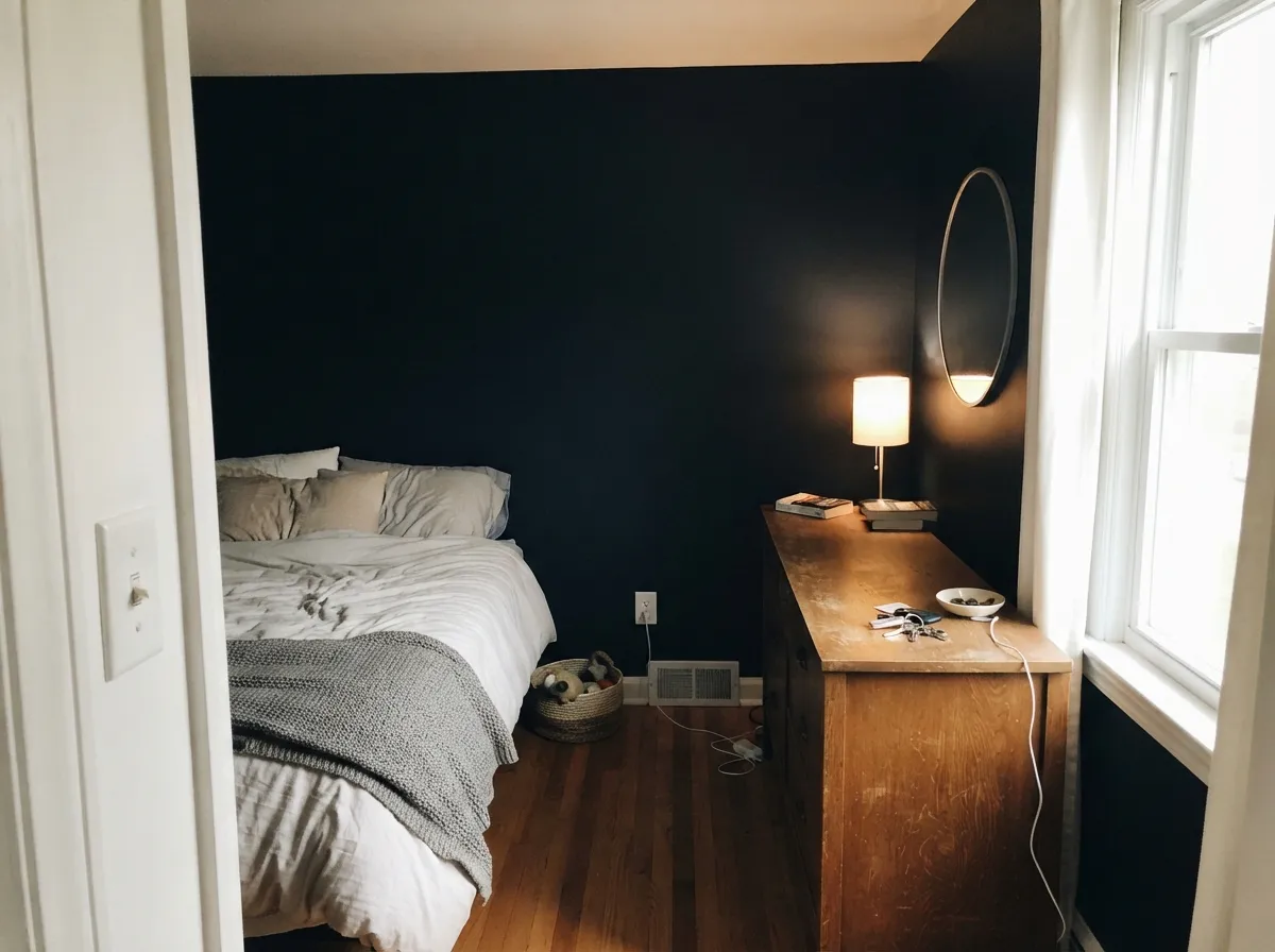
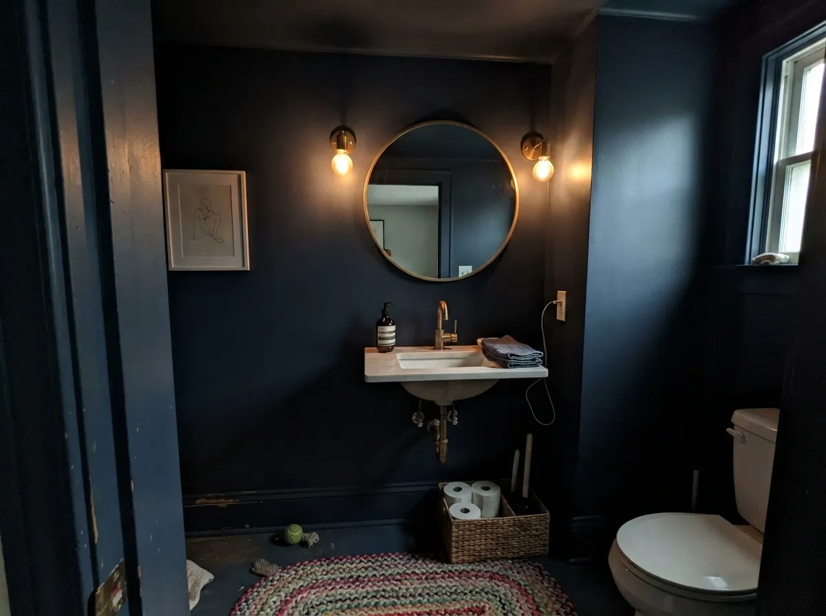
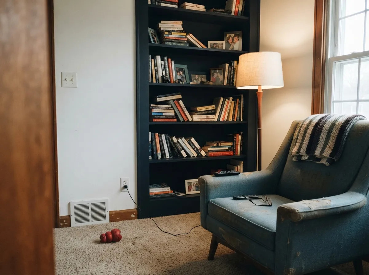
Your Light Is the Risk
Direct sun lifts the blue and the color finally shows its saturation. Midday is its best hour.
Cool, soft daylight has nothing to bounce off LRV 4. Expect near-black walls with a hint of blue at the edges.
Warm 2700K lamps keep it rich and cozy. Cool 4000K LEDs push it cold and stark — swap bulbs, not paint.
Basements, interior hallways, windowless baths: it stops being a color and becomes a black surface.
Most complaints about Naval are a light mismatch. Upload a photo of your actual room and see it on your walls — then ask for the same wall in north light or evening lamps before you buy a single sample.
Need It From Another Brand?
Any paint counter can custom-tint Sherwin-Williams SW 6244 directly. If you would rather stay in one brand's own deck, these are the closest stock matches, measured as ΔE2000. Under 2 is a difference you will not see on the wall.
| Brand | Closest color | ΔE | LRV | |
|---|---|---|---|---|
| Benjamin Moore | North SeaCC-932 · Benjamin Moore | 1.2 | 6 | Color page → |
| Valspar | Gotham Gray4009-3 · Valspar | 2.1 | 4.7 | Color page → |
| Dutch Boy | Ocean's Depth337-7DB · Dutch Boy | 0.0 | 4 | Color page → |
| HGTV Home by Sherwin-Williams | NavalHGSW 3351 · HGTV Home by Sherwin-Williams | 0.0 | 4 | Color page → |
| Dunn-Edwards | Old MillDEA185 · Dunn-Edwards | 4.8 | 5 | Color page → |
| Rodda | MidnightCA210 · Rodda | 4.8 | 5 | Color page → |
Similar Sherwin-Williams Colors
The nearest shades to Naval within Sherwin-Williams's own range, ranked by perceptual color distance — useful when you want the same look a touch lighter, darker, or warmer.
WCAG 2.1: AA is 4.5 : 1 for normal text, 3 : 1 for large text, AAA is 7 : 1.
Naval vs the Colors You're Also Considering
Every Naval sample board has the same rivals on it. The numbers show the real lightness gap — then it comes down to which risk you would rather live with.
Pick this when you want the blue to actually show.
Benjamin Moore HC-154 · LRV 6Hale NavyPick this for a grayer, softer navy that behaves like charcoal.
Side-by-side comparison →Pick this for the deeper, more classic, less coastal navy.
Sherwin-Williams SW 9177 · LRV 5Salty DogPick this for a brighter navy with a slight teal lift.
Side-by-side comparison →Salty Dog (SW 9177, LRV 5) is Naval's closest cousin in the line. It is a touch lighter and reads slightly more saturated and pure blue, while Naval feels a hair deeper and more classic. If you want the navy to lean a little brighter, choose Salty Dog; for the darker, near-black anchor, choose Naval.
Hale Navy (BM HC-154, LRV 6) is the famous comparison. It is noticeably grayer and softer, closer to a charcoal-navy, so it reads less blue and more muted on a wall. Naval is more clearly a saturated navy. Pick Hale Navy for a subtle, moody neutral-navy and Naval when you want the blue to show.
Indigo Batik (SW 7602, LRV 8) is lighter again and reads as a true medium blue you can actually use across full walls without going near-black. Use it when Naval feels too dark for the space.
Naval Coordinating Colors
Naval is the dark note in a scheme, so its partners have one job: put light back in the room. Bright whites work better than creamy ones here — cream reads slightly yellow against a saturated blue. Warm mid-tones on the walls stop the navy from feeling cold, and a warm dark like bronze gives you a second deep color that does not compete. These are the pairings that come up again and again:
Naval on Cabinets and Islands
This is where most people meet the color, and the split-level rule holds up: dark below, light above. Naval on the island and lower run with white uppers keeps counter light where you need it, and the room still gets the drama. Going dark on every door in a small kitchen is the single most common regret — designers who love this color still steer clients to the island or the vanity when the room is under about 120 square feet.
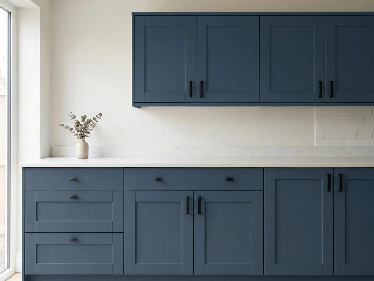
Practically, use a waterborne urethane cabinet enamel in satin, spray it if you can, and tint your primer gray. Two coats over tinted primer is normal; over bare white doors, budget three. Live with the maintenance honestly: navy shows dust film and knuckle marks, so hardware on every door and a touch-up jar in the cabinet under the sink are not optional. Warm brass or unlacquered bronze pulls look better against Naval than polished chrome, which reads cold next to it.
Naval on Exteriors and Front Doors
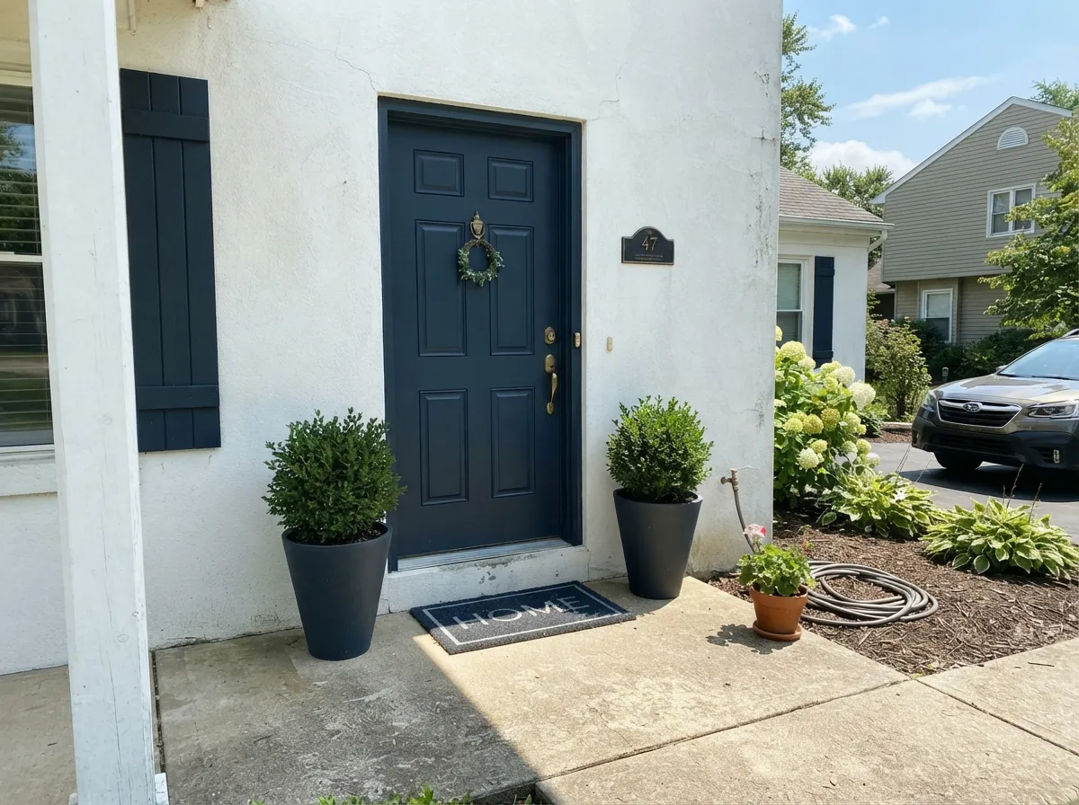
Outside, Naval behaves like a near-black with a blue soul, and that is a compliment. On siding with Extra White (SW 7006) trim it gives you the dark-house look without the heat-sink flatness of true black, and it sits comfortably with gray stone, cedar, and standing-seam metal. On a front door it is close to a default choice for white and light-gray houses.
Two honest warnings. Dark exterior colors fade fastest on south and west faces, so a door or shutter set in afternoon sun will want a refresh coat sooner than the shaded sides of the house. And on big horizontal surfaces — deck boards, a sunny porch floor — deep blues can come out looking grayish purple rather than navy, which is the exact complaint homeowners report after the deck dries. Sample on the actual surface, in the actual sun, before you commit a whole deck to it.
Three Ready Palettes Built on Naval
A color is never alone on the wall. These are complete combinations in the 60-30-10 pattern, with the reason each one holds together. Every one opens in the visualizer.
Naval takes the lower 60 percent of the eye line where dark belongs, so the counters still get their light back off white uppers. Accessible Beige warms the room enough that the navy reads rich instead of cold.
Try this palette in your roomOne color on walls and trim removes the contrast lines, which is what makes a small dark room feel deliberate rather than cramped. The soft white ceiling gives the eye somewhere to rest, and Ripe Olive adds a warm green note behind the books.
Try this palette in your roomExtra White at LRV 86 against Naval at 4 is the maximum contrast that still looks traditional, and bright white keeps the blue crisp under a gray sky. Urbane Bronze on the door adds the one warm note that stops the facade from feeling like a uniform.
Try this palette in your roomNaval FAQ
Does Naval just look black?
In good daylight, no — the blue is clear and people name it correctly across a room. In a dim room, at night without lamps, or in a flat sheen on a shaded wall, yes, it reads as a near-black. Hold it beside Tricorn Black (SW 6258) in the actual room; if you cannot tell them apart there, the room does not have enough light for Naval.
How many coats does it take, and do I need primer?
Two coats over a gray-tinted primer, and plan on three if you skip the primer or you are covering white cabinets. Naval is a deep-base color, so it goes on thin and translucent at first — that patchy first coat is normal, not a bad batch. Buy the primer tinted to about 50 percent Naval and you will usually save a coat.
Naval or Salty Dog for kitchen cabinets?
Naval is the deeper, more traditional navy; Salty Dog (SW 9177) is a touch lighter with a slight teal lift that reads more coastal. In a kitchen with warm wood and brass, Naval sits better. With cool marble, white quartz, and chrome, Salty Dog looks livelier and less like black.
Does it show fingerprints and dust on cabinets?
Yes, more than any mid-tone. Dark navy shows dust film on flat door faces, fingerprints around handles, and every chip at the edges. Use a satin urethane cabinet enamel, put pulls on every door so hands land on metal, and keep a small labeled touch-up jar — dab with a foam applicator, never a bristle brush, or the repair will show.
Can I paint a whole small room Naval?
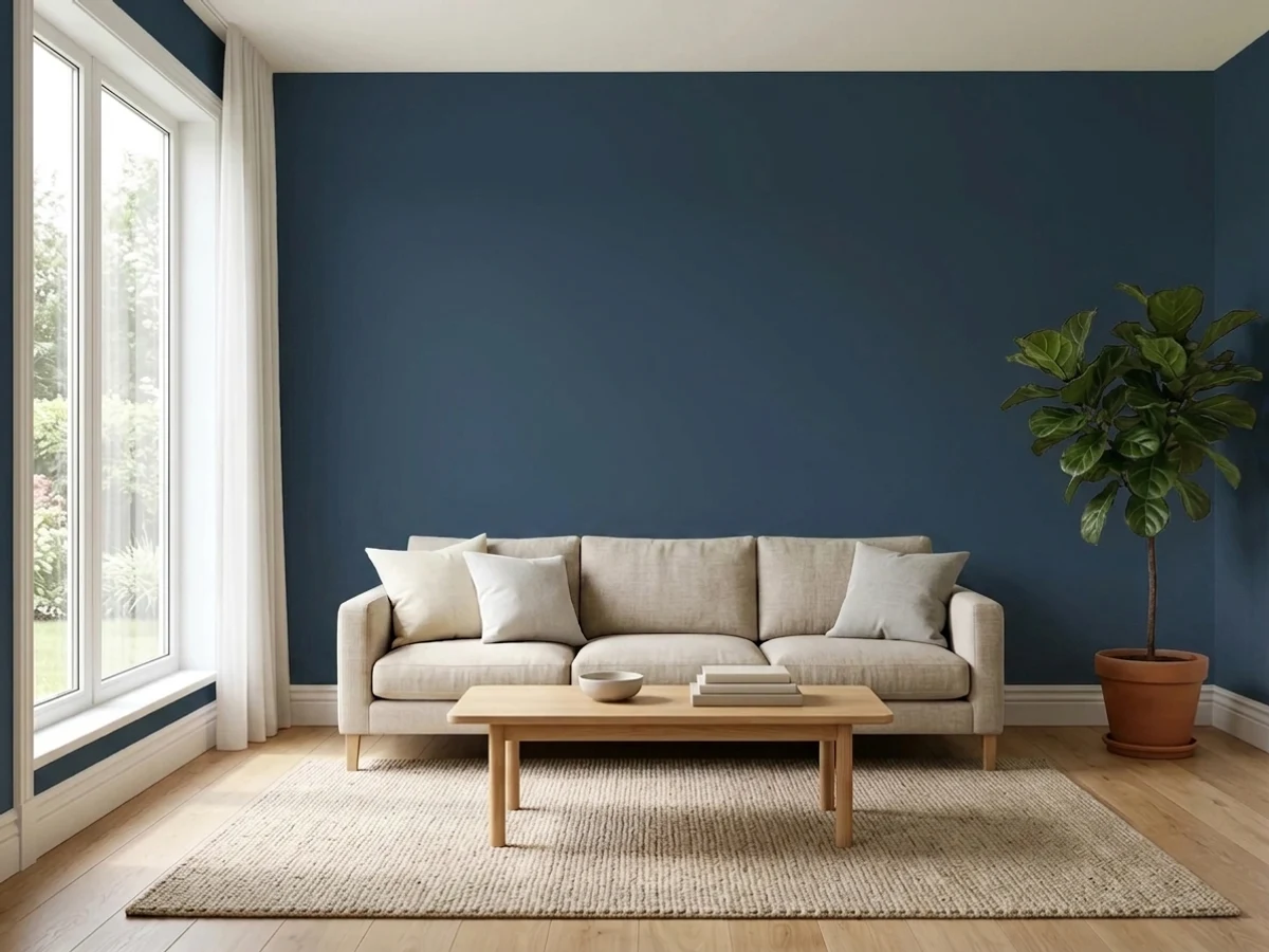
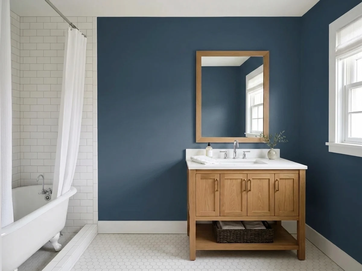
Yes, if you commit. Walls, trim, and ceiling all Naval works far better in a powder room or small study than Naval walls with white trim, because the contrast lines are what make a small dark room feel boxed in. What does not work is one small window, no lamps, and an expectation that it will look blue.
What sheen should I use?
Matte or eggshell on walls — flat sheens hide roller lap marks that dark colors love to show. Satin on cabinets, islands, and exterior doors so it wipes clean. Skip semi-gloss on large flat walls: at this depth, gloss turns every drywall imperfection into a highlight.
Does Naval work with warm wood floors and beige walls?
That is one of its most reliable setups. Gunstock or honey oak floors, Accessible Beige (SW 7036) walls, Naval cabinets, and Pure White (SW 7005) trim is a combination designers use constantly. Keep the trim white bright rather than creamy — a soft white like Alabaster can look slightly yellow where it meets the navy.
Have you painted with Naval?
Rate it — one tap helps the next reader decide.
Ask a Question