Gale Force
The green-leaning navy every kitchen designer knows and most homeowners don't, reviewed honestly: where it turns rich, the light that turns it black, and what to pick instead.

Jessica has spec'd whites and neutrals for more than 300 rooms and keeps a sample wall of painted drawdowns in her studio. Every color review is checked against real reader rooms in the comments and re-tested when a formula changes. About the testing process →
- 1Gale Force6
- 2Hidden Gem14
- 3Van Courtland Blue31
The Fast Verdict
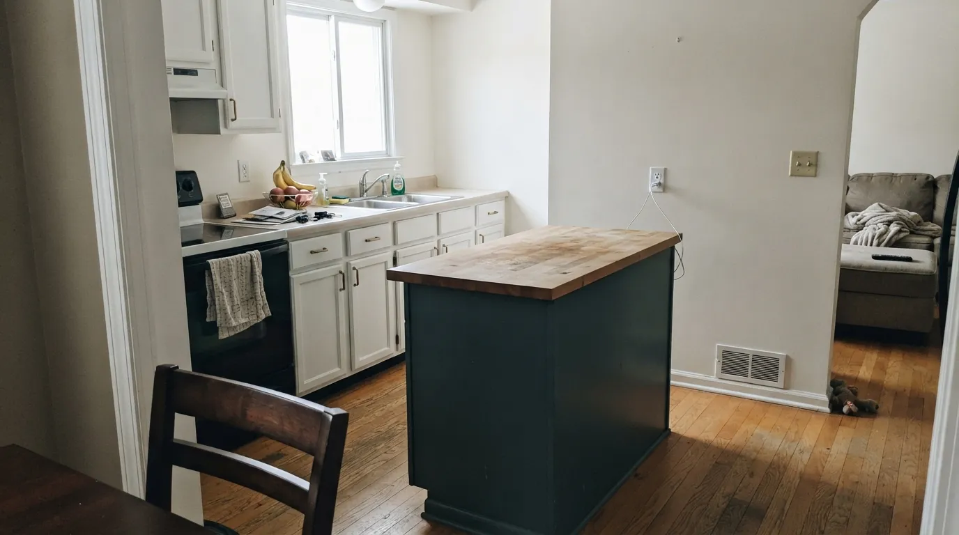
Gale Force is what you get when a navy stops pretending it's only blue. Sherwin-Williams files it under teal, not blue, and on the wall you can see why — a deep, cool blue-green-gray that reads almost black in shade and turns genuinely colorful the second real daylight hits it. It has quietly become a kitchen-island and front-door staple without ever getting a Color of the Year headline, which makes it a workhorse pick, not a trend bet.
Kitchen islands and cabinetry · front doors and shutters · built-ins with real daylight nearby · anyone who wants navy-adjacent drama with more personality than a flat blue
Your room has no real daylight · you want an unambiguous, no-green navy like Naval · you're judging it only under warm lamp light at night · you want the whole room in it with no white trim relief
- Genuine blue-green complexity — reads richer than a flat navy
- Kitchen islands and built-ins look custom, not just "dark"
- Front doors and shutters pop against light siding in real sun
- Hides scuffs and fingerprints well on cabinetry
- Warms up beautifully next to brass and walnut
- LRV 6 collapses to flat near-black without real daylight
- Not a true navy — the green surprises buyers expecting Hale Navy or Naval
- Whole-room use with no white relief reads like a cave
- Harder to preview confidently than most darks — shifts more between sun and shade
What Color Is Gale Force, Really?
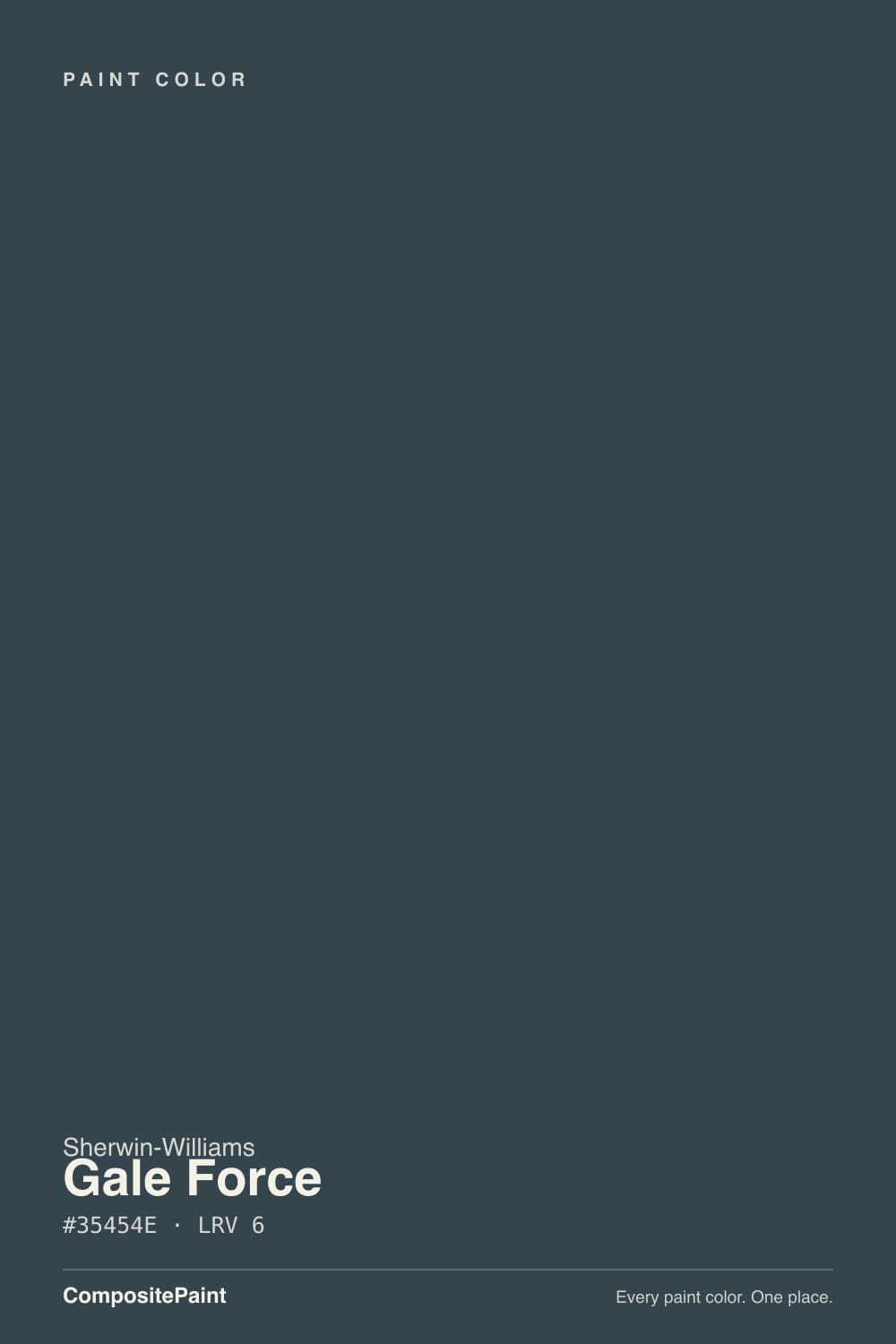
A deep, cool blue-green with a gray backbone — the green is not a rumor, it is the whole identity. Sherwin-Williams' own deck classifies Gale Force under the teal family rather than blue, and that filing matches what happens on the wall: next to a true navy like Naval, Gale Force noticeably leans green, especially in daylight. It reads as a moodier, earthier cousin of navy rather than navy itself, which is exactly why designers reach for it when a client wants "not another Hale Navy."
At LRV 6 it is genuinely dark — in the same near-black range as Sherwin-Williams' own Iron Ore (LRV 6) and just a shade lighter than Naval (LRV 4). That depth means it absorbs almost all the light that hits it: with strong daylight it holds its blue-green color and looks rich, almost jewel-toned; without daylight it collapses toward a flat charcoal-black and the color identity disappears. Put it next to a white like Alabaster (LRV 82) and the gap is enormous — that contrast is the tool, not a problem, and it is why the color earns its keep on a single island or door rather than a whole dim room.
Undertone in one line: blue-green first, gray second, never a clean, uncomplicated navy. If your sample reads like plain black in your kitchen, that is a light problem, not a paint problem — walk it to a window before judging it.
Where It Shines
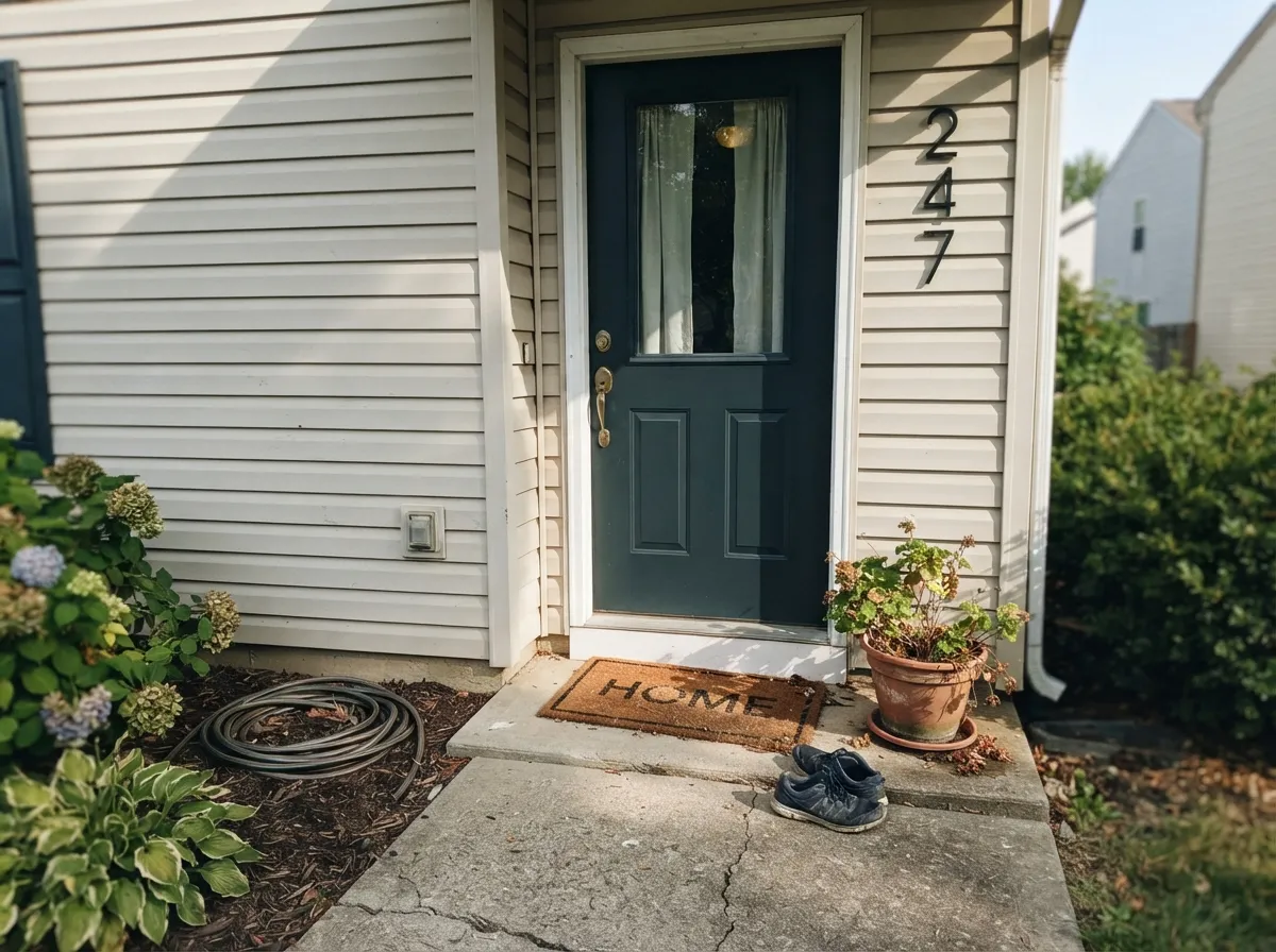
Give it a single surface and real daylight and it earns its reputation fast. On a kitchen island under white or light-wood perimeter cabinets, it reads custom and expensive, especially against brass or warm walnut. On an exterior front door — its other classic job — full sun brings the blue-green forward against light siding and it reads as a deliberate, sophisticated color choice rather than "just a dark door." It is a color built for one confident surface, not four walls of a dim room.
Where It Fails
Almost every disappointed review of Gale Force traces back to one of three setups, and all three are predictable before the first coat goes on. None of them are the paint's fault — but if your plan matches one, sample it hard before you commit a whole island or a whole room.
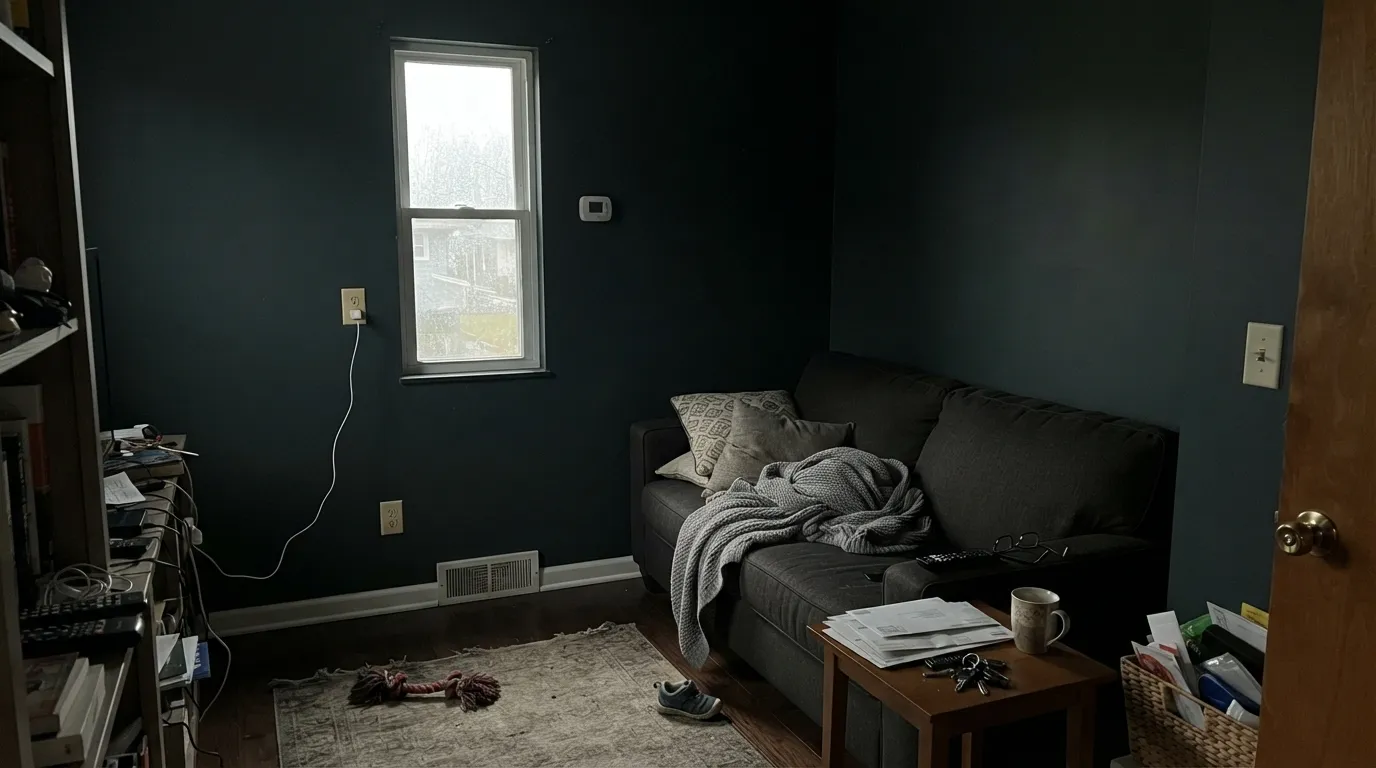
At LRV 6, Gale Force needs light to prove it is a color at all. In a shaded kitchen, a north-facing den, or under nothing but recessed cans, it reads as a flat, featureless near-black — the blue-green complexity readers loved in the fan deck simply never shows up. If the surface doesn't get real daylight at some point in the day, this is not the color to bet on.
Buyers coming from Naval or Hale Navy sometimes expect the same clean blue and get a color that visibly leans toward teal-green, particularly in daylight. It is not a defect — it is the color's whole point — but if "navy, no green" is a hard requirement, Gale Force will read as the wrong choice the moment the sample goes up.
Painted floor-to-ceiling in a small room with no trim break, no white ceiling, no light furniture to bounce light around, Gale Force swallows the space instead of grounding it. It was built to anchor one surface against lighter neighbors, not to be the only color in the room.
Room by Room
Under white or light perimeter cabinets, with brass or matte-black hardware, it is the classic anchoring island color. Satin urethane-fortified cabinet enamel; make sure the island gets some of the room's daylight, not just the range-hood light.
Full sun reads it as rich blue-green rather than plain dark; pair with light or mid-tone siding so the door has something to contrast against. Semi-gloss exterior enamel for durability.
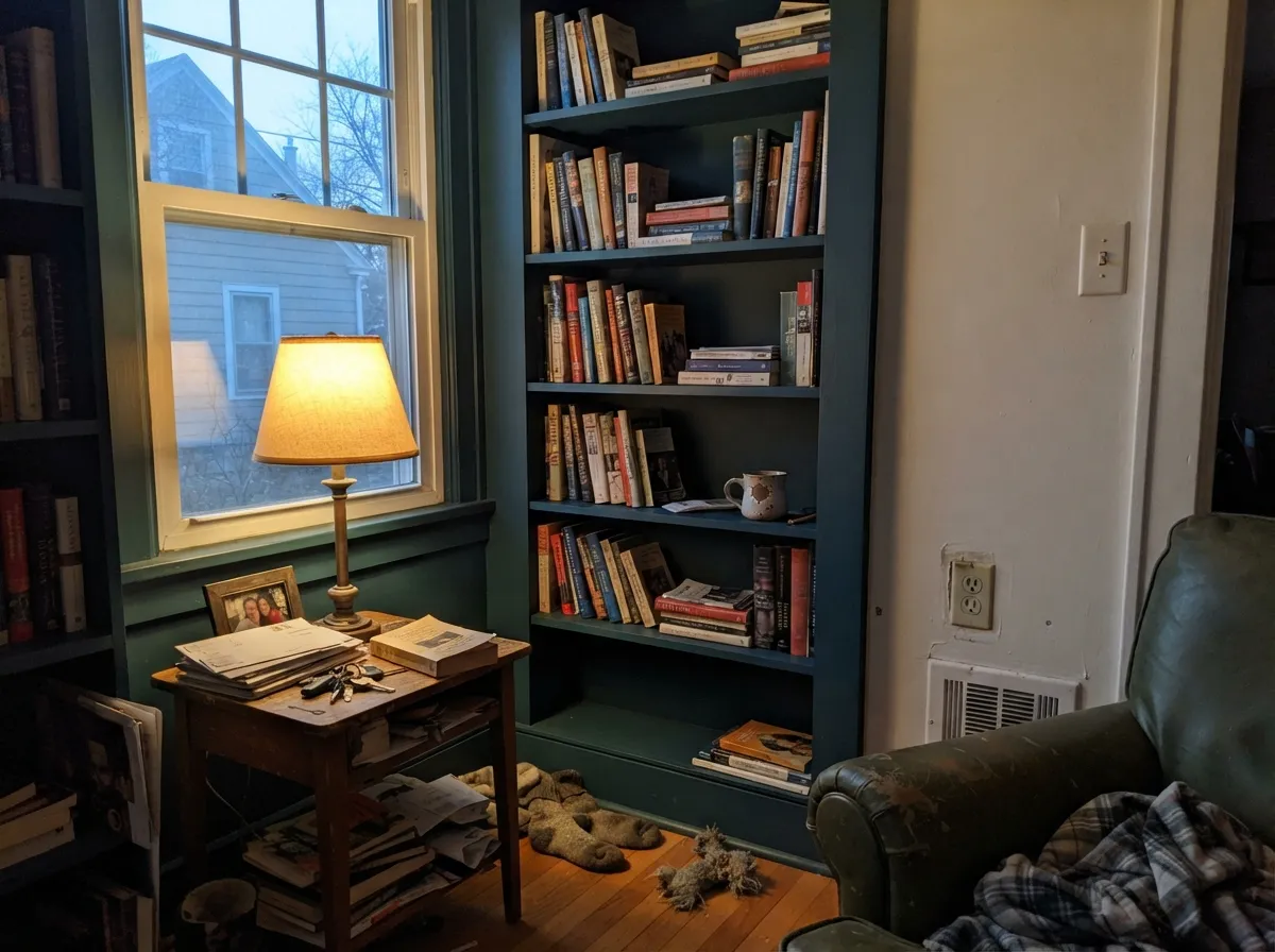
A library wall, a wet bar, or a media built-in near a window reads sophisticated and jewel-toned at night under warm lamps. Keep it off the wall that gets zero daylight all day.
One accent wall that catches real daylight for part of the day works beautifully. The same wall in a windowless hallway or a basement rec room goes flat and forgettable.
Works in a large, light-filled room with white trim and ceiling for relief. In a small or dim room it reads like a cave; step up in LRV or keep it to one wall instead.
A vanity under a window or a strong vanity light shows the blue-green beautifully against marble or white tile. Skip it on a windowless powder room vanity lit only by a single bulb.
Your Light Is the Risk
Real sun brings the blue-green forward and it reads rich and jewel-toned, not black. The light this color was made for.
Without direct sun it reads flat, featureless near-black — the color identity disappears. Test on the actual surface, not just a swatch on a bright wall nearby.
Cooler and more blue-black in early morning light, then the green comes forward as the sun gets warmer through the afternoon.
2700K warm bulbs pull the green forward into a teal-charcoal glow. Cool white LEDs push it back toward flat blue-black — pick your bulbs on purpose.
Most complaints about Gale Force are a light mismatch. Upload a photo of your actual room and see it on your walls — then ask for the same wall in north light or evening lamps before you buy a single sample.
Need It From Another Brand?
Any paint counter can custom-tint Sherwin-Williams SW 7605 directly. If you would rather stay in one brand's own deck, these are the closest stock matches, measured as ΔE2000. Under 2 is a difference you will not see on the wall.
| Brand | Closest color | ΔE | LRV | |
|---|---|---|---|---|
| Behr | Sled750F-6 · Behr | 1.6 | 5 | Color page → |
| Benjamin Moore | Gentleman's Gray2062-20 · Benjamin Moore | 3.3 | 7 | Color page → |
| Valspar | Dutch Licorice4008-4C · Valspar | 2.1 | 5.5 | Color page → |
| PPG / Glidden | Midnight HourPPG1038-7 · PPG / Glidden | 1.5 | 6 | Color page → |
| Glidden | Midnight HourPPG1038-7 · Glidden | 1.7 | 6 | Color page → |
| Dutch Boy | Mariana Blue334-7DB · Dutch Boy | 4.8 | 5 | Color page → |
Similar Sherwin-Williams Colors
The nearest shades to Gale Force within Sherwin-Williams's own range, ranked by perceptual color distance — useful when you want the same look a touch lighter, darker, or warmer.
WCAG 2.1: AA is 4.5 : 1 for normal text, 3 : 1 for large text, AAA is 7 : 1.
Gale Force vs the Colors You're Also Considering
Every Gale Force sample board has the same rivals on it. The numbers show the real lightness gap — then it comes down to which risk you would rather live with.
Pick this for the earthier, blue-green complexity Naval simply doesn't have.
Sherwin-Williams SW 6244 · LRV 4NavalPick this if you want a true, unambiguous navy with no green — Naval still reads navy in every light.
Pick this for a more distinct blue-green identity instead of a quiet neutral-leaning dark.
Sherwin-Williams SW 7964 · LRV 7CyberspacePick this for a calmer, grayer dark that never flashes green, once the room has light to give it.
In the Sherwin-Williams deck, Charcoal Blue (SW 2739) at LRV 6 sits at the same depth but leans more toward blue-violet and less toward teal. Mount Etna (SW 7625) at LRV 6 and Big Dipper (SW 9645) at LRV 6 both trade some blue for gray-green, so they read grayer on a wall. Rainstorm (SW 6230) and Moscow Midnight (SW 9142), both at LRV 5, are darker and noticeably more saturated blue-teal, which makes them read as color where Gale Force reads as near-black. Sea Serpent (SW 7615) at LRV 7 is the closest lighter option. Across brands, PPG and Glidden Midnight Hour (PPG1038-7) at a deltaE of 1.52, Behr Sled (750F-6) at 1.55, and C2 Paint Espionage (C2-742) at 1.77 are all visually identical in normal room light. Valspar Dutch Licorice (4008-4C) at 2.14 is very close, so sample first. Benjamin Moore Gentleman's Gray (2062-20) at 3.32 is close but visibly bluer side by side.
Gale Force Coordinating Colors
The rule for coordinating with Gale Force is simple: give it light neighbors and let it do the dark, saturated work alone. It pairs best with soft-to-bright whites, warm greiges, and one mid-dark bridge color if you need to layer toward it gradually — and it wants brass or warm wood nearby to soften its cool edge. These are the partners that keep showing up in rooms that work:
The Quiet Workhorse, Not the Headline Navy
Gale Force has never had a Color of the Year moment, and there is no viral room built entirely around it — the loud headlines in this part of the deck belong to Naval and Hale Navy. What it has instead is a steady, unglamorous reputation among kitchen designers and cabinet painters as the color you reach for when a client wants a dark island or a statement door that reads as more than just navy. It shows up constantly in kitchen-cabinet spotlight posts and custom-cabinet color charts, rarely in magazine trend round-ups.
That obscurity is honest, not a flaw. A color that has quietly done island and front-door duty for years without needing a marketing push is a genuinely dependable pick — it is just not the color to reach for if you specifically want the bragging rights of a famous name.
Gale Force With Wood Tones and Metals
Warm wood is the easy pairing: walnut, white oak, and butcher block all soften the color's cool edge and keep an island or built-in from feeling stark. Honey oak works too, though the contrast is stronger and more traditional-farmhouse than the walnut pairing, which reads more modern.
Metals split cleanly: unlacquered brass and warm brushed gold are the classic match and the reason it shows up on so many islands with brass pulls. Matte black hardware also works, for a more graphic, less warm look. Polished chrome and cool nickel are the one combination to sample first — they can push the whole pairing colder than most rooms want.
Three Ready Palettes Built on Gale Force
A color is never alone on the wall. These are complete combinations in the 60-30-10 pattern, with the reason each one holds together. Every one opens in the visualizer.
White Dove on the perimeter keeps the kitchen bright enough for the island to read as a deliberate anchor instead of a hole in the room; warm-greige walls bridge the two without competing with either.
Try this palette in your roomLight siding and a sharper white trim give the door maximum contrast to work with, so full sun reads Gale Force as rich blue-green instead of a plain dark blob against a busier facade.
Try this palette in your roomWhite Dove walls keep the room from going cave-dark, the built-ins get to carry the color, and Kendall Charcoal gives one mid-dark bridge between the near-black cabinetry and the soft white walls so the room reads layered, not two-toned.
Try this palette in your roomGale Force FAQ
Is Gale Force blue or green?
Both, honestly — Sherwin-Williams itself files it under the teal family rather than blue. In daylight the green comes forward noticeably; in shade or under cool bulbs it reads closer to a plain dark blue-black. If you want a color with zero green in it, look at Naval instead.
Is it good for a kitchen island?
Yes — it is one of its most common jobs. Pair it with white or light perimeter cabinets, satin urethane-fortified cabinet enamel, and make sure the island gets some real daylight during the day so the blue-green doesn't collapse into flat black.
What white goes with Gale Force?
A soft white like White Dove keeps the pairing warm and calm; a brighter white like Extra White or Alabaster gives the sharpest contrast, which is usually what you want against a dark exterior door. Avoid a dull, yellowed white — it will make the Gale Force look muddy instead of rich.
Does it work on a front door?
Yes, it is one of the color's classic jobs. Full sun brings the blue-green forward against light or mid-tone siding. A shaded, north-facing door on a dark house is the one situation to sample carefully first — it can read closer to plain black there.
Is Gale Force darker than Naval?
Almost the same depth, but not quite — Naval is LRV 4, Gale Force is LRV 6, so Gale Force is very slightly lighter. The bigger difference isn't depth, it's undertone: Naval reads as clean navy in nearly any light, while Gale Force visibly leans blue-green, especially in daylight.
Will it look black in a dim room?
Close to it. At LRV 6, without real daylight hitting the surface, Gale Force reads as a flat, featureless near-black and the blue-green character that makes the color interesting simply doesn't show. Save it for a surface that gets some direct light during the day.
Have you painted with Gale Force?
Rate it — one tap helps the next reader decide.
Ask a Question