Gentleman's Gray
A near-black teal-blue reviewed honestly: the misleading name, the light it needs to prove it isn't plain black, and the rooms where that trade pays off.

Jessica has spec'd whites and neutrals for more than 300 rooms and keeps a sample wall of painted drawdowns in her studio. Every color review is checked against real reader rooms in the comments and re-tested when a formula changes. About the testing process →
- 1Nightlife2
- 2Gentleman's Gray7
- 3Waterloo13
- 4Charcoal Blue19
The Fast Verdict
Gentleman's Gray is a deep, dressed-up teal-blue wearing a gray name it doesn't earn. At LRV 7 it sits right at the edge of black, and in a dim room that's exactly what it reads as — flat, featureless near-black, occasionally flashing purple in the corners on an overcast day. Give it real daylight or a warm bulb and the blue-green comes forward, tailored and a little moody, like a good navy suit under evening light. It has no Color-of-the-Year run and no viral before-and-after — it's a quiet workhorse most often seen doing one job at a time: a front door, a kitchen island, a built-in. It is not a whole-house color, and it never tried to be.
Front doors and covered porches with some light · kitchen islands under lighter perimeter cabinets · dens, libraries and home offices with lamps · powder rooms and built-ins · anyone who finds Hale Navy too obviously blue and wants something closer to black
You actually want a neutral gray, not blue-green · the room is dim, north-facing and lamp-free · you're painting an entire room with no accent light · your trim and hardware are all cool white and chrome
- Reads as a tailored blue-black, not plain flat black — genuinely more interesting up close
- The front door / island / built-in trick: a small, confident dose without committing a whole room
- Hides fingerprints and scuffs better than a true black would show
- Pairs cleanly with brass, walnut, and warm white trim
- A real alternative for anyone who finds Hale Navy too obviously blue
- Not actually gray, despite the name — a real blue undertone shows on any real surface
- LRV 7 is genuinely dark; without a light source it goes flat and featureless
- Too heavy for a full room without daylight or warm evening light
- Cool white trim or chrome hardware makes it read muddy instead of tailored
What Color Is Gentleman's Gray, Really?
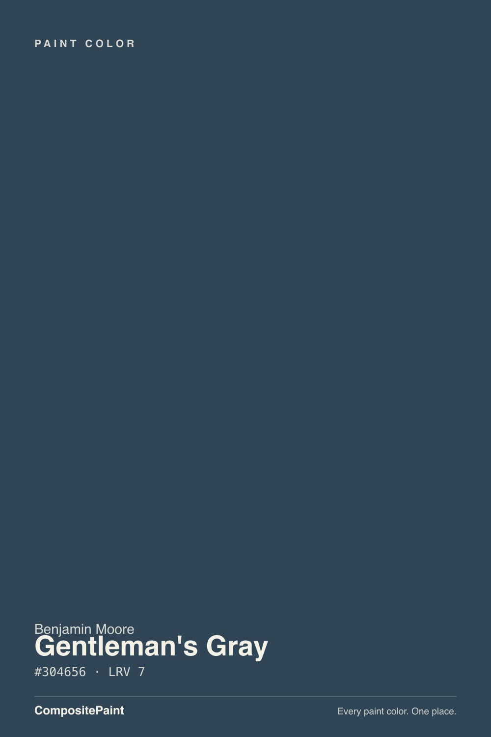
The name is doing marketing work the paint itself doesn't deliver: Gentleman's Gray is not a neutral gray. Reviewers who've actually rolled it describe a dark teal blue with subtle charcoal undertones, or a navy grayed with a quiet slate-green base — a couple even land on "blackened teal blue." Whatever the exact words, the pattern across independent color reviews is the same: this reads as a rich, sophisticated dark blue-green, not the neutral its name promises, and buyers expecting literal gray are consistently surprised.
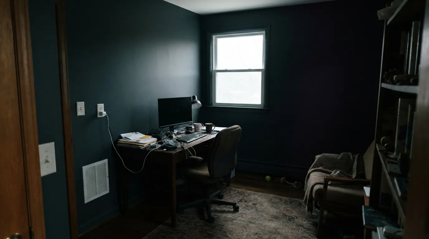
At LRV 7 it is genuinely dark, on par with a true near-black rather than a moody mid-tone. That depth is the whole trade: it absorbs almost all the light that hits it, so in a dim room it goes flat and featureless — reviewers describe it leaning almost navy or black in the corners of north-facing rooms, occasionally with a flash of purple where the shadow is deepest. Give it a real light source, daylight or a warm bulb, and the teal-blue reasserts itself, brighter and more clearly blue-green in a south-facing or well-lit room. This is a color that needs light to prove what it is.
Undertone in one line: blue-green (teal) first, with a charcoal base holding it down — never a clean, temperature-neutral gray. If your sample looks straight black or flashes purple in a dim corner, that's the light doing it, not a bad can of paint; move it toward a window or a lamp before you judge it.
Where It Shines
This color earns its keep in small, decisive doses with real light behind them. A front door under a porch light, a kitchen island between two windows, a den wall that catches a lamp every evening — that's where the blue comes alive and the color reads as deliberate and expensive rather than simply dark. It is the practical way to use near-black: commit a door or an island instead of a whole room, and let brass, walnut and a warm white trim do the rest of the work.
Where It Fails
Almost every disappointed review of Gentleman's Gray comes from one of three mismatches, and all three are visible before the first coat goes on. None of them are the paint failing — they're the paint being asked to do a job LRV 7 was never going to do.
The name promises gray; the can delivers a dark teal blue. On a 2-inch chip most people read it as charcoal. On four walls, or a full island, the blue-green is unmistakable — it's the single most repeated line in independent reviews of this color: "it's not actually gray." If gray is the actual goal, look at Kendall Charcoal instead and let this one stay a specialty color.
LRV 7 is already near the floor of the deck. Take away daylight and warm bulbs and there's nothing left to reveal the blue — the wall just goes flat black, and the room feels smaller and heavier instead of moody. This color needs a light source in the room; it will not create atmosphere on its own.
Cool white trim, cool white quartz, chrome hardware — all of it pulls Gentleman's Gray toward muddy and cold instead of tailored. Readers describe the combination as looking unfinished or dirty rather than intentional. Warm trim (White Dove), brass or warm bronze hardware, and wood grain fix this; stark cool white does not.
Room by Room
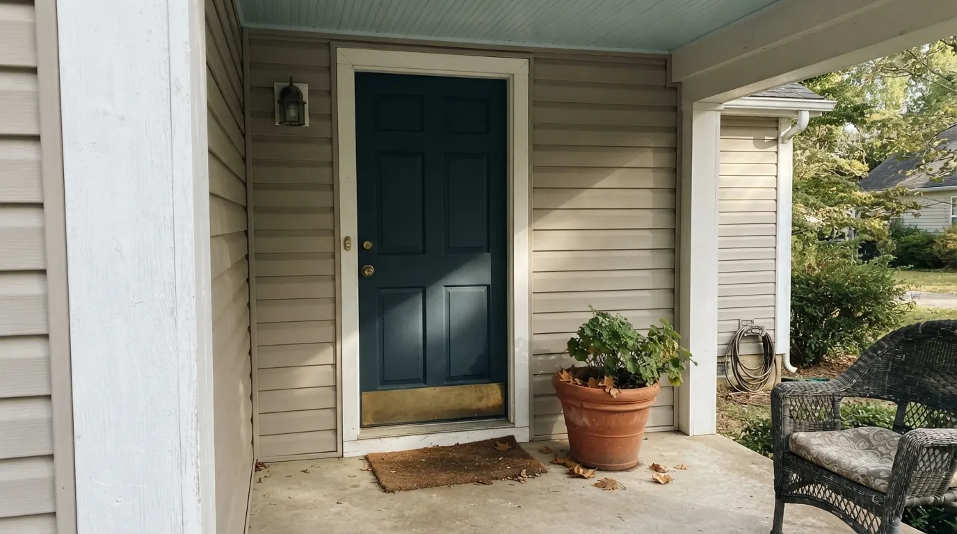
A covered porch with some ambient light is the classic home for this color: it reads as a tailored blue-black rather than plain black, and it holds up against brass hardware and a warm-white house body. Semi-gloss, and check the porch light at night — a bare bulb with no fixture will flatten it.
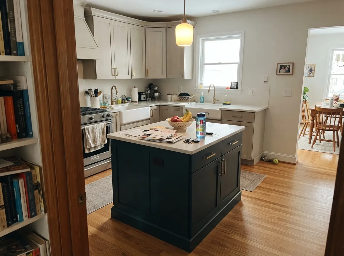
This is the color's single most common real job — Houzz and Pinterest are full of it. Pale Oak or another light, warm perimeter keeps the island from reading as a dark hole; between two windows or under real fixture light it anchors the room without going full black, and it hides fingerprints and scuffs better than a true black would show. Satin cabinet enamel.
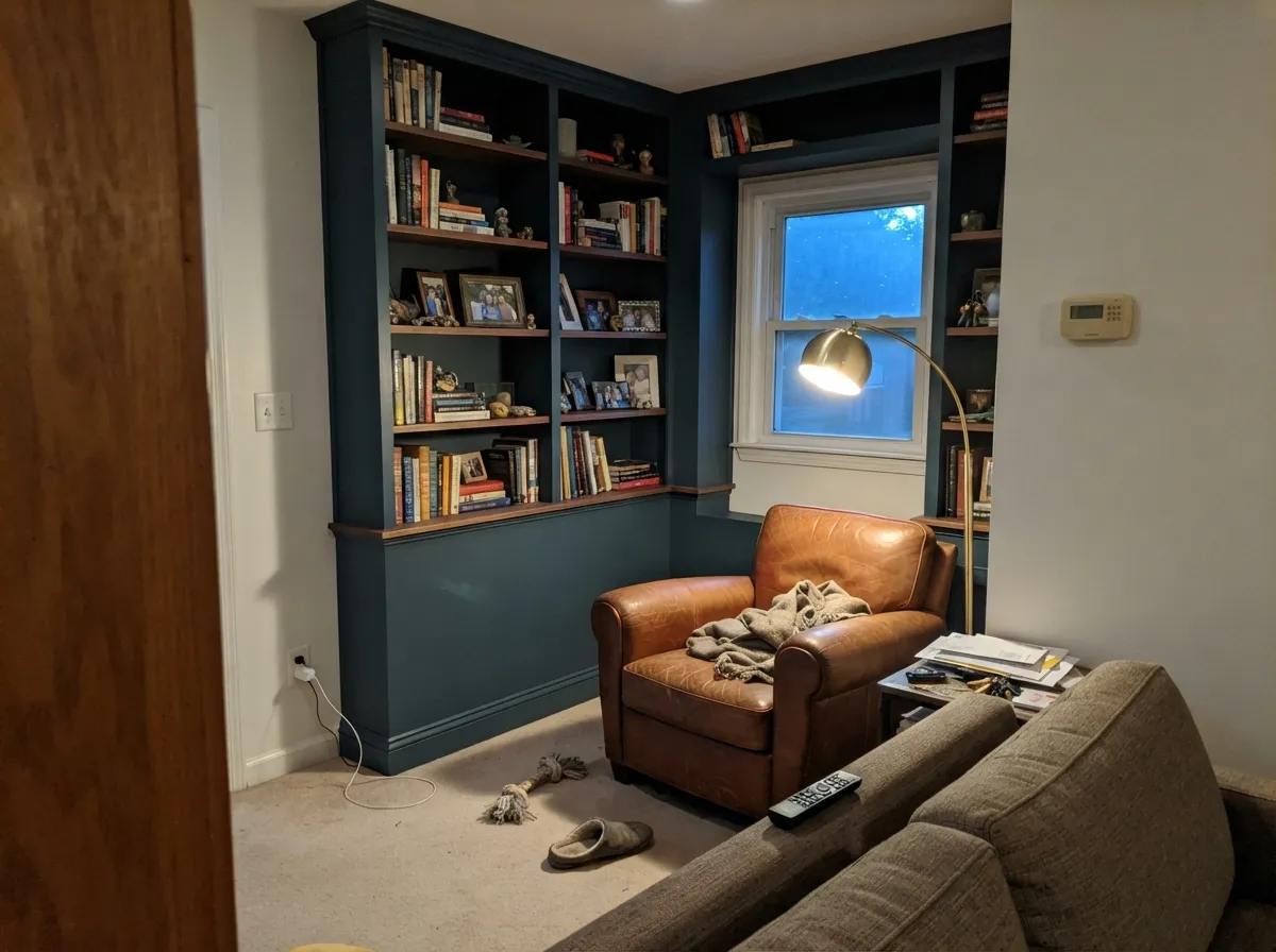
Rooms that are used mostly in lamp and evening light are the second-best home for this color: walnut shelving, leather, and a warm floor lamp bring out the blue instead of flattening it. Eggshell for durability where a desk chair scuffs the wall.
Four walls in a small, well-lit powder room is a low-risk way to use a near-black — the room is small enough that even modest light keeps the color from going flat, and a single sconce plus a mirror does most of the work.
This is not a gentle, restful dark like Sleepy Hollow. At LRV 7 a full bedroom needs serious lamp light or it reads as a cave, not a cocoon. It works for people who specifically want a dramatic, cave-like bedroom with layered warm lighting — a smaller risk on one accent wall than on all four.
Full-house siding this dark reads flat and swallows architectural detail from the street, and it shows dust and pollen fast on a large surface. Reserve it for the door, shutters, or a small accent — the places where its depth is a feature, not a liability.
Your Light Is the Risk
Real daylight brings out a clearly visible blue, even a slight teal, instead of collapsing to black. This is the light the color needs to work at all.
Reviewers describe it leaning almost navy or black in the corners, occasionally flashing purple in the deepest shadow. Test with the lights off before you commit a whole surface.
The same wall can read teal-blue near the window and near-black three feet into a corner — it shifts by distance from the light source as much as by time of day.
2700K warm bulbs bring the blue-charcoal richness forward and make it look tailored. Cool LEDs flatten it toward soot — swap the bulb before you swap the paint.
Most complaints about Gentleman's Gray are a light mismatch. Upload a photo of your actual room and see it on your walls — then ask for the same wall in north light or evening lamps before you buy a single sample.
Need It From Another Brand?
Any paint counter can custom-tint Benjamin Moore 2062-20 directly. If you would rather stay in one brand's own deck, these are the closest stock matches, measured as ΔE2000. Under 2 is a difference you will not see on the wall.
| Brand | Closest color | ΔE | LRV | |
|---|---|---|---|---|
| Sherwin-Williams | Gale ForceSW 7605 · Sherwin-Williams | 3.3 | 6 | Color page → |
| Behr | Sled750F-6 · Behr | 1.9 | 5 | Color page → |
| Valspar | Deep Galaxy8003-41G · Valspar | 4.5 | 6 | Color page → |
| PPG / Glidden | Sailor's CoatPPG1153-7 · PPG / Glidden | 2.6 | 6 | Color page → |
| Glidden | Ship'S HarborPPG1161-5 · Glidden | 2.6 | 6 | Color page → |
| Dutch Boy | Mariana Blue334-7DB · Dutch Boy | 4.6 | 5 | Color page → |
Similar Benjamin Moore Colors
The nearest shades to Gentleman's Gray within Benjamin Moore's own range, ranked by perceptual color distance — useful when you want the same look a touch lighter, darker, or warmer.
WCAG 2.1: AA is 4.5 : 1 for normal text, 3 : 1 for large text, AAA is 7 : 1.
Gentleman's Gray vs the Colors You're Also Considering
Every Gentleman's Gray sample board has the same rivals on it. The numbers show the real lightness gap — then it comes down to which risk you would rather live with.
Pick this if Hale Navy has ever felt too blue to you — this sits darker and closer to black.
Benjamin Moore HC-154 · LRV 6Hale NavyPick this if you want a lighter, more obviously "navy" navy that's easier to place in a full room.
Pick this for the darkest, most decisive version of the same idea.
Benjamin Moore 2129-30 · LRV 9Blue NotePick this for a slightly lighter step in the same near-black-blue family, a touch more forgiving in dim rooms.
Within the brand, Washington Blue CW-630 is the same #304656 at LRV 7 and is not a different color in practice. Twilight 2058-10 at #254455 is a hair more saturated and more clearly blue, while River Blue 2057-10 at LRV 6 and Dark Harbour CSP-720 at #1E4850 both lean green-teal. Miramichi CC-752 at #30484A is the greenest of the group. Cefalú Beach 2061-20 at LRV 8 is the brightest blue.
Across brands, C2 Nightspot C2-743 at deltaE 1.66 and Behr Sled 750F-6 at 1.91 are visually identical in normal room light. PPG Sailor's Coat PPG1153-7 and Glidden Ship'S Harbor PPG1161-5 both land at 2.63, and Sherwin-Williams Gale Force SW 7605 at 3.32 is very close but worth sampling first.
Valspar Deep Galaxy 8003-41G at 4.46, Dutch Boy Mariana Blue 334-7DB at 4.58 and Annie Sloan Aubusson Blue at 4.72 are close but visibly different side by side.
Gentleman's Gray Coordinating Colors
The rule for coordinating with Gentleman's Gray is simple: keep everything else warm, and give the color a light source to answer to. It pairs cleanly with warm whites, warm greiges, brass, and walnut — and it goes muddy next to cool white and chrome. These are the partners that keep showing up in rooms that work:
Gentleman's Gray: The Quiet Workhorse, Not the Headline Color
Gentleman's Gray isn't a famous color. It has never been a Color of the Year, it doesn't show up on viral before-and-afters the way Hale Navy or Sherwin-Williams's Naval do, and its biggest press moment on record is a modest "paint color of the month" nod on a design blog. Its real track record lives on Houzz and Pinterest: island cabinets, kitchen accents, the occasional front door — one deliberate surface at a time, in project after project, rather than any single famous room.
That honest, workhorse positioning is exactly why it earns a place on a door or an island rather than a whole house: it rewards people who already know they want depth and are willing to give it light, and it disappoints people expecting a headline color or a true neutral. Judge it for what it actually is — a tailored, light-dependent teal-blue near-black — and it performs exactly as advertised.
Gentleman's Gray With Wood Tones and Metals
Walnut, espresso stain, and dark-stained oak are this color's best company — the warm brown depth keeps the blue from reading cold, and the combination is the classic library-and-built-in look. Pale white oak and warm mid-tone oak also work fine as a lighter counterpoint on the floor. The one wood to watch is a very orange, glossy honey oak — the contrast can read dated rather than intentional; a rug or a stain refresh usually solves it.
Brass and warm bronze hardware are the natural partners, unlacquered or aged for the most tailored look. Polished chrome and cool nickel are the one metal combination that consistently reads wrong — they push the color toward cold and industrial instead of the warm, menswear-adjacent mood it's built for.
Three Ready Palettes Built on Gentleman's Gray
A color is never alone on the wall. These are complete combinations in the 60-30-10 pattern, with the reason each one holds together. Every one opens in the visualizer.
A warm greige body keeps the porch from going too cool, so the near-black door reads as a deliberate, tailored accent instead of a hole in the facade. White Dove trim softens the frame around it.
Try this palette in your roomPale Oak perimeter cabinets with a Gentleman's Gray island is a real, documented pairing — the kind homeowners actually post before-and-afters of. Pale Oak keeps enough light in the room that the island reads as an anchor, not a shadow, and White Dove walls bridge the two so the kitchen doesn't split into two competing zones.
Try this palette in your roomBuilt-ins carry the near-black without swallowing the whole room, because the surrounding walls stay light. A warm ceiling keeps the room from feeling capped even with a dark focal wall of shelving.
Try this palette in your roomGentleman's Gray FAQ
Is Gentleman's Gray actually gray, or is it blue?
It's a dark teal blue — a genuine blue-green with a charcoal base, not a neutral. Nearly every independent color review of this paint says some version of "it's not actually gray," and that's the single most common surprise reported. If you want an actual neutral near-black, look at Wrought Iron or Kendall Charcoal instead.
Is it too dark for a whole room?
For most rooms, yes. At LRV 7 it needs a genuine light source — daylight or warm lamps — to read as blue instead of flat black. It works best as a door, an island, or built-ins rather than four full walls, unless the room gets strong, direct light.
What's the best single use for this color?
A front door with some porch light, or a kitchen island between two windows. Both are small enough commitments that the color's depth reads as intentional, and both get enough light to show the blue instead of collapsing to black.
What trim color goes with Gentleman's Gray?
A warm white — White Dove is the safe default. Stark cool white or bright LED-lit trim pulls the color toward muddy instead of tailored. Semi-gloss on the trim, satin or matte on the color itself depending on the surface.
Does it work on an exterior door or shutters?
Yes — this is one of its strongest jobs. A covered entry with brass hardware and a warm-white or greige house body is the classic pairing. Avoid using it as full exterior siding; at this depth it flattens architectural detail and shows dust fast on a large surface.
How does it compare to Hale Navy?
Darker and more decisive. Hale Navy (LRV 6) reads as a clear, classic navy in most light; Gentleman's Gray sits closer to black, with the blue only fully visible once real light hits it. If Hale Navy has ever felt too obviously blue for your taste, this is the next step toward black.
Have you painted with Gentleman's Gray?
Rate it — one tap helps the next reader decide.
Ask a Question