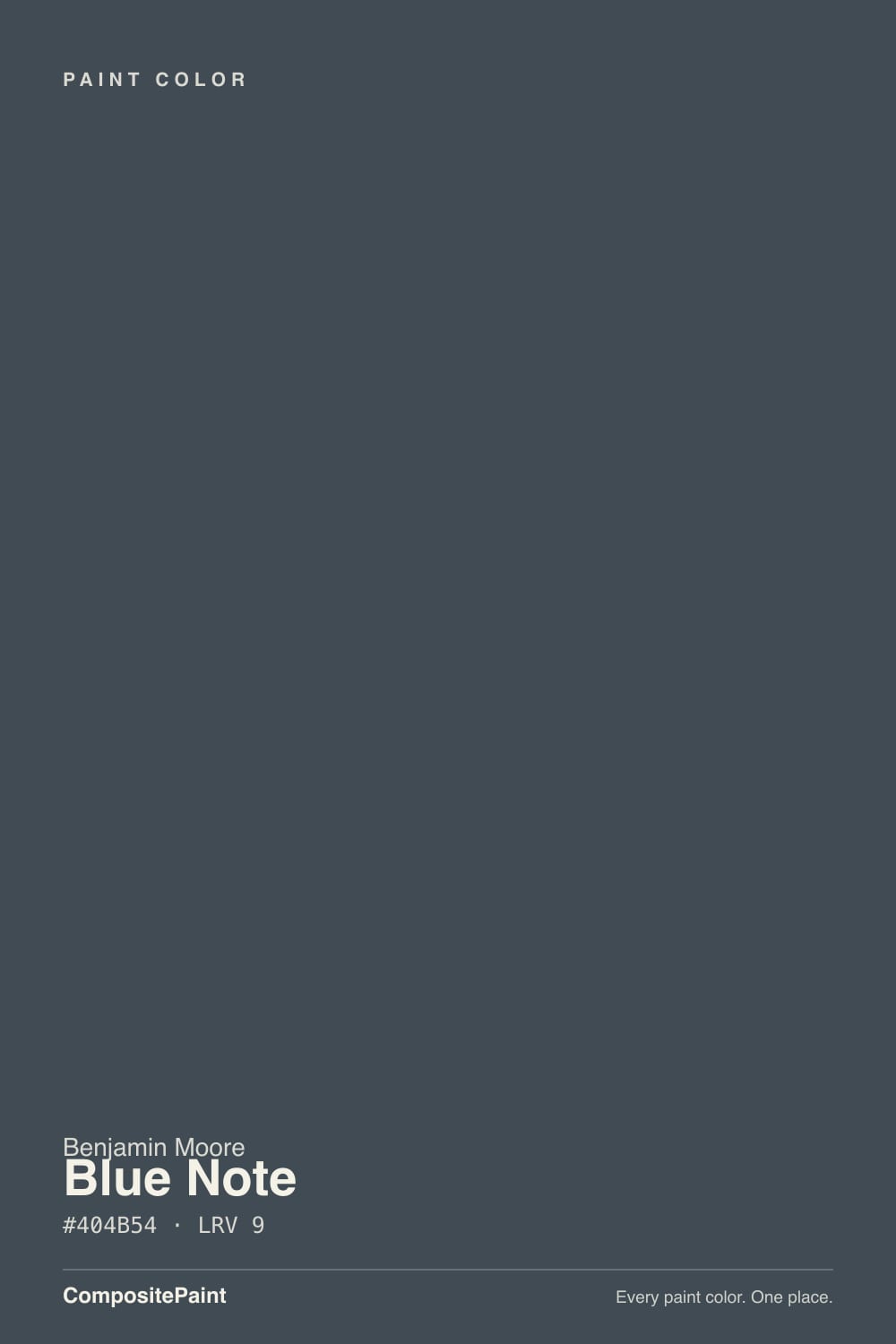
Blue Note
The navy pros reach for when Hale Navy reads too blue, reviewed honestly: why it's really a charcoal in disguise, the light it needs to prove it, and what to pick instead.

Jessica has spec'd whites and neutrals for more than 300 rooms and keeps a sample wall of painted drawdowns in her studio. Every color review is checked against real reader rooms in the comments and re-tested when a formula changes. About the testing process →
- 1Naval4
- 2Blue Note9
- 3Smoky Blue15
- 4Wolf Gray21
The Fast Verdict
Blue Note is Benjamin Moore's own answer when a client wants Hale Navy but grayer, sootier, less decorated. Benjamin Moore's official line is blunt about it: "dark gray undertones bring versatility to this deep shade of navy" — read that as charcoal first, blue second. At LRV 9 it sits almost in near-black territory, and it needs real light to prove it's blue at all. There is almost no designer-blog buzz around this color, and that is the honest story: it is a working color, not a famous one.
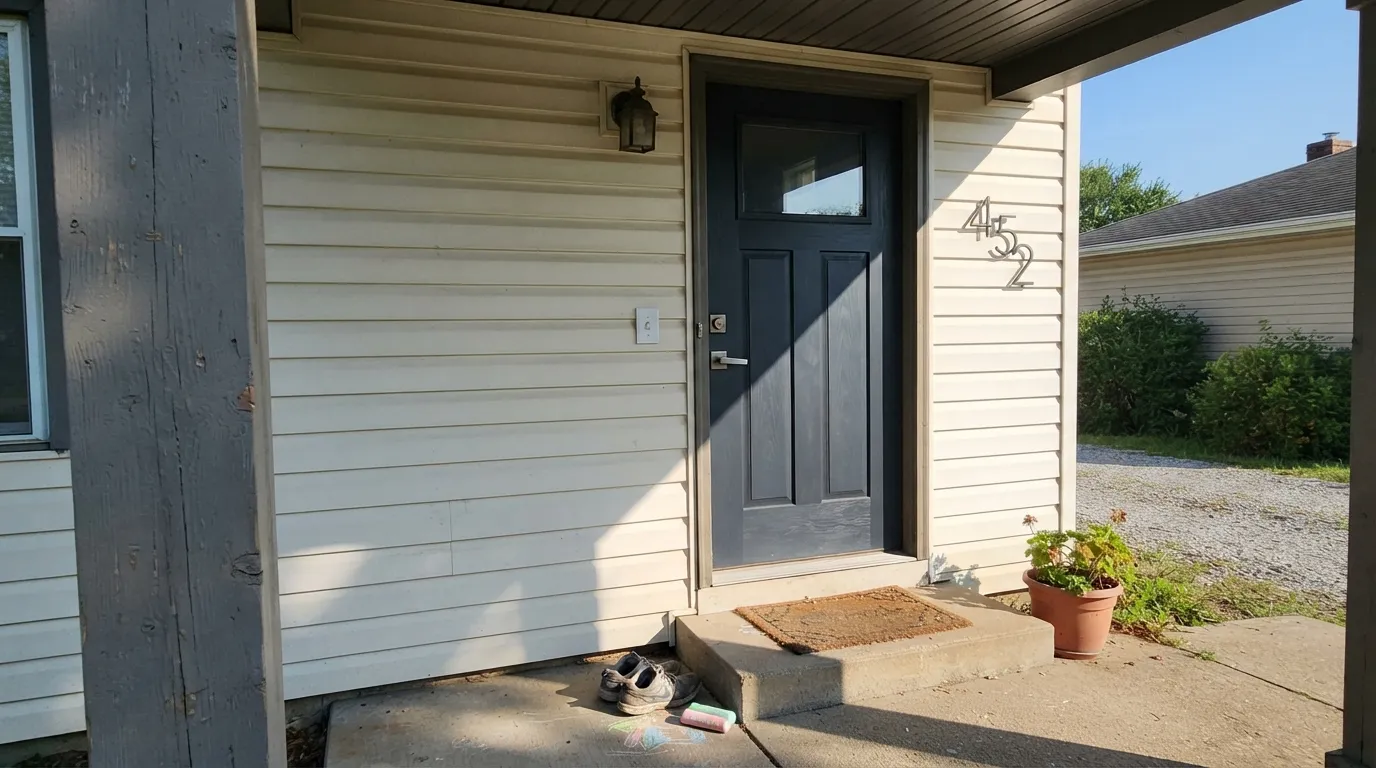
Front doors and exterior trim · kitchen islands and built-ins · a moody home-office or den accent wall · exterior siding, shakes and doors as an actual wood stain
You want a small room's walls to feel bigger · your room stays dim or overcast most days · you want the blue to read clearly without hunting for light · you're set on Hale Navy's cleaner, more saturated blue
- A genuine gray-navy that reads sophisticated, not trend-chasing
- Doubles as an exterior wood stain (Woodluxe) — same depth on siding, shakes and doors, not just paint
- Dark enough (LRV 9) to hide scuffs and weather grime on doors, trim and cabinets
- A quieter, grayer alternative when Hale Navy reads too saturated for the room
- Pairs cleanly with warm white trim and brass or matte black hardware
- At LRV 9, reads flat black in any dim, overcast, or lamp-free light — the blue needs real sun to show
- Too dark and light-hungry for a whole small room's walls
- Very little real-world documentation online — you're testing mostly on faith, not a chorus of reviews
- Loses its own shape next to other near-blacks without a light contrast partner
What Color Is Blue Note, Really?
Benjamin Moore's own description settles the character question before you even open the can: "dark gray undertones bring versatility to this deep shade of navy." That is a color company telling you, in its own copy, that this is a charcoal wearing a navy label. At LRV 9 it sits in the same near-black band as the deck's true blacks and near-blacks — deep enough that most people would call it black or charcoal on sight, not blue, until the light does some convincing.
The real story here is who reaches for it, not who's seen it on Instagram. Benjamin Moore's own similar-colors tool clusters Blue Note with Mysterious, Gravel Gray and Lead Gray, and separately lists it as one of the four closest matches to Hale Navy (with Mysterious, Evening Sky and Baby Seal Black). Put those two facts together and the picture is clear: this is the color a painter or designer pulls when a client loves the idea of Hale Navy but the sample reads too clean and too blue for the room — Blue Note gives the same depth with more gray, more shadow, less shine of personality. It also sits in Benjamin Moore's Woodluxe exterior wood stain lineup, so the same color shows up on siding and shakes as often as on trim.
Undertone in one line: charcoal-navy, gray leading, blue following — never purple, never true black. If your sample looks flat black on the chip or in the store, that's not a defect; at nine points of light reflectance, that's what this color does without real light to work with. Give it a bright window or direct sun and the blue steps forward.
Where It Shines
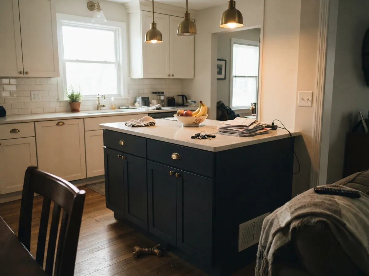
It earns its keep on things you touch and open, not whole rooms you sit in: a front door, a run of cabinets, a kitchen island. In good light it reads as a genuine gray-navy — sophisticated and quiet, not a trend color chasing attention — and because it doubles as a Woodluxe exterior stain, the same depth of color works on real wood siding and shakes, not just painted trim. Give it a bright entry, a well-lit kitchen, or full sun on an exterior wall and it looks deliberate and expensive rather than simply dark.
Where It Fails
Almost every disappointment with Blue Note traces back to one of three predictable mismatches, and all three show up before the first coat if you're honest about the room. None of them are a flaw in the paint — they're what happens when a near-black color meets the wrong light or the wrong ambition.
At LRV 9 this color absorbs almost all the light that hits it. In a small bedroom or bathroom with one window, four walls of Blue Note will feel like a box, not a mood. Save it for an accent wall, a door, or a room with real square footage and real daylight.
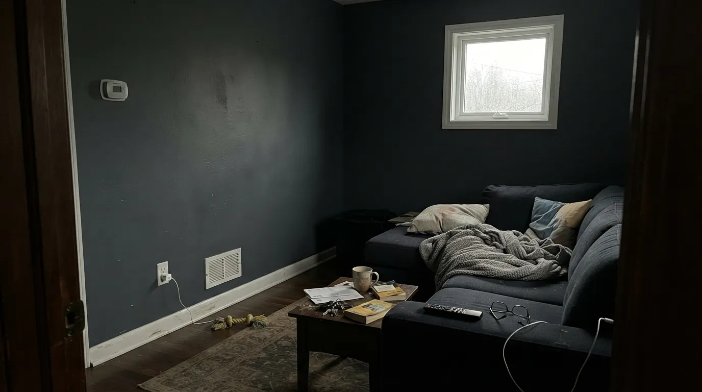
This is the single most common surprise. Under cloudy skies, in a north-facing room, or without a lamp nearby, Blue Note reads as flat black — the blue genuinely is not visible. That is not a bad batch; it is nine points of LRV doing exactly what nine points of LRV does. If you need the color to read clearly navy on an overcast Tuesday, size up in LRV or pick Van Deusen Blue instead.
Painted next to another near-black, or with no lighter trim or hardware to set it off, Blue Note just disappears into a dark mass — you lose the shape of the door or the island entirely. It needs a genuine contrast partner: a warm white trim, a pale counter, brass or matte black hardware that catches light.
Room by Room
Semi-gloss Blue Note against a warm white or light gray body reads confident without shouting. It hides handprints and weather grime better than a brighter color, and it photographs well in real daylight.
Blue Note is part of Benjamin Moore's Woodluxe exterior wood stain collection, so it's a real option for cedar shakes, board-and-batten or shutters as a stain, not just a paint. Full sun brings the blue out; shaded elevations will read closer to black.
One island or a run of lower cabinets in satin Blue Note under warm white uppers is a genuinely striking, restrained look. Pair it with a lighter counter and brass or matte black pulls so the cabinet fronts keep their shape under the kitchen lights.
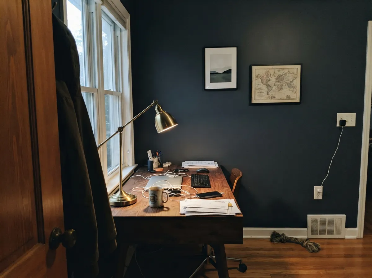
One wall behind a desk or bookshelf, with a warm lamp nearby, is where this color feels intentional rather than heavy. Matte finish keeps glare down on a screen; walnut shelving and brass fixtures are its natural company.
Works as a single headboard wall with real lamp light and a lighter ceiling and trim. A full bedroom in Blue Note asks a lot of a room that's usually dim at exactly the hours you're in it — sample big and test at night.
Skip it for a small guest bath, a windowless powder room, or any room that runs dark most of the day. This is the fastest way to end up with a room that just reads black, with none of the navy character you bought it for.
Your Light Is the Risk
Strong daylight is the only light that reliably proves this is a navy and not a black. On an exterior wall or a sunny entry, the blue is unmistakable.
Without strong light, Blue Note reads flat black — the gray undertone Benjamin Moore itself describes takes over completely. Sample it in your actual room's worst light before you commit.
Flat and black-ish in morning shade, visibly blue-gray at midday sun, back to near-black by evening. Near-black colors move less than lighter ones — don't expect drama, just a quiet flicker of blue at the brightest hour.
2700K lamps push it toward a warm, soft black with barely a hint of blue left. Cool LEDs keep a faint steel-blue cast but the color stays very dark either way — this is not a color that changes character much after dark.
Most complaints about Blue Note are a light mismatch. Upload a photo of your actual room and see it on your walls — then ask for the same wall in north light or evening lamps before you buy a single sample.
Need It From Another Brand?
Any paint counter can custom-tint Benjamin Moore 2129-30 directly. If you would rather stay in one brand's own deck, these are the closest stock matches, measured as ΔE2000. Under 2 is a difference you will not see on the wall.
| Brand | Closest color | ΔE | LRV | |
|---|---|---|---|---|
| Sherwin-Williams | Sea SerpentSW 7615 · Sherwin-Williams | 0.9 | 7 | Color page → |
| Behr | Dark NightPPF-58 · Behr | 1.7 | 7 | Color page → |
| Valspar | Night View4007-4C · Valspar | 1.3 | 6.6 | Color page → |
| PPG / Glidden | Black ForestPPG1012-7 · PPG / Glidden | 2.7 | 7 | Color page → |
| Glidden | Black ForestPPG1012-7 · Glidden | 2.7 | 7 | Color page → |
| Dutch Boy | Navigation432-7DB · Dutch Boy | 0.9 | 7 | Color page → |
Similar Benjamin Moore Colors
The nearest shades to Blue Note within Benjamin Moore's own range, ranked by perceptual color distance — useful when you want the same look a touch lighter, darker, or warmer.
WCAG 2.1: AA is 4.5 : 1 for normal text, 3 : 1 for large text, AAA is 7 : 1.
Blue Note vs the Colors You're Also Considering
Every Blue Note sample board has the same rivals on it. The numbers show the real lightness gap — then it comes down to which risk you would rather live with.
Pick this when Hale Navy feels too decorated or too blue for the room and you want the same depth with more gray.
Benjamin Moore HC-154 · LRV 6Hale NavyPick this for a cleaner, more saturated true navy — Benjamin Moore lists Blue Note as one of Hale Navy's closest neighbors, but Hale Navy reads more clearly blue.
Pick this if you're already committed to Benjamin Moore's Gennex line, or want the Woodluxe stain option.
Sherwin-Williams SW 7964 · LRV 7CyberspacePick this if your painter works in Sherwin-Williams — it's nearly the same gray-navy, a shade darker.
Inside the line, Hale Navy HC-154 (#434B56, LRV 8) is the nearest relative: a shade darker with a little more blue in it, which is why it reads as navy where Blue Note reads as charcoal. Mysterious AF-565 (#454B54, LRV 7) is darker and quieter again. Baby Seal Black 2119-30 (#464A50) shares the same LRV 9 but sits closer to a true gray, and Witching Hour 2120-30 (#46494F, LRV 9) is the most neutral of the group.
Across brands, Sherwin-Williams Sea Serpent SW 7615 (#3E4B54, LRV 7) and Dutch Boy Navigation 432-7DB both land at a deltaE of 0.9, close enough to call a match. Farrow and Ball Hague Blue No. 30 at 1.26 and Behr Orion Gray N510-6 at 1.74 are visually identical in normal room light. PPG Black Forest PPG1012-7 at 2.72 is very close, so sample first. Kompozit Calm Interlude 0501 at 4.68 is close but visibly different side by side.
Blue Note Coordinating Colors
The rule for coordinating with Blue Note is simple: give it a real light partner, or it disappears into its own shadow. Warm whites and light neutrals set off the near-black depth without fighting it; other dark neutrals from the same family (Wrought Iron, Kendall Charcoal) can echo it in a secondary accent without competing for attention. These are the partners that keep it legible:
The Real Story: Hale Navy's Quiet Backup, Not a Star on Its Own
Blue Note has no Color of the Year moment, no viral kitchen, no wave of designer-blog deep-dives — and that absence is itself the honest fact about this color. Search for it and you find Benjamin Moore's own product page, a handful of technical color-comparison tools, and almost nothing else. It sits in Benjamin Moore's standard Color Preview collection, not a curated historical or trend palette.
What it does have is a documented working relationship with Hale Navy. Benjamin Moore's own similar-colors data lists Blue Note as one of Hale Navy's four closest matches (alongside Mysterious, Evening Sky and Baby Seal Black), and separately clusters it with Gravel Gray and Lead Gray. Read plainly, that makes Blue Note a professional's substitution color: the one a painter reaches for when a client has fallen for Hale Navy on a sample chip but wants the finished room to feel a shade grayer and less overtly "blue." It's also one of the small number of Benjamin Moore colors sold as a Woodluxe exterior wood stain — a real, practical use most navy paint colors don't get.
Blue Note With Wood Tones and Floors
Warm wood is this color's best friend, the same way it is for almost every near-black neutral: walnut, oak treads, butcher block and brass all give Blue Note something to contrast against so it reads as a deliberate dark accent instead of a hole in the room. On an island or a front door, a warm wood floor or a wood porch ceiling keeps the color grounded rather than heavy.
The one caution is cool, pale flooring — white oak, gray-washed boards, polished concrete. Against those, a near-black this deep can look stark rather than rich, especially in low light. It's not a hard no, but it deserves a bigger sample and a look at the room in its dimmest hour before committing an island or a full accent wall to it.
Three Ready Palettes Built on Blue Note
A color is never alone on the wall. These are complete combinations in the 60-30-10 pattern, with the reason each one holds together. Every one opens in the visualizer.
White Dove keeps the house body warm and welcoming so the door reads as a deliberate dark accent, not a mistake. Kendall Charcoal on the shutters is close enough in weight to feel coordinated without competing for attention.
Try this palette in your roomThe high-LRV Chantilly Lace uppers give the island's near-black mass room to breathe, and Pale Oak on a pantry or shelving wall keeps the rest of the kitchen from feeling like it's negotiating with two whites at once.
Try this palette in your roomThis is the pairing that uses Blue Note the way Benjamin Moore actually built it to be used — as a Woodluxe stain on real wood siding, not just a wall paint. White Dove trim gives the shakes definition from the street; Wrought Iron ties the railing and fixtures to the same dark family without repeating the exact color.
Try this palette in your roomBlue Note FAQ
Is Blue Note more blue or more gray?
Gray leading, blue following — that's Benjamin Moore's own description: "dark gray undertones bring versatility to this deep shade of navy." At LRV 9 it needs real, direct light to show any blue at all; in ordinary indoor light it mostly reads as a soft black or charcoal.
How is Blue Note different from Hale Navy?
They're close enough that Benjamin Moore's own tool lists them as neighbors, but Hale Navy (LRV 6, family blue) reads as a cleaner, more saturated true navy, while Blue Note (LRV 9, filed closer to the gray family) is grayer and sootier. Designers reach for Blue Note specifically when a client wants Hale Navy's depth without it reading so distinctly blue.
Can I use Blue Note on exterior siding, not just walls?
Yes — it's part of Benjamin Moore's Woodluxe exterior wood stain collection, available in several opacities for cedar shakes, board-and-batten and trim. That's a real, documented use, not a stretch; full sun on an exterior elevation is one of the best places to see the blue in it.
Will Blue Note look black instead of blue?
In dim, overcast, or lamp-free light, yes — and that's expected at LRV 9, not a flaw. Test a large sample in your room's actual worst light before committing. If reading clearly navy on a cloudy day matters to you, Van Deusen Blue (LRV 11) will get you there more reliably.
What trim white goes with Blue Note?
A warm white like White Dove for a softer, welcoming look, or Chantilly Lace if you want a crisper, higher-contrast edge against the near-black. Either way, the trim needs enough LRV separation to keep the dark color from reading as one undefined mass.
Is it good for a whole small room?
Not usually. At LRV 9 it absorbs most of the light in the room, and a small space with limited daylight will feel closed-in rather than moody. It performs best as a door, an island, an accent wall, or exterior trim — a place where its depth is the point, not the whole room's atmosphere.
Have you painted with Blue Note?
Rate it — one tap helps the next reader decide.
Ask a Question