Smoky Blue
A deep, grayed-down blue-gray that Sherwin-Williams quietly files under Neutral — reviewed honestly: the light where it turns unmistakably blue, the light where it disappears, and the jobs where it actually earns its keep.

Jessica has spec'd whites and neutrals for more than 300 rooms and keeps a sample wall of painted drawdowns in her studio. Every color review is checked against real reader rooms in the comments and re-tested when a formula changes. About the testing process →
- 1Anchors Aweigh3
- 2Hale Navy8
- 3Smoky Blue15
- 4Wolf Gray21
- 5Resolute Blue40
The Fast Verdict
Smoky Blue is what happens when a real blue gets quietly grayed down until it can pass as a neutral. Sherwin-Williams even files it under its Neutral collection, not Blue — and on a chip in the store, that filing makes sense. On four walls in real daylight it stops pretending: this is a genuine deep blue-gray, clearly blue, just muted enough to sit next to almost anything instead of demanding the room around it. It has never been a headline color — no Color of the Year run, no viral room — and that is fine. It is a workhorse that does one job, a moody, grown-up blue with none of navy's drama, reliably, as long as the room gives it light to work with.
Kitchen islands and cabinets · bedrooms and home offices with real daylight · a front door on a white or gray house · anyone who wants blue without navy's full commitment
You want a true saturated navy, not a softened one · your room is small, north-facing, and lamp-free · you're set on honey oak floors and want zero friction · you want a color your guests will instantly recognize
- A genuine deep blue that stays grayed-down enough to sit next to almost anything
- One of the stronger kitchen-island and cabinet colors in the SW deck
- Reads sophisticated and coastal on a front door without navy's full commitment
- Pairs cleanly with white, marble, brass, and nickel — no clashing metals
- Honestly positioned: no trend hype, no Color of the Year run, just a dependable dark blue-gray
- Goes flat, near-charcoal in dim north-facing rooms without warm lamps
- Filed as a "Neutral" by SW, but reads clearly blue on the wall — a real surprise for buyers wanting gray
- Fights honey oak and other warm-orange wood tones
- Too deep and cool for a full whole-house wall color without real daylight
What Color Is Smoky Blue, Really?
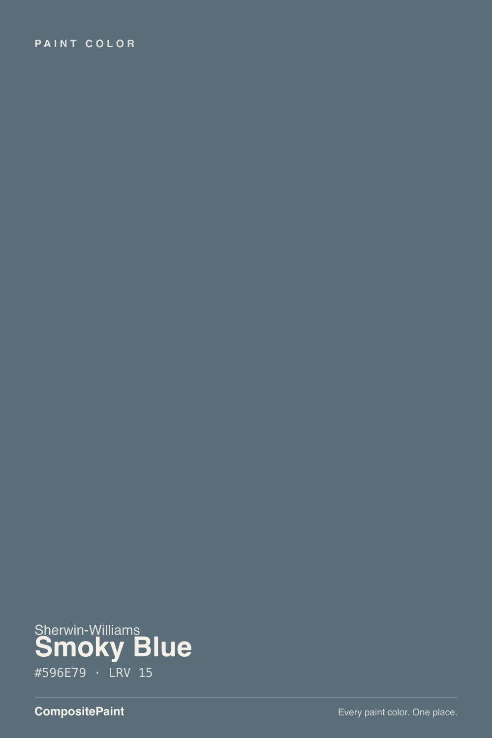
A deep blue with enough gray mixed in that Sherwin-Williams lists it under its Neutral paint colors, not Blue — an unusual filing that tells you exactly what this color is trying to be. It is not a bold, saturated blue, and it is nowhere near a true navy; the gray softens the edges so the color reads as a sophisticated backdrop before it reads as a blue accent wall. That restraint is the whole appeal: it gives a room depth and a cool, slightly weathered character without forcing every other color in the space to negotiate with it.
At LRV 15 it sits in genuine medium-dark territory — dark enough to anchor a kitchen island or a front door, nowhere close to black. Put it next to Naval (SW 6244, LRV 4) and Smoky Blue looks almost gentle by comparison; Naval stays a committed, saturated navy in nearly any light, while Smoky Blue's gray keeps pulling it back toward neutral. Put it next to Van Deusen Blue (Benjamin Moore HC-156, LRV 11) and the two read as close cousins — Van Deusen is the slightly more saturated, more clearly blue version of the same idea.
Undertone in one line: cool gray-blue, and the balance between the two shifts with the light. In real daylight the blue comes forward clearly; in lower or warmer light — evening lamps, an overcast afternoon — the gray takes over and the blue recedes. That is close to the opposite of how most warm neutrals behave, and it is the single most useful thing to know before you buy the sample.
Where It Shines
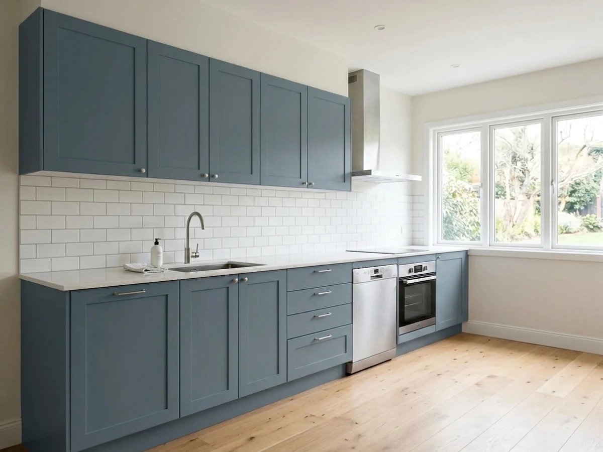
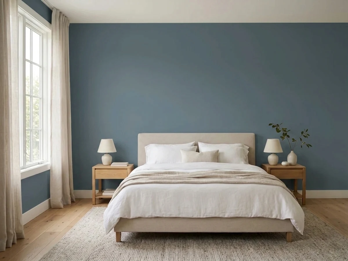
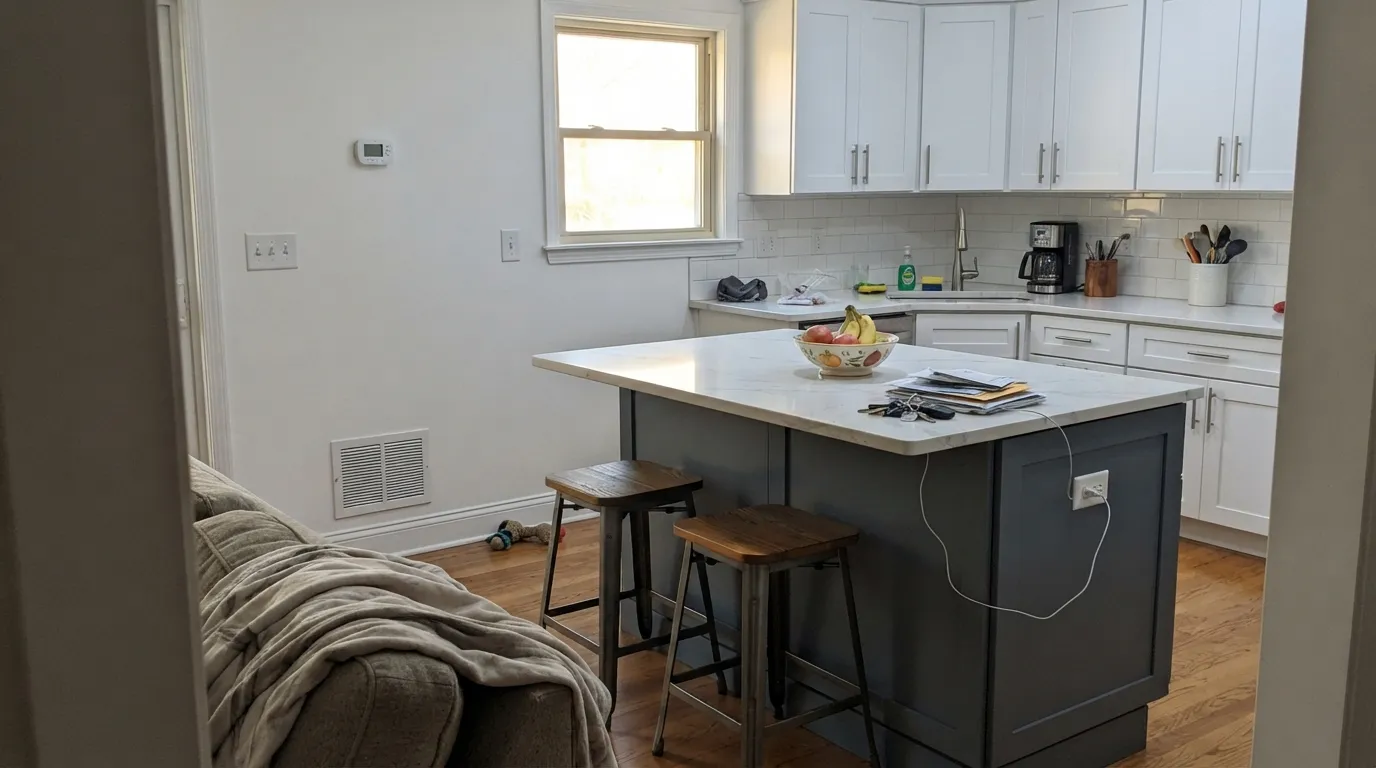
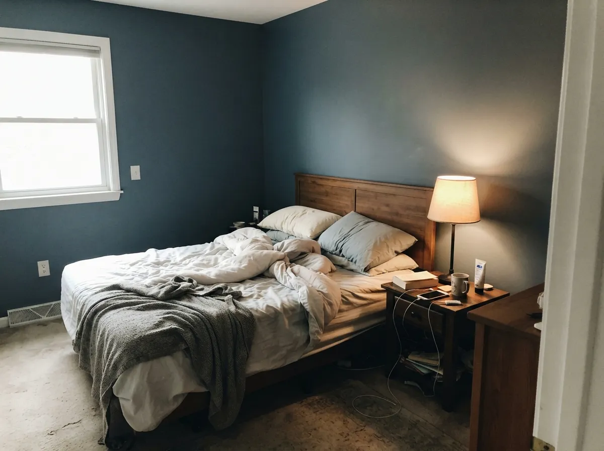
Give it a job with a clear edge — an island, a front door, an accent wall, a study with a window — and real daylight, and it looks expensive without trying. Kitchens are where it shows up most often: on an island or a full run of cabinets under white or marble-look countertops, with brushed nickel or brass hardware, it reads as a deliberate, high-end choice rather than "the blue kitchen." Bedrooms and studies are its other strong lane — a south- or west-facing room lets it hold a real, clearly blue color all day and then settle into something calmer at night.
Where It Fails
Almost every letdown with Smoky Blue traces back to one of three mismatches, and all three are visible before you buy the gallon. None of them are the paint's fault — but if your room or your expectations match one of these, sample big before you commit.
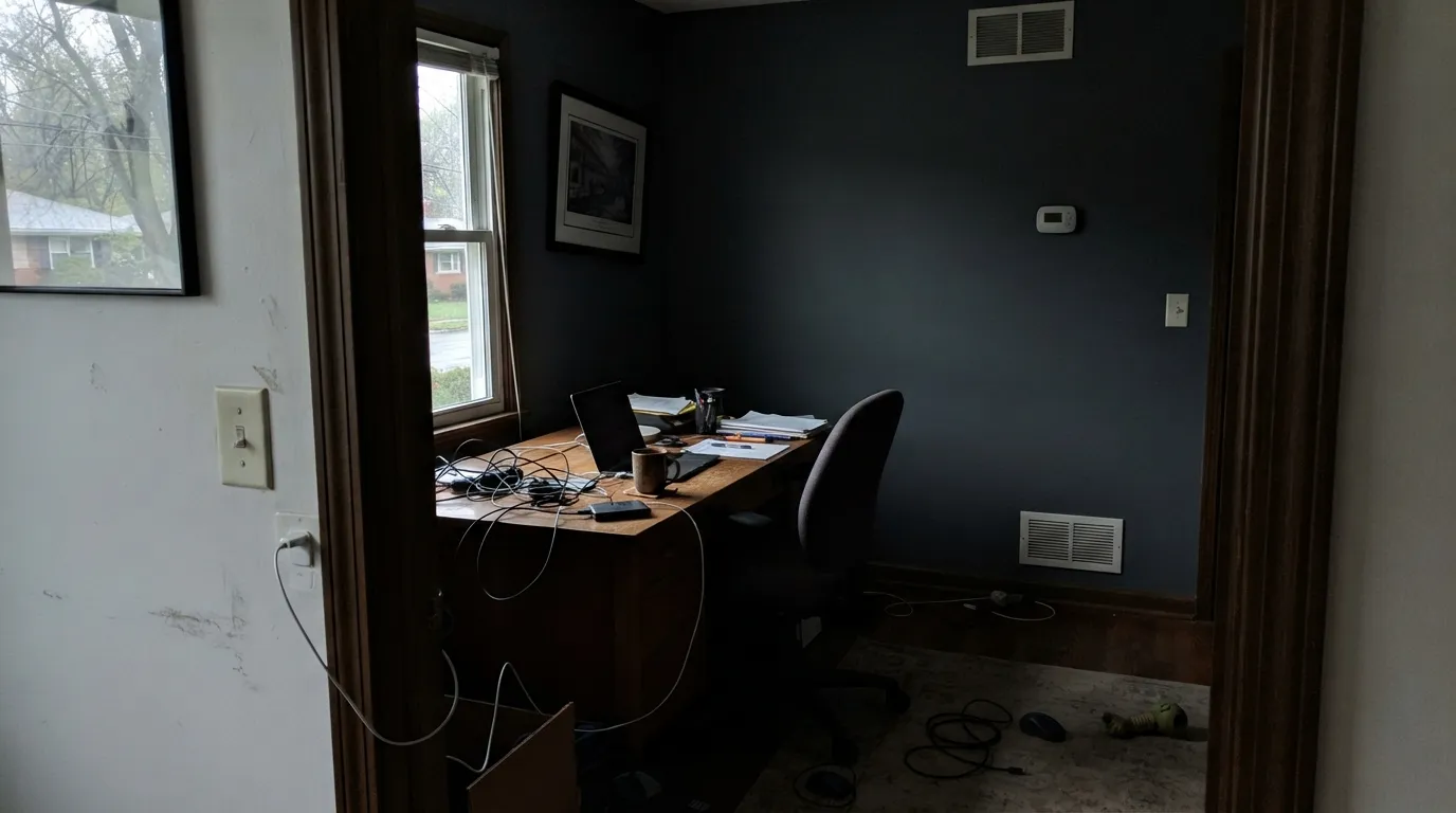
Cool daylight with no warmth to balance it drains the blue out and leaves a flat, almost charcoal-gray wall — readers who painted it expecting a moody blue describe a room that just looks dark. Add warm lamps or pick a lighter blue-gray like Stardew instead.
The Neutral-collection listing describes how it behaves next to other colors, not how it reads on your wall. Paint four walls of Smoky Blue and nobody in the room will call it gray — the blue is unmistakable in daylight. If gray is the actual goal, Peppercorn gives you a true dark neutral with no blue in it at all.
This is a cool, gray-blue color, and warm honey-oak floors sit at the opposite end of the temperature scale — the wood looks more orange next to it, and the walls look muddier next to the wood. It is built to be a strong, contained move — an island, a door, one wall — not a whole-house wall color over builder-grade oak.
Room by Room
Under white or marble-look counters with nickel or brass hardware, it is genuinely one of the strongest uses for this color — a deep, cool anchor in an otherwise light kitchen. Semi-gloss or satin holds up to daily use and keeps the color from going flat under cabinet lighting.
A south- or west-facing bedroom lets it read as a clear, calm blue all day; a dim north-facing bedroom without lamps is where it goes nearly black-gray. Eggshell on the walls, warm bulbs on the nightstands.
The depth reads focused rather than sleepy, and it holds up well on camera with a warm desk lamp in frame. Give it the same daylight test as the bedroom before committing to all four walls.
Pale oak vanities, linen towels, and brushed nickel or brass fixtures soften it; cold white subway tile and chrome push it colder than most people want. Satin or semi-gloss for moisture.
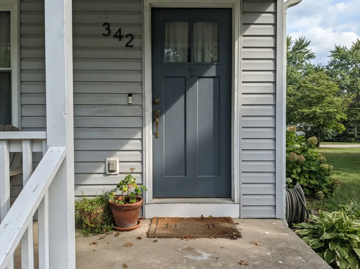
On a white, gray, or light-sided house it reads as a deliberate, coastal-leaning statement door without the starkness of a full navy. Exterior satin enamel; expect full sun to read it slightly brighter and more clearly blue than the interior version.
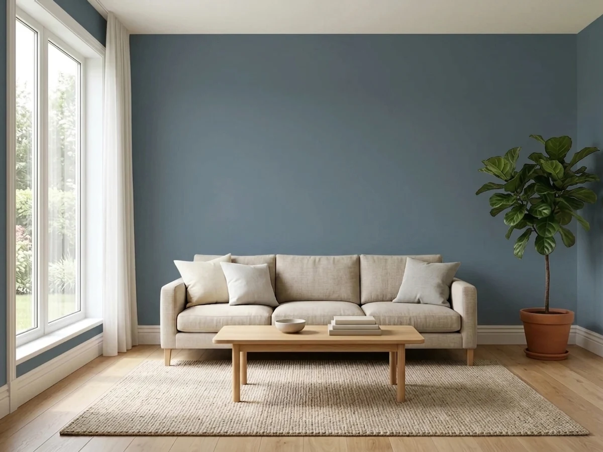
It can work as a full wall color in a genuinely bright, south-facing open room, but over large expanses with mixed or low light it stops feeling deliberate and starts feeling heavy. Better as the accent than the backdrop.
Your Light Is the Risk
Real daylight is where the blue is unmistakable and the color looks most like the chip. The most honest light to sample in.
Cool, low light drains the blue out entirely and leaves a flat, near-charcoal wall. Test before committing to a north-facing room.
Clearly blue at midday, quietly grayer as the light drops toward evening — most owners read this as the color settling down, not misbehaving.
Warm 2700K lamps pull the gray forward and mute the blue; cool LEDs let more of the blue survive after dark. Pick your bulb temperature based on which mood you want at night.
Most complaints about Smoky Blue are a light mismatch. Upload a photo of your actual room and see it on your walls — then ask for the same wall in north light or evening lamps before you buy a single sample.
Need It From Another Brand?
Any paint counter can custom-tint Sherwin-Williams SW 7604 directly. If you would rather stay in one brand's own deck, these are the closest stock matches, measured as ΔE2000. Under 2 is a difference you will not see on the wall.
| Brand | Closest color | ΔE | LRV | |
|---|---|---|---|---|
| Behr | NypdN480-6 · Behr | 2.0 | 15 | Color page → |
| Benjamin Moore | Blue Spruce1637 · Benjamin Moore | 2.3 | 17 | Color page → |
| Valspar | PassagewayV137-6 · Valspar | 1.0 | 14.2 | Color page → |
| PPG / Glidden | SuperstitionPPG1035-6 · PPG / Glidden | 2.4 | 15 | Color page → |
| Glidden | SuperstitionPPG1035-6 · Glidden | 2.4 | 15 | Color page → |
| Dutch Boy | Flint Stone433-5DB · Dutch Boy | 2.3 | 15 | Color page → |
Similar Sherwin-Williams Colors
The nearest shades to Smoky Blue within Sherwin-Williams's own range, ranked by perceptual color distance — useful when you want the same look a touch lighter, darker, or warmer.
WCAG 2.1: AA is 4.5 : 1 for normal text, 3 : 1 for large text, AAA is 7 : 1.
Smoky Blue vs the Colors You're Also Considering
Every Smoky Blue sample board has the same rivals on it. The numbers show the real lightness gap — then it comes down to which risk you would rather live with.
Pick this for a softer, more forgiving blue that still reads deliberate in a dim room.
Sherwin-Williams SW 6244 · LRV 4NavalPick this if you want a true, fully committed navy that stays navy in almost any light.
Pick this if you want the slightly grayer, more neutral-leaning version of this exact idea.
Benjamin Moore HC-156 · LRV 11Van Deusen BluePick this for the same depth with a touch more visible blue saturation — the closest cousin to Smoky Blue in another brand's deck.
Within Sherwin-Williams the differences are small but real. Distance (SW 6243), #5D6F7F at LRV 15, is the bluer sibling with less green. Slate Tile (SW 7624), #606E74 at LRV 15, is grayer and quieter. Granite Peak (SW 6250), #606B75 at LRV 14, is a touch darker and reads more like a blue-gray than a blue.
Across brands, Valspar Passageway (V137-6), #596C77 at LRV 14.2, has a color difference of 0.96, which makes it the same color for practical purposes. Benjamin Moore Blue Spruce (1637) at LRV 17 and Dunn-Edwards Moody Blues (DET590) at LRV 15 both sit near 2.3, so they are very close but worth sampling first.
Farrow & Ball Inchyra Blue (No. 289) at LRV 13 and Behr Sophisticated Teal (HDC-CL-22) at LRV 15 sit near 4.5 to 5. Both are close but visibly different side by side, Inchyra darker and greener, Sophisticated Teal further into teal.
Smoky Blue Coordinating Colors
The rule for coordinating with Smoky Blue is simple: keep everything else quiet and let the blue-gray do the work. Warm whites soften it, crisp whites sharpen it, and a true dark neutral or a deeper blue gives it one grounding partner instead of competition. These are the pairings that keep showing up in rooms that work:
Smoky Blue on Kitchen Islands and Open-Concept Kitchens
Smoky Blue doesn't have a Color of the Year run or a viral before-and-after behind it — it has become one of Sherwin-Williams' default dark-blue picks the ordinary way, one kitchen island at a time. In an open-concept home, a single deep-colored island does a specific job: it gives the eye a place to land in a room that otherwise runs wall-to-wall in one light neutral, without committing the whole kitchen to a bold color.
That is exactly the lane Smoky Blue fills. It reads as considered and a little coastal against white or marble-look counters, it doesn't fight brass or nickel hardware, and because the gray keeps it from getting too saturated, it ages better than a trendier, more saturated blue would. The tradeoff is the same one that shows up everywhere else in this review: give it counters and cabinetry, not four uninterrupted walls, unless the room has real daylight to spend.
Smoky Blue With Wood Tones and Floors
Cool, dark, and low on warmth is not what warm honey-oak floors want to stand next to — the two pull in opposite directions, with the floor reading more orange and the wall reading muddier the longer they sit together. That is the one genuine floor clash to plan around.
Everything else in the wood family gets along with it. Walnut, espresso, and other dark stains match its depth and read intentional rather than accidental. Pale white oak and light gray-washed floors give it room to breathe and keep the whole space from going too dark at once. Brushed nickel and unlacquered brass both warm it up nicely; polished chrome is the one metal that leans as cold as the paint itself.
Three Ready Palettes Built on Smoky Blue
A color is never alone on the wall. These are complete combinations in the 60-30-10 pattern, with the reason each one holds together. Every one opens in the visualizer.
Alabaster keeps the perimeter light so the island can carry all the depth in the room; Peppercorn on the window frames gives the space one more dark note so Smoky Blue doesn't stand alone as the only strong color.
Try this palette in your roomWhite Dove keeps the trim warm instead of stark, which stops the blue from reading cold; Van Deusen Blue as a single deeper accent gives the room one more shade of the same family instead of a competing color.
Try this palette in your roomGray siding and crisp white trim keep the rest of the house quiet, so the door does the only talking — the classic coastal move, and the one exterior job Smoky Blue is genuinely built for.
Try this palette in your roomSmoky Blue FAQ
Is Smoky Blue a blue or a gray?
Both, depending on the light — and that's the whole story. Sherwin-Williams technically files it under its Neutral paint colors, but on a real wall in daylight it reads as an unmistakable deep blue-gray, not a gray with a hint of blue. In dim or warm light the gray does take over. If you're buying it hoping for "basically gray," sample it in your actual room before you commit.
What does an LRV of 15 mean for this color?
LRV 15 puts it in genuine medium-dark territory — dark enough to anchor a room or a cabinet run, far short of near-black. For comparison, Naval sits at LRV 4 and reads as a true committed navy in nearly any light; Smoky Blue's higher LRV is exactly why it stays gentler and more forgiving.
Will it work in a north-facing room?
Carefully. Cool north daylight strips the blue out and can leave the walls reading flat and near-charcoal, especially without warm lamps in the evening. It's not a hard no, but it is the single riskiest light for this color — sample a large piece on the actual wall before painting.
Is Smoky Blue good for kitchen cabinets or islands?
It's one of its strongest uses. Against white or marble-look countertops with brushed nickel or brass hardware, it reads as a deliberate, high-end choice — genuinely one of the better dark blue-grays for a single island or a full cabinet run in the SW deck.
What trim color goes with Smoky Blue walls?
A warm white like Alabaster or White Dove softens the contrast for a traditional look; Extra White gives a crisper, more modern edge if the room has enough daylight to support it. Either way, keep the trim clean and let Smoky Blue carry the depth.
How is it different from Naval?
Naval is a fully saturated, committed navy that reads dark and blue in almost any light. Smoky Blue has more gray blended in, so it is gentler, easier to live with over a larger area, and more likely to fade toward gray in low light. Pick Naval if you want unmistakable navy; pick Smoky Blue if you want the same mood with more give.
Have you painted with Smoky Blue?
Rate it — one tap helps the next reader decide.
Ask a Question