Slate Tile
Sherwin-Williams' quiet blue-gray workhorse, reviewed honestly: where it reads a real blue, the light that turns it flat black, and what to paint it on instead of a whole room.

Jessica has spec'd whites and neutrals for more than 300 rooms and keeps a sample wall of painted drawdowns in her studio. Every color review is checked against real reader rooms in the comments and re-tested when a formula changes. About the testing process →
- 1Urbane Bronze8
- 2Slate Tile15
- 3Retreat21
- 4Stardew43
The Fast Verdict
Slate Tile is not a hype color — no Color of the Year moment, no viral kitchen — it is the blue-gray Sherwin-Williams designers reach for when a client wants "moody" on one surface and nothing more. At LRV 14 it is deep enough to read as a real commitment on an island or a front door, gray enough to sit quietly next to white and brass, and honest enough to admit it needs real light to prove it isn't just dark gray. Give it a single surface and good light and it earns its keep every time.
Kitchen islands and cabinets · bathroom vanities · front doors and exterior shutters · one accent wall in a bright room
You want it to read clearly blue in a dim room · you're covering all four walls of a living space · your room runs on cool LEDs with no warm lamp · you actually want a true, saturated navy
- A genuine blue-gray with real depth, not a black impostor — in the right light
- Works as hard on a front door as it does on a kitchen island
- Pairs effortlessly with brass, marble, quartz, and crisp white trim
- Deep enough (LRV 14) to anchor a small room without needing four walls of it
- A quiet, dependable color that never went viral and doesn't need to
- In dim rooms it reads flat black, not blue
- Not built for whole-room walls — needs a single surface or a small room
- Close enough to Waterloo and Smoky Blue that shoppers often grab the wrong one
- Needs real daylight or warm bulbs to prove it isn't just dark gray
What Color Is Slate Tile, Really?
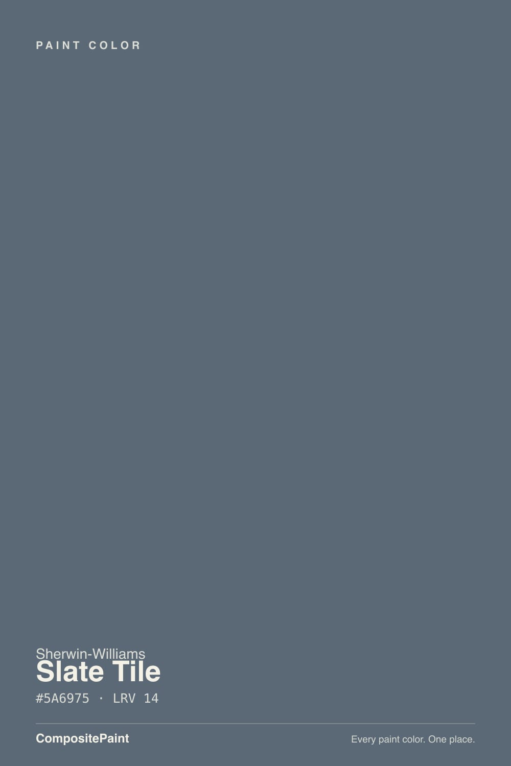
A muted, cool-leaning blue-gray with the blue kept firmly in check by gray — Sherwin-Williams files it under both its Blue and Neutral categories, and that dual listing tells you exactly how it behaves: color enough to notice, neutral enough to not fight with anything. It never had a Color of the Year moment and it isn't the color anyone posts to go viral. What it has instead is a steady career as the blue-gray designers reach for on a kitchen island or a front door when a client wants moody without wanting to think about it twice.
At LRV 14 it sits in genuinely dark territory — deeper than most named "blue-grays," closer to the near-black end of the deck than the mid-tone end. That depth is the whole trade-off: on one well-lit surface it reads as a deliberate, sophisticated dark blue; spread across four walls in ordinary daylight, it starts to behave like an absence of light rather than a color. This is an accent color's LRV, not a whole-room one, and the honest reviews out there all say so.
Undertone in one line: blue-gray with a faint blue-green cast in certain light, never warm. Compared with Waterloo, a close sibling in the SW deck, Slate Tile keeps the gray in charge and lets blue show only when the light is doing its job; Waterloo lets the blue read first, with less gray holding it back. If your sample looks plain black or charcoal on the wall, that is the room's light talking, not a different paint.
Where It Shines
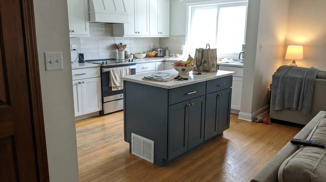
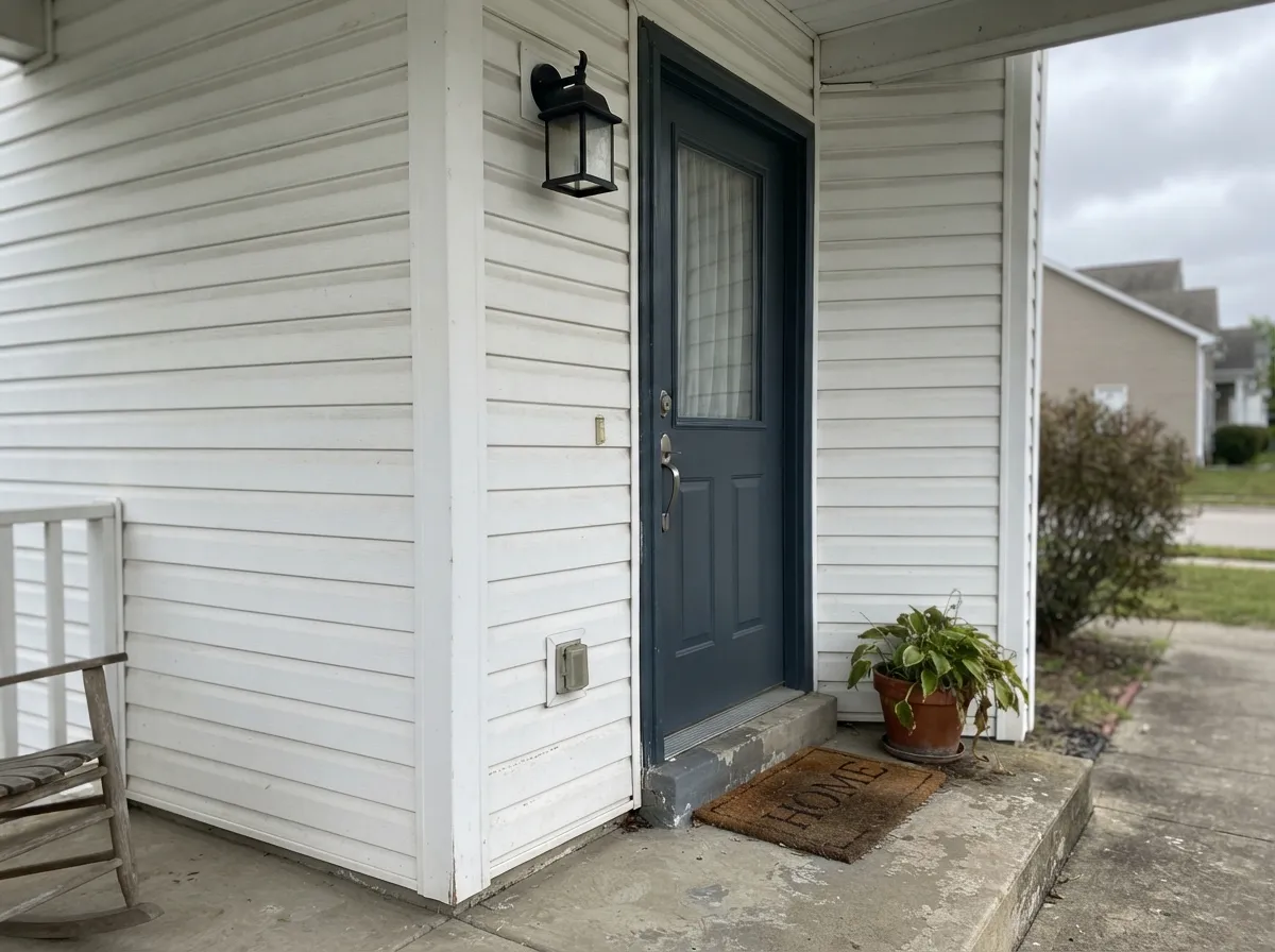
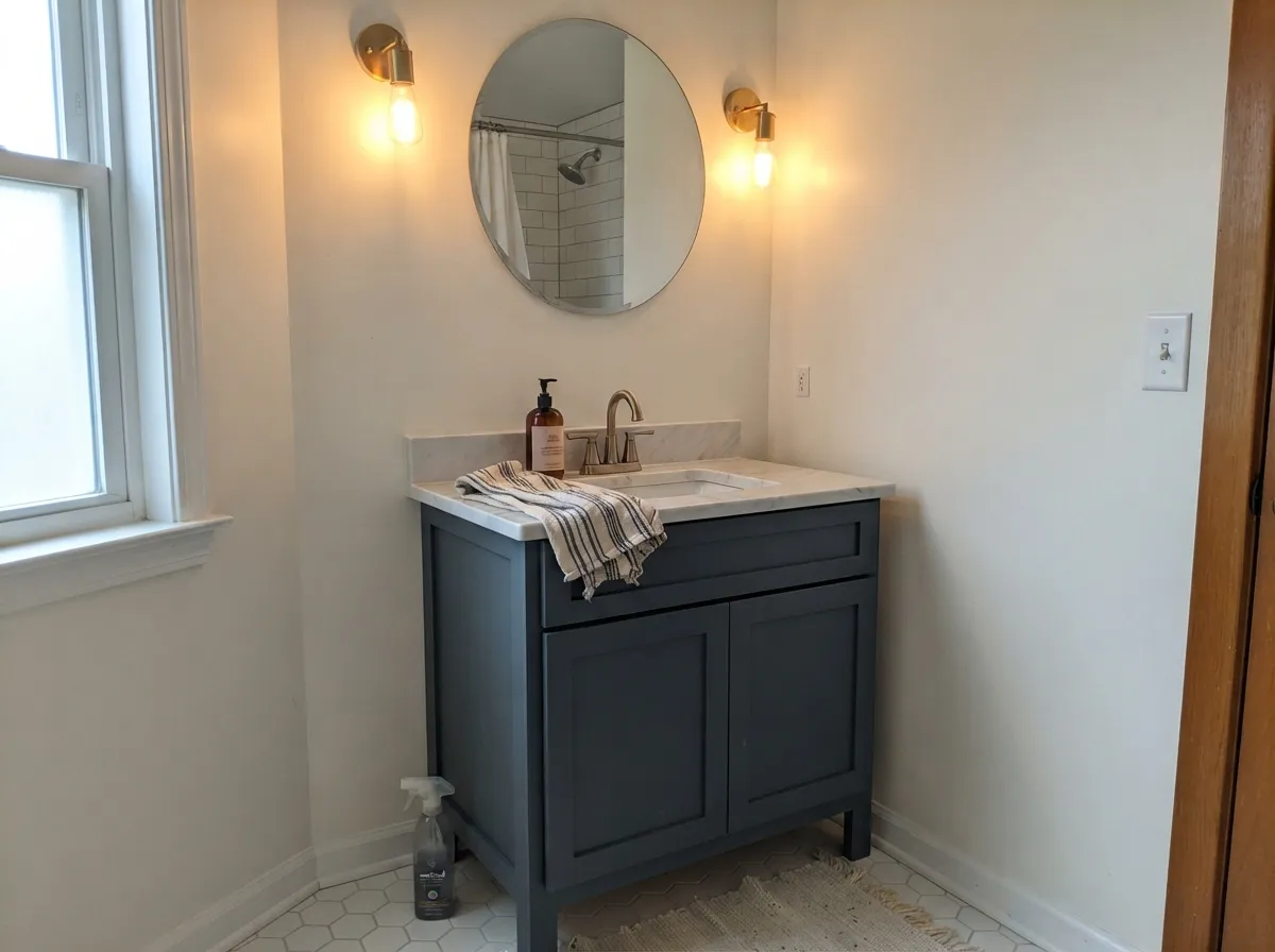
Give it one hard-working surface and real light and this is a genuinely good color. Kitchen islands are its signature job — paired with white or off-white perimeter cabinets, a marble or quartz top, and brushed brass hardware, it is the modern-farmhouse move real designers keep photographing. Front doors, shutters, and bathroom vanities are its other steady gigs: enough color to feel considered, dark enough to hide handprints and swing-marks, never loud enough to date a whole house.
Where It Fails
Almost every disappointed review of Slate Tile traces back to one of three setups, and all three are predictable before the first coat goes on. None of them are the paint's fault — but if your plan matches one of these, this is the wrong job for this color.
At LRV 14, a full room in ordinary daylight stops reading as a color and starts reading as an absence of light — flat, heavy, closing the room in rather than giving it depth. Slate Tile works on one surface or in a genuinely small room (a powder bath, a walk-in pantry); it was not built to carry a living room by itself.
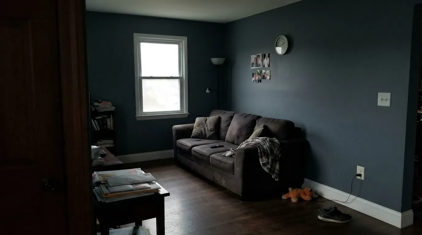
A dim corner, a north-facing room, or a wall with no lamp nearby: the blue disappears and the paint reads as plain black or charcoal. This is the "why does my blue paint look black" complaint, and the fix is a real light fixture aimed at the surface, not a different can of paint.
This is the grayed-down, quiet version of a blue-gray — gray leads, blue follows. If you want the blue to read clearly at a glance, go bluer with Waterloo, or go all the way to a true navy like Naval; Slate Tile will keep looking more gray than either of those, by design.
Room by Room
The signature use: a Slate Tile island against white or off-white perimeter cabinets, a light quartz or marble top, and brass or brushed-gold hardware. Satin cabinet enamel wipes clean and holds up to daily handling.
Against light siding it reads as a confident, near-navy statement without going full black-door predictable. Semi-gloss for the door; expect it to look a touch lighter and bluer outdoors than the chip suggests.
A steady designer move: Slate Tile vanity, white walls, marble top, brass fixtures. Satin urethane-fortified enamel handles splashes and daily wear.
Behind a bed or in a dining nook with a real window or a picture light, it reads as a deliberate dark blue-gray. Skip it on the wall the window is on, where you'll be looking at the color in shadow.
Unless the room gets excellent daylight all day, four walls of LRV 14 read oppressive rather than moody. If you love the color that much, use it on trim, doors, and built-ins around a much lighter wall instead.
On bookshelves, wainscoting, or a study door under warm lamp light, it reads rich and library-like. Eggshell where hands and books make contact.
Your Light Is the Risk
A large window with strong ambient light — not necessarily direct sun — lets the blue-gray read clearly without going harsh. This is the light that proves it isn't just dark gray.
Without a real light source aimed at the surface, it collapses toward flat black and the blue all but disappears. Fine if you actually wanted near-black; disappointing if you wanted blue.
Morning light keeps it cooler and more clearly blue; by late-afternoon shadow it settles toward plain charcoal. Expect more day-to-day change than a mid-tone color.
Warm 2700K bulbs pull it toward a soft charcoal-navy that still reads as color. Cool white LEDs flatten it to plain dark gray — use warm bulbs on anything painted this color.
Most complaints about Slate Tile are a light mismatch. Upload a photo of your actual room and see it on your walls — then ask for the same wall in north light or evening lamps before you buy a single sample.
Need It From Another Brand?
Any paint counter can custom-tint Sherwin-Williams SW 7624 directly. If you would rather stay in one brand's own deck, these are the closest stock matches, measured as ΔE2000. Under 2 is a difference you will not see on the wall.
| Brand | Closest color | ΔE | LRV | |
|---|---|---|---|---|
| Behr | NypdN480-6 · Behr | 1.5 | 15 | Color page → |
| Benjamin Moore | Blue Spruce1637 · Benjamin Moore | 1.0 | 17 | Color page → |
| Valspar | In the Deep Blue Sea8004-40F · Valspar | 2.1 | 14 | Color page → |
| PPG / Glidden | SuperstitionPPG1035-6 · PPG / Glidden | 2.0 | 15 | Color page → |
| Glidden | Deep Iron Creek30BG 15/062 · Glidden | 0.7 | 15 | Color page → |
| Dutch Boy | Whale's Tail430-6DB · Dutch Boy | 1.4 | 16 | Color page → |
Similar Sherwin-Williams Colors
The nearest shades to Slate Tile within Sherwin-Williams's own range, ranked by perceptual color distance — useful when you want the same look a touch lighter, darker, or warmer.
WCAG 2.1: AA is 4.5 : 1 for normal text, 3 : 1 for large text, AAA is 7 : 1.
Slate Tile vs the Colors You're Also Considering
Every Slate Tile sample board has the same rivals on it. The numbers show the real lightness gap — then it comes down to which risk you would rather live with.
Pick this when you want the quieter, more neutral version of the same depth.
Sherwin-Williams SW 9141 · LRV 13WaterlooPick this if you want more blue and less gray — Waterloo lets the blue read first where Slate Tile keeps gray in charge.
Pick this for the straighter blue-gray, with no green pulling at the undertone.
Sherwin-Williams SW 7604 · LRV 15Smoky BluePick this for the teal-leaning version of this same darkness — greener, less true gray.
Within Sherwin-Williams, Granite Peak SW 6250 shares the same LRV of 14 but its hex #606B75 is slightly lighter and less blue, so it behaves more like a neutral gray. Waterloo SW 9141 at LRV 13, hex #536872, is a little deeper and more clearly blue. Gibraltar SW 6257 at LRV 14 drops most of the blue for a plainer gray, while Mesmerize SW 6544 at LRV 13 shifts toward violet.
Across brands, the closest matches are Dutch Boy Stilled Night 433-6DB at deltaE 1.56 and HGTV Home by Sherwin-Williams Sweeping Rock HGSW 3362 at 1.83, both visually identical in normal room light. Valspar Passageway V137-6 at 2.06, Dunn-Edwards Made of Steel DET593 at 2.47, and Behr Rush Hour MQ5-25 at 3.06 are very close, so sample before ordering. Benjamin Moore Ocean Floor 1630 at deltaE 3.69 is close but visibly different side by side, reading grayer and less blue.
Slate Tile Coordinating Colors
The pairing rule is simple: keep the company light or truly dark, and let Slate Tile be the only mid-value note in the room. Warm whites soften it, true blacks sharpen it, and its own bluer or lighter siblings are the move when you want the same mood on a second surface without repeating the exact color:
A Color That Never Needed a Marketing Campaign
Slate Tile has no Color of the Year on its resume and no single viral room that made it famous. What it has instead is a long, quiet run as a working designer's choice — the color that shows up on a kitchen island under Calacatta-look tile and brass pendant lights, or on a front door against white siding, in project after project that never trended, just got specified. That is a different kind of proof than a headline: it means real painters and real designers keep choosing it on purpose, job after job, without a marketing push behind it.
The trade-off for that quiet reputation is that it is genuinely easy to confuse with its close relatives — Waterloo, Smoky Blue, Grays Harbor — on a phone screen or a small chip. All three occupy the same dark blue-gray neighborhood with small, real differences in how much blue versus gray leads. Pull physical samples of at least two before you commit; this is a family where the difference between colors matters more than the difference between brands.
Slate Tile With Wood, Metal, and Stone
Brass and warm gold hardware are the classic finish partner — unlacquered or brushed brass pulls, a brass or antique-gold light fixture, warm the color up just enough to keep it from feeling cold. Matte black hardware works too, for a cooler, more graphic look; polished chrome is the least flattering choice, since it pushes the whole pairing colder than the paint wants to be.
For countertops and stone, light wins: white or pale-veined quartz and marble are the standard match, giving the deep color somewhere bright to rest against. Butcher block and light oak floors are safe and warm the room slightly; very dark or heavily grained wood stacked against Slate Tile can tip a small room toward feeling cave-like, so keep at least one surface light when the color covers cabinetry or an island.
Three Ready Palettes Built on Slate Tile
A color is never alone on the wall. These are complete combinations in the 60-30-10 pattern, with the reason each one holds together. Every one opens in the visualizer.
The modern-farmhouse formula: a warm white perimeter keeps the kitchen bright, the island carries the one deep color the room needs, and a few true-black touches sharpen the edges instead of softening them. Brass hardware is what finishes it.
Try this palette in your roomA crisp white body lets one door carry all the color the facade needs; black shutters and fixtures pick up the same cool family without repeating it, so the whole front reads considered rather than themed.
Try this palette in your roomA powder room is small enough to take Slate Tile on all four walls without the LRV 14 problem a bigger room would have. Alabaster trim keeps the edges soft; a black mirror frame and fixtures give the room one sharp, deliberate note.
Try this palette in your roomSlate Tile FAQ
Is Slate Tile blue or gray?
Both, with gray leading. Sherwin-Williams files it under both its Blue and Neutral categories. In good light it reads as a clear, cool blue-gray; in dim light the gray takes over and it can look plain charcoal or near-black.
Is Slate Tile too dark for a whole room?
For most rooms, yes. At LRV 14 it needs excellent daylight to avoid feeling heavy across four walls. It is built to be an accent — an island, a door, a vanity, or a small powder room — rather than a whole living room or bedroom.
What white goes with Slate Tile?
A soft warm white like Alabaster is the classic pairing — it keeps the kitchen or bathroom bright without competing with the blue-gray. A crisper white like Pure White works well outdoors against Slate Tile trim or a front door.
Does Slate Tile work on an exterior front door?
Yes — it's one of its steadiest jobs. Against light siding it reads as a confident near-navy statement, and outdoors it tends to look a shade lighter and bluer than the chip suggests. Semi-gloss holds up best to weather and hands.
Slate Tile vs Waterloo — what's the real difference?
Waterloo lets the blue read first, with less gray holding it back; Slate Tile keeps gray in charge and shows blue mainly when the light is good. If you want the color to read clearly blue at a glance, pick Waterloo. If you want a quieter, more neutral dark, pick Slate Tile.
What sheen should I use for cabinets or an island in Slate Tile?
Satin, in a urethane-fortified cabinet enamel — it wipes clean, handles daily handling around pulls and edges, and doesn't flash the way semi-gloss can on a large flat door. Save semi-gloss for a front door or trim.
Have you painted with Slate Tile?
Rate it — one tap helps the next reader decide.
Ask a Question